The Los Angeles Gratitude Note: How lilmiquela Built This AI Art
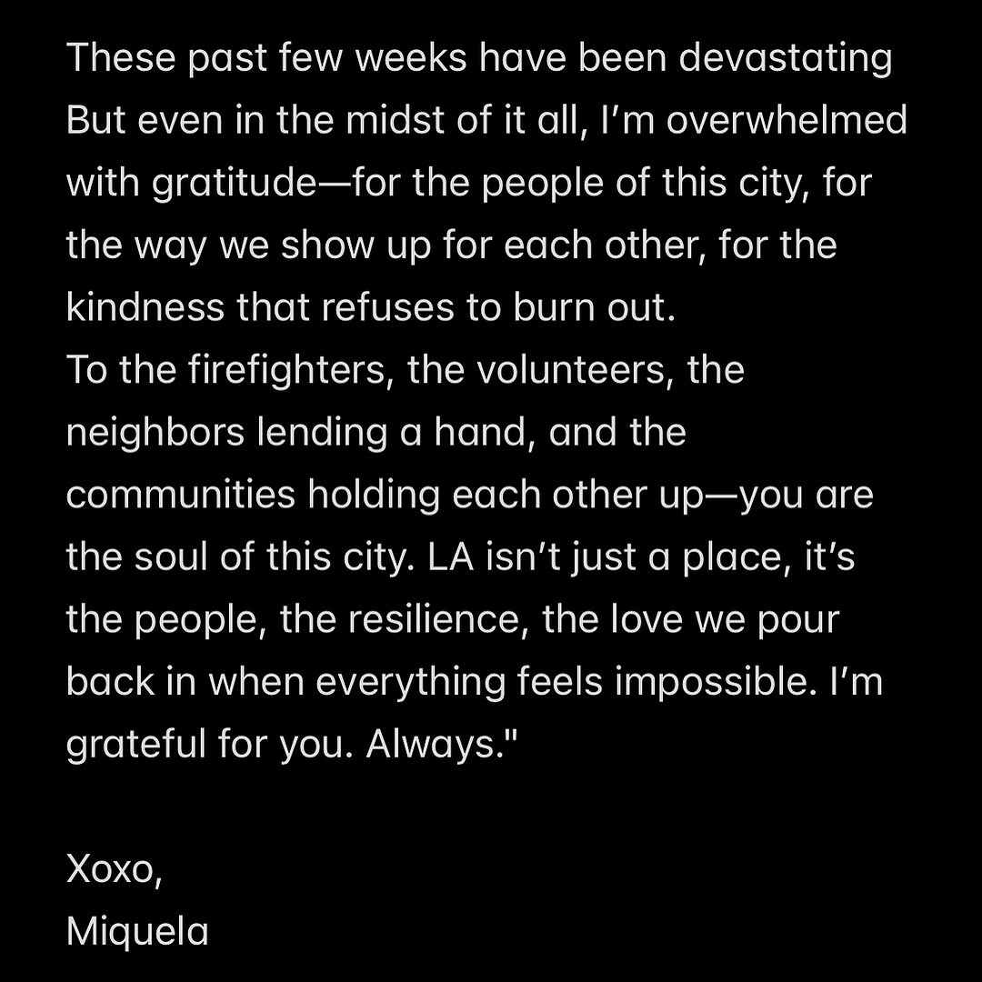
This image strips everything down to language and tone. That choice is strategic. In moments of collective stress, audiences often distrust polished visuals and respond better to direct human voice. A black background with white text reads as serious, immediate, and emotionally focused.
The message structure is also strong: pain acknowledged first, gratitude expanded second, identity reaffirmed third. This sequencing creates emotional credibility and gives readers a clear path from heaviness to solidarity.
Signal Table: Why It Works
| Signal | Evidence (from this image) | Mechanism | Replication Action |
|---|
| Radical visual restraint | No image, only high-contrast text | Removes distraction and increases message absorption | Use text-only cards when emotional clarity matters more than aesthetics |
| Collective gratitude framing | Thanks directed to firefighters, volunteers, neighbors | Shifts focus from self to community, strengthening trust | Name specific groups and contributions in plain language |
| Vulnerability + hope arc | Starts with devastation, ends with gratitude and “Always” | Narrative arc supports emotional completion | Write in three beats: acknowledge pain, recognize support, close with commitment |
| Personal sign-off | Signature line “Xoxo, Miquela” | Humanizes statement and increases intimacy | End with a personal voice marker, not corporate tagline |
Best-fit Scenarios and Limits
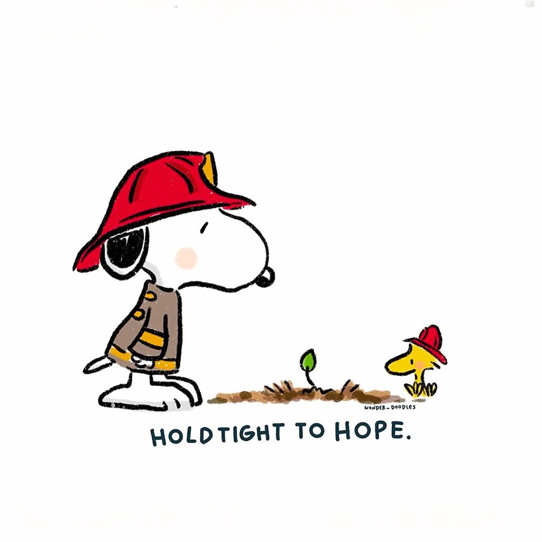
- Community crisis responses: ideal when empathy and clarity are priority.
- Creator accountability posts: strong for sincere reflection without visual noise.
- Memorial and gratitude messages: useful for respectful, focused communication.
- Nonprofit solidarity updates: effective when naming real helpers and shared resilience.
Not ideal:
- Product launches needing visual persuasion and feature proof.
- Entertainment teaser campaigns requiring energy and spectacle.
- Posts where complex data charts are necessary for understanding.
Three transfer recipes
- Community Update Variant — Keep: black card + left-aligned long-form message. Change: gratitude targets to local responders/team members. Slot template:
{opening_acknowledgment} + {specific_thanks_list} + {closing_commitment} + {signature} - Creator Apology Variant — Keep: restraint and direct voice. Change: structure to accountability + corrective action + continued commitment. Slot template:
{harm_acknowledgment}, {responsibility_statement}, {next_steps}, {personal_signoff} - Campaign Reflection Variant — Keep: monochrome note style and emotional arc. Change: context from crisis to milestone gratitude. Slot template:
{context_line}, {community_appreciation}, {future_promise}, {name_signoff}
Aesthetic Read: Why the Design Feels Honest
Honesty here is visualized through restraint. No decorative typography, no imagery, no brand clutter. The design implies: “read this, don’t scroll past it.” In a feed full of stimulation, this contrast can dramatically increase dwell time for serious messages.
| Observed detail | How to recreate |
|---|
| High-contrast readability | Use white text on pure black with generous margins |
| Left-aligned paragraph flow | Set readable line length and clear paragraph rhythm |
| Signature separation | Add vertical spacing before sign-off to mark emotional closure |
| No decorative noise | Avoid icons, gradients, stickers, and unnecessary branding |
Prompt Technique Breakdown
| Prompt chunk | What it controls | Swap ideas (EN) |
|---|
| Opening line block | Emotional entry | "These weeks have been hard", "This month has been painful", "We have been carrying a lot" |
| Specific gratitude block | Credibility | "thank responders", "thank volunteers", "thank neighbors" |
| City/community identity block | Collective belonging | "the soul of this city", "our community spirit", "our shared resilience" |
| Closure block | Emotional resolution | "I’m grateful for you", "we’re with you", "always with love" |
| Typography block | Trust tone | "plain sans-serif", "left-aligned body copy", "high-contrast note card" |
| Signature block | Voice ownership | "Xoxo, Name", "With love, Name", "— Name" |
Remix Playbook
Baseline lock: (1) monochrome text-only card, (2) three-part emotional arc, (3) personal sign-off.
- Run 1: Build baseline statement with pain acknowledgment, community gratitude, and signature close.
- Run 2: Keep layout fixed, test only opening line phrasing for authenticity.
- Run 3: Keep opening fixed, adjust middle gratitude section specificity.
- Run 4: Keep winner, test card length for readability vs emotional depth.
When publishing serious notes, clarity and sincerity should outweigh all visual experimentation.