How lilmiquela Made This LA Job Resource AI Art - and How to Recreate It
This kind of post works because it removes decision friction. There is no image to decode and no narrative puzzle to solve. The audience reads one message in one glance. For community support communication, that speed is a major performance advantage.
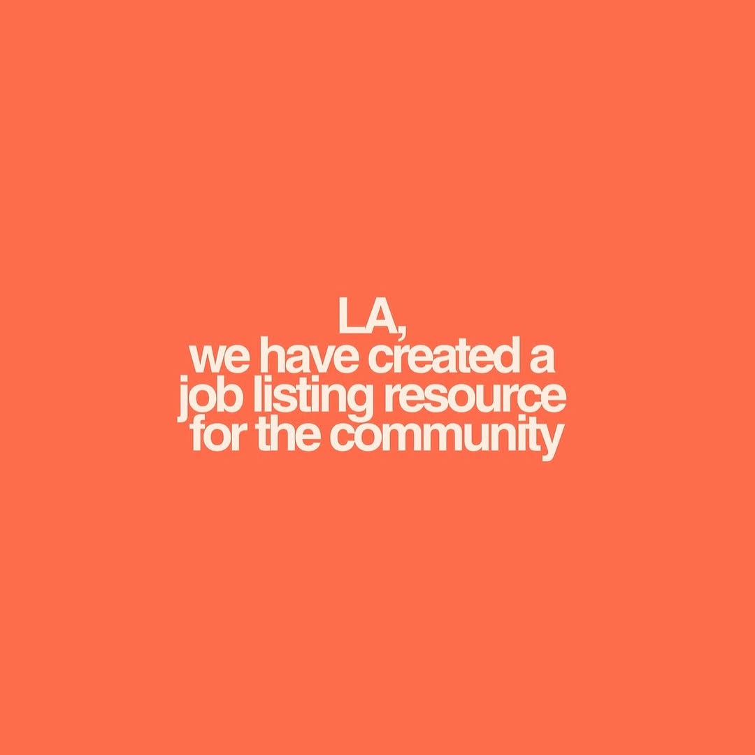
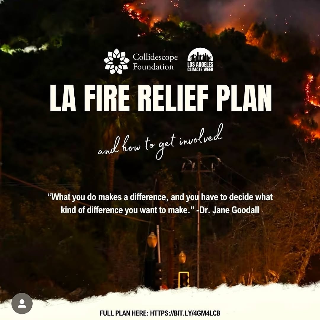
The coral background and bold white type make the card emotionally warm while still urgent. It feels human, not bureaucratic. That balance is exactly what creators need when sharing resources tied to jobs, relief, or local support.
Signal Table
| Signal | Evidence (from this image) | Mechanism | Replication Action |
|---|
| Single-message focus | Only one sentence appears in the frame | Maximizes comprehension speed | Reduce post to one clear statement and one action |
| High-contrast readability | White bold text on saturated coral | Improves retention in fast scrolling contexts | Use strong color contrast and heavy font weight |
| Large negative space | Most of the card is empty background | Increases emphasis on core message | Keep margins generous; resist adding decorative fillers |
| Community-first tone | Copy references local audience and shared resource | Builds trust and social relevance | Write direct audience-addressed language (city + value + purpose) |
Use Cases And Transfers
- Emergency resource posts: ideal fit; speed of reading is critical.
- Job board updates: ideal fit; pair with link in caption or bio.
- Event date changes: strong fit; state update clearly in one line.
- Community organizing calls: strong fit; add follow-up carousel with details.
- Not ideal for product showcase: no visual product proof.
- Not ideal for storytelling arcs: single-card format limits nuance.
- Not ideal for highly competitive aesthetic niches: plain style can feel too simple without strong copy.
Three Transfer Recipes
- Keep: one-color background + one bold statement. Change: topic. Template: "{city/community}, we created {resource} for {audience}".
- Keep: centered text block and wide margins. Change: urgency level. Template: "{urgent update} + {where to access help}".
- Keep: warm accessible tone. Change: platform intent (jobs, safety, events). Template: "direct support message + clear next step in caption".
Aesthetic Read
The design uses restraint as a growth strategy. The color does the emotional work, and the typography does the informational work. Nothing competes with the message. This is especially effective when trust and clarity matter more than visual spectacle. The card also scales well: it remains readable in feed previews, stories, and repost screenshots.
| Observed | Recreate evidence |
|---|
| Flat full-bleed color field | Choose one strong hue and avoid gradients |
| Compact multi-line center copy | Set bold sans text with balanced line length |
| No visual noise | Remove icons, logos, and decorative extras |
| Civic utility message | Use direct plain-language copy with clear audience targeting |
Prompt Technique Breakdown
| Prompt chunk | What it controls | Swap ideas (EN, 2-3 options) |
|---|
| "solid coral background" | Emotional warmth and visual stop power | "deep blue" / "safety yellow" / "soft green" |
| "bold centered white sans-serif text" | Readability hierarchy | "uppercase only" / "sentence case" / "slightly condensed font" |
| "single statement, no decoration" | Cognitive simplicity | "headline + one subline" / "headline + URL" / "headline + CTA button mock" |
| "community support phrasing" | Tone and trust | "mutual aid update" / "local jobs alert" / "free resource announcement" |
| "square card format" | Distribution flexibility | "story 9:16" / "landscape 16:9" / "carousel cover" |
Remix Steps
Baseline lock: lock one-color field, lock centered bold typography, lock single message intent.
- Run 1: finalize copy clarity in plain language.
- Run 2: test 2-3 background colors for readability and emotional fit.
- Run 3: tune line breaks for fastest scan speed.
- Run 4: publish paired with a detail slide or resource link destination.
Only change one variable each run. If engagement drops, simplify copy before altering design.