LA 🌆, you never stop showing up —
This city is built on love, care, and action. And I’m forever grateful for you ✨
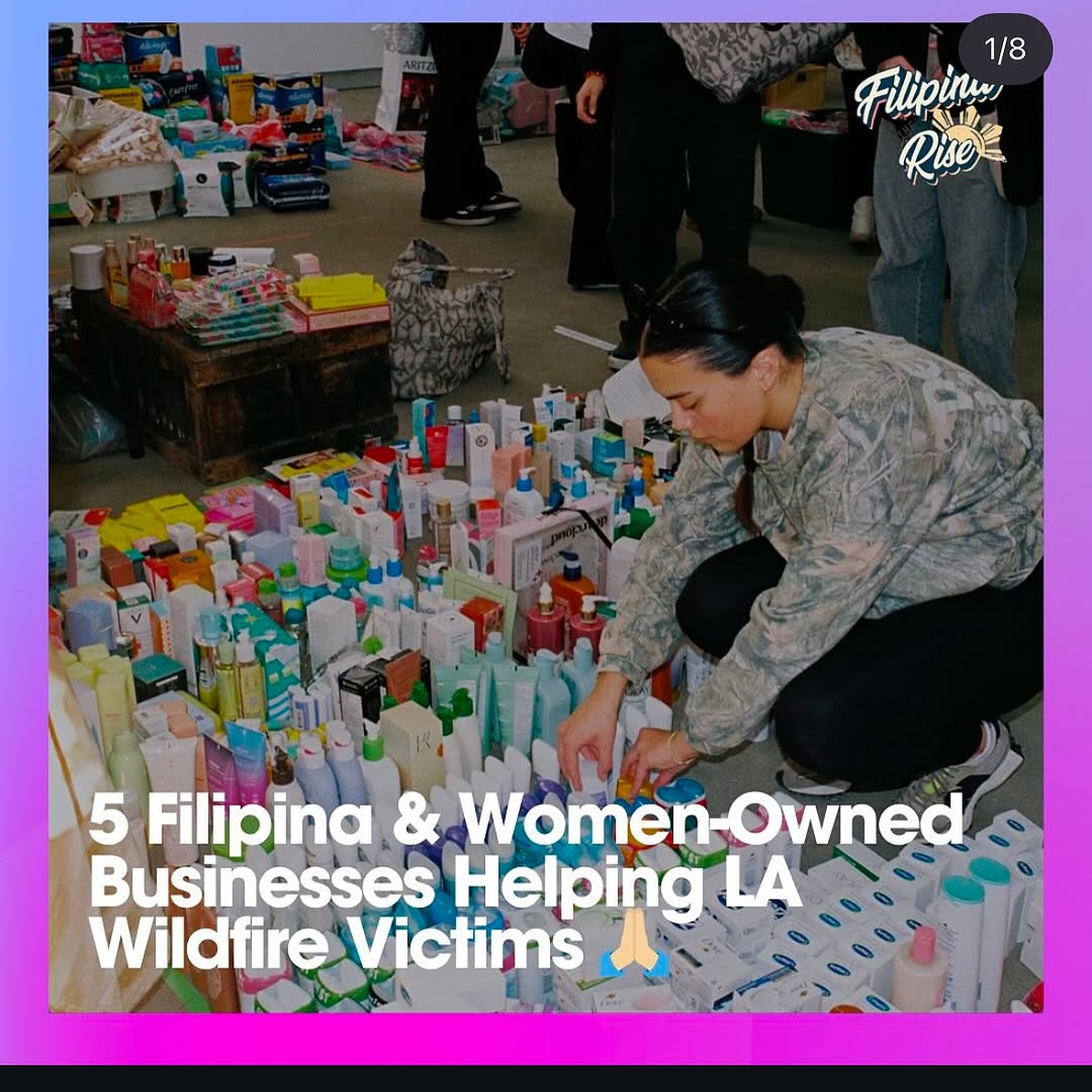
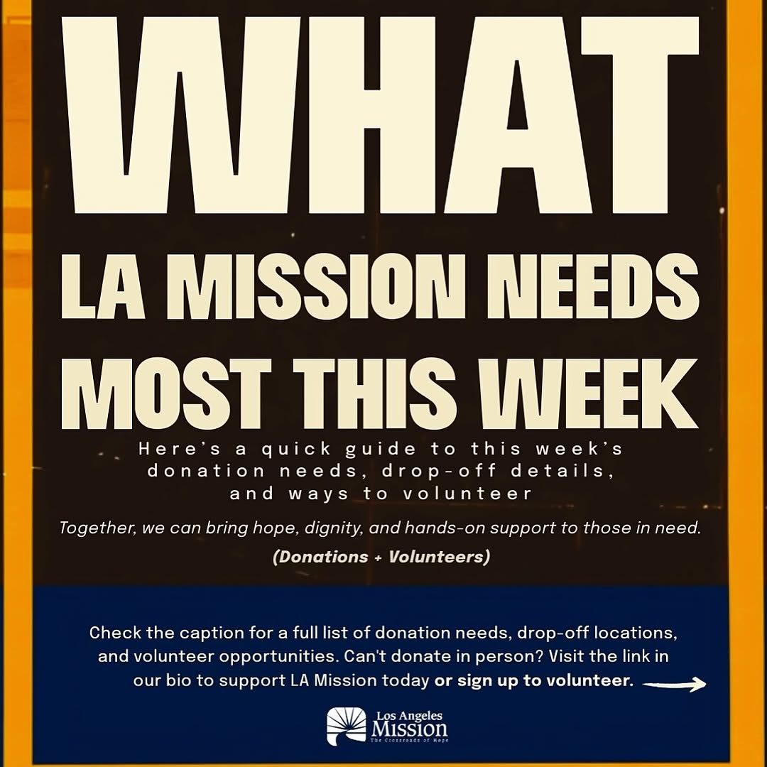
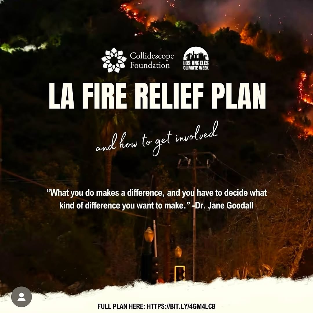
- few resources (slide 4- @filipinaontherise slide 5- @thelamission , slide 6- @walkgoodla, slide 7- @laclimateweek, slide 10- @lalgbtcenter) 🫂
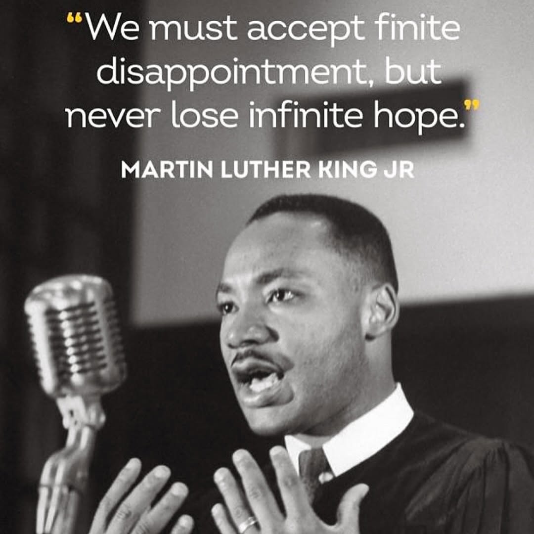
How lilmiquela Built This Martin Luther King Quote AI Art — and How to Recreate It
Quote graphics are often dismissed as "low effort," but high-performing ones are not random text drops. This image works because it combines authority, emotion, and visual hierarchy in one glance. The portrait carries credibility, the words carry emotional direction, and the typography makes the message instantly readable on mobile.
For small creators, this format is useful when you need a post that can travel by reposts and story shares. People share ideas that make them look thoughtful. If your visual turns a big idea into a clean, repostable frame, distribution comes from audience identity behavior, not just algorithm luck.
Why This Specific Execution Has Strong Share Potential
The strongest driver is contrast stacking. First, there is tonal contrast: white text on a dark monochrome background. Second, there is semantic contrast: finite disappointment versus infinite hope. Third, there is temporal contrast: historical imagery paired with modern social typography. Those layers make the post feel both timeless and current.
The design also avoids a common quote-card mistake: decorative clutter. There are no unnecessary icons, no overdone gradients, no visual noise around the message. The yellow accents are used sparingly, which creates emphasis without harming readability. This is exactly what creators should replicate: one focal sentence, one trusted visual anchor, one restrained accent color.
Signal
Evidence (from this image)
Mechanism
Replication Action
Authority Anchor
Recognizable historical speaker image + attribution line
Boosts trust and repost confidence
Pair every quote with a clear source line and a face or symbol tied to credibility
Mobile-first Readability
Large white sans-serif quote in top half
Fast comprehension during scroll
Set body text to occupy top 35-45% with strong contrast and generous line spacing
Emphasis Economy
Only key punctuation/words highlighted in yellow
Guides eye to emotional core
Use one accent color for 5-15% of text only, not full paragraph
Emotional Direction
Message pivots from disappointment to hope
Encourages saves and personal sharing
Write quote captions with tension-to-resolution structure
Use Cases and Practical Transfers
Best-fit scenarios
Mental resilience pages: this format works because people save words they need later; change only quote source and accent color.
Leadership newsletters on social: works as a bridge post between long-form essays; change image crop to include symbolic object.
Education creators: useful for topic entry points; change quote into "hook card" before carousel explanation.
Community organizers: high repost potential when values are clearly stated; change typography weight for accessibility.
Not ideal
Product launch announcements: motivational tone can dilute practical offer details.
Dense technical tutorials: quote-card simplicity may under-prepare users for complex steps.
Comedy meme feeds: serious historical framing may mismatch audience expectation.
Three transfer recipes
Founder mindset transfer Keep: monochrome portrait + top quote block + one accent color Change: source figure and wording for startup context Template: {historical_or_industry_portrait}, "{tension_line}, but {resolution_line}", clean source attribution
Student motivation transfer Keep: square layout and high-contrast text hierarchy Change: softer image and warmer accent color
Template: {mentor_image}, bold readable quote, one highlighted phrase, minimal background noise
Team culture transfer Keep: credibility anchor and concise language
Change: replace public quote with internal leadership principle
Template: {team_symbol_image}, "{principle_statement}", uppercase attribution line, restrained accent
Aesthetic Read: Observed Choices That Matter
The visual power comes from proportion control. The top text area dominates nearly half the frame, which signals that language is the hero, not decoration. The portrait still carries emotional depth because the subject is caught in expressive motion, not a static pose. The vintage microphone on the left adds historical context and texture, preventing the card from feeling like a generic text overlay.
Grayscale is doing strategic work here. Removing color strips distraction and increases seriousness. Then the small yellow accents reintroduce direction, telling the eye where to pause. The font choice is also crucial: a modern sans-serif keeps the layout current even though the photo is archival. This old-new blend is exactly why the post feels relevant in a modern feed.
Observed
How to Recreate
Why It Matters
Top-heavy quote composition
Reserve upper third-to-half exclusively for headline text
Immediate clarity on mobile
Archival monochrome portrait with expressive gesture
Use documentary-style image with visible emotion and hand movement