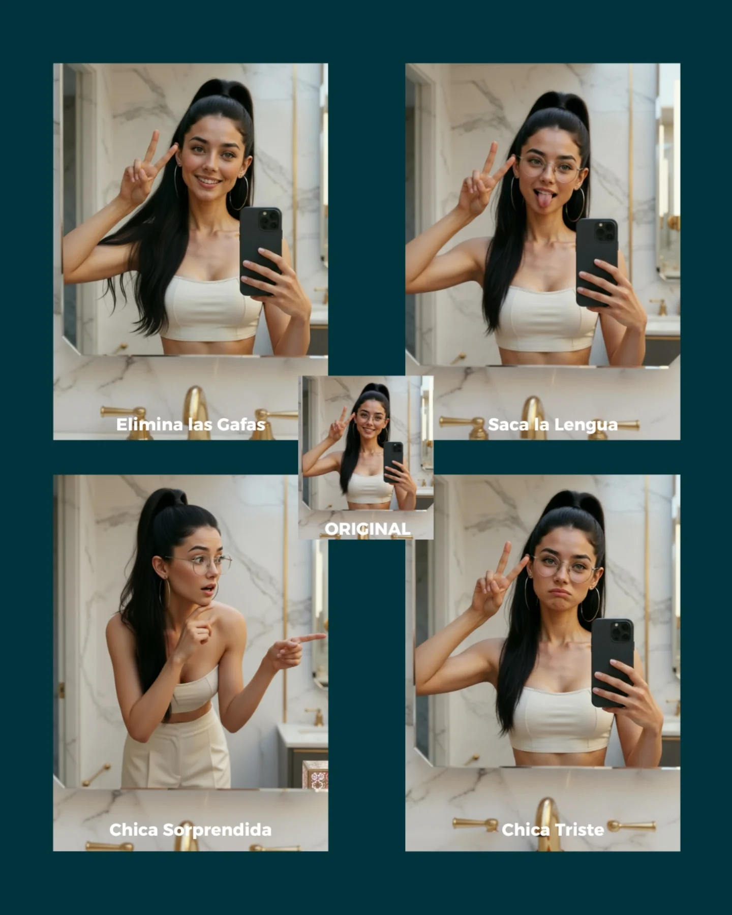
Soy_aria_cruz's Simple Prompt Variation Grid AI Image
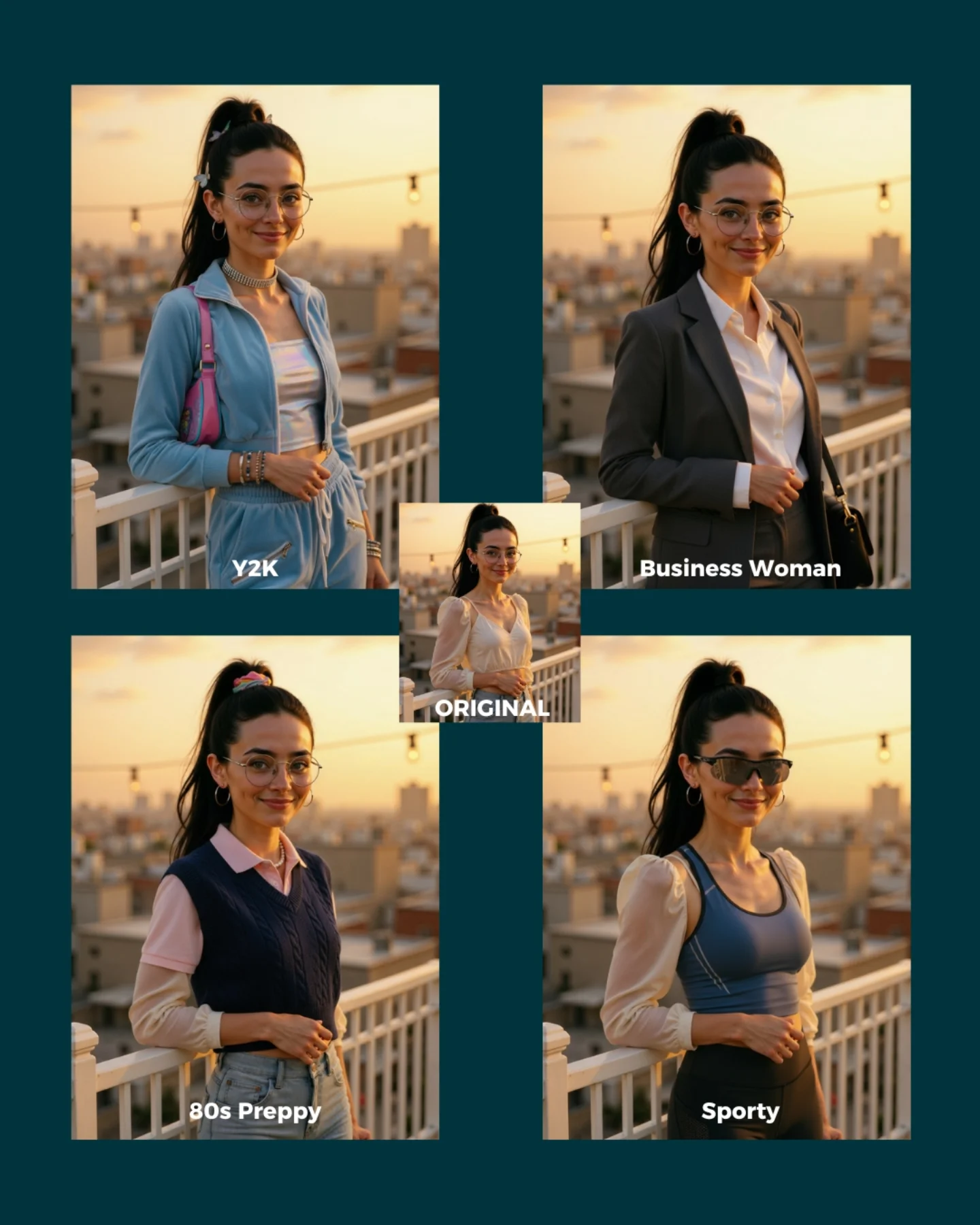
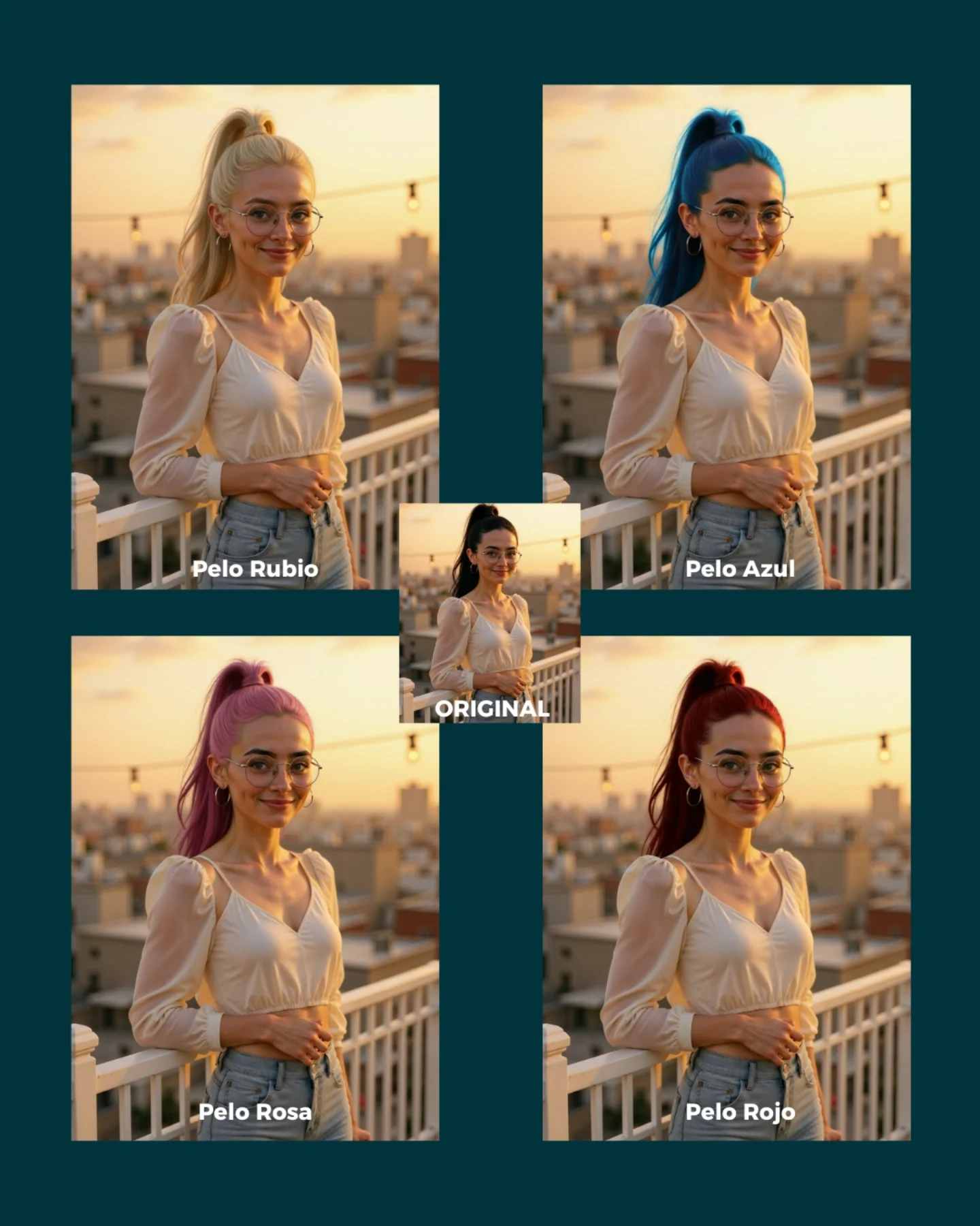
This image works because it shows something creators actually care about: how much you can change with a very small instruction while keeping the same person intact. Instead of talking abstractly about consistency, the grid makes it visible. One panel removes glasses, another changes expression, another changes the emotional tone, and another shifts the pose. Because the identity stays recognizable in all of them, the viewer understands the point immediately.
The layout is a big part of why this works. The original image sits in the center like an anchor, and the edited versions fan out around it. That makes the whole graphic read like a map of possibilities. It is not just “before and after.” It is “one image can branch into multiple believable outcomes.” For tutorial-style growth content, that is a much stronger promise.
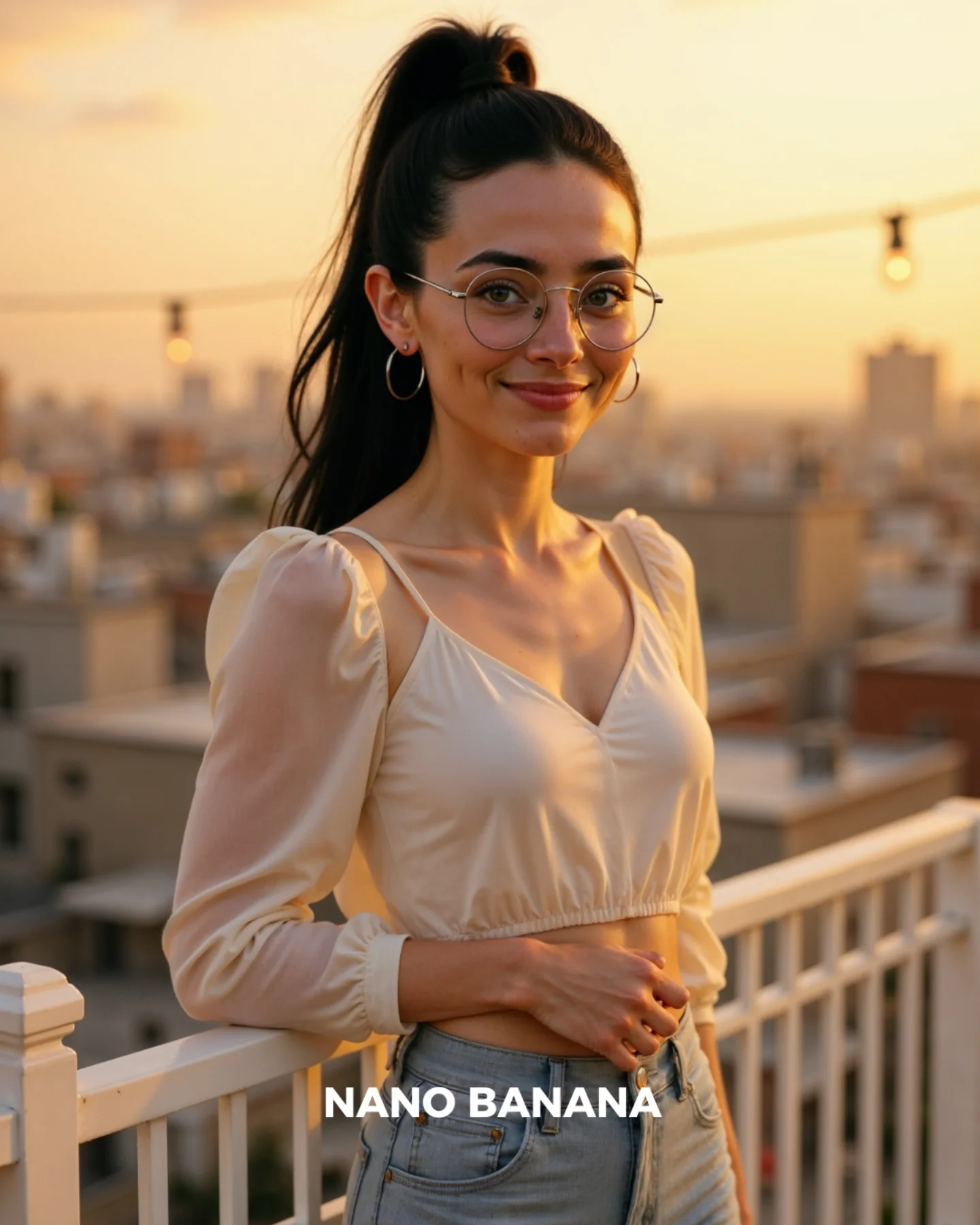
The bathroom selfie setting is also a smart base image. It is ordinary, clean, and easy to understand. When the starting point is familiar, the viewer can pay more attention to the edits themselves. That is useful for creators building prompt guides: simple base scenes often make editing power look more impressive, not less.
| Signal | Evidence (from this image) | Mechanism | Replication Action |
|---|
| One identity, many edits | The same face, hair, phone, and room remain stable across all panels | Proves the model can modify attributes without losing the character | Start from one clean base image and apply one small prompt change at a time |
| Clear comparison structure | Original in the center, four variations around it with labels | Makes the editing logic immediately understandable | Package edit demos as a hub-and-variations grid instead of posting single results separately |
| Simple base scene | Bathroom selfie with neutral styling and consistent lighting | Removes environmental noise so the edit itself becomes the story | Choose a straightforward base photo when demonstrating prompt-based variations |
Best-fit use cases
- Prompt-edit tutorial pages, because the image shows multiple possible instructions in one glance.
- Character-consistency demos, because the same person remains stable across expression and accessory changes.
- Comment-to-get-prompts social posts, because viewers can quickly imagine their own variations.
- Educational SEO pages about AI image editing, because the graphic is explanatory and visual at the same time.
Less ideal: cinematic storytelling, fashion campaigns, or environment-heavy edits. This format is best when the lesson is “change one thing, keep the person.”
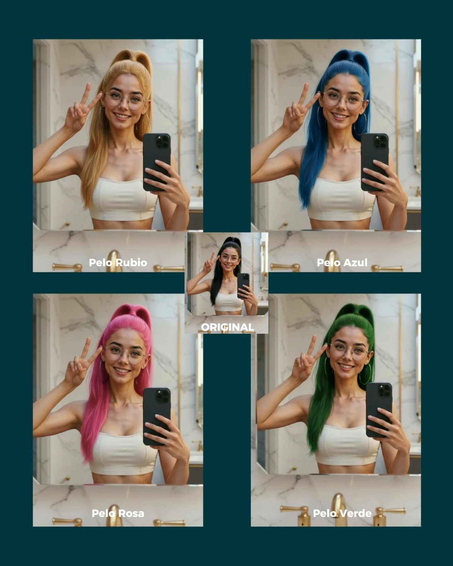
To adapt it, keep the original image in the center, keep the same base room, and vary only one prompt dimension per panel. The same structure works for hair color, outfit swap, accessory change, age-up/down, makeup intensity, or mood change. Slot template: {base image} + {4 single-variable edits} + {clear labels}.
Aesthetic read
The grid succeeds aesthetically because it is organized without feeling sterile. The dark teal background gives the panels enough separation, and the warm bathroom tones keep the whole collage approachable. Even though the image is instructional, it still feels like content someone would stop to inspect. That is important. Educational assets perform better when they are visually pleasant enough to hold attention before the lesson fully lands.
The labels also do more than explain. They create rhythm. Each panel becomes a small promise: remove glasses, stick out tongue, surprised girl, sad girl. That rhythm turns the image into a menu of edits. It encourages viewers to imagine more possibilities, which is exactly what good prompt-teaching content should do.
| Observed | Why it matters |
|---|
| Original panel centered among four edits | Makes the base image feel like the source of all variations |
| Same bathroom selfie setting across the grid | Shows that the model is editing, not replacing the whole scene |
| Different expressions and accessory changes | Demonstrate prompt sensitivity across multiple small edits |
| Dark teal outer background | Keeps the collage structured and easy to scan |
| Short Spanish labels on each panel | Turn the image into a quick instructional graphic |
Prompt technique breakdown
| Prompt chunk | What it controls | Swap ideas (EN, 2–3 options) |
|---|
| same woman identity in the same mirror-selfie bathroom | Base consistency anchor | same car selfie, same bedroom mirror shot, same kitchen candid |
| remove glasses / tongue out / surprised / sad | Single-variable edit prompts | change hair color, add freckles, wink, neutral face |
| five-panel collage with original in the center | Instructional packaging | 2x2 grid plus original, carousel opener layout, split-panel edit map |
| soft indoor bathroom lighting | Continuity across edits | warm vanity light, daylight bathroom light, softer neutral home light |
| short label under each panel | Readability and teaching clarity | edit name tag, numbered prompt cue, mini-caption under each result |
How to iterate without losing the core
Lock these three things first: the base identity, the base room, and the one-variable-per-panel rule. Those are the teaching anchors. Then change only one or two variables per new grid.
- Baseline run: keep one original image and generate four very simple edits that each change just one thing.
- Second run: keep the same structure but test a new category, such as hairstyle, makeup, or wardrobe.
- Third run: keep the same edit family and compare how different models preserve identity across the grid.
- Fourth run: build a small library of edit grids so users can understand which prompt types are safest and which drift more.
If the collage starts getting messy, the first thing to inspect is whether too many variables changed at once. This format works only when each panel teaches one clear idea.