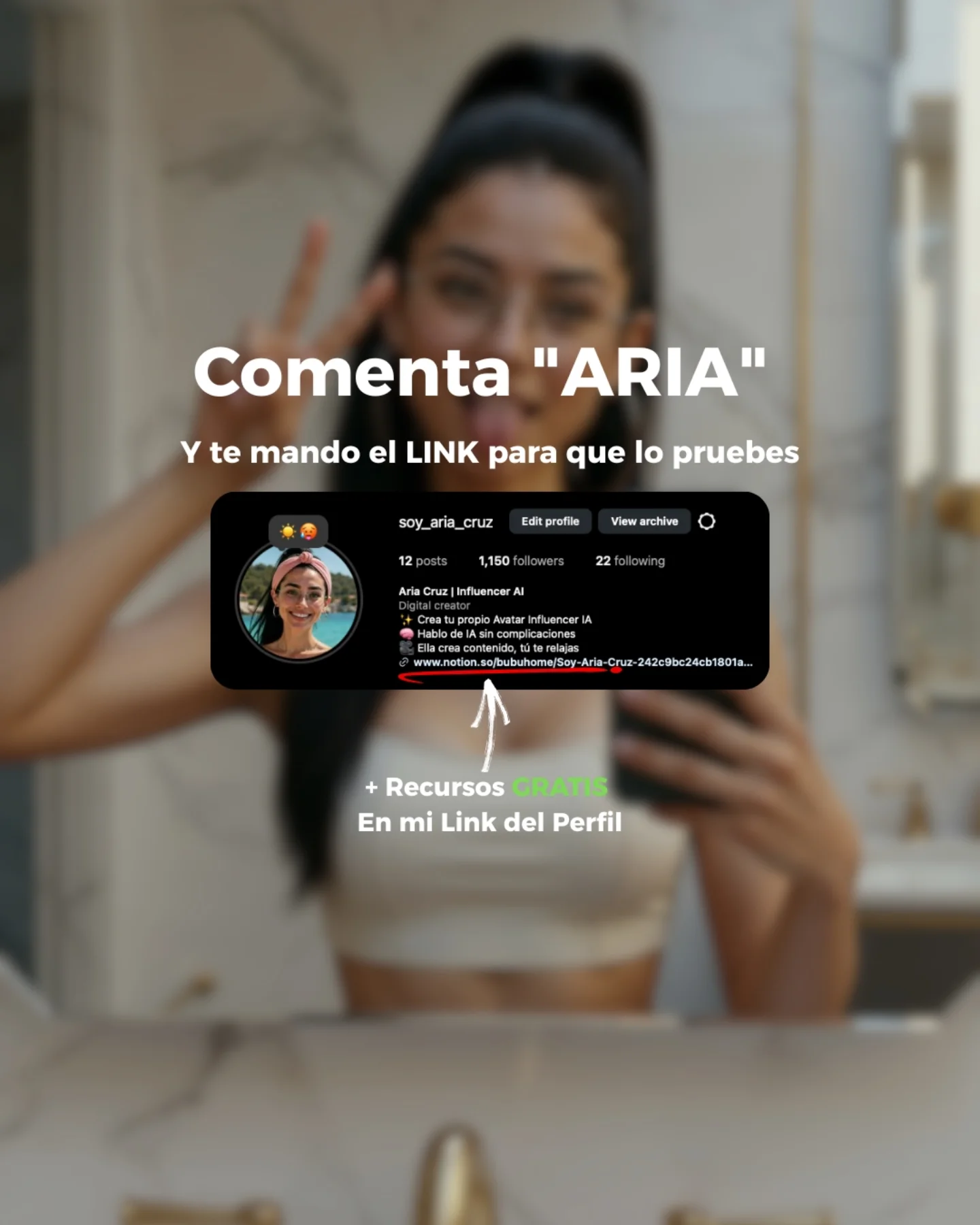
Why soy_aria_cruz's Comment Aria Link CTA Poster Went Viral — and the Formula Behind It
This version works because it shifts the offer without changing the funnel behavior. Instead of promising the prompts directly, it promises a link to try the thing. That small copy change matters. It moves the viewer from curiosity about the image toward action around the product or resource behind it. For creators, that is a useful distinction. Not every CTA should give the final asset immediately. Sometimes the better move is to deliver the path to the asset.
The poster still keeps the same conversion strengths: one keyword action, one visible creator profile for trust, and one extra free-resource layer at the bottom. That structure is what makes the design effective. The message changes, but the behavior framework stays the same.
Why This CTA Variation Works
The phrase “I’ll send you the link so you can try it” creates a different kind of motivation than “I’ll send you the prompts.” It suggests access, utility, and next-step action. This is especially helpful when the creator wants to drive trial rather than only collect engagement. The graphic makes that intent visible without needing a long caption to explain it.
| Signal | Evidence (from this image) | Mechanism | Replication Action |
|---|
| Keyword action | Large command: Comenta “ARIA” | Keeps the ask simple and memorable | Use one clear comment keyword as the single action step |
| Trial-oriented reward | “Y te mando el LINK para que lo pruebes” | Positions the CTA around access and experimentation | Offer a link or tool entry point when the goal is usage, not just curiosity |
| Trust proof | Centered Instagram profile screenshot | Makes the CTA feel personal and legitimate | Include one platform-native proof block tied to the creator identity |
| Secondary value layer | “+ Recursos GRATIS” and link-in-bio reminder | Captures viewers who want more than the main offer | Add one bonus resource line below the primary CTA path |
Aesthetic Read: Why The Design Still Feels Clean
The design stays effective because the background is blurred enough to support the copy rather than compete with it. The bathroom selfie silhouette remains emotionally useful, but the real focus is the hierarchy of text and proof. This is good CTA design discipline. The visual identity of the creator stays present, but the message remains easy to scan.
The black profile card also anchors the middle of the composition. Without it, the poster would just be floating text over a soft photo. With it, the graphic feels more credible and more platform-native. That is especially useful for creators running comment-to-DM or comment-to-link flows.
| Observed | Why It Matters | How To Recreate |
|---|
| Blurred selfie background | Preserves brand continuity without hurting readability | Use a recognizable creator image but soften it until it becomes supportive only |
| Central profile screenshot | Adds proof and trust | Place one interface-native element at the center of the CTA |
| Green highlight on GRATIS | Calls attention to extra value without clutter | Accent only one value word instead of using multiple emphasis colors |
| Arrow pointing to the lower CTA | Guides the reading order | Use one visual pointer when the offer has a secondary layer |
Best Use Cases And Transfers
- Comment-to-link funnels: Ideal when the goal is to push viewers toward trying a tool, product, or workflow.
- Creator trial campaigns: Strong because the promise of a link implies immediate usability.
- Prompt-marketing variants: Useful for testing whether “link to try” converts better than “send prompts.”
- Not ideal for purely aesthetic slideshows: This graphic is conversion-first, not mood-first.
- Not ideal for dense educational explainers: The format works best when the message stays very short and behavioral.
Three transfer recipes
- Keep: keyword CTA, profile proof, blurred creator background. Change: reward from prompts to link, preset, invite, or trial code. Slot template: {comment keyword} {reward line} {proof block} {bonus resource}
- Keep: centered hierarchy and one accent color. Change: platform or niche. Slot template: {platform card} {primary action} {trial offer} {free extra}
- Keep: simple reading flow from headline to proof to bonus. Change: language, product category, and audience promise. Slot template: {headline language} {tool or offer} {trust proof} {extra resource}
Prompt Technique Breakdown
| Prompt chunk | What it controls | Swap ideas (EN, 2-3 options) |
|---|
| blurred bathroom selfie as the background | Brand continuity layer | 'blurred mirror selfie', 'soft lifestyle portrait backdrop', 'defocused creator photo' |
| large Spanish keyword CTA headline | Main conversion instruction | 'Comenta “X”', 'Escribe “Y”', 'Manda “Z”' |
| reward line promising a link to try the tool | Conversion intent | 'te mando el link', 'te envío el acceso', 'te paso la prueba' |
| centered Instagram profile screenshot card | Trust and native context | 'creator account card', 'platform proof block', 'profile screenshot proof' |
| green-highlighted value word plus a lower link reminder | Secondary offer reinforcement | 'GRATIS', 'BONUS', 'RECURSOS' |
Execution Playbook
Lock three things first: the comment keyword, the link-based reward line, and the central proof card. Those are the conversion anchors. Then iterate one variable at a time. First version: test headline size and reward clarity. Second version: refine the profile-card scale and placement. Third version: adjust the amount of background blur. Fourth version: only then test accent-color emphasis or bonus-resource wording. That sequence keeps the graphic conversion-focused instead of drifting into decorative social design.