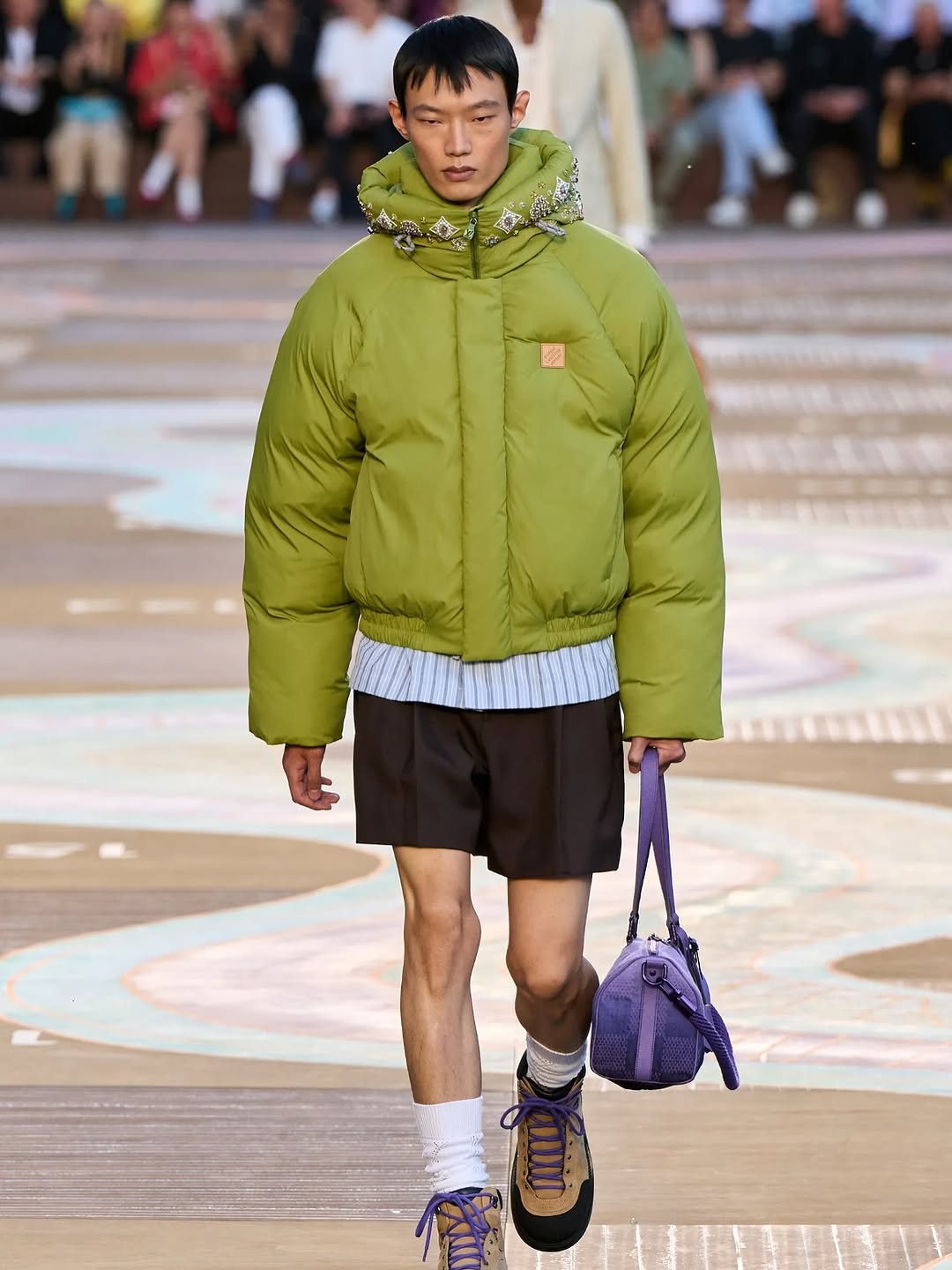
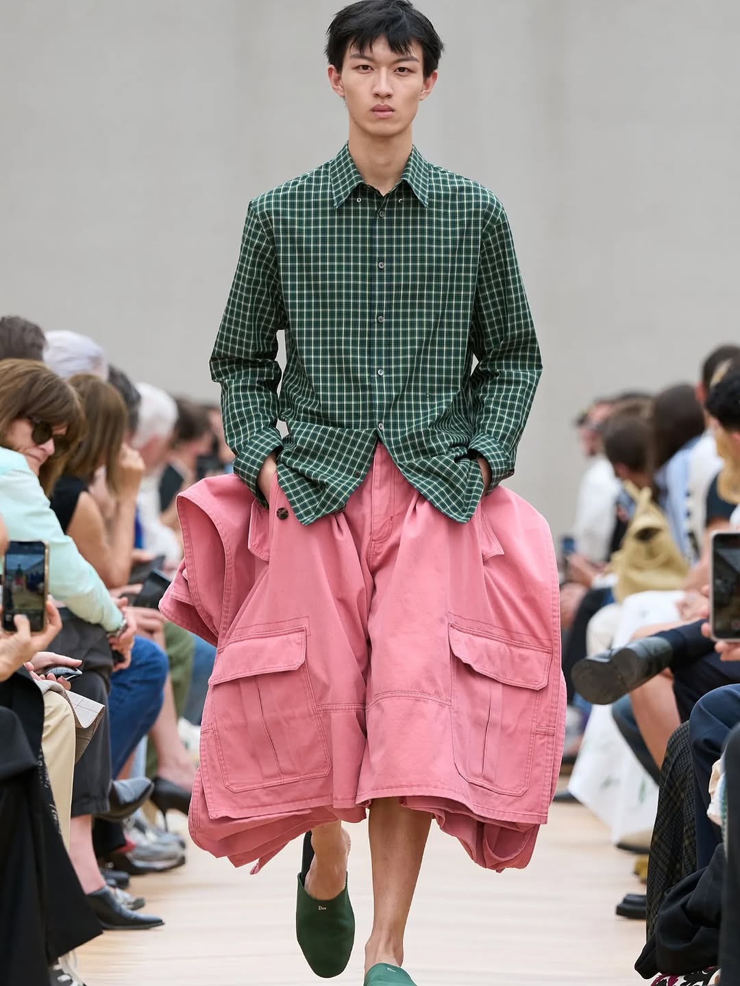
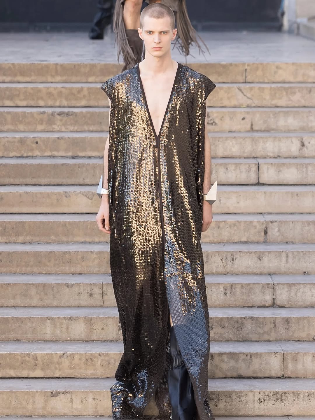
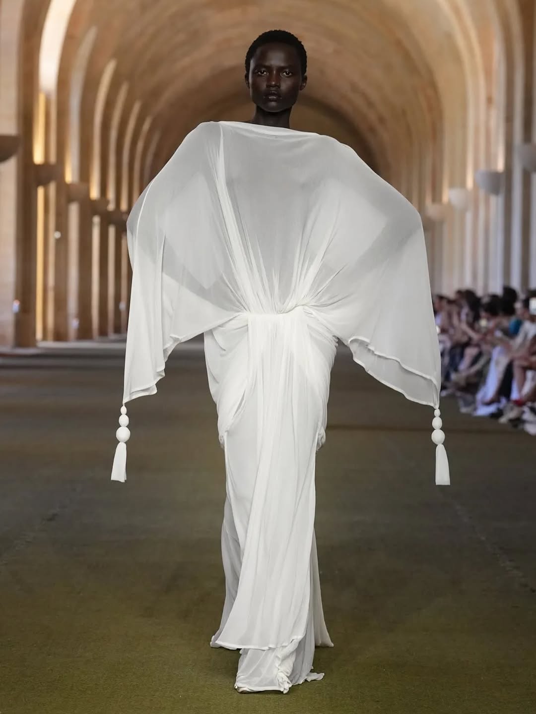
Paris Fashion Week favorites ⬇️!!👗👔
Me in my comfy Miranda Priestly era. ✍️👜
I’m always thinking about the future and what it feels like…and this season surprised me. Unique silhouettes and quiet opulence are being read as futuristic. Less noise, more intention. Beauty as resistance. Romance without irony. What do you think? 🤔Who was your favorite?
Top faves:
@kidsuper (OBSESSED with the colors in this show! 🎨)
@willychavarrianewyork(🇲🇽 love how he uses his platform)
@dior (welcome Jonathan Anderson!! 👋)
@rickowensonline (I wanted to get in the water 😩💧)
Other highlights:
@craig__green
@jacquemus
@undercover_lab
@kikokostadinov
@kenzo
@commedesgarcons
@amiri
@yohjiyamamotoofficial
@amiparis
@louisvuitton
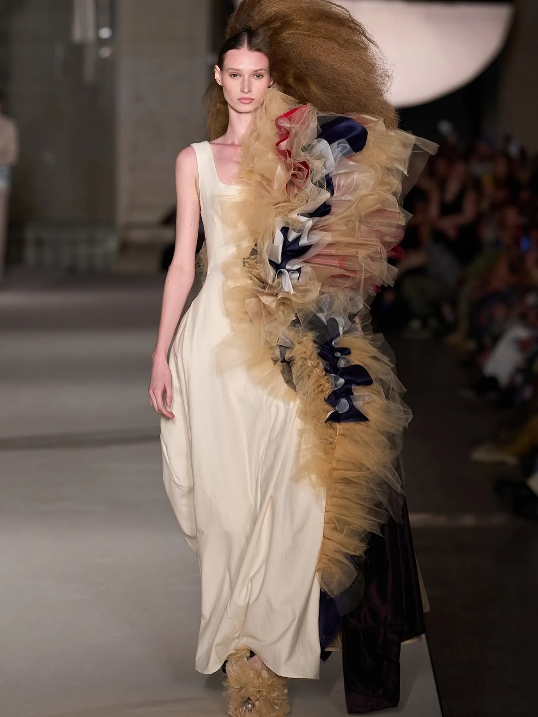
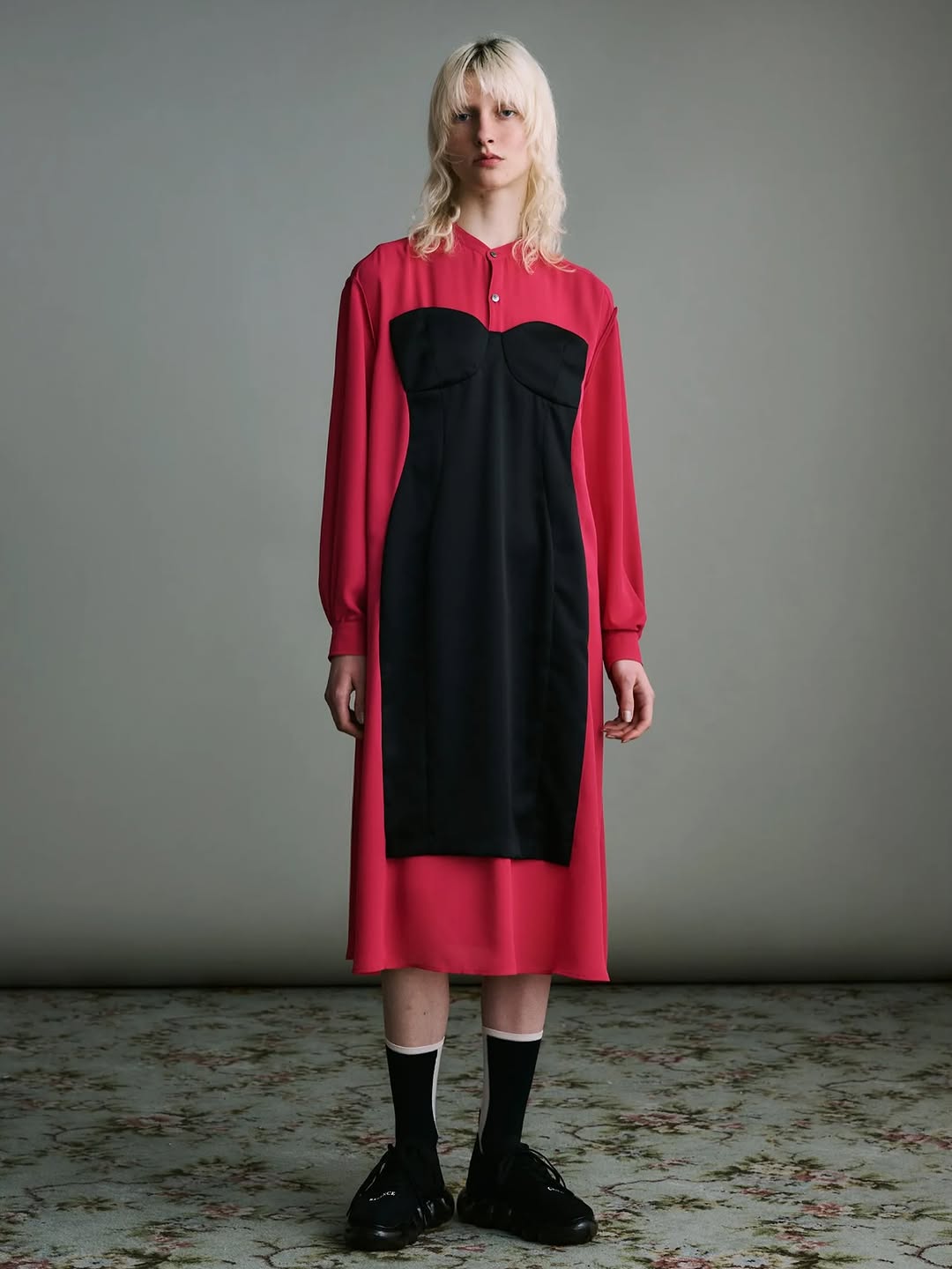
How lilmiquela Made This Paris Fashion Week Look Post and How to Recreate It
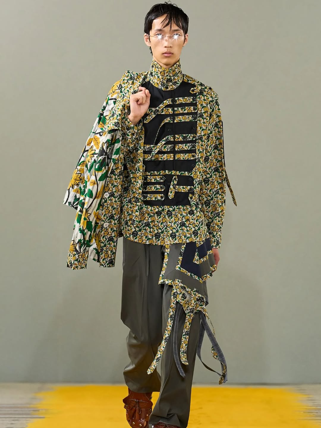
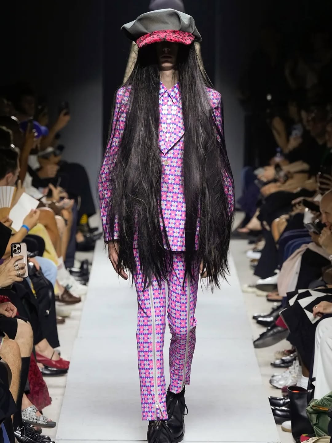
At first glance, this post feels maximal because the garment is packed with print, symbols, and layered fabric. But the image performs because everything around the outfit is minimal. The background is plain, the runway is simple, and the model is centered. That contrast makes complexity readable.
For creators, this is a useful growth pattern: when wardrobe carries the story, strip the environment to essentials. You do not need extra props, dramatic sets, or crowd context. A clean runway frame can make detailed design language feel intentional instead of chaotic.
Signal Table
Signal
Evidence (from this image)
Mechanism
Replication Action
Complexity with control
Dense floral-and-graphic outfit against plain gray background
High-detail subject stands out because visual noise is removed elsewhere
Keep set minimal when wardrobe is information-dense
Centerline authority
Model is front-facing and perfectly centered in full-body frame
Symmetry increases perceived editorial quality
Lock a centered full-length composition before styling experiments
Color anchor
Yellow runway strip echoes yellow tones in the garment
Small environmental color echo creates cohesion
Add one floor/accent color that repeats a key wardrobe tone
Best-Fit Use Cases
Fashion drop previews: Ideal for showcasing silhouette and textile detail with no distraction.
Designer storytelling: Great when you want viewers to decode pattern language and construction.
Lookbook carousel covers: Works as the hero image before close-up fabric crops.
Creator style analysis posts: Strong for educational content about layering, proportion, and print control.
Not Ideal
Lifestyle campaigns requiring environmental narrative and human interaction.
Comedy or meme-led posts where wardrobe detail is not the core value.
Fast product ads that need obvious branding over styling nuance.
Transfers (exactly 3)
Streetwear Museum Look Keep: centered full-body framing, minimal background, one accent floor color. Change: graphics to typographic street motifs, footwear to technical sneakers. Slot template (EN): {single_model_centered} {high_detail_top} {minimal_set} {color_anchor_floor}
Youth Pop Editorial Keep: front-facing runway walk and sharp textile detail.
Change: brighter palette, playful accessories, softer hair styling. Slot template (EN): {frontal_walk} {vivid_print_mix} {accessory_focus} {soft_even_light}
Aesthetic Read
The key aesthetic move is balancing motion with order. Fabric extensions and asymmetric drape create directional flow, while the centered stance and neutral wall keep the frame disciplined. Texture is doing most of the storytelling: floral micro-patterns, matte trouser folds, glossy glasses reflections, and denser black graphic panels across the chest. The shot is also proportion-aware. Full-body framing preserves silhouette logic, so the viewer can read where the volume sits: broad upper print density, calmer lower half, grounded by dark footwear. Lighting is intentionally neutral and non-dramatic, which is the right choice for runway documentation. It preserves garment truth instead of imposing atmosphere.
Observed
Recreate
Evidence
Centered full-length framing
Keep model on centerline in vertical composition
Silhouette reads clearly from head to shoes
Print-heavy upper body
Concentrate visual density in top/torso zones
Floral + black graphics dominate attention
Neutral set discipline
Use plain wall and minimal stage elements
No competing background clutter
Texture-first lighting
Soft even illumination with mild highlights
Fabric and glasses details remain legible
Prompt Technique Breakdown
Prompt chunk
What it controls
Swap ideas (EN, 2-3 options)
Model block
Pose, expression, and body line
“front runway walk”; “paused step with lifted chin”; “static center stance”