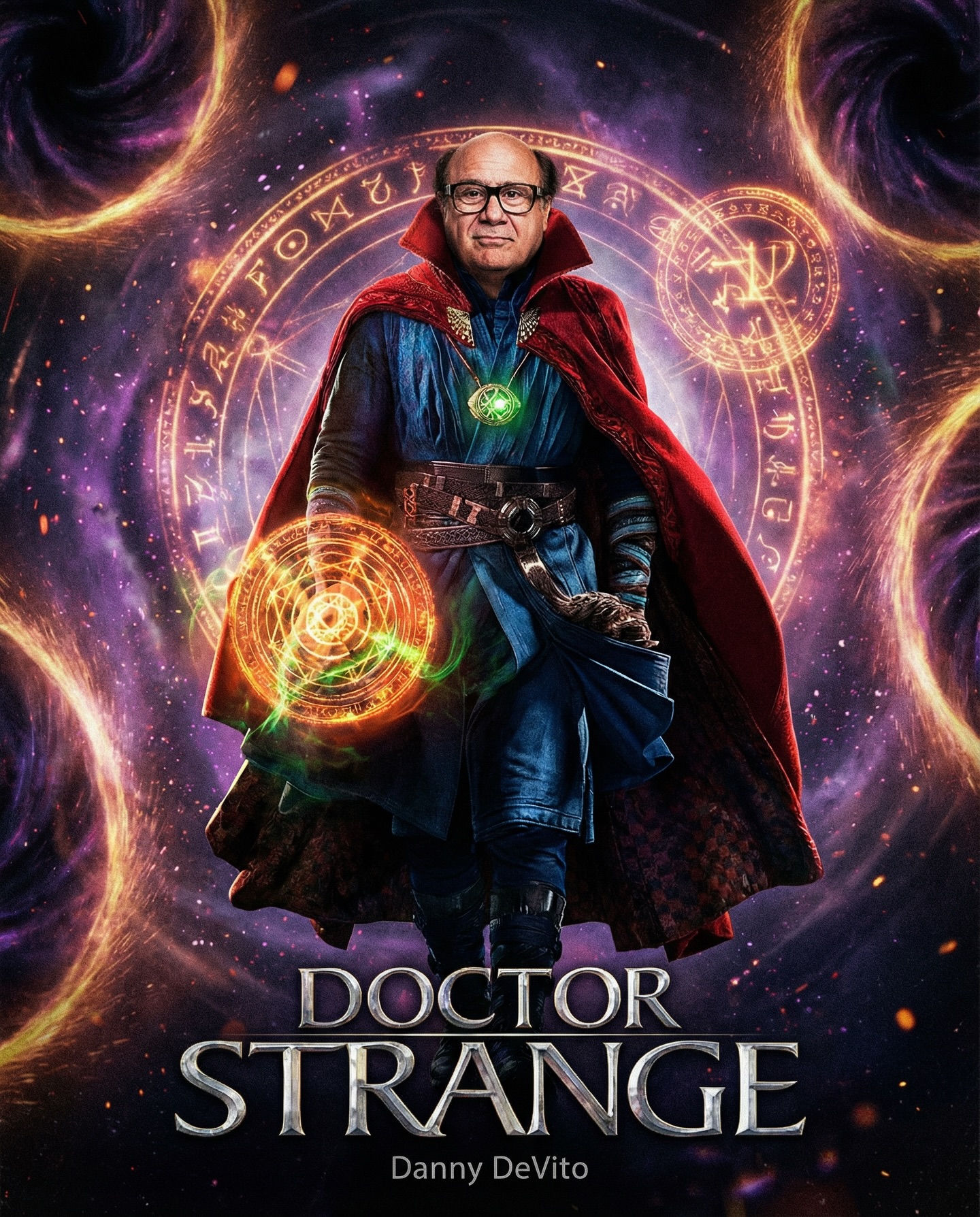
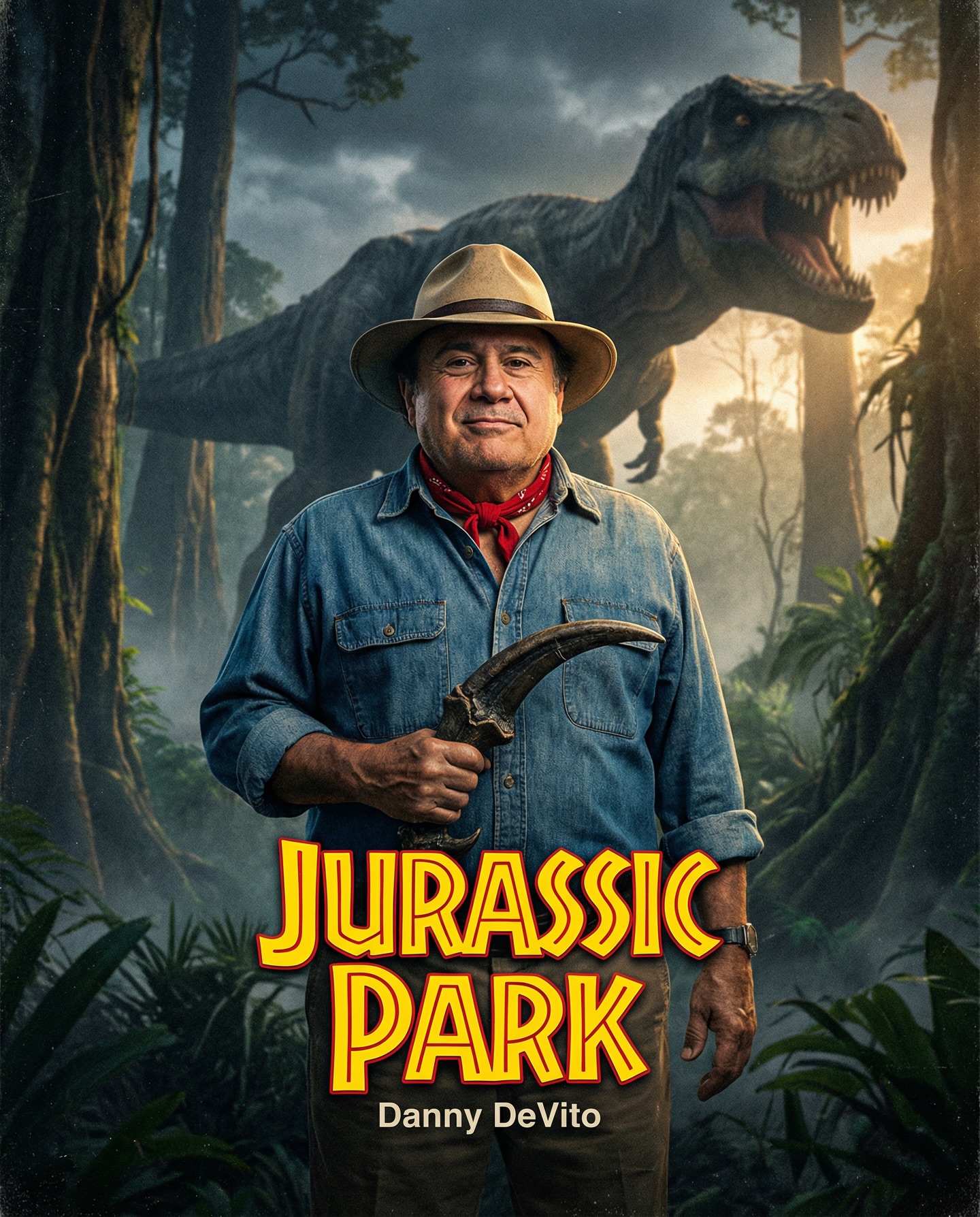
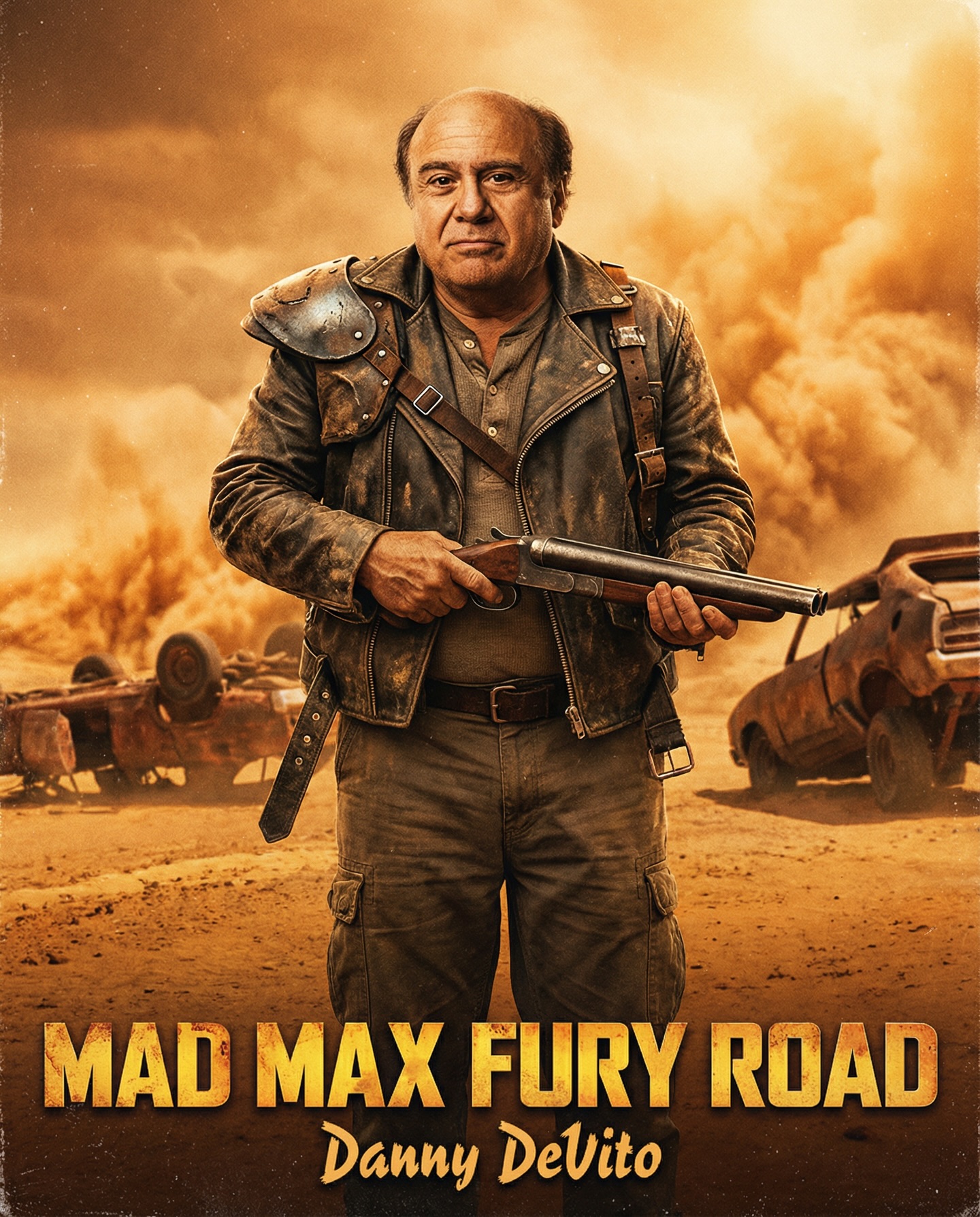
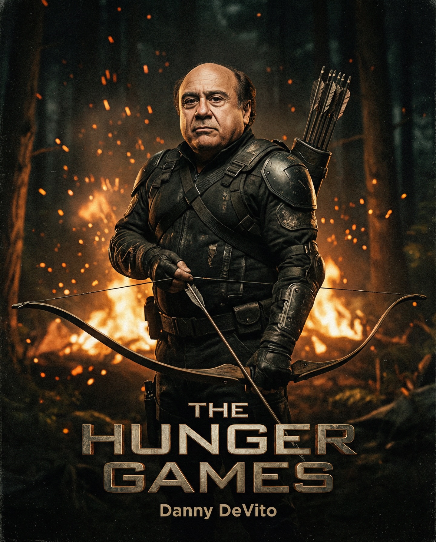
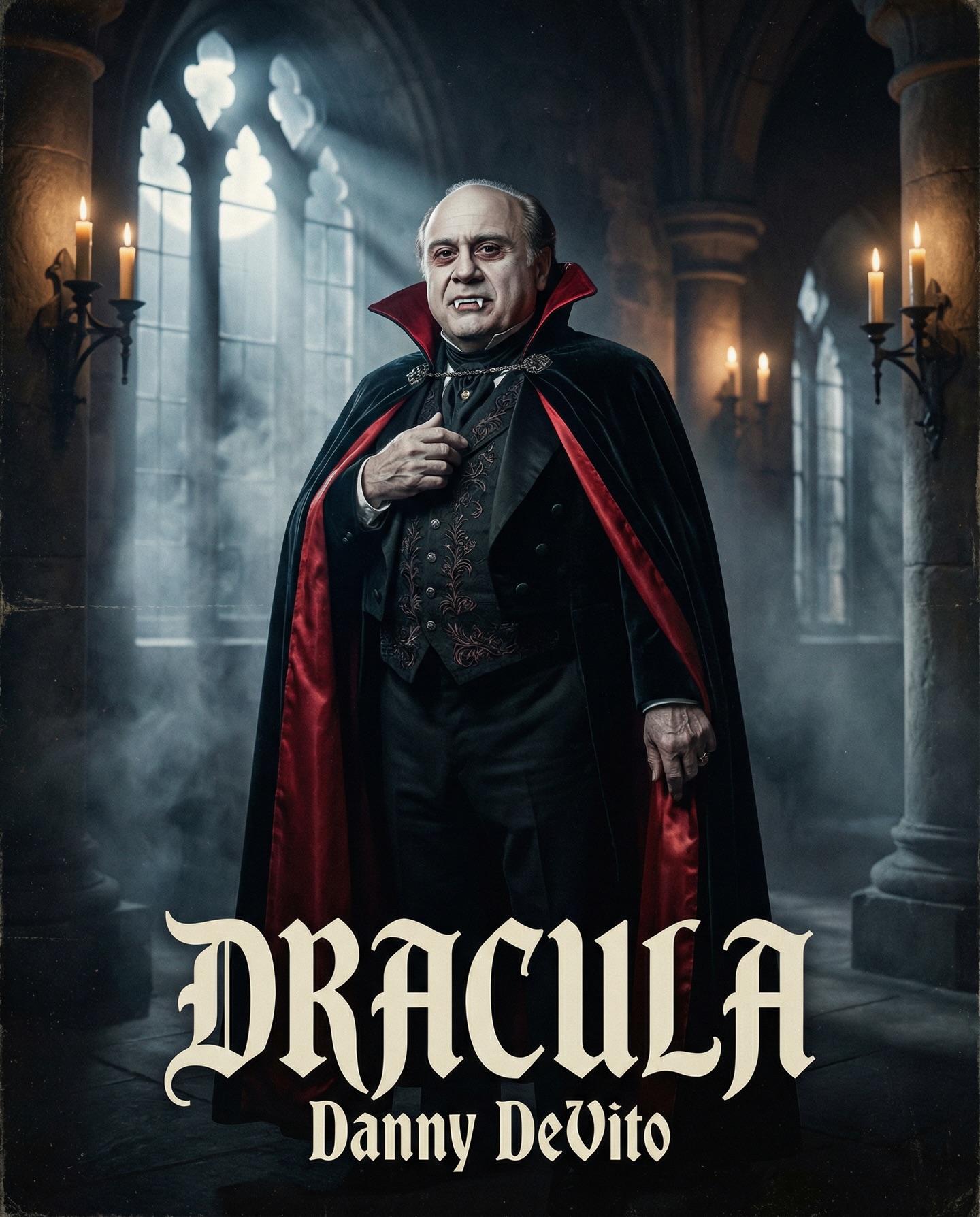
Danny DeVito in different roles Which one is your favorite one? #dannydevito Generated with Nano Banana Pro from @syntx_ai and @syntx_creators Syntx brings 90+ top AI tools into one simple interface, saving time and money
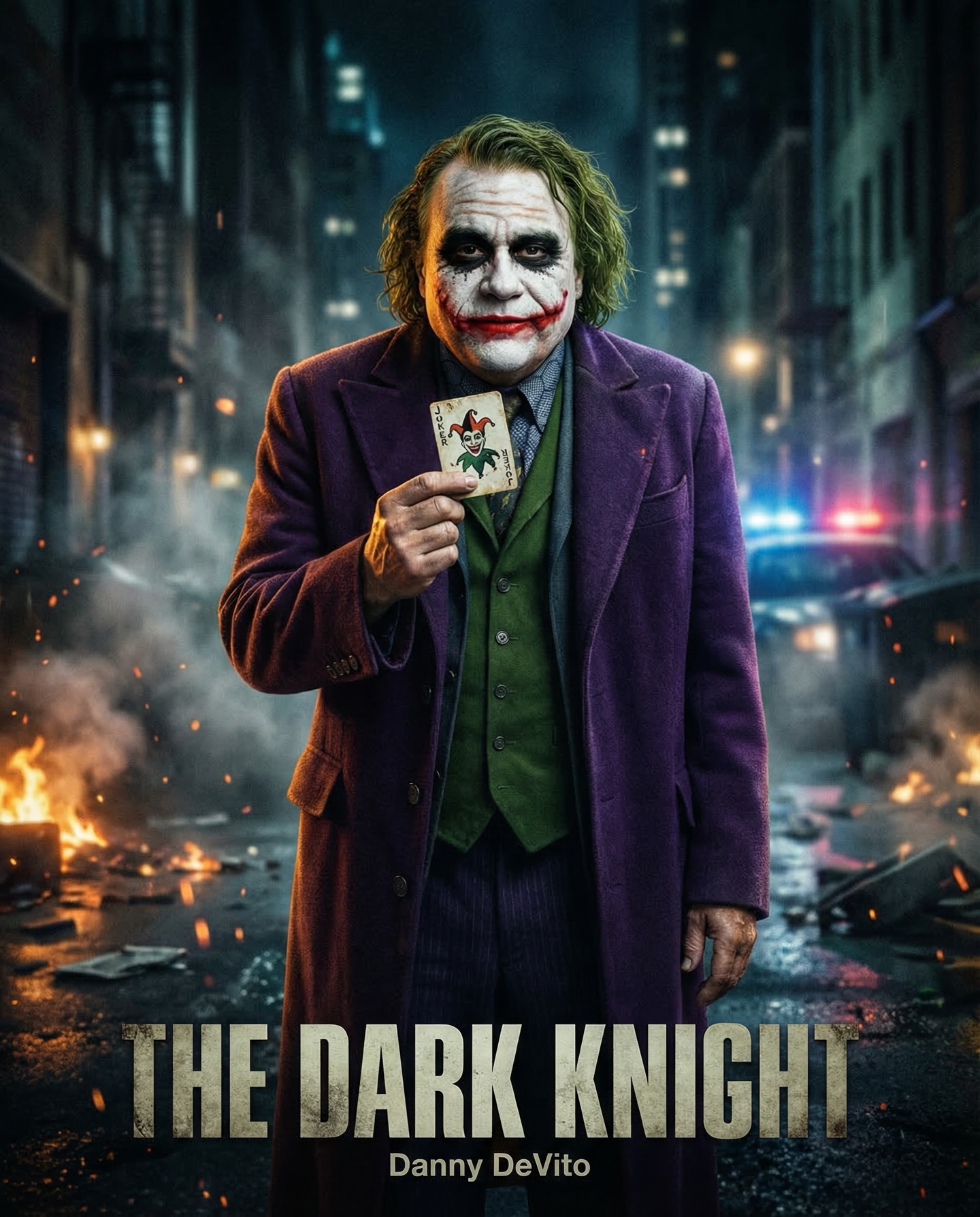
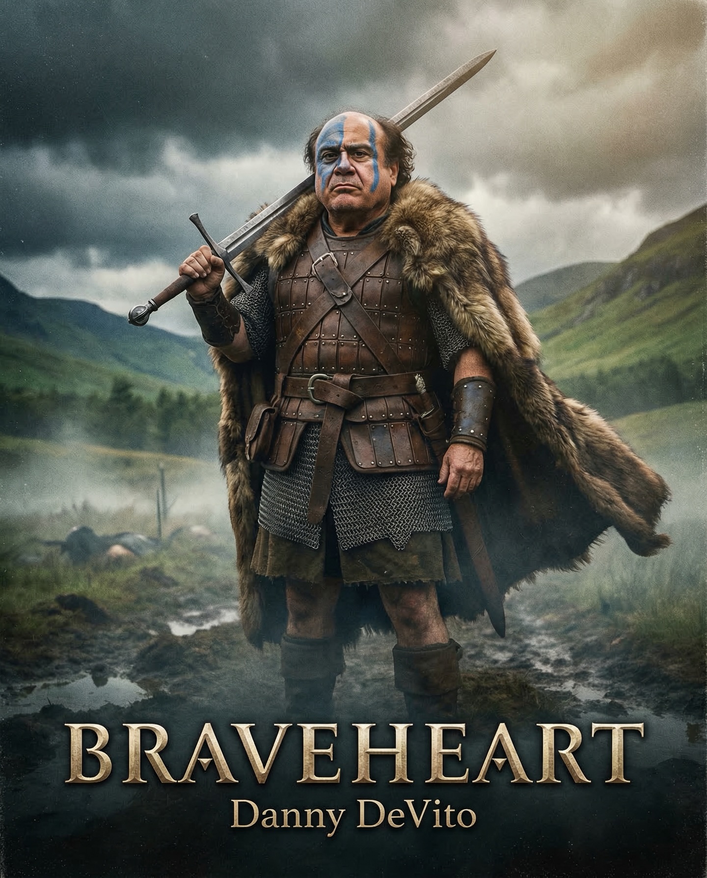
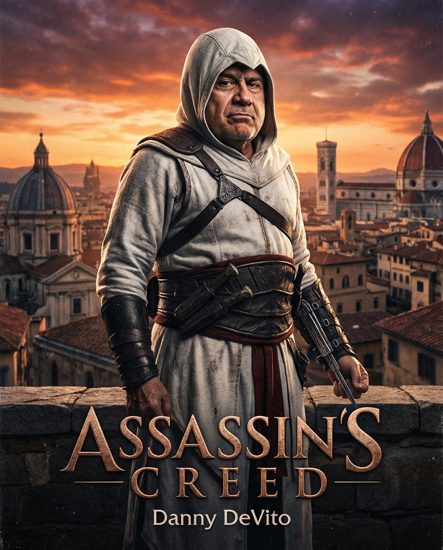
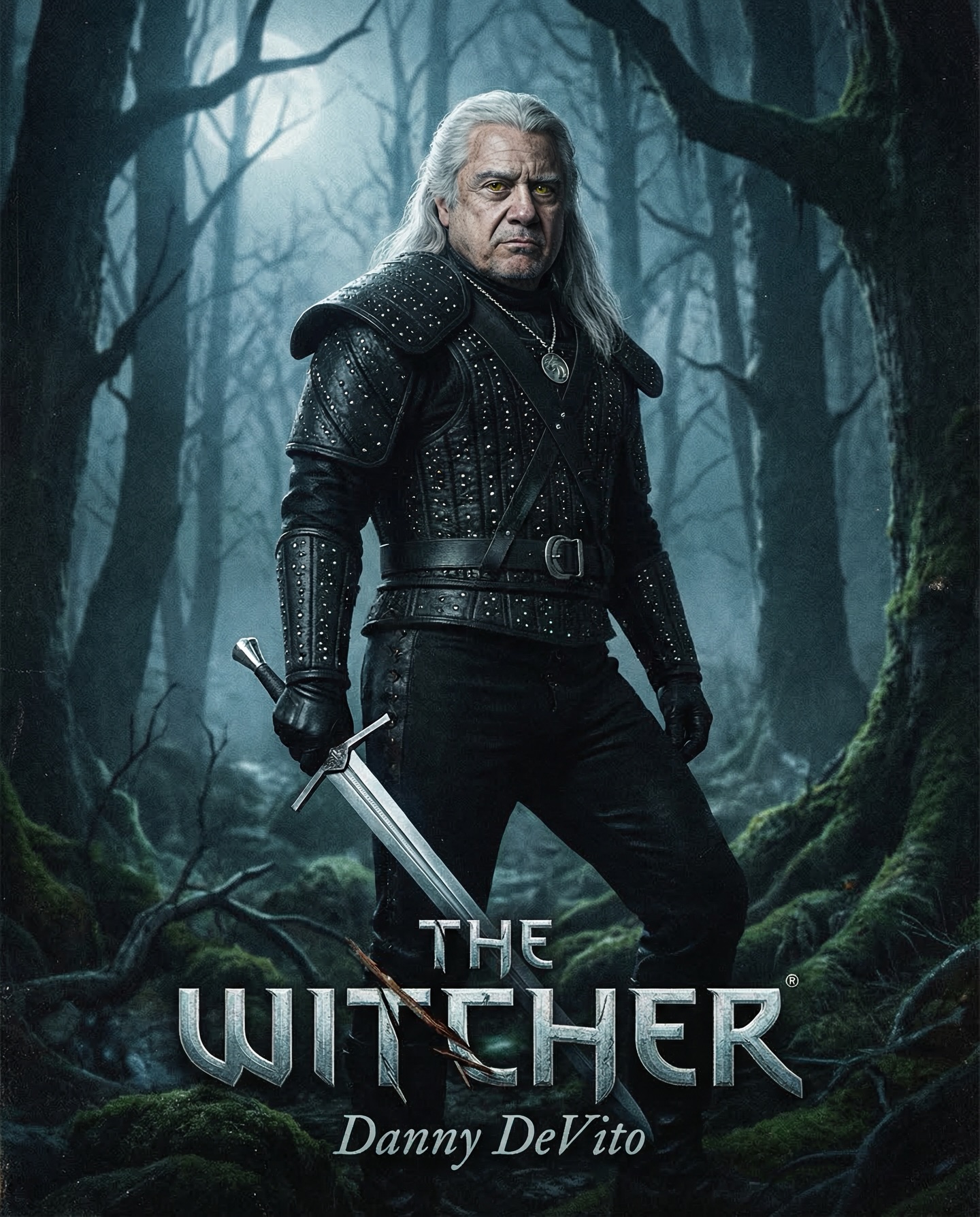
Danny DeVito in different roles Which one is your favorite one? #dannydevito Generated with Nano Banana Pro from @syntx_ai and @syntx_creators Syntx brings 90+ top AI tools into one simple interface, saving time and money
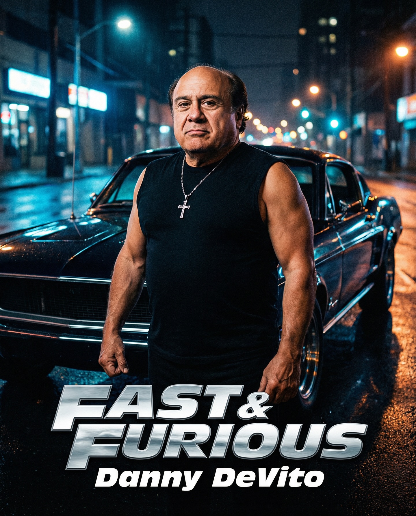
This image is a great example of why committed parody works better than half-joking parody. The concept is obviously absurd on paper: Danny DeVito presented as an ultra-serious street-racing antihero in front of a black muscle car on a rain-slick city street. But the image does not undermine its own premise. Instead, it borrows the exact visual language of high-intensity action-franchise poster art and applies it sincerely. That visual sincerity is what turns a ridiculous mashup into a surprisingly persuasive piece of poster design.
The first thing that makes the image effective is celebrity recognizability. In mashup prompt design, recognizable facial identity is the anchor that keeps the image legible. If the likeness is weak, the whole joke collapses into generic action-man imagery. Here, the face remains clearly identifiable while the rest of the body language, costume direction, and setting shift into blockbuster mode. That contrast creates the central tension: the viewer knows the casting is wrong, but the genre execution is strong enough to make it feel temporarily right.
The second major strength is the car. The black muscle car is not just a background prop. It is the symbol that tells the viewer which cinematic universe the image wants to borrow from. Street-racing mythology is built around vehicles as extensions of personality. By placing the subject directly in front of the grille and headlights, the image uses the car as part of the character silhouette. The vehicle becomes a supporting character, which is exactly how strong racing posters usually operate.
The wet street is equally important. Reflective pavement is one of the fastest ways to create premium action-movie mood because it makes every light source feel richer. Headlights, storefront glow, and ambient city color all become more dynamic when echoed on the road surface. This image uses that trick effectively. The street does not feel cluttered or overdesigned, but it has enough shine and atmosphere to imply speed, nightlife, and urban tension. It gives the poster visual depth without needing explosions or crowded action choreography.
Wardrobe is handled with deliberate simplicity. A sleeveless black shirt, visible muscularized arms, and a silver cross necklace are enough to trigger the action-hero grammar. The costume is not elaborate, but it does not need to be. In franchise poster design, shorthand often wins. A few clear signals can define archetype faster than a dense costume ever could. The necklace adds attitude, the shirt reinforces toughness, and the body treatment exaggerates the heroic fantasy. Combined with the stern expression, the subject reads as a mythologized urban antihero rather than a comic sketch.
What really sells the image is that it is framed like a real poster rather than an illustration of a joke. The composition is centered, stable, and iconic. The subject stands front and center with the car immediately behind, and the city lights stay blurred enough to support rather than distract. This arrangement gives the image thumbnail strength. Even at small scale, the viewer can identify the face, the car, the night setting, and the action-poster intent in a second. That kind of clarity is essential in both commercial poster work and AI prompt design.
The lighting also contributes heavily to that sense of conviction. Cool nighttime ambience provides mood, while warmer city highlights and frontal illumination keep the face readable. This balance matters. If the image leaned too dark, the celebrity likeness would suffer. If it leaned too bright, the atmosphere would disappear. Instead, the image keeps the actor recognizable while still feeling rooted in a slick, nocturnal street-racing world. That is a useful lesson for prompt builders: likeness and mood must be balanced rather than treated as separate concerns.
The body exaggeration is another key part of the visual joke. The arms are clearly stylized to appear stronger and more action-ready than the real-life figure being referenced. But the exaggeration stops before collapsing into cartoon anatomy. This is an important threshold. If the stylization goes too far, the result becomes meme imagery. If it stays controlled, the result feels like a believable alternate-casting poster. Strong parody images live in that middle space where absurdity is heightened, but the rendering logic still respects the source genre.
| Poster Component | Visible Signal | Why It Works | Prompt Lesson |
|---|---|---|---|
| Celebrity face | Recognizable Danny DeVito likeness | Creates instant conceptual readability | Lock the face before expanding environment complexity |
| Hero car | Black muscle car behind the subject | Anchors the image in street-racing mythology | Use one clear vehicle or prop as the genre backbone |
| Wet street atmosphere | Reflections and blurred city lights | Adds cinematic depth and premium mood | Reflective surfaces often outperform extra effects |
| Wardrobe shorthand | Sleeveless shirt and cross necklace | Builds instant tough-guy iconography | Use small, high-signal costume elements instead of clutter |
| Serious expression | Stern, unamused face | Makes the parody land harder | Let the image stay serious so the visual mismatch does the comedy |
If you want to recreate this kind of image, the biggest lesson is that a mashup prompt should describe both the subject and the target genre with equal discipline. Many users stop too early and write something like Danny DeVito in a street-racing movie poster. That gives the model a concept, but not a cinematic structure. To get closer to an image like this, the prompt needs to specify the black muscle car, wet nighttime city street, reflective pavement, centered hero-poster composition, sleeveless shirt, cross necklace, serious facial expression, and shallow depth of field. Those details create the believable framework that makes the casting joke work.
Another useful lesson is that the background should support the archetype rather than compete with it. This image does not need extra racers, drifting smoke, explosions, helicopters, or huge crowds. In fact, all of those would weaken the core read. The poster works because it focuses on three things: the face, the body attitude, and the car. Every other environmental choice is there to reinforce those three anchors. That economy is one of the reasons the composition feels clean instead of chaotic.
There is also a strong lesson here about tone control. The image is funny because the image itself refuses to be funny. It presents the scenario with total confidence. The expression is serious, the lighting is cinematic, the stance is composed, and the car is treated as a symbol of mythic cool. If the image had added goofy distortion, obvious satire text, or cartoon fireballs, it would lose impact. In prompt work, deadpan treatment often strengthens parody because the contradiction becomes sharper.
A useful prompt structure inspired by this image might look like this: Danny DeVito as a hardened street-racing antihero, standing in front of a black classic muscle car on a wet city street at night, sleeveless black shirt, silver cross necklace, stern expression, cinematic hero-poster composition, shallow background blur, cool blue street ambience, warm practical reflections, glossy asphalt, realistic action-franchise key art. That kind of phrasing is specific, layered, and still readable.
The most effective variations keep the same core structure while shifting only one major variable at a time. For example, you could preserve the face, car, and serious stance while changing the city from neon nightlife to industrial docklands. That would create a grittier version without erasing the street-racing identity. Or you could keep the location but swap the wardrobe slightly, adding a lightweight racing jacket or fingerless gloves. The key is not to replace every familiar signal at once. If too many anchors disappear, the genre read becomes unstable.
Another variation path is poster hierarchy. The current image is built like a clean character-and-car key visual. A sequel variation could widen the shot to include more street detail, but still keep the subject dominant. A more deluxe variant could include subtle motion cues like distant taillight streaks or drifting rain mist. But the central relationship between face and vehicle should remain intact, because that relationship is what carries the parody.
You could also push the image toward alternate subgenres while keeping the casting mismatch. A noir-crime version would reduce the racing emphasis and add more shadow structure. A glossy premium-franchise version would heighten the reflections and upscale the wardrobe finish. A grungier underground-racer version would lower polish and introduce a more chaotic urban backdrop. Each of these variations works only if the image still protects the same dead-serious poster tone.
| Variation Path | What To Change | What To Keep | Expected Effect |
|---|---|---|---|
| Industrial night racer | Swap city storefronts for warehouse or dock lights | Face, car, wet pavement, serious expression | Feels rougher and more underground |
| Premium franchise poster | Add richer reflections and cleaner wardrobe finish | Centered stance, black muscle car, deadpan tone | Feels more studio-polished and commercial |
| Street outlaw variant | Add subtle tire smoke or distant headlight streaks | Poster readability and subject dominance | Feels more kinetic without becoming cluttered |
| Noir action crossover | Push shadows and selective highlights | Recognizable face and car silhouette | Feels moodier while preserving the same joke structure |
This image is useful because it demonstrates that parody does not require chaos. The best AI poster mashups often come from disciplined genre imitation, not random exaggeration. The image knows exactly which poster traditions it wants to borrow: centered hero framing, signature car placement, urban night atmosphere, controlled reflections, and compressed wardrobe shorthand. That gives the output enough authenticity to hold together under a ridiculous casting premise.
For creators building reusable prompt systems, this is a strong template. Replace the celebrity, swap the franchise reference, and keep the same structural logic: recognizable subject, iconic prop or vehicle, one dominant environment, serious cinematic lighting, and minimal but high-signal wardrobe details. This formula can scale across genres because it is built on clarity rather than novelty alone.
The image also teaches an important marketing lesson. Good poster art does not merely show a character; it mythologizes the character. Here, the mythologizing is what makes the joke satisfying. Danny DeVito is not just inserted into a racing image. He is elevated into the full symbolic role of an impossible action icon. That is why the result feels memorable. It is not a collage of references; it is a deliberate transfer of visual myth.
Ultimately, this image succeeds because it treats visual comedy as a design problem rather than a meme problem. The face is right, the car is right, the street is right, the pose is right, and the mood is right. Once those foundations are in place, the absurdity can do its work naturally. For AI prompting, that is the central lesson: build the scene well enough that the mismatch feels like an alternate reality, not a throwaway joke.
If you want similarly strong results, define the archetype clearly, keep the car or prop iconic, let the environment enhance rather than overwhelm, and never break the serious tone. The more confidently the poster commits to its own cinematic illusion, the more effective the parody becomes. That is exactly what makes this image such a useful prompt reference.