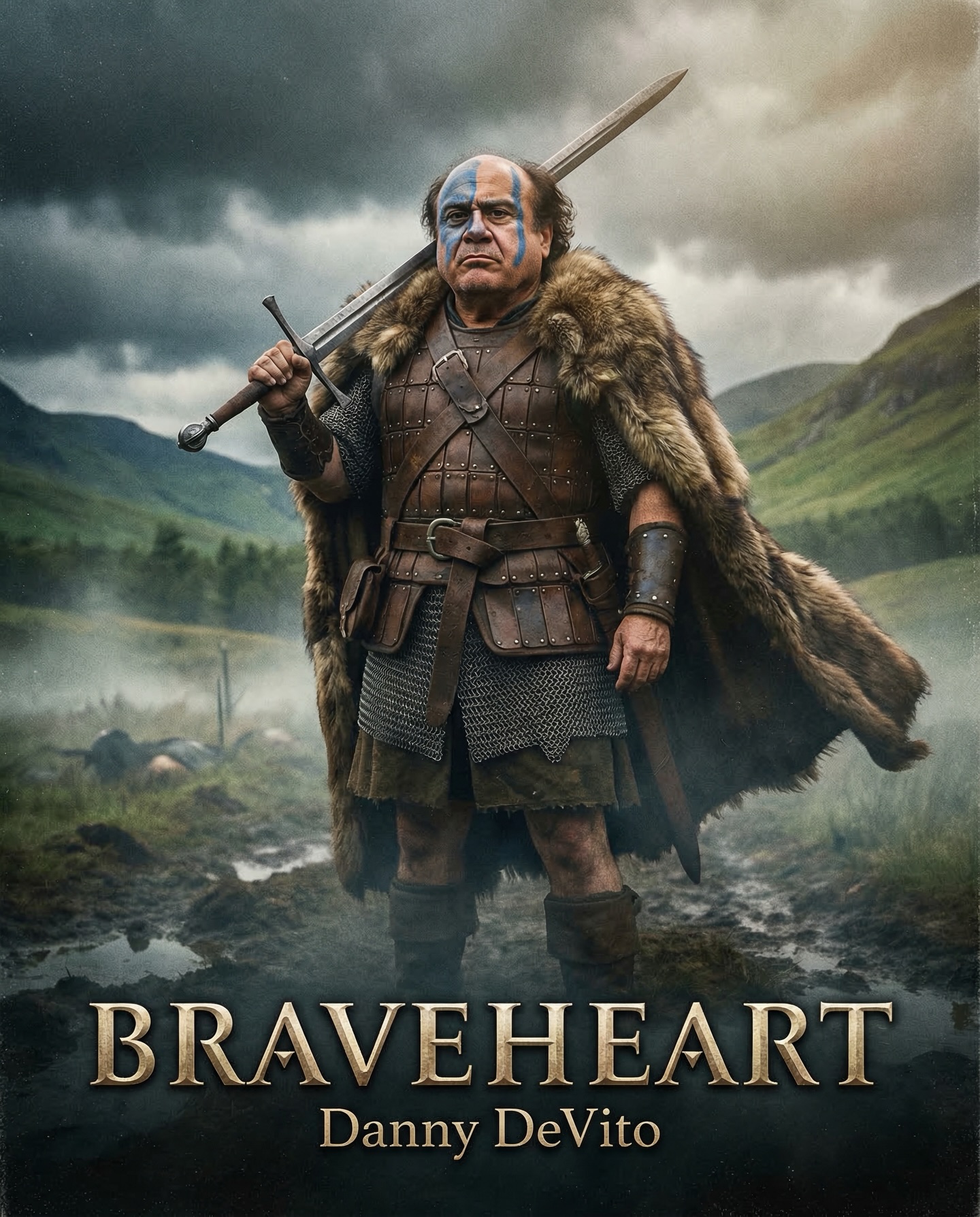
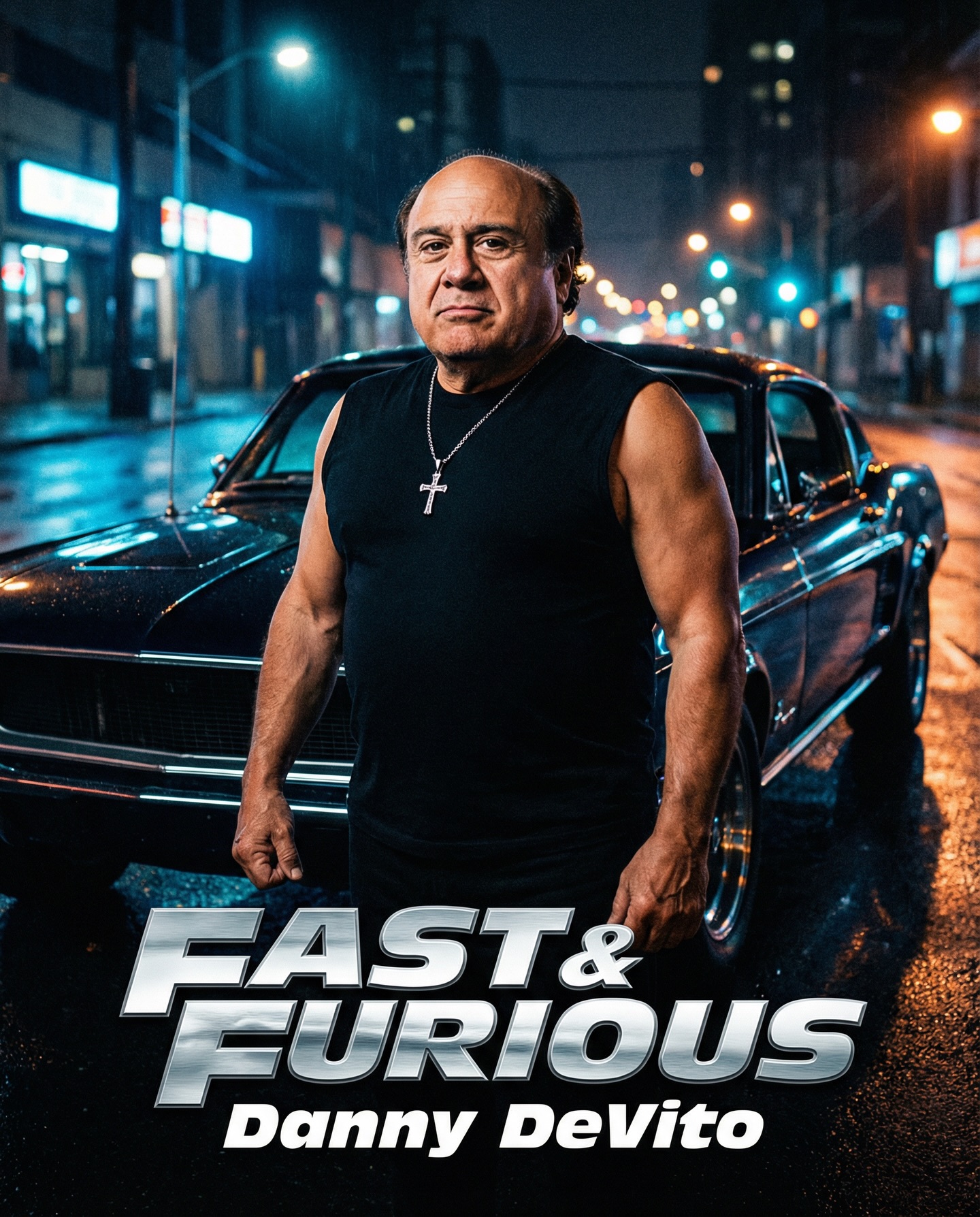
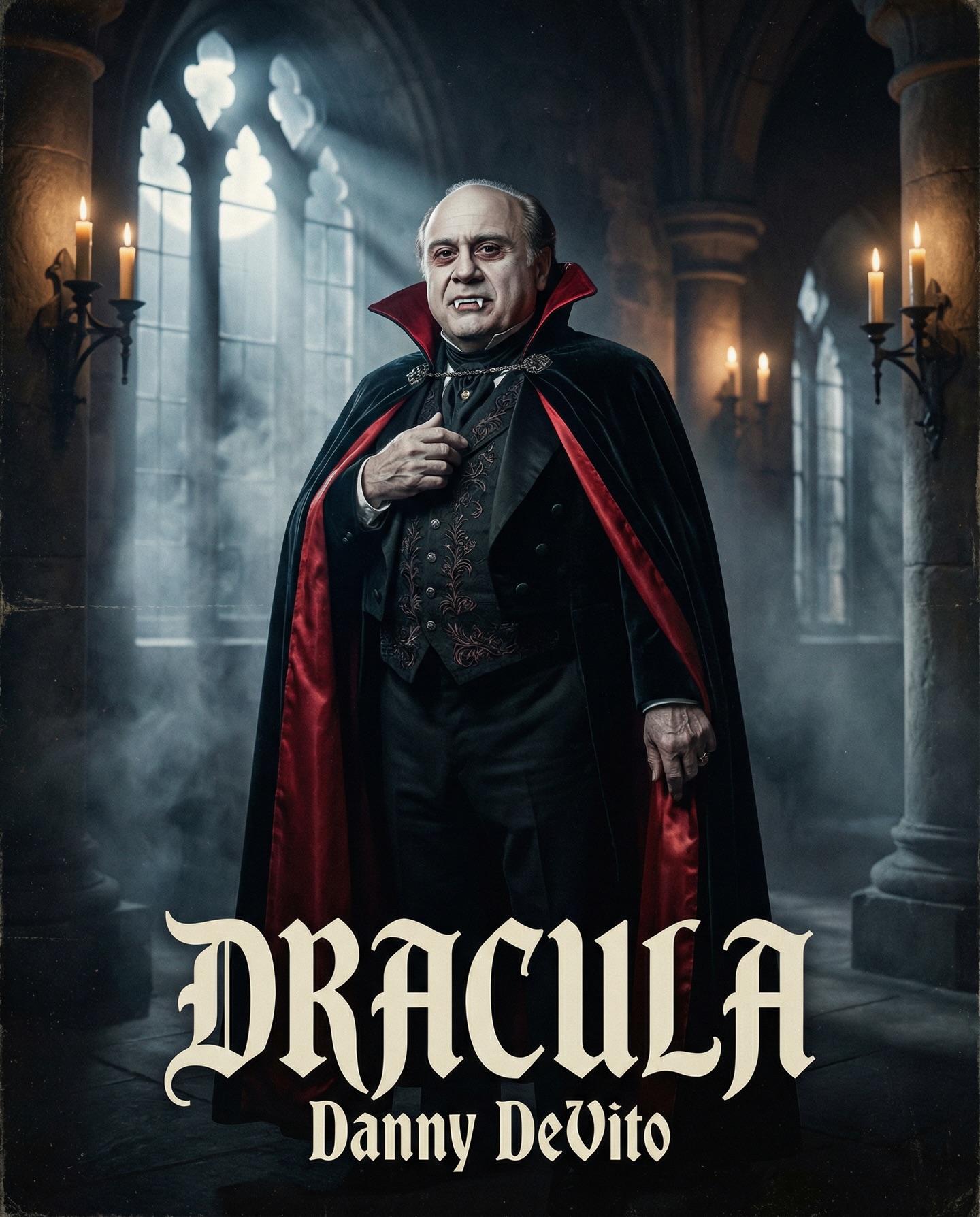
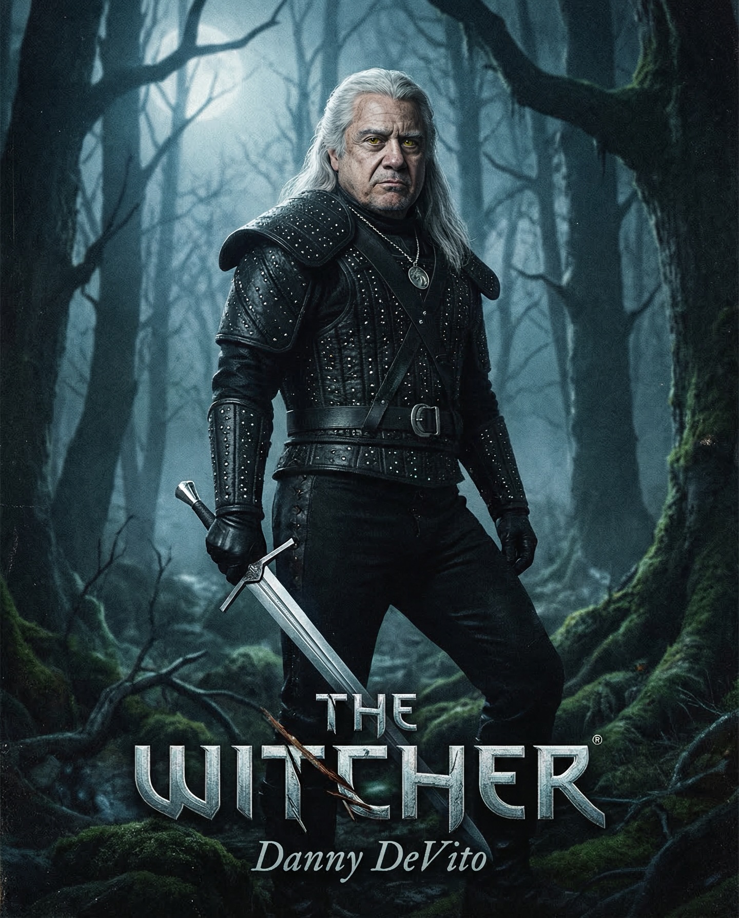
Danny DeVito in different roles Which one is your favorite one? #dannydevito Generated with Nano Banana Pro from @syntx_ai and @syntx_creators Syntx brings 90+ top AI tools into one simple interface, saving time and money
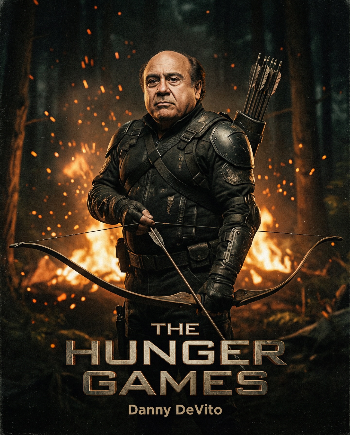
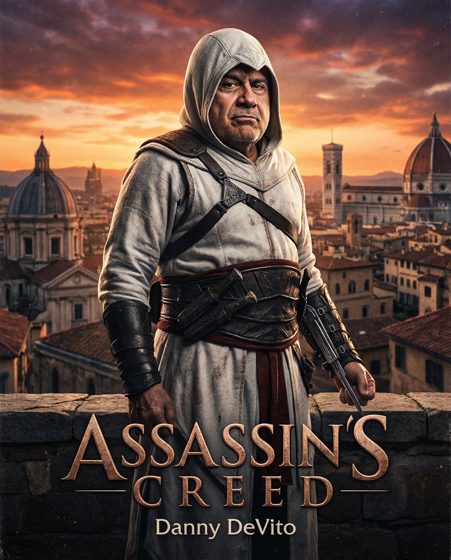
Danny DeVito in different roles Which one is your favorite one? #dannydevito Generated with Nano Banana Pro from @syntx_ai and @syntx_creators Syntx brings 90+ top AI tools into one simple interface, saving time and money
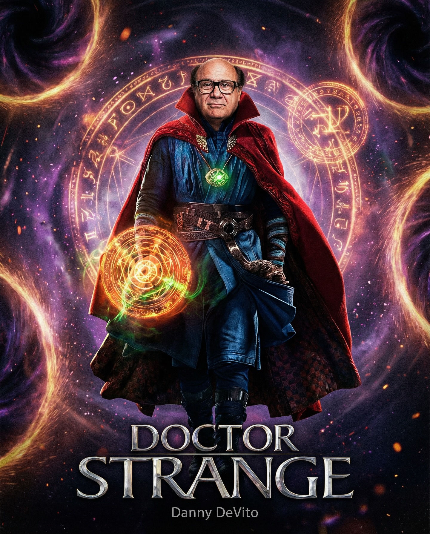
This image succeeds because it does more than make a joke. A lot of celebrity-swap fan art stops at the gag. This one goes further by committing to the full grammar of a Marvel poster: costume accuracy, magical VFX logic, cosmic background, heroic composition, and title treatment. That commitment is what turns the image from a throwaway meme into something surprisingly persuasive.
For creators, this is a strong lesson in execution. If the concept is absurd but the craft is serious, the result often becomes much stronger. Viewers laugh first because of the casting idea, but then stay because the image actually looks finished enough to imagine as a real campaign asset. That is where the image earns its staying power.
The first reason this image travels is cast collision. Danny DeVito is an instantly recognizable cultural figure, and Doctor Strange is an instantly recognizable franchise role. Bringing those two things together creates immediate click energy because the viewer understands the mismatch before they even process the full frame.
The second reason is poster credibility. The costume, portals, glowing sigils, and bottom title lockup all mimic official superhero marketing language closely enough that the image feels almost plausible. When fan art borrows institutional polish, it tends to spread farther because it can pass through both joke culture and fandom culture at once.
The third reason is tonal balance. The image is funny, but it is not visually sloppy. That matters. The more sincere the rendering, the stronger the contrast between concept and execution, and the more enjoyable the final result becomes.
| Signal | Evidence (from this image) | Mechanism | Replication Action |
|---|---|---|---|
| Instant celebrity recognition | The face clearly resembles Danny DeVito, complete with glasses and recognizable proportions. | Known faces create immediate attention and comment energy. | When using celebrity fan-casting, make the facial cues unmistakable before anything else. |
| Franchise fidelity | The red cloak, green amulet, spell circle, and title styling all feel authentically Doctor Strange. | Strong franchise cues let the joke land faster and feel more complete. | Match costume, props, and color logic to the target franchise with precision. |
| High-finish VFX language | The portals, magical rings, sparks, and cosmic backdrop look richly layered and cinematic. | Polish makes the absurd casting feel strangely believable. | Use one hero spell effect plus one strong environmental VFX layer instead of many disconnected effects. |
| Official-poster composition | The subject is centered heroically with the title filling the lower quarter. | Poster grammar helps the image feel culturally legible and share-worthy. | Use the same framing logic as blockbuster one-sheets when building parody or fan-cast posters. |
This format is excellent for fan-cast experiments, AI entertainment pages, parody posters with high production value, franchise remix content, and prompt studies about how to emulate official campaign logic. It is especially strong when the creative idea depends on contrast between subject identity and franchise role.
It is less ideal for subtle character studies, original worldbuilding, or grounded film posters where irony would break immersion. This format depends on the audience understanding the swap instantly.
Three transfer recipes are especially useful:
{celebrity likeness} as Doctor Strange in {Marvel-poster composition} with {signature VFX}.{celebrity likeness} as {franchise character}, wearing {signature costume}, with {world cue}.{unexpected subject} in {blockbuster role archetype}, framed as {official poster type}, under {VFX palette}.The image is aesthetically effective because it uses theatricality with discipline. The cloak is rich and dramatic, the cosmic background is loud, and the spell circles are bright, but the composition still stays easy to read. That is not accidental. The effects are arranged around the body instead of overwhelming it.
The color system is especially strong. Orange-gold magic, green amulet light, and purple space make a classic superhero palette triangle. This gives the poster a sense of internal logic that helps it feel like real franchise media rather than random effects pasted together.
The title at the bottom also matters. Without it, the image would still be amusing, but it would lose the “official one-sheet” feeling that completes the illusion. This is a useful reminder that typography often does as much genre work as costume and lighting.
| Observed | Recreate evidence |
|---|---|
| Character at the center of effect chaos | Keep the body readable and let effects orbit around it instead of obscuring it. |
| Tri-color magic palette | Balance orange spell light, green amulet glow, and purple cosmic atmosphere. |
| Title as authenticity cue | Use official-looking franchise typography at the bottom to lock the poster identity. |
| Costume texture richness | Let cloak fabric, tunic folds, and belt details carry high-detail realism. |
| Serious face, absurd concept | Keep the expression calm so the humor comes from the casting, not clownish acting. |
| Prompt chunk | What it controls | Swap ideas (EN, 2–3 options) |
|---|---|---|
| “Danny DeVito merged with Doctor Strange in a centered superhero-poster pose” | Locks the face-role contradiction and main composition. | “celebrity likeness as Marvel sorcerer” / “unexpected actor cast as magic hero” / “fan-cast blockbuster portrait” |
| “red high-collared cloak, blue tunic, green Eye of Agamotto” | Defines the franchise-recognition system. | “signature hero costume set” / “franchise-accurate robe and relic” / “iconic sorcerer wardrobe stack” |
| “orange magical sigil in the hand” | Creates the hero action cue and visual focal point. | “circular spell shield” / “glowing rune portal” / “arcane hand sigil effect” |
| “purple cosmic background with glowing rings and sparks” | Shapes the blockbuster fantasy environment. | “multiverse vortex” / “nebula portal chamber” / “mystical spacefield with runes” |
| “DOCTOR STRANGE title with Danny Devito below” | Completes the official-poster illusion. | “metallic franchise title stack” / “fan-cast film-poster lockup” / “studio-style name-and-title footer” |
| “realistic Marvel-style movie poster art” | Keeps the image polished rather than meme-flat. | “blockbuster key art” / “official-looking superhero poster realism” / “high-finish franchise campaign image” |
Lock three things first: the celebrity likeness, the franchise costume language, and the official title layout. Those are the anchors. If one of them drops out, the poster either stops being funny or stops feeling complete.
Use the one-change rule carefully. A practical four-step sequence might look like this:
This lets creators compare the casting joke while preserving the campaign realism that makes the whole idea land.
The main lesson is that parody gets stronger when the craft gets more serious. If the rendering looks sloppy, viewers only see the joke. If the rendering looks official, viewers get both the joke and the fantasy. That dual response is much more powerful.
For creators building fandom pages, AI concept portfolios, or prompt libraries for entertainment-style art, this is an excellent reference. It shows how to combine celebrity recognition, franchise fidelity, and blockbuster design grammar into a single image that is funny, polished, and highly shareable.