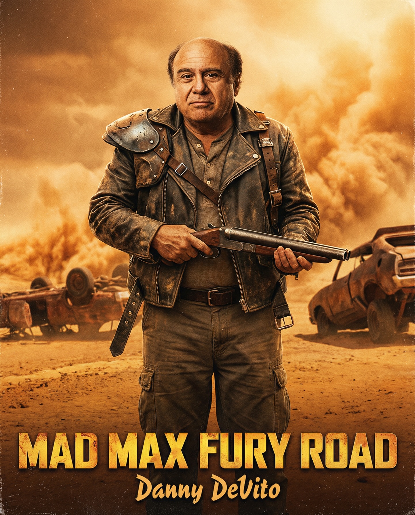
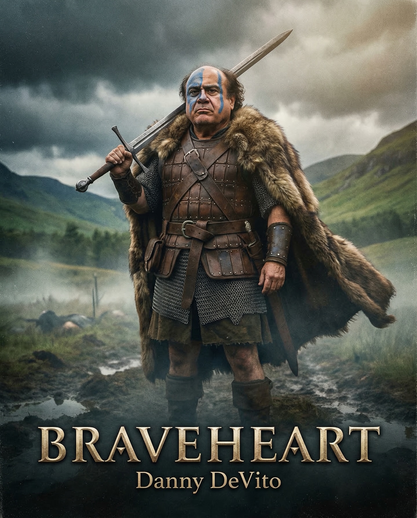
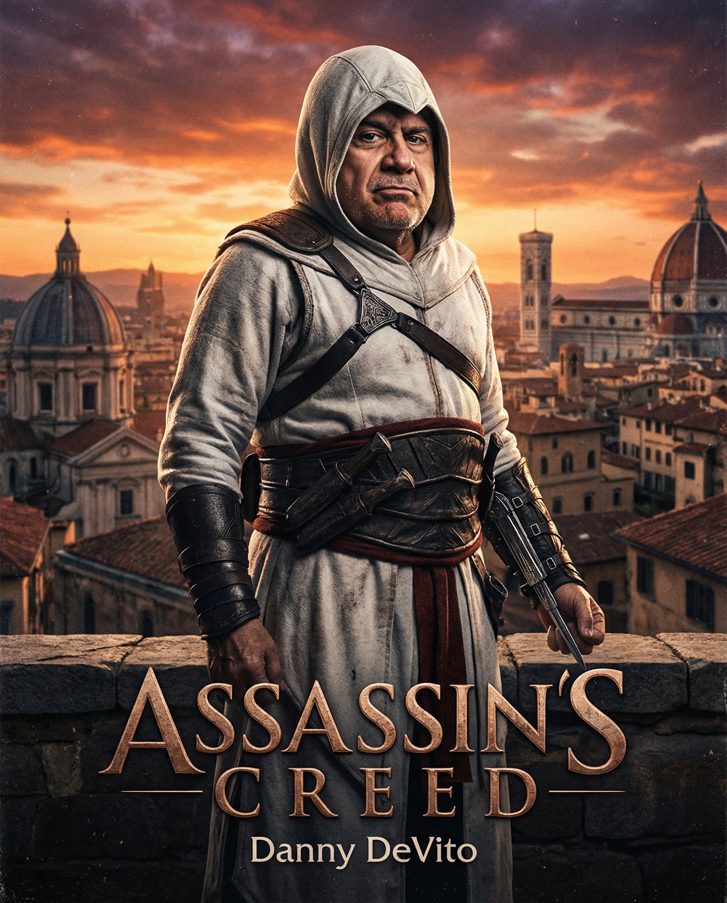
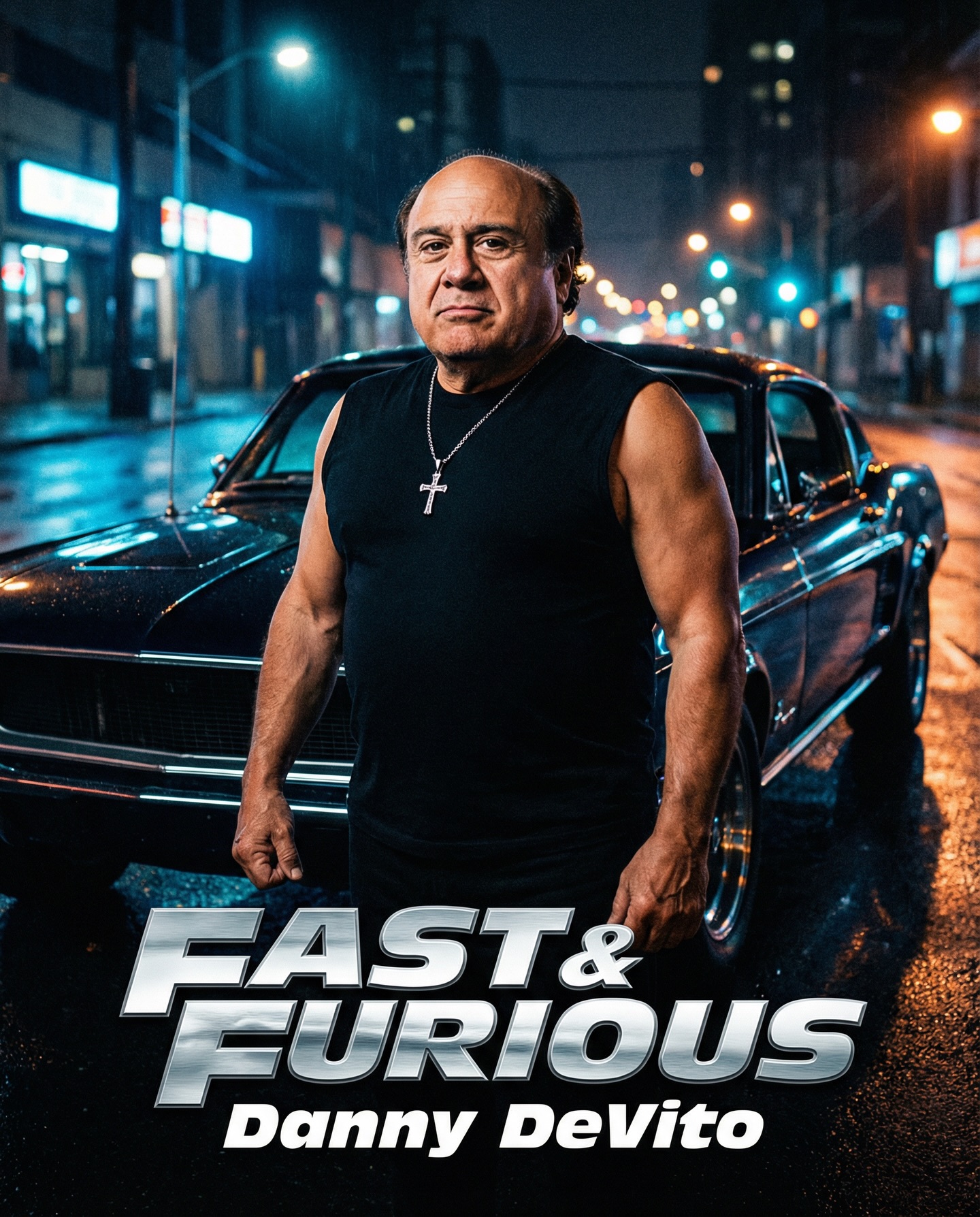
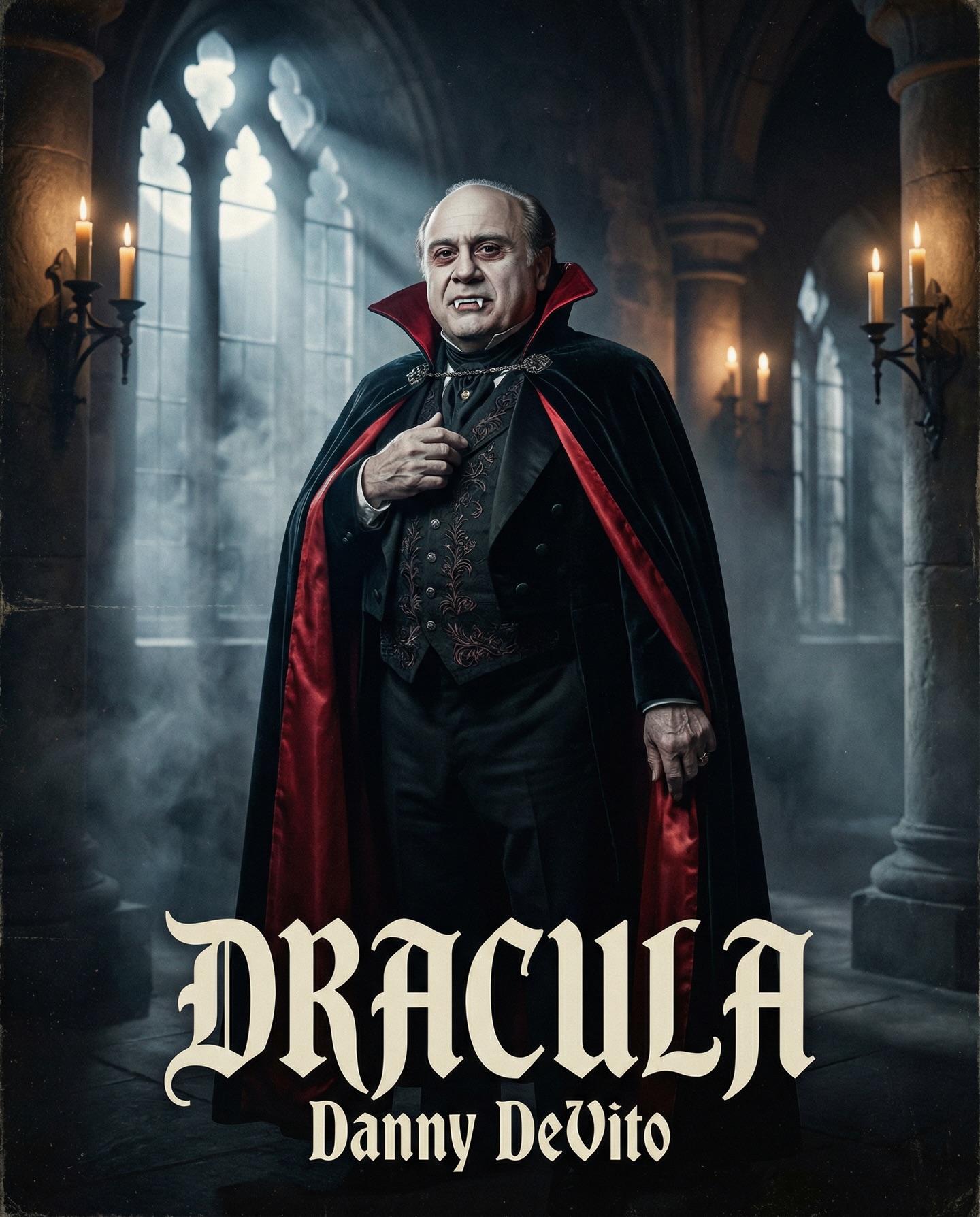
Danny DeVito in different roles Which one is your favorite one? #dannydevito Generated with Nano Banana Pro from @syntx_ai and @syntx_creators Syntx brings 90+ top AI tools into one simple interface, saving time and money
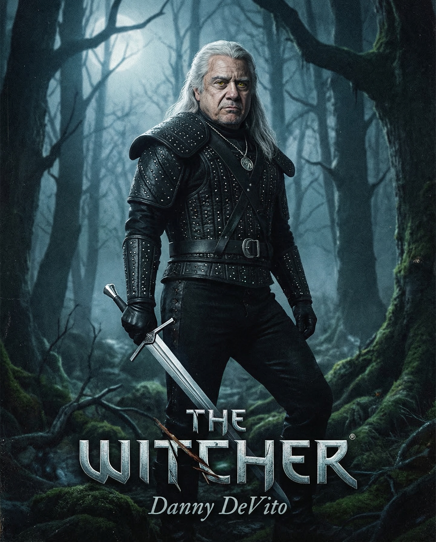
Danny DeVito in different roles Which one is your favorite one? #dannydevito Generated with Nano Banana Pro from @syntx_ai and @syntx_creators Syntx brings 90+ top AI tools into one simple interface, saving time and money
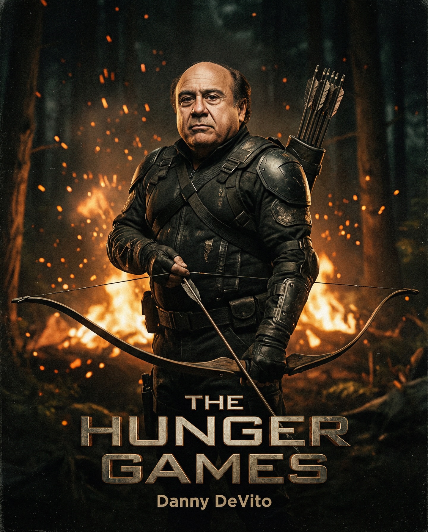
This poster concept succeeds because it understands exactly what makes a survival-franchise image feel cinematic. The frame is built around a short older bald man standing in a dark forest with tactical armor, a bow, glowing embers, and a wildfire-lit horizon behind him. Every major visual cue belongs to the language of dystopian action marketing: danger in the environment, determination in the stance, a weapon that implies both tension and skill, and a color scheme dominated by charred blacks, smoky grays, and burning orange light. If you are studying how to write stronger AI image prompts for movie-poster aesthetics, this is an excellent example of how clear genre grammar can make even an unexpected casting choice feel fully convincing.
The most striking decision in the composition is the character itself. The subject does not resemble the conventional young action hero that many models default to when you ask for a dystopian archer. Instead, the figure is older, compact, bald, and grounded. That gives the image immediate personality. It also creates contrast, which is often the difference between a generic poster and one that people remember. In prompt writing, surprising casting can be a strength when the rest of the scene remains visually disciplined. The character still looks credible because the armor, posture, lighting, and mood all support the larger world. The unusual lead does not weaken the fantasy; it sharpens it.
The wardrobe carries much of the visual authority. Matte-black tactical gear, reinforced shoulder plates, layered textures, gloves, straps, and dark survival styling all communicate readiness without needing extra exposition. This is important because AI-generated posters often become cluttered when too many accessories compete for attention. Here the styling reads immediately. You know this is a hardened survivor, not because the image explains it in words, but because every material choice points toward endurance and combat preparedness. When writing a similar prompt, phrases such as black tactical archer armor, survival gear, reinforced shoulder guards, layered matte textures, and battle-worn costume can help direct the model toward believable costume design.
The bow is also doing more than serving as a prop. It establishes tension. Firearms often create instant aggression, but bows create suspense because they suggest patience, aim, and control. That matters in poster design. A drawn or ready bow can imply a character who survives through precision rather than brute force alone. In visual storytelling terms, it also gives the body a natural compositional axis. Arms, bow, shoulders, and torso become one unified shape, making the pose feel deliberate. If you want a generated image to feel more iconic, weapon posture should not be an afterthought. It should be one of the structural elements of the composition.
The forest setting is equally effective because it operates on two levels at once. First, it provides environmental stakes. Fire in the distance tells the viewer that the world is unstable, violent, and already in motion. Second, it supplies the lighting logic. The orange glow from flames creates a high-contrast edge against the darkness of the outfit and the surrounding trees. That contrast allows the figure to separate cleanly from the background while still feeling embedded in the same world. This is a useful prompting lesson: dramatic environments are strongest when they also justify the light. Random flames are less convincing than fire that actually shapes the scene’s color and atmosphere.
Smoke and embers contribute heavily to the poster feel. They create depth, movement, and emotional pressure without forcing the subject to move dramatically. In many action posters, the character stands relatively still while the world around them suggests danger. That dynamic works here. Tiny glowing particles and smoky haze imply chaos and heat, while the character’s posture signals control and resilience. When prompt writing for cinematic results, atmosphere words such as ember-filled air, drifting smoke, scorched woodland haze, ash particles, and firelit dusk can help add the missing layer that separates polished poster art from flat character renders.
Color discipline is one of the most underrated reasons this image works. The palette is narrow and strategic: black armor, gray smoke, dark green or shadowy woodland tones, and fiery orange highlights. Limiting the palette makes the poster feel branded and intentional. It also helps the model keep a strong mood rather than drifting into random color noise. If your goal is to produce high-impact key art, it often helps to think in terms of dominant and accent colors. In this case, the dominant mood is charcoal darkness, and the accent is flame orange. That combination immediately communicates danger, intensity, and cinematic drama.
Pose matters just as much as costume and lighting. The subject is centered, front-facing, and stable. That makes him read as a protagonist rather than a side character. The image is not trying to capture a moment of frantic motion. It is presenting a survivor, a fighter, and a symbolic lead. Poster imagery often benefits from this kind of iconic stillness because it allows the audience to project a story onto the frame. In prompt language, terms like centered heroic stance, front-facing survival poster pose, determined expression, and grounded posture can help preserve that energy. The image does not need a leap or explosion in the foreground to feel dramatic. The stillness itself becomes a sign of confidence.
Another valuable lesson here is how the character’s expression and proportions reinforce narrative. A smaller or older body type surrounded by destruction can tell a story of grit and endurance more effectively than exaggerated invincibility. It implies that the hero survives not because the world is easy, but because the hero is relentless. In commercial terms, that creates emotional texture. In prompt terms, it reminds us that character design is not just about beauty or symmetry. It is about choosing a face and body that make the world feel believable. This is especially important when you want your AI art to stand out from the endless stream of polished but anonymous genre characters.
If you were rewriting this idea into a prompt, it helps to organize it in clear layers. Start with the subject: “an older bald man with a compact, hardened physique, standing as a dystopian archer hero.” Then add wardrobe: “wearing layered black tactical armor with shoulder plates, gloves, and survival gear.” Then define environment: “in a dark forest at night with distant wildfire glow, drifting smoke, and ember-filled air.” Finally add presentation language: “survival-thriller movie poster, cinematic lighting, high contrast, dramatic composition, intense mood.” This kind of layered structure tends to produce cleaner results than one unbroken sentence overloaded with disconnected descriptors.
You can also improve consistency by being explicit about what the image is not. If a model keeps drifting toward fantasy elf archers, medieval leather costumes, or generic superhero styling, your wording may need to anchor the scene more firmly in modern survival aesthetics. Terms such as tactical, matte armor, dystopian thriller, scorched forest, survival franchise poster, and cinematic ember glow all help keep the output inside the intended genre lane. Precision is especially important when the central idea uses an unexpected lead character, because the model may otherwise collapse back toward clichés.
From an editorial or blog perspective, this image is useful because it demonstrates that strong prompts are not built only from visual beauty. They are built from narrative clarity. The scene tells you where you are, what kind of world this is, who the hero might be, and what emotional temperature the story occupies. That is exactly what good poster design should do. The best prompts are not random piles of adjectives. They are controlled visual pitches. This one says: a hardened archer stands against fire and darkness, and the world behind him is already burning. That sentence alone contains the core of the image.
There are many ways to extend the concept while keeping its strengths. You could shift the environment from forest to ruined city streets, flooded industrial wasteland, or snowbound ruins while keeping the same character logic. You could alter the weapon from bow to crossbow, spear, or improvised survival tool. You could push the poster toward a more premium studio finish or a grittier grindhouse texture. But the essential formula should remain intact: one memorable character, one strong survival silhouette, one dominant mood, and one environment that justifies the light and atmosphere. If you preserve that structure, variations will still feel coherent.
This image also works well for prompt collections because it combines recognizable genre appeal with a fresh visual twist. People searching for dystopian poster prompts, cinematic survival art, tactical archer concepts, or dark forest hero imagery can instantly understand the appeal. At the same time, the unexpected lead casting keeps the frame from dissolving into sameness. That balance between familiarity and surprise is one of the best targets in AI image generation. You want viewers to understand the genre immediately, but you also want them to pause because something about the image feels newly specific.
Ultimately, the reason this dark archer poster feels strong is that it refuses indecision. It knows it is a survival-thriller image. It commits to the firelit forest, the black tactical silhouette, the centered character, and the ember-heavy atmosphere. Every part of the frame supports the same story. That is exactly the mindset worth bringing into your own prompts. Pick a clear visual thesis, make every element reinforce it, and allow contrast to create memorability. In this case, the contrast between the unexpected hero and the classic apocalyptic poster language is what gives the image its staying power.