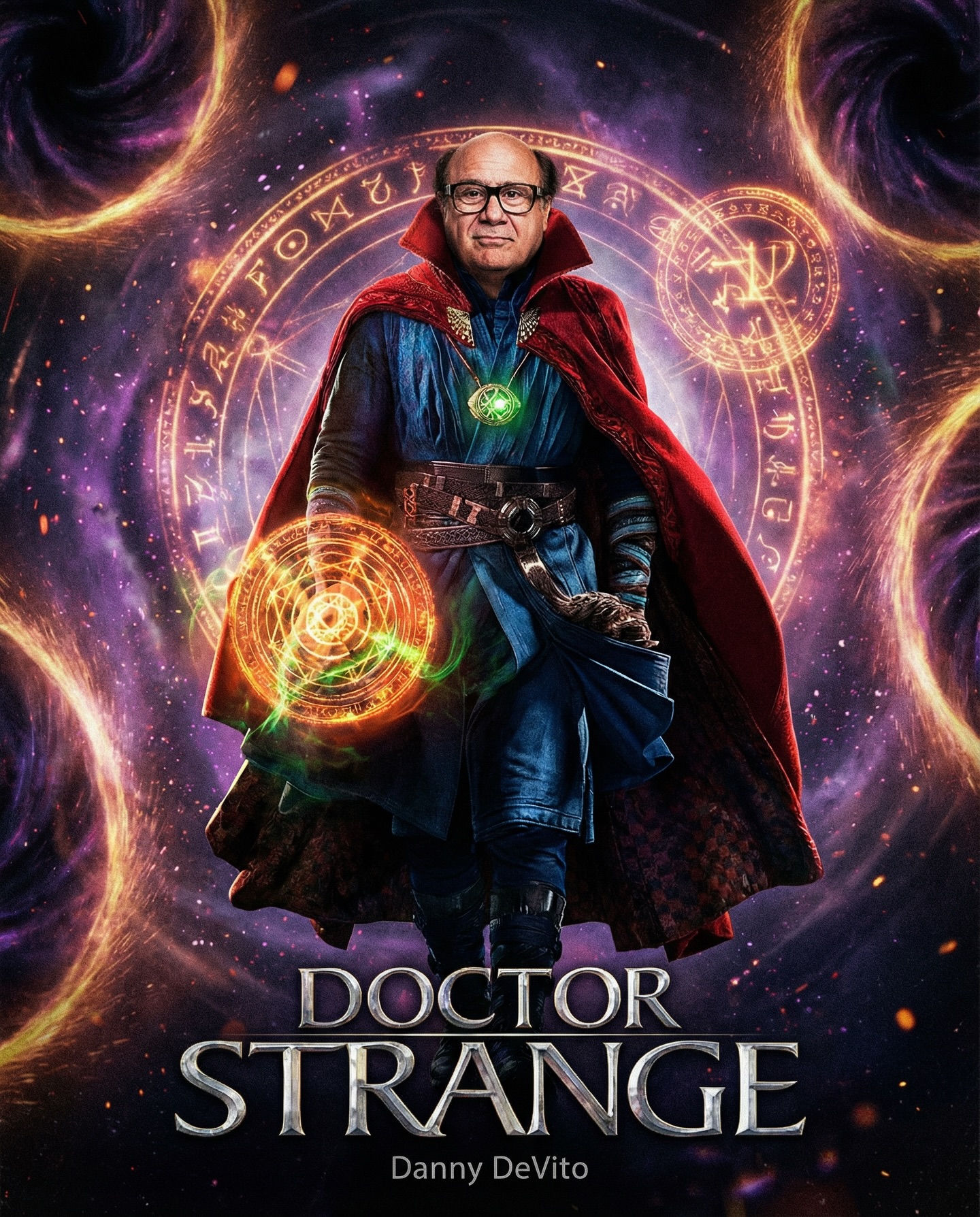
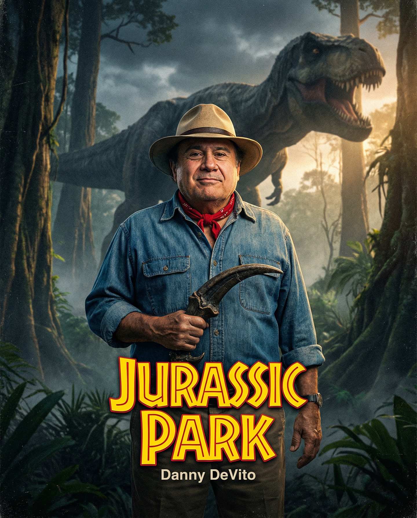
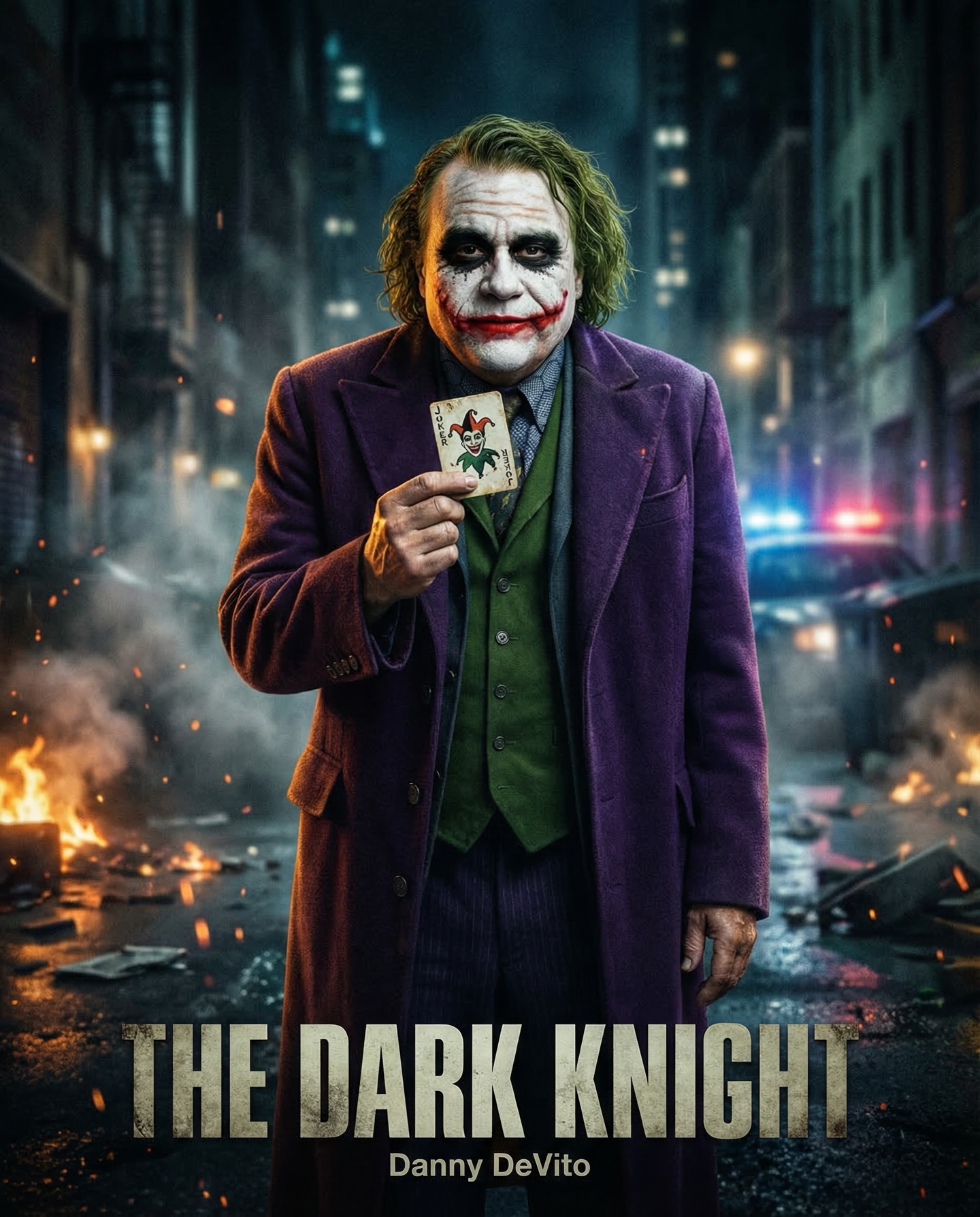
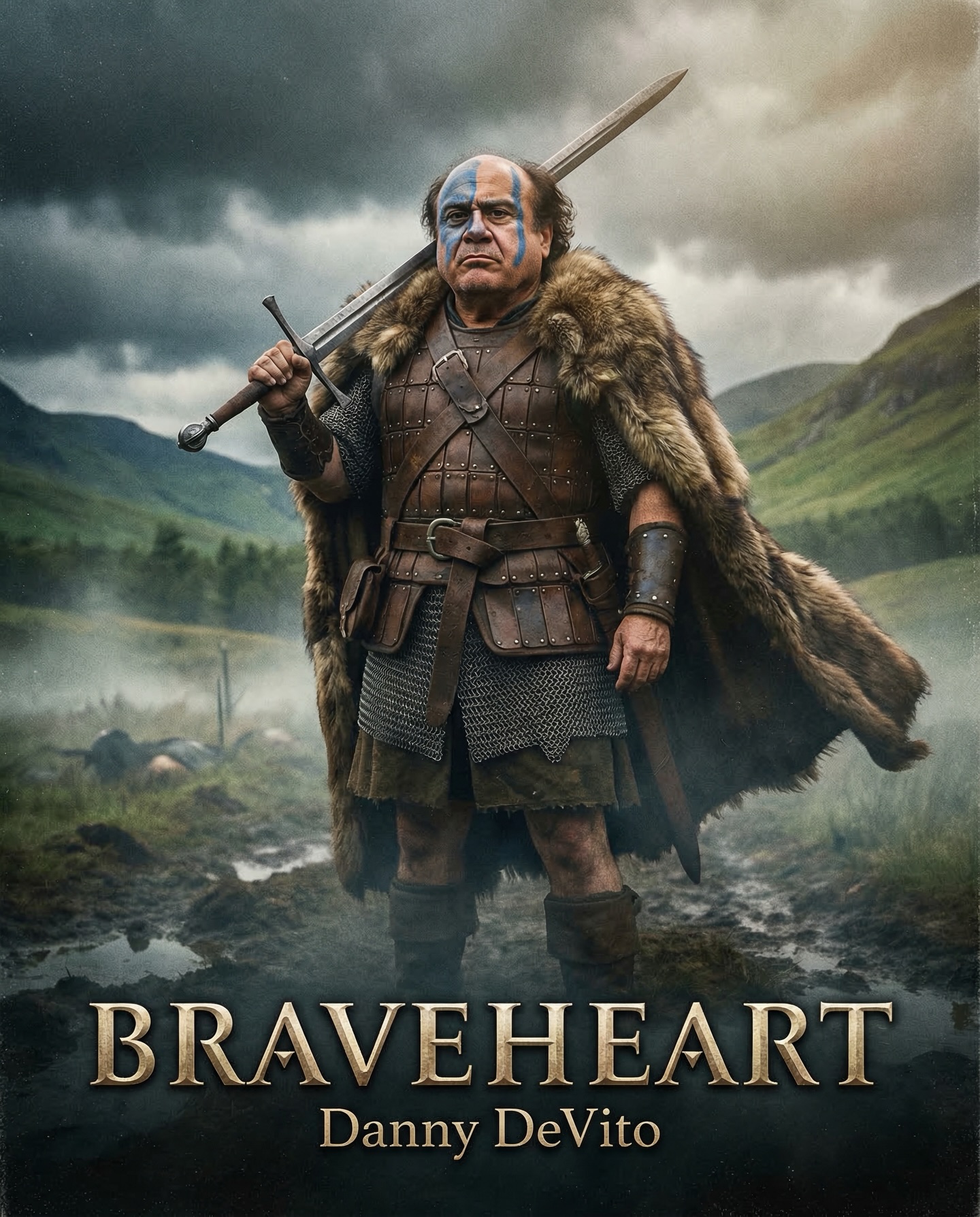
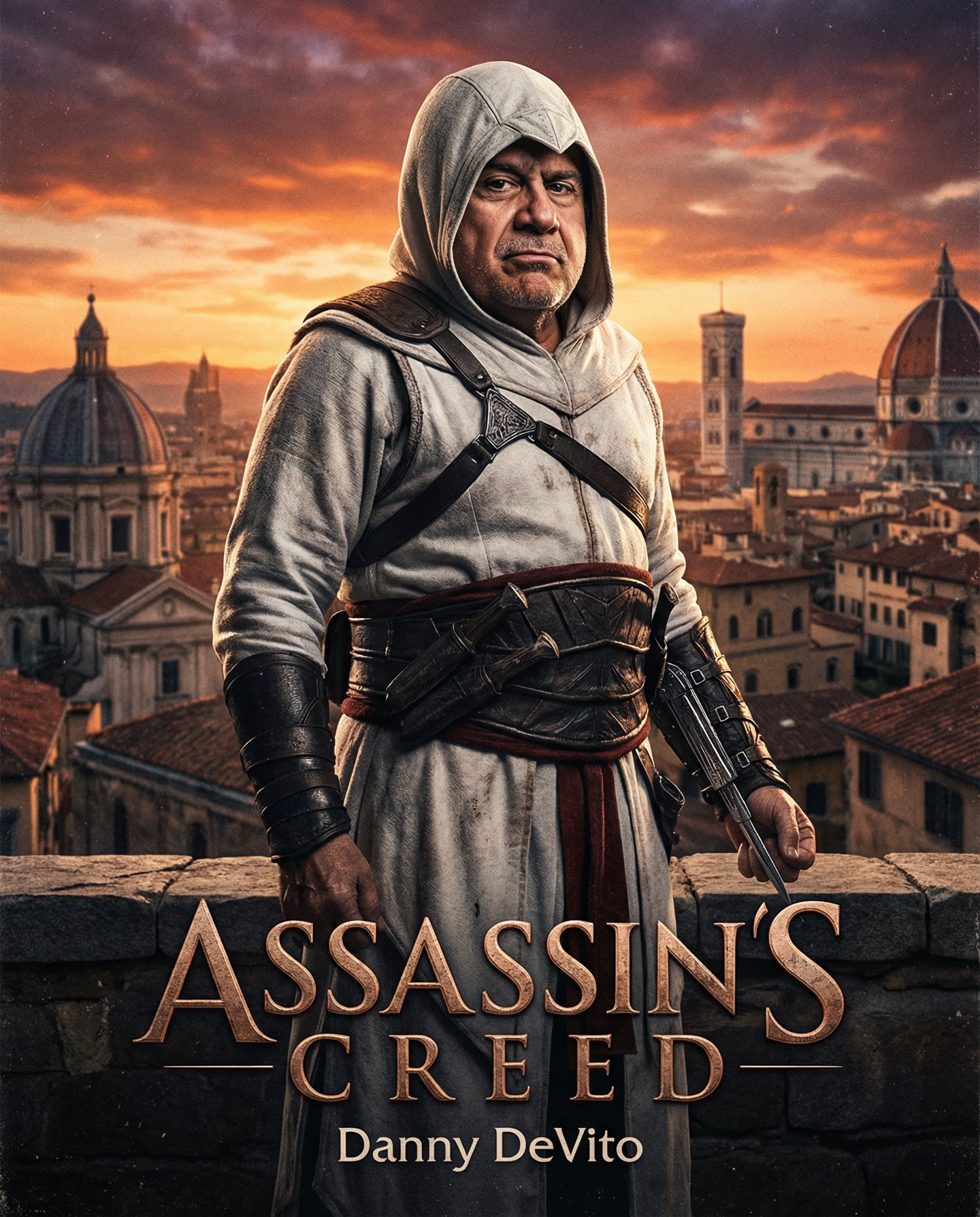
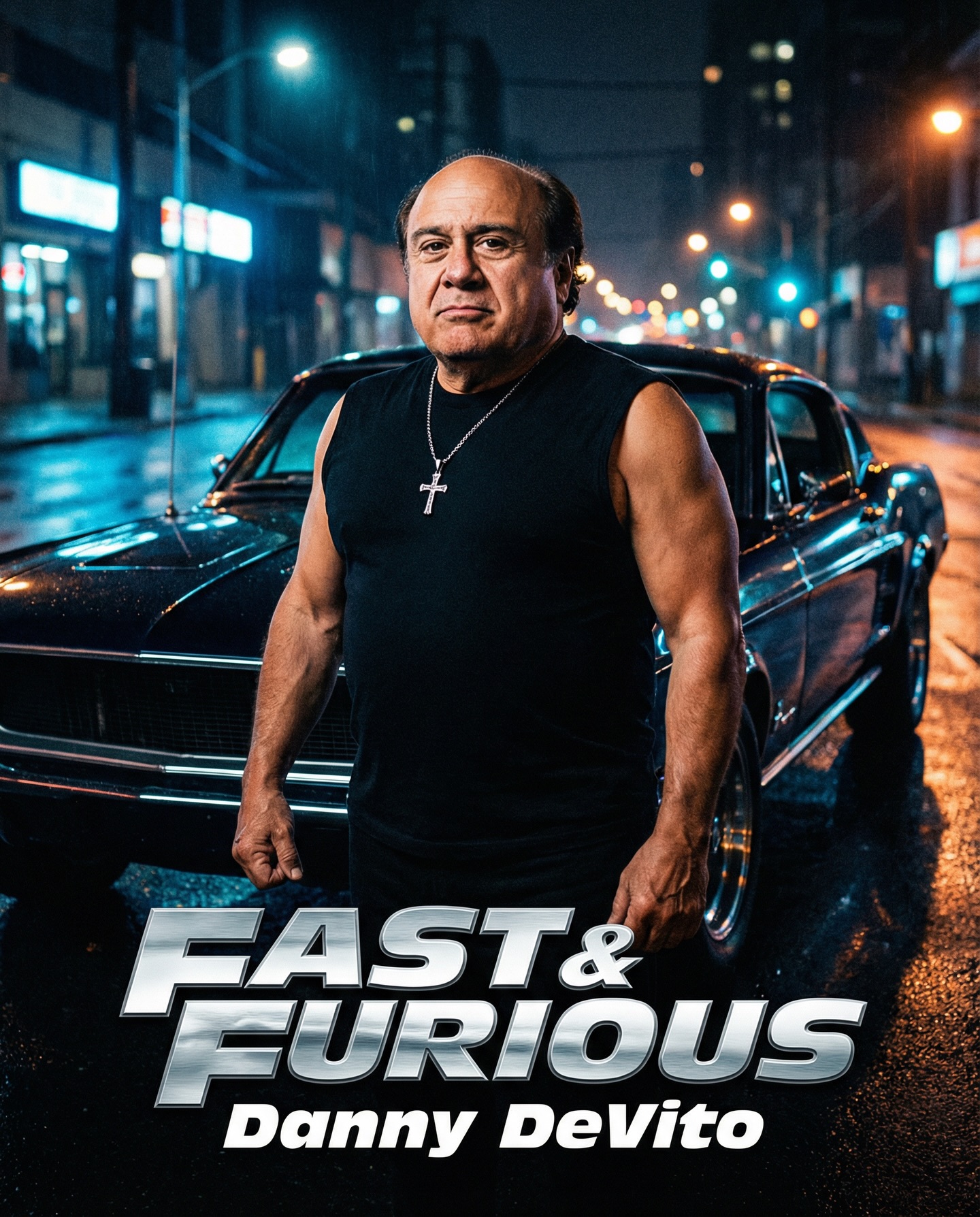
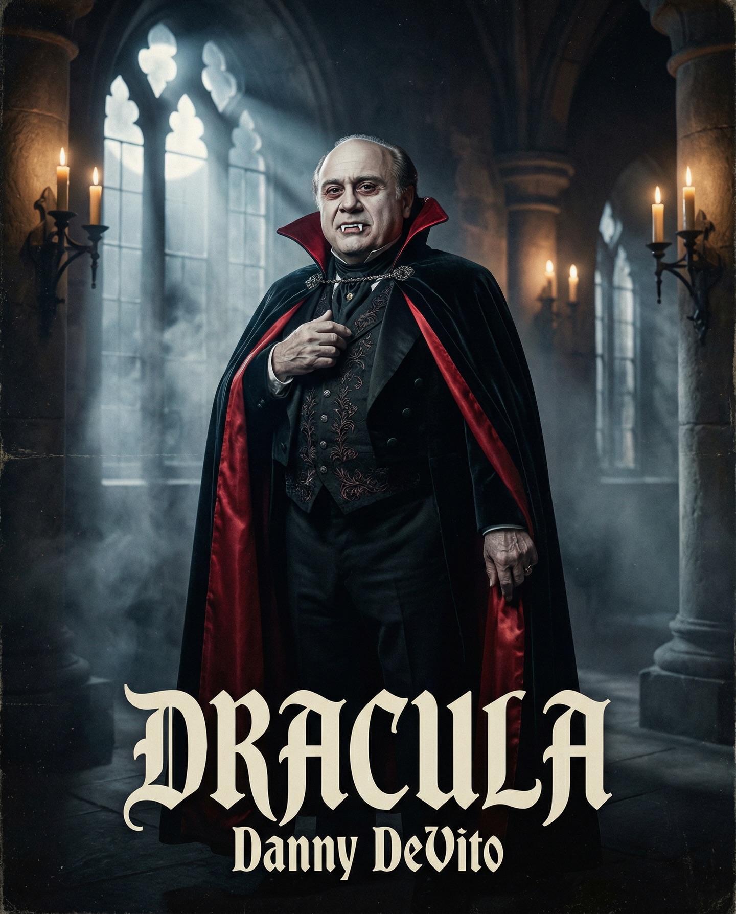
Danny DeVito in different roles Which one is your favorite one? #dannydevito Generated with Nano Banana Pro from @syntx_ai and @syntx_creators Syntx brings 90+ top AI tools into one simple interface, saving time and money
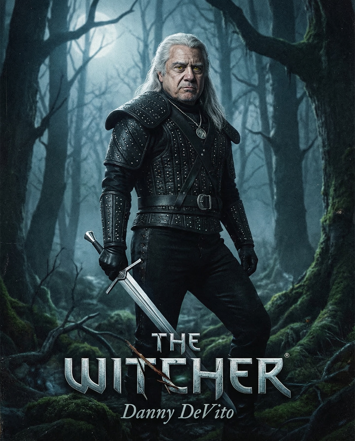
Danny DeVito in different roles Which one is your favorite one? #dannydevito Generated with Nano Banana Pro from @syntx_ai and @syntx_creators Syntx brings 90+ top AI tools into one simple interface, saving time and money
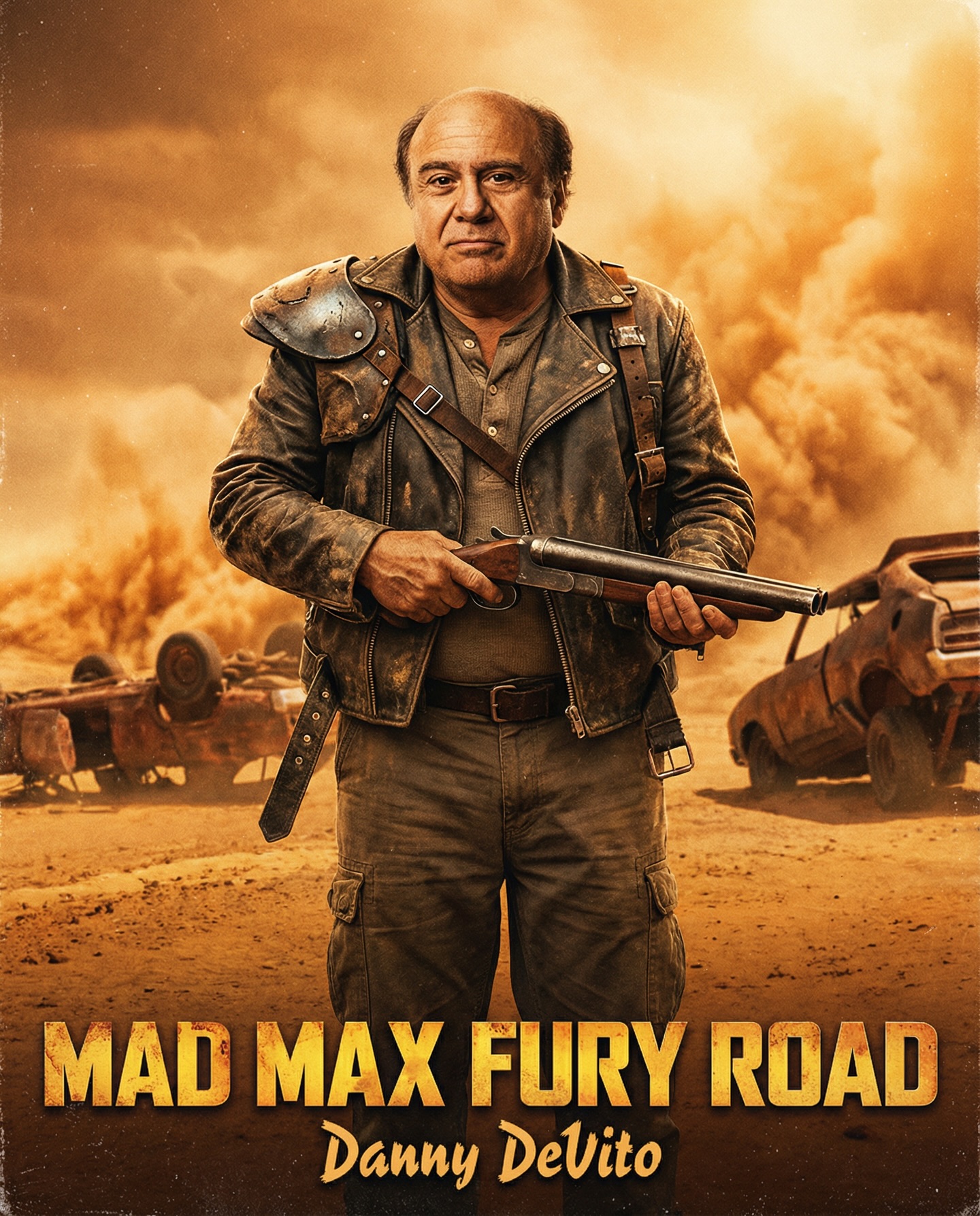
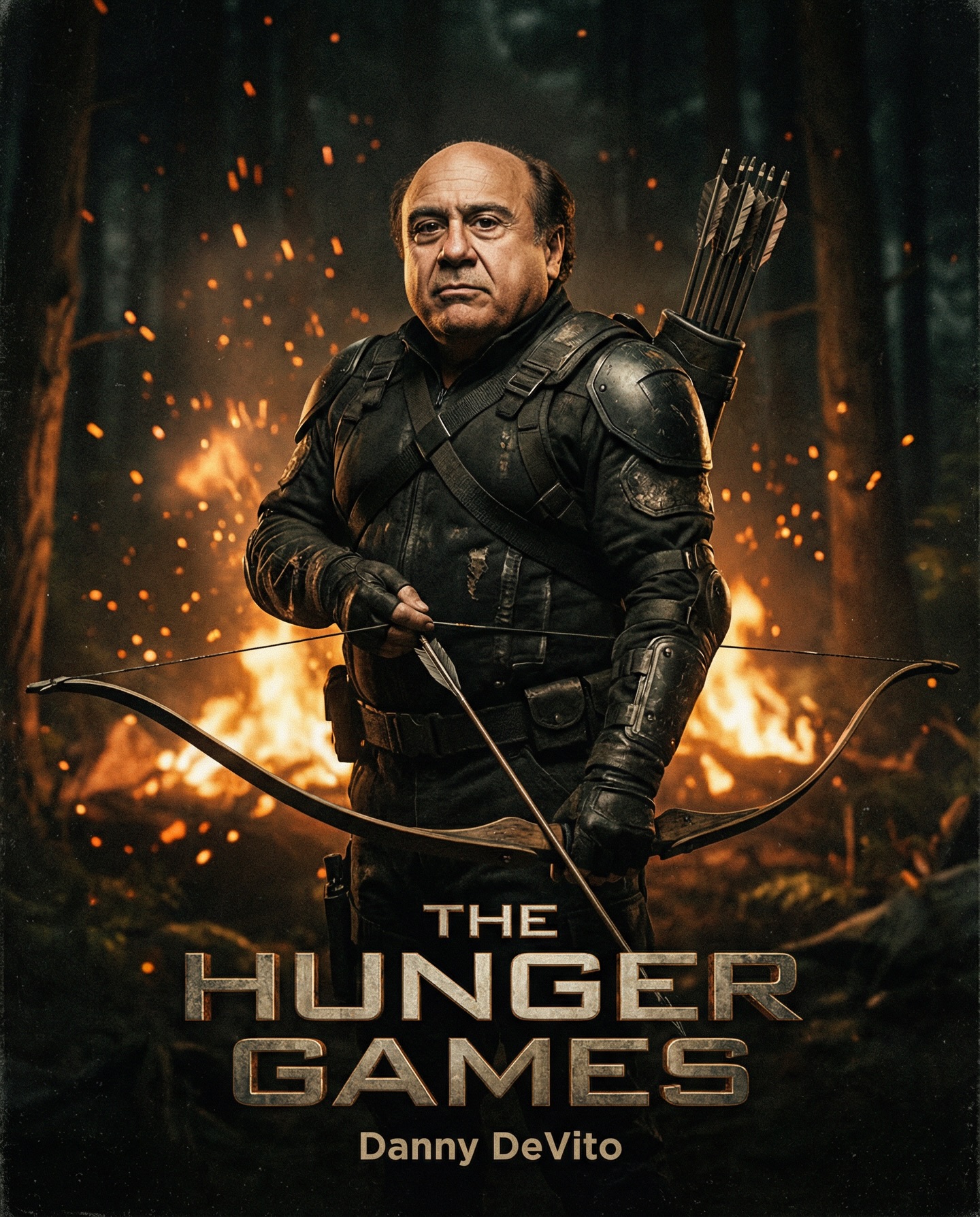
This image works because it understands that parody becomes stronger when the surrounding design language remains fully committed. Danny DeVito is placed into a Mad Max-style wasteland poster, holding a shotgun in a centered hero pose, wearing distressed desert leathers against a burning orange sky. The concept is humorous on its own, but the poster does not rely on exaggerated comedy to sell it. Instead, it treats the image like serious blockbuster key art. That sincerity is exactly what makes the result memorable. The visual system believes in the poster completely, and that commitment gives the casting swap its real force.
One of the most important strengths of the piece is that it does not dilute the genre. The desert atmosphere, rusted wrecks, orange smoke, and hard silhouette all establish the post-apocalyptic world immediately. If the prompt had softened those signals or introduced too many mixed references, the scene would have become vague. Instead, every environmental cue supports the same cinematic identity. The poster is not just funny because DeVito is there. It is strong because the world around him is convincingly harsh, dusty, and scorched.
The contrast between the subject and the genre framework is where the energy comes from. Danny DeVito’s recognizable face and compact body shape are visually far from the expected action-hero template. But because the image does not joke about that difference overtly, it becomes more effective. The humor emerges from the viewer’s recognition of the mismatch, not from clownish styling. This is a very useful lesson in prompt design. A parody image often improves when the style remains disciplined and the absurdity is allowed to speak through context alone.
The centered stance is one of the clearest reasons this poster works. Movie-poster compositions often rely on immediate readability, especially when the image must communicate from thumbnail scale as well as full-size viewing. By placing the character directly in the central axis, holding a shotgun across the torso, the poster creates a simple and iconic silhouette. The audience does not need time to decode the composition. They instantly understand that this is meant to be key art.
That clarity is crucial for parody as well. If the pose were overly dynamic, comedic, or cluttered with extra action beats, the central concept would weaken. A strong parody poster must first succeed as a poster. Only then does the mismatch become powerful. The centered stance, broad shoulders, and weapon placement make the image feel structurally authentic before the viewer even registers the casting twist.
There is also a tonal advantage to this kind of pose. It communicates seriousness. The character does not look confused, silly, or self-aware. He looks planted, capable, and ready. That seriousness is exactly what makes the swap amusing. The image respects the visual vocabulary of the genre enough that the viewer can enjoy the contrast without the composition collapsing into a joke first and an image second.
| Pose choice | What it creates | Why it helps |
|---|---|---|
| Centered frontal stance | Immediate poster readability | Makes the concept clear from small sizes upward |
| Shotgun across torso | Strong horizontal anchor | Stabilizes the composition and supports action-hero language |
| Serious expression | Tonal commitment | Lets the humor emerge from contrast instead of overacting |
| Grounded posture | Physical credibility | Prevents the parody from becoming slapstick |
The environment is not background decoration. It is the structure that makes the character swap legible. Rusted vehicles, dust, smoke, and a scorched orange sky all immediately signal a post-apocalyptic action world. Those cues are enough to anchor the viewer in a Mad Max-adjacent visual language without needing explicit logos or copy. This is efficient world-building. The image does not need to explain its reference because the setting explains it visually.
That matters in prompt writing. When building a parody or mashup, the target genre must be communicated through environment as much as through wardrobe and pose. If the background were generic, the image would lose most of its conceptual energy. The wasteland context here gives the subject a dramatic world to inhabit, and that world is what makes his presence funny and compelling at the same time.
The wrecked cars are especially useful because they create scale and history without stealing focus. They tell the viewer that the world has already collapsed, but they stay secondary to the hero silhouette. This is a good model for prompt authors: let the environment support the subject through atmosphere and context, not through noise. Background detail should deepen the world, not bury the poster.
The orange desert sky is one of the image’s most important decisions. It serves as both emotional backdrop and genre anchor. Warm scorched color immediately evokes heat, danger, and wasteland cinema. At the same time, the orange backdrop gives the darker costume, shotgun, and facial features stronger separation. This makes the poster highly legible and tonally unified. Without the sky, the scene would lose much of its intensity.
Color is particularly important in parody prompts because it helps the image commit to a recognizable world. The orange dust-and-fire palette tells the viewer what kind of movie this poster belongs to. If the colors drifted toward a generic neutral scheme, the image would feel less confident. Strong genre images often depend on having one dominant palette logic and letting everything else orbit around it.
The warm atmosphere also creates an interesting contrast with the serious facial expression. The whole world looks loud and destructive, yet the subject remains calm. That visual contradiction strengthens the character presence. He appears less like a victim of the wasteland and more like someone who has adapted to it. Even if the audience finds the concept absurd, the poster remains visually convincing because the color and pose support that interpretation.
| Palette decision | Visual result | Prompt lesson |
|---|---|---|
| Burning orange sky | Immediate wasteland identity | Use one dominant palette to define genre fast |
| Dust-softened light | Makes the scene cinematic rather than flat | Add atmosphere to unify subject and background |
| Dark leather against warm sky | Creates strong silhouette separation | Contrast helps preserve poster readability |
| Muted wreckage tones | Keeps the environment supportive | Background should not compete with the hero figure |
In any celebrity or character swap image, likeness is non-negotiable. If Danny DeVito’s face is not recognizable, the image loses most of its concept value. That is why the prompt must protect facial identity explicitly. The subject’s expression does not need to be exaggerated, but the core structure of the face must remain intact enough that the audience instantly recognizes who is being recast into the scene.
At the same time, likeness should not become caricature. Over-pushing the facial features would turn the image into a joke illustration instead of polished key art. The strongest version maintains recognition while still fitting naturally inside the action-poster world. This is a subtle balance, but a very important one. It is what separates high-quality parody from crude collage humor.
This lesson applies more broadly to any mashup prompt. The anchor identity of the inserted subject must be clear, but the surrounding image still has to behave like a unified poster. Prompt writers should think about likeness as one protected pillar among several, not as the only priority. The image succeeds when likeness, environment, pose, and palette all support one another.
This image offers a useful framework for building parody posters that still feel premium. First, identify the subject swap that creates the core conceptual tension. Second, describe the target genre with enough precision that the world becomes instantly readable. Third, choose a pose that reinforces poster clarity rather than action overload. Fourth, protect likeness and key prop placement. Fifth, commit to one color system that supports the reference world.
Another lesson is that parody often improves when the image avoids obvious self-awareness. There is no need for goofy expressions, overblown visual jokes, or chaotic set dressing. The more convincingly the poster behaves like real studio marketing, the better the concept lands. This is especially true for AI prompt work, where too many competing novelty signals can quickly reduce output quality.
As a creator-facing example, this poster is valuable because it shows how parody and production value can coexist. The image is amusing, but it is not disposable. It teaches a repeatable method: anchor the concept in a clear subject swap, build a believable genre environment, and design the poster as if it were a real piece of studio key art. That method can be reused for countless crossover or recasting concepts.
It also demonstrates that visual humor does not need noise to be memorable. The strongest part of the image is that it remains composed. It trusts the viewer to understand the absurdity without being overwhelmed by it. That makes the poster feel much more substantial than a throwaway joke image. For creators building prompt-share assets, this is a strong standard to aim for.
In the end, the image succeeds because it fully inhabits its alternate-universe premise. It feels like a real poster from a bizarre but coherent movie world. That is exactly why it works: not because it mocks the genre, but because it respects the genre enough to make the mismatch truly entertaining.