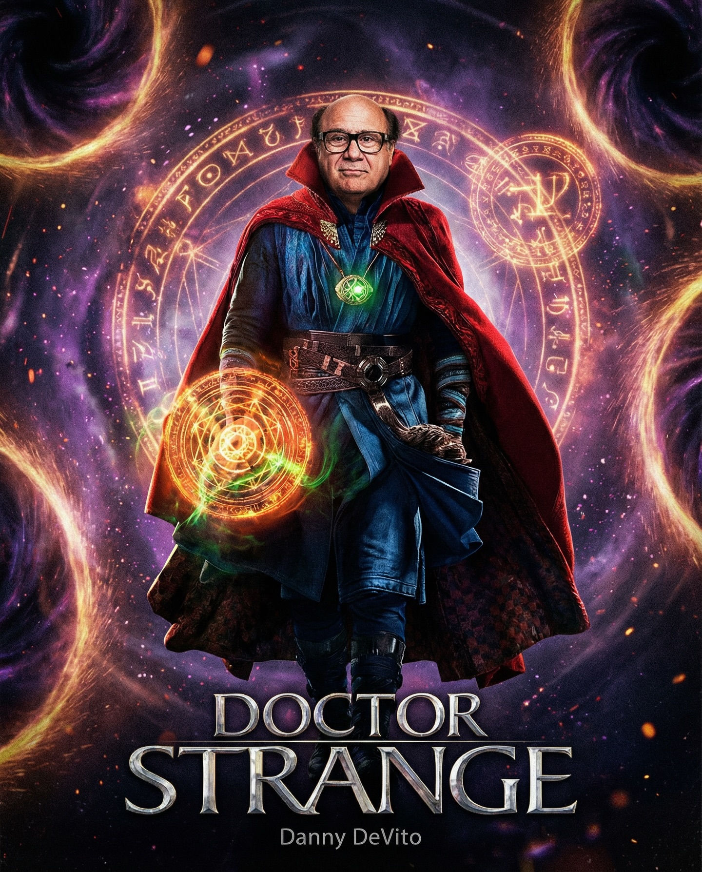
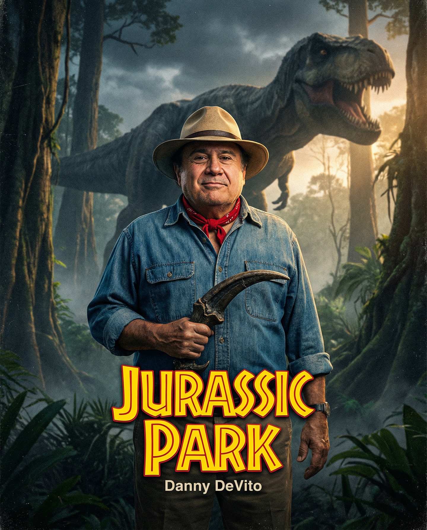
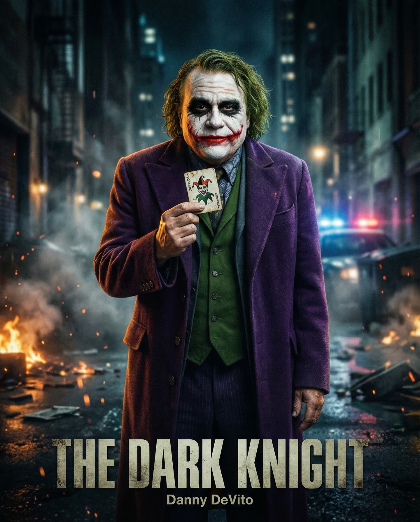
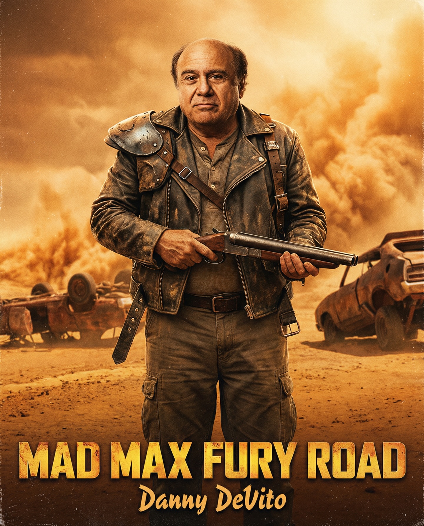
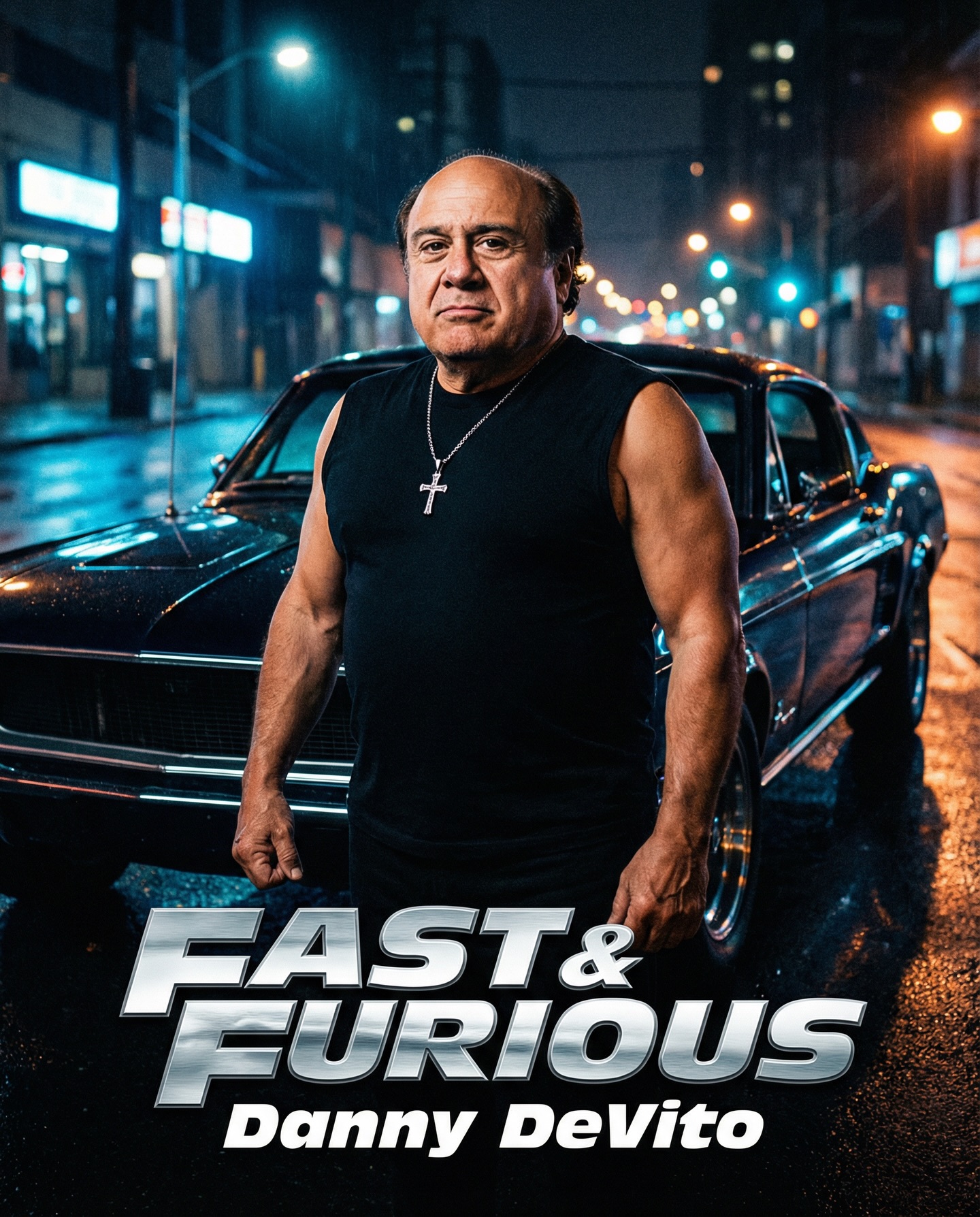
Danny DeVito in different roles Which one is your favorite one? #dannydevito Generated with Nano Banana Pro from @syntx_ai and @syntx_creators Syntx brings 90+ top AI tools into one simple interface, saving time and money
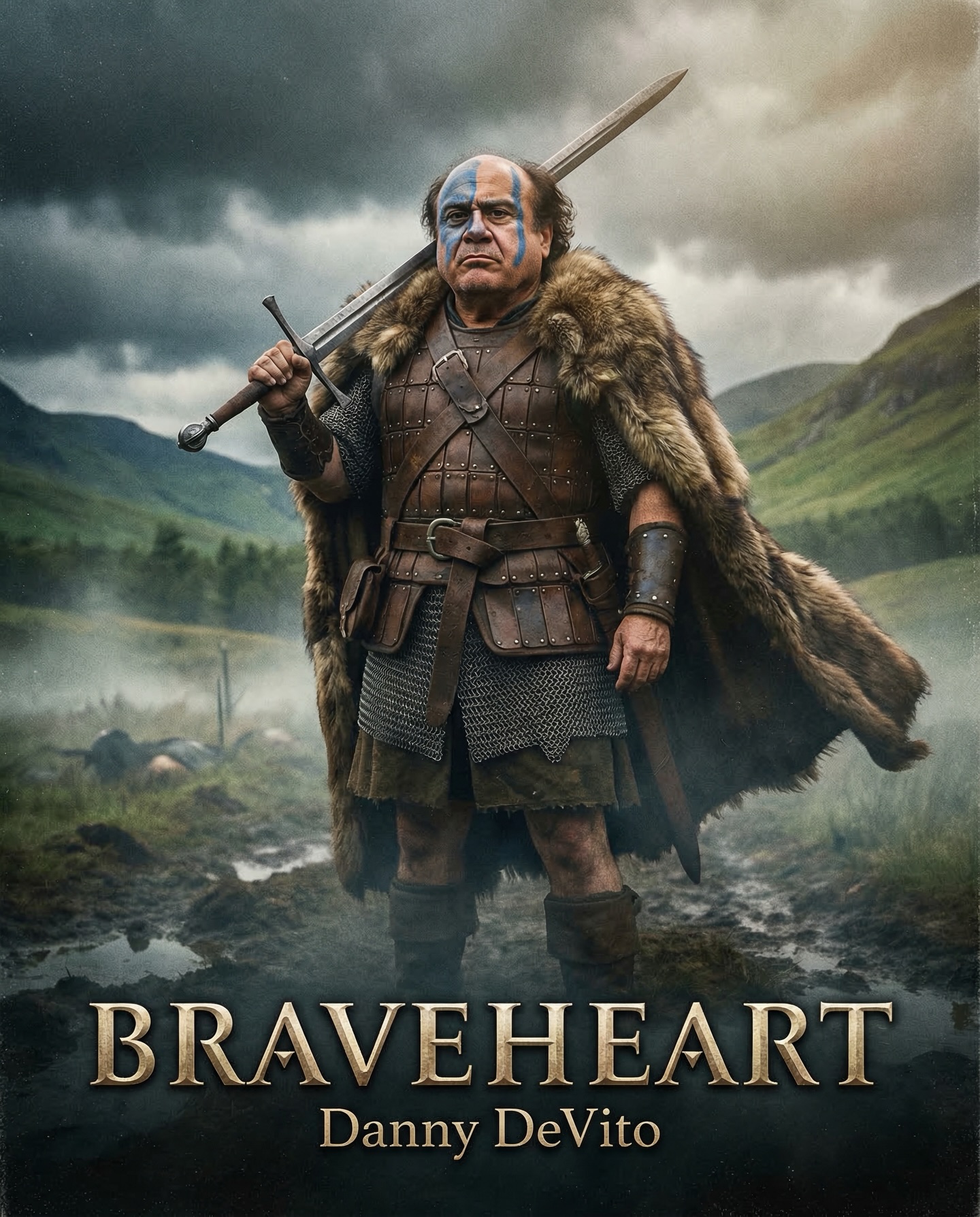
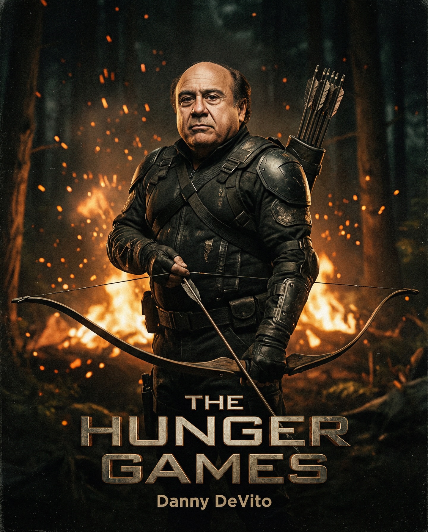
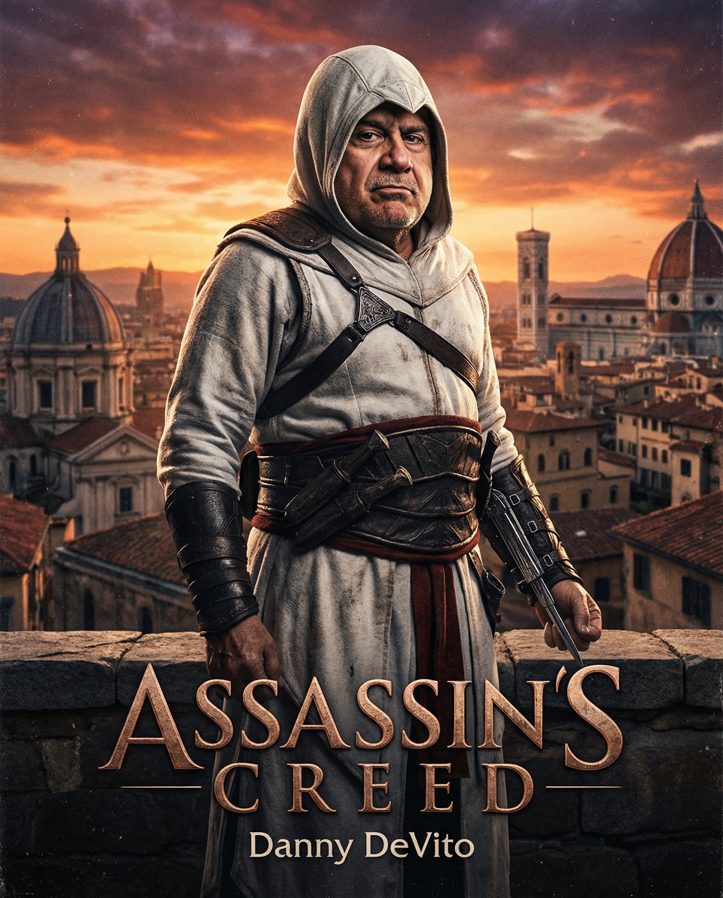
Danny DeVito in different roles Which one is your favorite one? #dannydevito Generated with Nano Banana Pro from @syntx_ai and @syntx_creators Syntx brings 90+ top AI tools into one simple interface, saving time and money
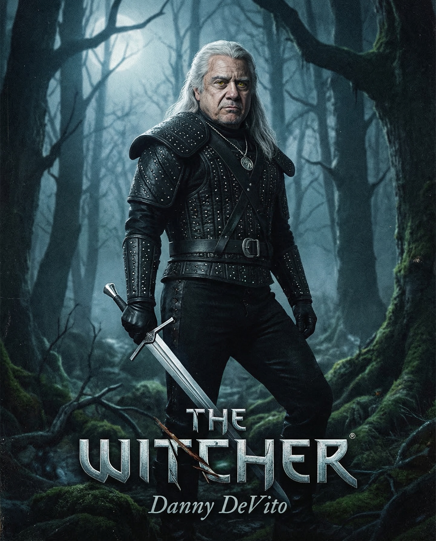
This image succeeds because it understands a basic truth about parody and fan casting: the joke lands hardest when the world around it is fully serious. If this were just Danny DeVito in a gray wig, the idea would fade quickly. Instead, the poster commits to the complete Witcher grammar: wet forest atmosphere, black studded armor, white hair, silver sword, wolf medallion, and the heavy metallic title at the bottom. That seriousness is what makes the casting twist enjoyable.
For creators, this is a valuable lesson in tonal discipline. Humor does not always come from exaggeration. Sometimes it comes from perfect sincerity wrapped around an absurd premise. The more polished the fantasy frame becomes, the more entertaining the mismatch at its center feels.
The first reason this image spreads is instant contrast. Danny DeVito is culturally familiar in a very different register from Geralt of Rivia. One reads as iconic comedic personality, the other as stoic fantasy archetype. Merging those two energies creates immediate curiosity, and curiosity is exactly what makes people stop and share.
The second reason is genre fidelity. The image does not ask viewers to do much interpretive labor. They can identify The Witcher world almost immediately through the white hair, black armor, sword, and dead forest atmosphere. Fast genre recognition is a huge asset in social content.
The third reason is polish. The frame looks like a real streaming-series campaign poster rather than a low-effort joke. That matters because polished fan-cast images can move through multiple audiences at once: meme culture, fandom culture, and design appreciation culture.
| Signal | Evidence (from this image) | Mechanism | Replication Action |
|---|---|---|---|
| Comedic casting collision | The face clearly evokes Danny DeVito while the costume and world are unmistakably Geralt-coded. | Unexpected casting creates immediate attention and comment energy. | Pick one highly recognizable face and place it inside a role with equally strong franchise coding. |
| Cold fantasy fidelity | The armor, silver hair, forest mist, and sword all feel authentic to The Witcher universe. | Strong world cues make the fan-cast feel complete instead of random. | Use the franchise’s climate, materials, and signature costume language precisely. |
| Official-poster finish | The image includes a metallic title and centered name lockup at the bottom. | Typography transforms the concept from image edit into campaign-like media. | Always finish fan-cast work with title treatment if the goal is movie-poster believability. |
| Single-character isolation | The frame contains one figure alone in the forest with no supporting cast. | Isolation increases iconic clarity and keeps the joke focused. | Reduce ensemble clutter when the casting itself is the hook. |
This structure is ideal for fan-cast posters, franchise remixes, AI entertainment pages, parody posters with genuine craft, and prompt studies in blockbuster visual grammar. It works especially well when the creator wants one image to trigger both humor and admiration for execution.
It is less ideal for original fantasy IP or romantic character portraits, because the image depends heavily on a cultural shortcut. The audience needs to understand both Danny DeVito and The Witcher quickly for the concept to hit at full strength.
Three transfer recipes are especially useful:
{celebrity likeness} as Geralt in {Witcher-poster framing}, with {forest mood}.{celebrity likeness} as {fantasy hero}, wearing {signature armor}, under {mood palette}.{original antihero} in {dark fantasy environment}, holding {weapon}, with {poster title}.The image works aesthetically because it keeps the forest and the armor in the same emotional register. The trees are stripped and harsh, the ground is cold and damp, and the leather armor looks heavy and worn. Nothing in the frame contradicts the world. That consistency is what allows the face-swap joke to sit inside the image without making the whole thing collapse.
The silver hair is doing a lot of work too. It becomes the bridge between the familiar actor face and the Witcher identity. In fan-cast poster design, one transformation element often carries the whole fusion. Here, that element is clearly the hair, backed by the medallion and the armor.
The metallic title at the bottom also finishes the illusion. Without it, the image would still be readable, but it would feel more like costume concept art than streaming-poster key art. Good fan-cast work knows when typography is not optional. This is one of those cases.
| Observed | Recreate evidence |
|---|---|
| Cold, wet atmosphere | Use mist, moss, and blue-gray forest depth instead of generic fantasy scenery. |
| Texture-heavy wardrobe | Let studs, leather, belts, and medallion details signal the franchise through material logic. |
| Transformation anchor | Use one major feature like white hair to fuse celebrity face and role identity. |
| Poster-footer authority | Finish the frame with a metallic franchise title and a centered name line below. |
| Single-character dominance | Keep the figure solitary so the concept remains instantly readable. |
| Prompt chunk | What it controls | Swap ideas (EN, 2–3 options) |
|---|---|---|
| “Danny DeVito merged with Geralt of Rivia in a centered dark-fantasy poster pose” | Locks the core face-role contradiction and poster framing. | “celebrity likeness as Witcher hero” / “unexpected actor as fantasy hunter” / “fan-cast Geralt movie poster” |
| “long white hair, black studded leather armor, wolf medallion” | Defines the franchise-recognition layer. | “white-haired monster hunter armor” / “dark leather fantasy warrior set” / “medallion-led Witcher styling” |
| “silver sword angled down” | Adds role iconography and quiet threat. | “steel blade held low” / “hunter sword at rest” / “downward-angled fantasy weapon” |
| “misty blue-green forest with bare trees” | Creates the grim Witcher atmosphere. | “foggy dark woodland” / “wet haunted forest” / “northern fantasy swamp edge” |
| “THE WITCHER title with Danny DeVito below” | Completes the official-poster illusion. | “metallic fantasy title stack” / “streaming-poster footer text” / “franchise-logo lockup” |
| “realistic dark-fantasy campaign poster” | Keeps the image polished rather than jokey or stylized. | “serious fantasy key art” / “high-finish fan-cast poster” / “premium streaming-series poster realism” |
Lock three things first: the Danny DeVito likeness, the Witcher world cues, and the metallic poster title. Those are the anchors. If one weakens, the image either stops being funny or stops reading as Witcher media.
Use the one-change rule with discipline. A practical four-step sequence might look like this:
This keeps the fan-cast logic coherent while allowing creators to experiment productively.
The main lesson is that the funnier the premise, the more disciplined the execution needs to be. When the image quality is high, the viewer gets both the gag and the fantasy. That dual effect is much more valuable than either one alone.
For creators building fan-cast prompt pages, cinematic AI showcases, or entertainment moodboards, this is a very useful reference. It shows how to make a ridiculous idea feel strangely premium through costume accuracy, atmosphere, and poster grammar. That is a skill worth studying.