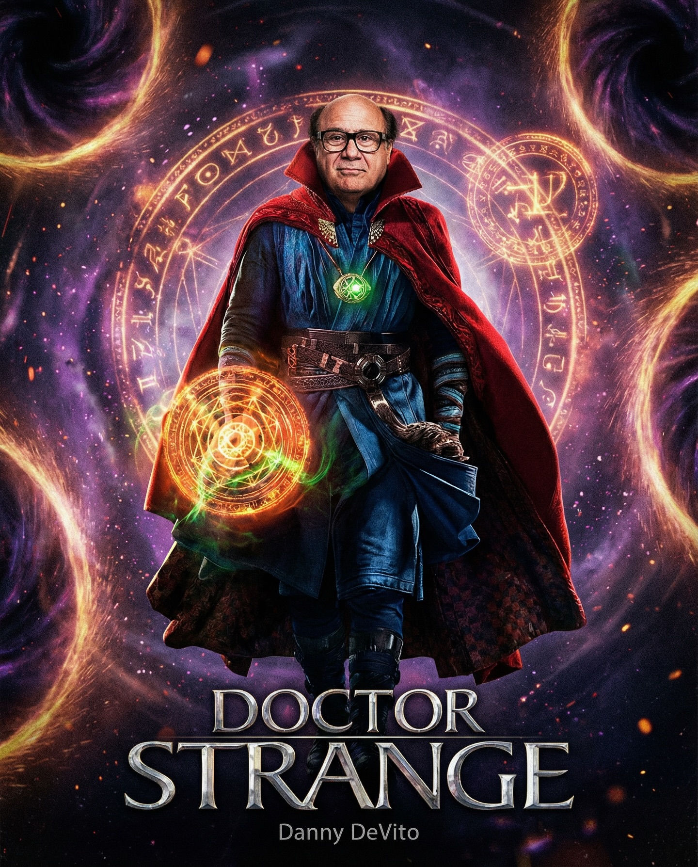

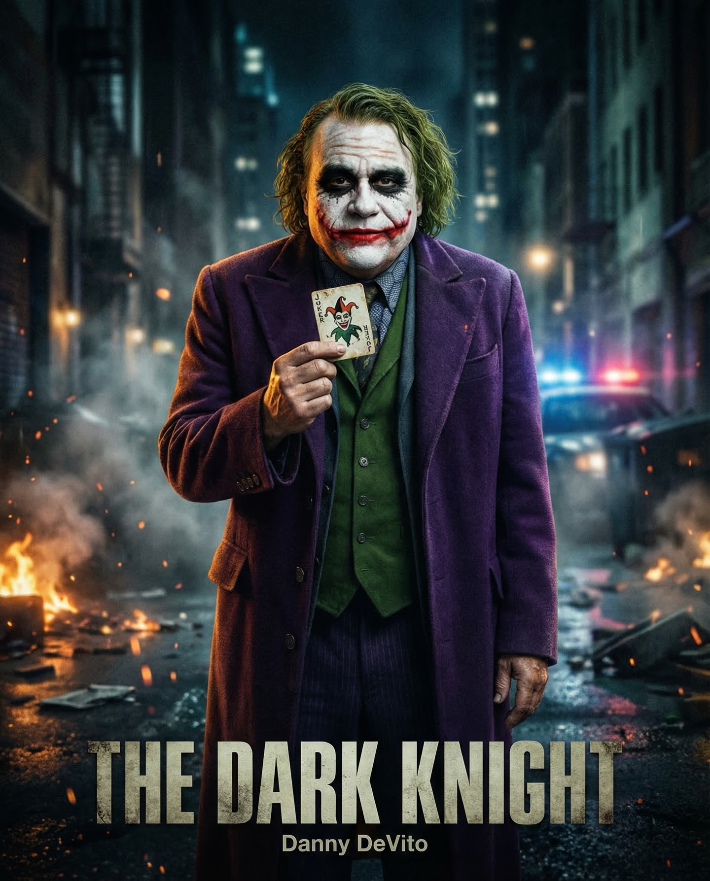
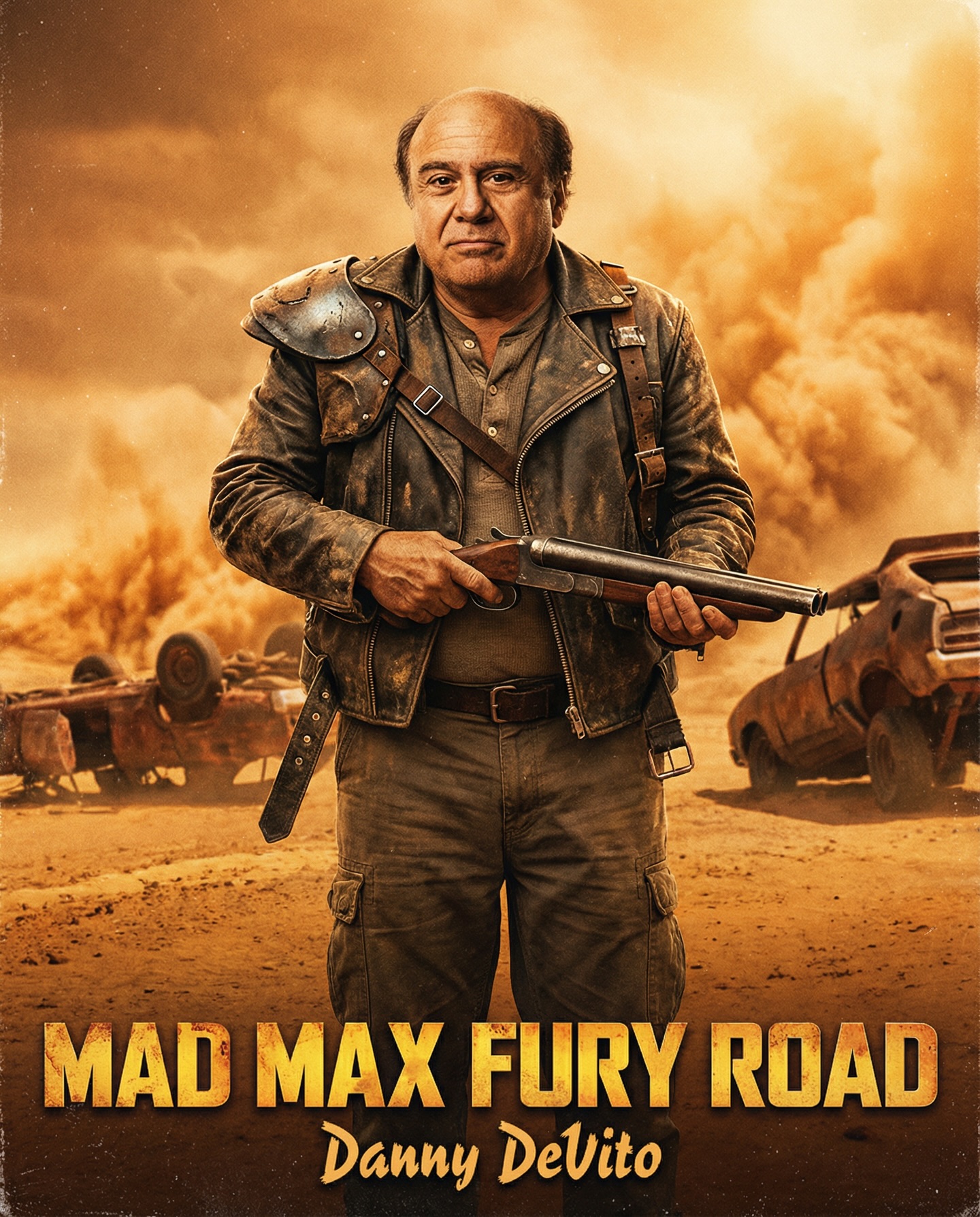
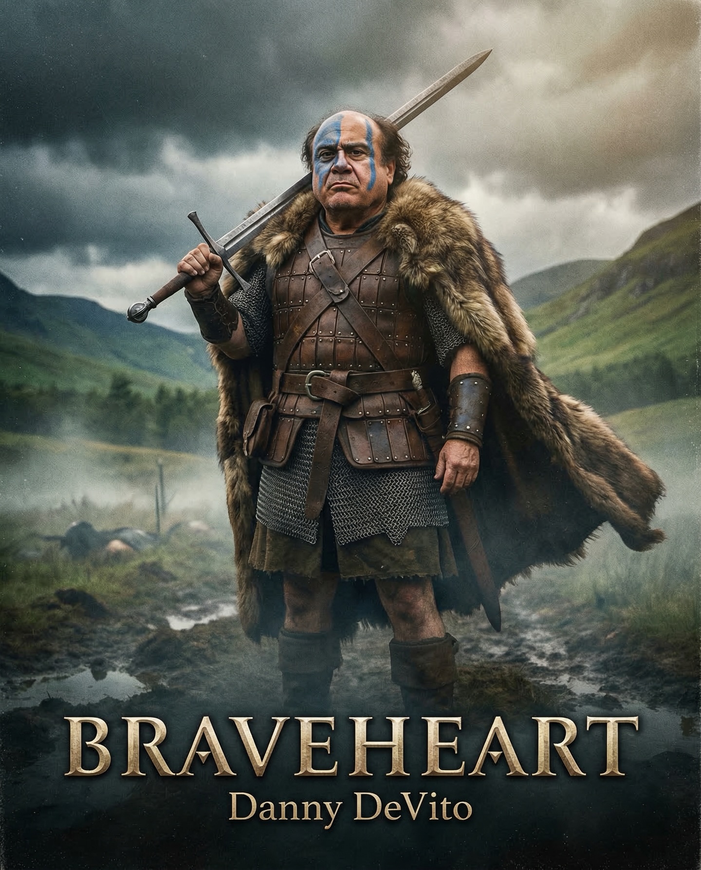
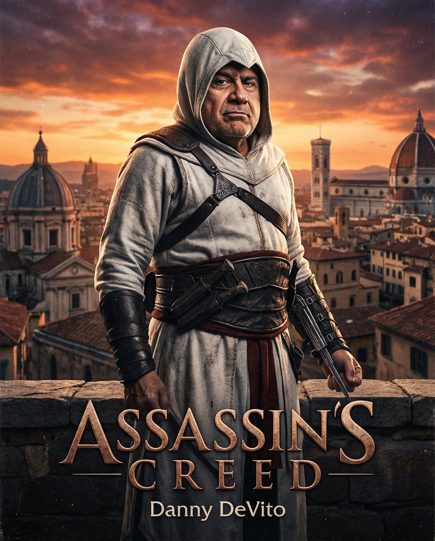
Danny DeVito in different roles Which one is your favorite one? #dannydevito Generated with Nano Banana Pro from @syntx_ai and @syntx_creators Syntx brings 90+ top AI tools into one simple interface, saving time and money
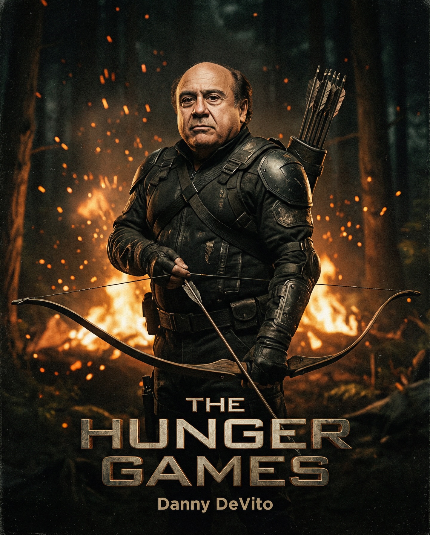
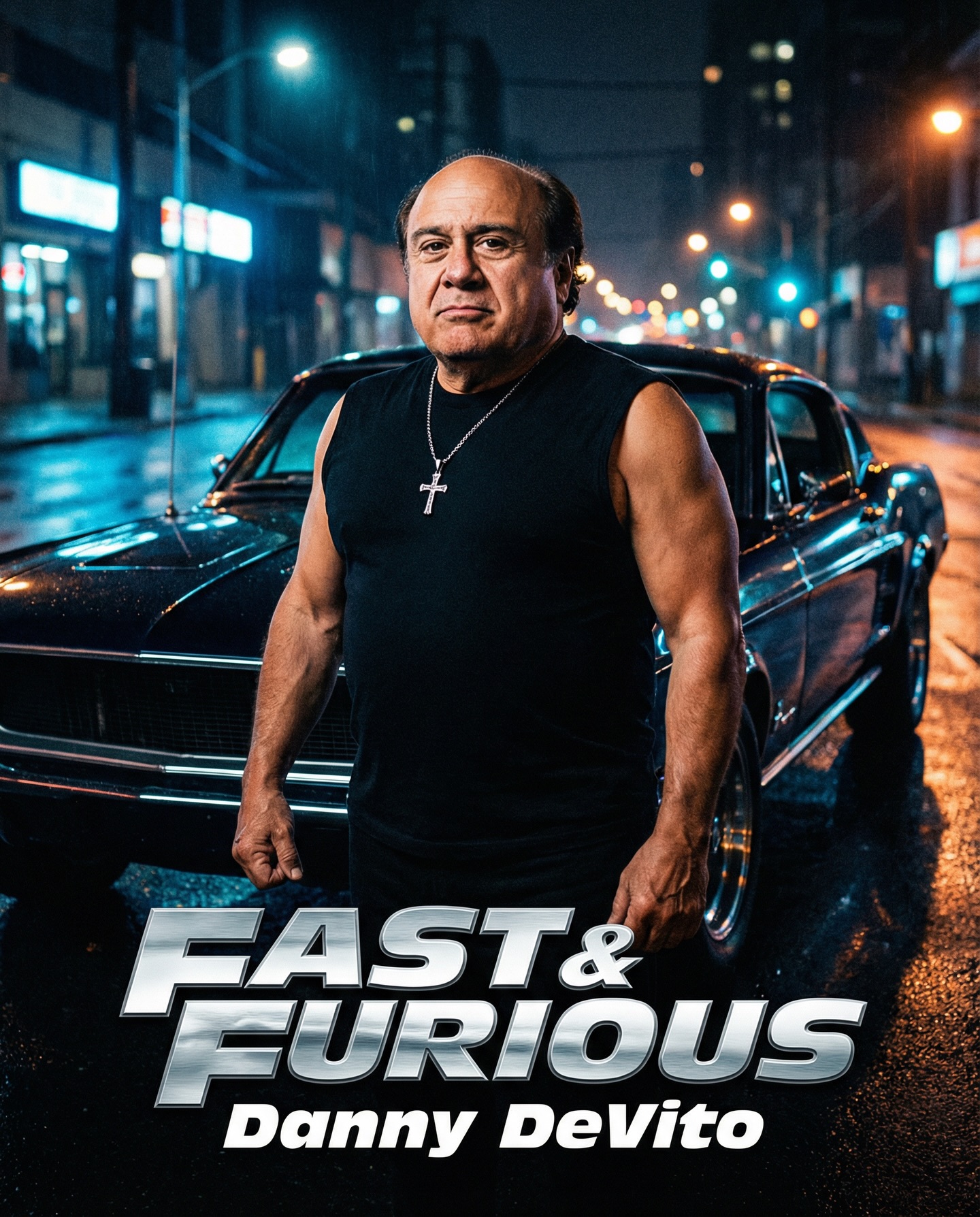
Danny DeVito in different roles Which one is your favorite one? #dannydevito Generated with Nano Banana Pro from @syntx_ai and @syntx_creators Syntx brings 90+ top AI tools into one simple interface, saving time and money
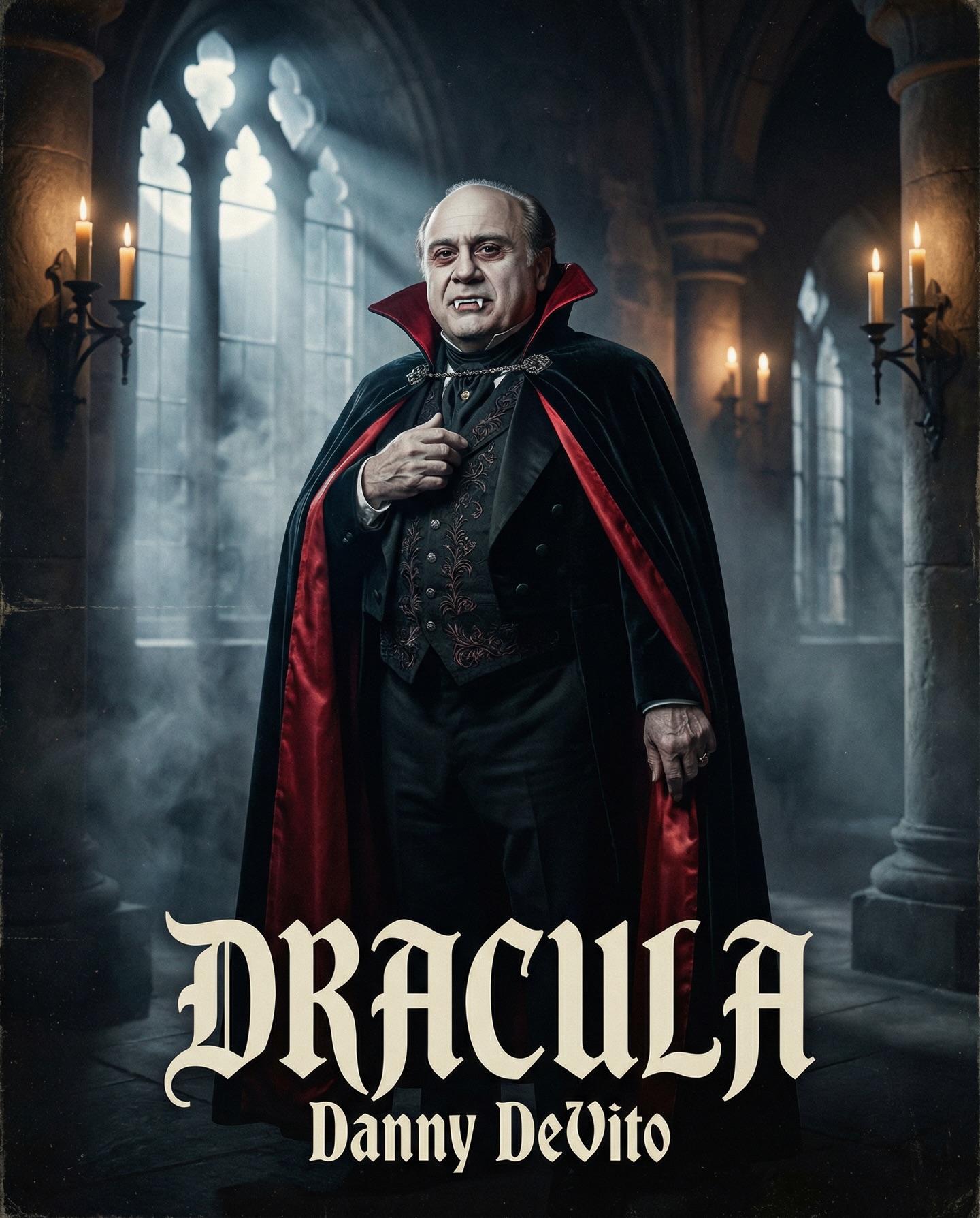
The image succeeds because it treats parody as casting, not as visual chaos. Danny DeVito is the surprise, but everything around him behaves like a legitimate prestige-gothic poster: the stone hall, the pointed windows, the candlelight, the velvet cape, the drifting fog, and the severe full-body stance. That discipline matters. The frame invites you to believe in the movie for a second before the absurdity of the casting catches up to you.
A common mistake in fan-made parody posters is doubling the joke. This image does not do that. It does not give Dracula a silly grin or overload the scene with visual gags. Instead, it stages DeVito with the same solemnity a classic monster campaign would use. That seriousness creates contrast. The viewer laughs because the visual language is so committed, not because the image winks at its own concept too aggressively.
The title treatment at the bottom reinforces that effect. The typography, the centered stance, and the symmetrical architecture all work together like real key art. Structurally, the frame understands what a horror one-sheet is supposed to feel like. That is the foundation of the humor.
| Signal | Evidence (from this image) | Mechanism | Replication Action |
|---|---|---|---|
| Prestige-horror sincerity | Severe expression, cathedral hall, moody fog, moonbeams | Genre seriousness makes the unusual casting funnier and more convincing | Write the prompt as if you are making a real gothic horror poster first, then add the parody actor |
| Iconic Dracula coding | Black cape, crimson lining, fangs, aristocratic tailoring | Traditional vampire symbols let the concept read instantly | Use classic Dracula wardrobe cues instead of inventing a new costume language |
| Architectural authority | Pointed windows, columns, symmetrical hall depth | Background structure adds ceremonial grandeur and old-world menace | Prompt for readable gothic geometry, not just “dark castle interior” |
| Controlled tonal contrast | Warm candles against cold moonlight | Temperature contrast adds depth and avoids flat monochrome gloom | Pair blue-gray window light with restrained amber practical light sources |
| Observed Style Choice | Why It Works | How to Recreate It |
|---|---|---|
| Full-body centered stance | Makes the figure feel theatrical and poster-worthy | Use a symmetrical one-sheet layout with the character planted firmly in the center |
| Velvet cape with red lining | Delivers instant Dracula identity and strong shape contrast | Call out both the black exterior and crimson interior so the cape carries visual drama |
| Thin low fog | Adds atmosphere without hiding the tailoring | Keep mist near the floor and around the legs rather than swallowing the whole set |
| Cathedral-style windows | Turns the environment into a genre signal rather than generic darkness | Specify pointed-arch gothic windows with moonlight beams cutting through haze |
| Prompt Layer | Purpose | Practical Writing Advice |
|---|---|---|
| Likeness layer | Anchors the parody casting | Define the facial structure and body type early so the celebrity swap remains recognizable |
| Monster layer | Locks the character into Dracula territory | Use aristocratic vampire cues like fangs, velvet cape, high collar, and formalwear |
| Architecture layer | Creates gothic authority and mood | Describe windows, columns, stone corridor depth, and candle placement explicitly |
| Lighting layer | Shapes the horror atmosphere | Pair cold moonbeams with warm candle accents to keep the face and cape readable |
| Poster layer | Transforms the image from portrait into campaign art | Reserve lower space for title treatment and keep the background symmetrical and uncluttered |
The main failure mode for this kind of image is tonal cheapness. If the costume starts to look like Halloween cosplay or the expression becomes too goofy, the concept collapses. Resist the temptation to overplay the joke. Let the actor stand in the frame with dignity. The straighter the performance, the stronger the parody.
A second failure mode is muddy horror lighting. Many gothic prompts turn into shapeless dark mush. Prevent that by requesting readable moonbeams, controlled fog, and selective candle warmth. Horror posters need structure as much as mood. Darkness is not enough by itself.
The best parody posters are built with the same craft as serious ones. This image works because it respects that rule. It is funny, but it also understands silhouette, atmosphere, lighting hierarchy, and genre tradition. That combination is what makes it feel shareable and oddly believable.