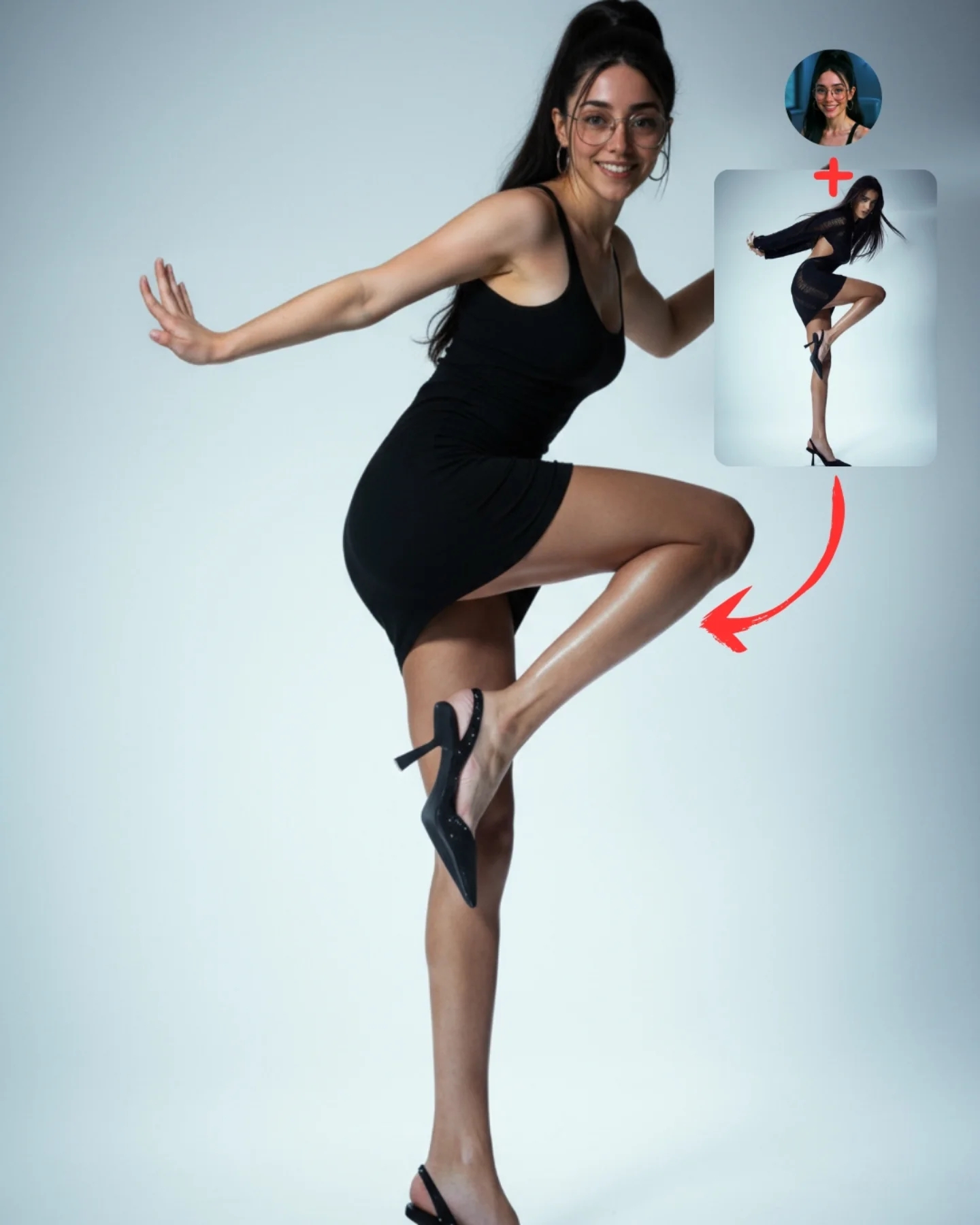
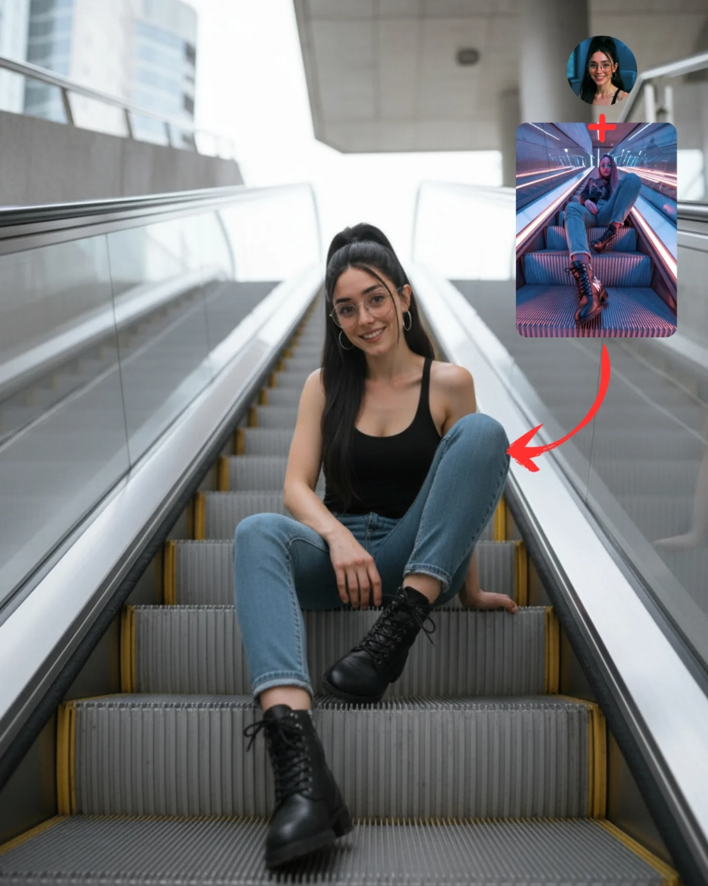
Transfiere Poses a tu Influencer IA 💕
A veces es muy complicado conseguir la pose que buscas y por eso, esta vez, me propuse averiguar cómo copiar una pose de una imagen de internet 🙊
Tras muchos intentos diseñé un Prompt Base que funciona 🧪
Cómo usarlo:
1️⃣ Imagen 1 = tu foto o la de tu influencer IA.
2️⃣ Imagen 2 = la pose que quieres recrear.
3️⃣ Genera en Nano-Banana y haz 4–8 intentos para elegir el mejor resultado.
Si quieres el Prompt Base comenta "ARIA" y te lo paso 💌
Mañana os subo un mini-vídeo con todo el paso a paso ✨
Workflow poster breakdown
How soy_aria_cruz Made This AI Pose Transfer Demo AI
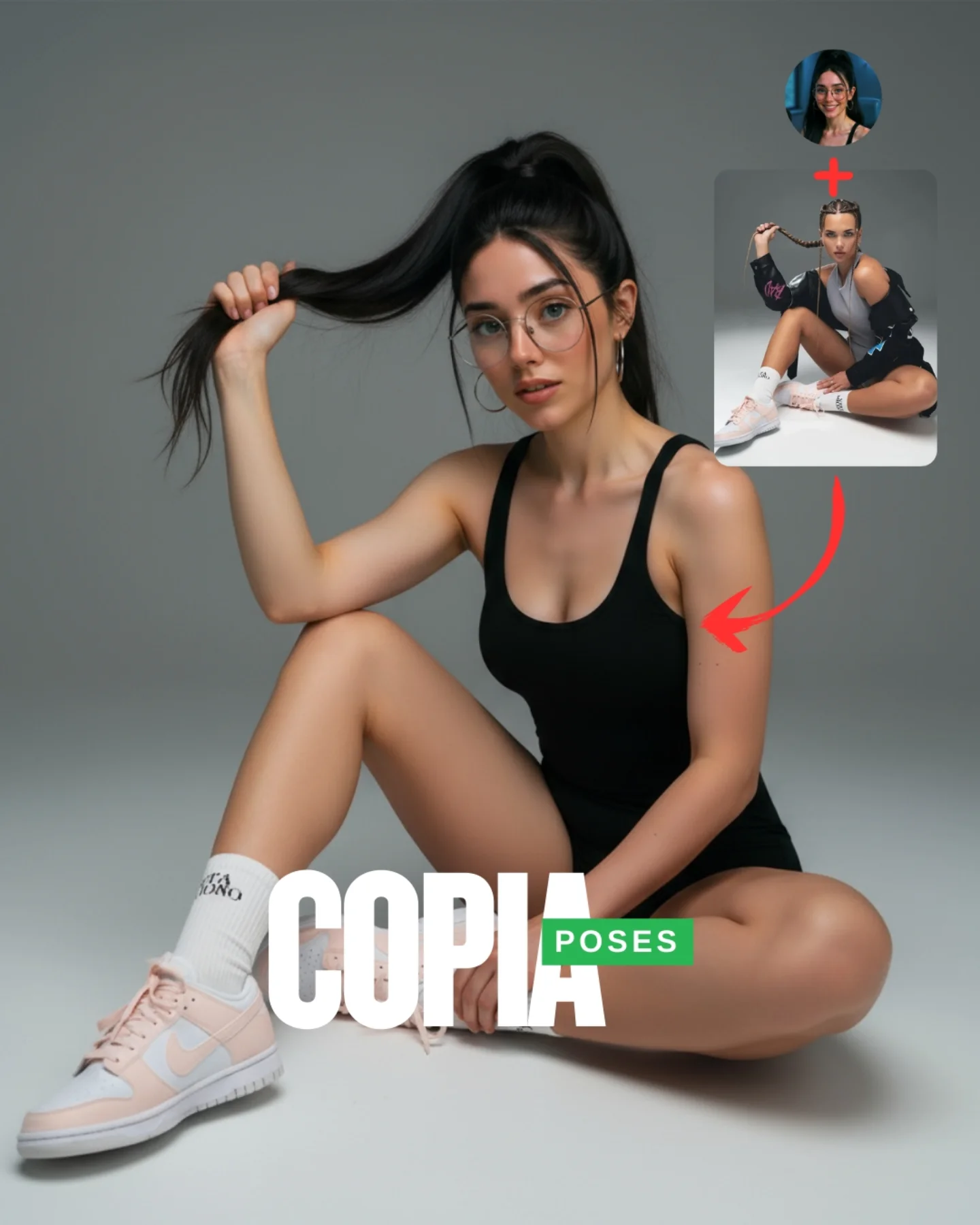
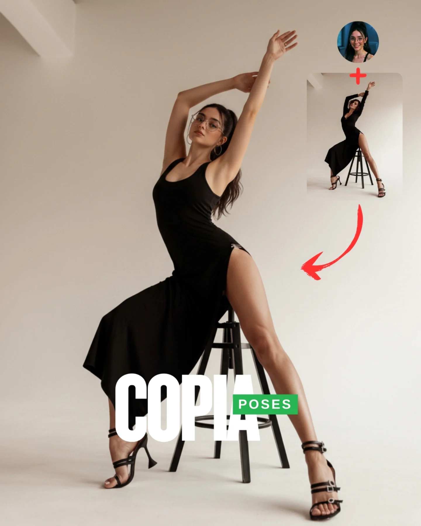
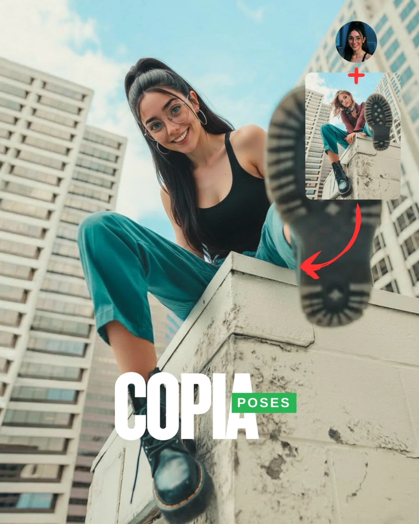
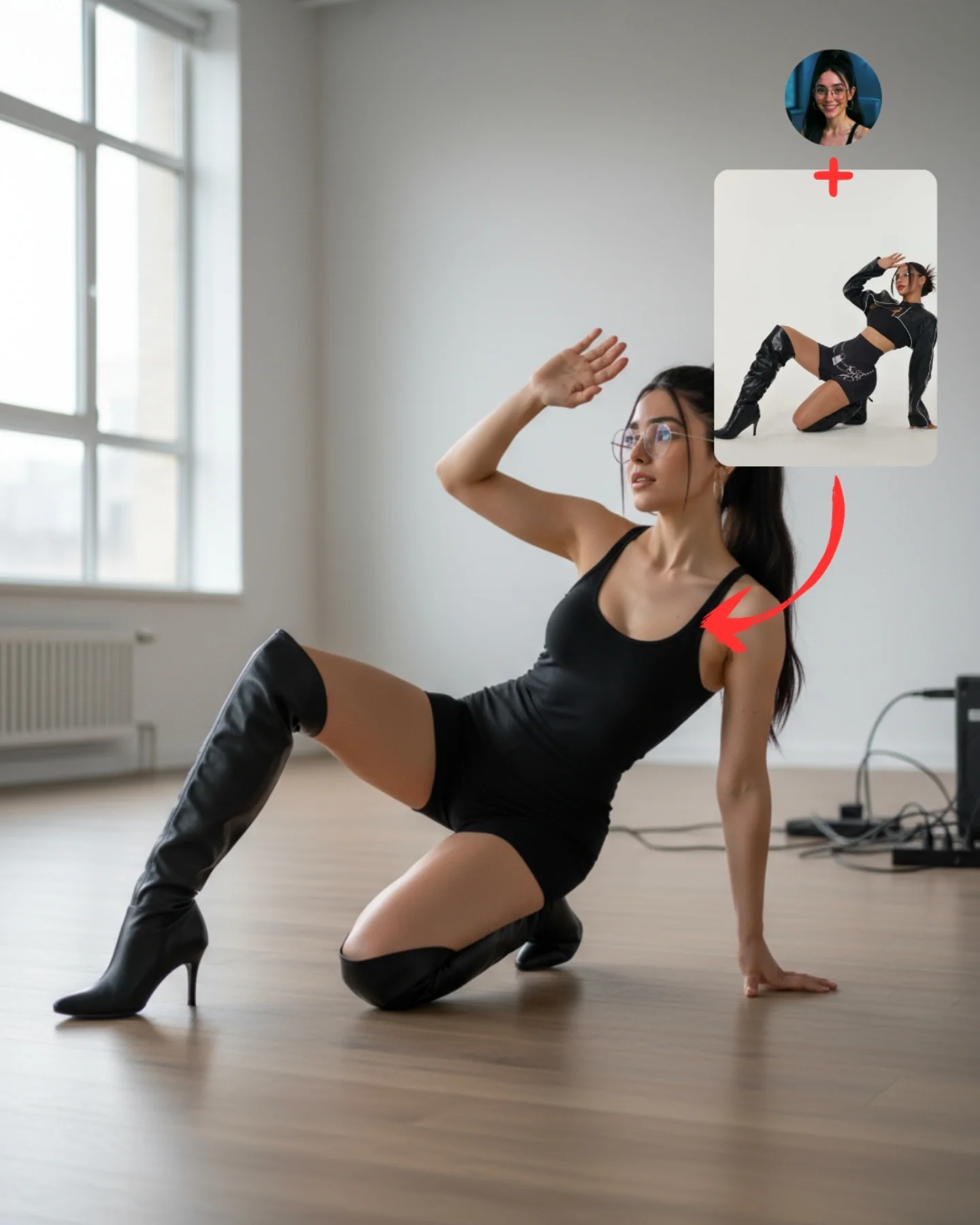
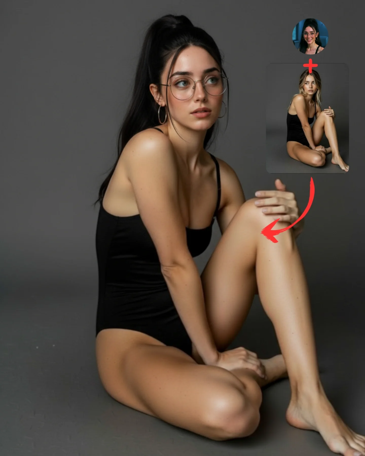
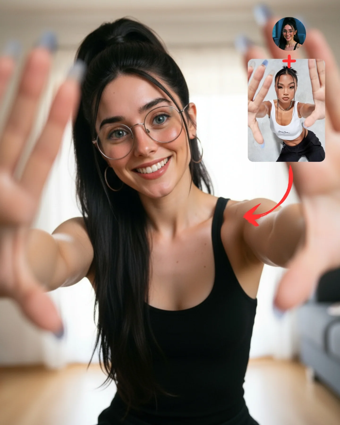
This image is not a standard portrait and it should never be prompted like one. It is an explainer graphic disguised as a stylish full-body image. The main value comes from the relationship between three things: the source identity, the borrowed reference pose, and the final transformed output. That is why the circular headshot, the pose inset, the red plus sign, and the curved arrow are not decoration. They are the entire logic of the post.
What makes the piece effective is that it solves a communication problem visually. Instead of writing paragraphs about identity preservation and pose transfer, it shows the mechanism in one frame. The face says “this is the same person,” the inset says “this is the motion reference,” and the hero figure says “this is the synthesized result.” Good AI workflow imagery works exactly like this: it reduces explanation cost and increases shareability.
Why This Works
The first reason it works is structural clarity. A lot of prompt demo posts fail because they are just before-and-after images with weak logic. This one is better because it uses a mini diagram. The plus sign introduces combination, the arrow indicates transformation, and the final image resolves the concept. Even at small size, the viewer understands the intended narrative path.
The second reason it works is identity continuity. The main figure and the circular headshot clearly belong to the same character: same glasses, same hair, same facial proportions, same creator-coded styling. That continuity is critical. Without it, the viewer cannot believe the transfer. A pose-transfer demonstration only works if the preserved identity remains obvious.
The third reason it works is contrast between the references and the output. The inset pose card shows a fashion pose that is aspirational and stylized. The main figure then translates that energy into a cleaner, more readable studio hero pose. This gives the post both instructional value and aesthetic appeal.
The fourth reason it works is background restraint. A flat studio backdrop keeps attention on the transformation logic. Any extra room detail would weaken the teaching function of the image. Educational social graphics benefit from ruthless simplification.
Signal Table
Signal
What it communicates
Why it matters
Circular headshot inset
Source identity
Anchors face continuity across the transformation
Pose reference card
Borrowed body pose or movement idea
Makes the tutorial logic concrete
Red plus sign
Combination mechanic
Shows that identity and pose are being merged
Curved red arrow
Transformation direction
Guides reading order without text explanation
Full-body hero figure
Final generated output
Provides payoff and visual aspiration
Plain studio background
Instruction-first composition
Prevents visual noise from interfering with understanding
Aesthetic Direction
This image sits between educational graphic design and social-fashion content. It borrows the clean backdrop and body clarity of studio fashion photography, but its true function is tutorial communication. That hybrid identity is important. If it becomes too instructional, it loses share appeal. If it becomes too fashion-driven, it loses explanatory power. The strongest version keeps both: stylish enough to stop the scroll, structured enough to teach.
The character styling also matters. The black dress, glasses, and ponytail are simple enough to preserve continuity across source and output. Complicated wardrobe would make the transfer harder to parse. For workflow posts, recognizable identity signals always outperform ornate styling.
Prompt Technique Breakdown
Technique
How it appears here
Operational benefit
Multi-panel composition control
Main hero plus inset identity and pose panels
Keeps the explanation visible in one image
Identity locking
Glasses, hair, earrings, face shape repeated
Preserves character continuity
Pose translation
Dynamic lifted-knee body shape
Shows the transfer result instead of a static clone
Graphic accent control
Red plus sign and curved arrow
Improves reading order instantly
Background minimization
Plain studio backdrop
Protects the educational hierarchy
Social-first readability
Simple shapes and strong contrast
Makes the post understandable at thumbnail scale
Use Cases
This format is strong for prompt breakdown posts, workflow threads, creator tutorials, AI-course slides, community content, and educational social media assets where visual explanation matters. It is especially useful when you need to show a concept like identity transfer, pose borrowing, face consistency, or reference-based generation in a format people can understand immediately.
It is weaker for luxury portfolio work, pure fashion editorials, or documentary-style realism. Those use cases need immersive imagery, not diagrammatic explanation.
Transfer Recipes
Recipe 1: Face-Swap Demo Version
Keep the same visual architecture, but replace the pose reference card with a target body image and emphasize face continuity. This works when teaching identity replacement workflows instead of pose borrowing.
Recipe 2: Style-Merge Demo Version
Use one inset for the person and one inset for a style reference such as noir lighting, anime rendering, or retro poster texture. Then let the hero figure embody the merged result. The same plus-sign and arrow logic remains effective.
Recipe 3: Educational Carousel Cover Version
Simplify the hero pose, enlarge the insets slightly, and leave more negative space for cover text. This variation is better when the image must act as slide one of a multi-post tutorial.
Execution Playbook
Start by deciding what the image is teaching. In this case, it teaches identity plus pose equals final result. Once that logic is fixed, assign one visual component to each concept. Do not improvise midway. Source identity gets a headshot. Pose gets a reference panel. Transformation gets an arrow. Result gets the largest body figure. The design will feel cleaner immediately.
Then lock identity markers before you worry about beauty. If the face, glasses, hair, or earrings drift, the whole demonstration breaks. After identity is stable, push pose readability. Finally, polish the background, shadows, and graphic accents. That order matters because clarity beats polish in educational visuals.
Summary
The durable lesson is that tutorial visuals perform best when they are built like diagrams with aesthetic discipline. If the viewer can understand the workflow in one glance, the post becomes more teachable, more shareable, and far more useful than a generic attractive portrait.