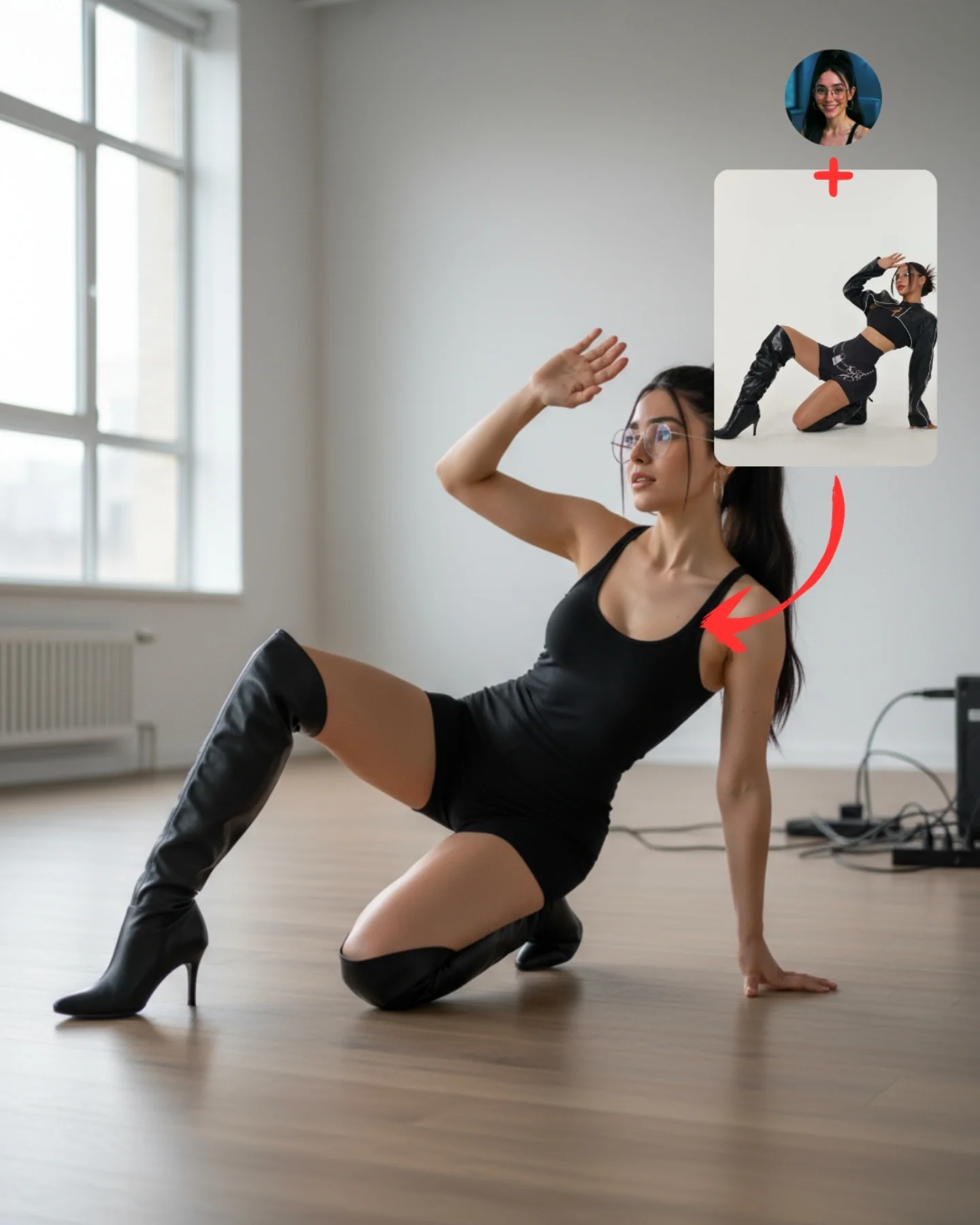
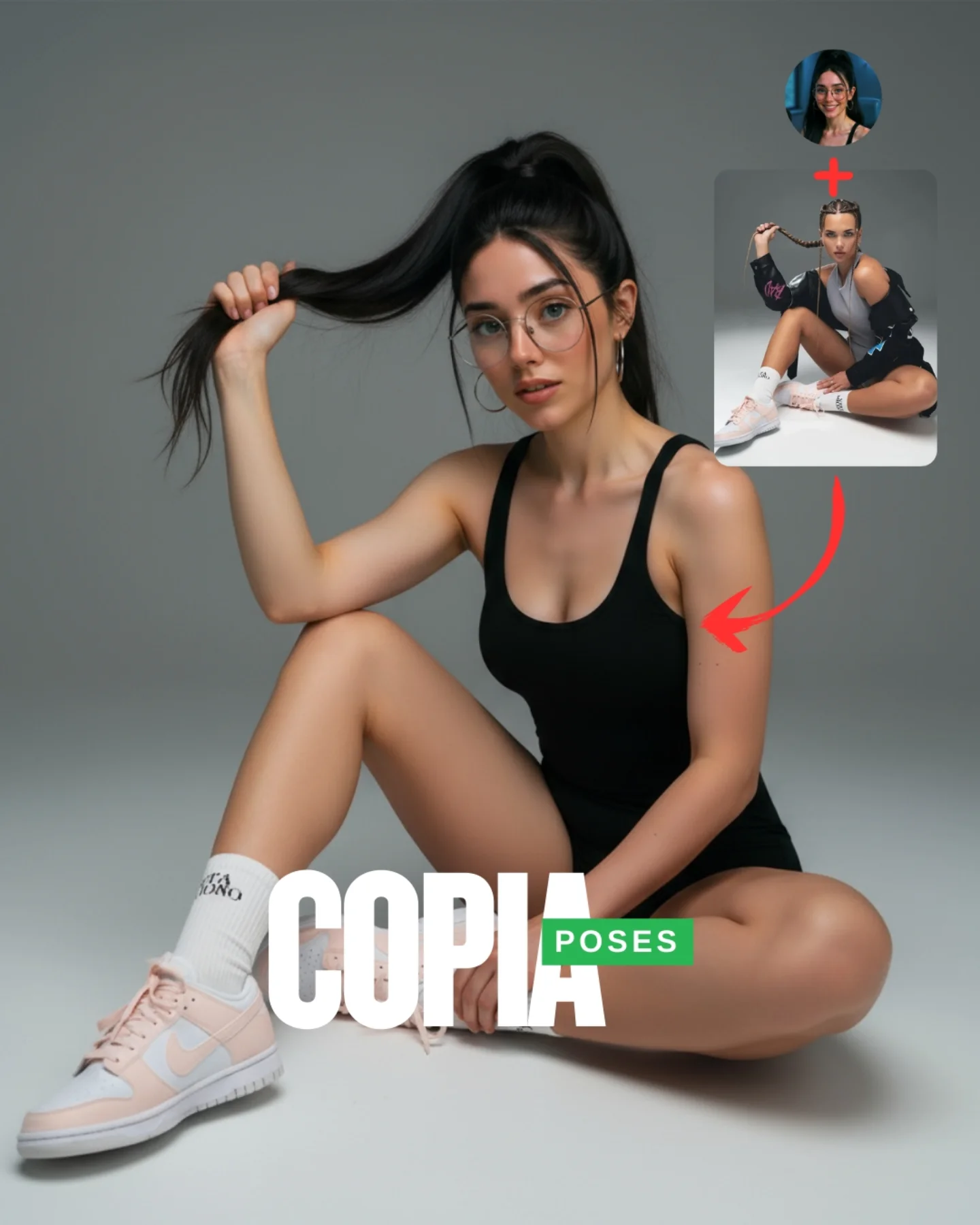
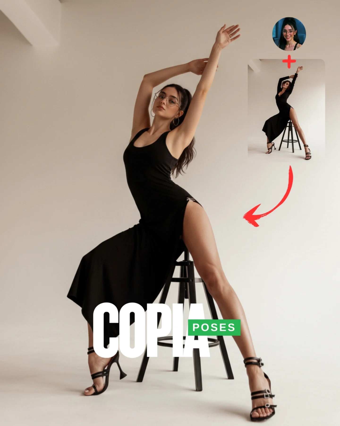
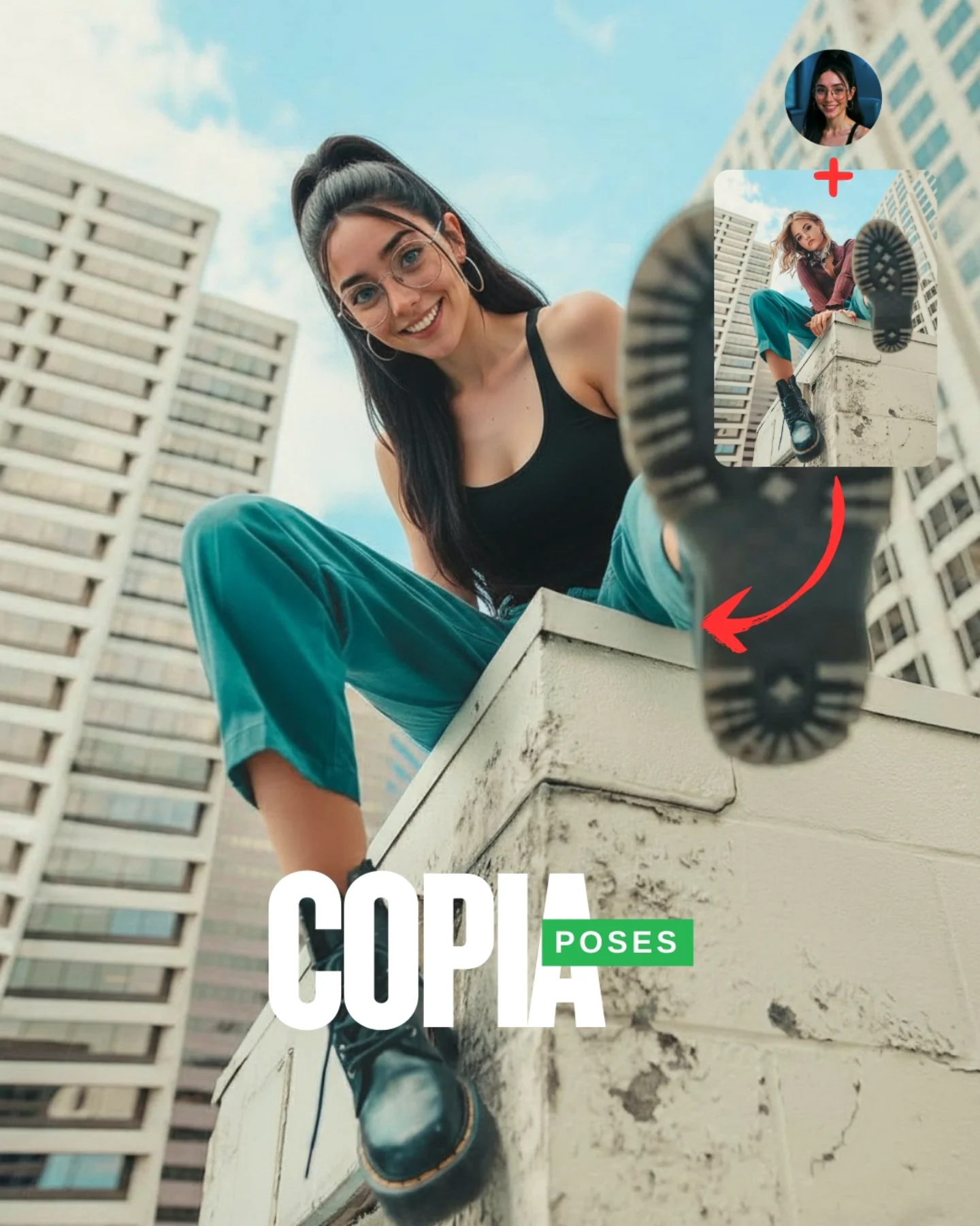
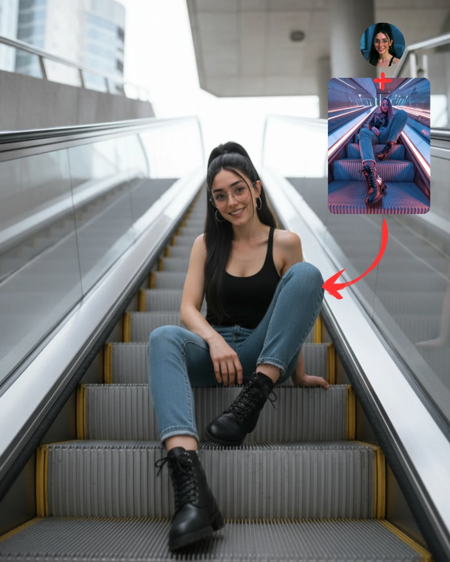
Transfiere Poses a tu Influencer IA 💕
A veces es muy complicado conseguir la pose que buscas y por eso, esta vez, me propuse averiguar cómo copiar una pose de una imagen de internet 🙊
Tras muchos intentos diseñé un Prompt Base que funciona 🧪
Cómo usarlo:
1️⃣ Imagen 1 = tu foto o la de tu influencer IA.
2️⃣ Imagen 2 = la pose que quieres recrear.
3️⃣ Genera en Nano-Banana y haz 4–8 intentos para elegir el mejor resultado.
Si quieres el Prompt Base comenta "ARIA" y te lo paso 💌
Mañana os subo un mini-vídeo con todo el paso a paso ✨
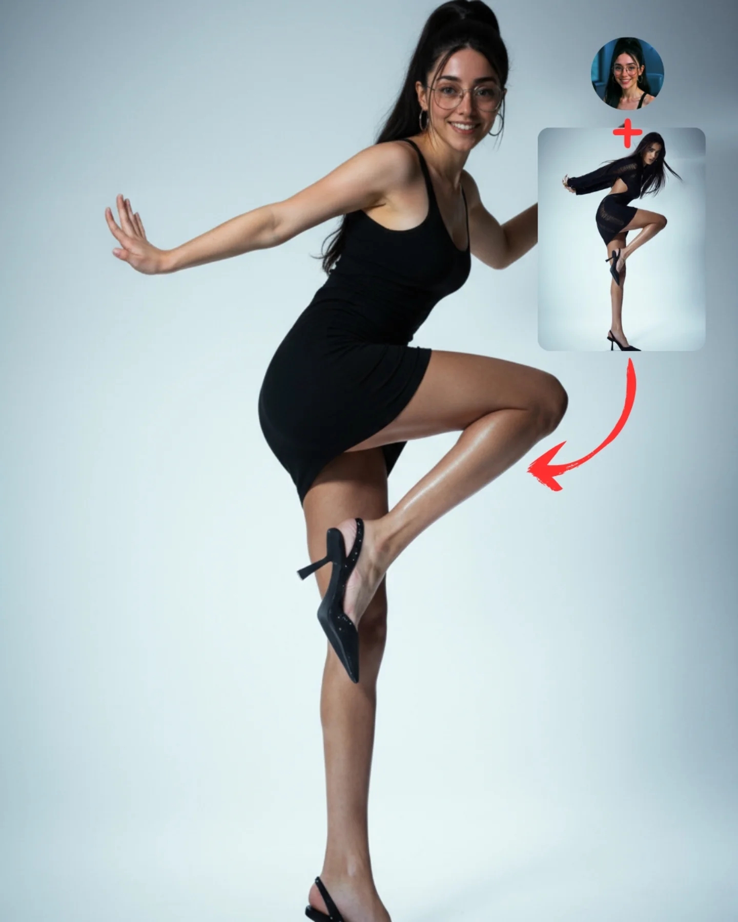
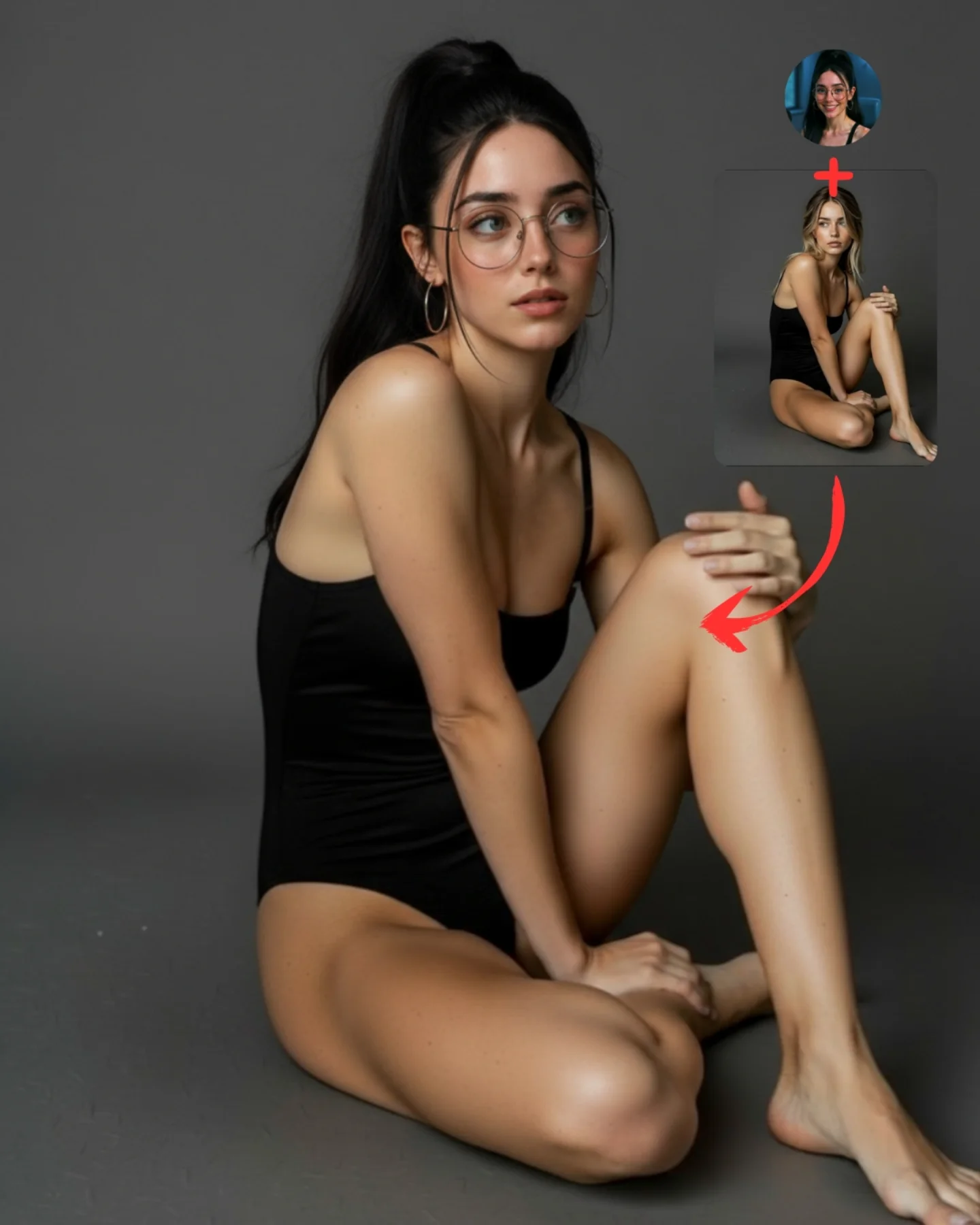
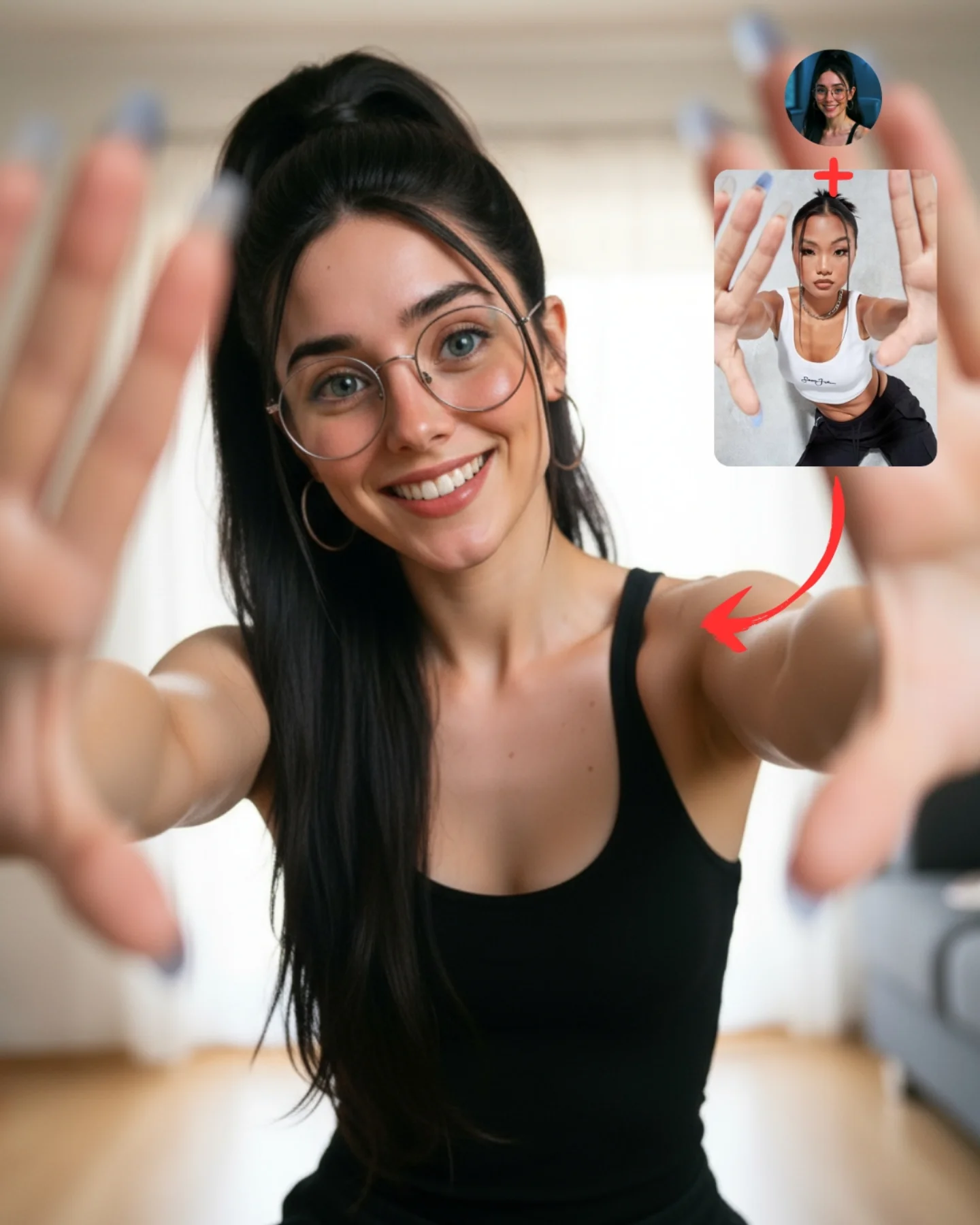
How soy_aria_cruz Made This Floor Pose Transfer Demo AI
This image works because the pose is clearly stylized but still readable. The body is low to the floor, one arm supports the weight, one hand lifts near the forehead, and the legs create a strong directional line. That makes the transfer easy to verify. For tutorial content, that matters more than pure beauty. The audience needs to see immediately that a specific pose reference has been translated into a believable final result.
The room choice is also smart. A bright, nearly empty interior gives the pose enough space to read without clutter. The left-side window explains the light, the wood floor grounds the body in a real room, and the small cables in the back keep the image from feeling too sterile. In other words, the setting stays useful without competing with the lesson. That is exactly the balance a good tutorial cover should aim for.
The top-right inserts do the rest of the educational work. One reference protects identity. The other reference explains the pose source. The arrow makes the logic unmistakable. This is what makes the cover high-functioning content rather than just a good image. It tells the viewer not only what was made, but how to think about making it.
Signal
Evidence (from this image)
Mechanism
Replication Action
Readable pose geometry
Floor-seated body line, bracing arm, lifted hand, extended leg
Lets viewers verify that transfer actually happened
Pick poses with a strong silhouette before trying to transfer them
Visible workflow
Face reference, pose reference, and red arrow appear in one frame
Reduces explanation cost and increases tutorial clarity
Always show identity source and pose source on the cover when teaching the method
Low-noise environment
Bright empty room with just enough real-world detail
Keeps the scene believable while prioritizing the pose
Use minimal environments when body position is the main lesson
Best-fit use cases
Pose-transfer tutorials, because the body arrangement is visually distinct and easy to compare.
Educational carousel covers, because the image explains the workflow quickly.
Model capability tests, because floor contact and body support expose weak outputs fast.
Creator SEO pages, because the frame offers both an end result and a process clue.
Less ideal: location-led storytelling, crowded scene generation, or mood-first editorial campaigns. This structure is for instruction and verification.
To adapt it, keep the reference corner, the clear silhouette, and the bright simple room. Then change the pose family or the object relationship. The same logic can teach chair poses, bench poses, kneeling poses, or leaning-against-wall poses. Slot template: {final pose result} + {identity reference} + {pose reference} + {clear arrow cue} in a {minimal believable room}.
Aesthetic read
The image succeeds aesthetically because it is calm even while the pose is dynamic. The room is pale, the light is soft, and the palette stays narrow. That means the viewer can focus on gesture rather than spectacle. For creators, this is a useful reminder that tutorial images do not need to be loud. They need to be legible.
The contrast between the bright room and the dark outfit also helps the body line stand out. That makes the pose easier to read at a glance, which is especially important for social feeds. If the silhouette is the point, tonal separation is one of the simplest ways to make the lesson stronger.
Observed
Why it matters
Bright left window with soft daylight
Explains the lighting naturally and keeps the room believable
Dark outfit against pale room and floor
Makes the pose silhouette easier to read
Reference boxes in the top-right corner
Turn the image into a self-explaining workflow
Floor contact points clearly visible
Help viewers judge whether the transferred pose is stable
Minimal background clutter
Keeps attention on the pose itself
Prompt technique breakdown
Prompt chunk
What it controls
Swap ideas (EN, 2–3 options)
same face source plus separate floor-pose reference
Core transfer workflow
identity source plus chair pose, face source plus standing pose, character source plus wall lean
bright minimal room with wooden floor and left window
Scene clarity and believable context
white studio loft, pale rehearsal room, empty daylight apartment
seated floor pose with one hand supporting the body and one hand raised
Silhouette distinctiveness
cross-leg seated pose, reclined side pose, bent-knee kneeling pose
black fitted outfit and knee-high boots
Strong tonal separation and readable body line
dark athleisure set, monochrome loungewear, simple denim-and-tee styling
Lock these three things first: the reference-box workflow, the silhouette clarity, and the simple daylight room. Those are the identity anchors. Then change only one or two variables per run.
Baseline run: keep the same room and pose structure until the body placement reads as stable and believable.
Second run: keep the layout but change only the pose family to compare which floor poses transfer most reliably.
Third run: keep the pose logic and change only the environment shell, for example from bright room to studio or rehearsal space.
Fourth run: keep the whole tutorial structure and apply it to another body-control lesson, such as hand placement or seated balance.
If the image starts failing, the first thing to inspect is usually not the face. It is the support logic: how the hand meets the floor, how the hips sit in space, and whether the extended leg still feels naturally anchored.