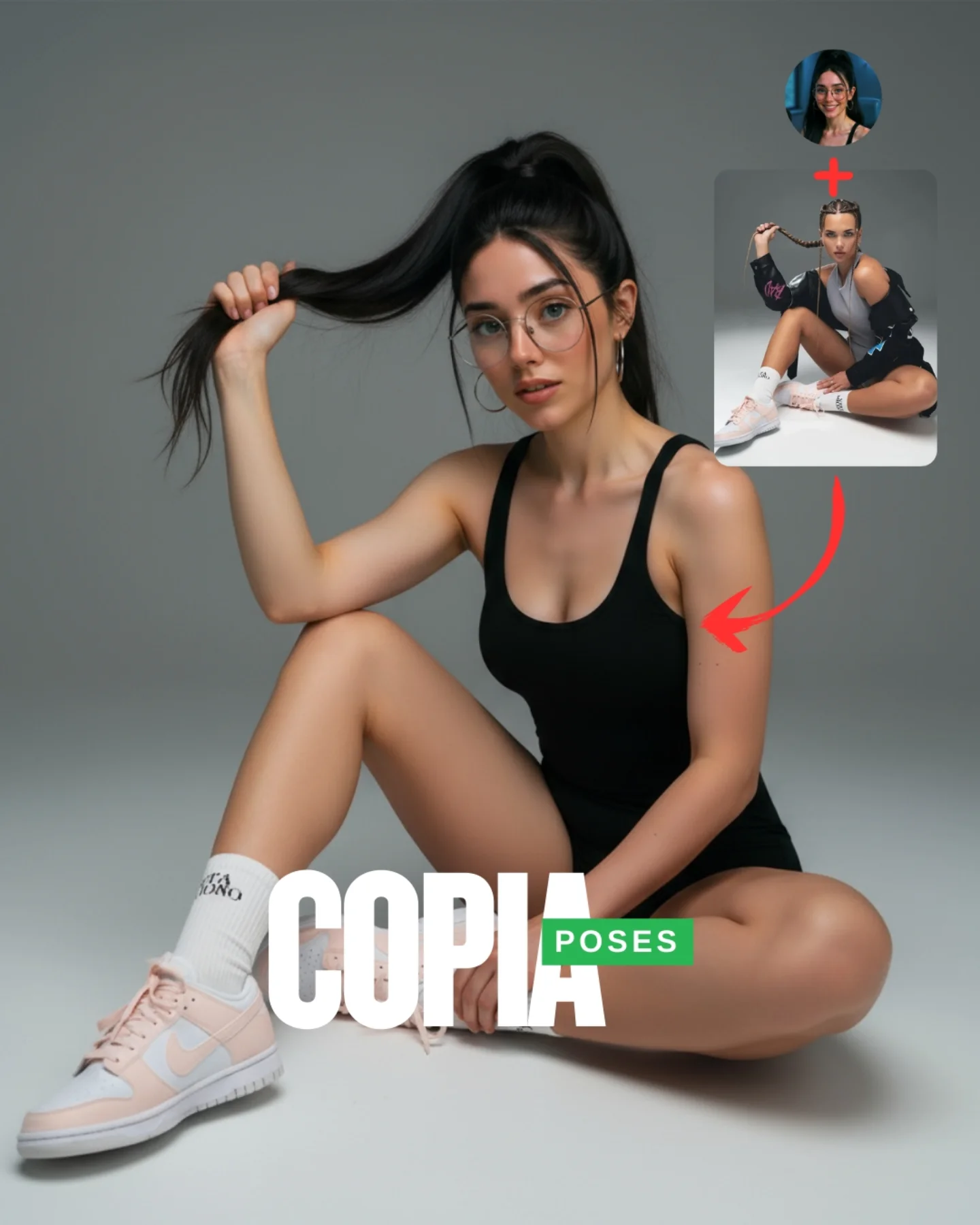
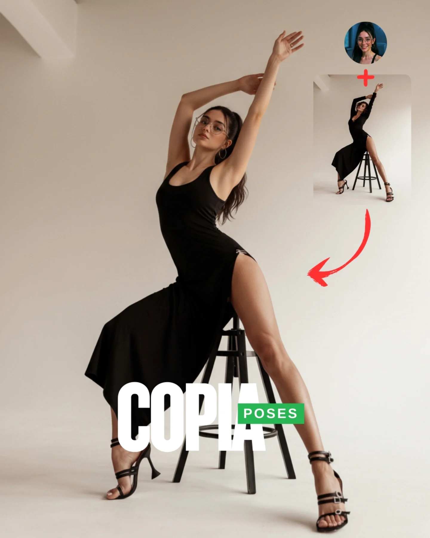
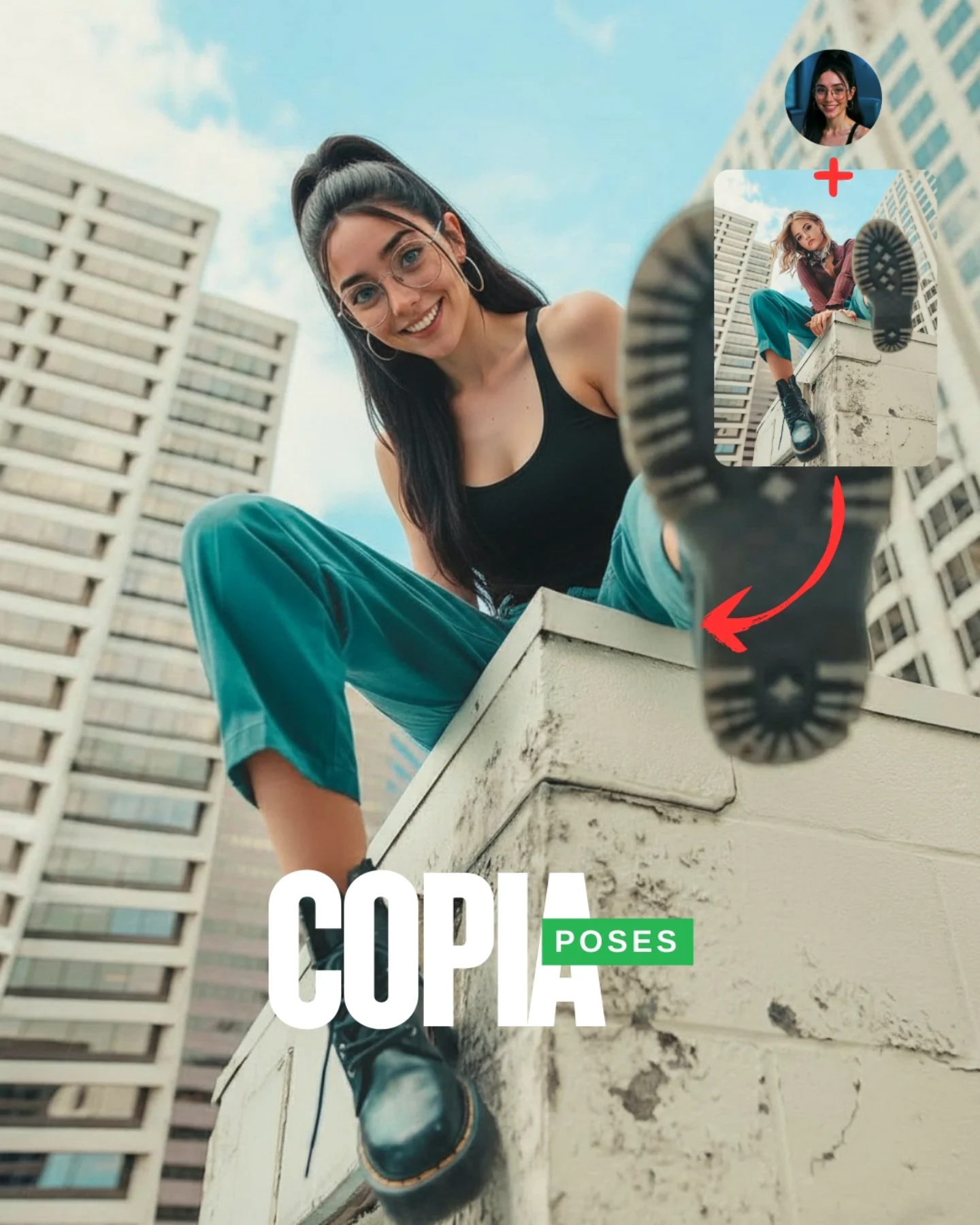
Transfiere Poses a tu Influencer IA 💕
A veces es muy complicado conseguir la pose que buscas y por eso, esta vez, me propuse averiguar cómo copiar una pose de una imagen de internet 🙊
Tras muchos intentos diseñé un Prompt Base que funciona 🧪
Cómo usarlo:
1️⃣ Imagen 1 = tu foto o la de tu influencer IA.
2️⃣ Imagen 2 = la pose que quieres recrear.
3️⃣ Genera en Nano-Banana y haz 4–8 intentos para elegir el mejor resultado.
Si quieres el Prompt Base comenta "ARIA" y te lo paso 💌
Mañana os subo un mini-vídeo con todo el paso a paso ✨
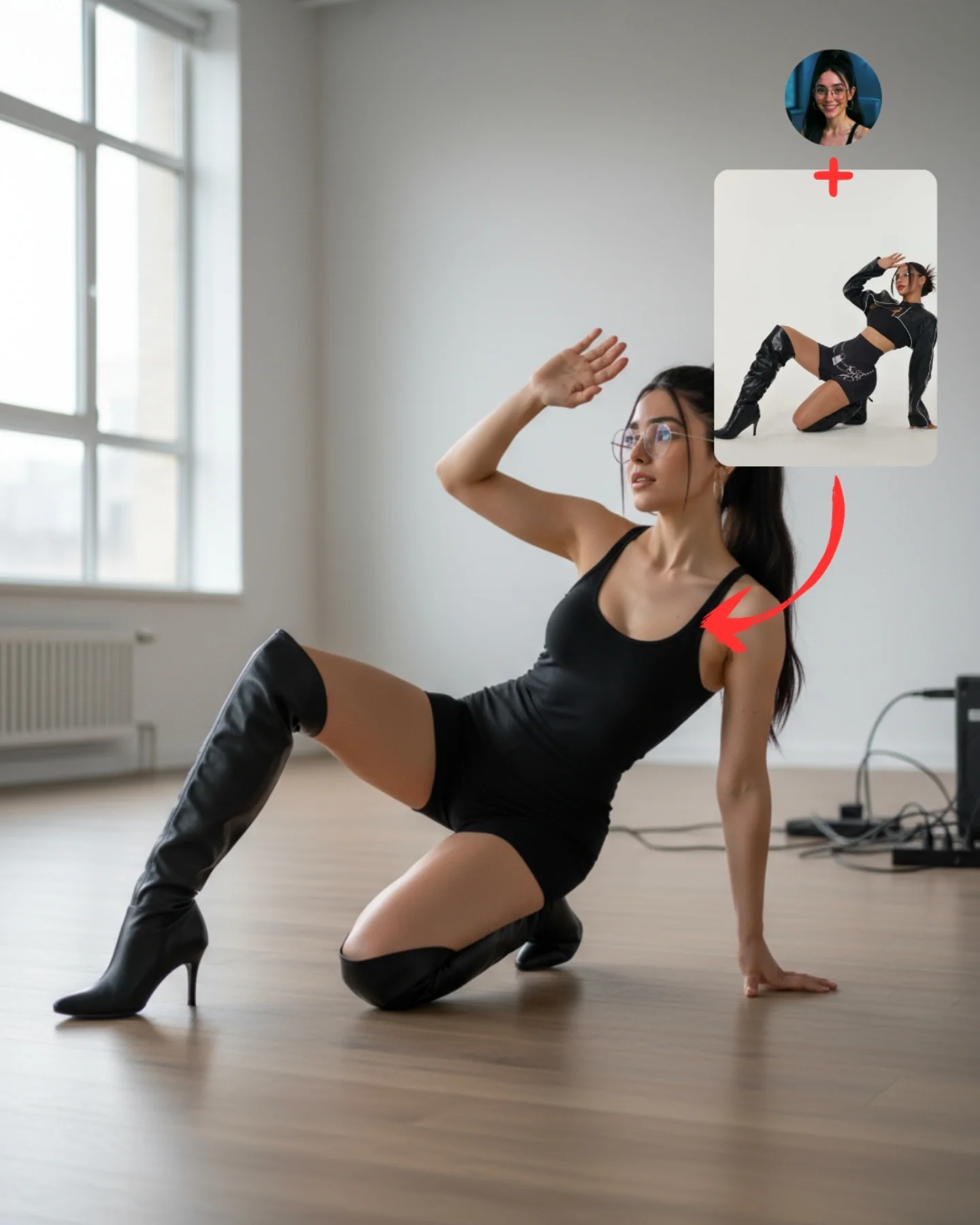
Why soy_aria_cruz's Pose Transfer Hands To Camera Photo Went Viral — and the Formula Behind It
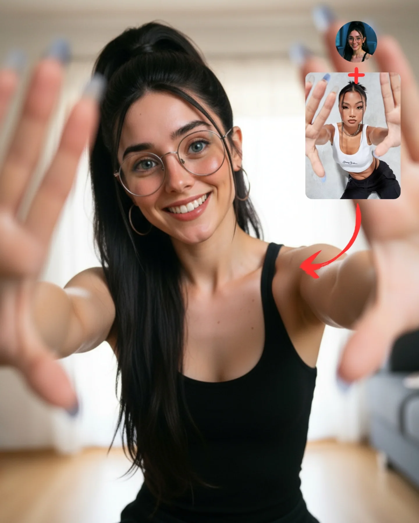
This image works because it teaches perspective, not just pose. The forward-reaching hands create depth immediately, which makes the frame more engaging than a normal portrait. Then the upper-right reference card and red arrow explain that this was not an accidental composition. It was a transferred pose. That combination of visual surprise and instructional clarity is what makes the post strong.
For creators, this is a good example of how to make pose-transfer content feel lively instead of technical. The setting is just a simple home interior, the clothing is a plain black tank top, and the styling is minimal. The energy comes almost entirely from the gesture. That is useful because it proves you do not need elaborate wardrobes or fantasy environments to make a pose demo work.
The image also benefits from emotional openness. The woman is smiling directly at the viewer, which turns a somewhat unusual perspective trick into something inviting. Without the warm face, the reaching hands could feel aggressive or awkward. With the smile, the image feels playful and social.
Why This Pose Transfer Post Performs
The first reason is immediate depth. Most social portraits stay on a flat plane. This one breaks that expectation by bringing the hands toward the camera. That creates foreground, midground, and background instantly. Images with obvious depth cues tend to hold attention longer because the eye has more to process.
The second reason is instructional transparency. The reference image in the corner tells the viewer exactly what is being demonstrated. There is no mystery about the purpose of the post. Educational content performs better when the value is visible before the caption explains it.
The third reason is low-complexity relatability. The indoor room is simple, the tank top is basic, and the styling feels approachable. That makes the technique feel accessible. Followers are more likely to save or comment on a pose they believe they could actually try.
Signal
Evidence (from this image)
Mechanism
Replication Action
Foreground depth cue
Both hands push toward the lens and frame the subject’s face
Strong perspective creates instant visual interest and modern social energy
Use one pose that forces a clear near-camera element into the composition
Visible workflow proof
Reference image and arrow make the transfer concept explicit
Clarity increases trust and makes the post feel practically useful
Show the source pose directly inside the cover when teaching transfer methods
Simple styling, strong idea
Black tank top and clean room keep the focus on the pose
Minimal styling makes the technique easier to inspect and recreate
Reduce wardrobe complexity when the main lesson is spatial composition
Friendly face
The smile softens the unusual hand-forward perspective
Warmth prevents the pose from feeling gimmicky or awkward
Pair experimental posing with an approachable facial expression
Where This Format Fits Best
This style is ideal for pose-transfer tutorials, beginner-friendly prompt education, indoor selfie prompts, creator workflow posts, and casual content that wants a little extra energy without requiring expensive props or locations. It is especially useful for accounts trying to show that AI posing can feel natural and fun.
Best fit: pose-transfer teaching posts. The image makes the effect visible immediately.
Best fit: casual home-interior prompt demos. The room is simple enough that the pose remains the clear focus.
Best fit: beginner-friendly creator education. The styling feels easy to recreate, which lowers intimidation.
Best fit: social cover slides. The foreground hands create instant feed impact.
Best fit: perspective-based prompt examples. It is a useful case study for depth and focal hierarchy.
It is less suited to luxury fashion, formal portraiture, or minimalist grid aesthetics that avoid playful distortion. The strength here is energetic relatability, not polish for its own sake.
Transfer Recipes
Phone-heart gesture version. Keep: hands close to lens and bright indoor setting. Change: finger shape and expression. Slot template: pose-transfer tutorial cover, same subject indoors, hands close to camera in {gesture}, reference inset and arrow
Window-light reach version. Keep: perspective-heavy pose and simple room. Change: light direction, hand openness, wardrobe color. Slot template: casual indoor portrait with hands reaching toward the camera, friendly smile, clean home background, source pose overlay
Creative selfie framing version. Keep: foreground hands and teaching layout. Change: pose symmetry, seated or standing stance, nail color. Slot template: social-media pose demo, both hands framing the lens, relaxed indoor setting, reference card in the corner
The Aesthetic Read
The strongest visual choice is the use of a basic home environment. That might seem unremarkable, but it is exactly what lets the pose carry the image. If the background were flashy, the tutorial value would weaken. Here, the neutral room gives the viewer permission to focus on perspective and anatomy.
The second smart choice is allowing the hands to go soft. Perfectly sharp hands would make the image look synthetic or strangely flat. By keeping the face sharp and the hands slightly blurred, the image mimics how a real camera sees depth. That small realism cue makes the pose-transfer result more convincing.
The black tank top is also doing practical work. It simplifies the body shape and keeps visual noise low around the torso. That helps the extended arms and hands become the main compositional event.
Observed
Why it matters
How to recreate it
Hands near the lens, face in focus
Creates believable depth and a contemporary selfie feel
Use shallow depth of field to separate the main face plane from the hands
Minimal indoor background
Protects the clarity of the pose demonstration
Keep the room soft and neutral when teaching a body-based technique
Reference overlay in the upper right
Transforms the image from portrait into instruction
Reserve corner space for source-pose proof elements
Black fitted top
Keeps the torso visually clean and easy to read
Use simple clothing when the compositional lesson is the main story
Warm direct smile
Makes an unusual perspective feel inviting instead of confrontational
Pair experimental angles with reassuring facial expression
Prompt Technique Breakdown
To recreate this image well, you need to control four things: perspective distortion, hand anatomy, subject sharpness, and the tutorial overlay. If any of those fails, the entire post weakens. The biggest trap is treating it like a normal portrait and forgetting that the near-camera hands are the core effect.
face sharp hands slightly soft; shallow depth with blurred fingertips; centered facial focus
Indoor simplicity
Keeps the tutorial readable
clean home interior; neutral curtains and wooden floor; soft apartment background
Teaching overlay
Makes the workflow obvious
reference card in the corner; red arrow to main pose; profile icon plus source pose
Identity anchors
Makes the demo feel creator-led instead of generic
round glasses; high ponytail; hoop earrings
Wardrobe restraint
Lets the pose stay dominant
simple black tank top; fitted sleeveless top; minimal indoor casualwear
The most likely drift point is hand anatomy. Close-to-lens hands are hard for generators. That is why the prompt needs to specify slightly softened focus plus realistic finger spacing, rather than asking for perfect sharp detail.
How to Iterate Without Breaking the Perspective
Lock three things first: the face-in-center framing, the hand-forward gesture, and the home background. Once those are stable, refine finger shape, nail color, or the softness of the depth falloff. If you try to perfect styling before perspective works, the image will remain weak no matter how polished it becomes.
Use a one-change rule. If the hands look wrong, fix only the hand anatomy. If the image feels too flat, push the hands closer to the lens. If it feels too chaotic, simplify the room further rather than changing the subject. Controlled edits are especially important when perspective distortion is the main lesson.
Run 1: Solve the arms-forward pose and centered face.
Run 2: Add realistic depth-of-field so the hands soften and the face stays crisp.
Run 3: Refine the glasses, ponytail, tank top, and room cues.
Run 4: Add the upper-right reference overlay, red arrow, and final teaching polish without moving the subject.
If the output becomes too polished, append a correction like friendly home pose-transfer demo, casual social-media realism, not a studio campaign. If it becomes too plain, strengthen the hand depth rather than adding props. The power of the image is the perspective trick, not the setting.