Why soy_aria_cruz's Police Uniform Room Portrait Went Viral — and the Formula Behind It
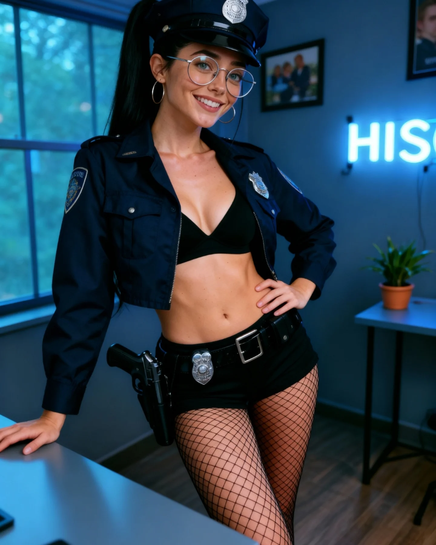
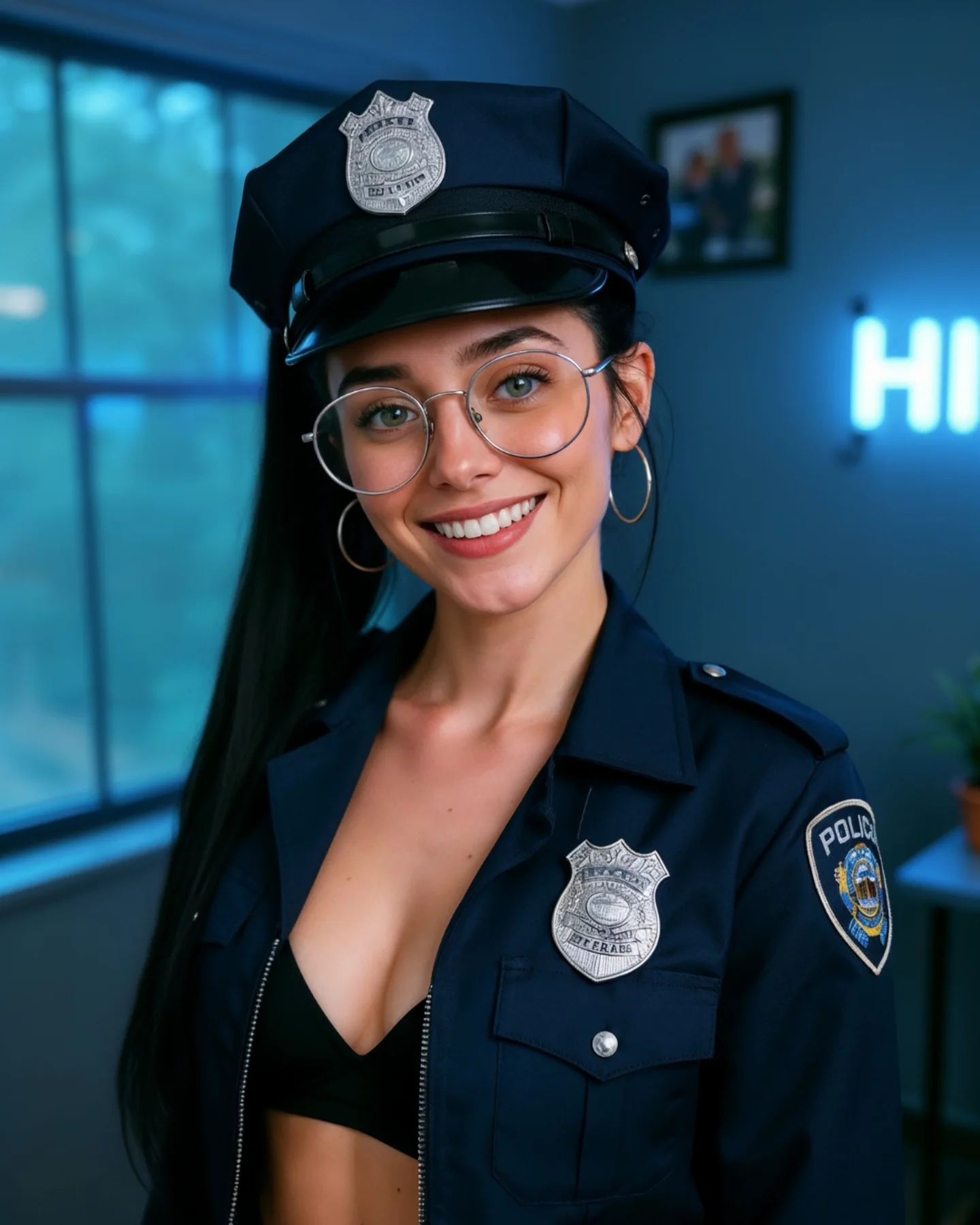
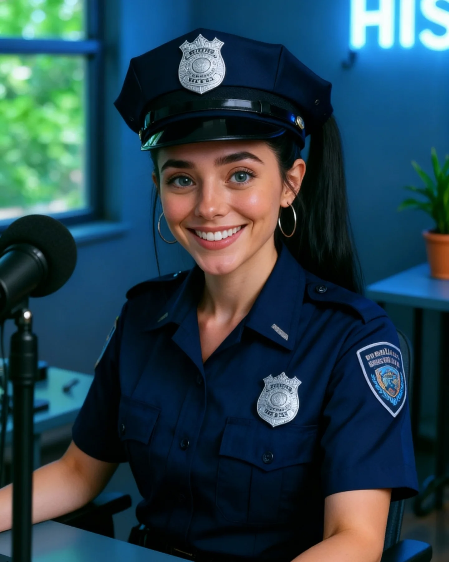
This image works because it treats a strong costume concept as a portrait problem, not an action scene. The room is quiet, the lighting is controlled, and the pose is simple. That means the costume remains the main signal without the image collapsing into noisy role-play. For creators, this is the difference between a usable themed portrait and a cluttered genre imitation.
The second reason it works is consistency across the room. The cool blue light, the navy uniform, the silver badges, and the blurred neon sign all belong to the same tonal family. That coherence makes the image feel polished. Even though the outfit theme is bold, the color system stays disciplined, so the frame never looks chaotic.
The pose also does exactly enough. One hand on the waist and one hand on the desk creates shape, confidence, and structure without demanding a full narrative. Social portraits often perform better when they signal character through silhouette rather than through complicated story props.
Why This Themed Portrait Holds Attention
The first reason is immediate role recognition. The hat, badge, and cropped jacket are enough to communicate the idea instantly. That speed matters on social. If the viewer understands the theme in half a second, the image has more time to reward them with texture and mood.
The second reason is room credibility. Instead of pretending the setting is a real station, the image accepts that it is a styled indoor portrait. That honesty makes the post easier to digest. Audiences often respond better when the image is clear about being a creator-led interpretation rather than a literal simulation.
The third reason is balance between bold and minimal. The outfit is specific, but the room is soft. The pose is confident, but not aggressive. The details are there, but they are concentrated in the right places. This is how themed content stays attractive without becoming cartoonish.
| Signal | Evidence (from this image) | Mechanism | Replication Action |
|---|
| Instant costume read | Cap, badges, and dark uniform jacket identify the concept immediately | Fast recognizability helps the image stop the scroll | Use a few unmistakable role cues instead of overloading the frame with props |
| Controlled room context | Window light, neon sign, table, and plant suggest a modern creator space | A believable but understated environment keeps themed portraits usable on social feeds | Let the background suggest lifestyle context without explaining the costume literally |
| Pose-built confidence | Hand on waist and desk support create shape and authority | Strong posture makes a static portrait feel intentional | Use one anchoring hand and one shaping hand when styling full-body indoor portraits |
| Tonal harmony | Navy, silver, black, and blue room tones all support each other | Color coherence makes even a bold concept feel polished | Match room temperature to wardrobe when working with themed outfits |
Where This Aesthetic Fits Best
This style is best for themed creator portraits, costume-led prompt showcases, character-inspired indoor photography, and realism tests focused on dark fabrics, metals, and room-light balance. It works when the goal is visual identity more than storytelling.
- Best fit: character-inspired portrait posts. The idea reads quickly without requiring a whole set build.
- Best fit: social-media themed styling. The room stays normal enough that the image still belongs on a creator feed.
- Best fit: realism benchmarks. Hat badges, fishnet texture, dark cloth, and cool room lights are useful details to inspect.
- Best fit: indoor outfit showcases. The background is simple enough that the clothing remains dominant.
- Best fit: serial character looks. The room can remain consistent while the wardrobe theme changes post to post.
It is less useful for documentary realism, cinematic action, or fully environment-driven storytelling. The power here is controlled persona, not worldbuilding.
Transfer Recipes
- Pilot-room version. Keep: cool room palette, clear insignia, one anchored pose. Change: hat shape, jacket cut, accessory logic. Slot template:
themed indoor portrait, clear {role} wardrobe cues, modern blurred room, one hand on hip, polished creator style - Sci-fi cadet version. Keep: costume-led portrait with minimal environment. Change: badge design, fabric finish, room accent light. Slot template:
character-style room portrait, recognizable uniform elements, cool indoor lighting, simple confident stance - Detective-office version. Keep: room restraint and role readability. Change: hat/no hat, palette warmth, table prop. Slot template:
social-media character portrait indoors, clear role cues, soft room blur, strong but simple pose
The Aesthetic Read
The strongest visual decision is keeping the room useful but quiet. The neon sign, framed photo, and plant give the image enough life that it does not feel like a floating costume test, but none of them compete with the subject. That is exactly how supporting environment should behave in a portrait like this.
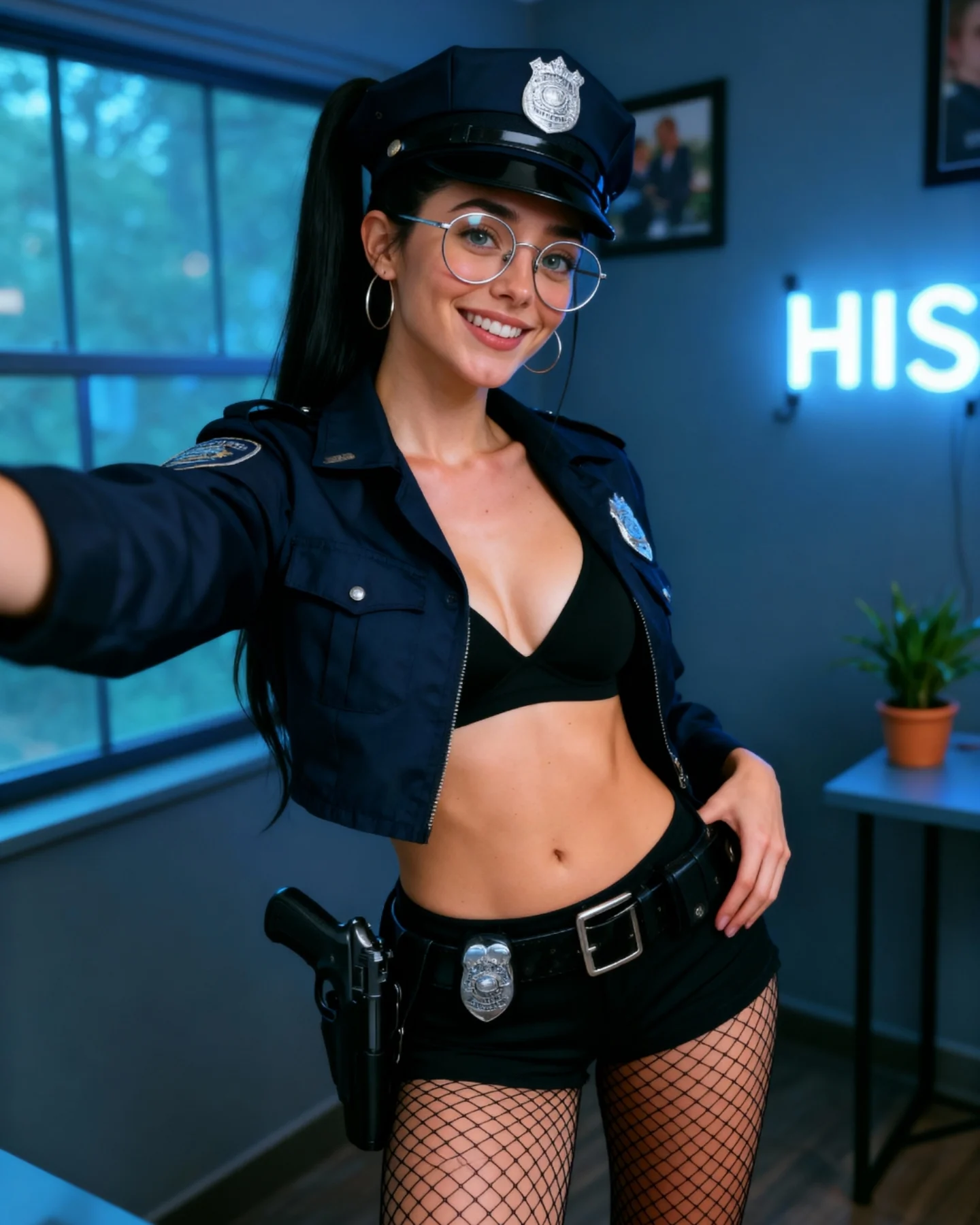
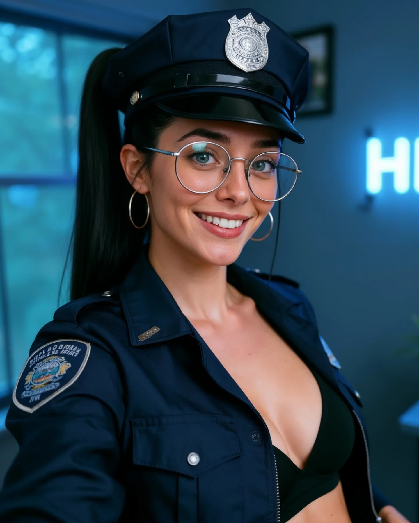
The second smart move is the use of a cropped jacket. It makes the silhouette more modern and keeps the image from looking like a literal costume rental. That slight stylization shifts the frame toward creator fashion rather than role-play imitation.
The fishnet tights and belt line also add lower-body structure, which helps the full-body crop feel intentional. Without those elements, the portrait would become top-heavy. Here, the clothing details distribute the visual weight better across the frame.
| Observed | Why it matters | How to recreate it |
|---|
| Cropped navy jacket and cap | Keep the role readable while making the styling feel current | Modernize costume-led looks through silhouette, not by removing the theme |
| One hand on desk, one on waist | Creates stability and shape in a static standing portrait | Use two different hand jobs to build both balance and attitude |
| Cool blue room with neon glow | Supports the navy palette and keeps the mood contemporary | Let room color temperature support the outfit instead of fighting it |
| Visible badges and belt details | Provide concept clarity and small inspection rewards | Keep 2-3 costume signals visible even in a fuller crop |
| Blurred domestic props | Make the themed look feel creator-led rather than theatrical | Place one or two casual room elements in the background and soften them |
Prompt Technique Breakdown
To recreate this image well, you need to control four systems: role cues, silhouette structure, room restraint, and tonal harmony. Most failed versions overcommit to one side. They either become too literal and scene-heavy or too generic and lose the themed identity. The image only works when the costume remains strong and everything else stays supportive.
| Prompt chunk | What it controls | Swap ideas (EN, 2-3 options) |
|---|
| Role cues | Fast concept recognition | police-style cap and badges; navy uniform jacket; shoulder patch and insignia |
| Silhouette structure | How intentional the standing pose feels | hand on waist with desk support; confident angled standing pose; one-hand-anchor stance |
| Room restraint | Whether the portrait stays polished or becomes cluttered | blurred creator room; soft indoor setup; minimal lifestyle background |
| Tonal harmony | Overall polish and coherence | navy and blue room tones; silver accents; cool indoor palette |
| Detail concentration | Gives viewers inspection points without overload | cap badge, belt badge, fishnet texture, glasses reflections |
| Creator identity | Keeps the portrait socially usable | round glasses; warm smile; high ponytail and hoop earrings |
The most likely drift point is environmental overreach. Once the room starts looking like a literal station or action setup, the portrait loses the balanced social-media feel that makes it effective.
How to Iterate Without Overbuilding It
Lock three things first: the cap-and-jacket read, the standing pose, and the cool room. Once those are stable, refine badge detail, glasses reflections, or room glow. If you begin by adding more props or sharper background elements, the image will quickly stop feeling clean.
Use a one-change rule. If the concept is too weak, strengthen badges and insignia. If it feels too costume-heavy, soften the room and the facial expression. If it feels too plain, improve the tonal harmony rather than adding more objects. Small changes keep the image readable and balanced.
- Run 1: Solve the standing pose, room placement, and overall crop.
- Run 2: Add the cap, cropped jacket, badges, and belt detail.
- Run 3: Refine glasses, smile, and high-ponytail identity markers.
- Run 4: Tune fishnet texture, desk edge, room blur, and neon glow without increasing clutter.
If the output becomes too much like role-play theater, append a correction like themed indoor creator portrait, clean room styling, realistic and socially polished. If it becomes too generic, strengthen the role cues instead of changing the environment. The image works because it stays in controlled balance.