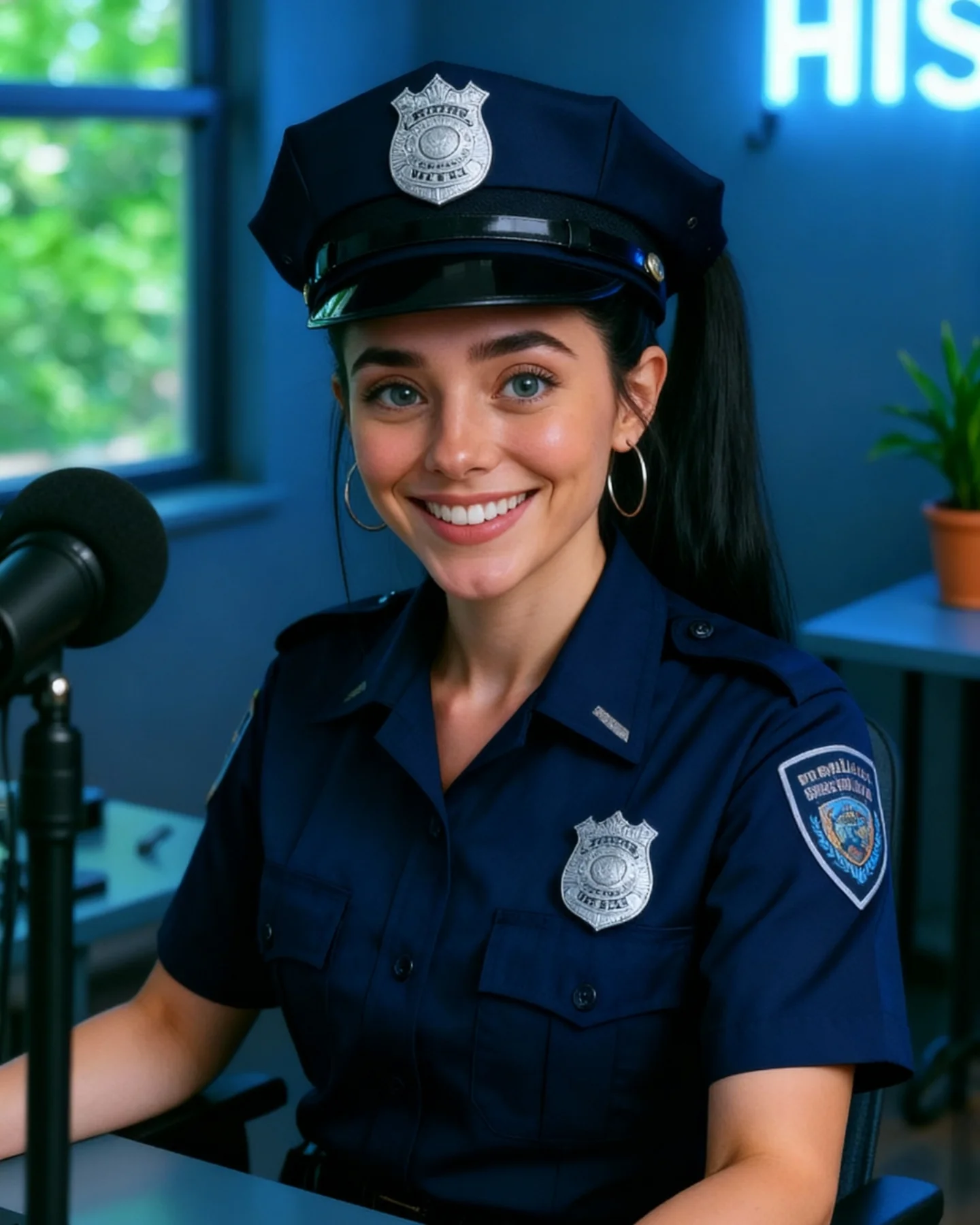
Soy_aria_cruz's Police Cap Desk Portrait AI Image
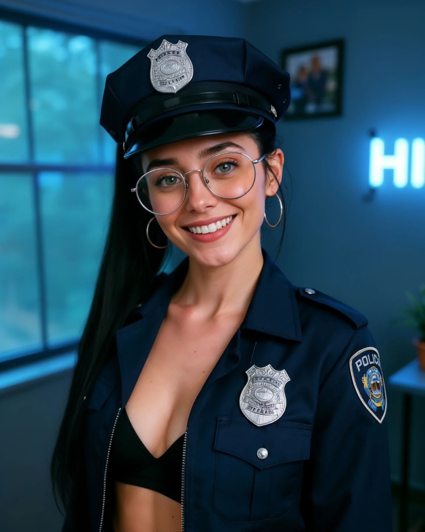
This image works because it finds a cleaner version of the same costume concept. Instead of leaning into a stylized outfit-first approach, it uses a more complete uniform silhouette and places the subject in a believable creator-room environment. That makes the image easier to post, easier to read, and more consistent with everyday social portrait content.
For creators, this is a useful reminder that themed content does not always need escalation. Sometimes the stronger move is simplifying the styling and letting the portrait become more legible. Here, the cap, badge, shoulder patch, glasses, and smile already communicate enough. By reducing visual noise, the image feels more polished.
The microphone is also doing smart contextual work. It shifts the room toward “creator setup” instead of “role-play room.” That small prop changes how the viewer reads the scene. The subject is still the center, but now the environment suggests content-making rather than theatrical set dressing.
Why This Version Performs
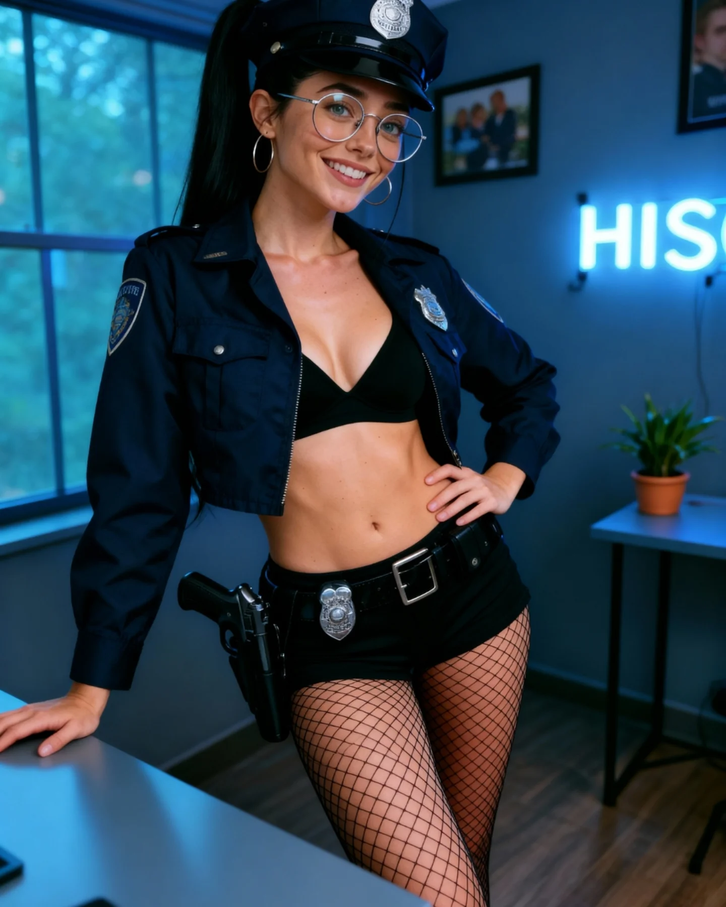
The first reason is clarity. The uniform reads more quickly here because the frame is cleaner and the clothing is more complete. Instead of balancing costume cues with exposed styling details, the image lets the role-signaling elements carry the concept directly.
The second reason is room credibility. The window, desk, microphone, and plant give the portrait a real indoor context without trying to imitate a station. Audiences generally respond better when a themed portrait is honest about being a styled interpretation rather than a literal reenactment.
The third reason is social warmth. The smile and glasses soften the uniform enough that the portrait remains approachable. This is important in creator content, where personality usually matters more than strict genre fidelity.
| Signal | Evidence (from this image) | Mechanism | Replication Action |
|---|
| Cleaner concept delivery | Uniform shirt, cap, badge, and shoulder patch are all visible in a straightforward crop | Simple, concentrated signals improve readability and polish | When a theme is already clear, reduce styling noise and strengthen the core identifiers |
| Creator-room context | Microphone, desk, neon glow, and plant make the room feel lived in and modern | Context grounds themed portraits in a believable social environment | Use one or two creator-space cues to keep costume content feed-friendly |
| Friendly authority | The smile balances the formal cues of the uniform | Warmth broadens audience appeal and makes the concept feel lighter | Use approachable facial expression when wardrobe already carries enough structure |
| Tonal consistency | Navy, silver, blue room light, and soft blur all support the same cool palette | Color harmony makes themed content feel intentional rather than gimmicky | Align room temperature with wardrobe tones to simplify the overall image |
Where This Aesthetic Fits Best
This style works best for creator-room character portraits, costume-led social posts, realism benchmark images, and indoor themed content that wants to stay polished instead of theatrical. It is especially useful when the goal is to suggest a character without building a complete fictional world.
- Best fit: creator portrait series. The room makes the image feel like part of a real ongoing account, not a one-off costume shoot.
- Best fit: cleaner themed styling posts. The concept remains obvious without excess props or narrative overload.
- Best fit: indoor realism tests. Badges, dark fabric, blue room light, glasses, and skin detail all provide useful checkpoints.
- Best fit: profile-level concept portraits. The crop is readable enough for thumbnails and feed previews.
- Best fit: cosplay-lite content. The image carries the idea while staying socially usable.
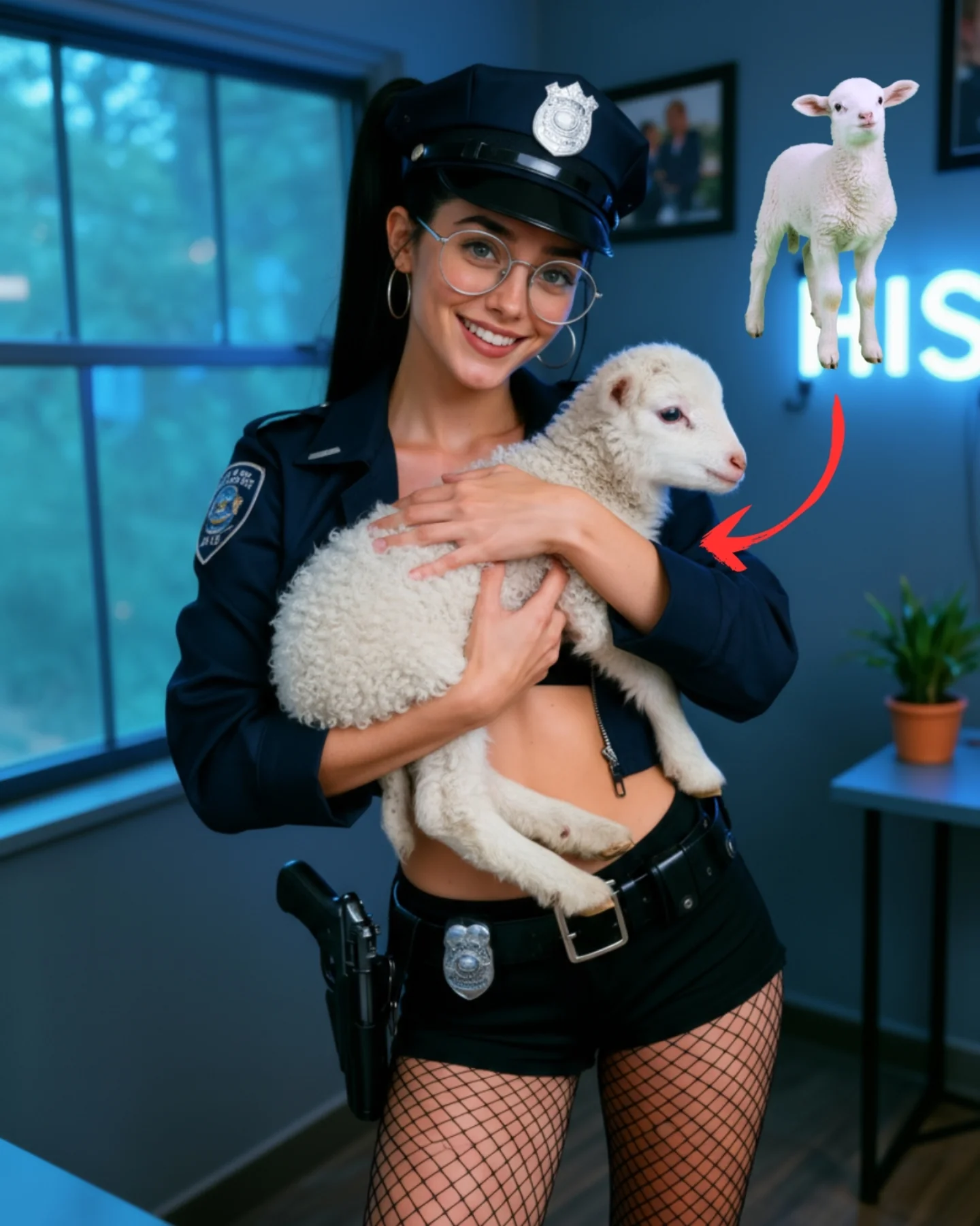
It is less useful for dramatic action scenes, heavy worldbuilding, or full-body costume showcases. The strength here is refined theme clarity in a small-space portrait format.
Transfer Recipes
- Firefighter-desk version. Keep: creator-room honesty and clear role cues. Change: cap shape, badge type, palette temperature. Slot template:
indoor creator-room portrait, clear {role} uniform details, microphone or desk cue, soft cool room blur - Airport-uniform version. Keep: simple role read and social warmth. Change: insignia placement, room prop, shirt shape. Slot template:
clean themed portrait in a modern room, recognizable uniform cues, approachable expression, feed-friendly realism - Detective-office-lite version. Keep: environment restraint and role-coded clothing. Change: jacket length, accessories, room accent light. Slot template:
character-inspired indoor portrait, strong costume signals, quiet room background, balanced social-media polish
The Aesthetic Read
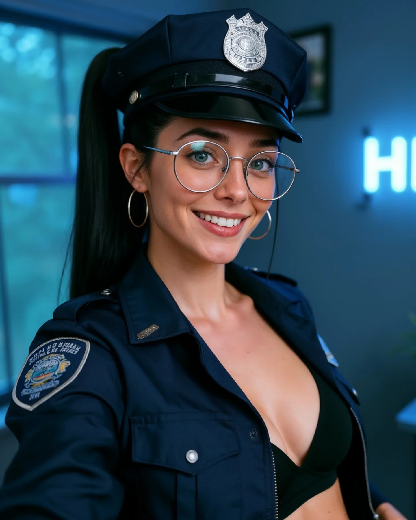
The strongest visual decision is the simplified costume structure. It makes the portrait feel less like a styled shoot and more like an identity variant inside a consistent creator world. That kind of continuity is valuable for social feeds, because it lets theme changes happen without breaking the overall page aesthetic.
The microphone is the second important choice. It places the image inside a world of making and talking, which is very different from a literal law-enforcement setting. That subtle repositioning keeps the portrait playful and audience-safe.
The navy-and-blue palette also does excellent work. It keeps the frame calm, modern, and coherent. The silver badges and glasses then act as small high-contrast accents, which helps the image feel detailed without becoming busy.
| Observed | Why it matters | How to recreate it |
|---|
| Short-sleeve uniform shirt with visible badge and patch | Delivers the theme cleanly in a compact crop | Use role-coded clothing pieces that remain legible near the face and torso |
| Microphone on the left | Reframes the image as creator content, not scene reenactment | Include one real-world creative tool to ground themed styling |
| Cool blue room and neon blur | Support the navy wardrobe and modernize the tone | Use soft room color that echoes the outfit palette |
| Round glasses and warm smile | Humanize the strong costume coding | Balance authority-coded wardrobe with everyday identity markers |
| Simple centered crop | Makes the concept readable quickly on mobile | Keep the framing direct when the wardrobe already carries the idea |
Prompt Technique Breakdown
To recreate this image well, think in four systems: role readability, room grounding, crop efficiency, and personal softness. Many weak versions either overbuild the scene or make the portrait too generic. This image works because it stays disciplined. The costume says enough, the room confirms enough, and the face does the rest.
| Prompt chunk | What it controls | Swap ideas (EN, 2-3 options) |
|---|
| Role readability | Fast concept recognition | police-style cap and shirt; visible badge and patch; uniform-coded silhouette |
| Room grounding | Why the image feels creator-led instead of theatrical | microphone in frame; modern desk setup; soft indoor lifestyle room |
| Crop efficiency | Mobile readability and conceptual density | medium portrait crop; desk-level to hat framing; centered upper-body composition |
| Palette coherence | Overall polish and tonal calm | navy and cool blue tones; silver accents; soft neon room highlights |
| Personal softness | Keeps the themed portrait socially approachable | warm smile; round glasses; high ponytail and hoop earrings |
| Background restraint | Stops the room from competing with the subject | blurred window light; soft plant detail; subtle neon sign blur |
The most likely drift point is the environment. If the room becomes too literal or too sharp, the portrait loses the “creator-world” balance that makes it work. Keep the room supportive, not explanatory.
How to Iterate Without Making It Heavier
Lock three things first: the cap-and-shirt uniform read, the microphone cue, and the centered crop. Once those are stable, refine badge metal, room glow, or skin realism. If you add more props or sharpen the room too much, the image will start to feel like scene-building instead of portraiture.
Use a one-change rule. If the concept is too weak, strengthen the patch and badge. If it feels too costume-heavy, increase the softness of the smile and room blur. If it feels too plain, improve tonal harmony rather than adding more objects. Small changes preserve the image’s clean usefulness.
- Run 1: Solve the centered portrait and uniform silhouette.
- Run 2: Add the microphone, window light, and neon glow.
- Run 3: Refine glasses reflections, badge structure, and shirt seams.
- Run 4: Tune the room softness, plant detail, and skin realism without widening the shot.
If the output becomes too literal, append a correction like friendly themed creator-room portrait, soft social-media realism, not a real police office scene. If it becomes too generic, reinforce the uniform signals rather than rebuilding the environment. The image works because it stays clear and light.