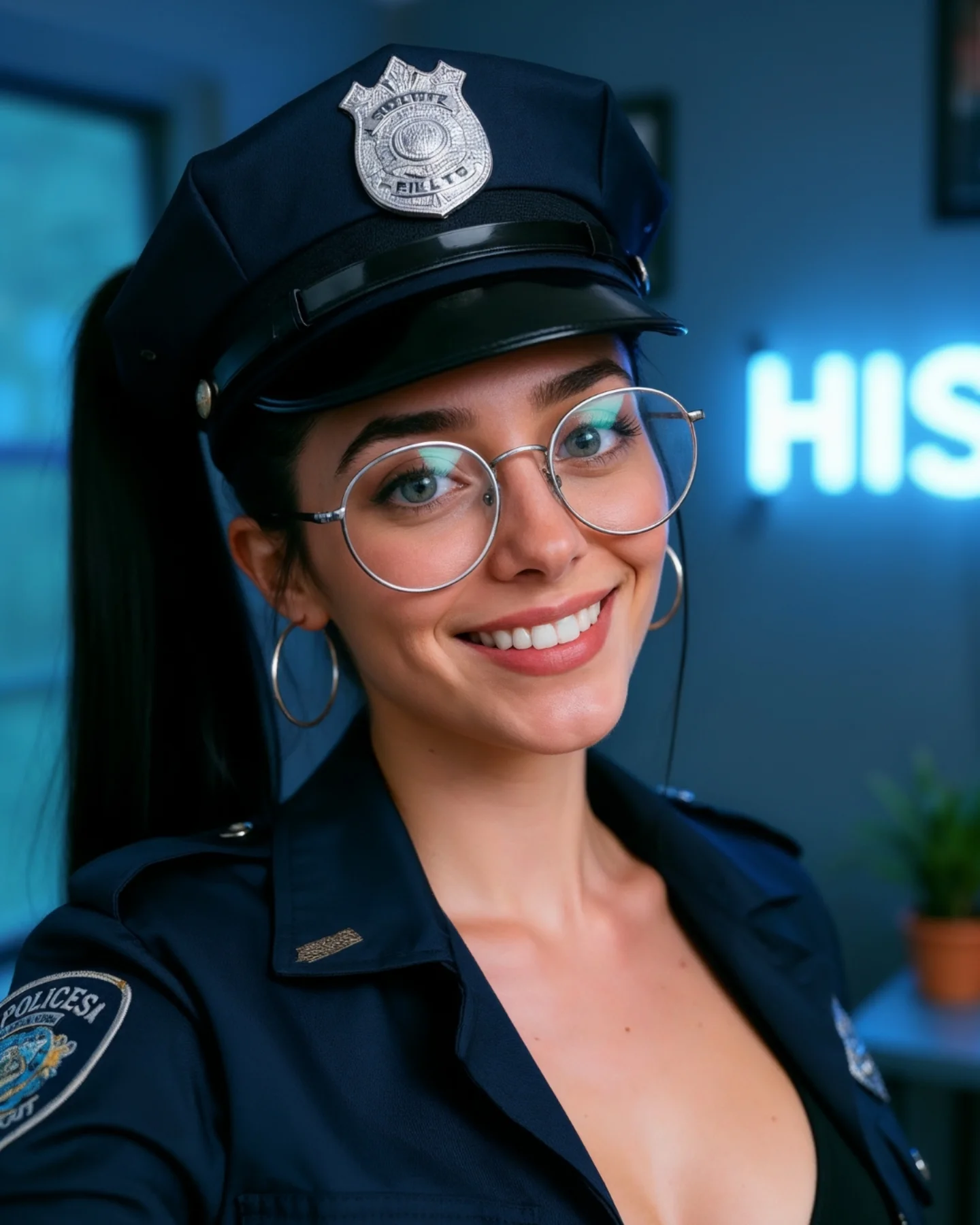
How soy_aria_cruz Created This Police Uniform Closeup AI Portrait
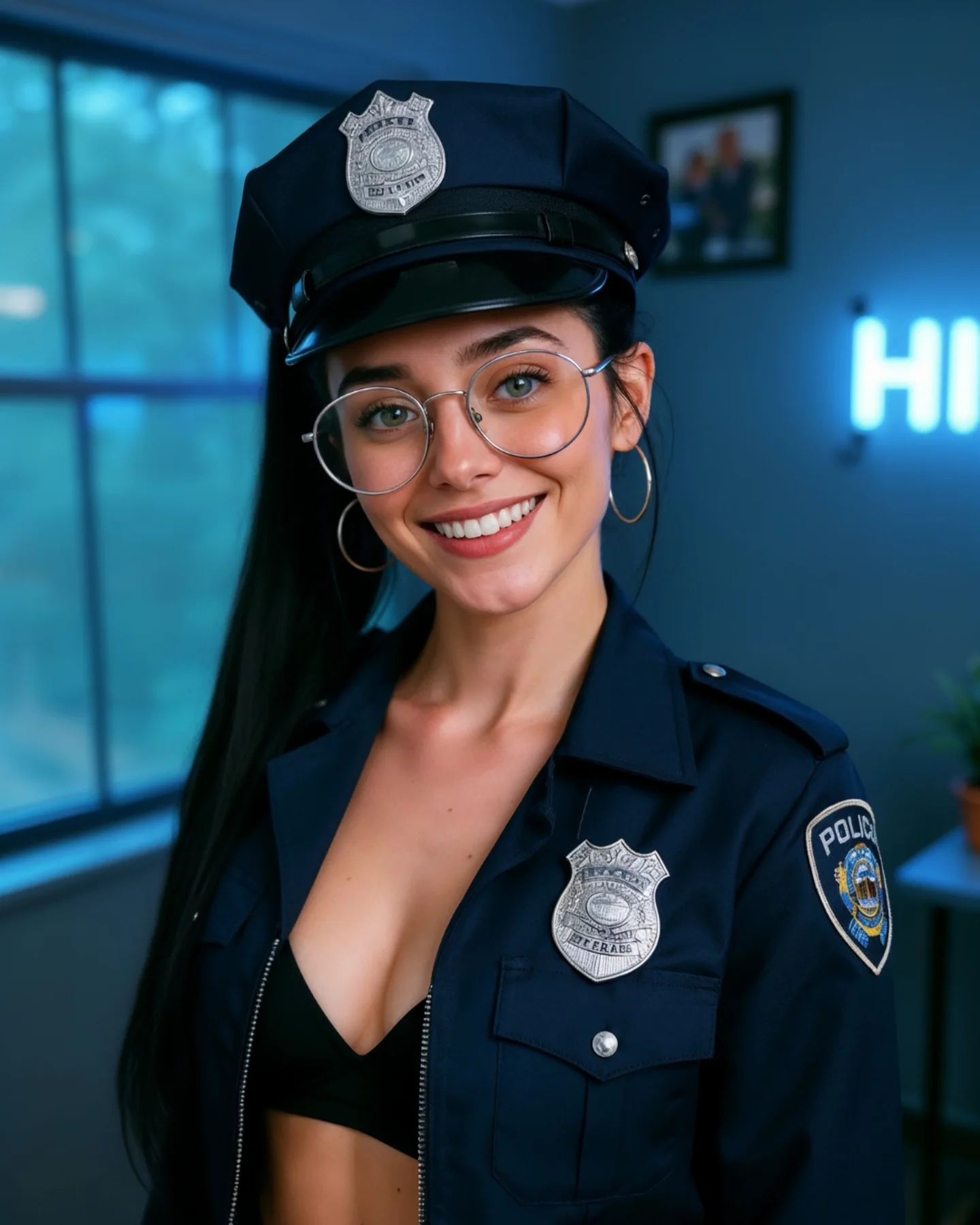
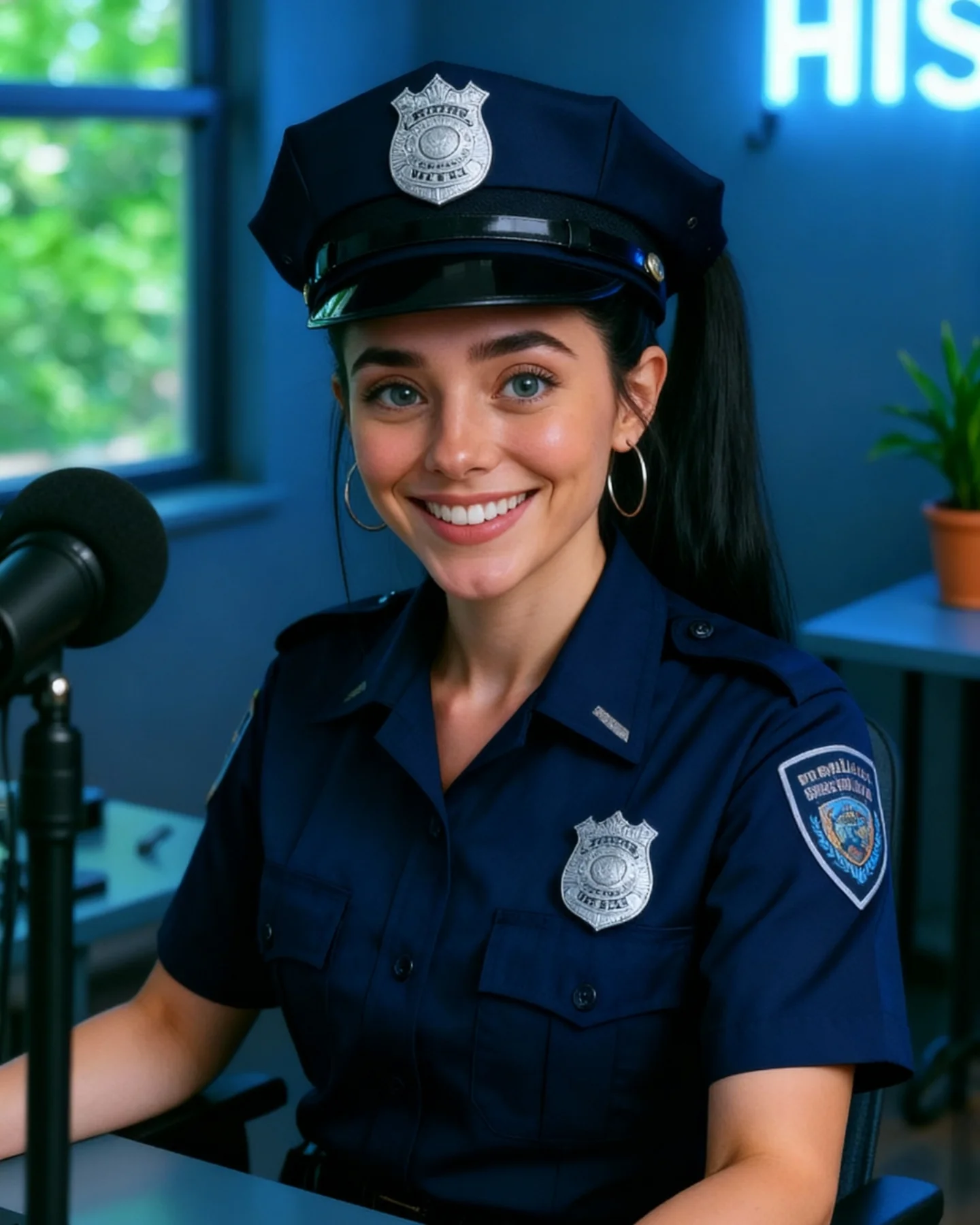
This image works because it tightens the concept. Compared with a wider themed portrait, this close crop removes distractions and concentrates all of the attention on face, hat, glasses, and badge. That makes the costume read faster and the expression land harder. The image becomes less about outfit styling and more about character impression.
For creators, that is a useful shift to understand. When a theme is already recognizable, you do not always need a wider frame to explain it. Sometimes a close-up makes the idea stronger because it forces the viewer to focus on the most identifiable signals. Here, that means the police cap, silver badge, glasses, and smile are doing almost all of the conceptual work.
The indoor room stays softly blurred, which is exactly right. It gives the subject a modern creator-space context without competing with the costume. This is one of the best ways to keep themed content usable on a normal social feed: let the wardrobe be specific and let the environment stay quiet.
Why This Close-Up Version Performs
The first reason is visual efficiency. The viewer can identify the costume concept in less than a second because the main signifiers are all near the face. That improves stop power. On mobile feeds, concentrated signals often outperform wider storytelling scenes.
The second reason is friendliness. The smile keeps the close-up from feeling intimidating. A police-inspired costume can easily drift into overly serious territory, but the expression resets the tone. The image reads as playful themed portraiture rather than role-play theater.
The third reason is accessory precision. In tight portraits, small details matter more. The glasses, earrings, badge, and collar each add a little structural information. Together they make the image feel polished without needing a lot of extra scene-building.
| Signal | Evidence (from this image) | Mechanism | Replication Action |
|---|
| Fast concept density | Cap, badge, glasses, and uniform collar all sit close to the face | Concentrated identifiers improve instant readability | When a costume is already clear, crop tighter around its strongest signals |
| Humanized authority | The bright smile softens the uniform-coded seriousness | Warmth makes themed portraits easier to engage with | Balance role-coded wardrobe with an inviting facial expression |
| Accessory-led polish | Badge, glasses, and earrings provide multiple small detail rewards | High-density detail makes a simple portrait feel richer | Focus refinement on 3-4 visible accessories instead of broad scene complexity |
| Soft room context | Blurred blue room hints at a creator environment without competing | Quiet environments keep attention on face-heavy portraits | Let background support the mood rather than explain the concept literally |
Where This Aesthetic Fits Best
This style is ideal for themed portrait covers, profile-level character looks, social posts that need immediate recognizability, cosplay-adjacent creator content, and realism tests around face, fabric, and metal accessory rendering. It is especially useful when the goal is to make one costume idea readable without building a full set.
- Best fit: close-up themed portraits. The concept lands quickly because the key signals are all near the face.
- Best fit: social-first character styling. The image feels creator-led, not cinematic or overproduced.
- Best fit: realism benchmark posts. Hat brim, badge metal, glasses, skin, and dark cloth all become useful quality checkpoints.
- Best fit: profile or thumbnail-style covers. Tight crops improve mobile readability.
- Best fit: indoor portrait series. The soft room backdrop helps different themes still feel consistent on a feed.
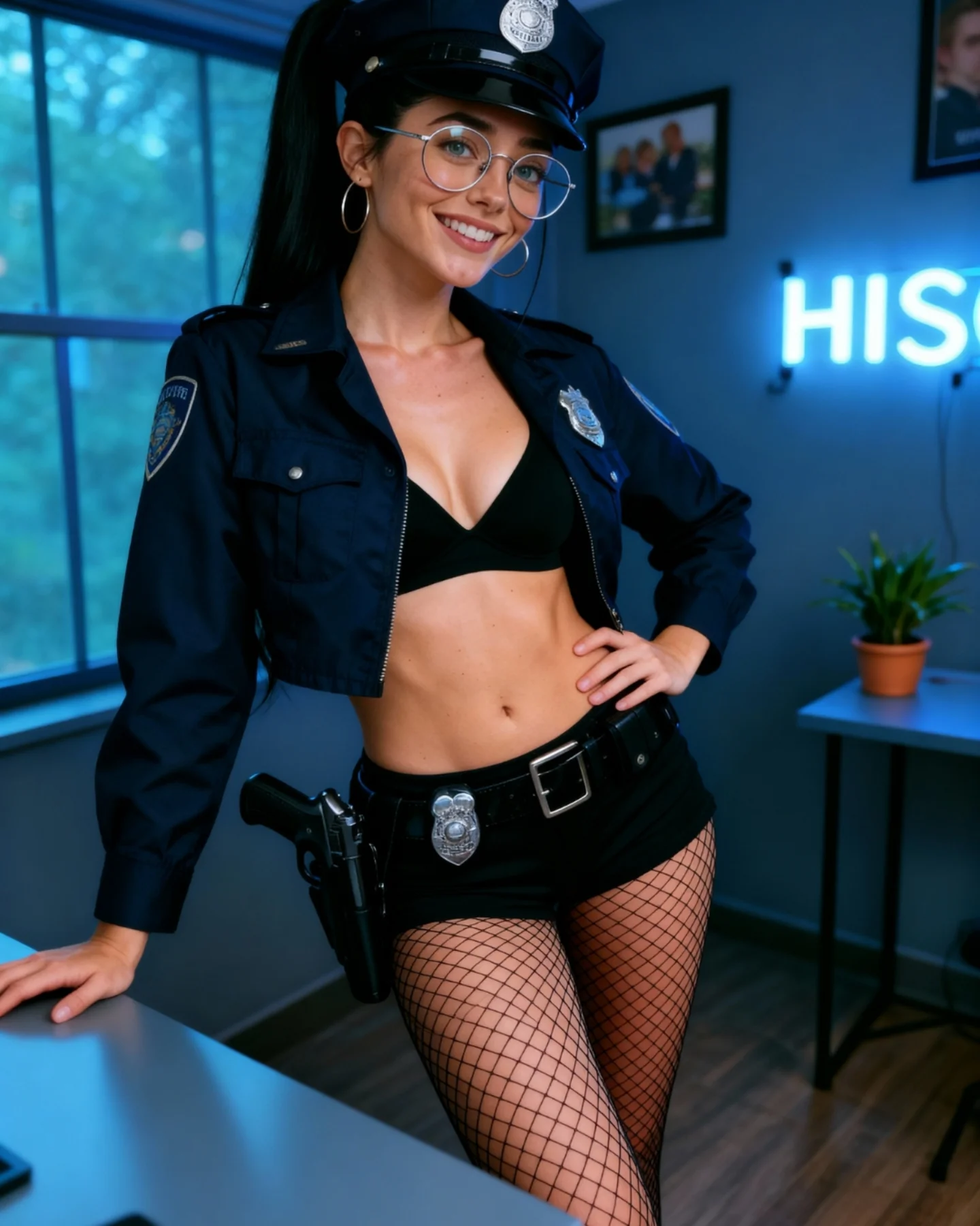
It is less useful for action storytelling, environment-heavy scenes, or content that needs a full-body costume read. The power here is concentration, not expansion.
Transfer Recipes
- Pilot cap close-up. Keep: tight crop and accessory density. Change: insignia style, shirt shape, color palette. Slot template:
tight themed portrait, visible {role-specific headwear}, warm smile, blurred creator-room background, social-media polish - Military-style portrait. Keep: face-first composition and quiet room. Change: patch design, collar shape, hair finish. Slot template:
close-up character-inspired portrait, clear insignia cues, round glasses, indoor blurred backdrop, approachable expression - Sci-fi officer version. Keep: concept density near the face. Change: badge design, material tone, light accent. Slot template:
tight portrait with role-signaling accessories, soft room blur, friendly social portrait energy, realistic details
The Aesthetic Read
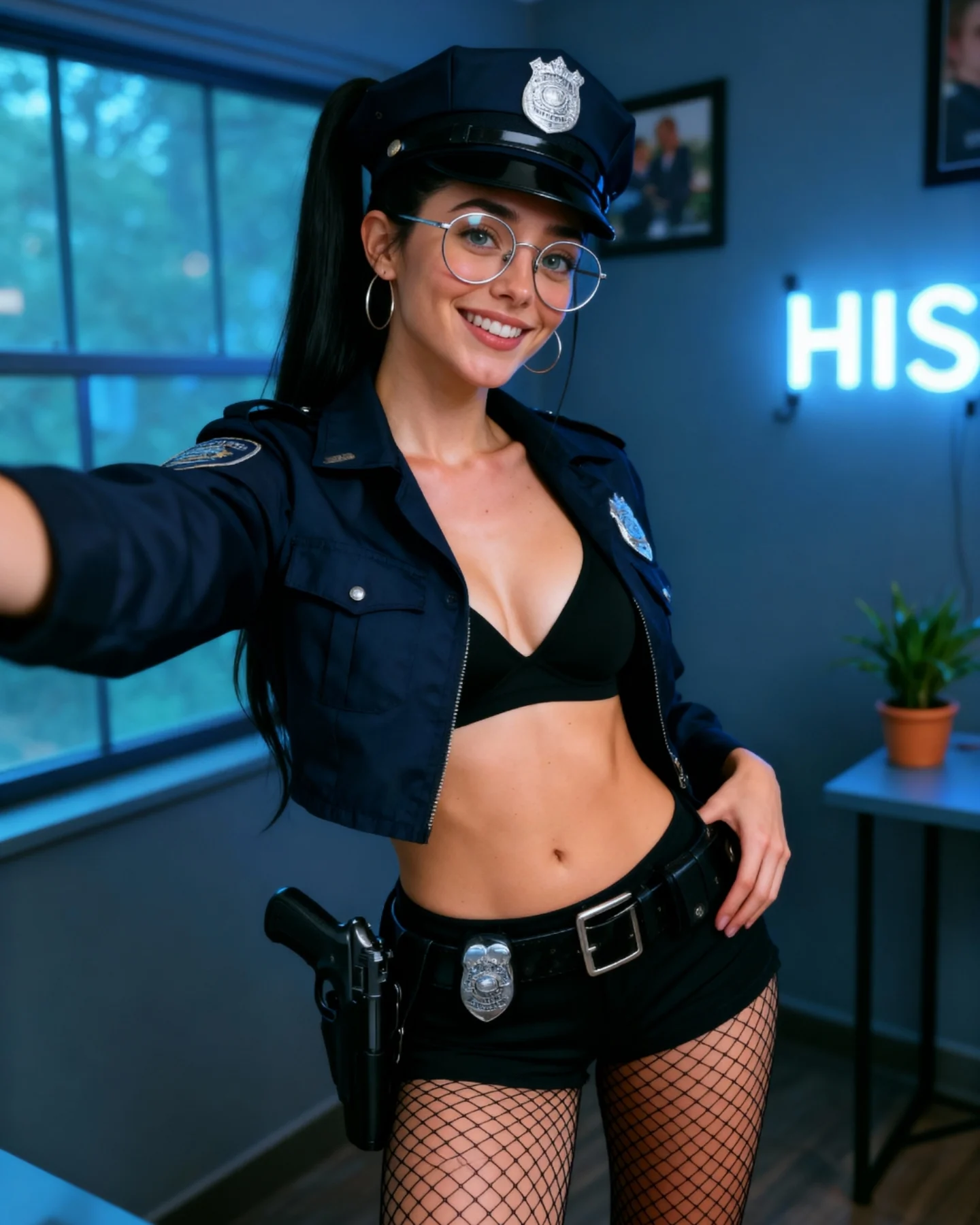
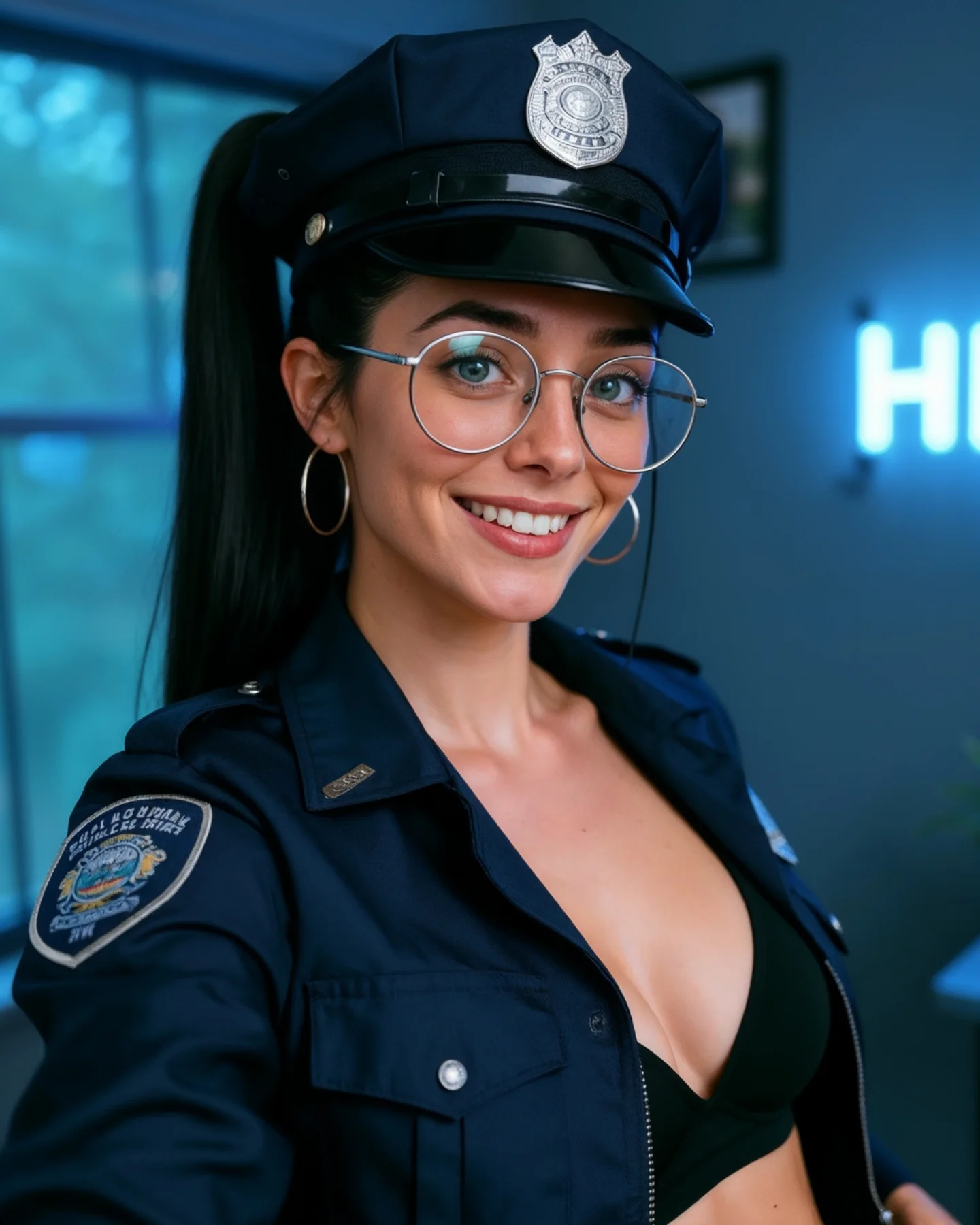
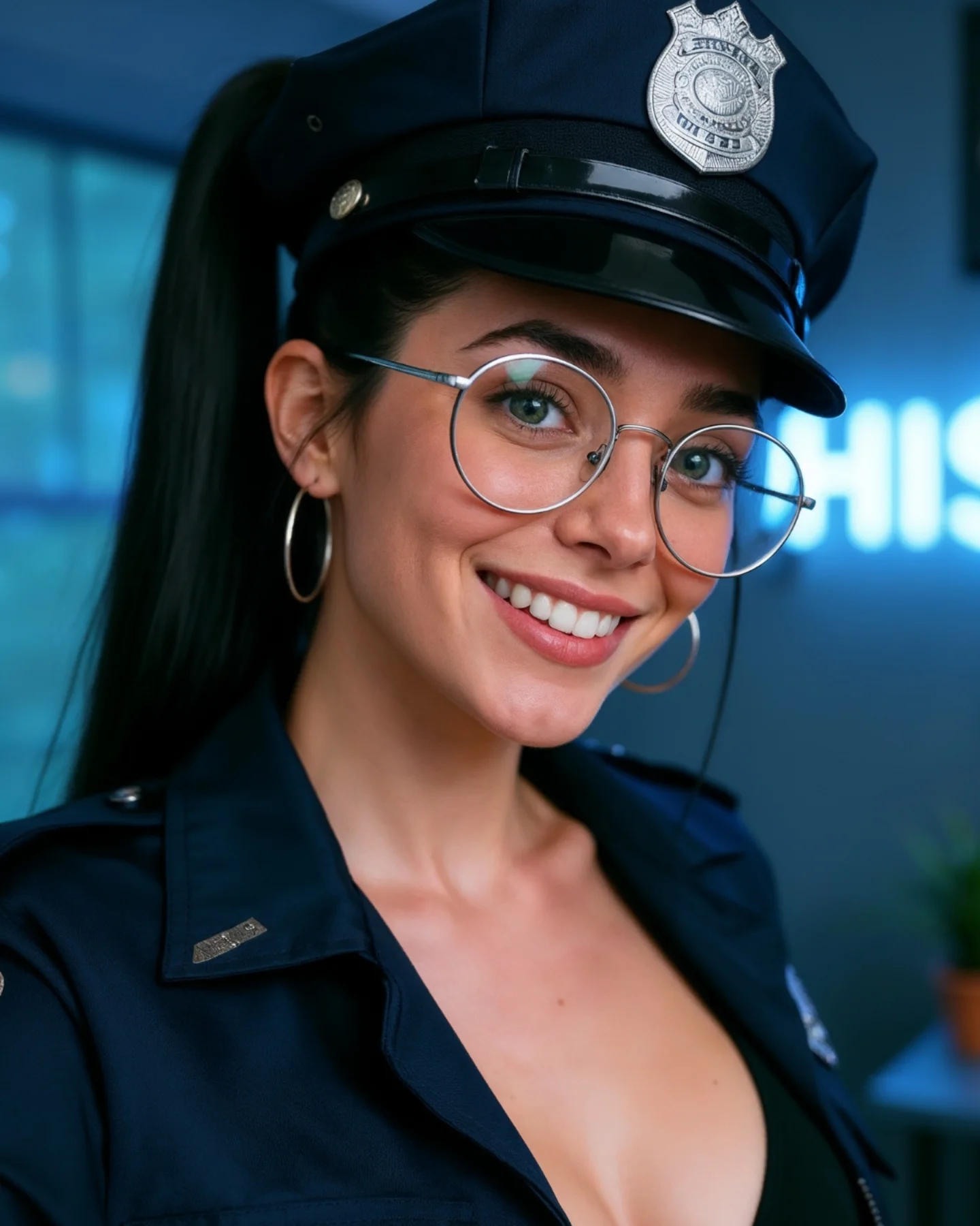
The strongest visual move is the crop. By excluding most of the body, the image becomes more graphic and more legible. The hat and face create a strong top-heavy composition that reads immediately on small screens. This is a good reminder that cropping is not just editing. It is concept control.
The second smart move is the blue room tone. It harmonizes with the dark navy uniform and makes the whole portrait feel coherent. Color temperature can do a lot of work in themed content. When the room and wardrobe support each other, the image feels more polished with less effort.
The glasses are also especially useful here. They create a contemporary creator identity inside a highly coded costume, which prevents the portrait from becoming generic fantasy roleplay. That tension between everyday and themed is what keeps the image usable.
| Observed | Why it matters | How to recreate it |
|---|
| Tight crop around hat, face, and collar | Makes the theme readable immediately | Frame close when the strongest costume cues are concentrated near the head and shoulders |
| Blue-toned blurred room | Supports the navy palette and modern creator mood | Use a cool, soft background to reinforce dark wardrobe tones |
| Silver badge and glasses | Add crisp metallic and structural detail to the portrait | Include a few reflective elements near the face for texture and precision |
| Friendly smile in uniform styling | Softens the concept and broadens appeal | Pair strong costume cues with social warmth rather than severity |
| Visible shoulder patch hint | Adds role readability without needing a full-body frame | Let one secondary insignia remain visible to support the main badge signal |
Prompt Technique Breakdown
To recreate this image effectively, focus on four systems: crop discipline, headwear recognizability, creator identity, and room restraint. The most common mistake is over-expanding the frame and diluting the concept. This image proves that a few precise signals can do more than a full set of props.
| Prompt chunk | What it controls | Swap ideas (EN, 2-3 options) |
|---|
| Crop discipline | Speed of recognition and mobile readability | tight portrait crop; face-and-hat close-up; upper-chest character portrait |
| Headwear cue | Main concept recognition | police-style cap with silver badge; uniform hat with insignia; dark structured cap |
| Creator identity | Prevents the portrait from feeling anonymous or overly role-played | round glasses; hoop earrings; high ponytail and warm smile |
| Background restraint | Keeps the face and costume dominant | blurred room with neon glow; cool indoor window light; soft creator-space backdrop |
| Palette harmony | Makes the image feel polished with minimal effort | navy uniform with blue-gray room; silver detail accents; cool cohesive color temperature |
| Friendly expression | Broadens the image’s social appeal | bright smile; approachable themed portrait; warm face in character styling |
The most likely drift point is overcomplication. If you add too much room detail or too much body, the portrait loses the clean face-first power that makes it work.
How to Iterate Without Diluting the Concept
Lock three things first: the tight crop, the hat-and-badge read, and the glasses-and-smile identity. Once those are stable, refine collar structure, room glow, or skin realism. If you start widening the frame or adding extra props, you will weaken the entire image.
Use a one-change rule. If the portrait feels too generic, strengthen the cap and badge. If it feels too role-play heavy, bring back the friendly creator expression. If it feels too flat, improve the cool room tone and metallic reflections instead of adding more objects. Small changes keep the image concentrated and readable.
- Run 1: Solve the face, cap, and close crop.
- Run 2: Add the glasses, hoop earrings, and identity markers.
- Run 3: Refine the uniform collar, badge metal, and shoulder patch hint.
- Run 4: Tune the room blur, blue ambient glow, and skin realism without widening the composition.
If the output becomes too serious, append a correction like friendly themed social-media portrait, approachable expression, clean indoor creator setting. If it becomes too plain, strengthen the badge and room-tone harmony rather than adding more scene detail. The image works because it stays focused.