Dream Squeeze🍊 Comment ‘vivid’ to get the prompts.📩 #ai #vivid #dreaming #prompt #midjourney
Dream Squeeze🍊 Comment ‘vivid’ to get the prompts.📩 #ai #vivid #dreaming #prompt #midjourney
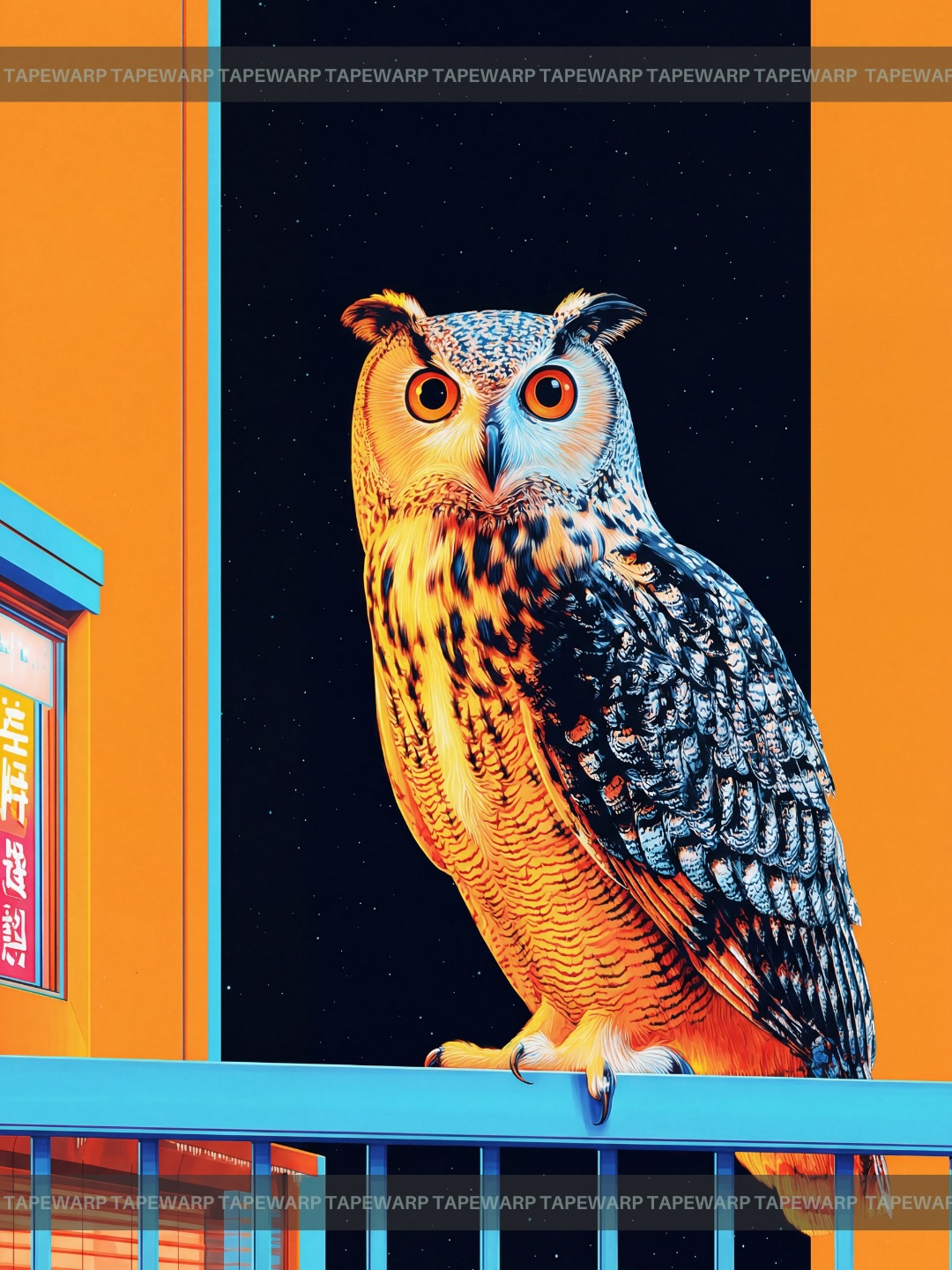
This image works because it takes a familiar wildlife subject and treats it like a designed poster object. The owl is not shown in a natural forest context. It is placed inside a rigid urban color system of orange, blue, and black, which makes the bird feel iconic rather than documentary.
| Element | What it contributes |
|---|---|
| Large orange eyes | Create immediate attention and emotional intensity. |
| Blue balcony rail | Anchors the subject and provides strong complementary contrast. |
| Orange wall planes | Turn the background into a graphic framing device. |
| Black night field | Isolates the owl and sharpens the composition. |
| Detailed feather texture | Keeps the image rich enough to sustain close viewing. |
The strongest choice here is stylization through environment. The owl itself remains recognizable, but everything around it has been reduced into poster geometry and complementary color contrast. That is what gives the image its contemporary visual punch. It feels part wildlife portrait, part brand campaign artwork.
The frontal pose is also important. Because the owl looks almost directly at the viewer, the image gains a confrontational stillness. The bird is calm, but the color treatment around it is loud. That tension makes the frame memorable.
| Color choice | Effect |
|---|---|
| Orange | Generates heat, energy, and instant visibility. |
| Cyan blue | Provides cool edge definition and urban-night tone. |
| Black sky | Creates isolation and makes the color blocking feel deliberate. |
| Grey-white feathers | Bridge the warm and cool lighting systems. |
The palette feels strong because it uses classic complementary contrast without overcomplicating the frame. The image is readable at a glance and still detailed enough to hold attention.
If you want to reuse this structure, keep the subject centered and the background reduced. The image depends on simplicity. You can swap the owl for another bird or animal, but the environment should still behave like a graphic frame instead of a realistic habitat.
A reliable variation path is to preserve the same complementary lighting logic while changing the architectural setting. Alley walls, rooftop railings, or minimal storefront geometry could all work, as long as the color split remains decisive.