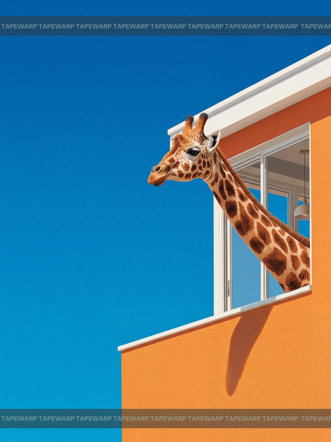
Dream Squeeze🍊 Comment ‘vivid’ to get the prompts.📩 #ai #vivid #dreaming #prompt #midjourney
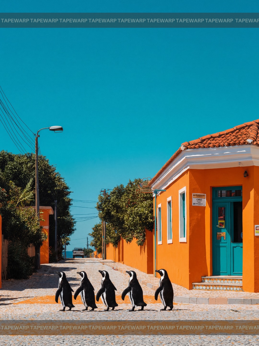
Dream Squeeze🍊 Comment ‘vivid’ to get the prompts.📩 #ai #vivid #dreaming #prompt #midjourney
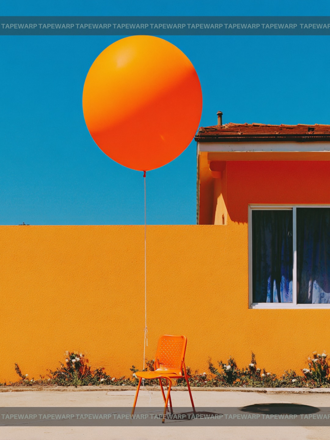
This prompt is a strong example of how everyday objects can be transformed into a visually memorable poster through color design, spatial restraint, and graphic composition. On the surface, the image is extremely simple: one orange balloon, one orange plastic chair, one sunlit wall, a slice of house facade, and a deep blue sky. But that simplicity is exactly why the result feels so effective. The image is not trying to impress through spectacle. It becomes compelling because it turns ordinary street-side materials into a controlled visual system built on shape, hue, balance, and negative space.
If you are learning how to write better prompts for minimalist architectural photography, editorial still-life scenes, or graphic color posters, this composition is worth studying carefully. It demonstrates that prompt quality is often determined by how precisely you control the relationship between objects and their environment. The balloon is not interesting just because it is bright. The chair is not useful just because it is present. What makes the image work is that each element supports a clean structure. The wall becomes a color field, the sky becomes a bold upper plane, the balloon becomes a circular focal accent, and the chair becomes the grounded anchor that keeps the scene from floating into abstraction.
The first major reason this prompt works is because it thinks in poster language rather than snapshot language. A casual photo of a balloon tied to a chair could easily look accidental, sentimental, or visually weak. This image avoids that by using strict front-facing composition, strong horizon placement, and clear geometric division. The wall cuts across the frame like a deliberate band of color. The sky forms a saturated upper panel. The pavement and curb ground the image without stealing attention. The balloon and chair sit inside that structure as if they were placed by a designer for maximum clarity.
That poster sensibility is reinforced by the brand-strip framing and the clean symmetry of the visual rhythm. The repeated border text at the top and bottom turns the picture into something that feels published rather than merely captured. This is an important lesson for prompt writing: if you want an image to feel like cover art, print design, or gallery poster work, you must say so through framing, margins, and compositional intent. Leaving those aspects vague often causes AI outputs to drift toward generic lifestyle photography instead of strong graphic design.
Although the prompt names physical objects, the real subject of the image is color. The sky is a rich unbroken blue. The wall is a warm yellow-orange. The balloon and chair intensify the orange register. Small neutral elements such as the curb, concrete, and roof edges exist mainly to support the dominant contrast. This is a classic color-block strategy. The image becomes memorable not because there are many details to discover, but because the eye immediately understands the tension between warm and cool zones.
For prompt writers, this is a useful reminder that objects can be chosen primarily for their color function. The balloon supplies a clean circular orange accent against the blue sky. The chair reinforces the orange note lower in the frame, creating vertical repetition. The wall broadens the warm field so the composition does not rely on only one bright object. That repetition of hue across different scales is what makes the image feel designed. If you were to replace the chair with a random neutral object, much of the visual coherence would disappear.
One of the smartest things about this prompt is its refusal to overcrowd the frame. Many AI prompts become weaker because they ask for too many decorative items, too many props, or too much environmental storytelling. Here, the prompt keeps the object count low and lets each component matter. One balloon. One chair. One wall. One slice of a house. One sky plane. That small inventory makes it much easier for the model to maintain clean shape relationships and controlled emphasis.
This economy also improves thumbnail performance. At small sizes, complex images tend to collapse into noise. By contrast, this poster stays readable even when reduced because the main forms remain large and distinct. The circular balloon, rectilinear chair, wide wall band, and blue sky block are all simple enough to survive compression. If your work will appear as prompt previews, social covers, print mockups, or portfolio thumbnails, that kind of readability is extremely valuable.
Minimal compositions still need tension, and this image gets it from placement and proportion. The balloon introduces vertical lift while the chair anchors the lower part of the frame. The string acts as a delicate connector, guiding the eye between those two forms. The visible portion of the house facade above the wall prevents the image from becoming too flat or too purely abstract. It gives the viewer just enough architectural context to interpret the scene as a real roadside environment rather than a studio set. That small contextual cue matters because it adds emotional texture without breaking the formal clarity.
The front-facing perspective is also important. A dramatic angle would have turned the scene into something more cinematic, but the direct camera position preserves the poster quality. Flatness here is a strength. It lets the color planes read like deliberate design panels, almost as if the image were halfway between photography and graphic printmaking. Prompt writers who want this kind of effect should think carefully about when to ask for dynamic perspective and when to ask for still, frontal composure. In this case, restraint is exactly what gives the scene authority.
This prompt style is especially useful for people building portfolios around design-conscious AI imagery. It would fit easily into branding moodboards, contemporary poster collections, architecture-inspired social graphics, or prompt packs about color field photography. It could also work well as album-cover inspiration, wall-art mockup material, or editorial magazine visual language. The image feels modern, calm, and intentional, which makes it adaptable across many creative contexts.
For educators or prompt coaches, it also makes a strong teaching example. It shows that ordinary objects do not have to become surreal to feel artistic. You do not always need impossible lighting, fantasy environments, or highly stylized characters. Sometimes the most useful prompt lesson comes from seeing how carefully framed reality can feel just as striking as spectacle. This makes the image especially good for explaining design fundamentals to beginners who assume every successful AI image must be visually loud.
There are many effective variations you could build from this structure. You could keep the wall-and-sky geometry but change the central object pair, such as using a green bicycle against a pink wall or a white umbrella against a cobalt facade. You could also preserve the orange-and-blue palette while replacing the chair with another grounded form such as a bench, stool, or crate. Another variation would be to move from a clean suburban edge to a more Mediterranean or modernist setting while keeping the same discipline of color fields and object isolation.
You can also adjust mood through weather and light. A late-afternoon version would soften the color contrast and introduce longer shadow geometry. A cloudless noon version, like the one implied here, produces the strongest graphic clarity. If you want the poster to feel crisp, contemporary, and print-ready, hard sunlight and clean skies are usually beneficial. If you want something more nostalgic or poetic, softer light may help. The key is to keep those choices consistent with the overall visual agenda.
There are several practical techniques embedded in this prompt that are worth reusing elsewhere. First, choose objects that reinforce the palette instead of diluting it. Second, define the background as broad visual planes rather than as cluttered scenery. Third, use composition language such as front-facing, wide shot, vertical poster, and centered placement to control how the image behaves. Fourth, limit the number of objects so each one contributes meaningfully. Fifth, if you want the image to feel designed, say so through border, print, poster, or editorial framing cues.
These principles can scale across many subjects. Whether you are making travel posters, architectural studies, branded still-life scenes, or conceptual product art, the same logic applies. Images become stronger when every element has compositional purpose. Prompts become stronger when they describe not just what appears in the image, but how those objects collaborate to create a specific visual experience.
What makes this balloon-and-chair image successful is not novelty but discipline. The prompt trusts color, geometry, and placement enough to let them carry the image. Instead of competing details, the scene is built from a few clean relationships: circle versus rectangle, warm wall versus cool sky, grounded chair versus floating balloon, domestic architecture versus abstract color field. That balance between realism and graphic simplification is what gives the image its poster power.
If you want to produce more convincing AI posters from ordinary subjects, this is an excellent model to study. Start with one strong palette, one controlled frame, and one or two objects that can hold symbolic weight. Then make sure every supporting detail strengthens the same idea. When the prompt is this coherent, even the simplest roadside scene can look polished, intentional, and visually collectible.