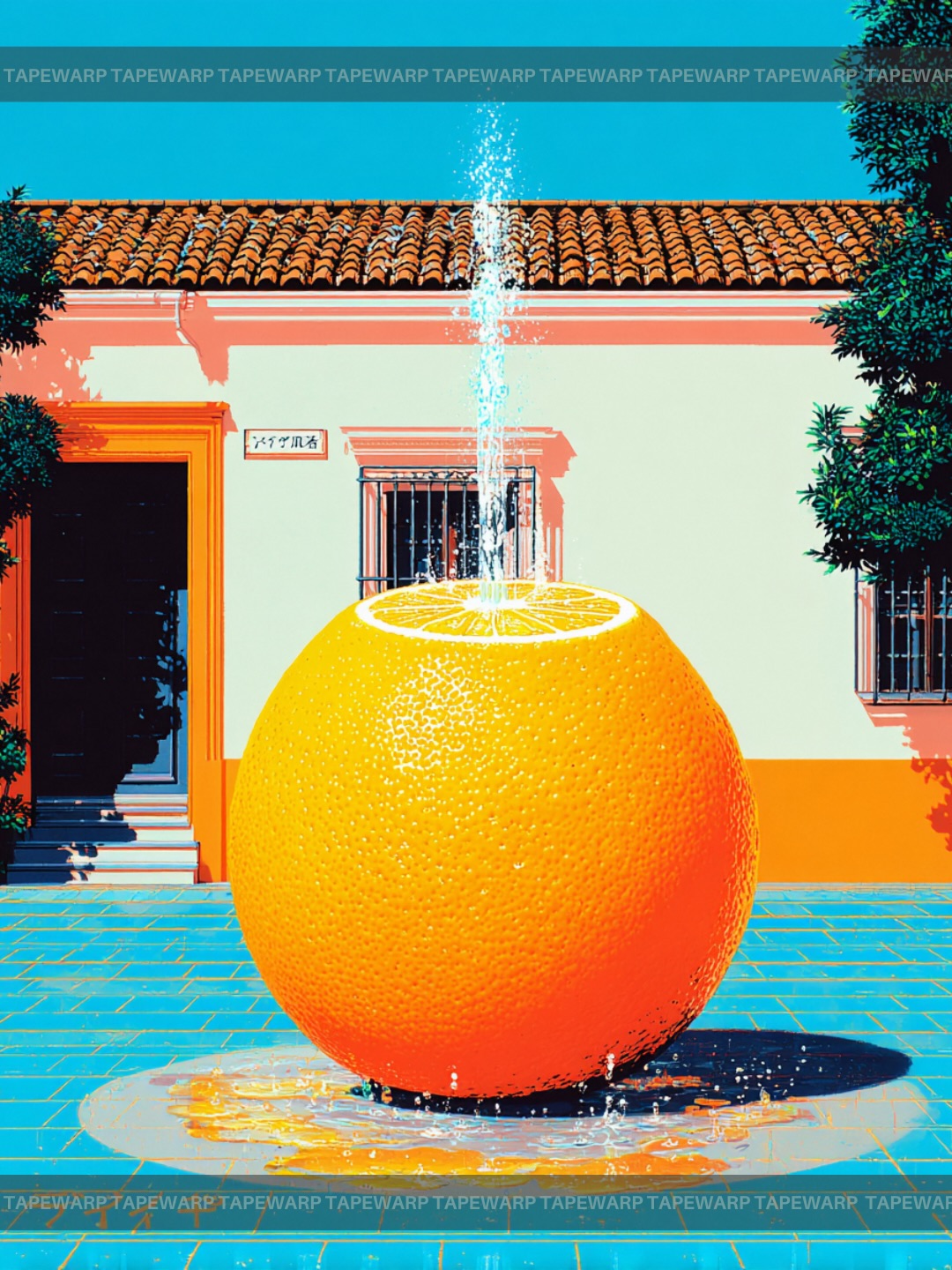
Dream Squeeze🍊 Comment ‘vivid’ to get the prompts.📩 #ai #vivid #dreaming #prompt #midjourney
Dream Squeeze🍊 Comment ‘vivid’ to get the prompts.📩 #ai #vivid #dreaming #prompt #midjourney
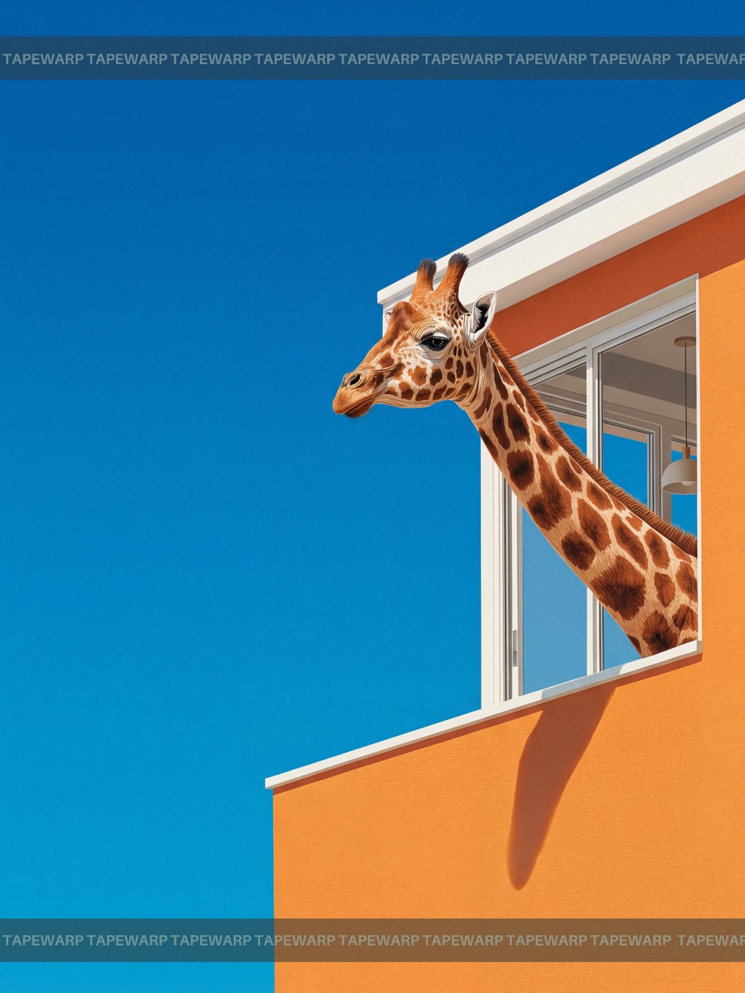
This image succeeds because it takes a fundamentally absurd idea and presents it with complete visual discipline. A giraffe extending its head and neck from an upper-story window is impossible in literal terms, yet the frame is composed with such calm confidence that the scene feels elegant rather than chaotic. The contrast between surreal subject matter and highly controlled composition is exactly what gives the image its power.
Many surreal visuals fail because they add too many unusual things at once. This one avoids that trap completely. It gives the viewer a single impossible event and surrounds it with order: a modern orange wall, a clean white window frame, hard sunlight, and a huge field of clear blue sky. That restraint makes the absurdity feel intentional. The poster is memorable not because it is loud, but because it is composed with confidence.
The central concept is extremely simple: one giraffe, one window, one architectural wall, one wide open sky. That simplicity is one of the image’s biggest strengths. Instead of trying to shock the viewer with multiple surreal elements, the composition places all of its energy into one impossible gesture. This gives the image focus. The viewer understands the premise immediately, which makes the experience satisfying rather than confusing.
In poster design, singularity often creates impact. When a composition commits to one improbable action and supports it cleanly, the result tends to feel more iconic. This image understands that principle well. The giraffe does not need companions, dramatic props, or narrative clutter. Its presence emerging from a window is enough. Because the rest of the visual system is so clean, that single gesture becomes unforgettable.
This also gives the image replay value. The viewer looks once, recognizes the impossibility, and then looks again to admire how neatly it has been staged. That second look is important. It is often where memorable images become sticky in the mind. This picture earns that second look because it pairs conceptual surprise with design precision.
The wide field of uninterrupted blue sky is not empty background. It is one of the most active parts of the composition. By allowing so much negative space around the subject and architecture, the image gains authority, calmness, and graphic clarity. The viewer’s attention is not split across multiple competing zones. Instead, the eye can move cleanly between the giraffe’s head, the window, and the orange wall.
Negative space is especially important in surreal poster work because it gives the impossible element room to resonate. If the sky were filled with clouds, extra buildings, or decorative distraction, the giraffe might feel less extraordinary. Here, the emptiness amplifies the event. It gives the image breathing space, which makes the absurdity feel more sophisticated.
This is also why the poster feels premium rather than gimmicky. Many novelty images try to maximize surprise with maximal detail. This one does the opposite. It lets emptiness do part of the work. That is a hallmark of strong editorial and campaign composition. Restraint becomes part of the message.
The bright orange stucco wall functions as a bold graphic block that anchors the entire composition. It gives the image warmth, saturation, and immediate recognition. Against the blue sky, it creates a classic complementary contrast that feels vibrant without becoming chaotic. This color relationship is one reason the image feels so poster-ready. The palette is simple, decisive, and memorable.
The wall also introduces architectural order. Its flatness, hard edges, and strong vertical-horizontal lines create a rational system that the giraffe then disrupts. That disruption is what makes the image work. If the background were already organic and irregular, the surreal intrusion would feel less sharp. Because the wall is geometric and disciplined, the animal’s emergence becomes more striking.
The stucco texture remains subtle enough not to interfere with the large-shape reading. That matters. The image benefits from the wall feeling like a color plane first and a material surface second. This keeps the composition bold at a distance while still retaining enough realism up close.
One of the reasons the image feels effective is that the giraffe itself is rendered with believable anatomy. The coat patterning, head structure, ossicones, and facial expression all feel grounded in natural observation. This realism matters because surrealism becomes more persuasive when the impossible event is carried by something otherwise believable. If the animal were cartoonish or distorted, the image would lose much of its visual tension.
The giraffe’s calm expression is also important. It does not appear aggressive, exaggerated, or theatrically comedic. Instead, it looks quietly alert, almost as if leaning out of a window were a normal behavior. That emotional neutrality makes the absurdity even more effective. The image does not beg for laughter. It simply presents the impossible as if it were self-evident, which is often a stronger surreal strategy.
The long neck also provides a beautiful compositional line. It extends diagonally from the window into the open field of sky, creating a natural visual bridge between architecture and emptiness. That line is one of the strongest formal elements in the image. It gives the poster movement without requiring any clutter or action effects.
The architecture contributes more than setting. It gives the image structure. The white window trim creates a crisp frame inside the orange wall, and that frame becomes the point of transformation where the impossible enters the scene. In a sense, the window is a threshold between logic and absurdity. That threshold is clear enough that the viewer immediately understands the joke or concept.
The building mass occupies the right side and lower portion of the frame, while the giraffe breaks outward into the open blue field. This asymmetrical distribution is very effective. It keeps the poster dynamic without feeling unstable. The heavy geometry of the building is balanced by the extended organic form of the neck, which creates a satisfying compositional equilibrium.
This interplay of rigid and organic shape is one of the most sophisticated aspects of the image. Surrealism often becomes strongest when two incompatible logics share the same frame. Here, architecture represents stability, function, and order. The giraffe represents impossibility, curiosity, and humor. Their coexistence is what gives the image its spark.
Hard sunlight is exactly the right choice for this concept because it makes everything feel clean, direct, and undeniably present. The sharp neck shadow on the orange wall confirms the physicality of the scene, even though the premise is impossible. This is important. Shadows are visual proof. They make the surreal event feel more integrated into the environment.
The bright daylight also intensifies the color palette. Blue becomes cleaner, orange becomes hotter, and the giraffe’s natural patterning remains distinct. That combination gives the image a travel-poster clarity. It feels like a real location captured in perfect weather, which again makes the surreal intrusion more compelling. The more ordinary the light, the stranger the event feels.
Harsh light can be difficult to use in portrait work, but here it is a benefit because the poster thrives on bold contrast and shape clarity. There is very little ambiguity in the frame. Everything is legible. That decisiveness is what gives the image such strong graphic presence.
There is obvious humor in the concept, but the image does not collapse into parody. That is because the humor is delivered through composition rather than visual messiness. The frame is so composed that the absurdity feels elevated. In other words, the image trusts the idea enough not to oversell it. That trust is what keeps it elegant.
Humorous surrealism often works best when it is played straight. This image does exactly that. The giraffe is not exaggerated into slapstick. The architecture is not tilted or distorted. The sky is not filled with additional jokes. The scene is calm, and that calmness allows the idea to feel sharper. The humor becomes more intelligent because the composition refuses to become frantic.
This balance between wit and control is why the poster could easily function in editorial, advertising, or conceptual branding contexts. It is unusual enough to grab attention, but refined enough to remain stylish. That is a difficult balance to achieve, and this image handles it well.
There are several useful lessons here. First, one strong impossible event is often more effective than many medium-strength ones. Second, negative space can amplify surrealism by giving the concept room to resonate. Third, color blocking can turn a simple image into something poster-like and memorable. Fourth, realistic rendering often strengthens conceptual imagery because it makes the impossible feel more surprising.
Another important lesson is that architecture can function as a stabilizer in surreal work. Clean walls, windows, doors, and geometric planes create order that makes unusual subject placement feel sharper. This is especially useful for image-makers who want conceptual results without drifting into cluttered fantasy aesthetics.
Finally, the image demonstrates that humor does not need to be noisy. A strange idea presented with elegance can be far more effective than a strange idea presented with exaggeration. That is one of the most durable lessons in surreal visual communication.
The composition is poster-ready because it has strong shape hierarchy, a memorable palette, immediate legibility, and a concept that survives reduction. At thumbnail scale, you still understand what is happening: blue sky, orange wall, giraffe out of window. That clarity matters enormously in contemporary visual distribution, where images are often encountered first on phones or inside crowded grids.
The frame also has the right balance of open space and focal interest for typography, branding, or editorial use if needed. The sky area could hold copy, the architecture could anchor a visual identity, and the giraffe remains the unmistakable central hook. This adaptability is another sign of strong poster thinking.
Ultimately, what makes the image memorable is not simply that a giraffe is in an impossible place. It is that the impossibility has been designed with confidence, discipline, and visual economy. That is why the image feels not just amusing, but iconic.