Dream Squeeze🍊 Comment ‘vivid’ to get the prompts.📩 #ai #vivid #dreaming #prompt #midjourney
Dream Squeeze🍊 Comment ‘vivid’ to get the prompts.📩 #ai #vivid #dreaming #prompt #midjourney
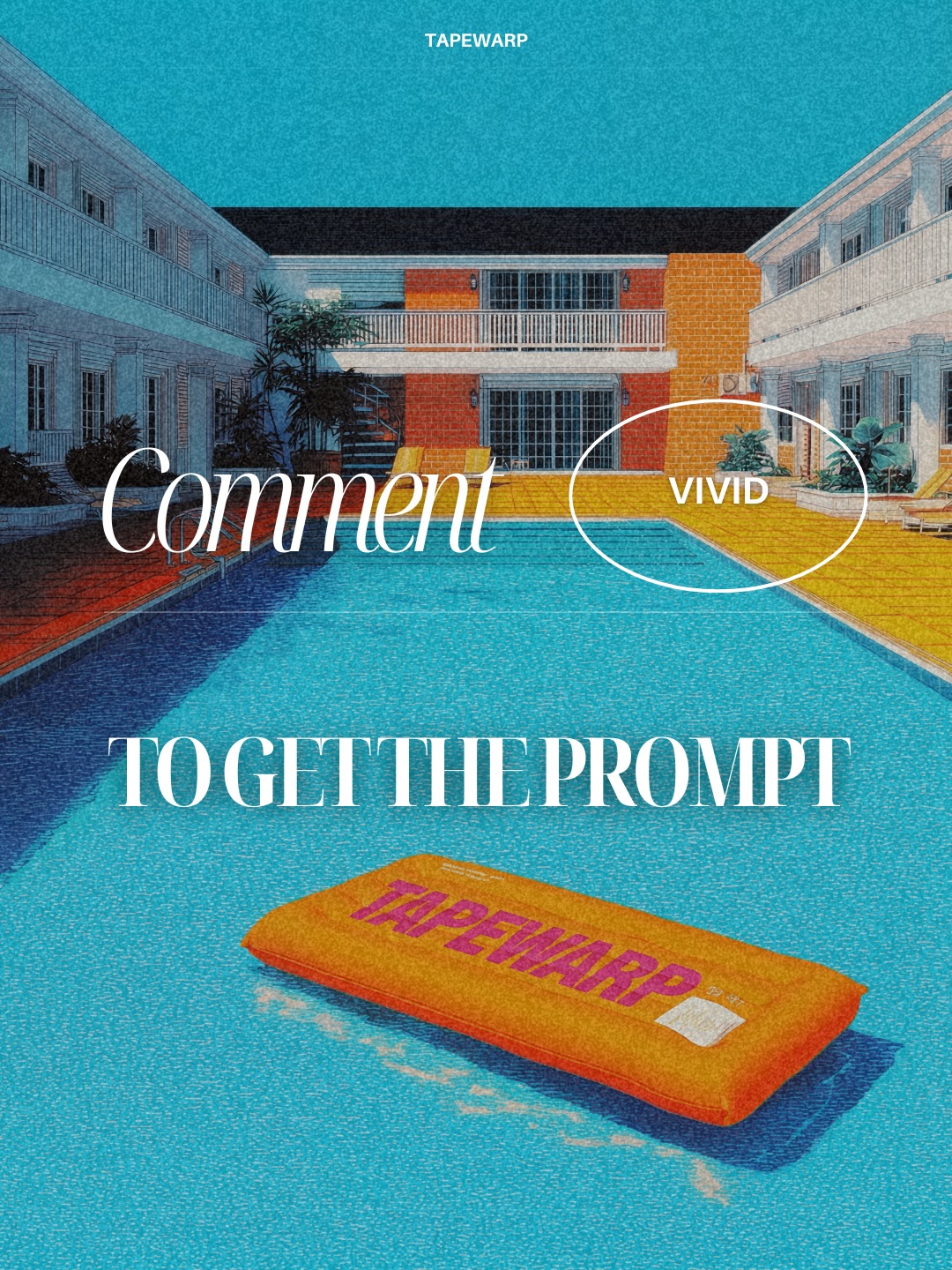
This image is doing a smart thing that many creator promo posts never quite manage: it turns a simple call to action into a mood object. On paper, the message is basic. “Comment to get the prompt.” But visually, the post presents that request inside a fully styled world. The result is that the viewer does not feel like they are looking at a favor ask. They feel like they are stepping into a brand universe.
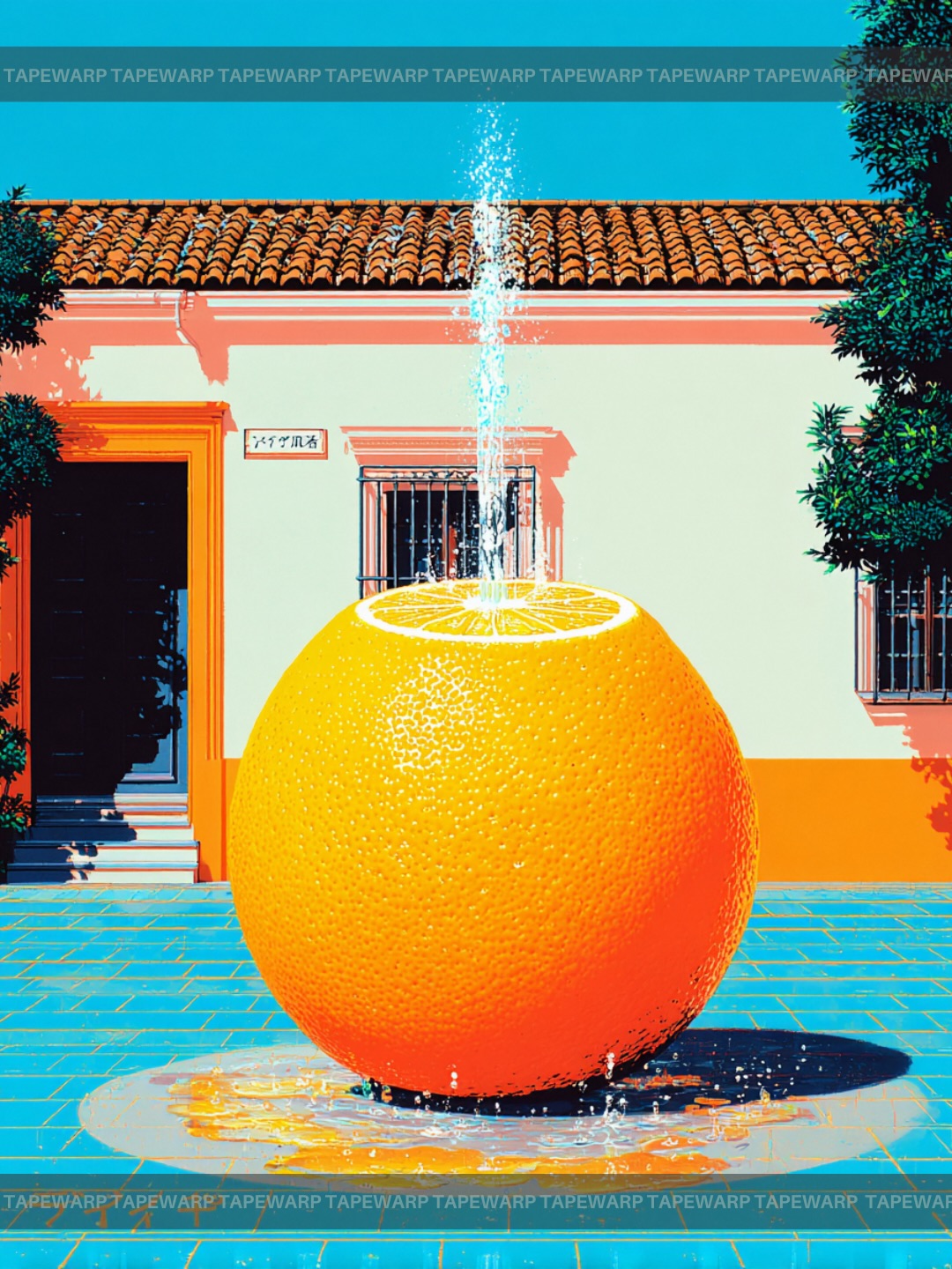
The strongest move is the transformation of the prompt into an object. The orange floating cushion becomes a stand-in for the offer itself. That is what makes the post feel premium. Intangible value is hard to market unless you give it a visible body. Here, the prompt is not shown as a text file or a screenshot. It becomes a collectible-feeling piece of design drifting inside a perfect pool scene.
The post wins first on color. Cyan pool water and orange paving already create a strong travel-poster contrast, and then the orange branded float doubles down on the warm accent. That kind of narrow palette is effective because it reads almost instantly from across a feed. You do not need to decode a lot of information to understand the image’s energy.
The second reason it works is environmental aspiration. The empty motel courtyard, the still water, and the bright weather create a fantasy of private access. It feels relaxed, exclusive, and edited. That makes the CTA softer. People are more willing to engage with a direct ask when the visual container feels desirable rather than needy. The image is not begging for comments. It is inviting viewers into a vibe.
| Signal | Evidence (from this image) | Mechanism | Replication Action |
|---|---|---|---|
| Objectized offer | The orange TAPEWARP float acts like a physical embodiment of the prompt | Making the offer feel tangible increases perceived value | Represent digital products as a branded physical-like object inside the composition |
| Travel-poster palette | Bright turquoise water, orange paving, white text, blue sky | Clean complementary color contrast makes the graphic feel instantly branded | Choose one cool field color and one strong warm accent, then repeat them consistently |
| Still luxury setting | Empty symmetrical motel courtyard with no people and calm pool water | Stillness creates premium atmosphere and lets the CTA breathe | Use an uncluttered aspirational environment when the message is simple |
| Text as design | Large serif typography is integrated into the pool scene, not tucked into a corner | The CTA feels intentional and collectible rather than transactional | Build the headline into the composition so it shares the visual hierarchy with the object |
This approach works especially well for prompt giveaways, gated resources, creator lead magnets, limited drops, and comments-driven engagement posts. It is also strong for brands selling taste more than explanation. If your audience already understands your niche, this kind of visual can make a routine CTA feel elevated.
It is less useful for educational breakdowns, nuanced multi-step tutorials, or posts that need dense information. This kind of graphic is built to seduce first and explain later.
The image borrows from travel posters, motel iconography, and modern creator branding at the same time. The motel courtyard is familiar enough to feel nostalgic, but the color treatment pushes it away from plain realism and into branded fantasy. That is a productive zone for social design. It feels rooted, yet idealized.
The orange float is also doing several jobs at once. It breaks the large pool field, it carries the brand mark, and it adds a little playful absurdity. That last part matters. Without the float, the scene could become too polished and static. The branded object gives the post a personality hook.
The typography is equally important. The serif headline gives the frame a fashion-editorial feel, while the smaller labels and outlined “VIVID” stamp add just enough system to make it feel like a campaign rather than a one-off picture. That combination is why the image feels designed by a point of view instead of assembled from parts.
| Observed | Why it matters for recreation |
|---|---|
| Foreground hero object floats in the pool instead of sitting on land | This makes the CTA feel playful and visually memorable |
| Courtyard architecture is symmetrical and uncluttered | Order and emptiness make the post feel premium |
| Large serif text crosses the water rather than sitting above it | Typography becomes part of the image architecture |
| Blue-orange palette repeats across sky, water, paving, and object | Repetition is what turns color into branding |
| Print grain softens the digital polish | Texture gives the graphic character and keeps it from feeling template-flat |
If you want to recreate this class of promo image, think in branded scene logic. The main question is not “what does the object look like?” It is “how do setting, color, and CTA all agree that this offer is worth attention?”
| Prompt chunk | What it controls | Swap ideas (EN, 2–3 options) |
|---|---|---|
| bright orange branded float in a turquoise pool | Hero object, palette anchor, offer embodiment | “orange inflatable tag in a blue pool”; “branded floating cushion in clear water”; “bold warm product-object in a cool pool field” |
| symmetrical motel courtyard under bright daylight | Scene order, aspiration, nostalgic architecture | “empty retro motel pool”; “clean courtyard hotel scene”; “mid-century vacation pool setting” |
| oversized white editorial CTA typography | Message hierarchy and poster authority | “large serif call-to-action text”; “fashion-style white headline”; “oversized promotional copy integrated into the scene” |
| grainy retro print texture | Tactility, nostalgia, anti-template personality | “risograph grain”; “vintage poster texture”; “soft halftone travel-poster finish” |
| white outlined VIVID callout and top wordmark | Brand system and secondary UI rhythm | “small white stamp label”; “outlined brand callout”; “top-centered minimalist wordmark” |
Lock three things first: the turquoise pool field, the orange branded object, and the large white CTA type. Those are the image’s identity pillars. If any one of them weakens, the design stops feeling like a branded poster and starts feeling like a random resort shot with text on it.
Then follow the one-change rule. Move only one or two dials per round.
If you want a CTA post to feel premium, stop treating the CTA as text alone. Build it into a world that already feels worth entering.