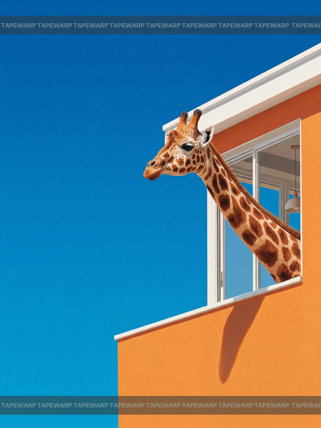
Dream Squeeze🍊 Comment ‘vivid’ to get the prompts.📩 #ai #vivid #dreaming #prompt #midjourney
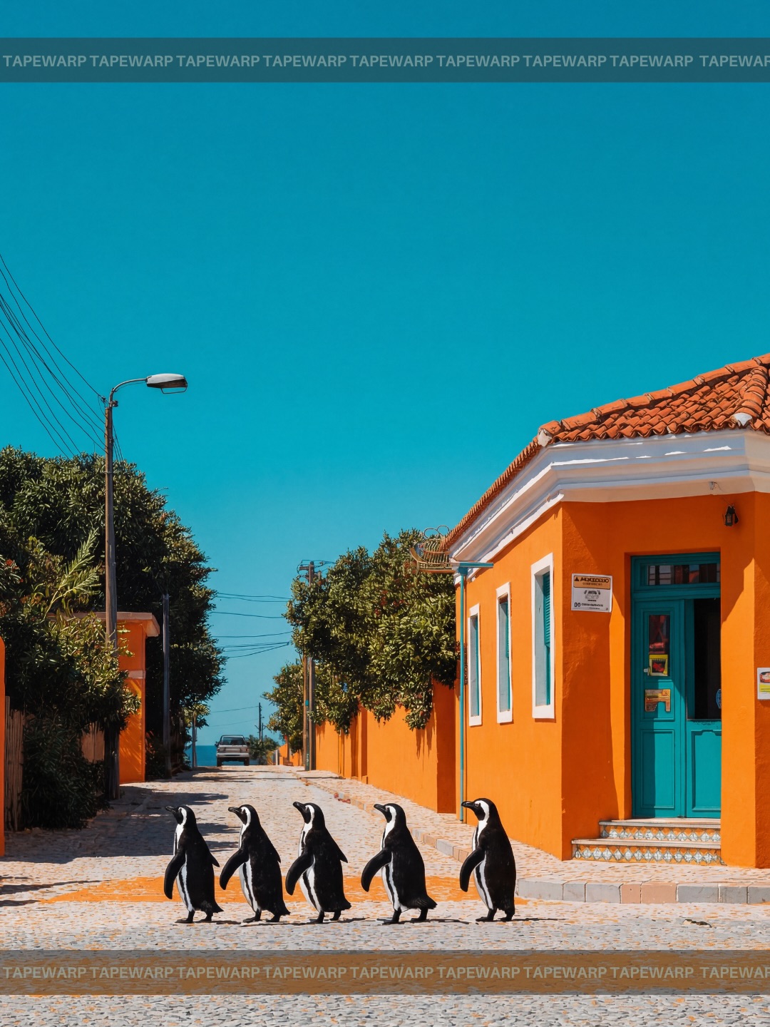
Dream Squeeze🍊 Comment ‘vivid’ to get the prompts.📩 #ai #vivid #dreaming #prompt #midjourney
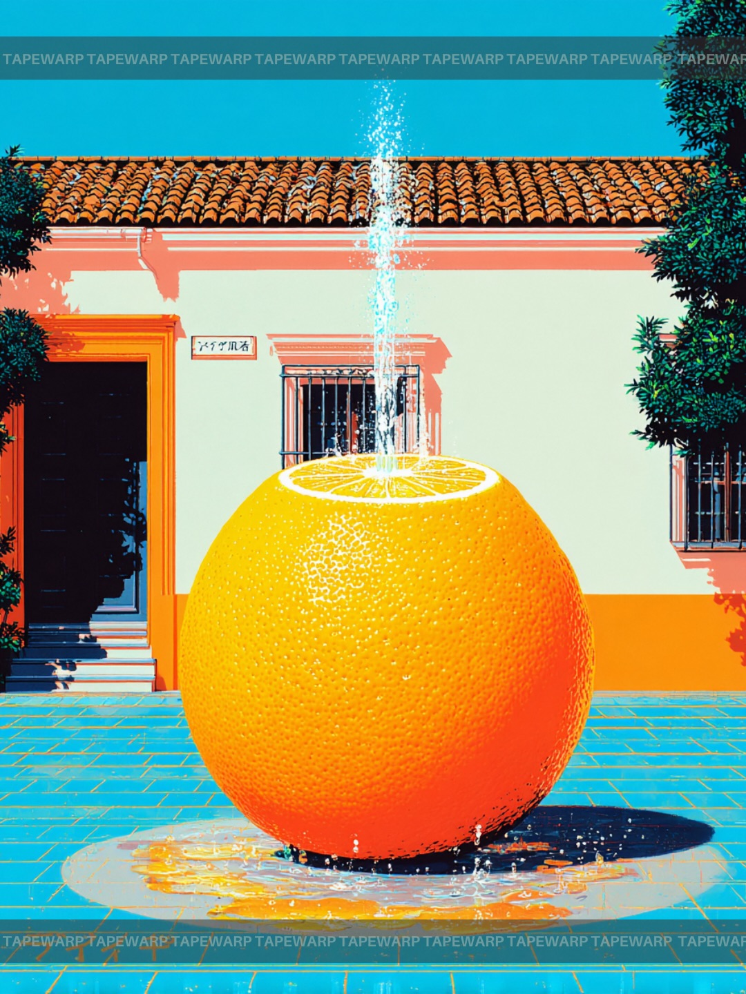
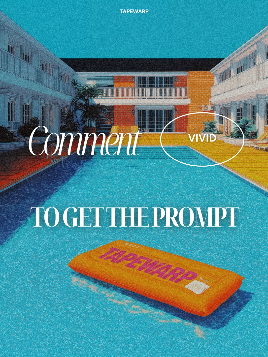
This image succeeds because it treats surrealism as design rather than chaos. The central concept is bold and immediately legible: a giant orange transformed into a courtyard fountain, complete with a sliced top and an upward water plume. That single impossible object is all the frame needs to create wonder. The rest of the scene is structured to support it rather than compete with it. This is an important distinction. Many surreal images fail because they introduce too many strange ideas at once. Here, the image commits to one excellent idea and builds the entire poster around it.
The orange itself is the hero object, and it works because it still behaves visually like a real orange. The peel texture remains detailed, the sliced top remains citrus-specific, and the surface retains enough natural realism to support the scale transformation. That material honesty matters. When surreal objects stop feeling materially believable, the image can collapse into gimmick. In contrast, this giant orange fountain feels like something that could genuinely exist as a contemporary public sculpture. That is why the concept feels polished rather than random.
The Mediterranean courtyard is an equally important part of the image’s success. White stucco walls, terracotta roof tiles, geometric windows, and a turquoise tiled ground create an environment that is stable, recognizable, and architecturally coherent. This coherence is what gives the orange fountain somewhere meaningful to live. Surreal images often become stronger when the impossible object is placed inside a believable and visually disciplined setting. The logic of the place makes the impossible object feel more intentional, not less.
Color is doing a tremendous amount of work here. The orange fruit against the cool cyan-blue floor and deep blue sky creates a strong warm-cool opposition that feels instantly poster-ready. The white walls keep the color palette from becoming muddy, while the terracotta accents gently echo the citrus warmth without overwhelming it. This is not accidental. Strong surreal poster design often depends less on the weirdness of the idea and more on whether the color relationships are clean enough to make the image feel designed.
The fountain behavior is another smart detail. The water jet rises vertically from the sliced top, creating a clean axis that reinforces the centered composition. That simple decision makes the orange read as a functioning sculpture rather than a random oversized fruit. It introduces purpose. Once the water behavior is clear, the object stops feeling like a novelty prop and starts feeling like a real site-specific installation. This is a useful prompt lesson: surreal objects become more persuasive when they have a clear function inside the world.
One of the strongest qualities of this image is that it borrows the visual language of public art and design-object photography instead of fantasy illustration. The scene does not rely on dream haze, floating fragments, or magical visual noise. Instead, it presents the fountain in a direct, almost architectural way. That choice helps the viewer treat the object as a designed intervention. In other words, the image is not only surreal, it is curated. That difference is why the concept feels suitable for a gallery poster, editorial feature, or collectible art print.
The courtyard background is planar and symmetrical enough to act like a stage. The giant orange sits centered, the building facade creates a flat graphic backdrop, and the tiled ground provides a strong geometric base. All of these choices make the surreal centerpiece easier to read. Good public-art poster images often use architecture in this way: as a framework for attention rather than a distraction. The building does not tell its own story. It gives the sculpture authority.
Midday lighting further reinforces this contemporary-art feeling. Hard-edged sunlight, crisp shadows, and clear specular highlights on the wet surfaces make the object feel installed in a real outdoor place. The light is not dreamy. It is precise. That precision matters because it helps the image feel expensive and intentional. The shadow geometry also enhances the graphic quality of the frame, making it feel more like a designed print than a spontaneous photograph.
| Visual Component | What It Contributes | Why It Matters | Prompting Lesson |
|---|---|---|---|
| Giant orange sculpture | Creates the central surreal hook | Instantly defines the image concept | Lead with one impossible object, not many |
| Vertical water jet | Gives the orange functional meaning | Transforms novelty into plausible design | Add utility or logic to surreal objects whenever possible |
| Mediterranean courtyard | Provides site specificity and geometric stability | Makes the surreal object feel grounded | Use coherent architecture as a stage for surreal concepts |
| Hard midday light | Sharpens color, edges, and reflections | Boosts print-quality realism and poster impact | Controlled daylight can make surrealism feel more believable |
| Warm-cool palette | Creates immediate graphic contrast | Helps the scene feel intentional and collectible | Build surreal compositions around a clear palette strategy |
If you want to create similar work, the biggest lesson is to define both the transformed object and the surrounding architecture with equal clarity. Many weak surreal prompts only describe the strange object and leave the setting vague. That often produces aimless outputs. This image succeeds because the orange fountain and the Mediterranean courtyard are equally specified. The fruit is giant, sliced, textured, and functional. The courtyard is white, tiled, sunlit, and geometrically clean. The viewer feels both elements at once, and that is why the concept feels complete.
Another useful prompt lesson is to control scale through context rather than through explanation. The image never needs textual instructions telling the viewer that the orange is enormous. The scale is communicated by courtyard doors, windows, ground perspective, and water behavior. In prompt writing, contextual scale indicators are much stronger than adjectives like huge or massive alone. Architecture, doorways, furniture, or paving patterns are often the best tools for making giant objects feel truly giant.
The image also shows how important it is to avoid clutter when the core concept is already strong. Adding people, market stalls, decorative furniture, or too many environmental props would weaken the read. This poster benefits from clean negative space and crisp edges. The building facade, tiled ground, and simple branding bands are enough. That restraint allows the eye to stay focused on the orange fountain and the water plume. In prompt terms, less can be more when the main concept is already unusually strong.
A practical prompt inspired by this image might read like this: giant orange transformed into a public fountain sculpture, sliced citrus top with a clean vertical water jet, centered in a sunlit Mediterranean courtyard, white stucco walls, turquoise floor tiles, terracotta roof accents, hard midday light, sharp shadows, saturated warm-cool color blocking, editorial art-poster finish, surreal but architecturally believable. That kind of phrasing gives the generation enough structure to stay focused and strong.
The easiest way to evolve this image without weakening it is to preserve the object-function relationship while changing the architectural site or material mood. For example, the same orange fountain could be relocated to a modern museum courtyard with pale concrete and glass. It would still work because the key idea is not the exact wall texture. The key idea is that a citrus object has been elevated into public sculpture. Similarly, the courtyard could shift into a warm coastal plaza or a more enclosed cloister-like setting, provided the geometric clarity remains intact.
Another strong variation path is to explore different fruit-sculpture identities using the same design logic. A lemon fountain would feel sharper and brighter. A pomegranate sculpture would feel denser and more mythic. A giant fig fountain would become more decadent and sculptural. But the lesson remains the same: if the object is the surreal engine, the architecture must stay disciplined. That is the balance that makes this kind of image feel elevated rather than silly.
The lighting can also be shifted strategically. Golden-hour light would make the image softer and more romantic, while overcast light would create a museum-catalog atmosphere. But the current midday choice is arguably the strongest because it sharpens geometry and saturation. In poster work, clarity often beats softness, especially when the scene contains one central object that needs to read immediately.
| Variation Direction | What To Change | What To Preserve | Result |
|---|---|---|---|
| Museum courtyard version | Swap stucco walls for pale concrete and clean glass | Centered fruit fountain, clear water jet, graphic composition | Feels more high-design and contemporary institutional |
| Coastal plaza version | Add sun-washed stone and open sky horizon | Warm-cool contrast and functional fountain logic | Feels more travel-editorial and open-air |
| Lemon fountain version | Replace orange with bright yellow citrus sculpture | Material realism and clean architectural setting | Feels sharper, fresher, and more playful |
| Golden hour version | Shift lighting to late-afternoon warmth | Object scale, center axis, and courtyard discipline | Feels softer and more cinematic |
This image is especially useful for blog analysis because it is easy to explain without being simple. Every major decision supports the same goal: turning a fruit into a monumental designed object. The object realism, the water behavior, the architecture, the color blocking, and the graphic composition all point in the same direction. That coherence makes the image educational. A reader can study it and actually learn how surrealism becomes persuasive through design discipline.
It is also a strong reminder that surreal AI imagery does not need to be dreamlike to be interesting. There is another path, and that path is design surrealism. Instead of visual chaos, it uses functional transformation. Instead of fantasy haze, it uses architectural placement. Instead of symbolic overload, it uses one object and one environment extremely well. This makes the image more reusable for professional or editorial contexts, because it feels intentional and printable.
For creators building prompt libraries, this image suggests a durable framework: one transformed everyday object, one clear function, one coherent setting, one strong palette, and one poster-minded composition. That framework is flexible enough to generate many strong concepts while still preserving quality control. It can be used for sculpture posters, conceptual product visuals, gallery-style editorials, or surreal travel campaign concepts.
Ultimately, this image succeeds because it understands that surrealism becomes stronger when the world around it stays rational. The orange is impossible, but the water, the shadows, the courtyard, and the composition all feel deeply intentional. That is what makes the image memorable. It does not just show something weird. It shows something weird with architectural confidence. That difference is why it feels sophisticated and blog-worthy.
If you want to create similar work, focus on object transformation, environmental discipline, and palette structure. Make the impossible idea clear, then let everything else serve it. This image proves that one surreal fountain can do more than ten competing strange ideas if the design is sharp enough.