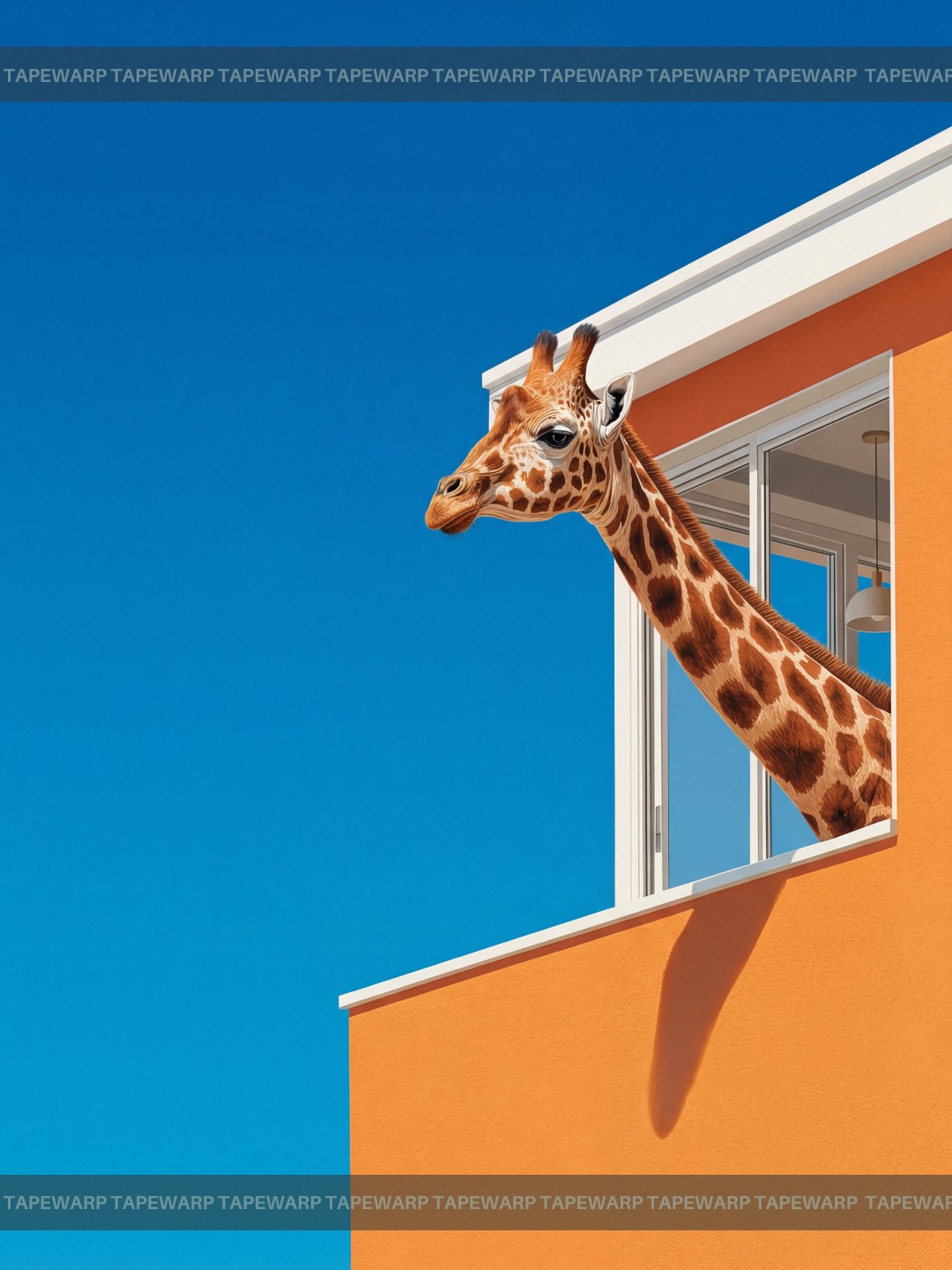
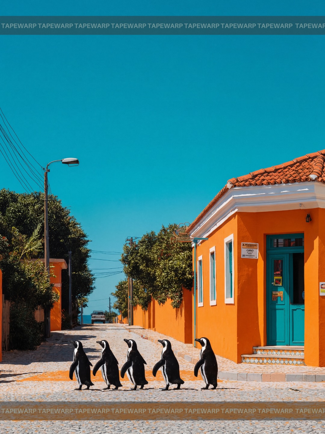
Dream Squeeze🍊 Comment ‘vivid’ to get the prompts.📩 #ai #vivid #dreaming #prompt #midjourney
Dream Squeeze🍊 Comment ‘vivid’ to get the prompts.📩 #ai #vivid #dreaming #prompt #midjourney
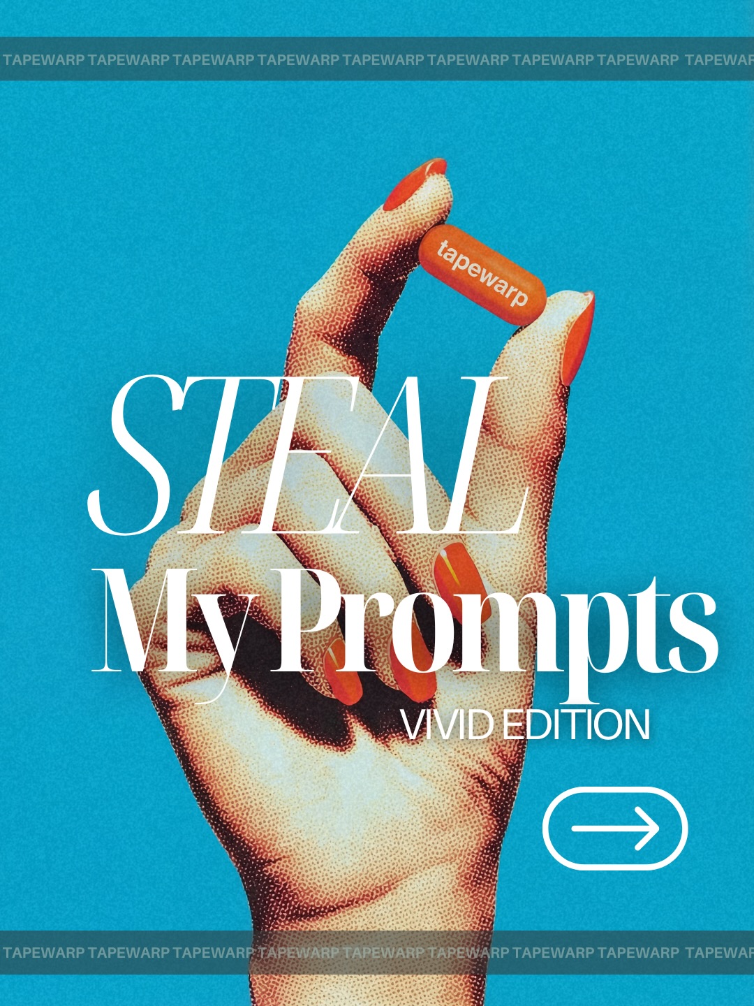
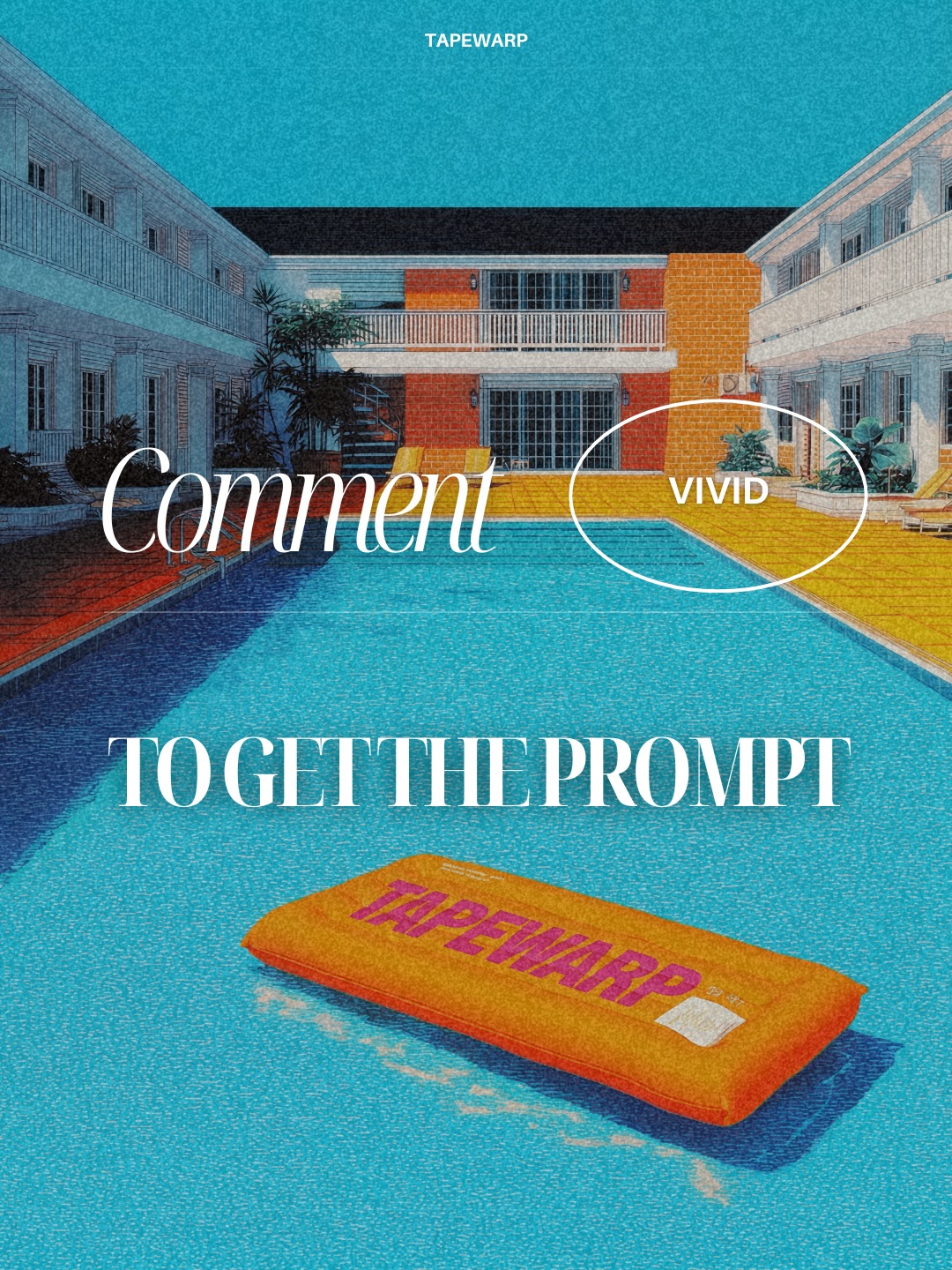
Some creator posts work because they explain something useful. This one works before explanation even begins. The image behaves like a product ad for taste itself: one hand, one electric blue field, one orange accent, one oversized line of serif type. It is simple enough to read instantly, but styled enough to feel like something worth clicking, saving, or buying into.
The clever move is that the graphic treats prompts as a premium object. Instead of showing screenshots, folders, or generic text blocks, it turns the idea of “my prompts” into a branded visual product. That matters for growth. The audience is not only receiving information; they are receiving a status-coded package. The post says these prompts are not casual leftovers. They are curated, stylized, and valuable.
The first reason is contrast economy. The palette is tight: cyan, orange, white, and a little charcoal transparency. That discipline makes the image feel more expensive than most prompt-promo graphics. The second reason is object clarity. The hand pinching the orange tag creates a miniature product moment. Even if the viewer does not read every word, they understand that something branded and collectible is being offered.
The third reason is typography hierarchy. “STEAL My Prompts” is not buried under decoration. It is the decoration. The type does the main selling, while the hand gives it attitude and tactility. That is a great creator lesson: if the message is the product, design the message like the hero object, not like a caption pasted on top.
| Signal | Evidence (from this image) | Mechanism | Replication Action |
|---|---|---|---|
| Color discipline | Bright cyan background, orange tag and nails, white typography | Controlled palette creates immediate brand memory and a premium feel | Limit the graphic to one cold field, one warm accent, and one text color |
| Objectized information | The hand physically pinches a small “tapewarp” tag like a product token | Turning abstract value into a visible object increases perceived worth | Represent the offer with a holdable visual element, not only text |
| Editorial type scale | Massive serif headline dominates the center of the frame | Big type creates poster authority and makes the message legible at thumbnail size | Scale the headline until it becomes part of the composition, not just a label |
| Print-texture nostalgia | The hand surface has a visible halftone or risograph-like texture | Texture prevents the design from feeling too sterile or template-driven | Add one tactile material treatment such as grain, halftone, or print noise |
This style is ideal for prompt packs, digital product drops, resource announcements, creator-brand launches, and swipe graphics where the real goal is to make the audience feel they are accessing something curated. It is especially strong when your offer is intangible. Good design helps intangible value feel touchable.
It is less ideal for educational carousels with long explanations, narrative storytelling, or documentary-style posting. This visual system is built to attract, position, and package, not to unpack nuance on its own.
The hand is doing more than holding an object. It is performing curation. The gesture feels precise, almost precious, which subtly tells the viewer that what is being offered has been selected rather than dumped. That is a small but important branding cue. Curation feels more valuable than abundance.
The halftone texture is the second key move. Without it, this might read as a generic Canva-style promo. With it, the image gains tactile confidence. It nods to print culture, magazines, zines, and fashion posters, which gives the design cultural weight. Texture here is not decoration. It is credibility.
The typography also earns its scale. The serif headline feels luxurious, while the sans-serif subhead and arrow icon keep the piece modern enough for social. That friction between classic editorial type and digital CTA language is what makes the poster feel current instead of retro-costume.
| Observed | Why it matters for recreation |
|---|---|
| One hand fills the composition against a flat blue field | Isolation gives the design a product-shot clarity even without a traditional product |
| Orange-red nails and orange tag create a concentrated warm accent | Warm accent control is what keeps the composition energetic without clutter |
| Large white serif type overlaps the hand | Type integration makes the message feel designed, not pasted on |
| Top and bottom brand strips repeat the same word | Repetition turns the frame into a branded system rather than a one-off graphic |
| Halftone skin texture softens the digital polish | Tactile imperfection makes the poster feel more memorable and less generic |
If you want to build this kind of graphic, think like a creative director, not just a prompt writer. Your key controls are object scale, type hierarchy, palette restriction, and texture treatment.
| Prompt chunk | What it controls | Swap ideas (EN, 2–3 options) |
|---|---|---|
| close-up female hand pinching a small branded orange tag | Main object logic, gesture, tactile focus | “hand holding a small branded capsule”; “elegant hand presenting a tiny label”; “close-up fingers pinching a collectible tag” |
| flat cyan background with bold editorial poster composition | Scene simplicity, poster readability, color field | “solid electric blue backdrop”; “clean color-block poster field”; “flat saturated blue commercial background” |
| oversized white serif headline layered over the hand | Typography hierarchy and message dominance | “huge luxury serif headline”; “editorial title overlapping the object”; “large white fashion-magazine typography” |
| halftone print texture on skin and surface | Tactility, nostalgia, anti-template feel | “risograph-like grain”; “vintage print dot texture”; “editorial halftone poster finish” |
| orange-red nails, white arrow icon, repeating brand strips | Accent system and branded UI details | “warm orange manicure with CTA icon”; “graphic arrow button and repeated wordmark”; “minimal brand bands with repeated label text” |
Lock three things first: the flat cyan field, the hand-plus-tag gesture, and the huge white headline. Those are the structure. If any one of them weakens, the poster starts feeling like a normal promo instead of a branded statement.
Then use the one-change rule. Shift only one or two variables per pass.
If you want an intangible offer to feel valuable, do not just explain it. Design it like something people want to hold.