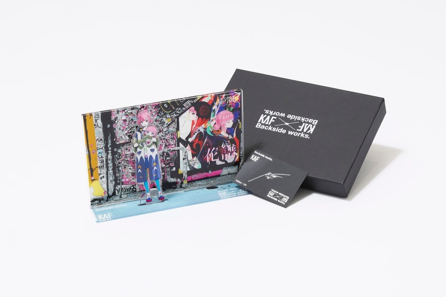
How virtual_kaf Built This KAF x Backside works. Merch Visual — and How to Recreate It
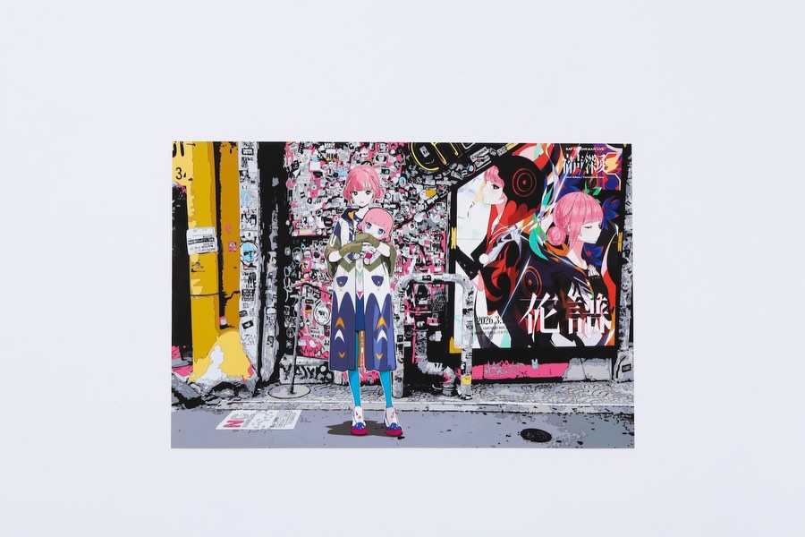
This post is interesting because it uses two layers of composition at once. The outer canvas is a calm light-gray field, while the inner frame is dense urban poster chaos. That contrast creates a strong attention rhythm: first the eye notices the unusual empty border, then it dives into the busy alley detail. It is a smart feed strategy because it interrupts pattern recognition without becoming unreadable.
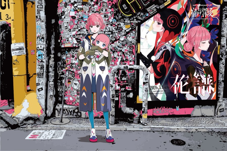
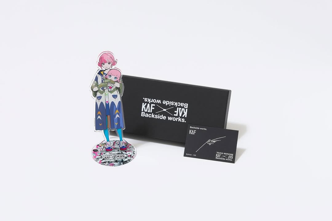
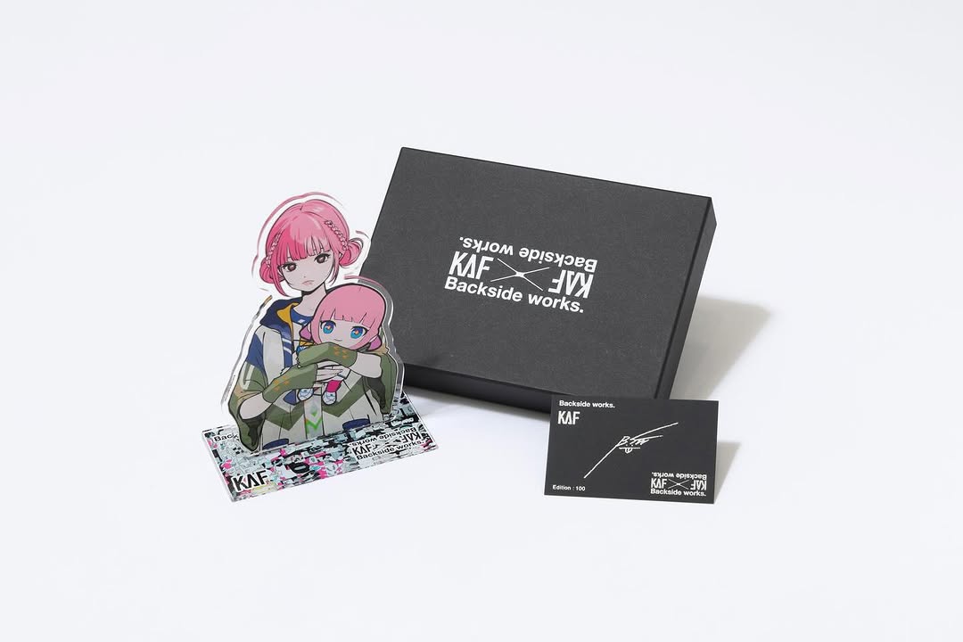
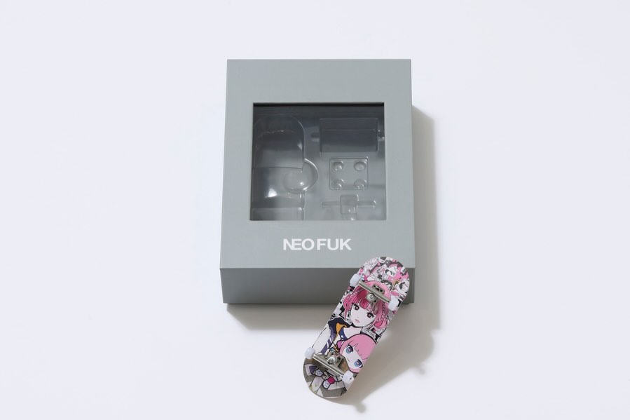
The character design also carries a clear hook: a pink-haired anime girl holding a smaller version of herself. That self-referential visual concept invites rewatch and discussion, especially among audiences who like character lore, meta-humor, and street-pop aesthetics. For creators, this is a good case of combining graphic novelty with narrative clarity.
Signal Table
| Signal | Evidence (from this image) | Mechanism | Replication Action |
|---|
| Frame-within-frame novelty | Large gray outer area with centered inset image | Pattern break increases scroll stop | Use an outer matte zone to isolate and spotlight inner story scene |
| Meta character hook | Main character holding a mini version of herself | Creates curiosity and replay behavior | Add one recursive or symbolic prop tied to character identity |
| Urban texture density | Sticker-heavy wall, signage, layered posters | Encourages longer dwell through detail exploration | Build background with many micro-elements but keep subject centered |
| Color anchor points | Pink hair + yellow pole + blue leggings | Gives visual navigation across dense composition | Lock 3 accent colors and repeat them across character and set |
Use Cases and Transfer
- Anime character worldbuilding posts: Best fit because visual storytelling is layered. Change: rotate background district themes.
- Street-pop art releases: Best fit for mixed manga + urban graphics audiences. Change: keep inset layout, swap character outfit palette.
- Music visualizers for virtual artists: Best fit due poster-culture energy and identity symbolism.
- Merch announcement art: Best fit when character and environment both carry brand motifs.
Not ideal: minimalist brand campaigns, realism-focused photography pages, or info-heavy educational content.
Three Transfer Recipes
| Transfer | Keep | Change | Slot template (EN) |
|---|
| Neon Metro Transfer | Inset composition + centered character + dense texture | Sticker alley to neon station walls | {inner_scene_type} {character_palette} {meta_prop} {outer_matte_color} |
| Retro Arcade Transfer | Recursive character concept and pop-art contrast | Street posters to arcade cabinets and flyers | {retro_environment} {outfit_style} {held_object_variant} {graphic_density} |
| Monochrome Punk Transfer | Frame-within-frame hierarchy | Colorful palette to black-white-red limited palette | {palette_limit} {poster_language} {subject_centering} {line_style} |
Aesthetic Read
The strongest aesthetic choice is the deliberate imbalance between empty and crowded space. Most creators either go fully minimal or fully maximal. This image does both at the same time: outer calm, inner chaos. That creates a gallery-like presentation while preserving street energy inside the core scene.
The second strength is object hierarchy. Even with extreme background texture, the main subject remains readable because of center placement and repeated accent colors. The yellow vertical pole and right billboard act as structural rails that keep the scene from collapsing into noise. This is useful for creators designing dense illustrations that still need feed-level clarity.
| Observed | Recreate |
|---|
| Outer matte + inner story panel | Build two-layer composition with large neutral margin and compact narrative core |
| Centered subject in busy background | Keep protagonist dead-center when texture complexity is high |
| Recursive character element | Add one self-referential prop/mini character for concept depth |
| Structural side anchors | Place one strong element on left and one poster block on right |
| Flat graphic rendering | Use cel-shaded linework and avoid cinematic depth blur |
Prompt Technique Breakdown
| Prompt chunk | What it controls | Swap ideas (EN, 2-3 options) |
|---|
| "pink-haired anime girl holding mini self" | Core narrative hook | "blue-haired version", "mask-wearing variant", "robot mini-self" |
| "poster-dense urban alley" | Background complexity and culture signal | "subway corridor stickers", "graffiti tunnel", "festival notice wall" |
| "right-side large anime billboard" | Secondary focal structure | "neon ad panel", "band poster collage", "comic mural" |
| "left vertical yellow pole" | Spatial anchor and color balance | "cyan utility pipe", "red signpost", "white neon strip" |
| "centered inset image on gray outer canvas" | Feed-level novelty and framing | "black outer matte", "cream border", "paper texture border" |
| "anime cel-shaded urban pop-art style" | Rendering language | "manga ink style", "flat vector pop", "halftone comic treatment" |
Remix Steps
Baseline lock: inset layout, centered subject, poster-density level.
One-change rule: adjust one knob per run to keep readability stable.
- Run 1: establish baseline with current pink-yellow-blue color anchors.
- Run 2: keep layout fixed, change only background poster language style.
- Run 3: keep background winner, change only outfit motif complexity.
- Run 4: keep winners, test one outer matte color shift for feed contrast.
This workflow helps creators produce maximalist scenes that still convert cleanly in social feeds.