The Anime Acrylic Stand Merch Set: How virtual_kaf Built This AI Art
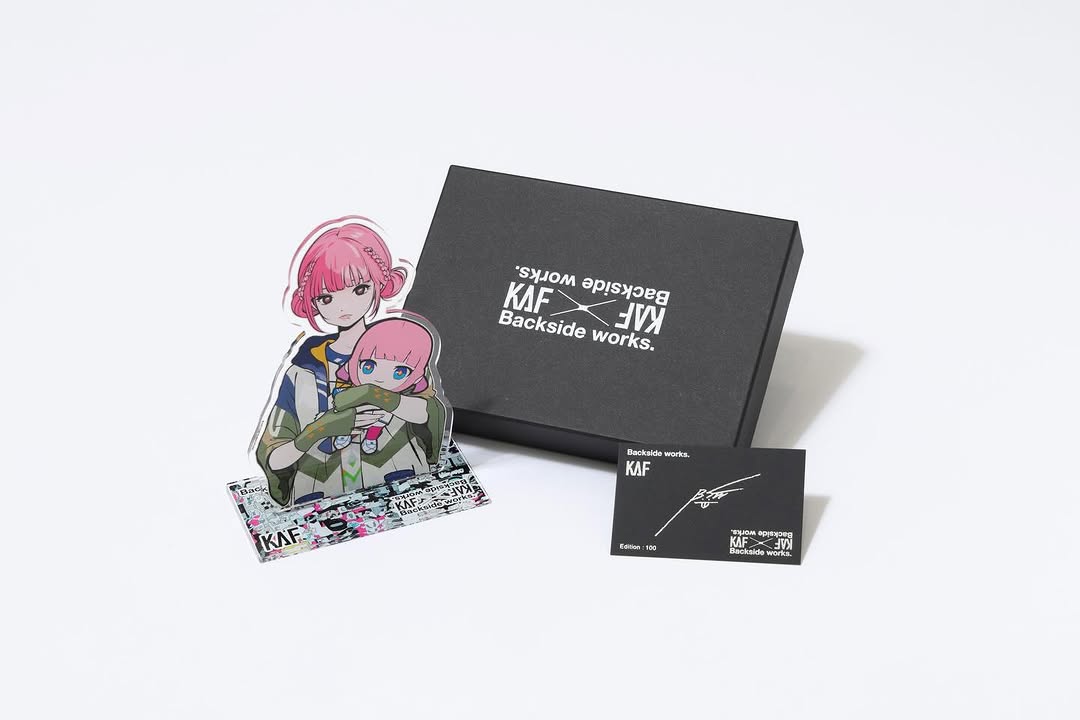
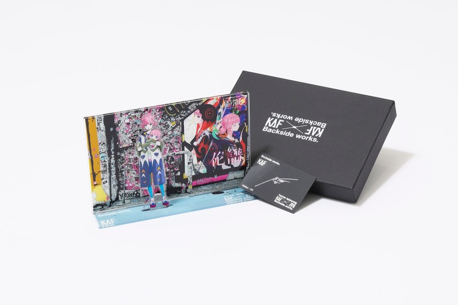
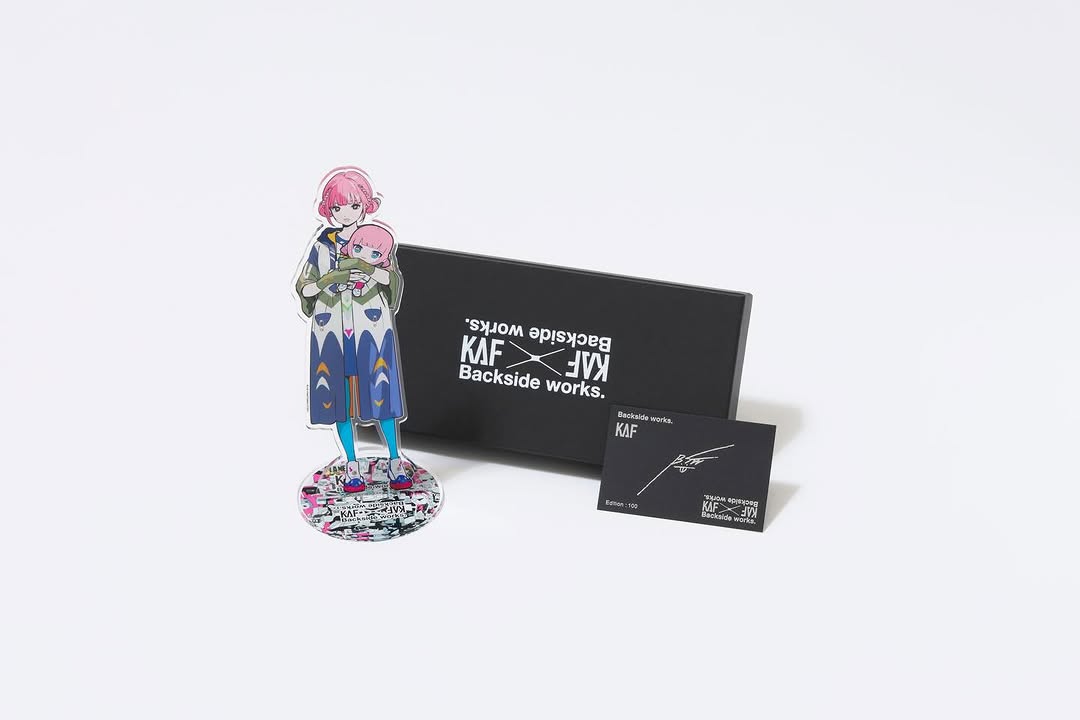
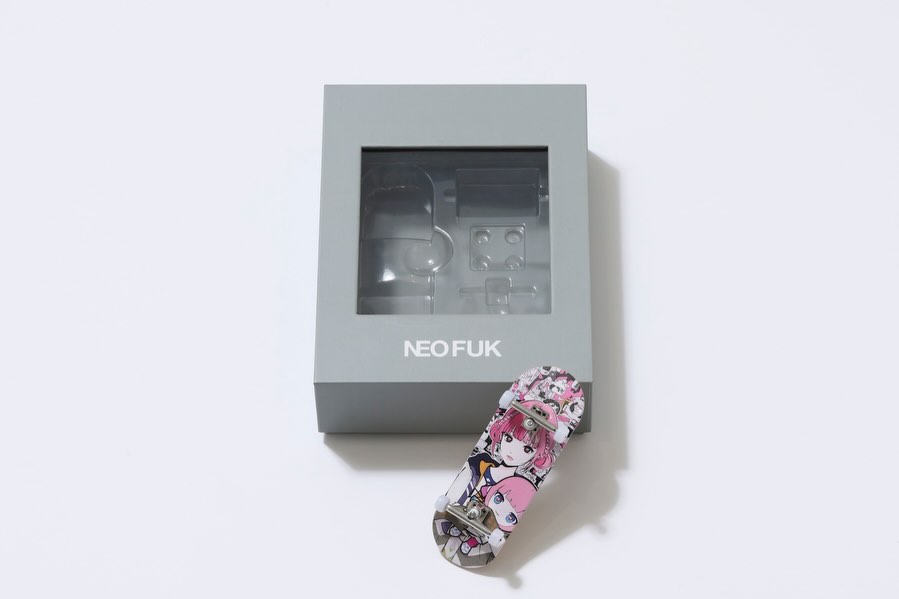
This post is a strong example of set-based product storytelling. Instead of showing one item in isolation, it presents a complete collector package: display box, acrylic character stand, and edition card. That structure communicates value layering and makes the drop feel intentional.
For creator brands, this approach is especially useful when launching collaboration goods with limited quantities.
Why This Product Visual Converts Better
The image answers buyer questions at a glance: What is included? Is it official? Is it collectible? The black box and certificate-style card establish legitimacy, while the acrylic figure delivers emotional fandom appeal.
The neutral background helps too. With no visual noise, users can quickly inspect logo details and object quality. That reduces hesitation in pre-order windows.
| Signal |
Evidence (from this image) |
Mechanism |
Replication Action |
| Bundle clarity |
Three components shown together in one frame |
Reduces confusion and increases perceived value |
Always show full bundle composition in the first hero image |
| Legitimacy cues |
Branded black box and signed/edition-style card |
Builds trust for premium or limited pricing |
Include certification or edition element visually, not only in caption |
| Emotional anchor |
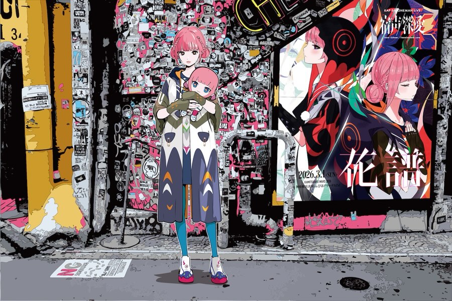
Colorful acrylic stand with character illustration |
Fandom attachment drives saves and shares |
Place the most emotionally recognizable piece in front-left or center |
| Clean catalog framing |
Large negative space and soft studio shadows |
Makes products look premium and organized |
Keep background neutral and avoid decorative clutter in conversion posts |
Best-Fit Scenarios and Caveats
- Limited-edition drops: perfect for scarcity campaigns and lottery sales.
- Artist collaboration releases: ideal for showing co-branded assets clearly.
- Pre-order windows: useful when buyers need fast trust signals before checkout.
- Collector-targeted storefronts: strong for premium product positioning.
Not ideal: lifestyle storytelling posts, behind-the-scenes narratives, or social-first memes where polish is less important than spontaneity.
Three Transfer Recipes
- Collector bundle transfer
Keep: package + hero item + authenticity card layout.
Change: hero item type by fandom (figure, keychain, mini artbook).
Slot template (EN): {premium_box} + {hero_collectible} + {auth_card}, neutral studio background
- Collab announcement transfer
Keep: dual-brand logo readability and triangular arrangement.
Change: one accent object to represent each collaborator.
Slot template (EN): {brandA_brandB_box}, {character_piece}, {edition_card}, clear co-brand marks
- Storefront hero transfer
Keep: clean negative space and soft shadow.
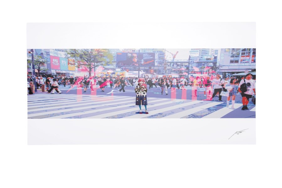
Change: add one alternate angle as second slide.
Slot template (EN): slide1 front set layout, slide2 45-degree closeup of {key_detail}
Aesthetic Read: Why the Set Feels Premium
The composition uses a simple triangle structure that keeps each component readable without overlap chaos. Matte black packaging creates a high-value baseline, while the colorful acrylic art acts as the emotional contrast point.
The card on the right balances the visual weight and adds a subtle “certificate” message. That small object significantly increases collector perception.
Prompt Technique Breakdown
| Prompt chunk |
What it controls |
Swap ideas (EN, 2-3 options) |
| three-piece merch set arrangement |
Bundle clarity and hierarchy |
"box + figurine + card" / "box + pin set + certificate" / "box + print + serial card" |
| matte black packaging with white logos |
Premium tone and brand contrast |
"charcoal box" / "navy box" / "white box with black mark" |
| acrylic stand with character art |
Fandom appeal and visual accent |
"acrylic key visual plate" / "mini standee" / "character card block" |
| neutral light-gray studio background |
Distraction control and readability |
"pure white" / "warm light gray" / "cool gray seamless" |
| soft diffused product lighting |
Material fidelity and clean shadows |
"shadowless high-key" / "single softbox left" / "dual softbox even light" |
Remix Steps for Merch Teams
Baseline lock: lock object count and arrangement, lock neutral backdrop, lock logo-facing orientation.
One-change rule: one controlled adjustment per variant.
- Variant 1: test spacing between objects only.
- Variant 2: keep spacing winner, test shadow density only.
- Variant 3: keep shadow winner, test camera height only.
- Variant 4: keep visual winner, test caption CTA (limited quantity vs collaboration story).
This creates consistent product communication while improving conversion through measured iteration.