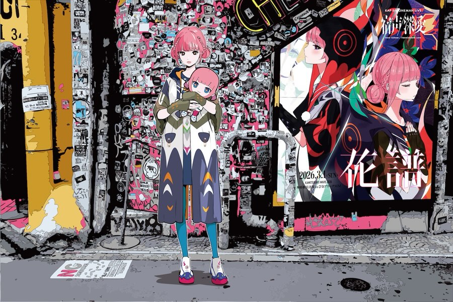
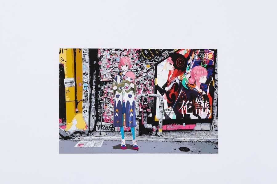
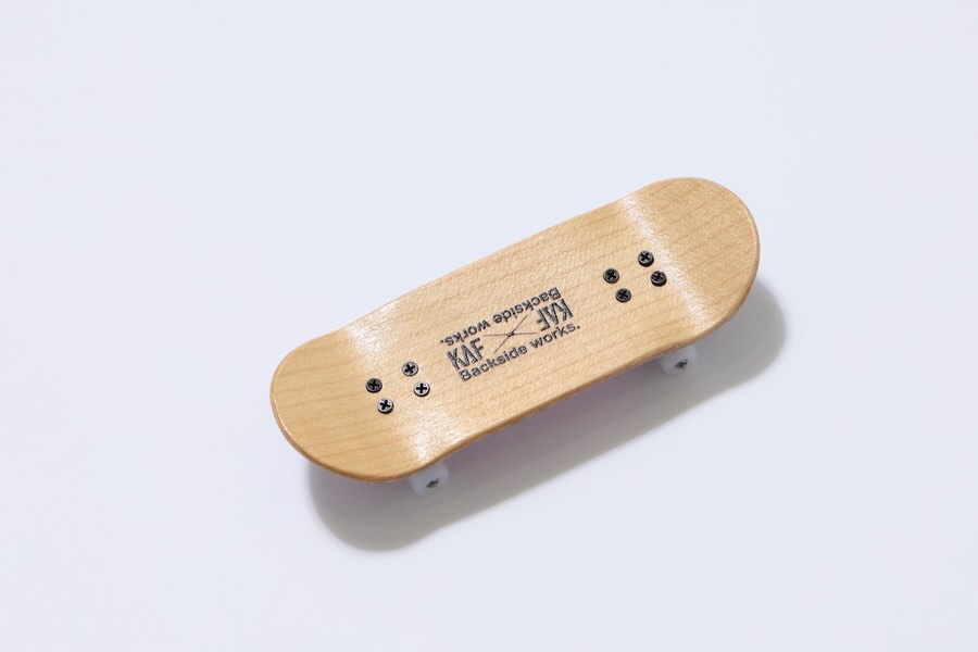
花譜とBackside works.によるコラボレーション商品を、
花譜のライブグッズおよび「花譜展」に関連した商品として販売いたします。
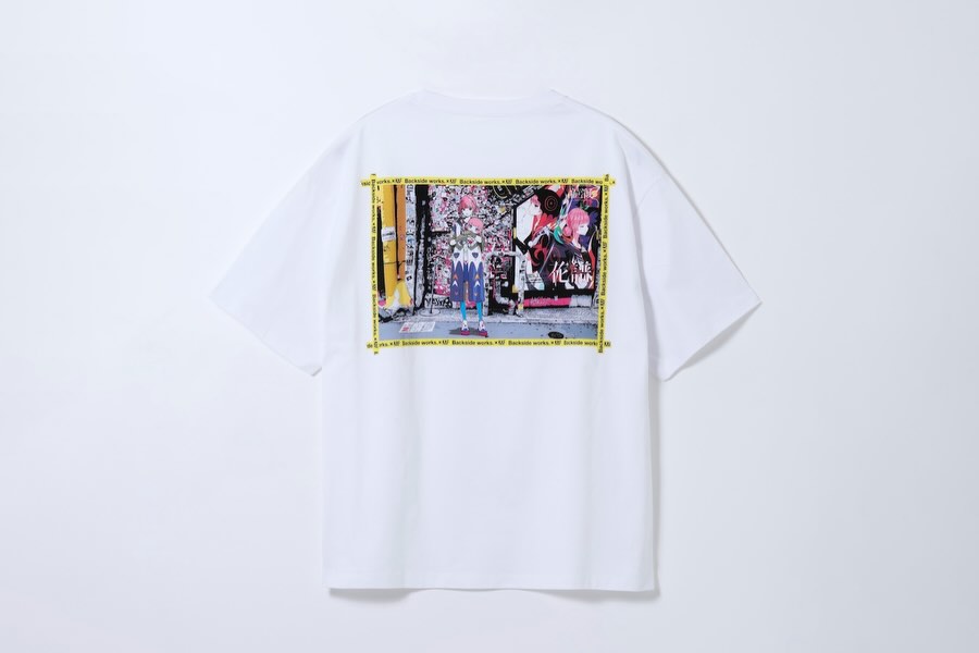
花譜 5th One-Man Live「宿声/深愛」
OFFICIAL LIVE GOODS 第二弾
Backside works.が本公演を記念して特別に描き下ろしたイラストを使用したグッズを販売いたします。
【予約販売】
予約期間:12/24(火)21:00 ~ 1/19(日)13:00
お届け予定:2026年2月23日(月)頃
販売ページ
https://findmestore.thinkr.jp/
※販売開始時間までは販売ページは非表示となります。
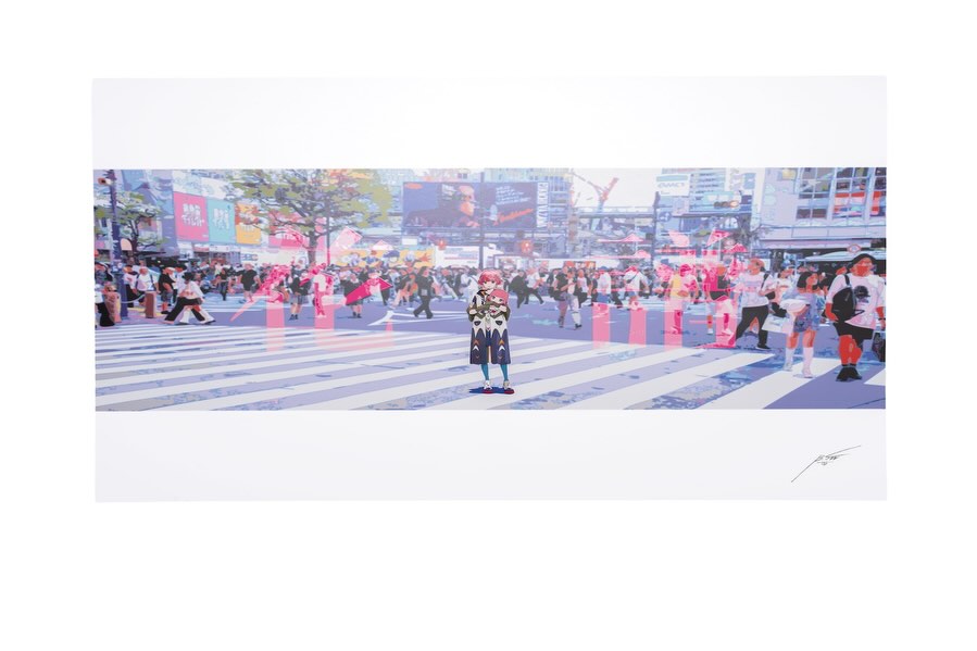
花譜展で展示される作品のポスターを、100枚限定で販売予定です。
本商品は展示会場での販売ではなく、後日「FINDME STORE by THINKR」にて抽選販売を予定しております。
※販売時期・詳細につきましては、確定次第あらためてご案内いたします。
抽選応募対象:
過去1年間に FINDME STORE by THINKR にてお買い物いただいた方のみ
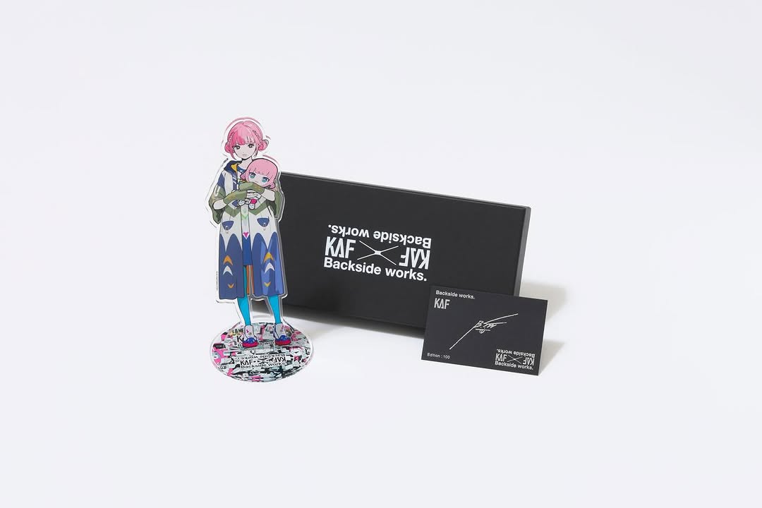
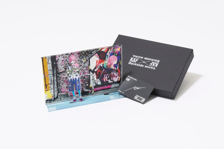
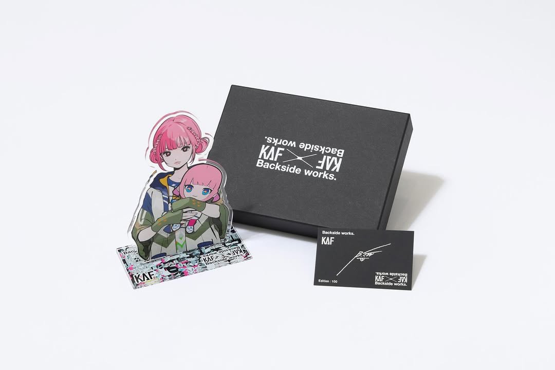
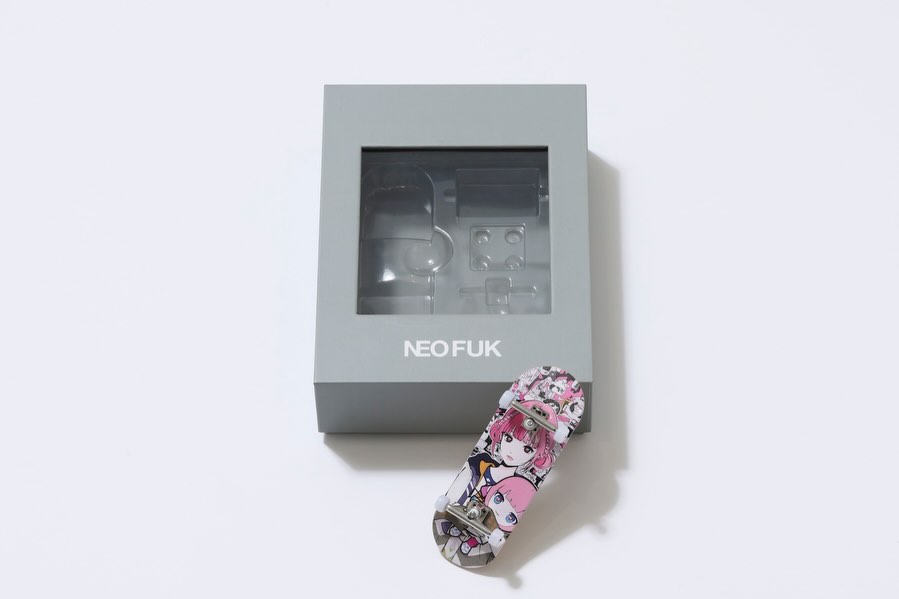
The KAF Backside Works Merch Set: How virtual_kaf Built This AI Art
This is a near-perfect product shot for character merch. The acrylic standee is the hero (the thing fans actually want to see), the black box signals premium packaging, and the small card adds credibility—like a certificate or edition proof.
The photo is also doing something very practical: it leaves a lot of white space. That makes it easy to reuse for banners, store thumbnails, and reposts without redesigning the image every time.
Why it spreads: collectible cues + instant clarity
Fans share merch when it feels collectible. A matte black box plus a small “edition” style card is a strong signal: this isn’t random goods, it’s a designed item. The acrylic standee also reads instantly at thumbnail size because the silhouette is clear and the colors are concentrated.
From a growth perspective, the biggest win is that the image answers questions before anyone asks: what does it look like, how big is it (relative to the box), and what’s included. That reduces friction and increases conversions.
Signal table
Signal
Evidence (from this image)
Mechanism
Replication Action
Hero-first readability
Standee placed in front with full silhouette visible
Fans instantly recognize the character
Place the hero item foreground-left and keep it unobstructed
Premium packaging cue
Matte black box with crisp white branding
Raises perceived value
Use matte packaging or a black backing element to frame the hero
Collectible proof
Small card with signature/edition-style text
Signals limited/official goods
Add an insert card or edition label and make it visible in the shot
Reusable whitespace
Large clean white negative space around the cluster
Makes the asset flexible across placements
Leave margin intentionally; don’t fill the entire frame
Use cases & transfers
Best-fit scenarios
Limited drops: show the standee + packaging + insert in one clean hero image.
Store listings: consistent white-background shots improve trust and conversion.
Event merch promos: “official goods” feel without needing a lifestyle shoot.
Collab releases: packaging and signature card help communicate legitimacy.
Not ideal
Too many SKUs: beyond 3–4 items, clarity drops fast.
Glossy acrylic without control: glare can kill readability.
Storytelling posts: this is for clarity and conversion, not narrative.
Slot template: “include {insert} and make the text readable at close crop”
Aesthetic read: contrast does the heavy lifting
White background gives you trust and clarity. Black packaging gives you premium contrast. The standee gives you character color. That three-part system is why the shot feels clean and expensive at the same time.
To keep acrylic looking real, you need two things: visible edges and controlled reflections. If the acrylic looks like a PNG cutout, your lighting is too flat or your prompt isn’t asking for transparent edges.
Prompt technique breakdown (lego blocks)
Prompt chunk
What it controls
Swap ideas (EN)
“seamless white background, high-key product photo”
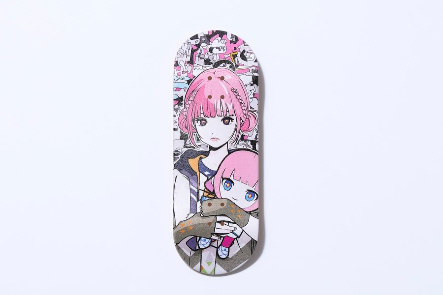
Clean studio product photo on a seamless pure white background: a clear acrylic character standee (anime pink-haired girl holding a small doll) placed foreground-left on a round acrylic base with a sticker-collage print, a matte black rigid branded box behind-right with crisp white branding, and a small black insert card foreground-right with white logo text and edition-style details. Three-quarter product angle slightly above tabletop height, wide framing with large white negative space, soft diffuse softbox lighting, gentle soft shadows, subtle controlled reflections on acrylic, matte box finish, photoreal e-commerce look, sharp edges, no props, no hands.
Remix steps: converge like a product photographer
Baseline lock
Layout: hero front, box back, card visible
Lighting: soft diffuse, minimal shadows, no glare
Materials: matte box + transparent acrylic edges
One-change rule (example 4 runs)
Run 1: lock arrangement and negative space.
Run 2: refine only acrylic edges and reflections.
Run 3: refine only shadows (softer, lighter, cleaner).
Run 4: refine only branding readability (box + card text placement).