How virtual_kaf Framed This KAF Art Print Poster AI Art — and How to Recreate It
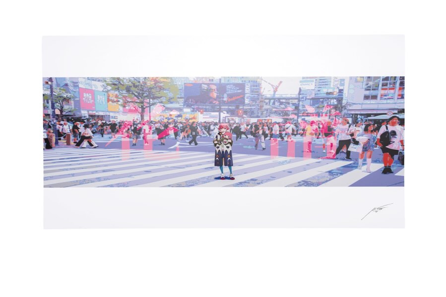
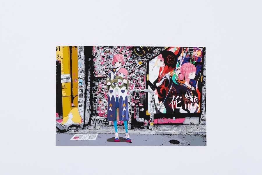
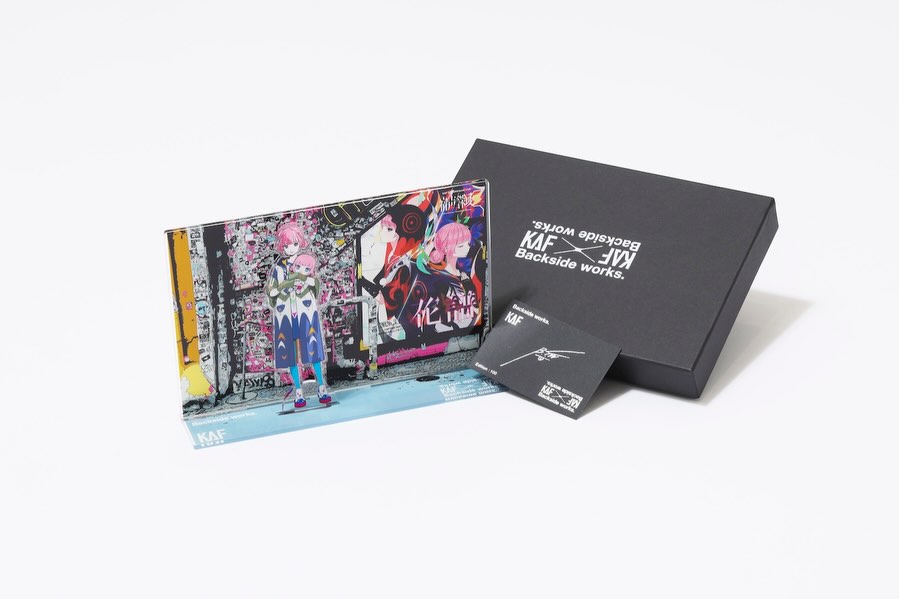
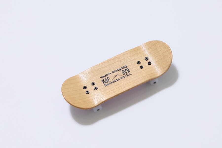
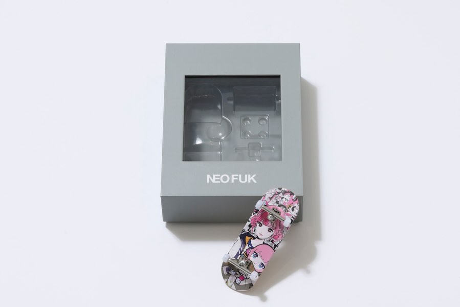
This image is not trying to show everything at once. It uses a clean product-style layout to spotlight one collectible print. That restraint communicates value. Instead of noisy promo graphics, we get gallery energy: white space, centered object, and a clear focus on the artwork itself.
For creators launching collab goods or limited posters, this is a useful conversion format because it makes the product feel curated, not mass-listed.
Why This Merch Visual Works
The strongest mechanism is presentation contrast. The outer frame is minimal and quiet, while the inner artwork is dense and story-rich. This makes the viewer pause: first to read the print as an object, then to inspect the details inside it.
The second mechanism is scarcity signaling. A gallery-like presentation style implies collectibility and limited availability, which aligns well with lottery or pre-order drops.
| Signal |
Evidence (from this image) |
Mechanism |
Replication Action |
| Gallery-style whitespace |
Large neutral margins around one print |
Increases perceived product value |
Use isolated single-product layout for hero merch posts |
| Artwork depth |
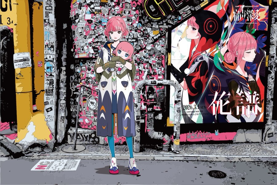
Panoramic city scene with layered visual elements |
Encourages zoom-in behavior and saves |
Choose artwork with discoverable micro-details for close inspection |
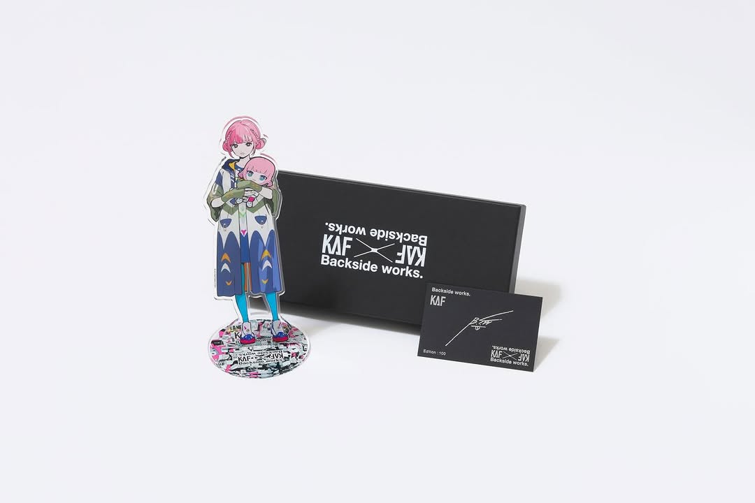
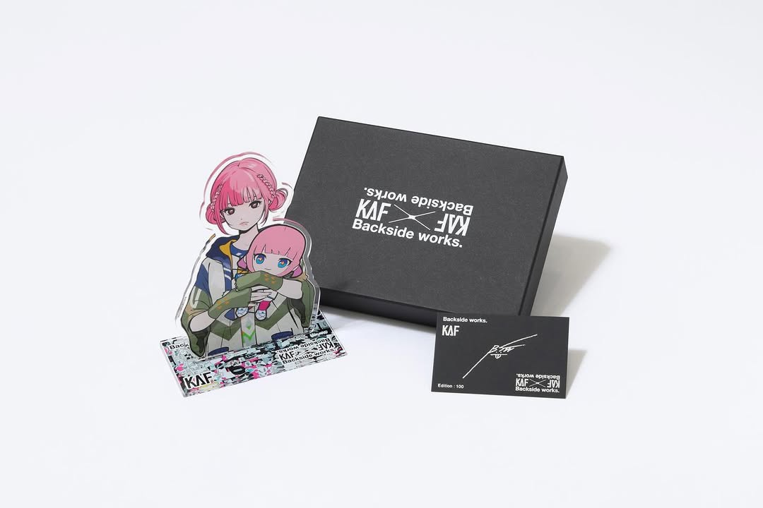
| Character focal contrast |
Small central anime figure within real urban setting |
Creates narrative tension and uniqueness |
Include one clear focal character even in landscape scene compositions |
| Collector cue |
Subtle signature mark on print |
Signals authorship and edition mindset |
Add artist mark or edition info in tasteful, low-noise placement |
Use Cases and Transfer Paths
- Limited poster sales: ideal for scarcity-driven campaigns.
- Exhibition tie-in merchandise: strong when art and event branding overlap.
- Pre-order announcement posts: effective for clean, trustworthy product communication.
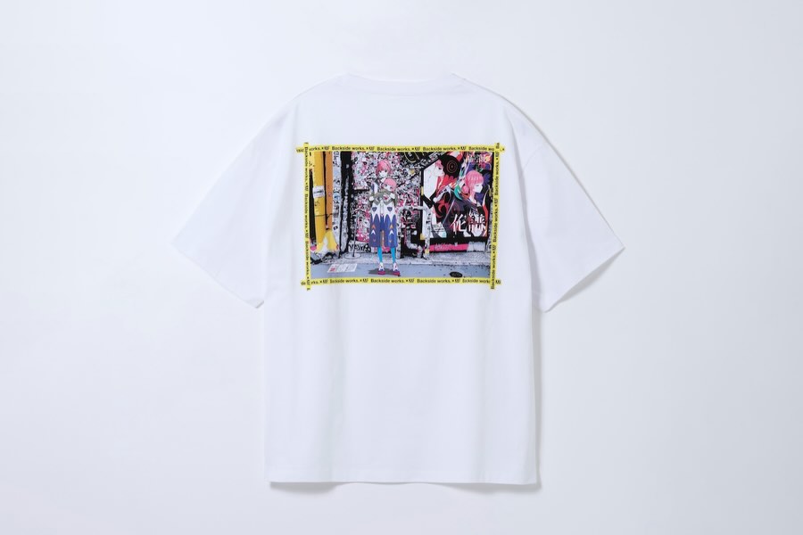
- Artist collaboration drops: useful when you need to honor both creators’ identities.
Not ideal: multi-item carousel summaries, urgent discount ads, or posts that must explain many specs visually in one frame.
Three Transfer Recipes
- Poster launch transfer
Keep: centered single print with large whitespace.
Change: inner artwork theme (city, nature, stage scene).
Slot template (EN): single {print_type} centered on neutral background, inner art {scene_theme}, subtle signature
- Exhibition merch transfer
Keep: minimal product presentation and collector tone.
Change: add small exhibition tag line under print in separate variant.
Slot template (EN): {artwork_print} on clean backdrop, optional {event_tagline}, premium whitespace composition
- Lottery-sale transfer
Keep: one hero product visual.
Change: create companion slide with deadline details while preserving first-slide minimalism.
Slot template (EN): slide1 {clean_product_hero}, slide2 {application_window_details}
Aesthetic Read: Why the Image Feels Curated
The composition separates object and content. The print is treated as an art object first, which elevates perceived quality. Inside the print, the visual blend of real crowd space and stylized character adds a contemporary, hybrid identity that fits virtual-artist ecosystems.
This double-layer storytelling is especially effective for creator brands that operate between music, character worldbuilding, and exhibition culture.
Prompt Technique Breakdown
| Prompt chunk |
What it controls |
Swap ideas (EN, 2-3 options) |
| single centered print on neutral background |
Product focus and premium catalog feel |
"floating poster mockup" / "flat print laydown" / "museum card style" |
| panoramic city-crosswalk artwork |
Inner-scene complexity and urban context |
"concert venue panorama" / "night alley panorama" / "station platform panorama" |
| small central anime character overlay |
Narrative focal point |
"small figure silhouette" / "duo character center" / "single walking character" |
| wide white border/mat around art |
Collector aesthetic and breathing room |
"thin border" / "gallery mat" / "edge-to-edge print" |
| soft even catalog lighting |
Neutral presentation clarity |
"high-key studio" / "flat e-commerce light" / "subtle side shadow" |
Execution Steps for Merch Posts
Baseline lock: lock single-item composition, lock background neutrality, lock whitespace ratio.
One-change rule: one controlled change per variant.
- Variant 1: change only inner artwork crop.
- Variant 2: keep crop winner, change border thickness only.
- Variant 3: keep border winner, change background tone (white vs light gray).
- Variant 4: keep visual winner, test caption CTA (pre-order urgency vs collector story).
This keeps product communication clean while still optimizing for engagement and conversion.