The KAF Backside Works T Shirt: How virtual_kaf Built This AI Art
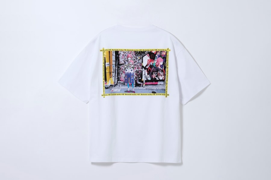
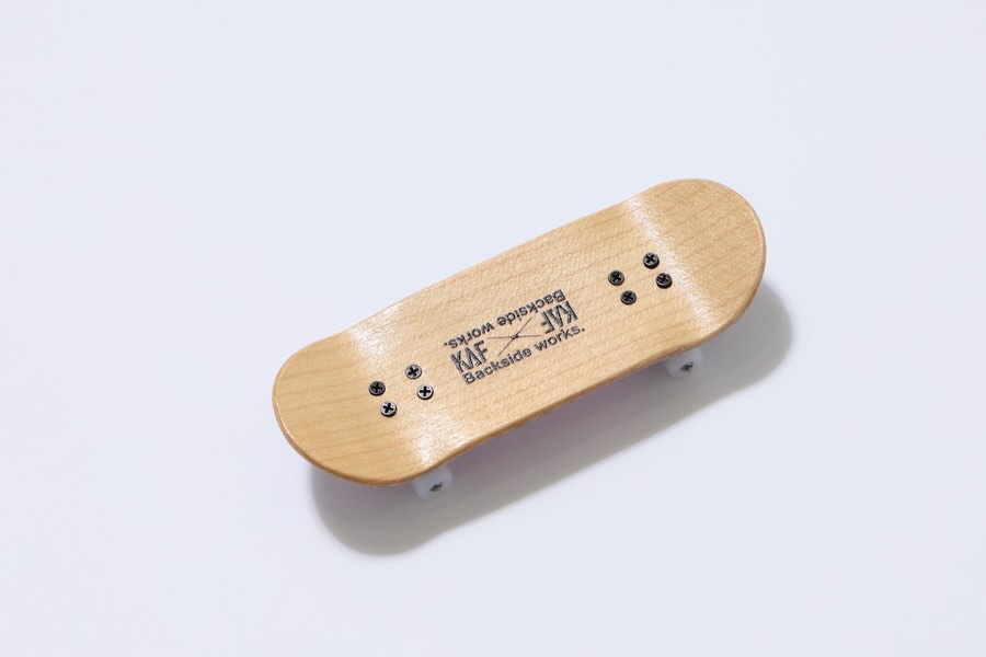
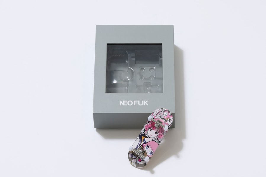
This image is a great reminder that merch content does not need visual chaos to perform. The frame is clean, centered, and frictionless: one product, one background, one clear print story. That clarity reduces buyer hesitation because viewers can immediately inspect silhouette and artwork placement.
The strongest viral/commercial mechanism here is contrast between base and focal area. The shirt is pure white, so the colorful print panel becomes the only narrative anchor. In product feeds, this “single focal block” strategy improves scanning speed and helps shoppers remember the design.
It also works for SEO-rich creator pages because this format is easy to repurpose into comparison carousels, detail zooms, and styling lookbooks. One clean master shot can generate a full content stack.
Signal Table
| Signal | Evidence (from this image) | Mechanism | Replication Action |
|---|
| Single-product clarity | Only one tee on a plain background | Removes cognitive overload and boosts purchase confidence | Publish at least one isolated hero frame per product |
| Focal print hierarchy | Multicolor back graphic framed by yellow border | Directs eye instantly to design value | Place print in center mass and preserve high edge sharpness |
| Neutral color management | White fabric remains clean without blowout | Improves perceived quality and trust | Use soft diffused light and control highlights in post |
| Symmetry and breathing room | Centered composition with margins around tee | Looks professional and catalog-ready | Use grid alignment and leave 8-12% frame margin |
Best-Fit Scenarios
- D2C apparel drops: Ideal for hero SKU reveal. Change: add front/back pair as slide 2.
- Artist collaboration merch: Great fit when print narrative is core value. Change: include close crop of artwork texture.
- Marketplace listing images: Works for clean compliance and trust. Change: keep background tone consistent across all SKUs.
- SEO product case studies: Strong fit for prompt-to-product tutorials. Change: annotate generation process in caption, not on image.
Not Ideal
- Lifestyle aspiration campaigns: Needs model context for emotional storytelling.
- Fabric drape storytelling: Flat static display hides movement behavior.
- Streetwear vibe content: May feel too catalog-clean without styling shots.
Three Transfer Recipes
- Keep: Isolated product center composition.
Change: Garment type (hoodie, long sleeve, tote).
Template: {single product} {neutral seamless bg} {center alignment} {one focal graphic} - Keep: White/neutral base with high-contrast print focal point.
Change: Print location (chest, back, sleeve).
Template: {base garment color} {print placement} {soft catalog light} {full-item frame} - Keep: Symmetry and edge detail fidelity.
Change: Background tint for seasonal collections.
Template: {centered garment} {seasonal neutral tone} {minimal shadow} {ecommerce realism}
Aesthetic Read
The aesthetic value comes from precision, not decoration. The garment silhouette is clean and readable, the print block is loud enough to carry brand identity, and the neutral field gives all attention to product quality. This format feels trustworthy because nothing is hidden: viewers can evaluate shape, hem line, sleeve width, and print scale in one glance. For creators, this is a cornerstone image type that supports both commerce conversion and search discoverability.
| Observed | Recreate | Evidence cue |
|---|
| Centered orthographic-like product angle | Shoot perpendicular to garment plane | No dramatic perspective distortion |
| Soft shadow under hem | Add subtle under-light separation | Product does not float unnaturally |
| High print legibility | Maintain sharp focus and moderate contrast | Artwork remains readable when zoomed |
| Uncluttered frame discipline | Exclude props and overlays | Commercial trust and clean branding |
Prompt Technique Breakdown
| Prompt chunk | What it controls | Swap ideas (EN, 2-3 options) |
|---|
| “white cotton tee, back view, regular cut” | Base silhouette and viewpoint | “oversized heavy tee”, “cropped boxy tee”, “long sleeve tee” |
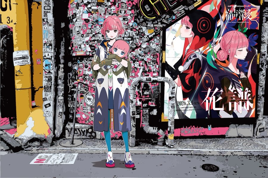
| “central rectangular anime collage print with yellow frame” | Graphic identity anchor | “monochrome typographic panel”, “photo collage panel”, “line-art poster panel” |
| “plain light-gray seamless background” | Distraction control | “off-white seamless”, “very pale blue seamless”, “warm gray seamless” |
| “soft even studio catalog lighting” | Color accuracy and fabric readability | “top-front softbox”, “two-side soft fill”, “flat lay diffused light” |
| “full product centered with margin” | Marketplace-ready composition | “slightly closer crop”, “dual-product grid”, “left-right comparison layout” |
Execution Playbook
Baseline Lock
- Lock center composition and full-garment visibility.
- Lock neutral background and soft lighting.
- Lock exact print placement ratio on garment body.
One-Change Rule
- Run 1: Publish clean back-view baseline.
- Run 2: Change only background tint slightly.
- Run 3: Keep winner, change only print scale variant.
- Run 4: Keep visual winner, test caption angle (design story vs fit details).
Use saves and outbound product clicks as primary KPIs. For merch imagery, these signals are more actionable than engagement vanity metrics.