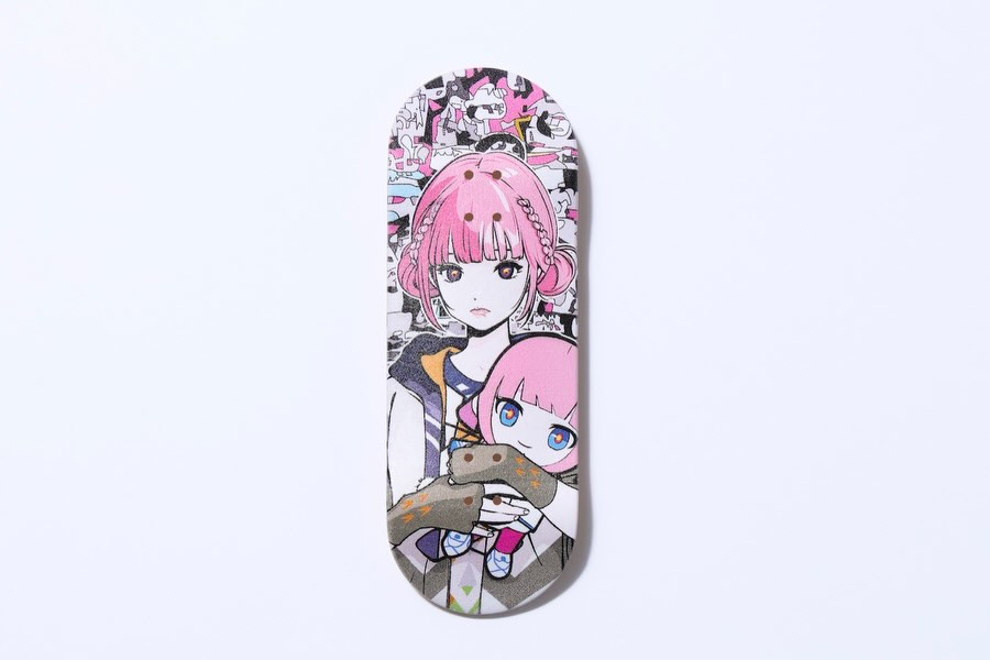
How virtual_kaf Framed This KAF Backside Skateboard Deck AI Art — and How to Recreate It
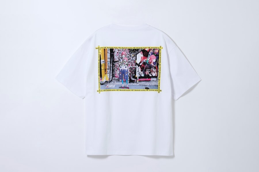
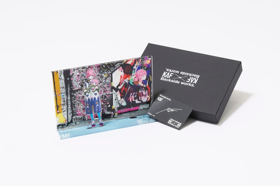
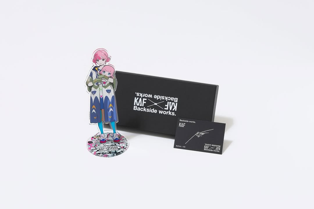
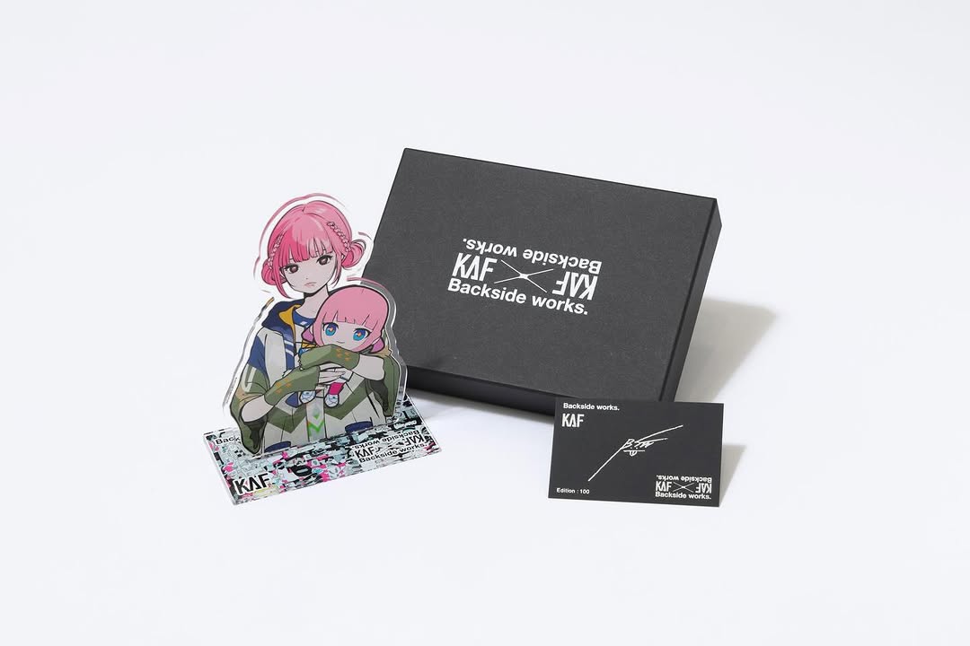
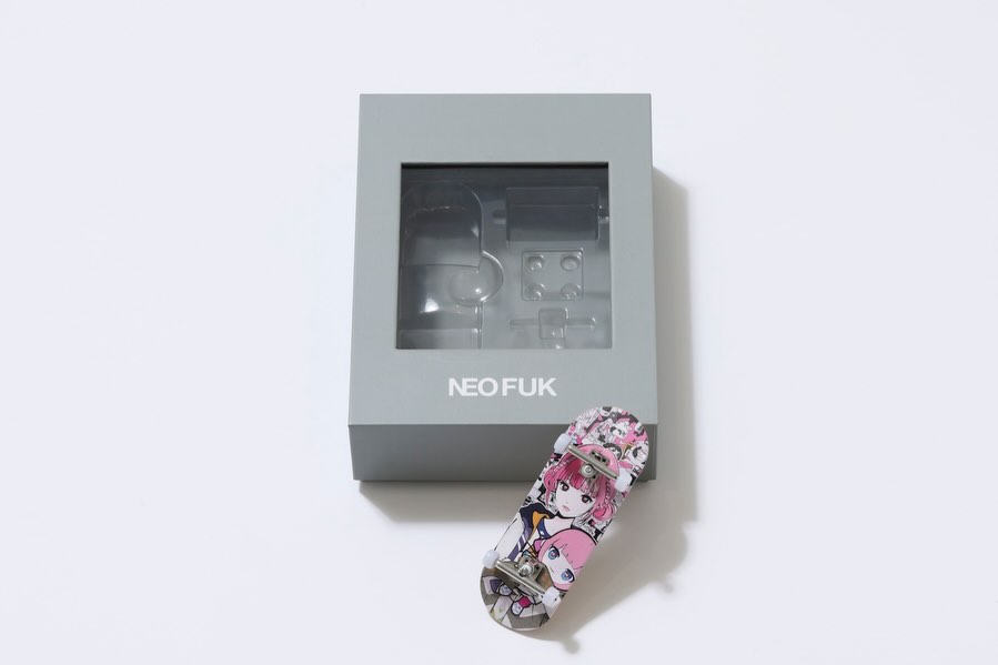
This image is a lesson in restraint. It is not trying to be a “cool street photo.” It is a catalog-style product shot, but the art on the deck carries enough character and narrative to make the product feel collectible. If you sell or announce goods, this is one of the most reliable formats: clean frame, strong graphic, zero distractions.
Why this works as a growth asset
It looks official. The white seamless background and overhead lighting signal “this is a real drop,” not fan art. That matters because audiences share announcements when they trust them. Then the deck graphic does the emotional work: a recognizable character face plus a small chibi/plush cue that reads as cute, limited, and giftable.
There is also a very practical feed mechanic here: your eye locks onto the pink hair immediately. Against a mostly white background, one saturated accent color becomes a thumbnail hook. The product is centered with lots of negative space, so it stays readable even on a small screen.
| Signal |
Evidence (from this image) |
Mechanism |
Replication Action |
| Official drop feel |
White seamless background, clean overhead product framing |
Reduces skepticism and increases share intent |
Use an ecommerce lighting setup for announcements, even if your brand is “art” |
| Thumbnail hook |
Pink character graphic centered on a white field |
High contrast creates a fast scroll-stop |
Pick one dominant accent color and protect it with negative space |
| Collectible narrative |
Character face plus chibi/plush motif within the print |
People share what feels limited, cute, and identity-coded |
Build merch graphics around one face + one “secondary charm” object |
| Clean composition |
Centered deck with gentle shadow, no clutter |
Readability survives compression and reposting |
Keep one product per frame; avoid lifestyle props on the first announcement slide |
Use cases and transfers
Best-fit scenarios
- Limited merch drops: first slide is pure product proof, second slide can be lifestyle.
- Collaboration items: keep the same background system; rotate products (deck, tee, poster, vinyl).
- Pre-order announcements: the clean shot pairs perfectly with date/time information in the caption.
- Storefront refresh: use a consistent product system to make your grid look intentional.
- Giveaways: centered product photo is easy for others to repost in stories.
Not ideal
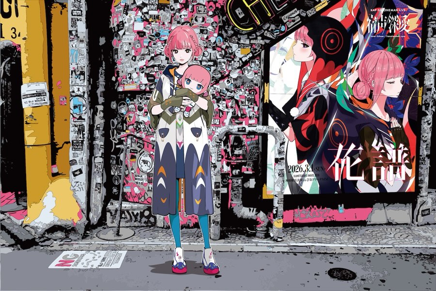
- High-emotion storytelling where a human moment is the point.
- Complex bundles that need multiple items shown together (do those after the hero slide).
- Instructional posts that require many labels or diagrams.
Transfers (3 remix recipes)
- Keep: white seamless + overhead flat-lay. Change: product. Template: "single {product} centered on white seamless background, soft shadow, clean ecommerce photo".
- Keep: centered negative space system. Change: graphic palette. Template: "white background product shot with one dominant accent color: {accent}".
- Keep: lighting direction (upper-left) and shadow. Change: crop. Template: "top-down product photo, gentle right-side shadow, large negative space".
Aesthetic read: proof over vibes
This is “proof photography.” The background is blank so nothing competes with the product. The shadow is gentle so the deck feels physical. The graphic is the hero. That combination makes the image portable: it can be screenshotted, reposted, and used in multiple announcement contexts without falling apart.
If you want the same effect, do not start by adding props. Start by making the product feel real and purchasable. When the first slide is proof, your caption can carry the logistics (release time, pre-order window) without the audience doubting what they are seeing.
| Observed |
Recreate |
Why it matters |
| One product only |
Ban extra objects on the hero image |
Maximizes clarity and trust |
| Large negative space |
Center the product and leave room around it |
Improves thumbnail readability |
| Soft directional shadow |
Light from upper-left; shadow falls right |
Signals physicality without drama |
| Dominant accent color |
Pick one color (here: pink) and make it the hook |
Increases stop-rate and recognition |
Prompt technique breakdown
| Prompt chunk |
What it controls |
Swap ideas (EN, 2–3 options) |
| product + hardware constraint |
Whether it stays a clean catalog shot |
deck only; poster only; t-shirt folded only |
| background system |
Trust and portability |
white seamless; light gray seamless; clean studio sweep |
| lighting direction |
Physicality and shadow behavior |
upper-left soft key; top-down soft key; window-soft light |
| graphic hook |
Thumbnail stop-rate |
pink hair; neon emblem; bold mascot face |
| composition |
Readability on mobile |
centered; slightly off-center; closer crop with margin |
Remix steps (iteration strategy)
Baseline Lock: (1) top-down angle, (2) empty seamless background, (3) one product only.
One-change rule: change only 1–2 knobs per run. Example sequence:
- Run 1: Lock the deck placement and negative space.
- Run 2: Fix lighting so the shadow is soft and consistent.
- Run 3: Tune the graphic clarity (linework sharp, colors accurate).
- Run 4: Swap only the product graphic for the next drop while keeping the same photo system.
Once the system is locked, you can scale a merch season without reinventing your visual language every time.