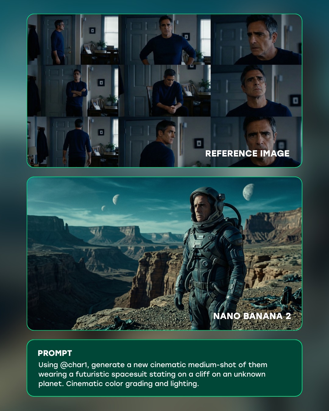
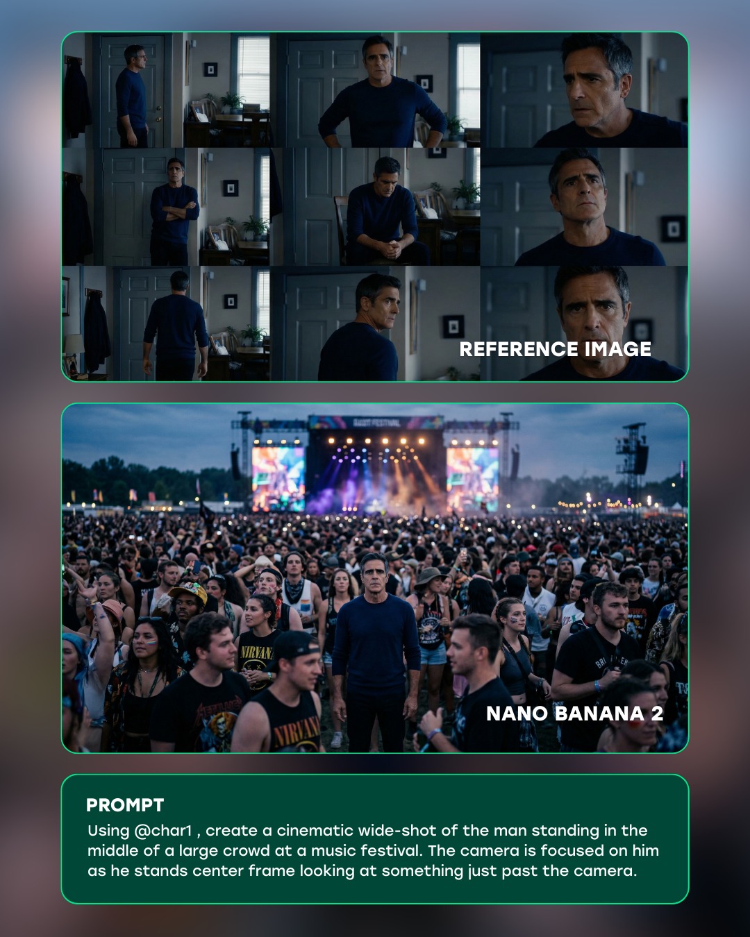
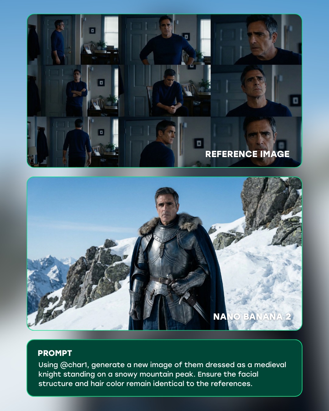
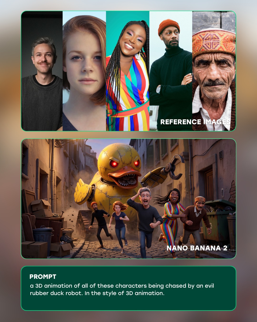
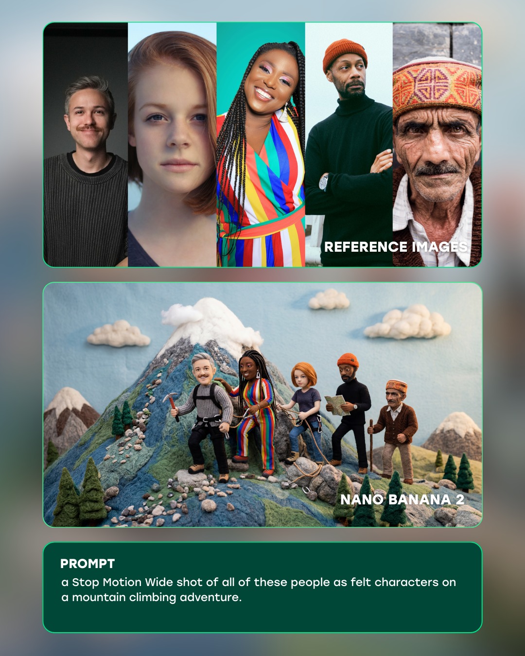
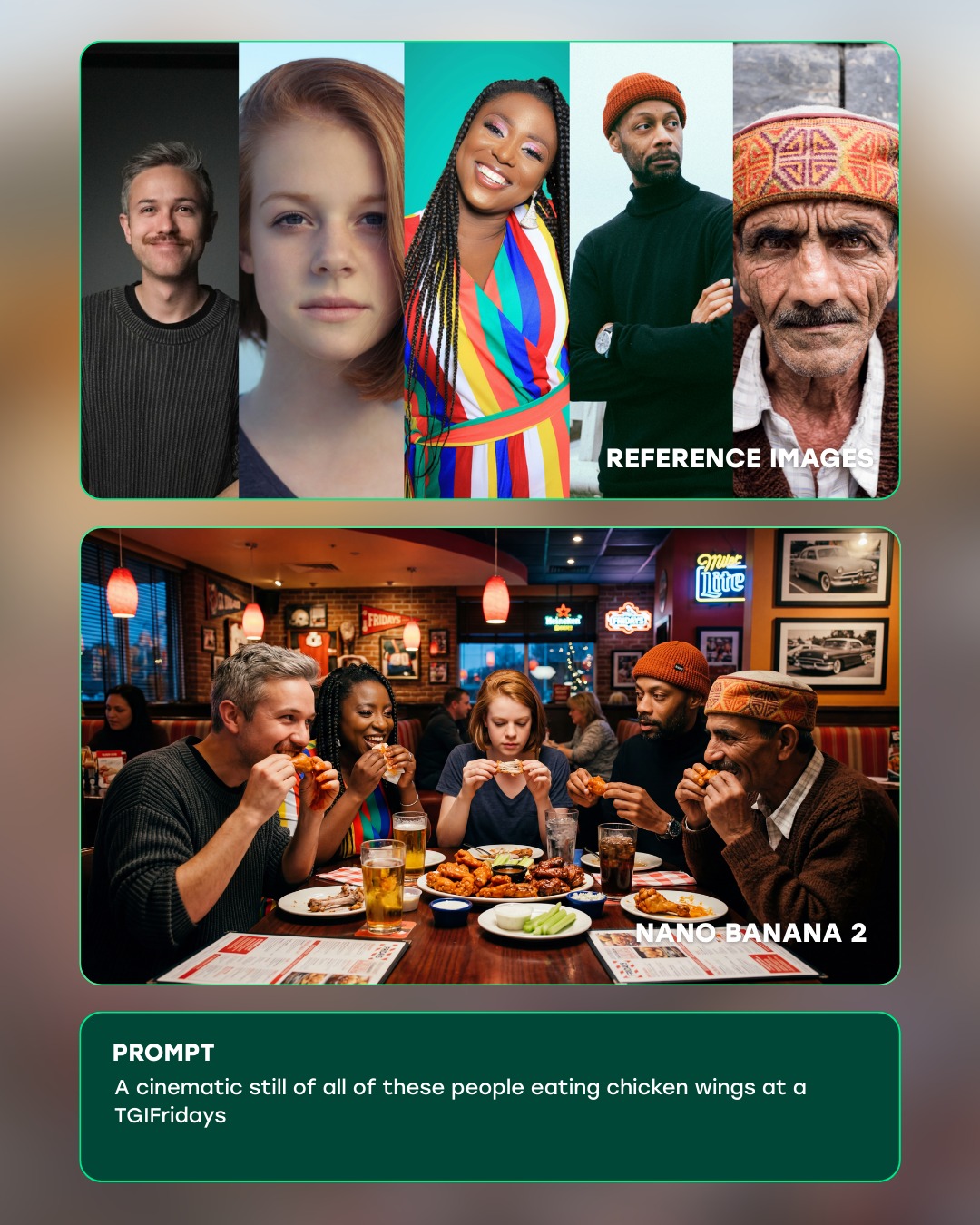
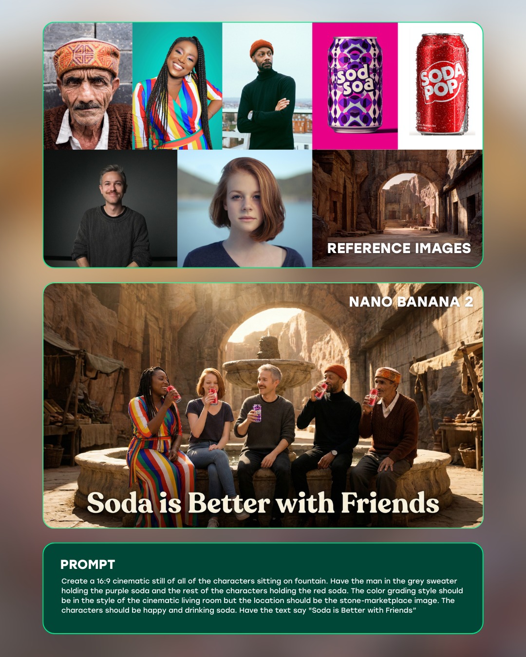
This image works because it is not only showing a final picture, it is showing a process. The top grid establishes identity consistency, the middle frame demonstrates the transformed result, and the bottom prompt card explains the instruction that connects them. That three-step structure is what makes the graphic persuasive. It does not ask the viewer to guess what the tool did; it stages the proof visually.
The most useful design choice here is the contrast between the mundane reference context and the cinematic generated output. The source frames are dim, domestic, and observational. The output is expansive, mythic, and heavily graded. Because the same face carries across both sections, the transformation feels impressive rather than arbitrary. This is exactly the kind of structure that sells AI image tooling well: continuity first, spectacle second.
How curiousrefuge Made This Futuristic Spacesuit Cliff Planet AI Art -- and How to Recreate It
| Signal | Evidence (from this image) | Mechanism | Replication Action |
|---|
| Process transparency | The graphic explicitly separates reference images, output image, and prompt text | Stepwise layout increases trust because the viewer can inspect the workflow | Design product demos in clear before-and-after stages rather than showing only the result |
| Identity preservation | The same man appears in both the domestic reference grid and the astronaut output | Continuity makes the transformation feel technically credible | Emphasize consistent facial structure and age across source and generated sections |
| Spectacle contrast | The output frame shifts from indoor realism to alien-canyon cinematic scale | Large visual gap between source and output makes capability feel more dramatic | Choose reference material that is plain enough to make the transformation legible |
| Product polish | Rounded cards, teal borders, and clean typography make the layout feel like a tool showcase | Interface refinement makes the workflow feel intentional and premium | Use consistent card styling and restrained UI chrome when presenting model capabilities |
Observed Style Choices
| Style Choice | Observed Effect |
|---|
| Stacked card layout | Keeps the workflow readable in a fast social-media scroll context |
| Teal border accents | Creates subtle futuristic branding without overwhelming the images |
| Muted reference stills | Push the viewer’s attention toward the stronger generated result |
| Cinematic output frame | Provides the “wow” moment that justifies the workflow graphic |
| Bottom prompt card | Shows exactly how the transformation was instructed, increasing perceived clarity |
Prompt Technique Breakdown
| Technique | Why It Matters Here | How To Phrase It |
|---|
| Workflow framing | The image is selling a system, not just a single generated picture | "AI product demo showing reference images, generated result, and prompt panel in one layout" |
| Identity continuity | The success of the demo depends on believable transformation of the same person | "same middle-aged man preserved across the reference grid and sci-fi output" |
| Output escalation | The result must feel much more cinematic than the source material | "generated cinematic medium shot in futuristic spacesuit on an alien cliff" |
| UI restraint | Too much interface chrome would cheapen the presentation | "minimal rounded cards, teal edge glow, clear typography, no extra dashboard clutter" |
| Caption support | The prompt card explains the transformation and completes the demo logic | "bottom prompt box with concise transformation instruction in readable white text" |
Execution Notes
To recreate this kind of graphic, begin by designing the information hierarchy before refining the images. Decide what the viewer should understand in three seconds: reference identity, generated result, and prompt logic. Once that is clear, style the cards consistently and let the output frame carry most of the cinematic excitement.
Most weak versions will either crowd the layout with too much UI or fail to make the identity continuity obvious enough. Fix that by reducing interface noise and ensuring the reference face and output face remain recognizably linked. If the result feels like a random collage, strengthen the stacking logic and make the middle panel visibly superior in cinematic quality. The best version feels like a product demo that earns the viewer’s trust while still delivering spectacle.