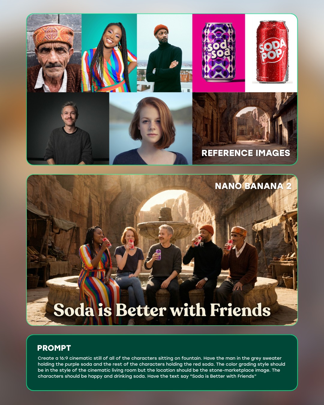
How curiousrefuge Made This Soda Friends Fountain Commercial Ad AI Art -- and How to Recreate It
This piece is a strong example of why AI image presentation matters almost as much as image generation itself. The board does not stop at showing a polished commercial-style output. Instead, it organizes the entire creative logic into a readable visual sequence: reference material at the top, the final hero image in the middle, and the generating prompt in a dedicated lower section. That three-part structure turns the composition into something much more useful than a simple poster. It becomes an educational artifact, a creator showcase, and a visual proof of process all at once.
That is what makes this format especially valuable for creators, teams, and prompt designers. A single finished image may be attractive, but it usually hides the decision-making chain. A well-built case study board reveals how aesthetic direction was formed. It gives the viewer clues about reference selection, prompt construction, visual hierarchy, and final rendering intent. In other words, this type of board is not just about documenting a result. It is about documenting how a result was achieved in a way that other people can understand and learn from.
Why the Three-Zone Structure Works So Well
The layout is built on three stacked zones, and each one has a clear role. The upper panel gathers the raw ingredients: portrait references, soda product cues, and architectural environment ideas. The central panel presents the final output, a warm commercial-style group scene in a courtyard. The lower panel anchors the whole board with prompt text and explanatory content. This structure feels intuitive because it follows the order most viewers already expect. First they see where the ideas came from, then they see what those ideas became, and finally they see how the transformation was described in text.
That sequence reduces confusion immediately. A weaker board might scatter references around the hero image or bury the prompt in decorative interface elements. This one avoids that mistake. It uses separation, spacing, and stacked reading order to make the narrative simple. Even if a viewer only glances at the piece, they can still recognize the intended story: reference collection, generated result, prompt logic. That kind of legibility is exactly what makes creator-education layouts effective.
For prompt workflow boards, structure is not a cosmetic choice. It is the foundation of clarity. If the zones are not clearly separated, the viewer has to decode the presentation before they can understand the creative process. That wastes attention. By contrast, a strong three-zone system directs the eye naturally and preserves comprehension even at smaller display sizes.
The Reference Panel as a Curated Visual Brief
The reference section in this image works because it feels curated rather than random. It includes different kinds of inputs, but each input serves a specific purpose. Some references define faces and character energy. Some define product styling. Some define environmental tone. That separation matters. A good reference panel is not a moodboard of unrelated images. It is a compact visual brief, where each chosen image contributes one part of the final outcome.
This is one of the most important lessons hidden inside the board. When creators say they used references, that can mean many different things. Sometimes they used a color palette reference. Sometimes they used wardrobe cues. Sometimes they used camera composition. Sometimes they used object design. A high-quality case study board makes those functions visible. It helps viewers understand that “reference” is not a single category. It is a set of different visual jobs being assigned to different source images.
If you are building a board like this yourself, the top panel should not become overcrowded. The goal is not to prove that you looked at many images. The goal is to show that you looked at the right images. A handful of well-chosen references is usually stronger than a dense collage of weakly connected material. Readability improves, and the relationship between reference and output becomes more obvious.
Why the Hero Image Feels Persuasive
The central image succeeds because it looks like a finished commercial still rather than a random group scene. Five friends are placed around a fountain in a warm stone courtyard, holding colorful soda cups under inviting golden light. The architecture, body language, and color accents all work toward the same advertising mood. It feels relaxed, sociable, and sellable. That is exactly the right emotional register for a beverage campaign.
The warmth is doing a lot of the heavy lifting. The stone surfaces, sunlit courtyard, and soft highlights create a lifestyle-ad tone that feels aspirational without becoming too glossy or artificial. The cup colors add immediate product contrast, while the group arrangement communicates connection and shared enjoyment. The result is not just technically coherent. It is narratively coherent. You can instantly understand the kind of campaign mood it is trying to evoke.
This matters because workflow boards often fail when the “final result” does not feel meaningfully better than the references. In a strong board, the output should synthesize the source material into something more unified and more market-ready. That is what happens here. The hero image does not merely repeat the references. It transforms them into a scene with commercial direction, emotional warmth, and cinematic polish.
The Role of Warm Commercial Lighting
The lighting language inside the central panel deserves close attention. The board intentionally distinguishes between interface lighting and scene lighting. The overall design board is bright, clean, and neutral so that all zones remain easy to read. The hero scene, however, uses a very different light signature: golden commercial illumination, warm stone highlights, and inviting skin tones. That contrast helps the central image feel premium and emotionally alive while the surrounding layout remains functional and educational.
This split is smart because it prevents visual conflict. If the whole board adopted the same cinematic warmth, the reference panel and prompt panel might become muddy or decorative. If the hero image adopted the same flat interface brightness as the rest of the board, it would lose its ad-like emotional impact. Separating those lighting systems lets each zone do its own job properly. The layout teaches; the hero image sells.
For creators building similar content, this is a useful principle: presentation framing and generated output do not need to share identical lighting logic. In fact, they often should not. The board container should prioritize neutrality and legibility, while the featured image can push further into cinematic mood. That difference enhances hierarchy rather than breaking it.
What Makes the Board Feel Modern Instead of Cluttered
Modern AI workflow graphics often fail because they mimic software interfaces too literally. They add too many boxes, too many labels, too many decorative dividers, and too many small UI cues that do not actually improve understanding. This board avoids that trap. It uses rounded containers, a clean stacked composition, and a small amount of interface framing without turning the design into a fake dashboard.
That balance is crucial. The piece still feels instructional, but it does not feel messy. The border logic is controlled. The spacing is intentional. The hero image has breathing room. The lower panel reads as a designed content block, not as a screenshot of raw text. That restraint is what gives the board polish. It tells the viewer that the designer understands both interface language and editorial design, and knows when to stop adding visual noise.
If you want to reproduce this kind of board, focus on hierarchy before decoration. Ask what the viewer needs to understand first, second, and third. Then build framing devices around those priorities. Rounded corners, clear card boundaries, and consistent spacing are enough to make the board feel current. You do not need a dense layer of pseudo-UI chrome to communicate sophistication.
Why Prompt Transparency Adds Credibility
The lower prompt panel is not just filler. It is one of the reasons the board feels trustworthy. When a creator openly shows prompt logic, the work becomes easier to evaluate and learn from. The viewer can see that the final output was not the result of hidden magic. It came from a describable process. That transparency matters in educational content, because it turns the board into a transferable example rather than a closed demonstration.
Prompt visibility also helps reveal strategy. A viewer can compare the references with the wording and see how abstract goals were translated into language. They can notice how environment, character energy, product cues, and layout intent were encoded. Even if they never use the exact same prompt, they can learn how prompt structure supports a specific visual outcome. In that sense, the bottom panel is doing instructional work that the hero image alone could never accomplish.
For creator portfolios, this is especially useful. A clean workflow board tells clients or collaborators that the author is capable of more than getting lucky with a single output. It demonstrates repeatability, reasoning, and method. That perceived reliability can matter as much as aesthetics when the work is being evaluated professionally.
How to Improve a Board Like This Further
Even though this board already works well, there are several ways you could refine the concept further depending on the intended audience. If the board is meant for beginners, you could make the reference roles more explicit by labeling them as character, product, and environment references. If it is meant for a professional audience, you could reduce the explanatory text and give more room to the final hero image. If it is meant for social media education, you could tighten the prompt block and emphasize the before-and-after logic more aggressively.
Another useful refinement would be to add a very brief takeaway section under the hero image, summarizing the major creative decisions in one or two lines. That can help viewers who do not want to read a full prompt block but still want to understand why the result looks the way it does. Similarly, if the board is part of a series, consistent labeling and repeated layout structure could make the entire series feel more like a designed framework rather than isolated posts.
However, the key principle should remain unchanged: every added element must clarify the workflow, not merely decorate it. The more unnecessary interface or explanatory clutter you add, the weaker the board becomes. Educational visual design is strongest when it feels deliberate, focused, and easy to scan.
Prompt Lessons for Future Workflow Boards
This image offers several direct prompt-writing lessons. First, define the layout explicitly. Saying “three stacked zones with top references, center output, bottom prompt panel” is far stronger than asking for a generic case study board. Second, separate the visual language of the board itself from the visual language of the hero image. Third, specify the role of the reference panel instead of treating it as random collage decoration. Fourth, describe the final hero image in enough detail that it can carry the emotional center of the composition.
You should also be clear about what not to include. In this kind of board, that means avoiding overloaded widgets, noisy icons, unreadable text density, and cluttered decorative effects. The negative prompt is doing important work because it protects the hierarchy. Educational layouts can degrade quickly when too many visual systems compete in one image.
Most importantly, treat the final board as a communication object, not just an image object. Its job is not only to look polished. Its job is to explain how polished work gets made. When you prompt with that intention, the resulting board becomes far more useful and far more memorable.
Why This Format Matters for AI-Era Creative Communication
As AI-generated visuals become more common, the value of process communication keeps increasing. Many people can show outputs. Fewer can explain the relationship between source inspiration, prompt construction, and final result in a clear visual format. That is why boards like this matter. They transform generation into explanation. They make invisible decisions visible. They help audiences trust, learn from, and reuse the methodology behind the image.
That is ultimately what makes this piece successful. It does not only present a warm, attractive soda-ad scene. It presents a repeatable workflow in a visually organized way. The references feel purposeful, the hero image feels commercially persuasive, and the prompt panel grounds the whole board in process transparency. It is a modern creator-education artifact that understands both aesthetics and communication. For anyone building AI case study content, that combination is the real standard to aim for.