How curiousrefuge Made This Character Consistency Diner Test Card AI Art -- and How to Recreate It
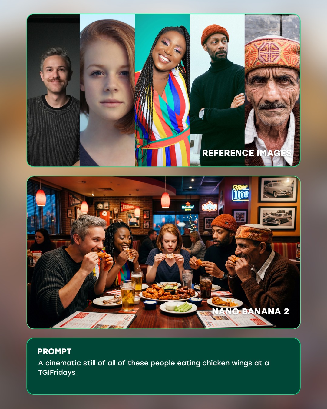
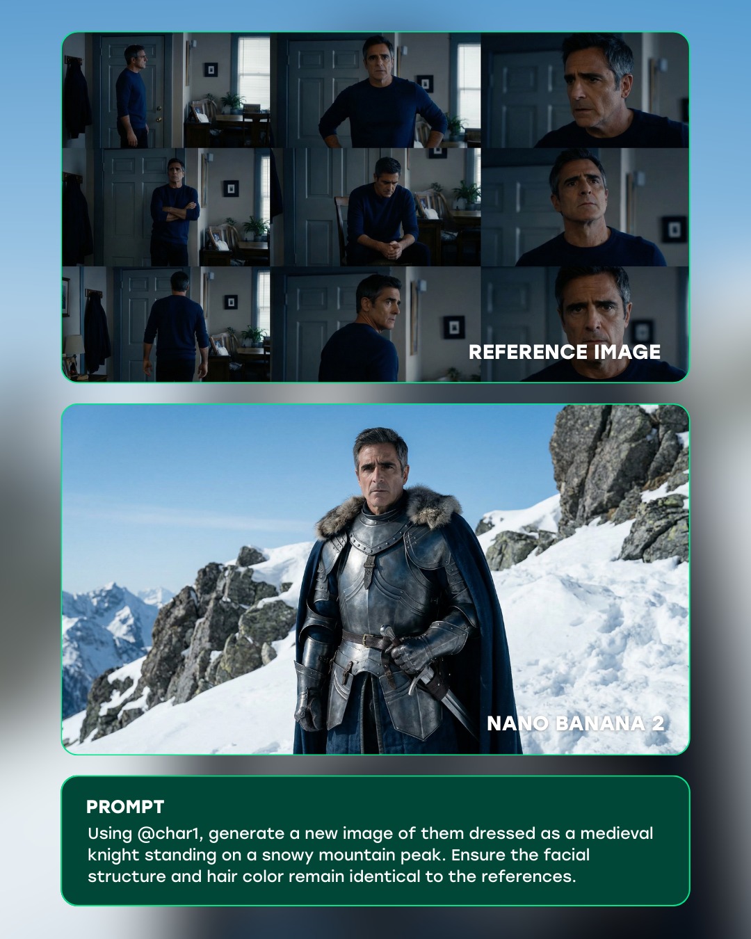
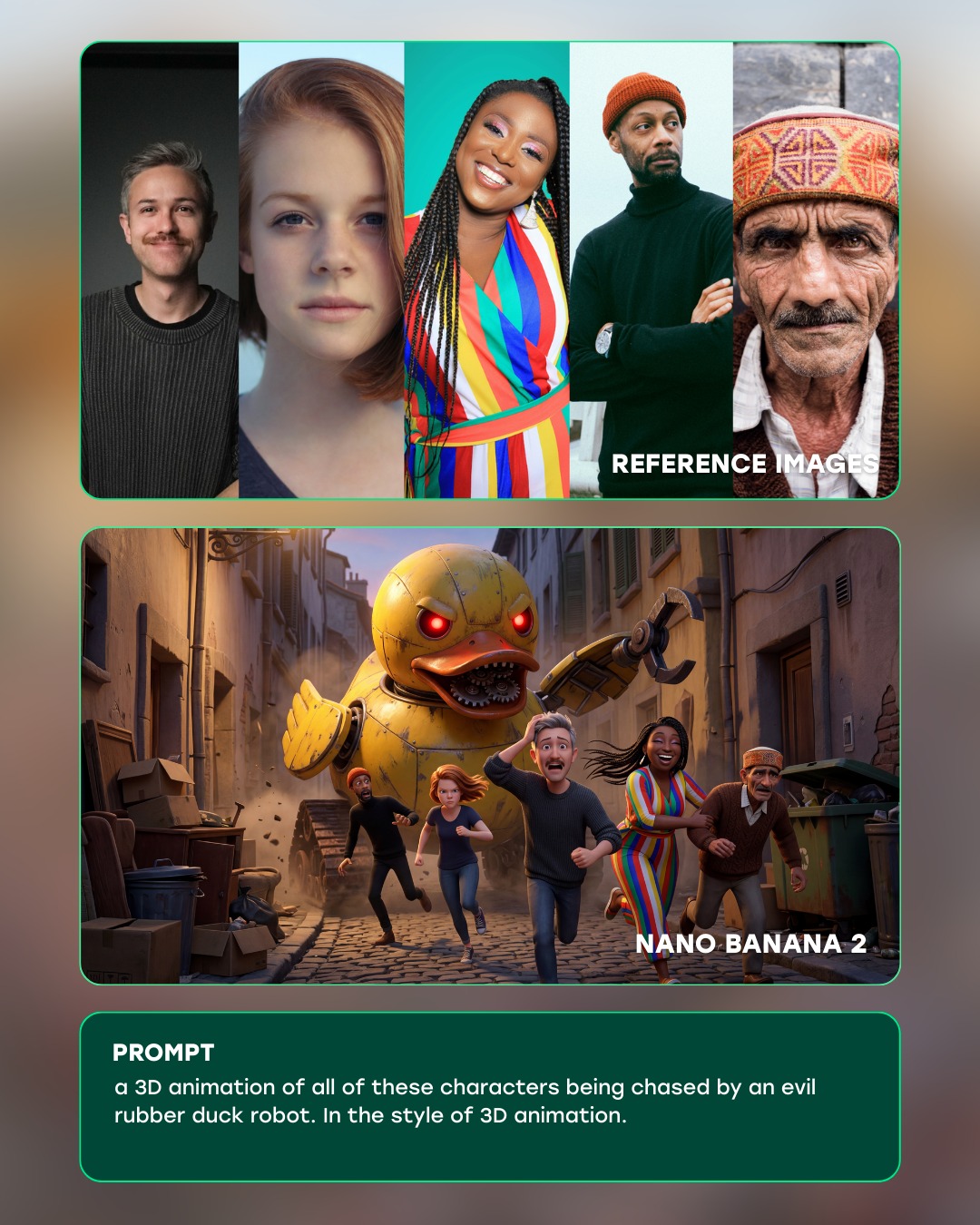
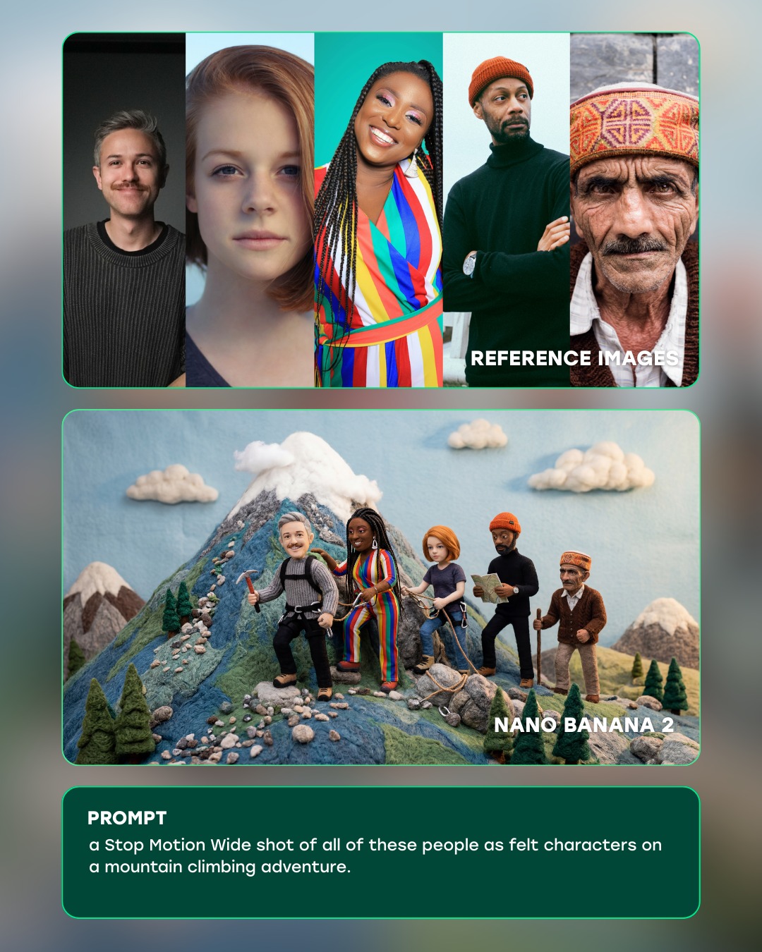
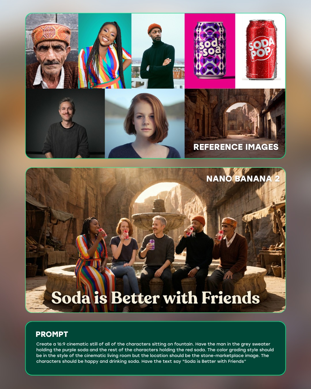
This image works because it is designed as an explanation, not just a result. It shows the inputs, the generated output, and the underlying prompt in one vertical flow. That makes the claim immediately legible: these reference images were used to generate a group diner scene with the same characters.
Visual breakdown
| Section | Purpose |
|---|
| Top reference row | Establishes the five character identities used as source inputs. |
| Middle diner scene | Shows the generated result where all characters appear together in one narrative frame. |
| Bottom prompt panel | Explains the generation instruction in plain language. |
| Rounded panel borders | Separate the information clearly and make the graphic feel productized. |
| Warm restaurant interior | Gives the result image a relatable social setting rather than an abstract test. |
What the image is really doing
The most important thing here is trust-building. A plain generated image would only show a result. This layout shows the evidence chain. The references are visible, the prompt is visible, and the output sits between them as a claimed transformation. That is exactly the right structure when you want viewers to evaluate consistency rather than aesthetics alone.
The middle scene is also chosen well. A diner table is socially familiar, visually busy enough to test multi-character coherence, and compact enough that everyone has to share a believable space. That makes it a useful test scenario rather than a random creative choice.
Why the layout works
| Design choice | Effect |
|---|
| Vertical stack | Creates a clear top-to-bottom reading order. |
| Panel framing | Stops the asset from feeling visually chaotic. |
| Warm output image | Makes the result feel approachable and cinematic. |
| Dark prompt card | Provides contrast and anchors the explanatory copy. |
The graphic feels effective because it does not ask the viewer to infer the workflow. It displays the workflow. That is a strong content design choice for educational or marketing material around AI tools.
Best-fit uses and transfer paths
- Reference for AI product marketing that needs to demonstrate a test workflow clearly.
- Useful for prompt engineering explainers and character-consistency case studies.
- Good inspiration for carousel slides, tutorial thumbnails, and educational social assets.
- Strong benchmark for showing input-output relationships in one static image.
How to adapt the idea without weakening it
If you reuse this structure, keep the evidence chain intact: references first, output second, prompt or method third. That order is carrying most of the clarity. You can change the test scenario from a diner scene to another setting, but the layout should still make the comparison immediate.
A reliable variation path is to preserve the same three-panel logic while changing the number of references or the style of output. As long as the viewer can quickly understand what went in and what came out, the graphic will keep its explanatory strength.