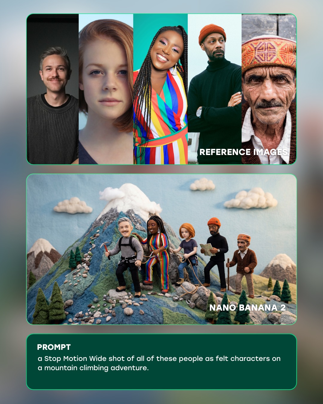
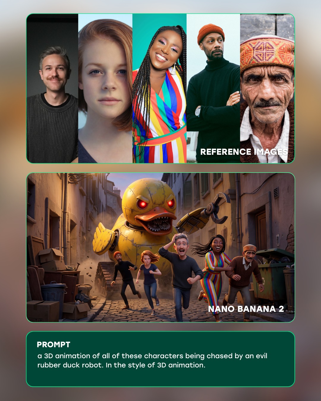
This image works because it sells transformation through structure, not just through spectacle. The top panel gives the raw source material, the middle panel delivers the imaginative payoff, and the bottom panel explains the instruction that connects the two. That sequence makes the AI workflow legible in seconds. The viewer can understand both the technical claim and the creative leap without reading a long explanation.
The transformation itself is also well chosen. The reference portraits are highly varied in age, styling, and facial features, which makes the output challenge more convincing. Turning those distinct people into stop-motion felt adventurers on a mountain is visually surprising, but still simple enough to read. The output is not just “stylized”; it has a very specific handcrafted medium, and that specificity is what makes the demo memorable.
How curiousrefuge Created This Stop Motion Felt Mountain Adventure AI Art — and How to Recreate It
| Signal | Evidence (from this image) | Mechanism | Replication Action |
|---|
| Workflow clarity | The graphic is divided into reference images, generated result, and prompt text | Sequential layout reduces cognitive friction and makes the transformation instantly understandable | Present AI demos in explicit stages rather than relying on caption text alone |
| Identity continuity | Each person in the portrait strip appears as a recognizable felt counterpart in the output | One-to-one mapping increases trust in the tool’s consistency | Choose reference material where the identities can be clearly tracked into the result |
| Medium specificity | The output is not generic animation but a handcrafted stop-motion felt world | Specific material language makes the model capability feel more impressive and intentional | Use transformation prompts that target a concrete medium, not a vague style label |
| Product polish | Rounded cards, teal outlines, and clean labels create a unified showcase aesthetic | Refined presentation makes the workflow feel premium and credible | Use consistent panel styling and restrained UI accents to frame the transformation |
Observed Style Choices
| Style Choice | Observed Effect |
|---|
| Top portrait strip | Creates fast reference diversity and sets up the transformation challenge |
| Central felt mountain scene | Acts as the emotional and visual payoff of the graphic |
| Teal rounded borders | Unify the three sections and signal modern product design |
| Handcrafted miniature textures | Give the generated result charm, warmth, and medium specificity |
| Bottom prompt box | Explains the exact instruction that generated the output |
Prompt Technique Breakdown
| Technique | Why It Matters Here | How To Phrase It |
|---|
| Reference-to-output mapping | The core value of the demo is showing that multiple identities can be transformed together | "all of these people reimagined as felt stop-motion characters" |
| Medium locking | The output becomes stronger when the handcrafted medium is explicit | "stop-motion wide shot, felt characters, miniature mountain set, wool textures" |
| Workflow framing | The image is presenting a tool capability, not just artwork | "AI product demo with reference panel, generated panel, and prompt card" |
| Scale and scene simplification | The mountain adventure remains readable because the scene is miniature and contained | "storybook mountain trail with small trees, clouds, and a snow-capped felt peak" |
| UI restraint | Too much interface decoration would weaken the clarity of the showcase | "minimal rounded panels, teal edge accents, clean typography, no extra dashboard clutter" |
Execution Notes
To recreate this kind of demo, design the information hierarchy first. Decide which part proves identity, which part delivers the imaginative jump, and which part explains the prompt. Once that structure is stable, the actual generated image has room to shine. Here the middle panel is clearly the hero, while the top and bottom panels function as evidence and explanation.
Most weak versions will either use a transformation that is too vague or an interface that is too noisy. Fix that by choosing a very specific medium like felt stop-motion and simplifying the presentation to three clean panels. If the result feels random, strengthen the one-to-one identity mapping between the portraits and the output characters. The best version feels like a product demo that is both technically trustworthy and creatively delightful.