Why soy_aria_cruz's Sad Expression Model Comparison Went Viral — and the Formula Behind It
This image works because it compares something that actually matters: emotional control. Most side-by-side model comparisons stay shallow by comparing surface beauty only. This one is more useful because it asks whether the model can hold a subtle emotional instruction and keep the same subject identity at the same time. That is a much harder test, and it is far more relevant for creators who want usable storytelling images.
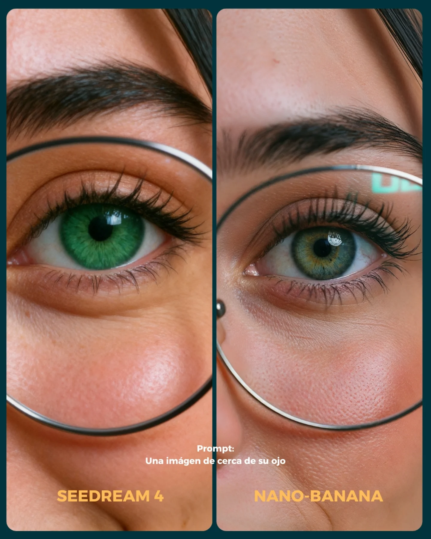
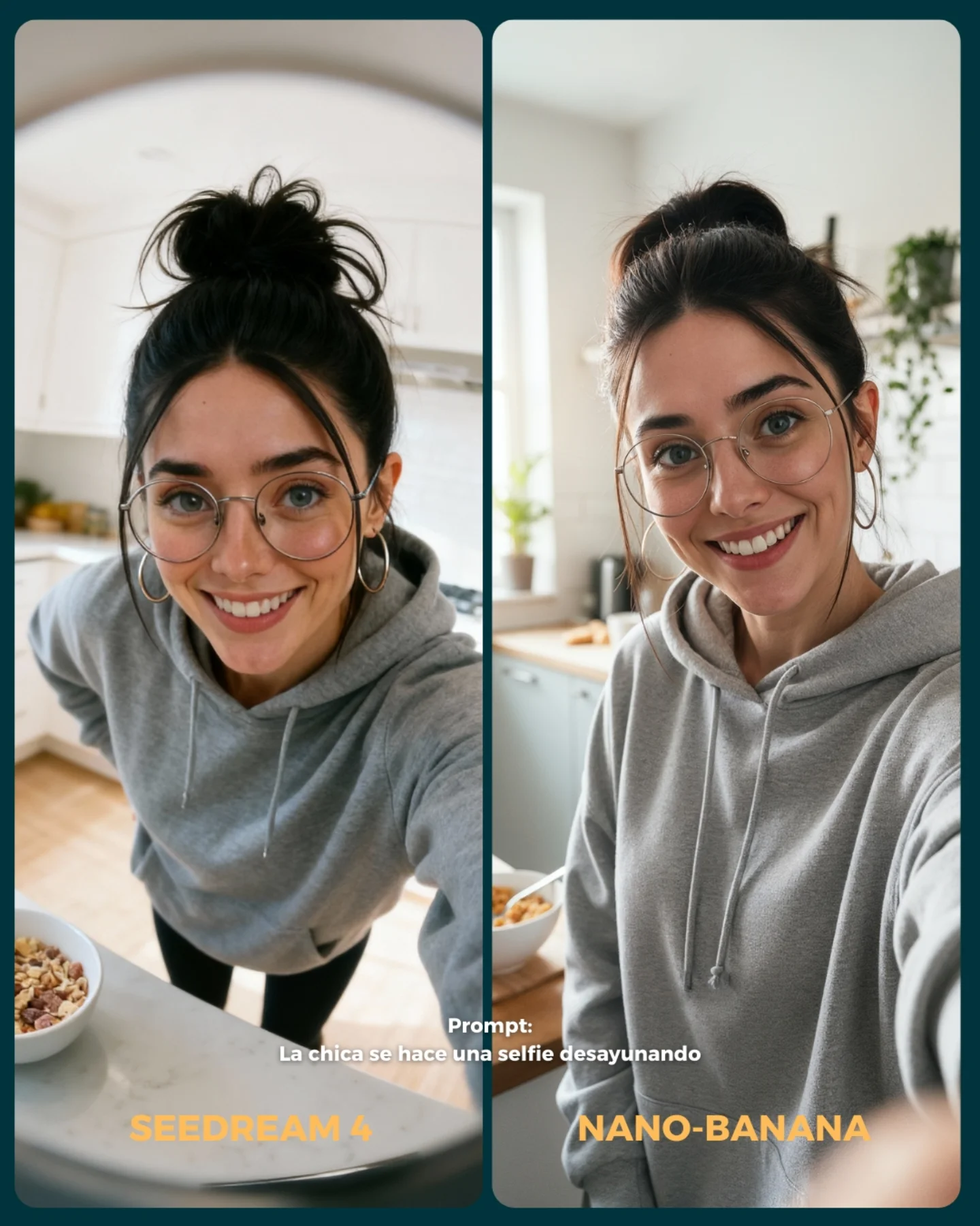
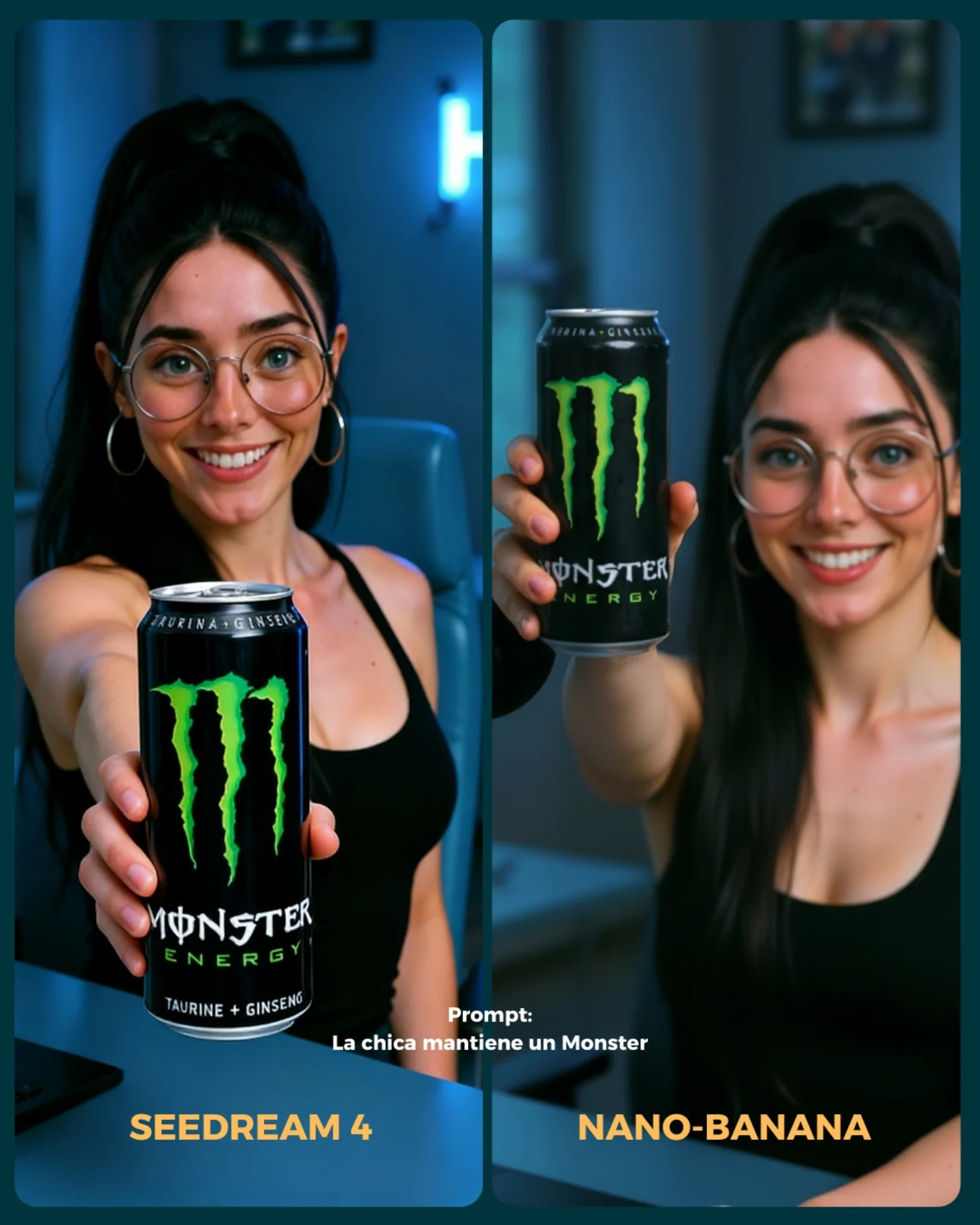
The prompt itself is simple, which is part of the point. A phrase like “the girl is sad” sounds easy, but facial sadness often collapses into blankness, overacting, or unrelated facial distortion. Here, the comparison image tries to isolate the emotional read. The identical glasses, ponytail, black top, blue-lit room, and desk angle keep the context stable so the viewer can judge the face rather than the styling.
Why This Comparison Format Has Value
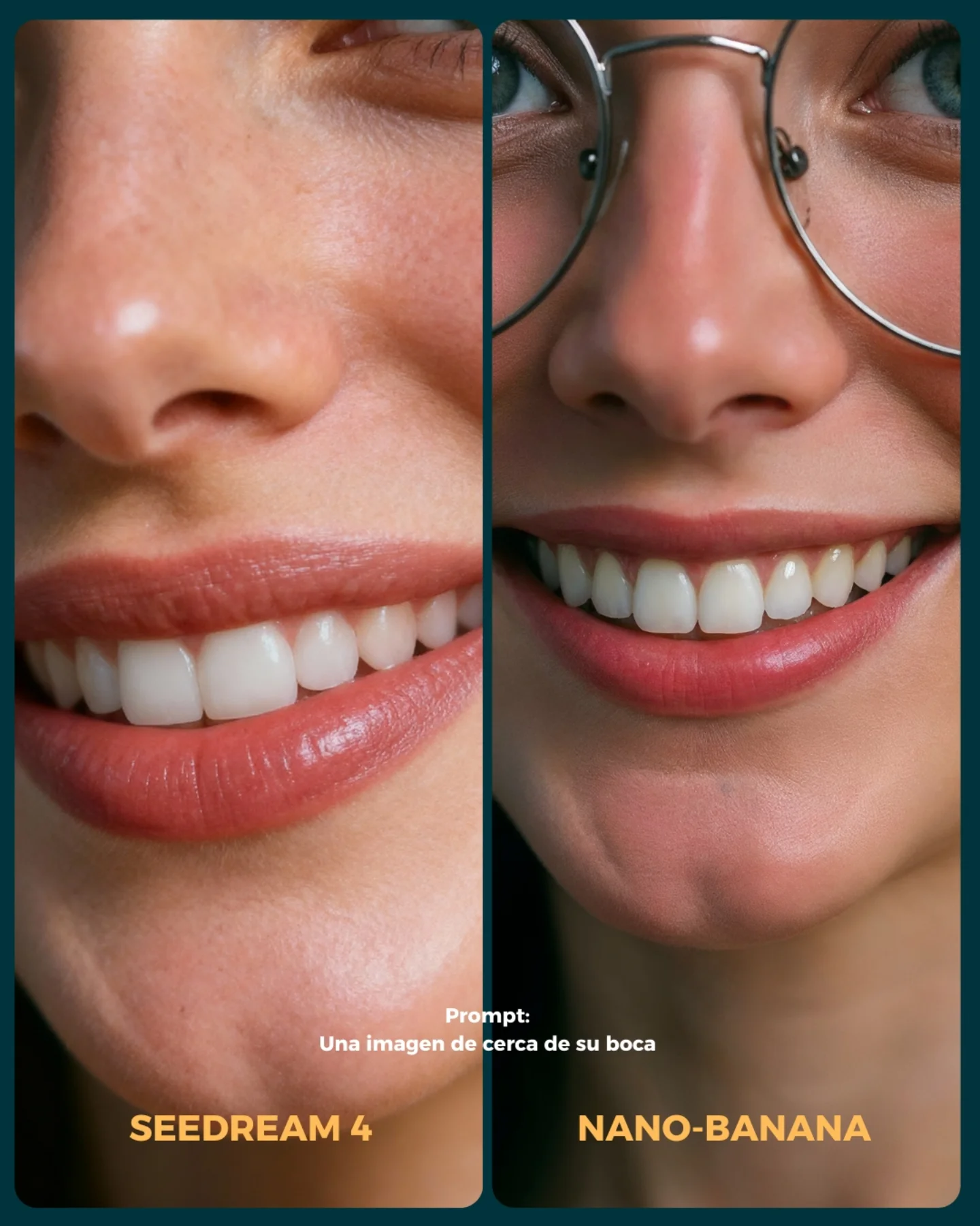
The cover is effective because it makes the evaluation criteria visible. When both panels keep the same crop and environment, the viewer can compare micro-expression fidelity instead of getting distracted by different styling. That is the right way to do AI image testing for creators. If too many variables change at once, the comparison stops being instructive.
| Signal | Evidence (from this image) | Mechanism | Replication Action |
|---|
| Expression-first testing | Both panels focus on a sad, worried face rather than wardrobe variety | Turns the comparison into a real control test | Keep styling fixed and compare one emotional instruction at a time |
| Consistent identity anchors | Same glasses, ponytail, hoops, black top, desk setup | Helps viewers notice emotional differences instead of identity drift | Lock hair, accessories, and camera angle before testing expression quality |
| Readable room mood | Blue ambient interior and partial neon sign remain stable in both panels | Supports a melancholy tone without changing the subject | Use the same environment cues across both models to avoid false comparisons |
| Tight crop on face | Upper-chest framing emphasizes brows, eyes, and mouth | Makes subtle expression differences easier to judge | Crop closer when testing emotional prompting, not farther |
Aesthetic Read: What The Cover Is Doing Well
The cover works visually because it uses a narrow palette and a calm layout. Blue room lighting, black clothing, dark hair, and skin tones keep the image easy to read. Nothing loud competes with the emotional performance. The result feels more analytical than decorative, which is the right direction for a comparison cover.
The emotional cue is also intentionally restrained. The face is sad, but not theatrical. That is important because subtle sadness is usually harder for models than obvious crying or exaggerated distress. A creator comparing outputs wants to know whether the model can handle this quieter kind of expression, because that is what makes images feel believable.
| Observed | Why It Matters | How To Recreate |
|---|
| Two-panel mirrored setup | Keeps the comparison fair and legible | Use the same crop, styling, and environment in both outputs |
| Subtle sad facial tension | Tests realism better than exaggerated crying | Prompt for knitted brows and downturned lips instead of tears first |
| Blue-lit desk environment | Adds tone without distracting from the face | Choose one mood-supporting room cue and keep it stable |
| Glasses and ponytail held constant | Reduce identity drift between models | Lock signature accessories and hair shape in the base prompt |
Best Use Cases And Transfers
- AI model comparison covers: Ideal when you want to test emotional fidelity instead of only beauty rendering.
- Prompt engineering lessons: Strong for teaching how to isolate one variable at a time in image testing.
- Expression control tutorials: Useful for showing creators how small facial cues matter more than dramatic wording.
- Not ideal for broad style comparisons: The frame is intentionally too controlled if your goal is outfit or environment variety.
- Not ideal for entertainment-first thumbnails: The value here is precision, not spectacle.
Three transfer recipes
- Keep: same identity anchors, same crop, same room. Change: target emotion. Slot template: {emotion} {hair lock} {accessory lock} {room mood}
- Keep: side-by-side comparison layout and desk composition. Change: genre from sad to nervous, relieved, skeptical, or embarrassed. Slot template: {micro-expression} {subject identity} {comparison layout} {lighting tone}
- Keep: cool indoor palette and upper-chest crop. Change: location detail or neon color while preserving the emotional test. Slot template: {room accent} {expression intensity} {crop tightness} {identity anchors}
Prompt Technique Breakdown
| Prompt chunk | What it controls | Swap ideas (EN, 2-3 options) |
|---|
| same young woman shown in two side-by-side comparison panels | Comparison structure | 'split-screen test layout', 'two-panel model comparison', 'side-by-side portrait evaluation' |
| worried sad expression with knitted brows and downturned lips | Emotion fidelity | 'subtle anxiety', 'quiet disappointment', 'teary concern' |
| large round glasses, high ponytail, hoop earrings, black sleeveless top | Identity consistency | 'clear acetate glasses', 'slick bun', 'gray tee instead of black top' |
| cool blue indoor room with desk and partial neon sign | Mood-supporting environment | 'blue-lit workspace', 'purple bedroom desk setup', 'soft cool studio office' |
| upper-chest portrait crop with one hand on desk | Face readability and framing stability | 'head-and-shoulders crop', 'waist-up desk portrait', 'close emotional portrait' |
Execution Playbook
Lock three things first: subject identity, room lighting, and crop. Those are the controls. Then test only the expression. Start with a baseline sad prompt using brows, eyes, and mouth cues. Next, adjust only brow tension. Then adjust only mouth downturn. Finally, if needed, add eye moisture or a more fragile gaze. This step-by-step method is much better than throwing in a dozen emotional adjectives at once, because it tells you which prompt knob actually improved the output.