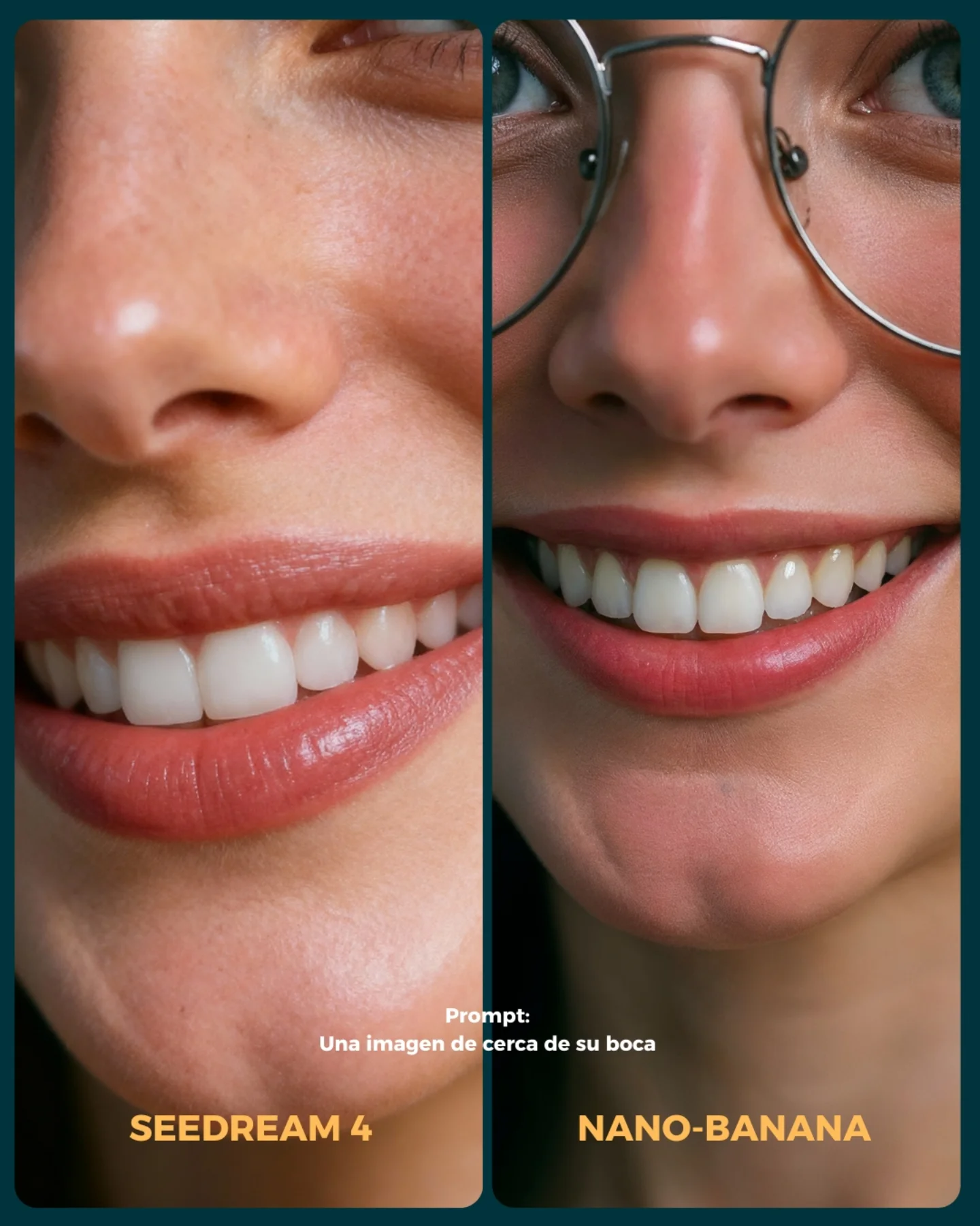
How soy_aria_cruz Built This Mouth Closeup AI Realism Test
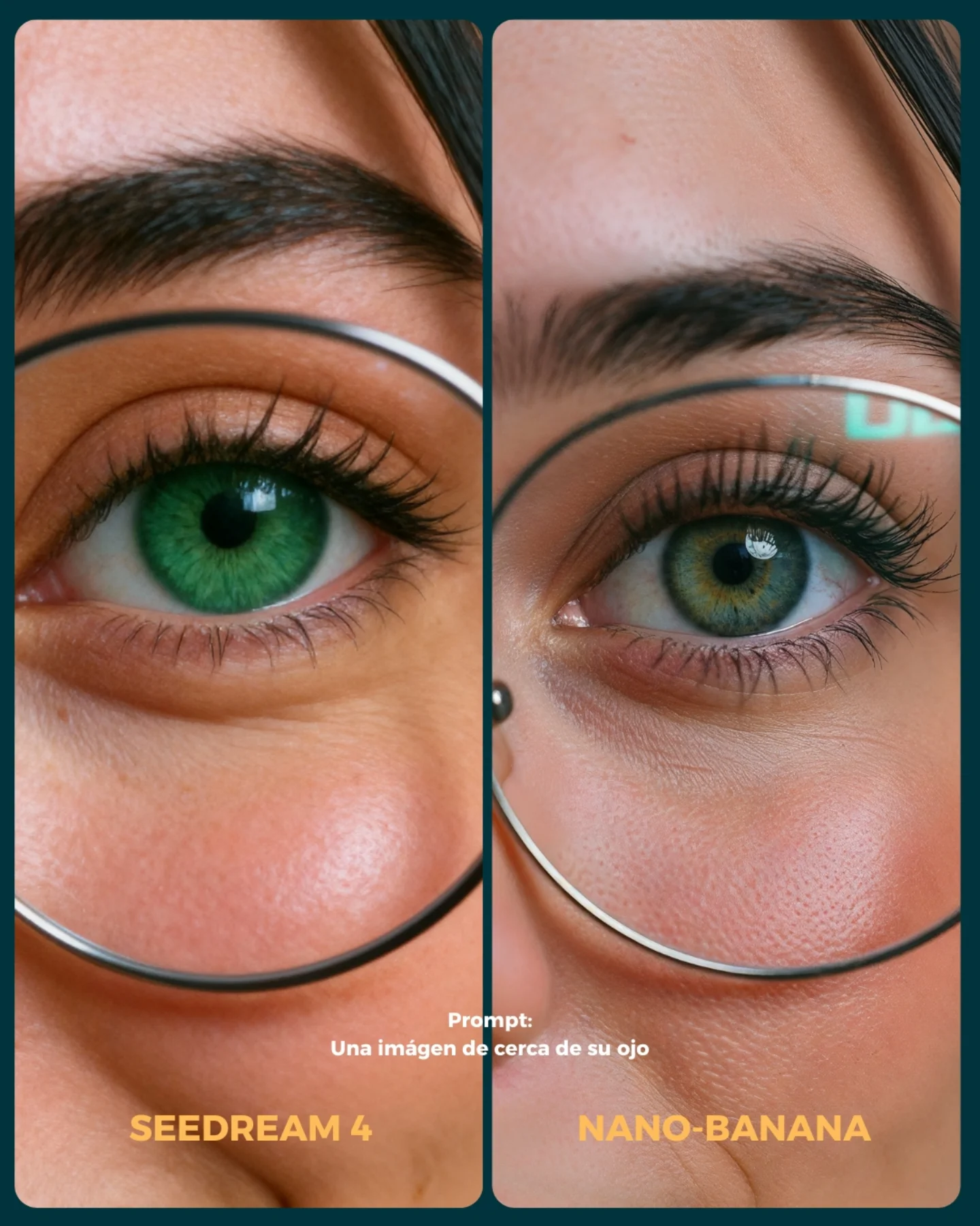
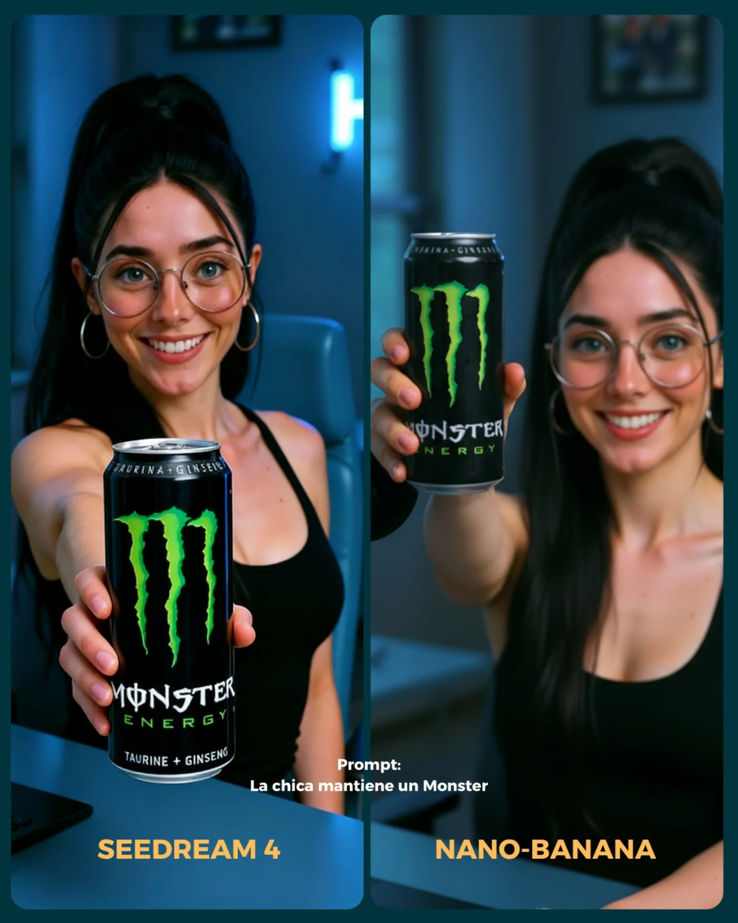
This image works because it narrows the comparison down to one fragile realism zone: the lower half of the face. That is a smart benchmark choice. Once the crop gets this close, the viewer stops reacting to styling and starts reacting to rendering quality. Skin texture, lip edges, tooth shape, nose shading, and eyeglass integration all become impossible to hide. That is exactly what a good model test should do.
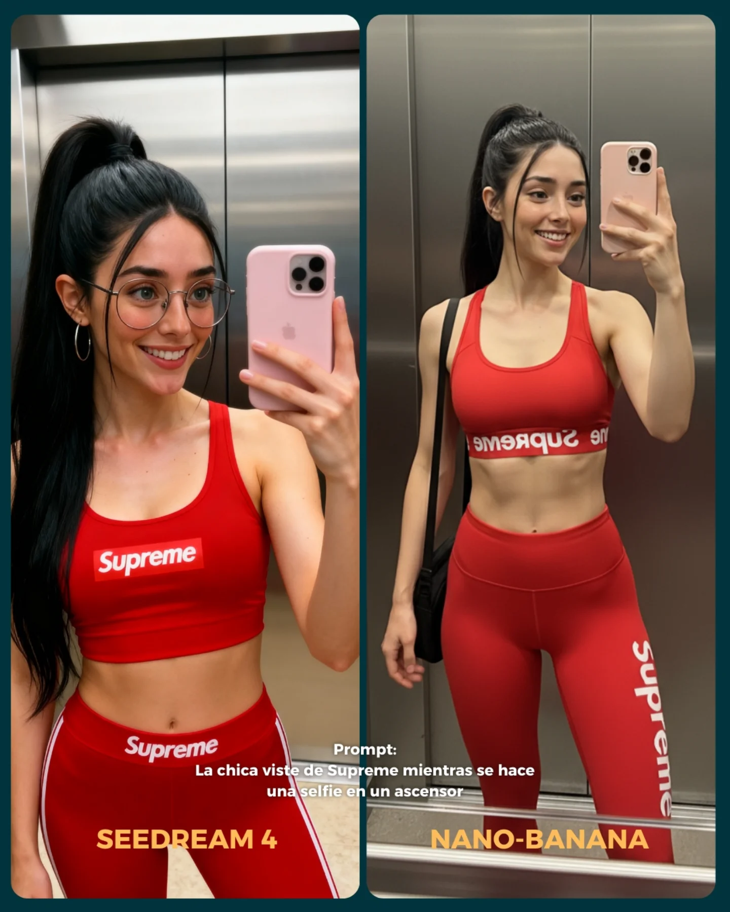
The comparison also benefits from focus discipline. It is not asking the models to solve a whole scene. It is asking them to solve a very specific visual problem under controlled conditions. When creators compare tools this way, the result becomes more useful. The audience can actually learn something from the image instead of just voting for whichever overall picture feels prettier.
The presence of the glasses on one side adds another useful pressure point. Eyeglass rims are great realism tests because they sit right at the boundary between skin, reflection, and perspective distortion. Combined with teeth and lip texture, this gives the frame multiple micro-zones where quality differences can show up fast. That is why this image is stronger than a normal smiling portrait. It is effectively a stress test disguised as a clean beauty crop.
| Signal | Evidence (from this image) | Mechanism | Replication Action |
|---|
| Ultra-specific crop | The frame isolates nose, lips, teeth, chin, and part of the eye area | Removes styling distraction and forces attention onto rendering quality | Use extreme close-ups when benchmarking skin, lips, and dental realism |
| Micro-detail pressure points | Teeth, lip sheen, skin texture, nose highlights, glasses rim | Small errors become obvious very quickly at this distance | Choose 3 to 5 delicate facial zones and compare them under the same crop |
| Clear comparison packaging | Two equal panels, model labels, and the prompt text are all visible | Makes the benchmark instantly readable and socially shareable | Package the comparison as one direct visual test instead of a long explanation |
Best-fit use cases
- Model comparison pages, because the image isolates realism instead of broad style preference.
- Beauty-closeup prompt libraries, because the crop teaches exactly what to test.
- Educational posts about AI image quality, because the viewer can inspect multiple weak points at once.
- Carousel openers for “which model handles detail better?” style content.
Less ideal: storytelling posts, environment tests, fashion outfit comparisons, or lifestyle scenes where context matters more than texture. This frame is for inspection.
To adapt it, keep the same comparison logic but move the fragile zone. You can do the same structure for eyes and lashes, hands holding jewelry, wet skin, fabric seams, or hairline realism. Slot template: {two-model comparison} focused on {one fragile realism zone} under {matched close-up lighting}.
Aesthetic read
The image succeeds aesthetically because it is almost clinical without feeling cold. The warm-neutral skin tones, soft portrait light, and clean smile keep it accessible, while the macro crop keeps it technical. That balance matters. Benchmark content performs better when it still looks like content someone wants to look at, not just lab evidence.
The split layout also helps by making the image legible from a distance. Even before you zoom in, you understand the game: same prompt, two outputs, one close-up challenge. That instant readability is a large part of why comparison posts spread so easily.
| Observed | Why it matters |
|---|
| Macro crop on lips, teeth, nose, and cheek | Turns the image into a focused realism test |
| Right panel includes eyeglass rim and bridge detail | Adds a second material/rendering challenge |
| Soft clean portrait light | Keeps texture differences visible without harsh distraction |
| Matched two-panel layout | Makes the comparison feel fair and fast to read |
| Prompt text embedded in the image | Connects the benchmark directly to a reusable test case |
Prompt technique breakdown
| Prompt chunk | What it controls | Swap ideas (EN, 2–3 options) |
|---|
| extreme close-up of the mouth and lower face | Test scope and vulnerability zone | extreme eye close-up, chin-and-lips crop, nose-and-cheek crop |
| soft smiling mouth with visible teeth and natural lip texture | Facial-detail complexity | closed lips with gloss, laughing mouth, neutral mouth with dry-lip texture |
| glasses visible on one side of the comparison | Material edge and facial-contact realism | sunglasses edge, nose ring detail, earring close-up |
| matched two-panel layout with model labels | Comparison clarity | before/after split, model-vs-model badge layout, benchmark carousel opener |
| prompt text embedded in the center lower area | Educational reuse and context | short test prompt footer, benchmark caption line, challenge label |
How to iterate without losing the core
Lock these three things first: the crop zone, the lighting style, and the comparison packaging. Those are the identity anchors. Then change only one or two variables per run.
- Baseline run: keep the same mouth close-up and compare both models directly.
- Second run: keep the crop fixed but change only the facial expression slightly, for example from small smile to open laugh.
- Third run: keep the lower-face crop and add one more rendering challenge, such as gloss, lipstick, or stronger glasses reflections.
- Fourth run: keep the benchmark structure and move to another fragile detail zone like eyes, hands, or wet skin.
If the comparison stops being useful, the first thing to inspect is usually the crop discipline. Once too much of the face or background enters the frame, viewers start evaluating style instead of the targeted realism challenge.