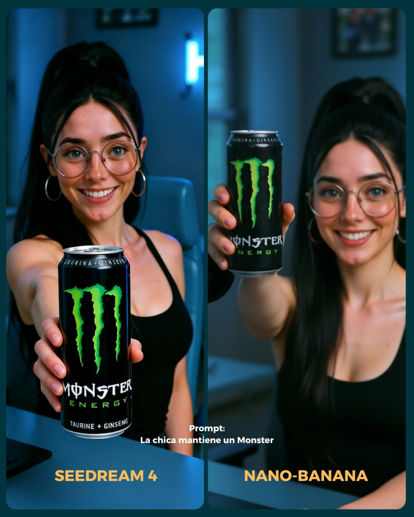
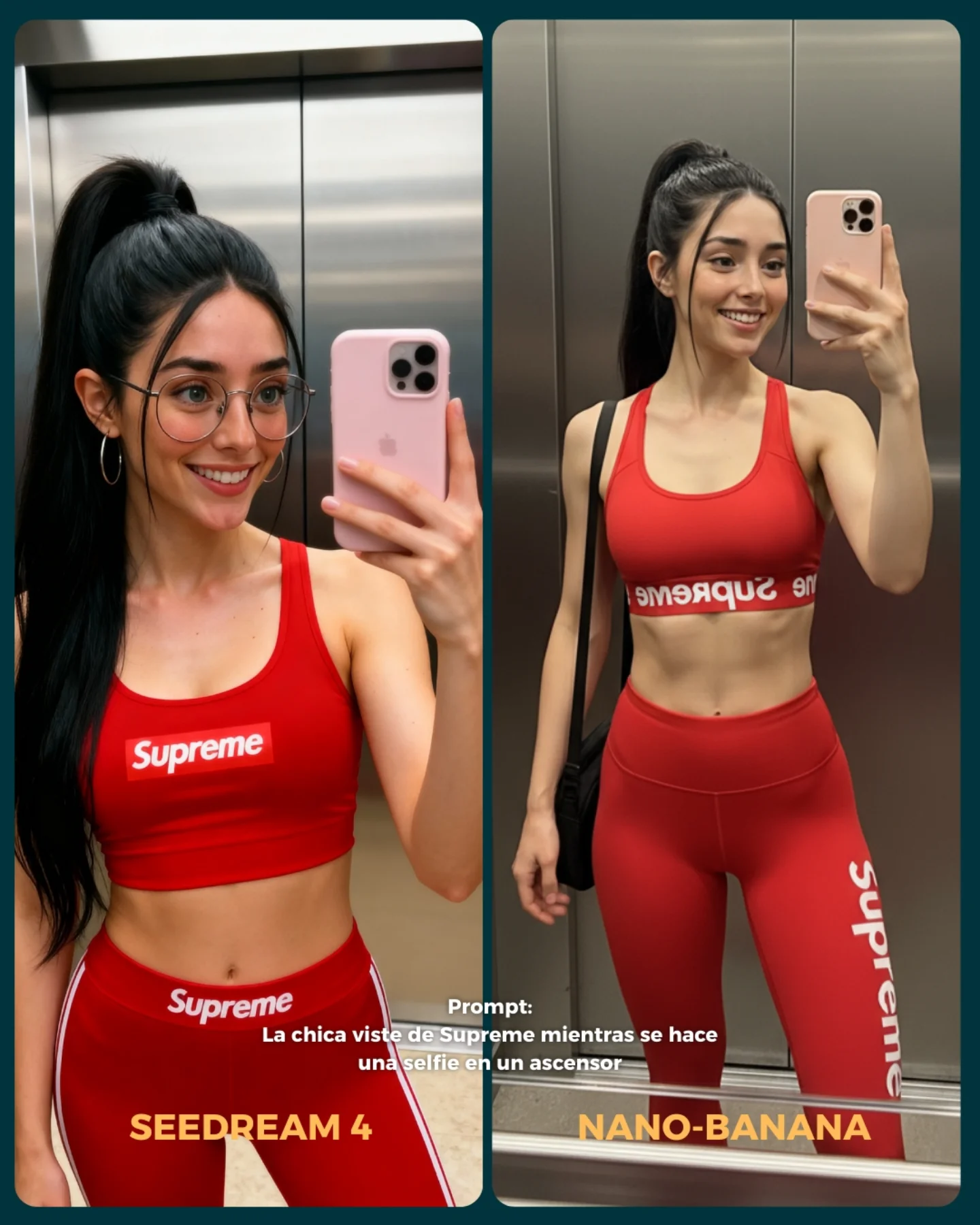
💥 Seedream 4 VS. Nano-Banana
Hoy toca poner a prueba el nuevo generador Seedream 4 que promete crear imágenes en 4K 😍
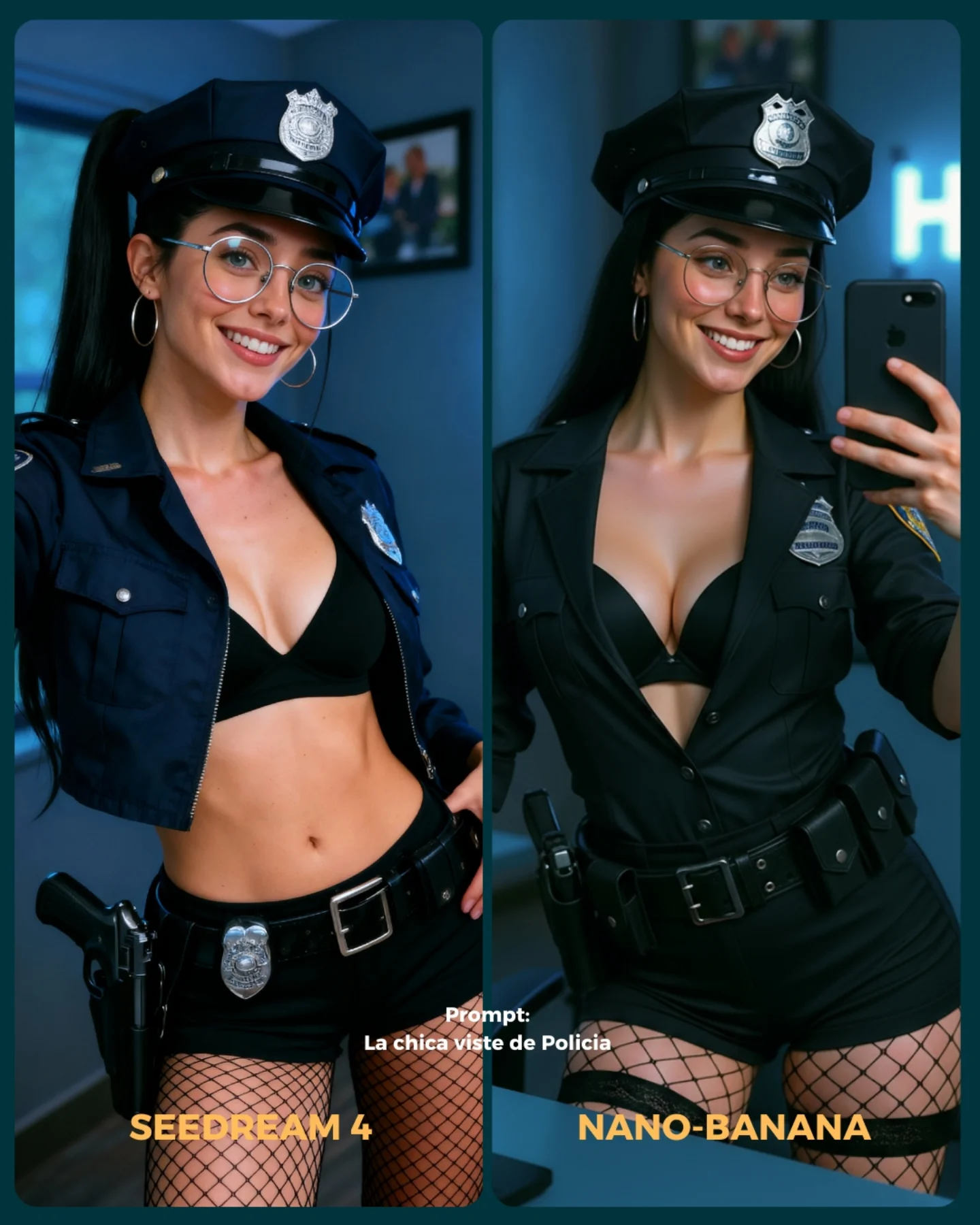
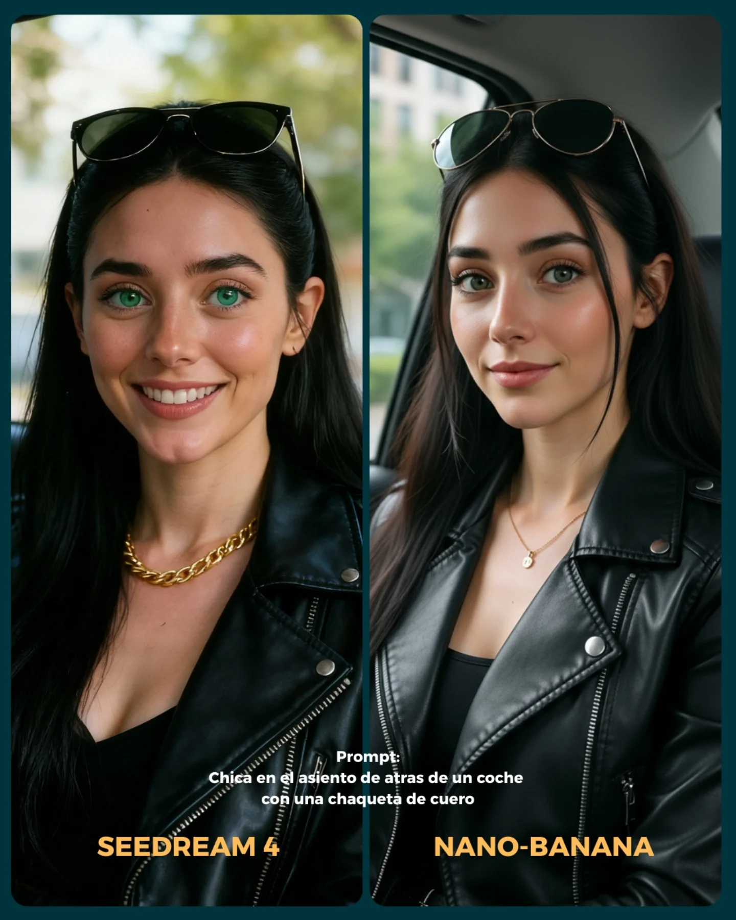
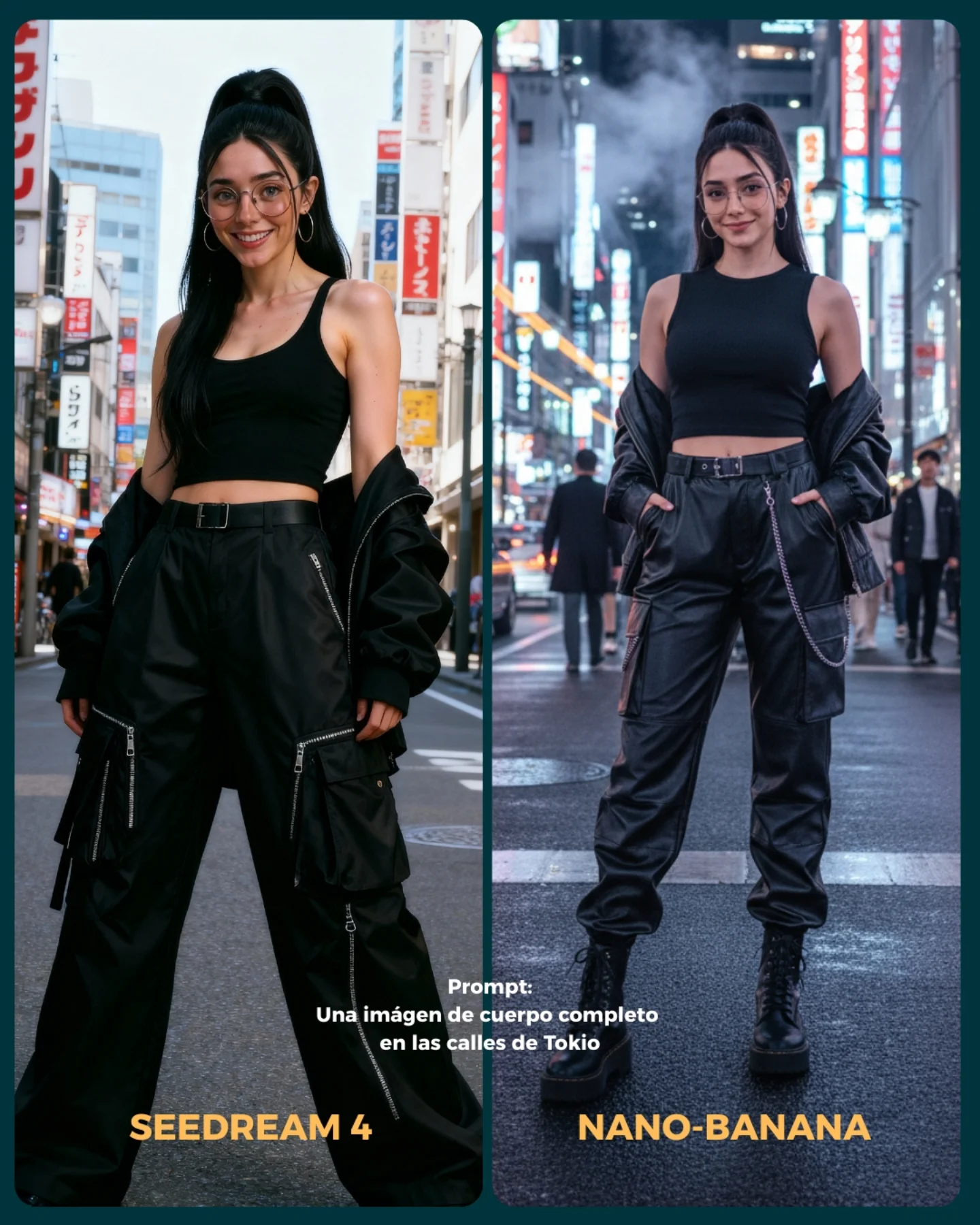
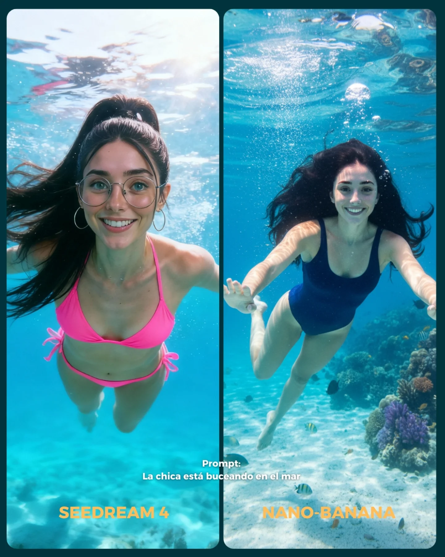
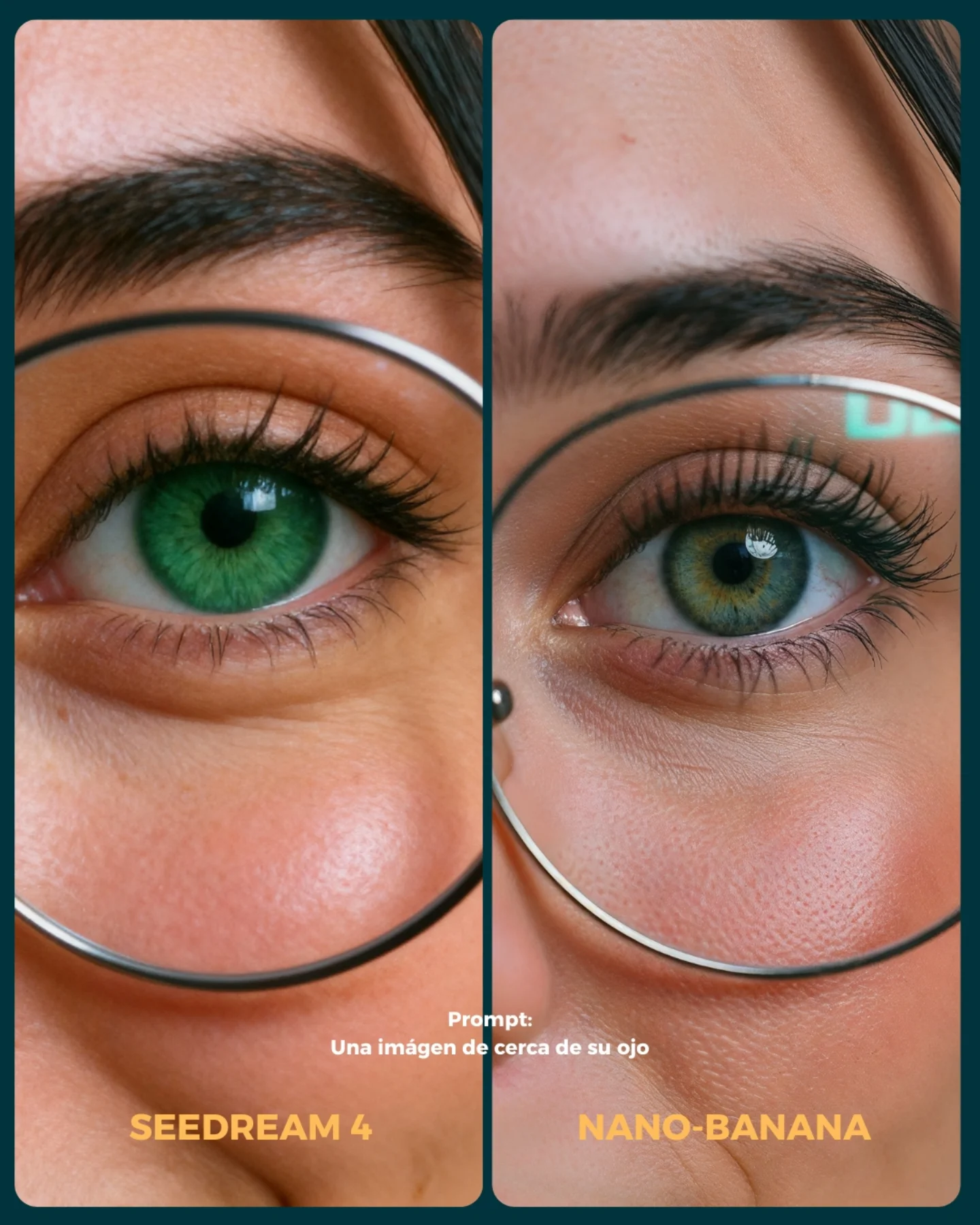
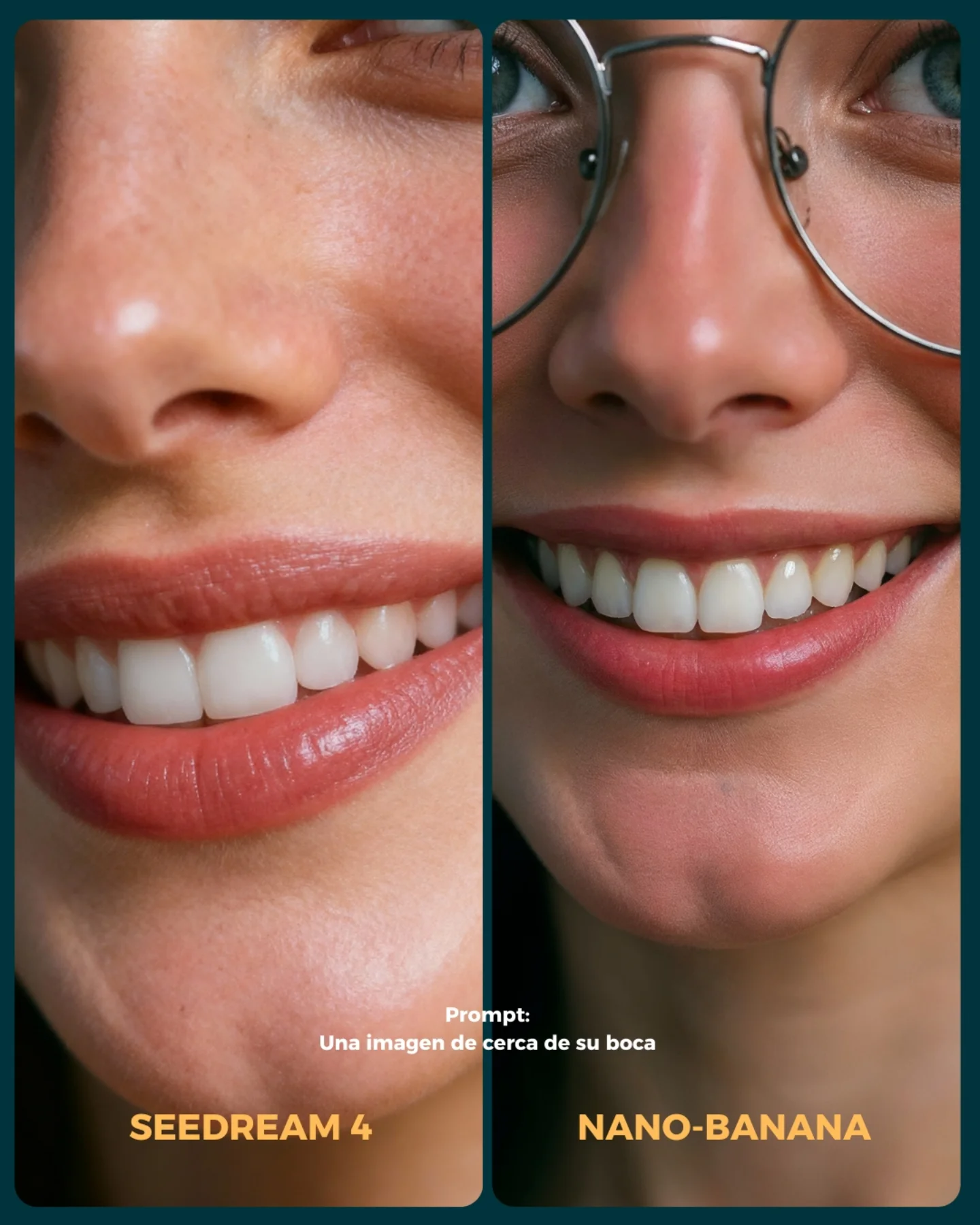
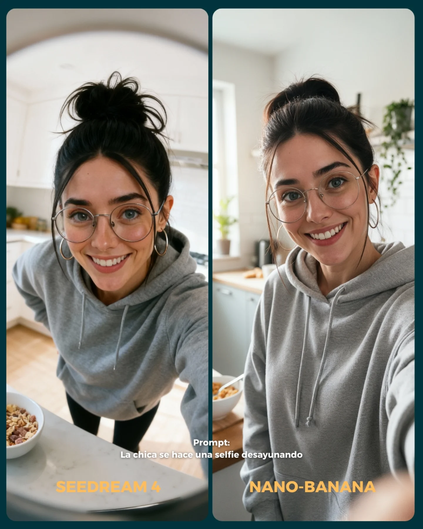
La idea fue elegir diferentes retos y situaciones para ponerlo a prueba con Nano Banana 🍌
- Integrando un producto (Monster)
- Cambios de ropa + de marca
- Imágenes de muy cerca (piel, ojos, boca)
- Selfies
- Buceando debajo del agua
- Expresiones faciales
- Imágenes de cuerpo completo para la consistencia del rostro
Si se te ocurren más situaciones que no he tenido en cuenta, comenta cuáles y lo pongo a prueba 💕
💌 Y dime... Con cual te quedas de los dos?? 👀
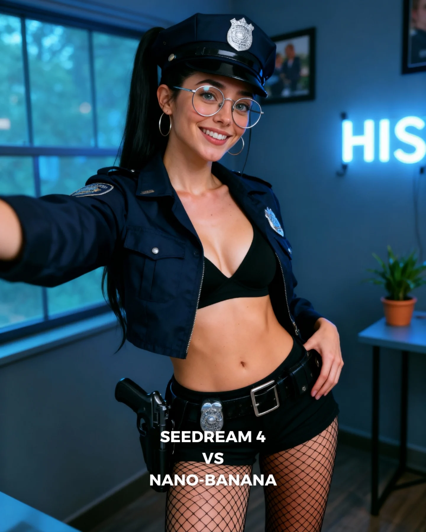
How soy_aria_cruz Made This Police Costume Selfie AI
This image works because it combines a strong costume concept with a casual camera relationship. The extended arm makes the frame feel more personal and less like a formal character portrait. That matters. The viewer does not feel as if they are looking at a polished costume shoot from a distance. They feel as if the subject is showing them the look directly.
For creators, this is a useful way to humanize themed content. The costume is still unmistakable, but the selfie-like framing pulls it back into the world of social media. The room, the neon sign, the plant, and the visible text label all reinforce that this is a creator-made comparison post, not a movie poster or a role-play scene.
The frame is also efficient. It carries the costume, the room, and the generator comparison label all at once, but the subject remains dominant because the face and torso are still the clearest elements. That balance is what keeps the image readable instead of overloaded.
Why This Format Performs
The first reason is contrast between costume and camera feel. The outfit is strong and themed, but the framing feels casual and direct. That contrast creates novelty. People stop because the image is more personal than a standard themed portrait but more distinctive than a normal selfie.
The second reason is layered usefulness. The image is not only a costume portrait. It is also a comparison cover and a creator-room portrait. Multi-function images often perform well because they offer more than one reason to care. Here, the viewer can respond to styling, realism, or the generator matchup.
The third reason is structure. The subject takes the center, the extended arm adds energy, the room provides context, and the text stays low. Each element has a separate job. Good social images are often just good layout decisions disguised as casual posts.
Signal
Evidence (from this image)
Mechanism
Replication Action
Casual camera relationship
The extended arm suggests a self-shot or direct creator capture
Selfie logic makes a themed image feel more personal and socially native
Introduce one self-capture cue when a costume concept risks feeling too distant
Multi-function content
The frame acts as costume portrait, room portrait, and generator comparison cover
Layered utility broadens engagement paths
Design covers that support more than one reading without sacrificing clarity
Room grounding
Window, neon sign, plant, and desk make the setting believable but not noisy
Context supports the subject and keeps the image feed-friendly
Use a few soft room anchors instead of role-specific background props
Bottom text containment
The comparison label sits low and does not compete with the face
Clean hierarchy preserves readability
Keep functional comparison text in the lower portion of the frame
Where This Aesthetic Fits Best
This style is ideal for generator comparisons, themed creator portraits, character-inspired thumbnails, and social covers that need both personality and information density. It works especially well when the goal is to connect a stylized image back to a real creator presence.
Best fit: comparison covers. The bottom label makes the post immediately legible as a benchmark.
Best fit: themed creator content. The selfie-like arm keeps the look approachable and personal.
Best fit: indoor character portraits. The room gives just enough context to make the post feel situated.
Best fit: prompt-test series. This format can carry repeated costume or scenario variations while staying consistent.
Best fit: social thumbnails. Tight readable framing and explicit labels make it work well at small sizes.
It is less useful for cinematic storytelling, minimalist beauty feeds, or realism-first documentary styles. The power here comes from stylized social utility, not immersion or neutrality.
Gamer-cosplay version. Keep: personal framing plus themed wardrobe. Change: room props, outfit texture, color family. Slot template: social-media themed portrait with selfie energy, modern room background, comparison text, stylized but approachable
Office-character version. Keep: room realism and centered subject hierarchy. Change: outfit coding and desk detail. Slot template: indoor creator portrait, one arm reaching toward camera, role-inspired outfit, clean room blur, comparison-cover layout
The Aesthetic Read
The strongest visual move is the arm. It gives the image an implied point of view and prevents the theme from feeling too staged. Small perspective cues like that are often what separate a good social portrait from a generic costume render.
The second smart choice is the consistency of the palette. Navy, black, silver, and cool room blues keep the image coherent even though the content concept is already strong. Color discipline is what stops the frame from becoming gimmicky.
The third useful choice is the room restraint. The plant and neon sign are enough to make the space feel real, but not so much that they compete with the badges, cap, or face. Supporting details are working the right way here: quietly.
Observed
Why it matters
How to recreate it
Extended left arm entering frame
Creates immediacy and self-capture logic
Add one near-camera limb or phone cue when you want a portrait to feel more personal
Bottom comparison text
Clarifies the image’s utility without breaking the portrait
Place benchmark labels low in the frame and keep the face area clean
Cropped navy jacket and cap
Keep the theme obvious without needing a full narrative setting
Use role-signaling wardrobe pieces that stay readable in medium crops
Blue room with neon and plant
Grounds the image in a creator space rather than a role-play set
Include one or two ordinary room anchors to humanize stylized content
Friendly smile in a strong costume
Prevents the themed image from becoming too severe or distant
Pair bold wardrobe with an approachable expression
Prompt Technique Breakdown
To recreate this image well, you need to balance four systems: costume recognizability, creator-room realism, selfie energy, and label clarity. Most weak versions will over-prioritize one of those systems and lose the rest. A good comparison cover needs all four working together.
Prompt chunk
What it controls
Swap ideas (EN, 2-3 options)
Costume recognizability
Fast concept read
police-style cap and cropped jacket; visible badge and patch; dark navy role-coded uniform
Selfie energy
Makes the image feel socially native instead of staged
extended arm toward camera; self-captured portrait feel; casual creator framing
Room realism
Humanizes the concept and grounds it in a real setting
navy and blue room tones; silver accents; black base layers
Identity anchors
Keeps the portrait tied to the creator rather than a generic model
round glasses; hoop earrings; long high ponytail and warm smile
The biggest drift risk is losing the self-capture feel. If the arm disappears and the frame becomes too formal, the image becomes just another themed portrait. The casual point of view is a core part of the appeal.
How to Iterate Without Flattening It
Lock three things first: the arm-forward framing, the cap-and-jacket costume signals, and the bottom comparison text. Once those are stable, refine room blur, badge detail, or skin realism. If you start adding more props or widening the frame, you will dilute the image’s tight social-media logic.
Use a one-change rule. If the portrait feels too posed, push the arm or perspective more. If it feels too gimmicky, calm the room and expression while keeping the same costume. If the comparison purpose feels weak, strengthen the lower label instead of changing the scene. Small changes help the image stay multi-purpose without becoming cluttered.
Run 1: Solve the centered subject, extended arm, and face-first readability.
Run 2: Add the cap, badges, cropped jacket, and lower comparison text.
Run 3: Refine the room anchors: window, neon, desk, and plant.
Run 4: Tune glasses reflections, skin texture, and fishnet detail without widening the crop.
If the output becomes too much like a costume poster, append a correction like creator-room comparison cover, social-media realism, self-shot portrait energy. If it becomes too plain, reinforce the cap and labels rather than decorating the room. The image works because it stays efficient.