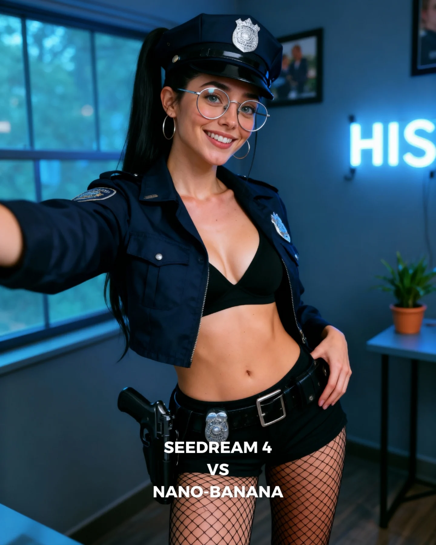
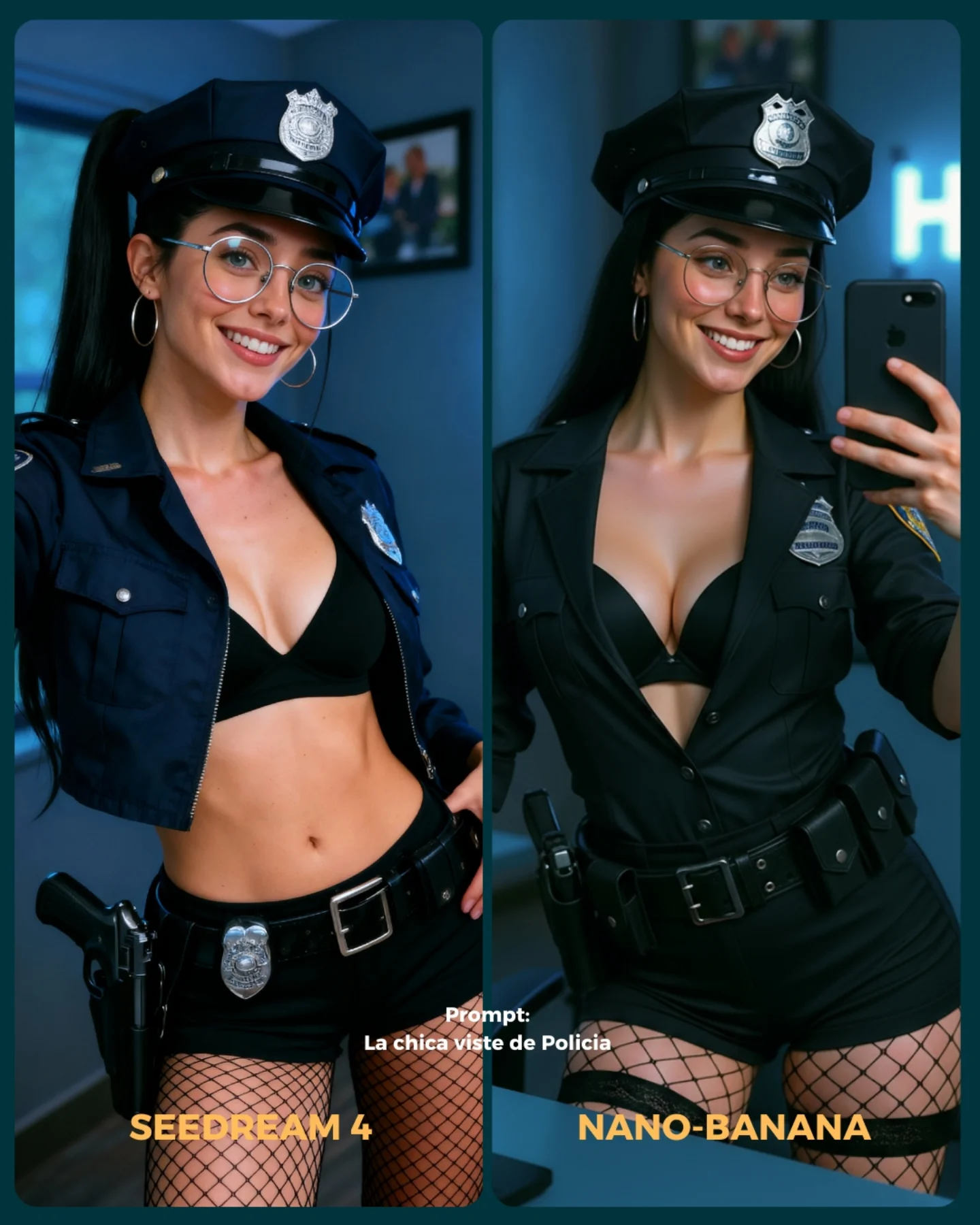
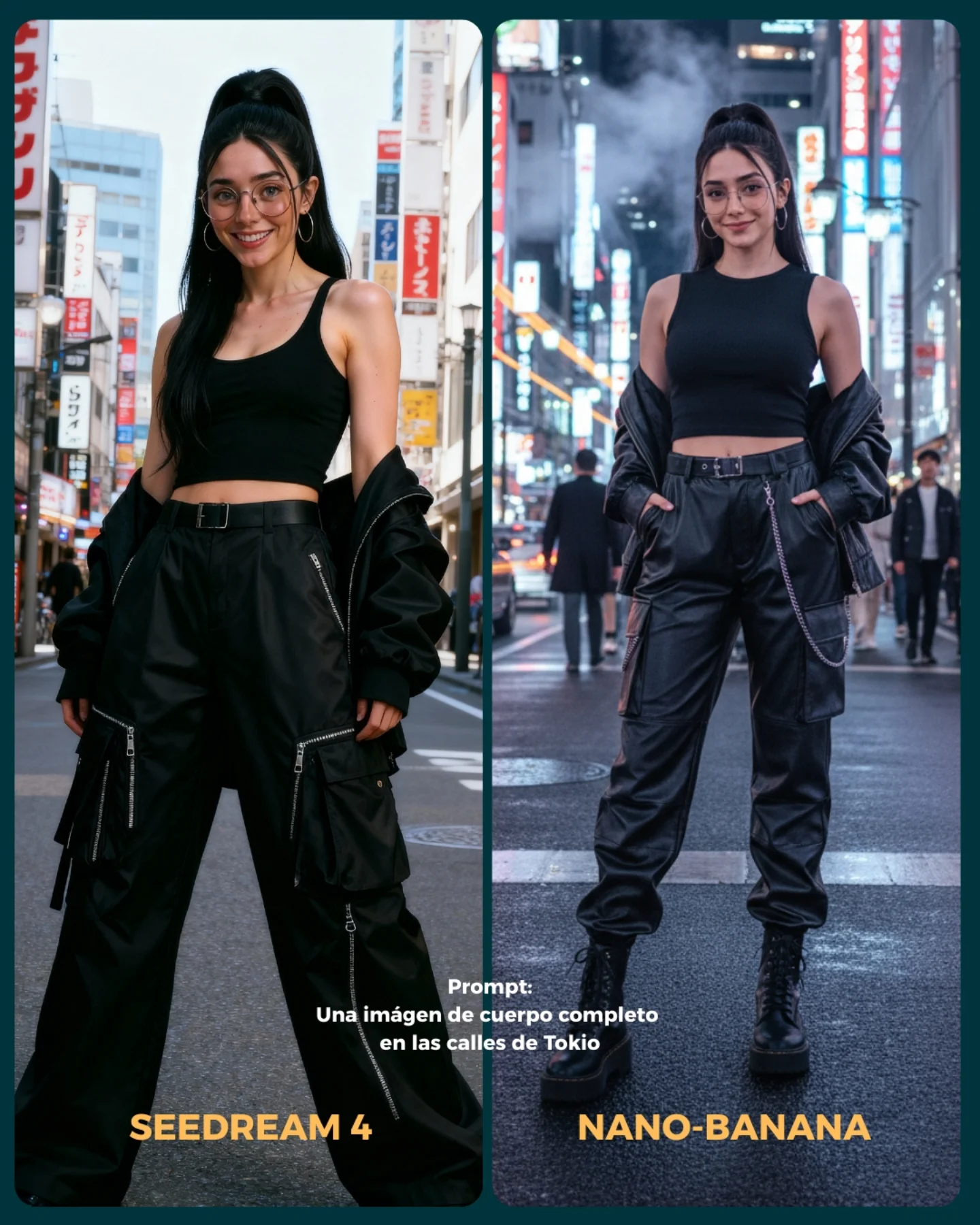
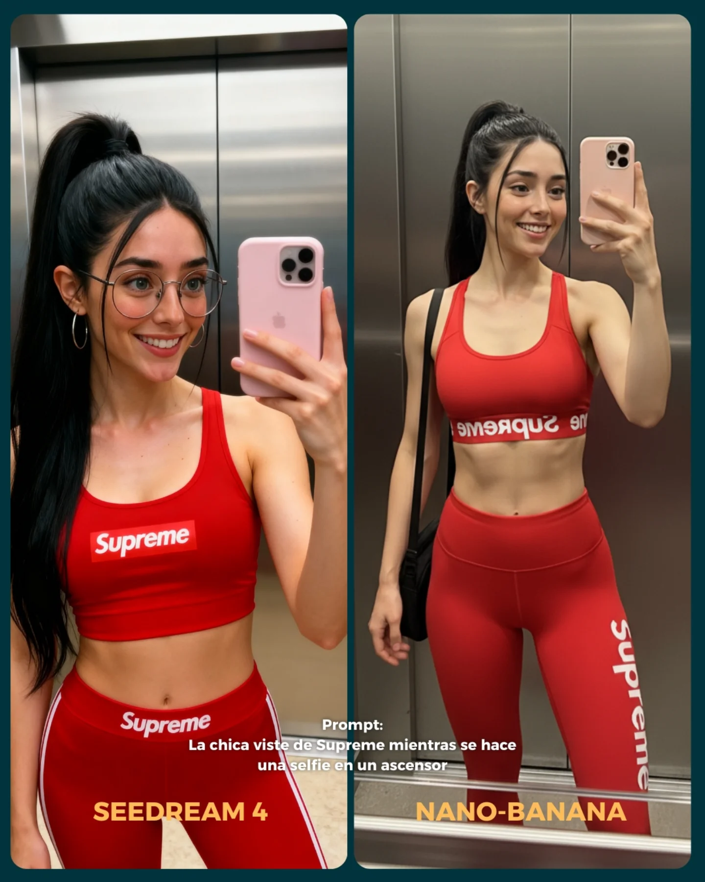
💥 Seedream 4 VS. Nano-Banana
Hoy toca poner a prueba el nuevo generador Seedream 4 que promete crear imágenes en 4K 😍
La idea fue elegir diferentes retos y situaciones para ponerlo a prueba con Nano Banana 🍌
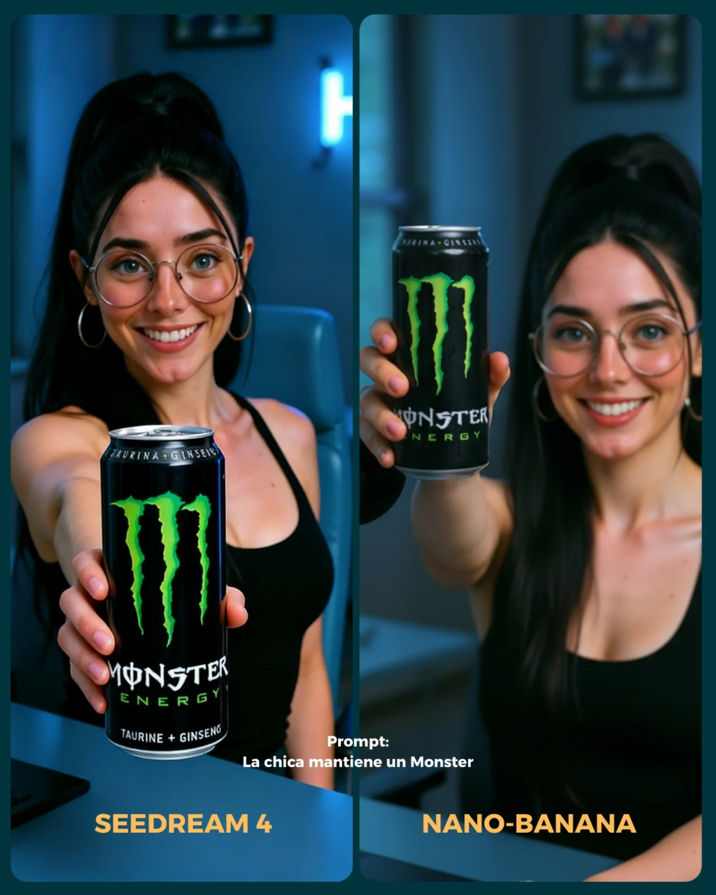
- Integrando un producto (Monster)
- Cambios de ropa + de marca
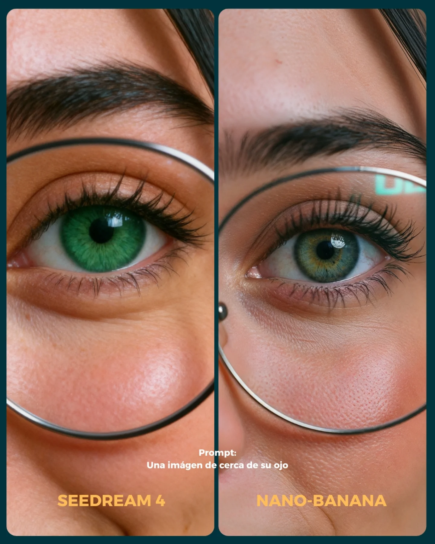
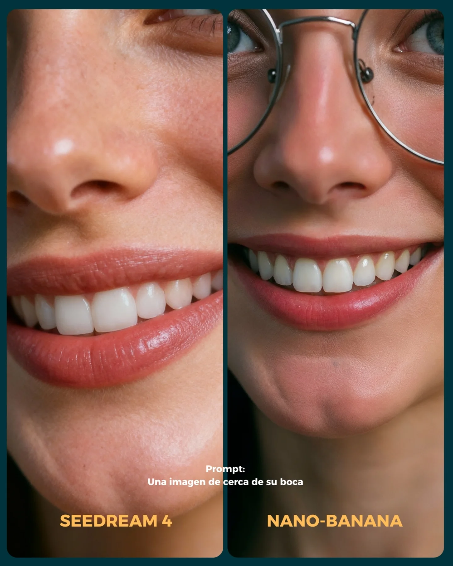
- Imágenes de muy cerca (piel, ojos, boca)
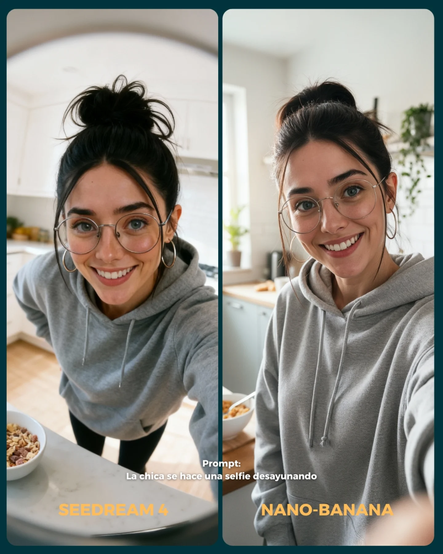
- Selfies
- Buceando debajo del agua
- Expresiones faciales
- Imágenes de cuerpo completo para la consistencia del rostro
Si se te ocurren más situaciones que no he tenido en cuenta, comenta cuáles y lo pongo a prueba 💕
💌 Y dime... Con cual te quedas de los dos?? 👀
How soy_aria_cruz Made This Leather Jacket Car Portrait AI
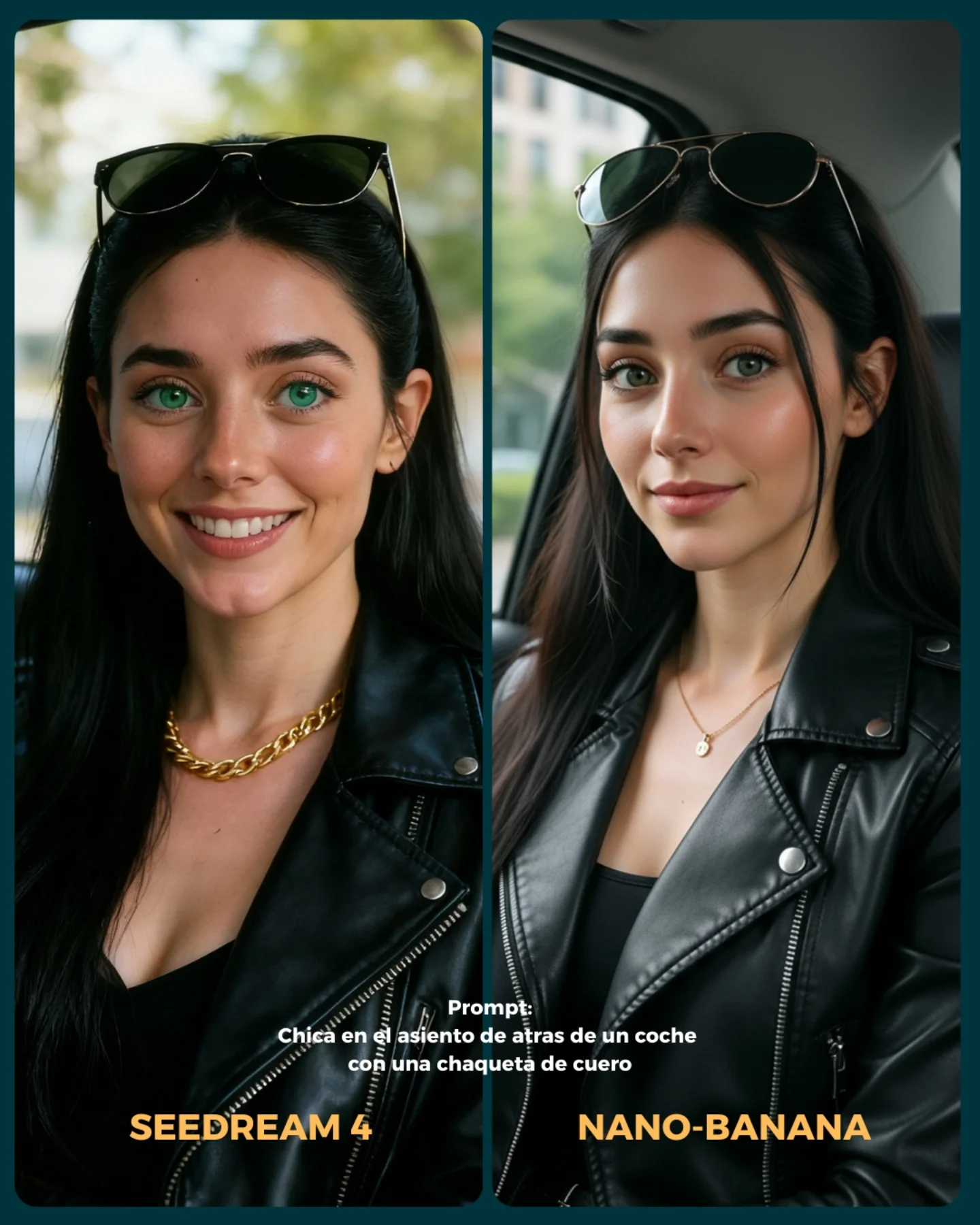
This image works because it understands that comparison posts still need design. A lot of model-versus-model assets fail by putting two outputs next to each other and calling it a day. Here, the portraits are only part of the appeal. The rounded panel shapes, the dark outer frame, the warm model labels, and the Spanish prompt text all help turn a technical comparison into something scroll-friendly and brand-aware.
The most useful thing about the card is that the two portraits are similar enough to compare but different enough to notice. Both women are clearly built from the same prompt concept: back seat of a car, black leather jacket, sunglasses on head, green eyes, soft daylight. But the left panel leans warmer and more cheerful, while the right panel feels calmer and slightly more editorial. That difference is exactly what makes the post worth looking at. If the outputs were too different, it would stop being a useful comparison. If they were too similar, it would become boring.
The setting choice is also smart. A car back seat gives enough context to make the portraits feel like lifestyle imagery, but not so much that the background becomes hard to control. That is why car-based prompt tests are so common: they offer believable reflections, soft window light, and subtle environmental structure without requiring a complicated scene.
What elevates this image beyond raw model testing is the way it behaves like a piece of content, not just evidence. The viewer is not only evaluating rendering quality. They are also consuming a designed post. That matters for creators, because technical comparison performs better when it still looks publishable.
Signal Table
Signal
Evidence (from this image)
Mechanism
Replication Action
Readable comparison
Two nearly matched portraits with small expression and styling differences
The audience can compare rendering quality without getting distracted by prompt drift
Keep prompt variables locked and only allow small model-driven differences when building side-by-side tests
Publishable design
Rounded panels, dark card background, warm model labels, centered prompt text
The asset feels like a finished social post rather than a raw workflow screenshot
Wrap comparisons inside a simple visual system instead of posting raw exports
Lifestyle familiarity
Car back seat, daylight, leather jacket, sunglasses on head
Recognizable visual cues make the comparison immediately accessible even to non-technical viewers
Choose everyday settings with strong aesthetic signals so the comparison has broad appeal
Clear model personality difference
Left panel brighter and friendlier, right panel more polished and composed
Subtle mood shifts make viewers feel the difference between outputs rather than only inspect details
When presenting comparisons, call attention to expression, finish, and vibe, not just sharpness or realism
Where This Format Fits Best
Model comparison posts: It fits because the card keeps the test understandable and attractive at the same time. Keep one prompt and one styling system stable.
Prompt showcase content: This works well when the creator wants to prove that a simple prompt can produce multiple strong but different outputs.
AI creator education posts: The layout helps bridge technical evaluation and lifestyle aesthetics, which makes the post easier to share beyond hardcore AI audiences.
Brand-safe productized tutorials: The comparison-card format is strong when teaching creators how small differences in models affect beauty, realism, and mood.
It is less ideal for deep technical audits where zoomed crops, metadata, or failure cases matter more than presentation. It is also less ideal for highly narrative artwork, because side-by-side comparison naturally flattens storytelling into evaluation.
Three Transfer Recipes
Beauty Model Test Variant Keep: two-panel card, same subject concept, prompt text, clear model labels Change: wardrobe to blazer or knitwear, location to café or office, text language as needed Slot template (EN):{same prompt subject} shown in two rounded comparison panels with {model labels}, {short prompt text}, and a clean social-card layout
Product Styling Variant Keep: matched scene setup, slightly different output moods, designed border and label system Change: add one product category like perfume or eyewear while keeping the comparison structure identical Slot template (EN):{two model outputs} of {same subject holding/wearing product} inside {comparison card}, with clear labels and one shared prompt line
Streetwear Portrait Variant Keep: lifestyle setting, same prompt in both panels, social-ready card treatment Change: car interior to urban wall or train seat, jacket type, expression range, color of label accents Slot template (EN):{same streetwear portrait prompt} rendered by {model A} and {model B} in a clean dual-panel vertical card with prompt caption and bold names
What The Aesthetic Is Really Doing
The strongest aesthetic move here is that the card treats technical comparison as a visual genre. The portraits themselves are attractive, but the frame around them is what makes the whole asset cohesive. Rounded corners soften the presentation. The dark border gives the images weight. The orange-yellow model names pull the eye to the bottom and create a strong completion point. These are small design choices, but they turn a test into content.
The portrait concept itself is also well chosen. Leather jacket, black top, sunglasses on head, green eyes, back-seat daylight. Those are all high-recognition beauty-lifestyle signals. That means the audience can quickly perceive subtle differences in rendering quality because the base concept is already familiar and easy to read.
The final aesthetic lesson is that comparison content performs better when it preserves vibe. Viewers do not want raw technical proof alone. They also want to feel what each output is doing emotionally. This card succeeds because one side feels brighter and more approachable, while the other feels calmer and more editorial, even though the prompt remains effectively the same.
Prompt Technique Breakdown
Prompt chunk
What it controls
Swap ideas (EN, 2-3 options)
young woman in back seat of car with leather jacket and sunglasses on head
shared lifestyle concept across both panels
woman in car back seat with black leather jacket; off-duty car portrait with sunglasses on head; close-up urban-casual passenger-seat beauty portrait
two side-by-side portrait panels of the same concept
Baseline Lock: lock the shared portrait concept, the dual-panel layout, and the card typography system first. Those three decisions define whether the image reads as usable comparison content.
One-change rule: only change one or two variables per run. If you alter subject, location, wardrobe, and panel design at the same time, you lose the ability to compare meaningfully.
Run 1: establish the two-panel structure. Make sure the same subject concept is clearly visible in both frames and the card border feels balanced.
Run 2: refine portrait differences. Tune expression warmth, skin gloss, hair neatness, and leather texture between the two outputs.
Run 3: refine card design. Improve label readability, prompt caption placement, and rounded-corner hierarchy.
Run 4: polish final cohesion. Adjust contrast, outer-frame color, and text weight so the asset reads cleanly on a fast-scrolling feed.
If you want this format to become a repeatable series, keep the card system fixed and only swap the shared prompt concept from post to post. That way the audience starts recognizing the comparison language immediately, and the content becomes easier to follow.
Quick creator takeaway
The best comparison posts are not raw output dumps. They are designed arguments. This card works because it lets viewers compare while still giving them something that looks finished enough to share.