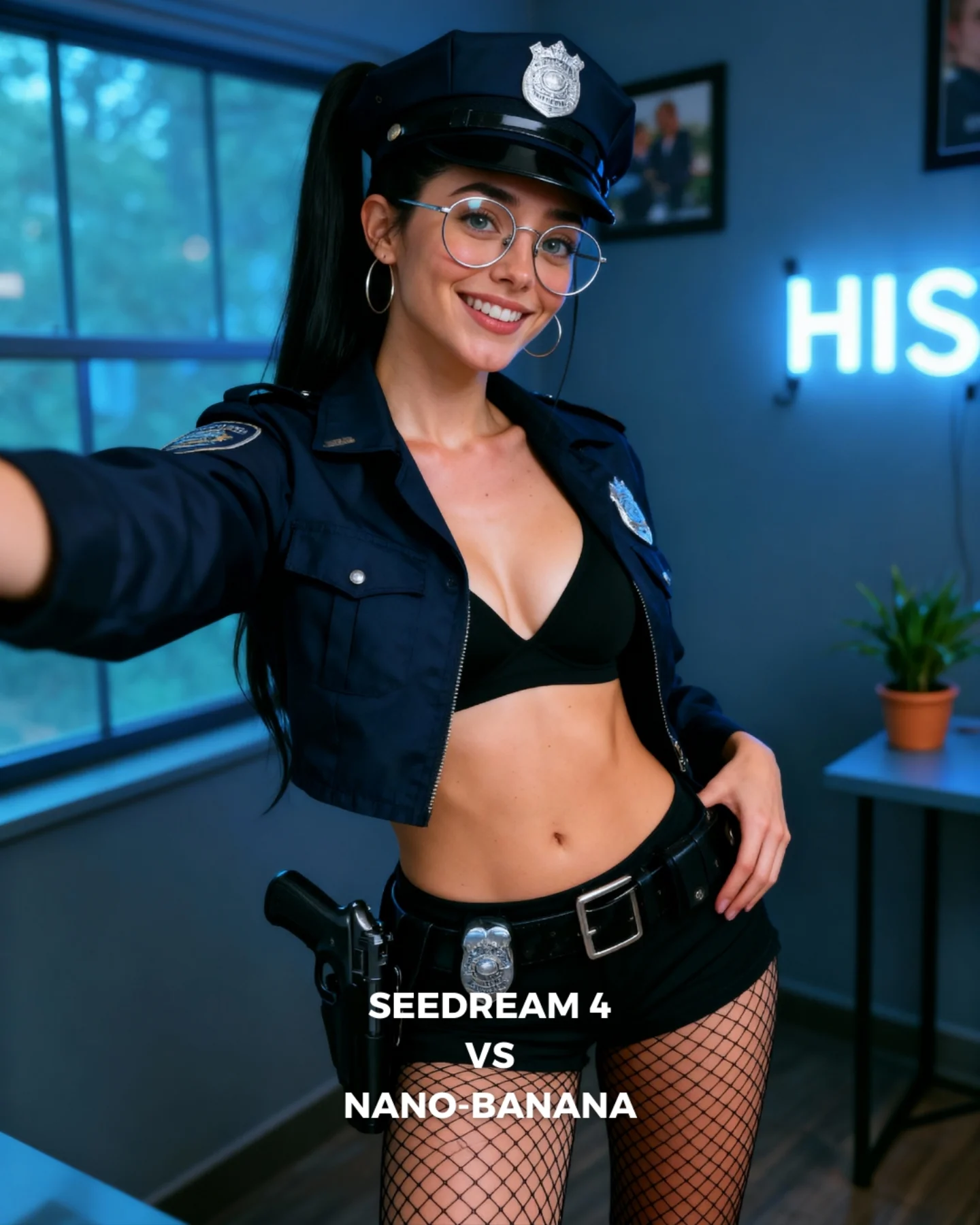
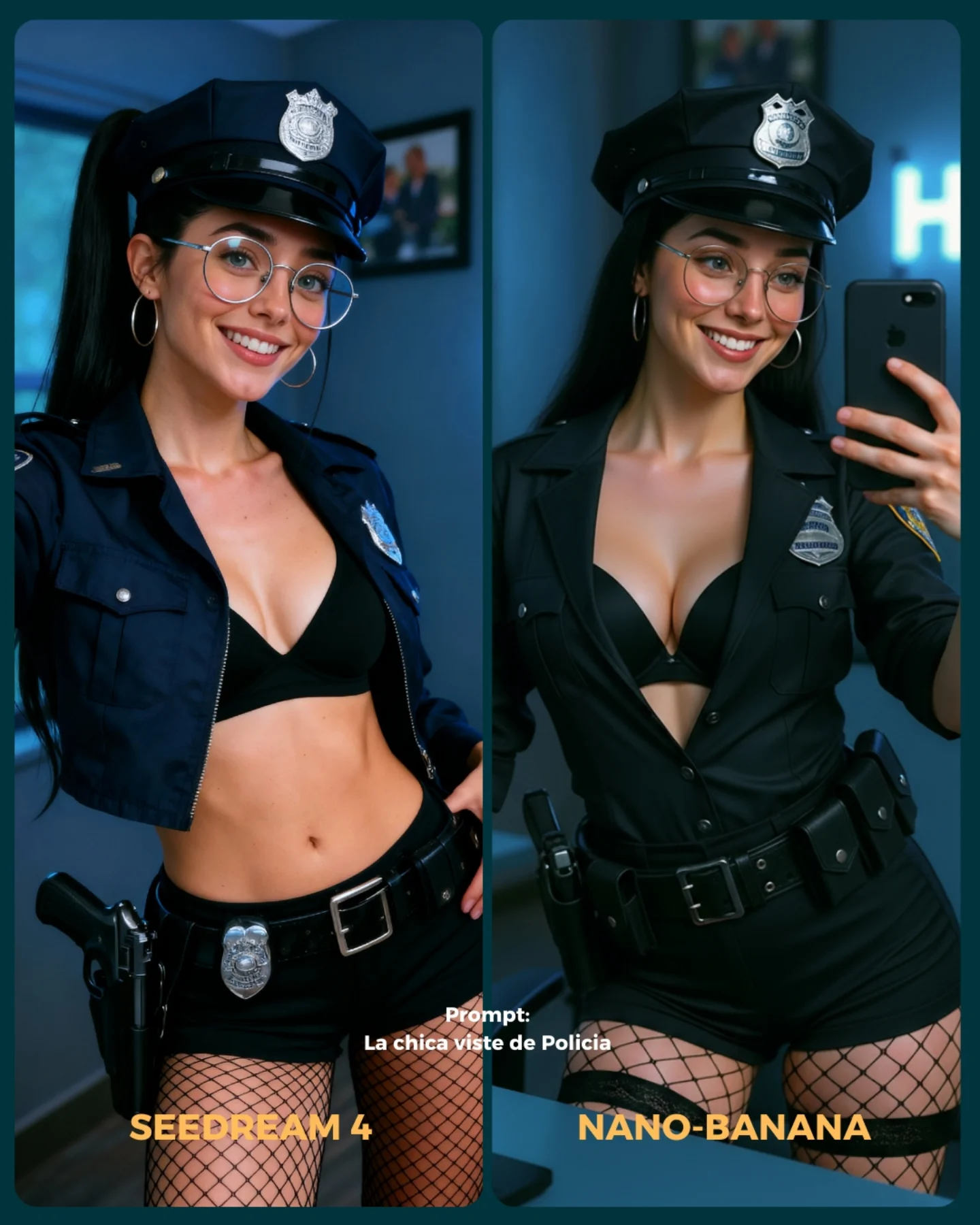
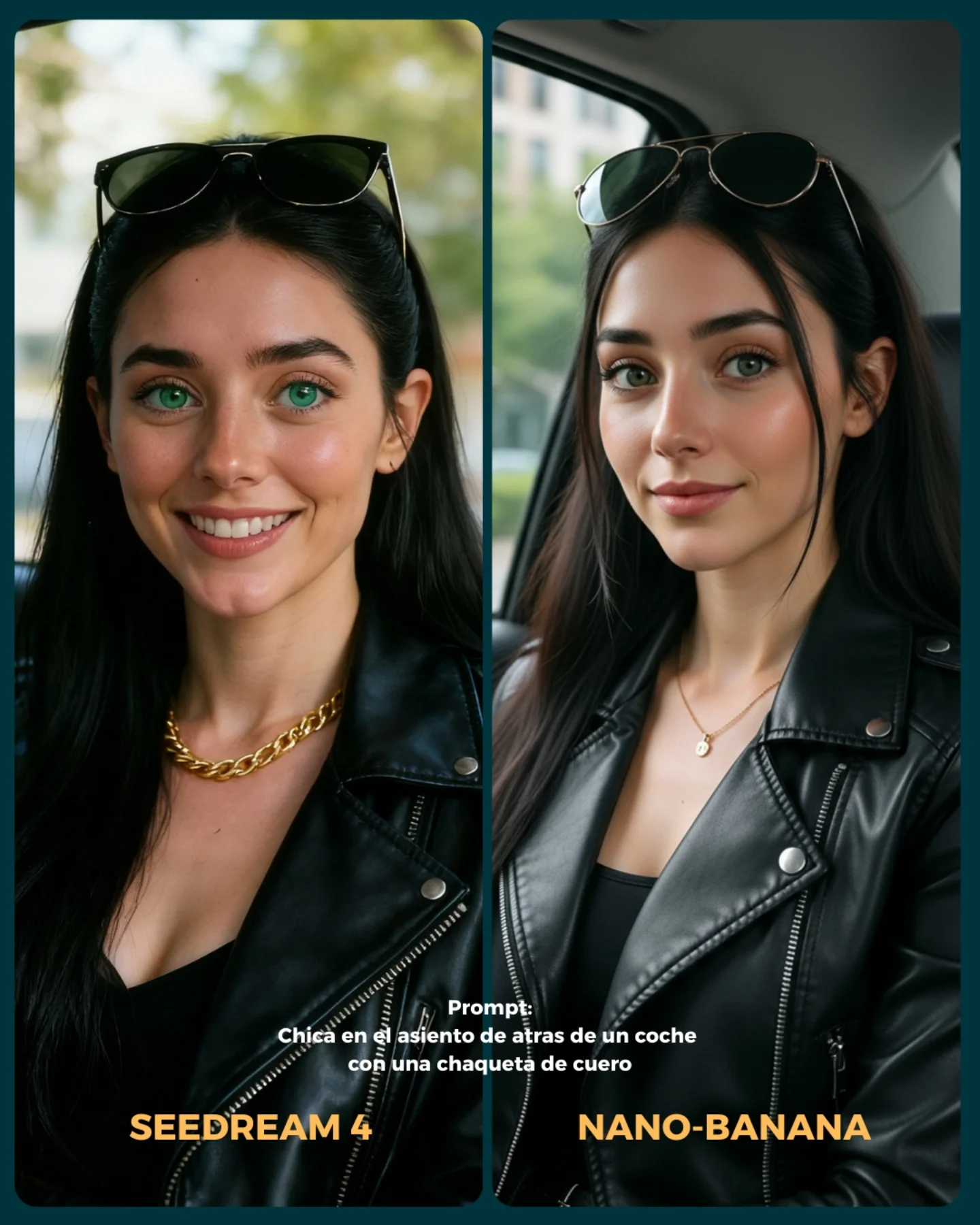
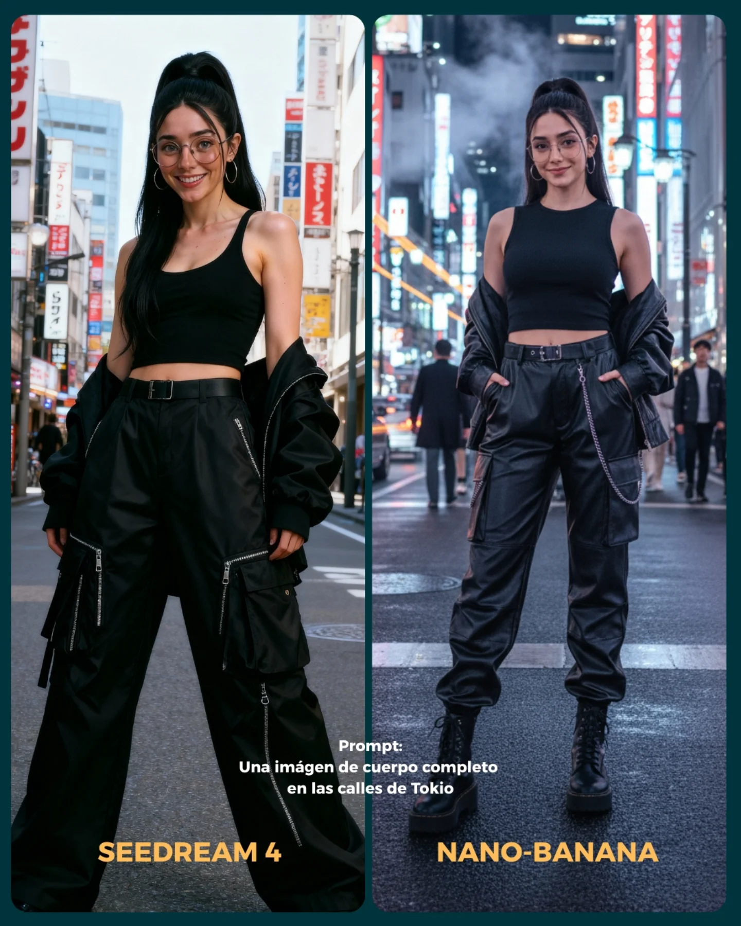
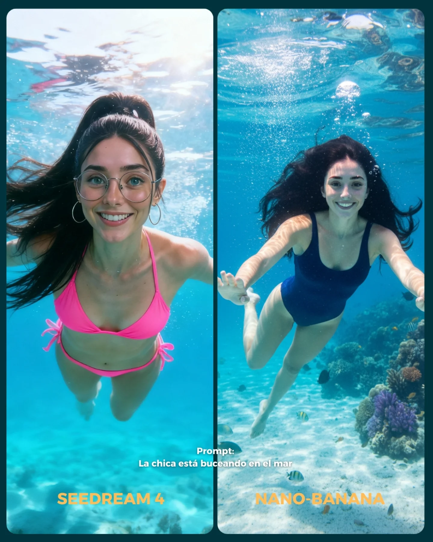
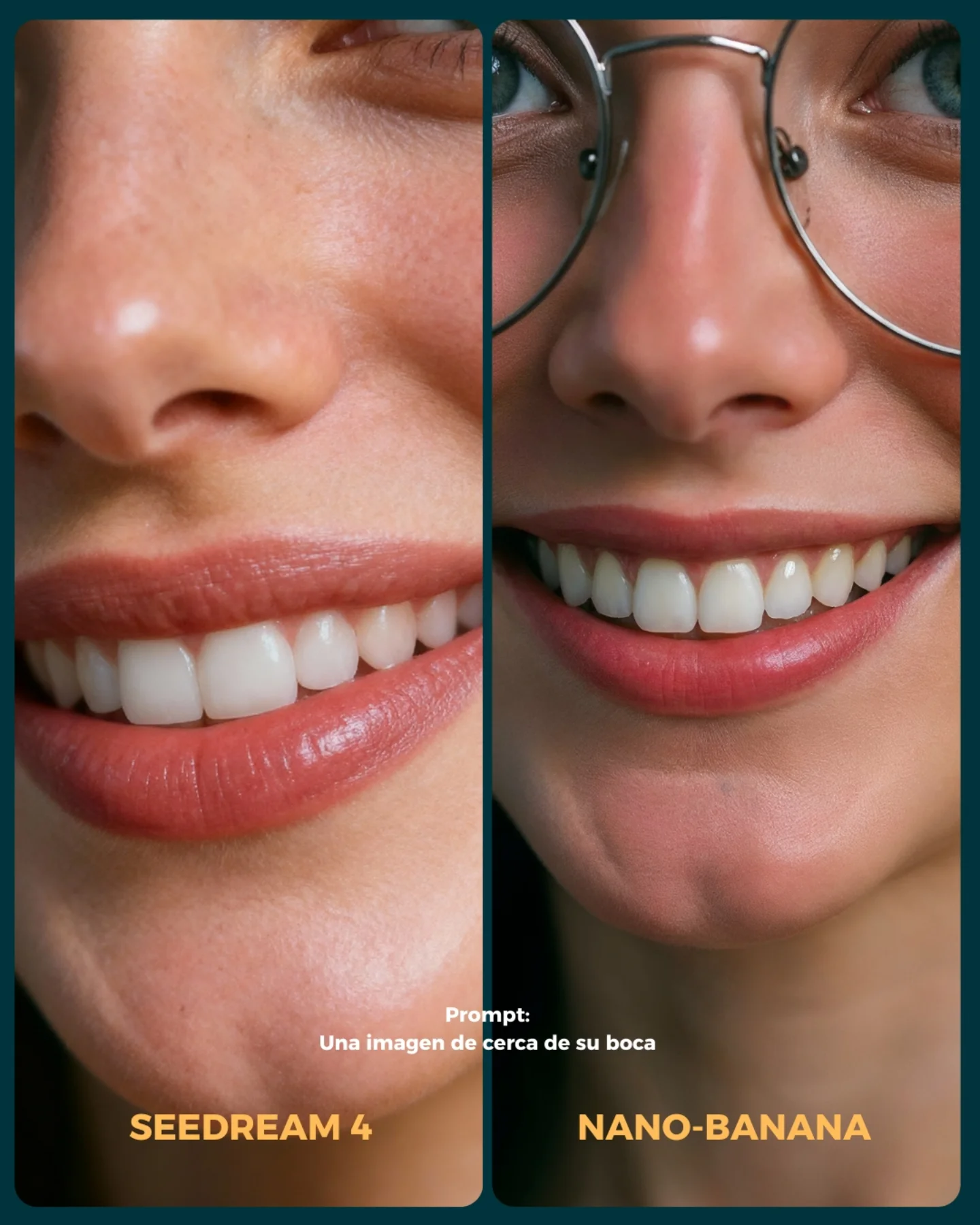
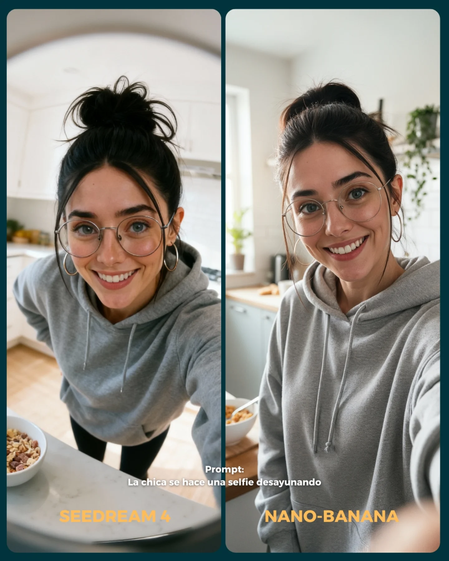
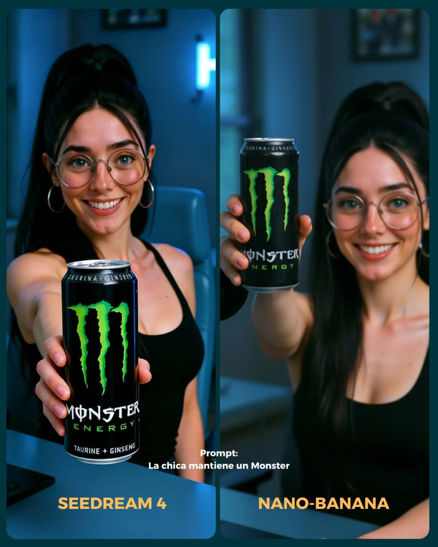
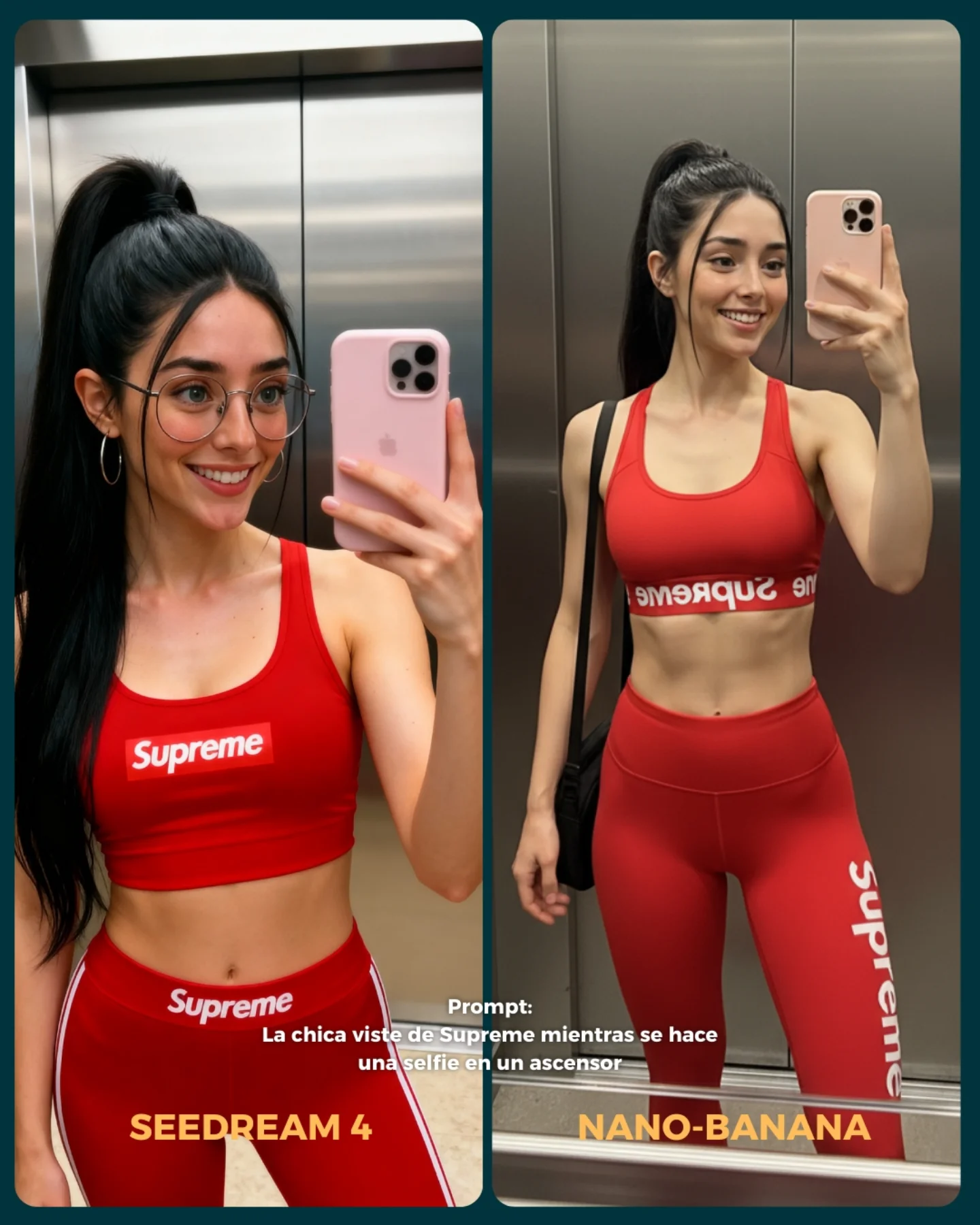
💥 Seedream 4 VS. Nano-Banana
Hoy toca poner a prueba el nuevo generador Seedream 4 que promete crear imágenes en 4K 😍
La idea fue elegir diferentes retos y situaciones para ponerlo a prueba con Nano Banana 🍌
- Integrando un producto (Monster)
- Cambios de ropa + de marca
- Imágenes de muy cerca (piel, ojos, boca)
- Selfies
- Buceando debajo del agua
- Expresiones faciales
- Imágenes de cuerpo completo para la consistencia del rostro
Si se te ocurren más situaciones que no he tenido en cuenta, comenta cuáles y lo pongo a prueba 💕
💌 Y dime... Con cual te quedas de los dos?? 👀
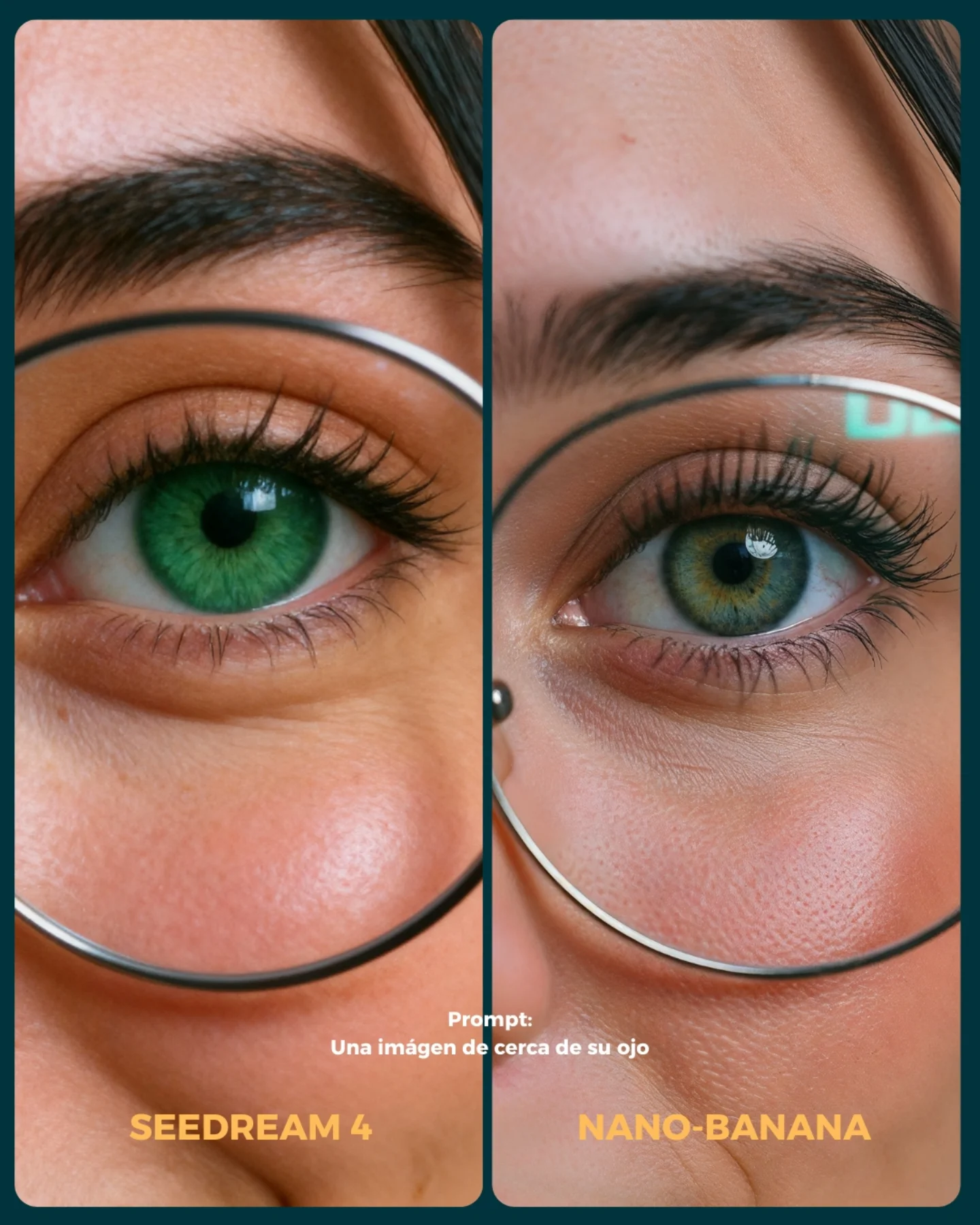
Soy_aria_cruz's Close Up Eye Detail Comparison AI Image
This image is not a portrait in the normal sense. It is a comparison asset. The whole point is to let viewers inspect micro-differences between two model outputs under nearly identical framing. If you prompt it like a beauty close-up, you will miss the actual job of the image.
The visual power here comes from controlled sameness. Both panels are close enough to feel matched, but different enough to invite inspection. That inspection behavior is the product. The image is built to make people zoom, compare, and argue about fidelity.
Why This Works
The first reason is scale. Eye-level macro detail turns tiny rendering differences into big perceptual events. Eyelashes, pore density, under-eye gradients, catchlights, and iris complexity all become reviewable objects instead of background detail.
The second reason is layout restraint. The composition does not waste attention. There is no room decor, no extra styling, and no narrative baggage. Everything is bent toward a single question: which model rendered the close-up better?
The third reason is typography placement. The prompt line and model labels anchor the image as a benchmark card rather than a generic beauty crop. That text is not decoration. It tells the viewer how to read the frame.
Signal Table
Signal
Evidence (from this image)
Mechanism
Replication Action
Benchmark framing
Two matched eye crops side by side
Invites direct model comparison instead of passive viewing
Prompt a diptych or split-panel comparison card explicitly
Micro-detail emphasis
Pores, lashes, eyebrow hairs, iris texture
Makes fidelity differences visible at a glance
Specify “macro eye crop with natural skin texture and lash detail”
Graphic card structure
Rounded panels, divider, bottom labels
Frames the image as an evaluation object
Include “social comparison card with model labels and prompt caption”
Near-symmetry
Both panels share almost identical crop logic
Reduces confounds and improves trust in the comparison
Use mirrored alignment and matched composition language
Color difference cue
Emerald eye left, olive-blue eye right
Creates immediate visible distinction between outputs
Allow one or two controlled differences while preserving layout sameness
Neutral light honesty
Soft frontal light across both panels
Supports fair texture read and avoids theatrical distortion
Use beauty-tech neutral lighting, not cinematic shadow design
Why You Should Not Treat This as a Generic Beauty Prompt
If you describe this only as “close-up eye detail”, the model will likely output a single polished beauty image. That would miss the benchmark structure entirely. The value here is comparative legibility, not standalone glamour.
To preserve that value, the prompt has to name the card logic: two panels, mirrored crop, model-label text blocks, macro inspection purpose, and a restrained test-light setup. Without those constraints, the output becomes aesthetically fine but functionally useless.
Best Use Cases
This structure fits AI model tests, checkpoint comparisons, prompt-engineering educational content, social proof posts for image fidelity, and creator threads where the audience is expected to compare render behavior. It is strong for technical communities because it makes quality differences discussable.
It is a weak fit for portfolio portraits, editorial character work, branding hero images, or emotional storytelling. Comparison cards are analytical by nature. They are designed for inspection, not immersion.
Prompt Technique Breakdown
Prompt chunk
What it controls
Swap ideas (EN, 2-3 options)
split-panel eye macro comparison card
Overall image type and layout logic
diptych benchmark post; side-by-side fidelity card; dual-panel model test graphic
thin round eyeglasses framing the eye
Shared structural cue across both outputs
circular eyewire close-up; metal round frames; eyeglass rim crossing the cheek and eye zone
named output labels; benchmark footer text; prompt caption overlay
soft neutral frontal lighting
Fairness and texture truthfulness
beauty-tech test light; neutral inspection light; diffuse macro comparison lighting
Three Transfer Recipes
Recipe 1: Turn It into a Skin Test
Keep the diptych layout, but widen the crop to include more cheek, nose, and under-eye area. This is useful when you want to compare pore rendering, blush gradients, and subtle realism rather than just iris detail.
Recipe 2: Turn It into a Glasses Reflection Test
Keep the macro crop but emphasize eyewire, lens reflections, and specular behavior. This works well for benchmarking realism around reflective surfaces and optical edge handling.
Recipe 3: Turn It into a Mascara / Lash Fidelity Test
Reduce iris emphasis and shift the prompt toward individual lashes, lash curl separation, and lid texture. This makes the comparison more cosmetic-detail focused while preserving the same benchmarking structure.
Aesthetic Read
The aesthetic category here is “technical seduction.” It uses beauty imagery to hold attention, but the actual payload is evaluation. The image is attractive enough to stop scrolling, then analytical enough to keep the viewer engaged.
The strongest move is that it refuses background storytelling. That refusal is smart. By stripping away everything except the eye macro and card labels, the image creates a clean laboratory for visual argument.
Execution Playbook
Start by fixing the format. Write “side-by-side macro comparison card” before you describe the face. If you do not establish the card format first, many models will ignore the split-screen logic entirely.
Then define the shared visual anchors: glasses, eyebrow, eyelashes, pores, nose bridge, and eye reflection. These are the elements that must persist across both panels. The differences should be controlled, not random.
After that, add the graphic shell: rounded panels, divider, bottom labels, prompt caption. These details tell the viewer that this is a model comparison artifact rather than a beauty crop accidentally placed next to another beauty crop.
Finally, keep the lighting neutral. The more dramatic the light, the less trustworthy the comparison becomes. Neutral frontal lighting is not boring here. It is what makes the inspection credible.
Quick diagnostic checklist
Before you accept the result, check five things: do both panels still read as matched crops, are pores and lashes visible, is the eyeglass rim intact in both halves, does the divider remain clean, and do the labels still make the image legible as a benchmark card. If any of those fail, the image loses its comparison value.