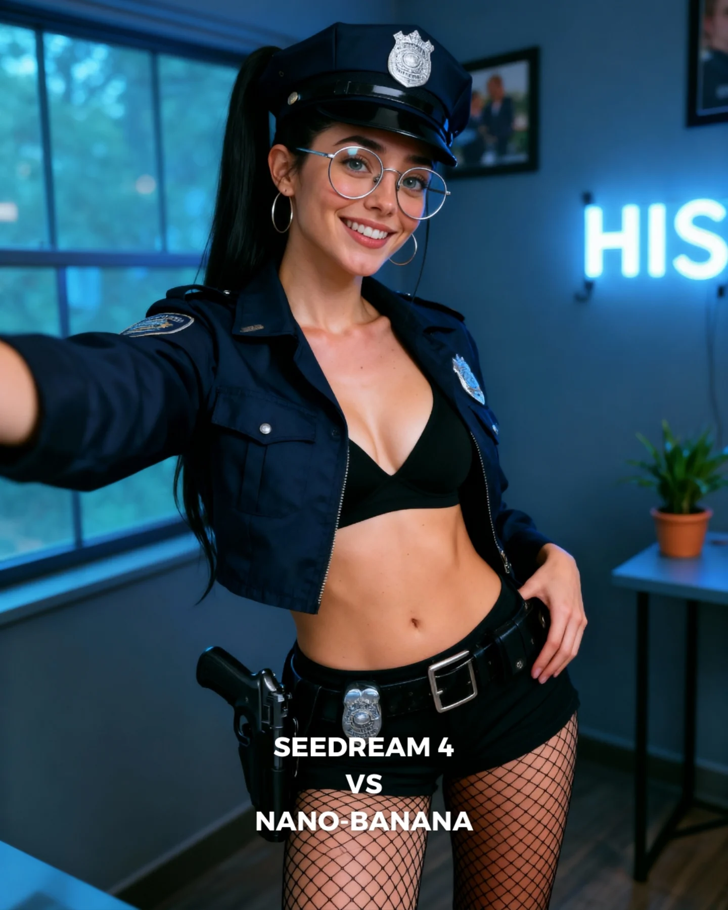
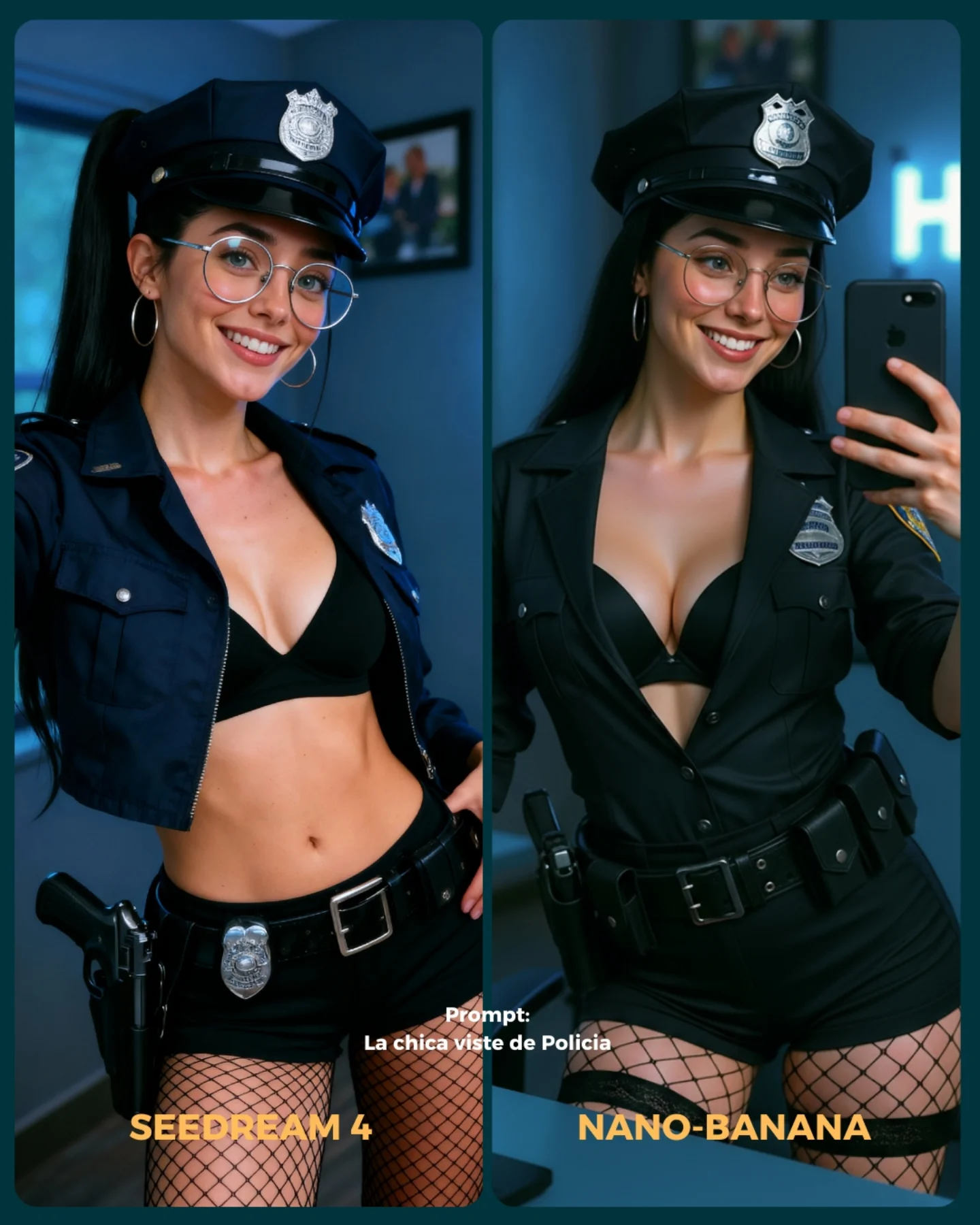
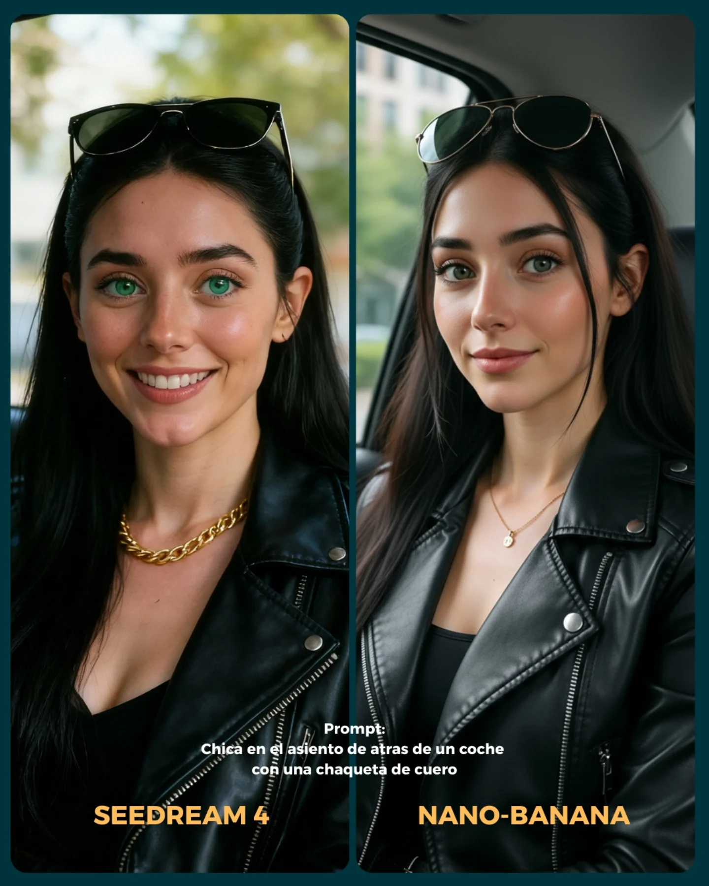
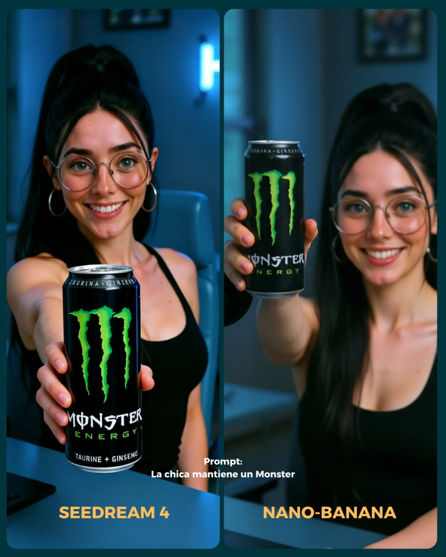
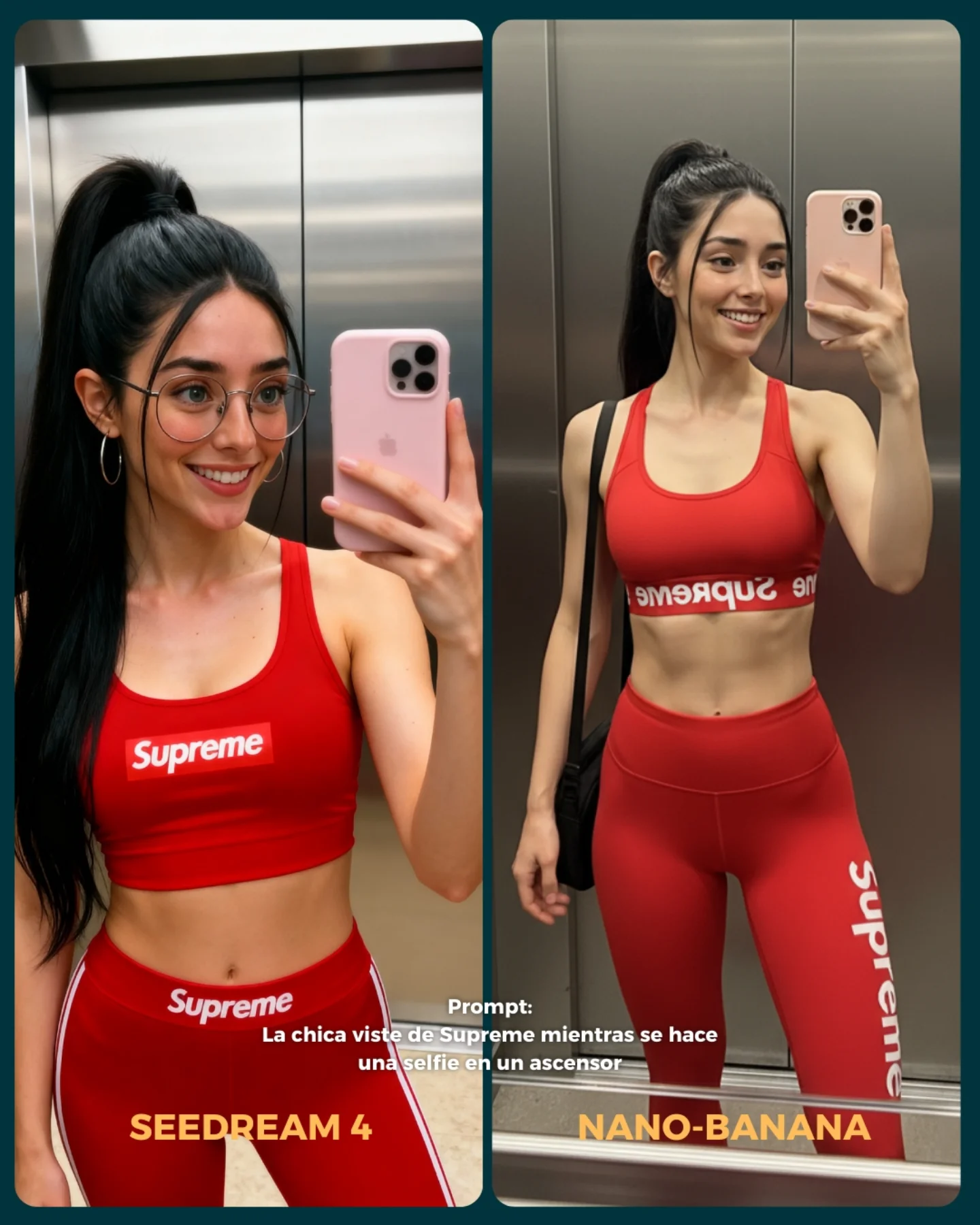
💥 Seedream 4 VS. Nano-Banana
Hoy toca poner a prueba el nuevo generador Seedream 4 que promete crear imágenes en 4K 😍
La idea fue elegir diferentes retos y situaciones para ponerlo a prueba con Nano Banana 🍌
- Integrando un producto (Monster)
- Cambios de ropa + de marca
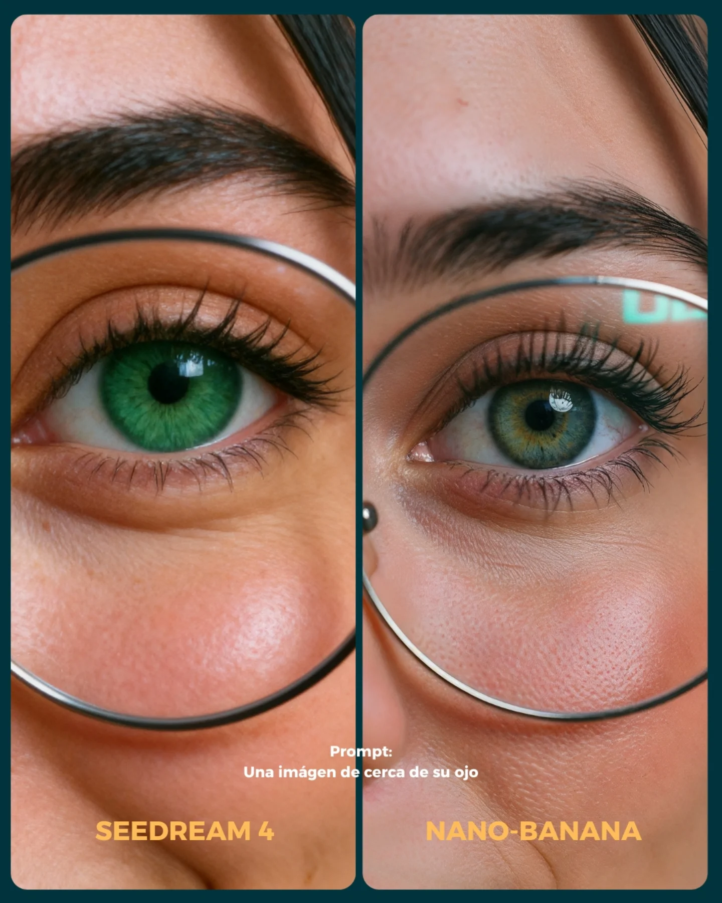
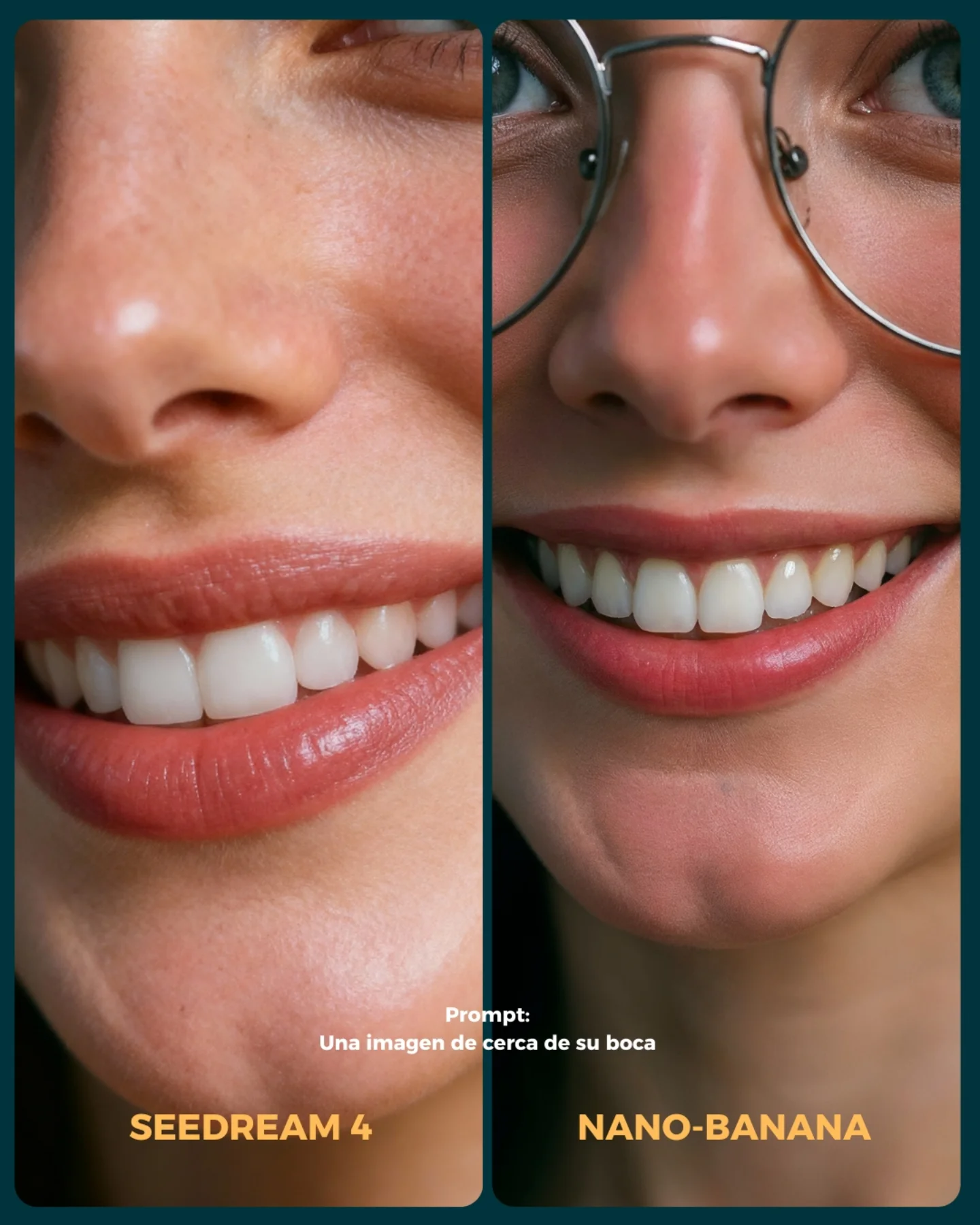
- Imágenes de muy cerca (piel, ojos, boca)
- Selfies
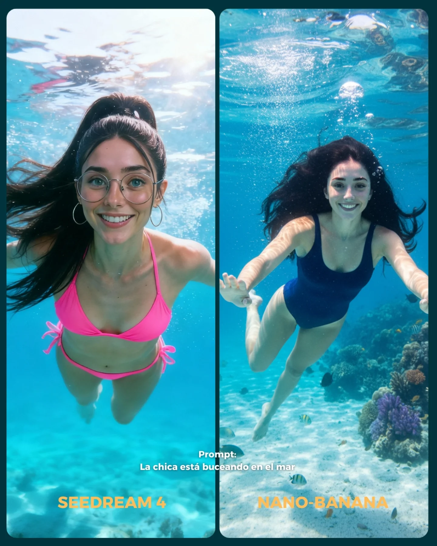
- Buceando debajo del agua
- Expresiones faciales
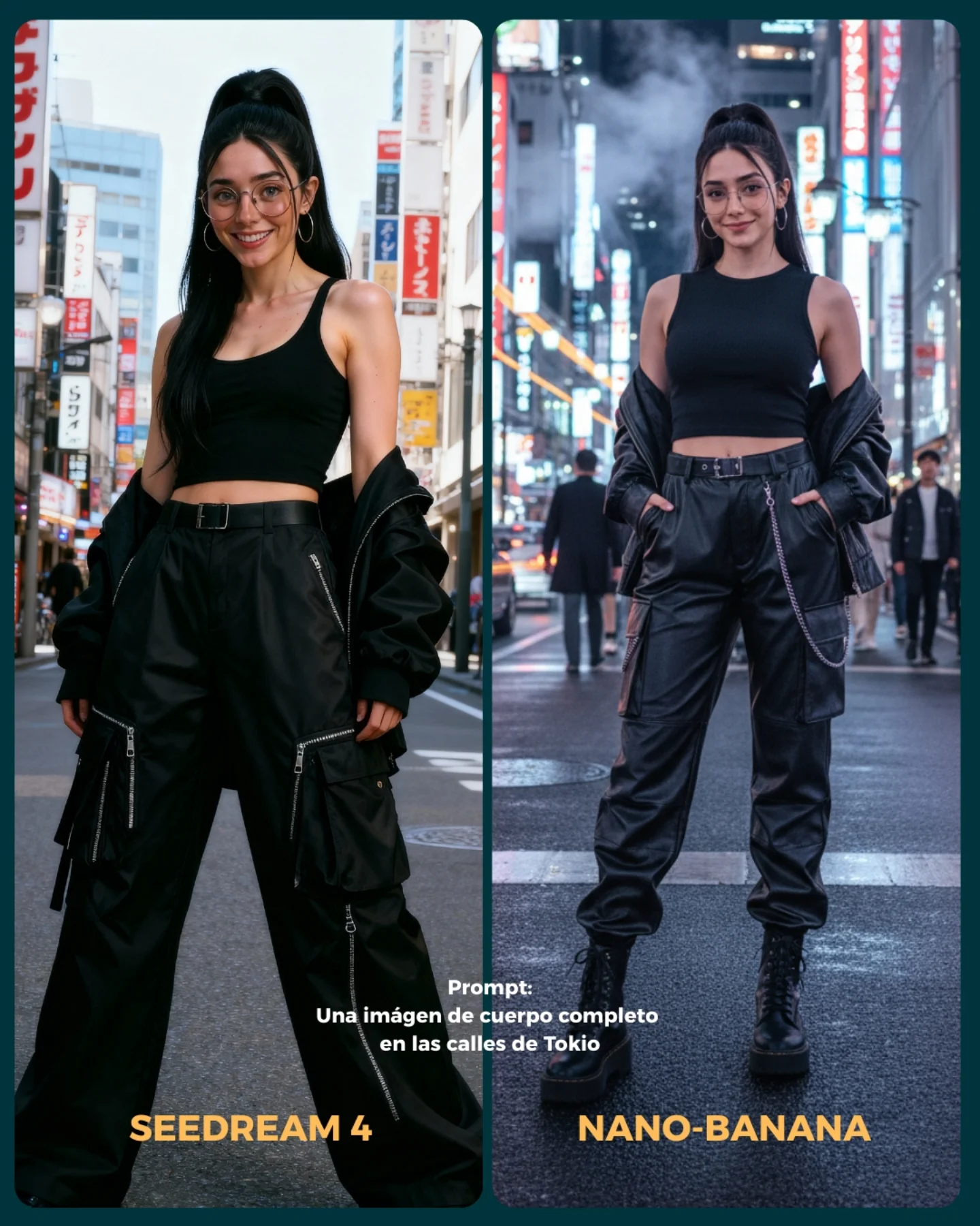
- Imágenes de cuerpo completo para la consistencia del rostro
Si se te ocurren más situaciones que no he tenido en cuenta, comenta cuáles y lo pongo a prueba 💕
💌 Y dime... Con cual te quedas de los dos?? 👀
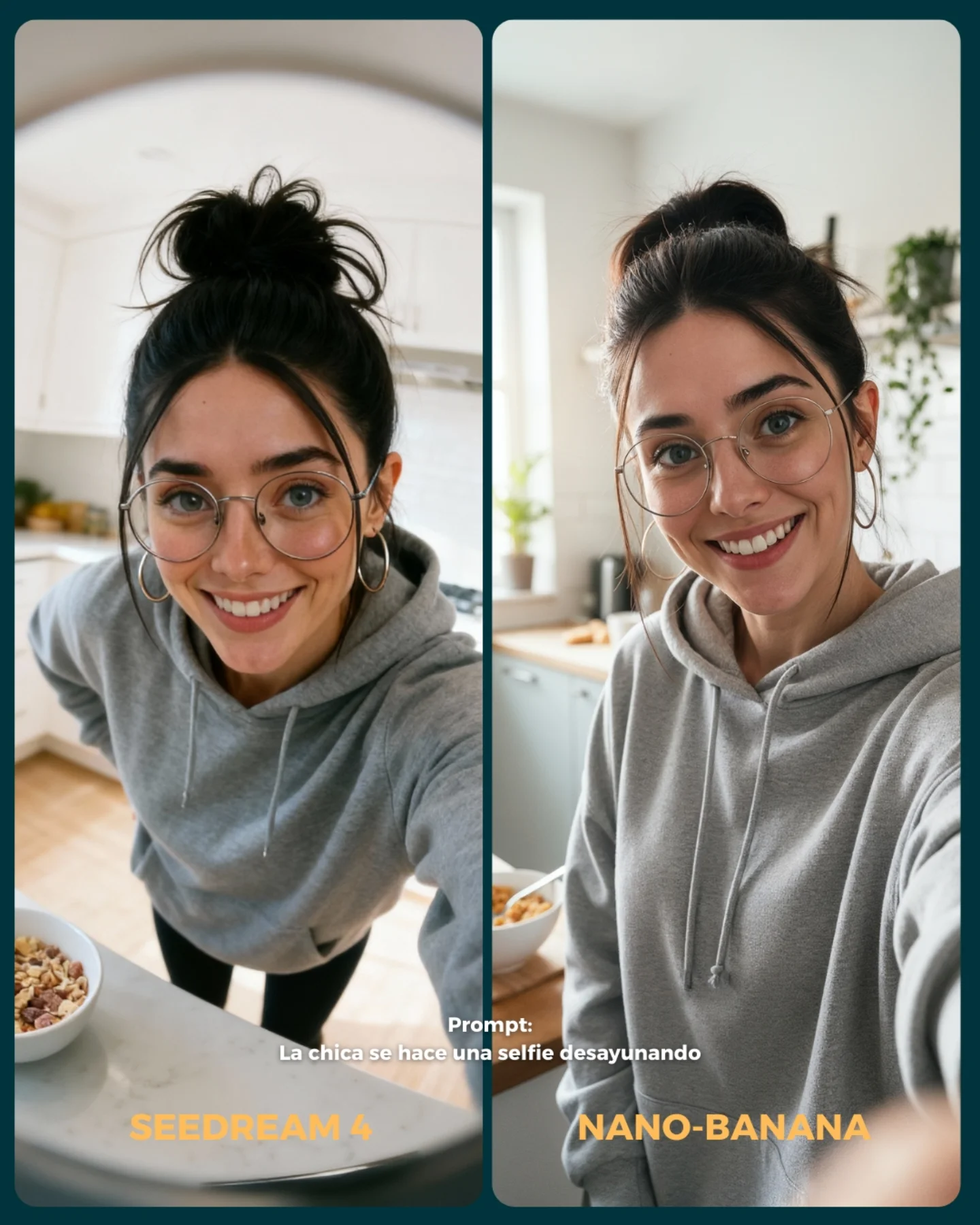
Why soy_aria_cruz's Seedream 4 Vs Nano Banana Kitchen Selfie Went Viral — and the Formula Behind It
This image works because it turns a very ordinary situation into a useful visual test. “A girl taking a breakfast selfie” is not a spectacular prompt on its own, and that is exactly why it is smart. Simple domestic prompts reveal model behavior quickly. You can see how each system handles identity, daylight realism, selfie perspective, background organization, and casual lifestyle mood without getting distracted by a complex scene.
The split layout also does a lot of heavy lifting. The dark border, central divider, and clear labels make the comparison readable in less than a second. That matters for social media. A comparison post succeeds when the audience understands the game immediately: same idea, different generator, pick your favorite. This frame explains that fast.
The best part is that the scenario feels genuinely useful for creators. Breakfast selfies, hoodie shots, kitchen backgrounds, and home-life moments are common use cases for AI influencer pages. So the image is not only comparing two models; it is comparing them inside a situation creators actually care about. That practical relevance makes the post stronger than a purely flashy benchmark would be.
Why This Comparison Format Performs
The first reason is low-concept accessibility. Everyone instantly understands the scene. The second reason is side-by-side clarity. The viewer is invited to compare style instead of decode context. The third reason is real-world usefulness. Kitchen selfies are common enough that differences between generators feel actionable, not abstract.
The image also benefits from balanced asymmetry. The left panel is slightly more exaggerated in perspective, which makes it more energetic. The right panel is calmer and more natural, which can make it feel more believable. That difference creates a genuine vote instead of two panels that feel interchangeable.
Signal
Evidence (from this image)
Mechanism
Replication Action
Instant comparison logic
Two equal panels, divider, generator labels, prompt text
Viewers know immediately how to engage and what to compare
Use explicit structural cues so the audience understands the test without reading the caption first
Useful everyday prompt
Simple breakfast selfie in a home kitchen
Relatable prompts make model differences feel practical for creators
Choose test prompts that map to actual creator use cases, not only fantasy scenarios
Identity consistency test
Same face, glasses, hoodie, and hairstyle across both sides
The audience can judge the model instead of getting lost in character drift
Lock 3-4 signature identity cues in every panel of the comparison
Subtle style contrast
Left feels more exaggerated, right feels more natural
Meaningful differences encourage comments and preferences
Present outputs where the distinction is visible but the underlying scenario is the same
Best Use Cases and Transfers
This layout is ideal for generator-vs-generator tests, prompt education posts, creator tool reviews, “which output do you trust more?” comparisons, and practical AI use-case breakdowns. It works especially well when the prompt is simple enough that stylistic differences become the main thing people notice.
Best fit: AI model battles. The labels and clean structure make the post inherently interactive.
Best fit: tool education for creators. The prompt is ordinary enough to feel directly reusable.
Best fit: consistency tests. Matching the same identity across both panels lets viewers compare model handling honestly.
Best fit: tutorial thumbnails. The comparison reads quickly and promises useful information.
Best fit: carousel opener slides. It creates a clear “here is the experiment” frame for the rest of the post.
It is less suitable for purely emotional storytelling. This format is analytical in function, even if it looks warm and friendly.
Transfer Recipes
Product integration variant. Keep: same panel structure and identity lock. Change: breakfast bowl to handheld product. Slot template: {same character}, split-screen model comparison, {simple use case}, clear generator labels, one prompt line
Mirror-selfie variant. Keep: domestic realism and comparison card design. Change: room type and camera angle. Slot template: {same woman}, side-by-side AI comparison, {selfie prompt}, labeled panels, social-friendly layout
Close-up beauty variant. Keep: two-panel educational format. Change: crop size and test focus. Slot template: {generator A vs generator B}, one consistent face, {beauty prompt}, clear prompt text, comparative visual framing
What the Aesthetic Is Doing
The image is effective because it keeps the prompt ordinary and lets the rendering differences do the talking. The left image feels a little more stylized and perspective-heavy. The right image feels more relaxed and natural. That is exactly the kind of distinction that audiences can talk about without needing technical vocabulary. It turns subjective style judgment into easy engagement.
The hoodie is also a smart wardrobe choice. It removes fashion complexity and keeps the comparison inside a casual daily-life setting. That means viewers focus on face, light, and realism rather than on fabric detail or branding. In comparison posts, simple clothing is often better because it reduces noise.
The breakfast bowls are small but important. They make the prompt feel grounded. Without them, the scene could just be “girl in kitchen.” With them, the image supports the written prompt more precisely, which makes the comparison feel fairer and more intentional.
Observed
Why it matters
How to recreate it
Dark teal border and divider
Turns two outputs into one clear shareable card
Use a strong frame color to unify the comparison layout
Prompt text across the lower middle
Anchors the test and reduces ambiguity
State the exact prompt or scenario directly on the image
Same hoodie and face cues in both panels
Keeps the test about model behavior instead of styling changes
Hold identity markers constant across every compared output
Different selfie energy per panel
Creates a real choice instead of redundant outputs
Let each model show its bias while preserving the same scene objective
Breakfast bowls in both kitchens
Makes the domestic prompt feel specific and honest
Include one small object that confirms the use case in each panel
Prompt Technique Breakdown
The key prompt lesson here is that comparison graphics need both image quality and editorial packaging. A good pair of outputs is not enough if the post does not explain itself quickly. The labels, the divider, and the prompt line are not decoration. They are the mechanism that makes the comparison readable and shareable.
The biggest drift risk is overcomplicating the prompt. If the scene becomes too elaborate, the audience stops comparing generators and starts comparing everything else. Simplicity is what makes the benchmark useful.
Execution Playbook for Iteration
Lock the structure first: two panels, divider, labels, and prompt text. Then lock the identity: glasses, hoodie, bun, same face. Then differentiate the angles and kitchen mood. That order makes sure the post stays useful as a comparison card even before the fine visual polish is perfect.
Use the one-change rule. First solve the domestic scene. Then solve identity. Then solve panel differences. Then solve typography and framing. This approach keeps the comparison honest and prevents the design layer from masking weak visual logic.
Run 1: Generate two kitchen breakfast selfie panels with the same woman in a gray hoodie and glasses.
Run 2: Push the left panel toward a higher-angle, slightly more stylized selfie and keep the right more balanced and natural.
Run 3: Add the breakfast bowls, dark teal divider, and border to turn the images into one coherent card.
Run 4: Overlay the prompt text and yellow generator labels, then refine the kitchen brightness and facial consistency.
If the panels look too similar, exaggerate the camera-angle difference before changing anything else. If they feel too different, bring back the same hoodie, face, and breakfast context. If the post looks cluttered, remove background kitchen details before touching the comparison text. The strongest version is simple, useful, and instantly arguable.