How soy_aria_cruz Made This Monster Can Comparison Image — and How to Recreate It
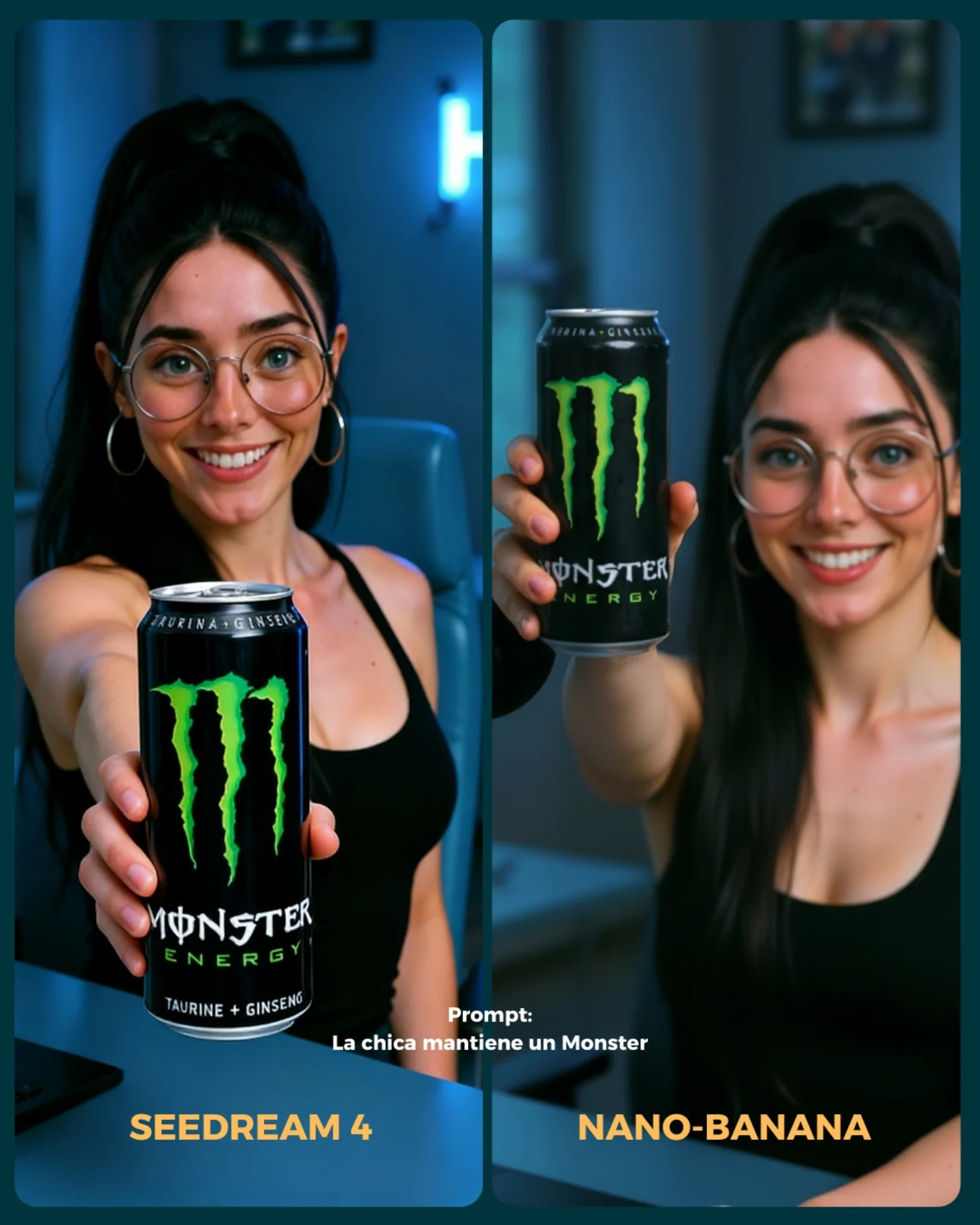
This image is useful because it tests one of the hardest practical tasks in AI image generation: putting a recognizable product into a believable social photo. Faces are one challenge. Hands are another. But branded objects are where many models still fall apart, especially when the object has to remain readable, correctly shaped, and naturally held inside a casual lifestyle frame.
For creators, that makes this a more meaningful comparison than a generic portrait test. It asks whether the model can protect brand identity, can geometry, logo placement, hand anatomy, and the social feel of the image all at once. If it can do that, the output becomes much more useful for commercial or creator-brand use cases.
Why the image works as a comparison
The strongest mechanism here is task clarity. Both sides are trying to solve the exact same problem: a smiling woman holding a Monster can toward the camera. Because the setup is nearly identical, small differences in can realism, label legibility, or hand-object interaction become easy to notice. That makes the comparison feel fair.
The second strength is that the product is integrated into normal behavior. The subject is not standing in a sterile ad setup. She looks like someone casually showing what she is drinking. That matters, because product placement on social often has to feel effortless rather than obviously commercial. A benchmark like this tests whether the model understands that tone.
| Signal | Evidence (from this image) | Mechanism | Replication Action |
|---|
| Readable product challenge | The Monster can is held close to the camera with logo and text exposed | Brand readability makes the benchmark practical, not abstract | Use products with obvious logos when testing integration quality |
| Hand-object realism | Finger placement and can proportions are central to the frame | Weak geometry becomes immediately visible to the viewer | Choose props that must be physically grasped when evaluating model control |
| Lifestyle framing | The subject smiles naturally in a casual indoor room instead of a studio ad set | The product placement feels closer to real creator content | Benchmark product insertion inside believable social situations, not only clean packshots |
Where this style fits best
This format is ideal for creators testing branded content, prompt educators comparing product integration quality, and AI workflow pages showing what models can do beyond faces alone. It is especially relevant for people making influencer-style images, affiliate content, or visual ads that need products to stay recognizable.
It is less useful for audiences only interested in artistic image quality. This comparison is practical first. Its value comes from whether the image can be used, not only admired.
- Best fit: product-integration benchmark posts. Why fit: the image clearly tests label readability, can shape, and hand realism. What to change: swap beverage can for cosmetics, snacks, or tech products.
- Best fit: prompt educators. Why fit: one frame can teach how product placement differs from simple portrait prompting. What to change: annotate which details to inspect, such as logo fidelity or finger contact.
- Best fit: creator-brand experiments. Why fit: the scene feels like real influencer content instead of a sterile mockup. What to change: match the product type to the persona or room aesthetic.
- Not ideal: pure fine-art accounts. Reason: the benchmark is commercial and practical by design.
- Not ideal: minimal portrait feeds. Reason: the product becomes the central visual task, not the face alone.
Transfer recipes
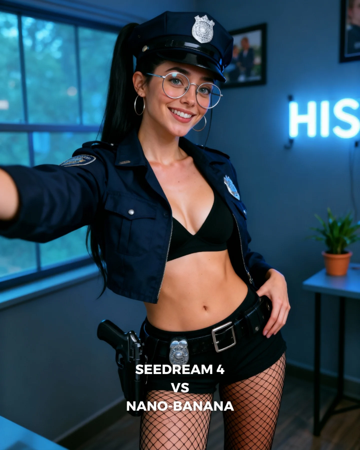
- Keep: same subject, same pose, and a clearly branded product held toward camera. Change: the category from energy drink to skincare, perfume, or soda. Slot template: "{same subject} holding {brand object} in a side-by-side model comparison"
- Keep: casual indoor lifestyle setup. Change: the room mood and persona around the product. Slot template: "{product integration benchmark} inside {social setting}"
- Keep: one product foreground challenge and two matched panels. Change: the difficulty by testing transparent bottles, reflective cans, or flexible packaging. Slot template: "{matched split-screen test} focused on {product-material challenge}"
What the image gets right aesthetically
The image succeeds because it keeps the scene simple enough for the product to matter. The room is softly blurred, the outfit is neutral, and the face remains friendly but secondary to the can. That is the right priority. In product-integration benchmarks, the item should not disappear behind styling noise.
The green Monster logo is also a strong benchmark choice because it is visually distinct and easy to judge. You do not need to know design theory to tell whether the mark looks right. That makes the comparison more accessible for a broad audience.
| Observed | Why it matters for recreation |
|---|
| Product can pushed toward the foreground | Makes label fidelity and scale central to the test |
| Same smiling woman in both panels | Keep the identity variable stable so the product task becomes easier to compare |
| Cool indoor room with soft blur | Provide context without competing with the product |
| Bottom labels and prompt note | Frame the image as a benchmark rather than a random collage |
| Strong can logo contrast | Let viewers judge branding quality quickly, even at feed speed |
Prompt chunks worth locking first
If you want to recreate this type of image, start with the product task and hand placement before you worry about background mood. The value of the image comes from whether the branded object survives the generation cleanly.
| Prompt chunk | What it controls | Swap ideas (EN, 2–3 options) |
|---|
| same woman holding a branded can toward the camera in two panels | Core benchmark structure and product challenge | same subject holding perfume bottle, snack pack, or phone box |
| black Monster can with green logo and readable text | Brand fidelity | reflective soda can, matte skincare tube, labeled coffee cup |
| natural hand grip and casual indoor smile | Social realism and anatomy | one-hand presentation, two-hand hold, casual toast gesture |
| cool-lit room background | Lifestyle context | bedroom shelf background, gaming room glow, office corner blur |
| bottom labels and prompt note | Comparison readability | MODEL A / MODEL B, prompt caption strip, brand integration test note |
| photoreal product-integration benchmark | Overall output goal | social ad realism, creator-brand mockup, influencer product test |
An iteration path that keeps the benchmark useful
Lock these three things first: the same subject identity, the same can-forward pose, and the readable product logo. Those are the anchor variables. After that, refine finger contact, metallic can finish, and room blur one step at a time.
- Run 1: stabilize can shape, logo placement, and overall split-screen consistency.
- Run 2: improve hand anatomy, finger wrapping, and the can’s metallic reflection behavior.
- Run 3: refine the room context so it feels social but stays secondary to the product.
- Run 4: remix the product category while preserving the same benchmark logic.
If the image feels too much like an ad, make the subject behavior more casual. If it feels too casual and the product gets lost, push the can closer to the lens and simplify the room further.