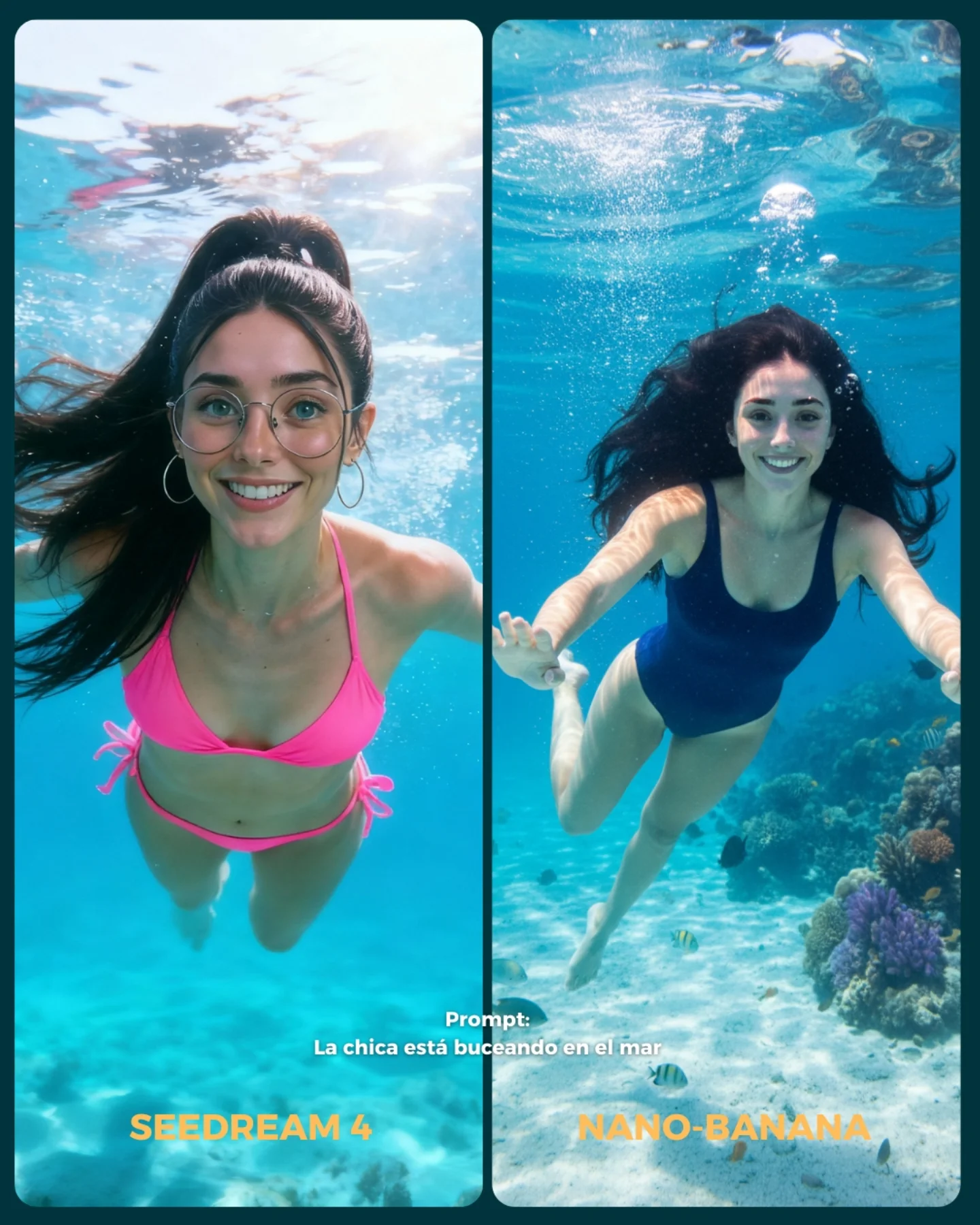
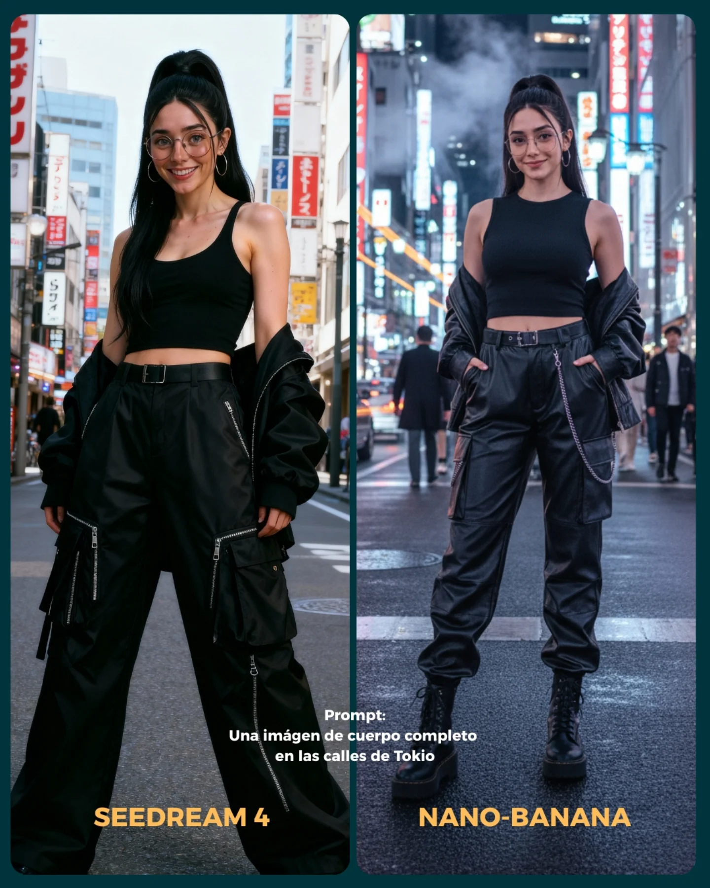
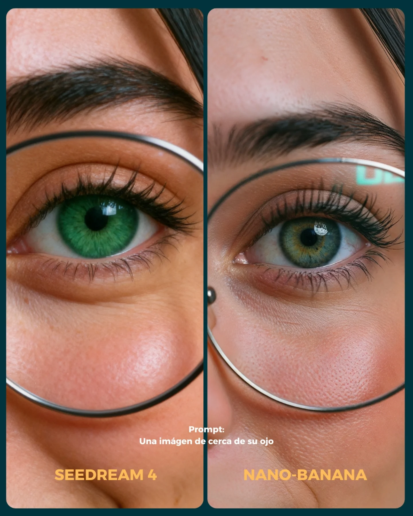
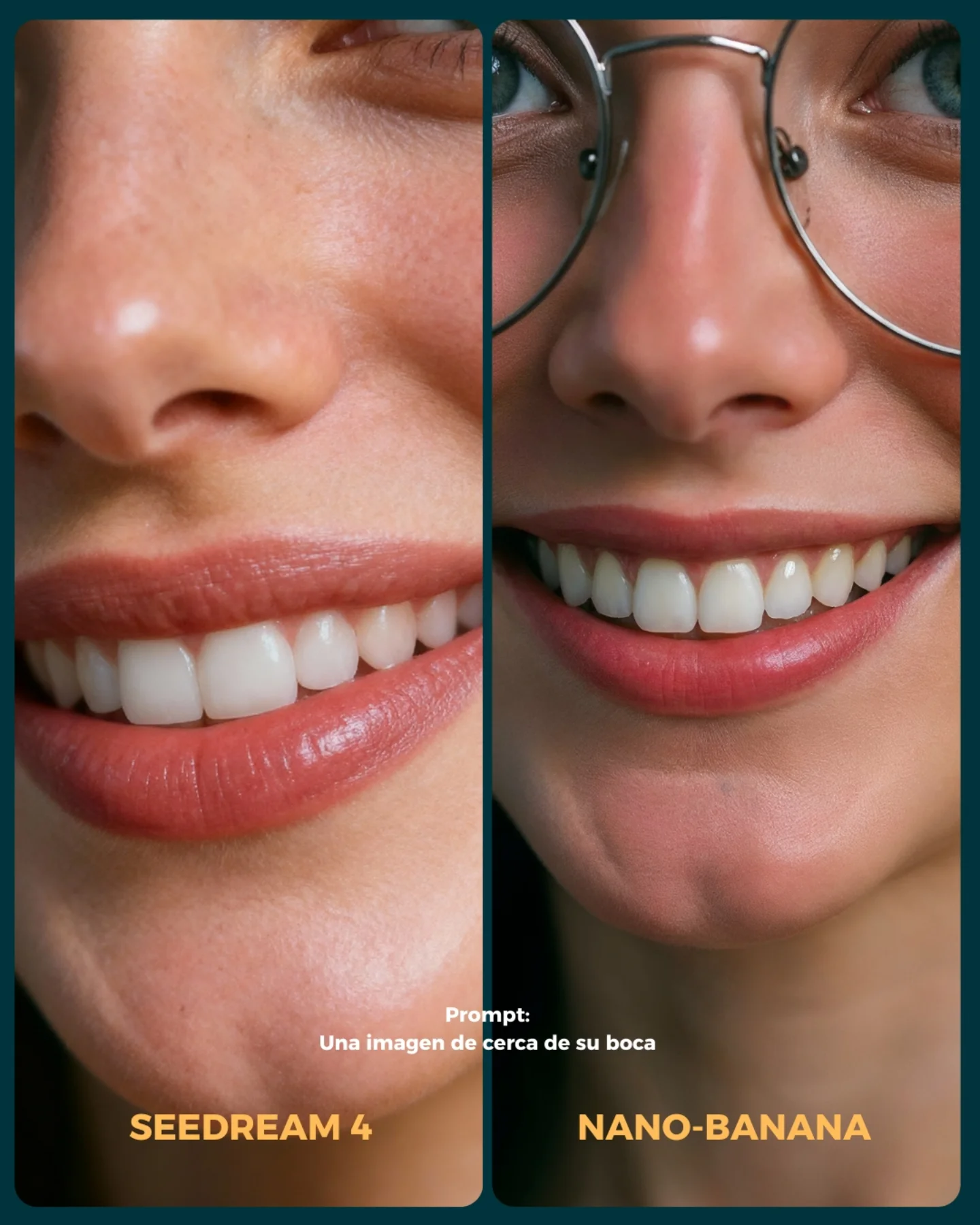
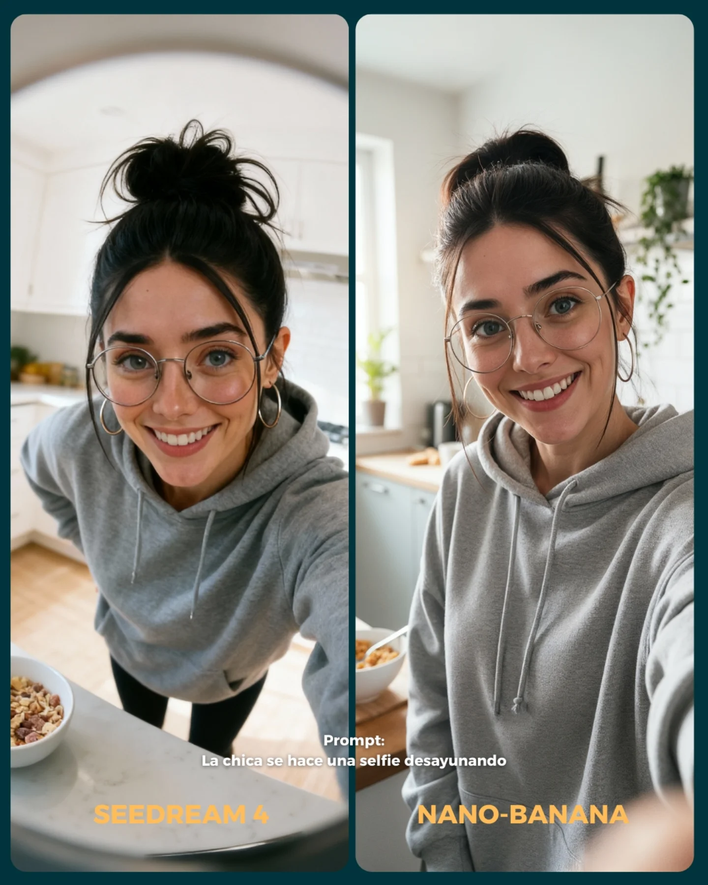
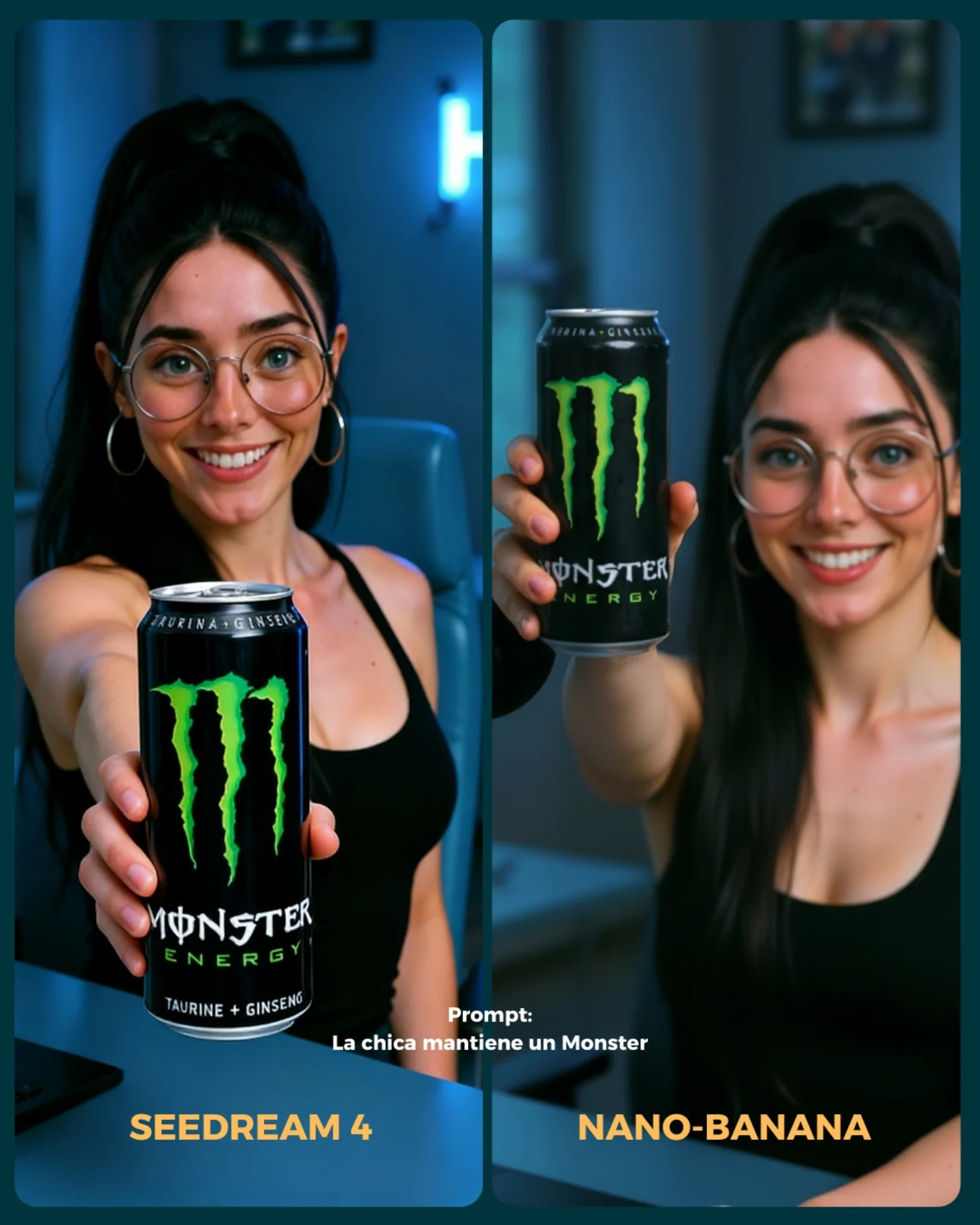
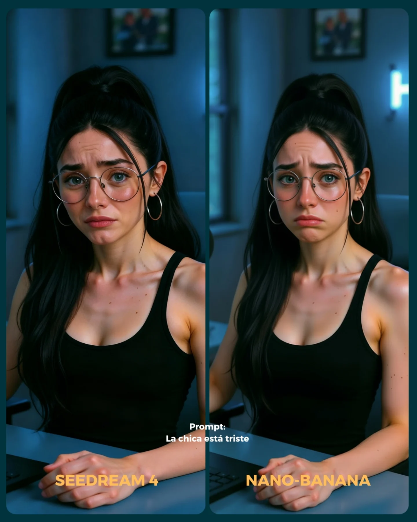
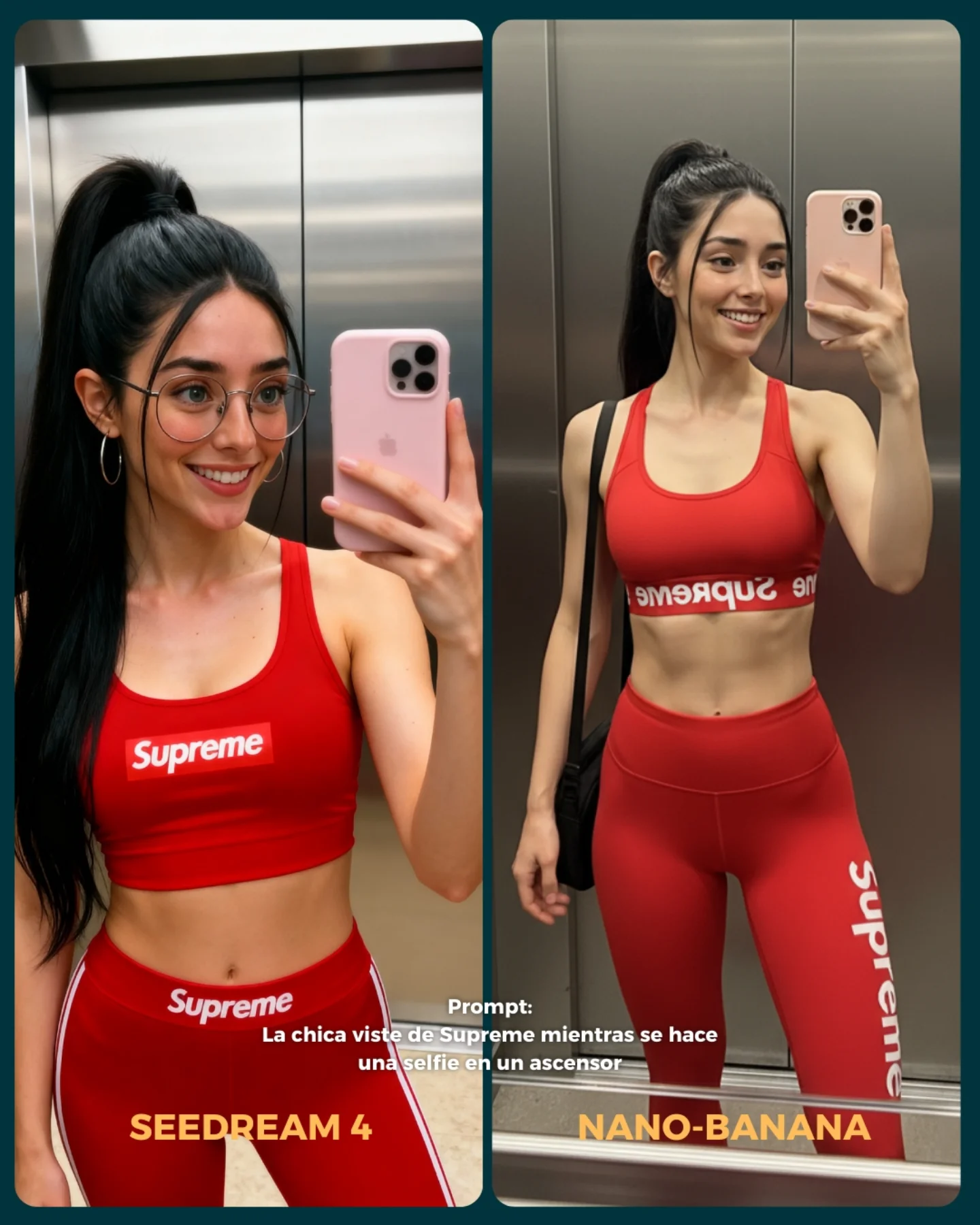
This prompt is effective because it compares two difficult underwater image-generation challenges at the same time: identity consistency and environmental realism. Water changes hair behavior, facial clarity, lighting, color, and body pose all at once, so a side-by-side layout makes the differences immediately visible. It is a strong testing format because both images share the same basic idea but reveal different strengths in execution.
The left panel is more portrait-driven, while the right panel is more scene-driven. That contrast is useful. One side emphasizes facial fidelity, accessories, and subject clarity; the other emphasizes full-body motion, coral detail, and underwater world-building. This makes the comparison card richer than a simple “same pose, different render” test.
How soy_aria_cruz Made This Underwater Swimming Model Comparison Image — and How to Recreate It
| Element |
Value In The Comparison |
| Two-panel vertical layout |
Makes it easy to compare style, realism, and identity at a glance. |
| Underwater setting |
Tests difficult rendering conditions like light rays, bubbles, hair motion, and water distortion. |
| Close portrait on the left |
Highlights face quality, expression, glasses rendering, and accessory consistency. |
| Environmental swim on the right |
Shows how well the model handles full body pose and marine surroundings. |
| Prompt text and model labels |
Turn the image into a clear benchmark card instead of two unrelated underwater photos. |
Best Use Cases
Use this structure for AI model comparisons, benchmark carousels, visual testing posts, or prompt experiments focused on water, facial consistency, and scene complexity. It is especially useful when you want a side-by-side result that feels visually engaging but still functions like a controlled test.
What Should Stay Consistent
| Detail |
Why It Matters |
| Same core face identity |
The whole comparison becomes more meaningful when the person still reads as the same subject. |
| Cheerful underwater expression |
Keeps both sides emotionally aligned and easier to compare fairly. |
| Blue tropical water tone |
Creates visual coherence across both panels even when the styling changes. |
| Surface shimmer and bubbles |
Sell the underwater realism and test how convincingly each side handles water physics. |
| Readable panel labels |
Ensure the viewer knows exactly which model each result belongs to. |
Prompt Writing Tips
When writing comparison prompts, define the role of each panel instead of only describing the overall theme. Here, one side is intentionally closer and cleaner, while the other is wider and more environmental. That choice produces a more informative card. Also specify the placement of text and labels clearly, because comparison graphics depend on legibility almost as much as image quality.
Common Mistakes To Avoid
| Mistake |
What Goes Wrong |
| Panels too similar |
The comparison becomes less informative and visually less engaging. |
| No underwater physics details |
The images may feel like normal portraits tinted blue instead of submerged scenes. |
| Text placed badly |
The card becomes harder to read and loses its benchmark usefulness. |
| Identity shifts too much between panels |
The viewer cannot tell whether the comparison is about models or different characters. |
| Background clutter overwhelms the subject |
The underwater scene becomes noisy and the portrait value is reduced. |
Final Takeaway
This prompt is strong because it uses an inherently difficult setting to reveal meaningful differences between image models. Underwater portraits stress facial consistency, hair motion, water lighting, and scenic rendering all at once. By splitting the image into a portrait-focused panel and an environment-focused panel, the comparison becomes both informative and visually compelling.