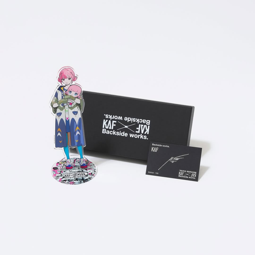
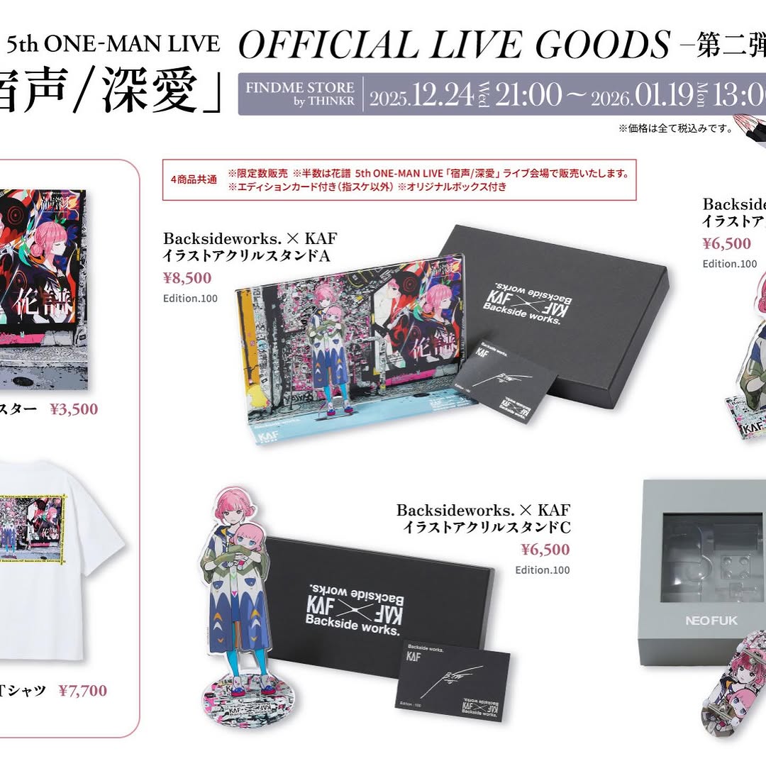
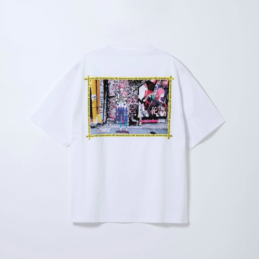
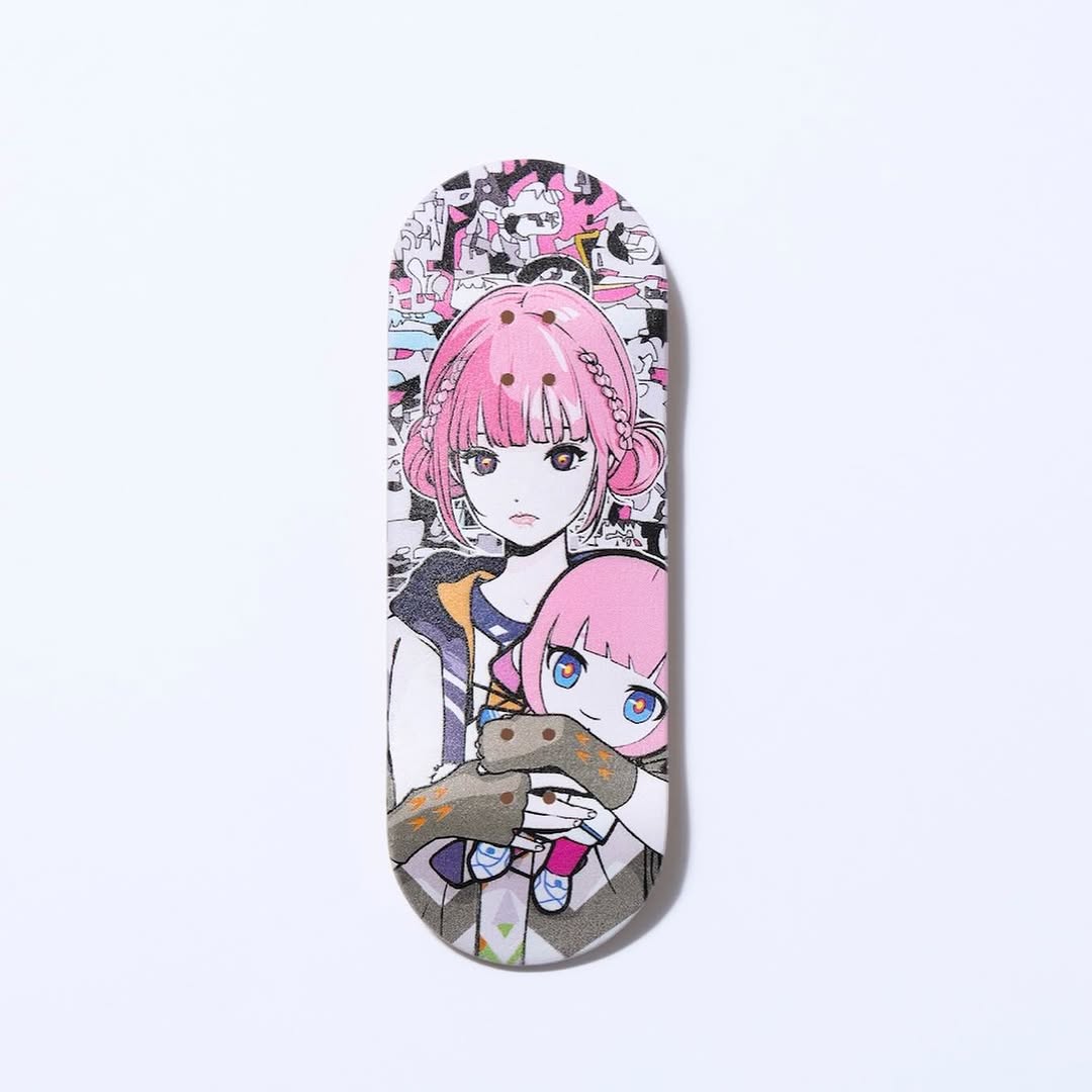
【#花譜5thワンマン グッズ第二弾📢】 花譜 5th ONE-MAN LIVE「宿声 / 深愛」 OFFICIAL LIVE GOODS 第二弾 12月24日(水) 21:00より販売スタート!! 顔や本名、性別、年齢を明かさずに活動する福岡出身の作家Backside works.さんがライブを記念して特別に描き下ろした花譜のイラストを使用したグッズを販売いたします!! 一部商品は数量限定となっております。 予めご了承ください。
【#花譜5thワンマン グッズ第二弾📢】 花譜 5th ONE-MAN LIVE「宿声 / 深愛」 OFFICIAL LIVE GOODS 第二弾 12月24日(水) 21:00より販売スタート!! 顔や本名、性別、年齢を明かさずに活動する福岡出身の作家Backside works.さんがライブを記念して特別に描き下ろした花譜のイラストを使用したグッズを販売いたします!! 一部商品は数量限定となっております。 予めご了承ください。
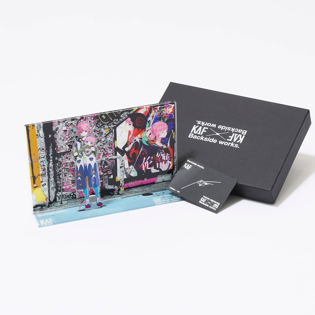
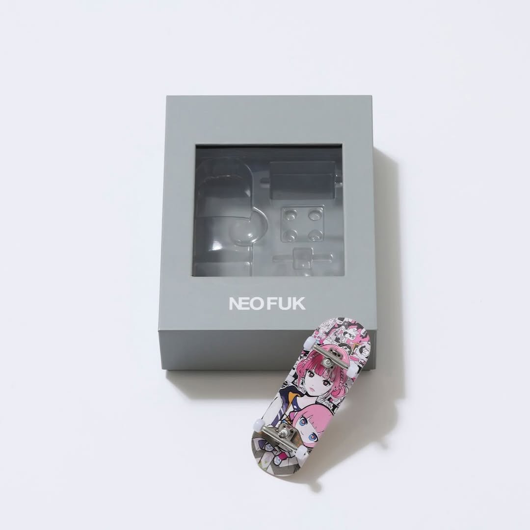
This image works because it communicates bundle value in a single glance. You can see the character stand, branded box, and signed card together, so buyers immediately understand what is included. That clarity reduces purchase hesitation and improves conversion quality.
The layout also balances detail and breathing room. Products sit low in the frame with generous negative space above, giving a premium catalog feel. For creator merchandise, this is a strong middle ground between pure technical listing and emotional fan storytelling.
| Signal | Evidence (from this image) | Mechanism | Replication Action |
|---|---|---|---|
| Bundle comprehension | Three components shown together | Shoppers quickly understand package contents | Always include one all-in-one bundle overview shot |
| Brand continuity | Consistent black packaging with white logo text | Unified branding increases trust and perceived quality | Keep packaging typography and color system consistent |
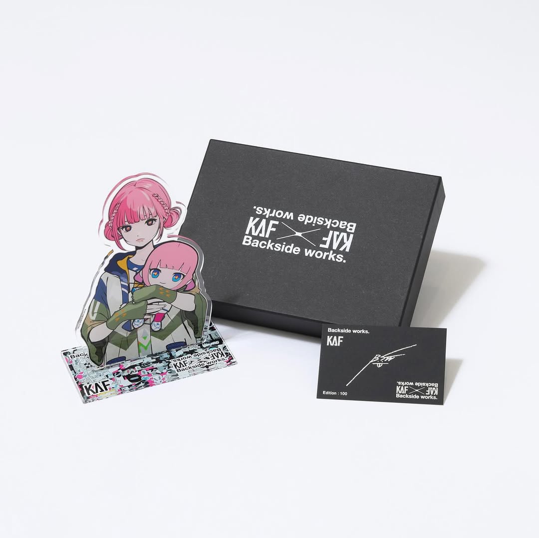
| Fandom appeal | Character acrylic figure with pink-haired design | Character visibility anchors emotional purchase intent | Place character item in front/primary visual position |
| Catalog readability | Neutral background and soft even lighting | Improves detail legibility and visual comfort | Use low-contrast studio light and uncluttered backdrops |
| Recipe | Keep | Change | Slot template (EN) |
|---|---|---|---|
| Deluxe bundle variant | Three-item triangular arrangement | Add one extra collectible in rear layer | {hero figure} + {branded box} + {certificate card} + {bonus item} |
| Minimal bundle variant | Neutral background and product spacing | Reduce to two essentials for lower-tier pricing | {main item} + {core package} + {price tier note} + {clean studio layout} |
| Detail carousel variant | All-in-one hero first frame | Follow with macro slides per item | {bundle overview} + {item close-up 1} + {item close-up 2} + {authenticity proof} |
The most effective visual decision is depth layering. The stand sits in front as the emotional hook, the box anchors brand identity behind it, and the card confirms collector value in the foreground right. This depth stack tells a complete merchandising story without needing extra text.
The restrained color system also supports performance. Neutral background and black packaging keep attention on character artwork. For creators, this is a scalable template for merch ecosystems: keep structure fixed, rotate character art and edition details.
| Prompt chunk | What it controls | Swap ideas (EN, 2-3 options) |
|---|---|---|
| "three-item merch arrangement" | Bundle clarity | "two-item starter set" / "four-item deluxe set" / "single-item hero" |
| "anime acrylic stand foreground" | Emotional focal point | "keychain focus" / "poster focus" / "vinyl figure focus" |
| "black branded box + signature card" | Brand credibility and collector value | "white premium box" / "foil-stamped card" / "numbered certificate" |
| "clean light-gray studio background" | Catalog readability | "pure white background" / "soft gradient gray" / "light pastel base" |
Baseline Lock: lock bundle item count, lock foreground/center/rear hierarchy, lock neutral lighting.