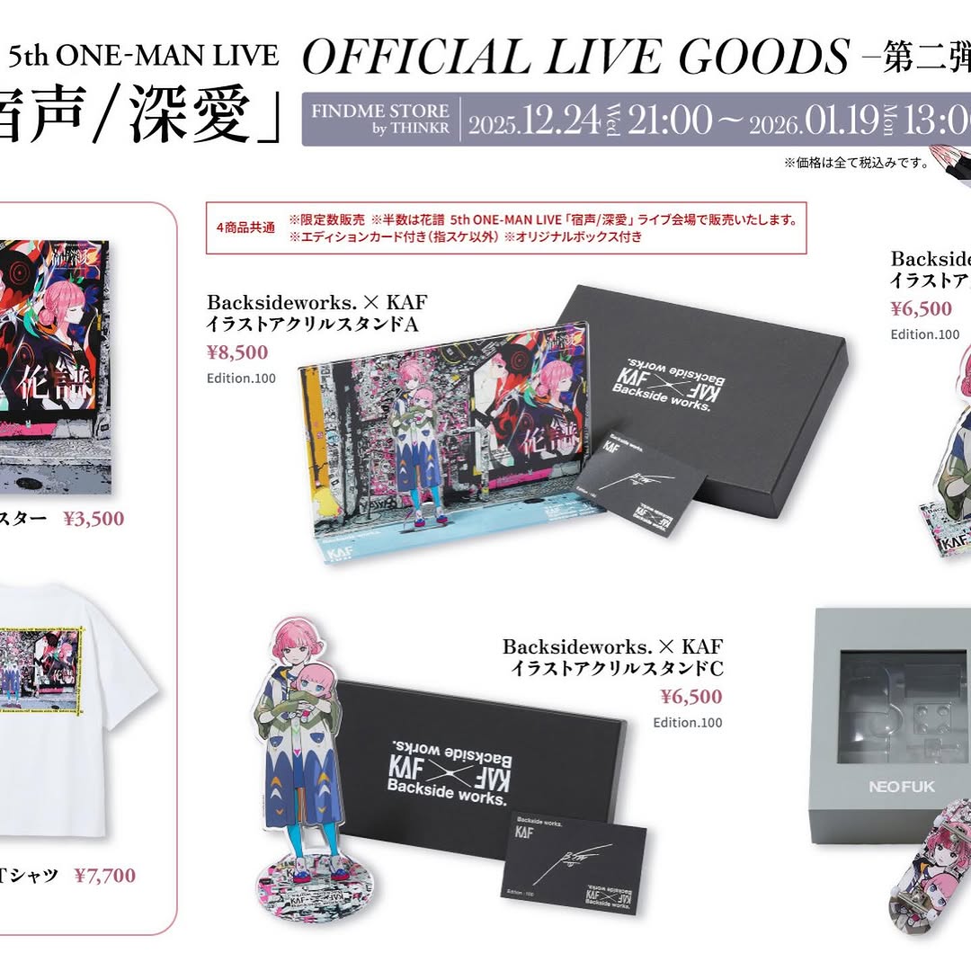
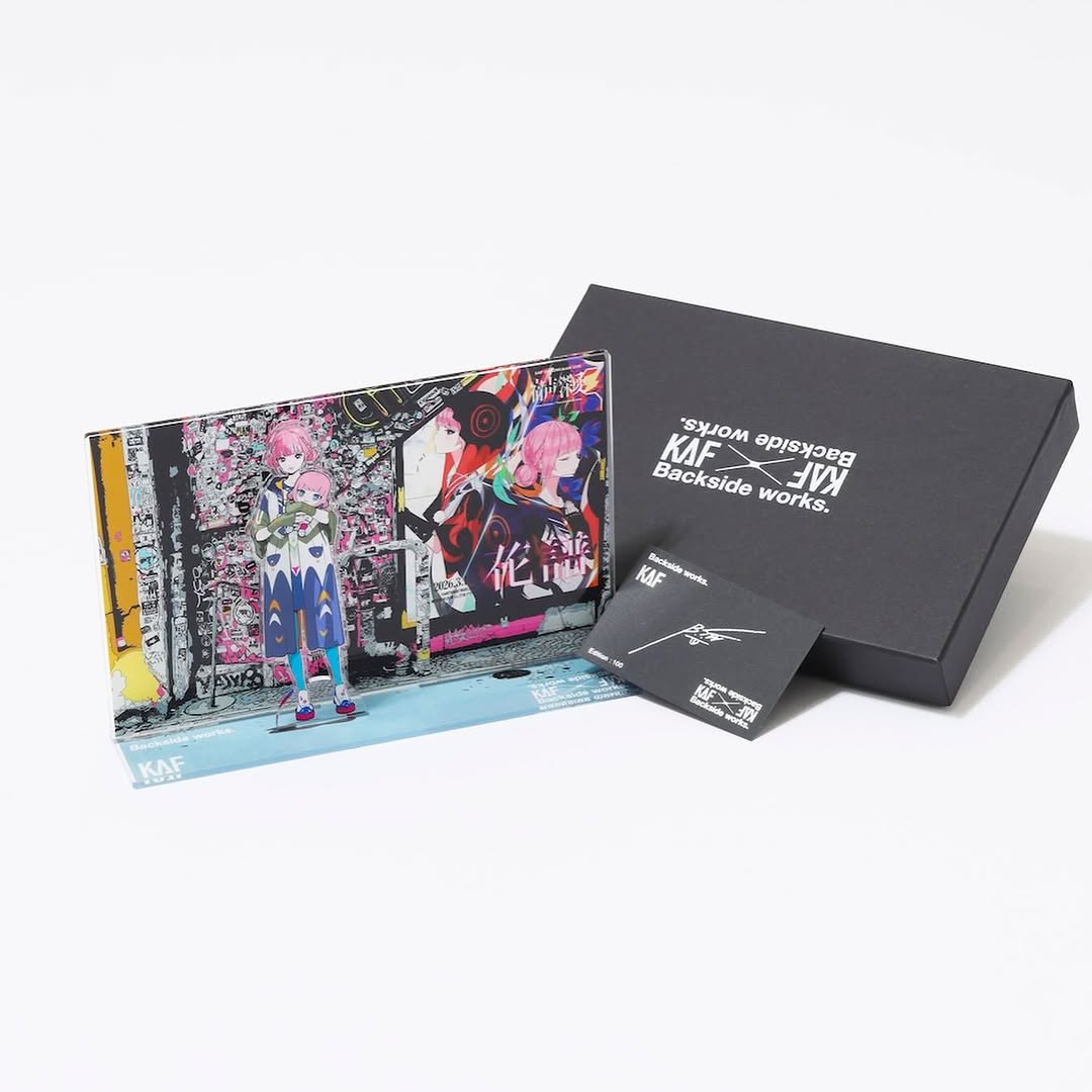
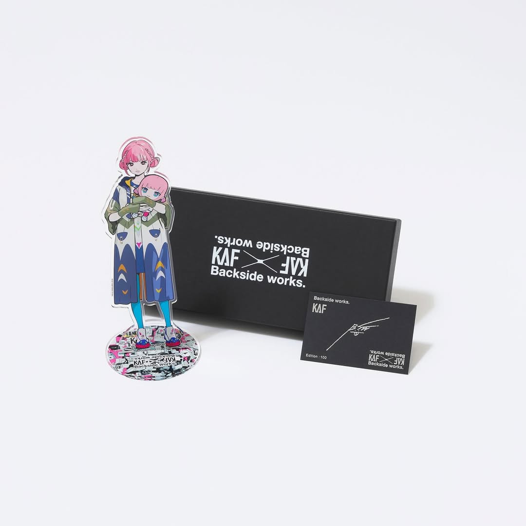
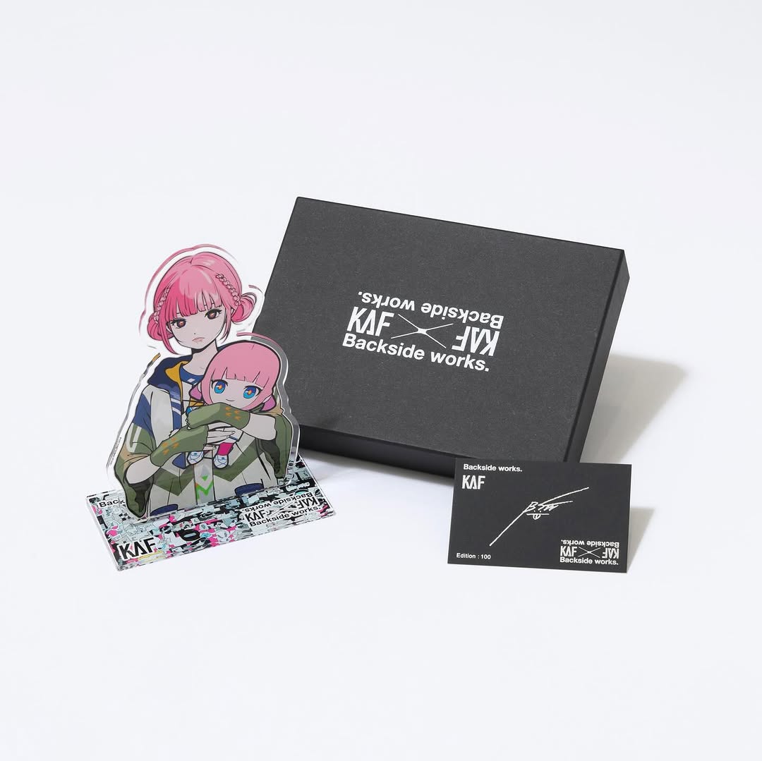
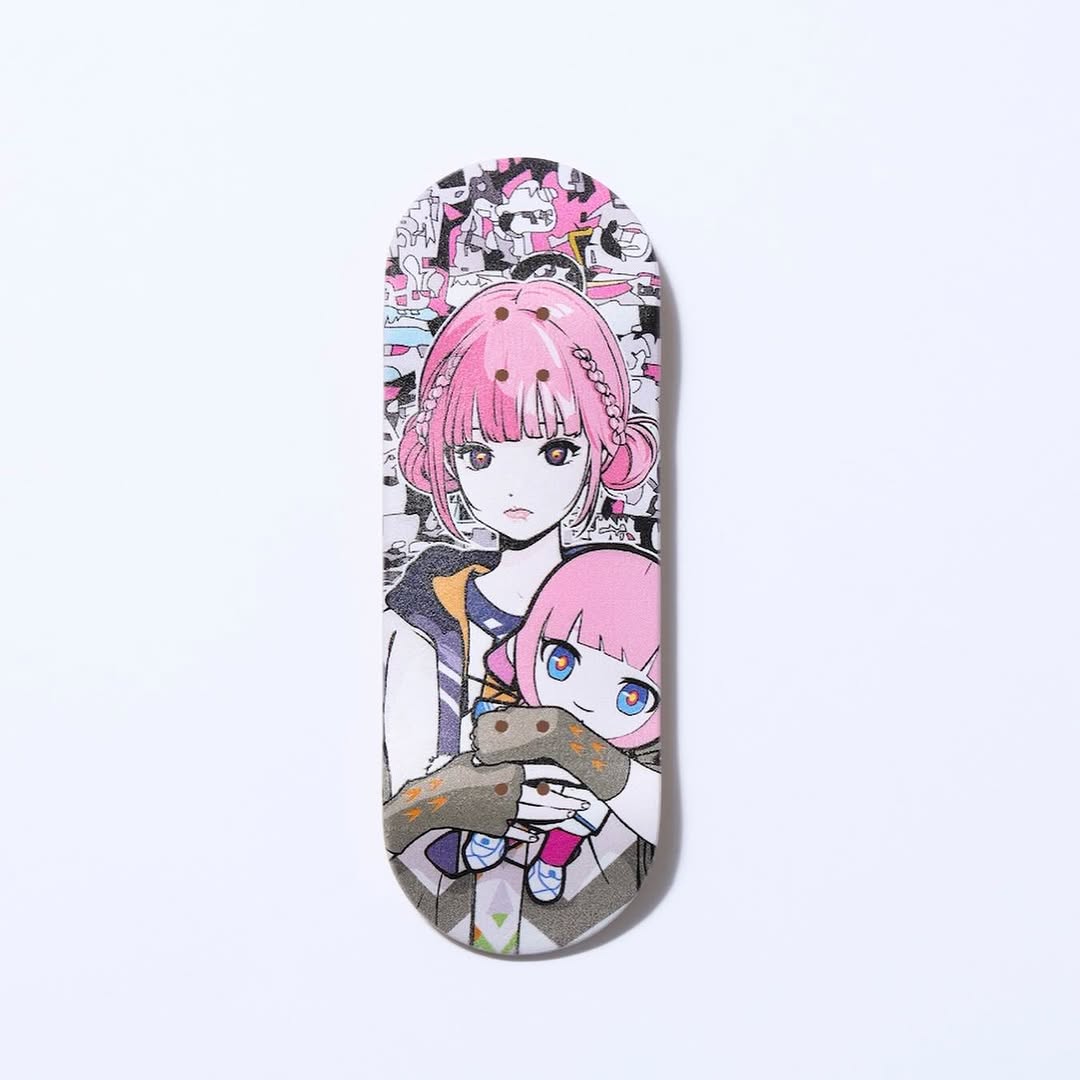
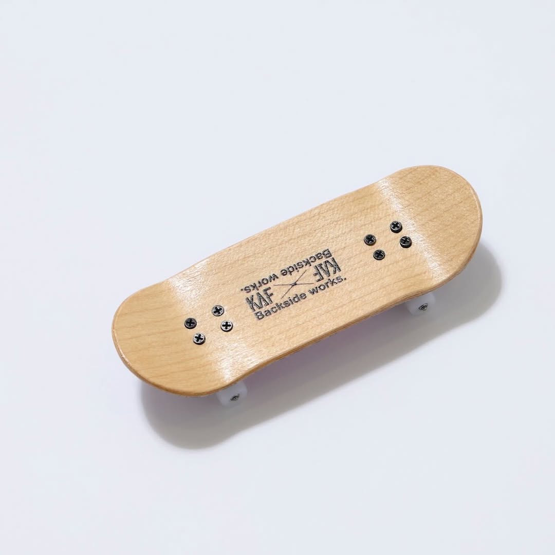
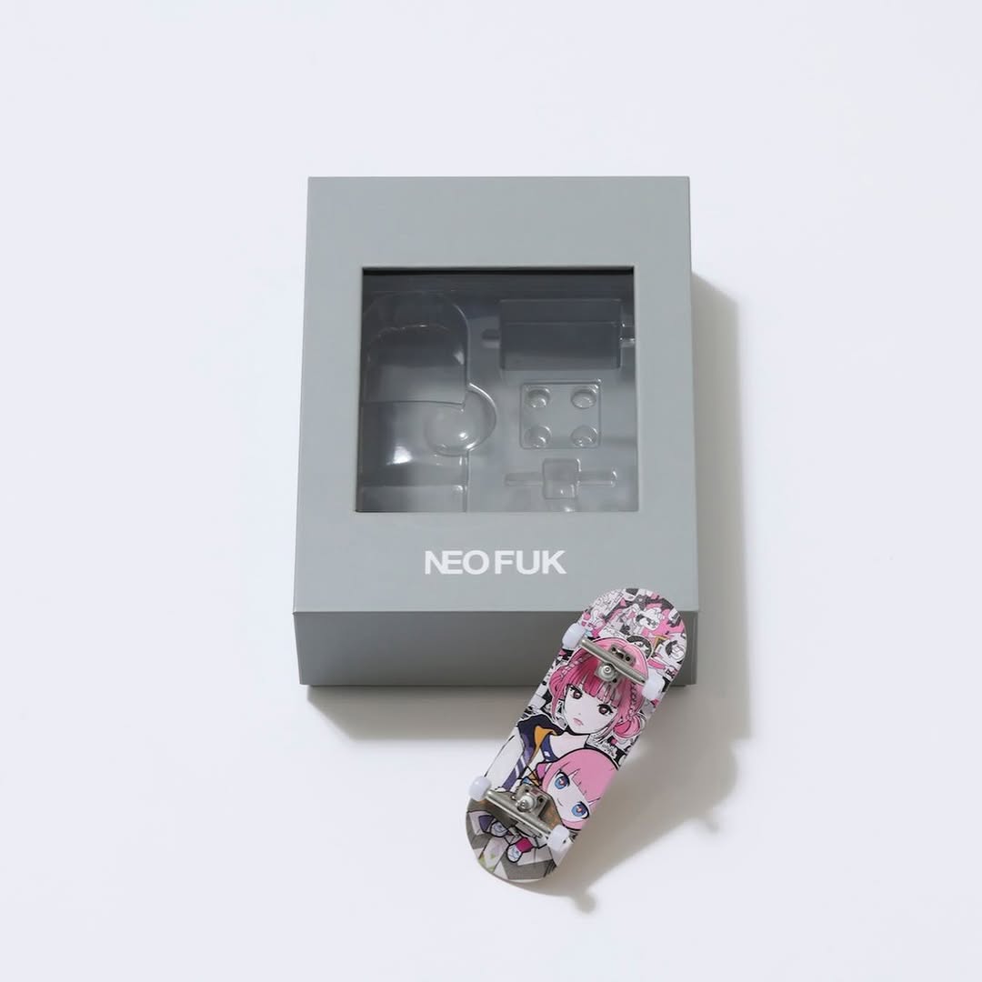
【#花譜5thワンマン グッズ第二弾📢】 花譜 5th ONE-MAN LIVE「宿声 / 深愛」 OFFICIAL LIVE GOODS 第二弾 12月24日(水) 21:00より販売スタート!! 顔や本名、性別、年齢を明かさずに活動する福岡出身の作家Backside works.さんがライブを記念して特別に描き下ろした花譜のイラストを使用したグッズを販売いたします!! 一部商品は数量限定となっております。 予めご了承ください。
【#花譜5thワンマン グッズ第二弾📢】 花譜 5th ONE-MAN LIVE「宿声 / 深愛」 OFFICIAL LIVE GOODS 第二弾 12月24日(水) 21:00より販売スタート!! 顔や本名、性別、年齢を明かさずに活動する福岡出身の作家Backside works.さんがライブを記念して特別に描き下ろした花譜のイラストを使用したグッズを販売いたします!! 一部商品は数量限定となっております。 予めご了承ください。
This post is not a beauty image or lifestyle portrait. It is an information-dense conversion asset. The goal is clear: show product variety, price points, and event timing in one visual. For creator commerce, this type of graphic is essential because it answers buying questions before users ask.
The strongest move here is hierarchy. The top band establishes official context and date range, while product blocks below provide concrete purchase options. That sequence reduces friction and helps fans transition from excitement to transaction.
| Signal | Evidence (from this image) | Mechanism | Replication Action |
|---|---|---|---|
| Official trust signal | Large headline and structured event branding at top | Legitimacy reduces buyer hesitation | Start merch sheets with one strong official header block |
| Decision support | Multiple SKUs shown with visible prices in yen | Price transparency accelerates purchase intent | Display SKU + price + image together in every module |
| Fan-identity pull | Anime character artwork repeated across products | Character consistency strengthens emotional buying | Reuse signature art motif across different item categories |
| Scan efficiency | Grid-like modular sections and boxed spacing | Users can compare options quickly | Design in modular blocks, avoid freeform random placement |
| Recipe | Keep | Change | Slot template (EN) |
|---|---|---|---|
| Minimal catalog variant | Header + SKU blocks + price pairing | Reduce to top 4 best-sellers only | {official header} + {top SKU grid} + {price labels} + {date CTA} |
| Carousel split variant | Consistent visual language and typography | Break categories by slide (apparel/accessories/collectibles) | {category title} + {3-4 product cards} + {price line} + {availability note} |
| Countdown sale variant | Dense product reference style | Add urgency strip and stock tags | {event banner} + {product modules} + {price} + {deadline cue} |
This graphic uses utilitarian aesthetics on purpose. White background, black text, and modular blocks maximize readability. The artwork thumbnails add emotional color, but typography remains the structural backbone. That balance between emotion and clarity is what makes merch graphics convert better than purely decorative posters.
For creators, the takeaway is simple: separate “hype visuals” and “buying visuals.” Hype visuals build desire; catalog visuals remove friction. A strong launch needs both.
| Prompt chunk | What it controls | Swap ideas (EN, 2-3 options) |
|---|---|---|
| "official live goods header band" | Trust and context framing | "tour merch update" / "seasonal drop header" / "fan club exclusive banner" |
| "multi-product grid with yen prices" | Commerce readability | "USD pricing grid" / "sold-out tags" / "bundle pricing modules" |
| "anime artwork repeated across items" | Brand/fandom continuity | "logo-first branding" / "photo-based merch art" / "minimal icon system" |
| "clean white layout with boxed sections" | Scan speed and hierarchy | "dark mode catalog" / "color-coded categories" / "magazine collage layout" |
Baseline Lock: lock official header zone, lock SKU+price module structure, lock consistent typography hierarchy.