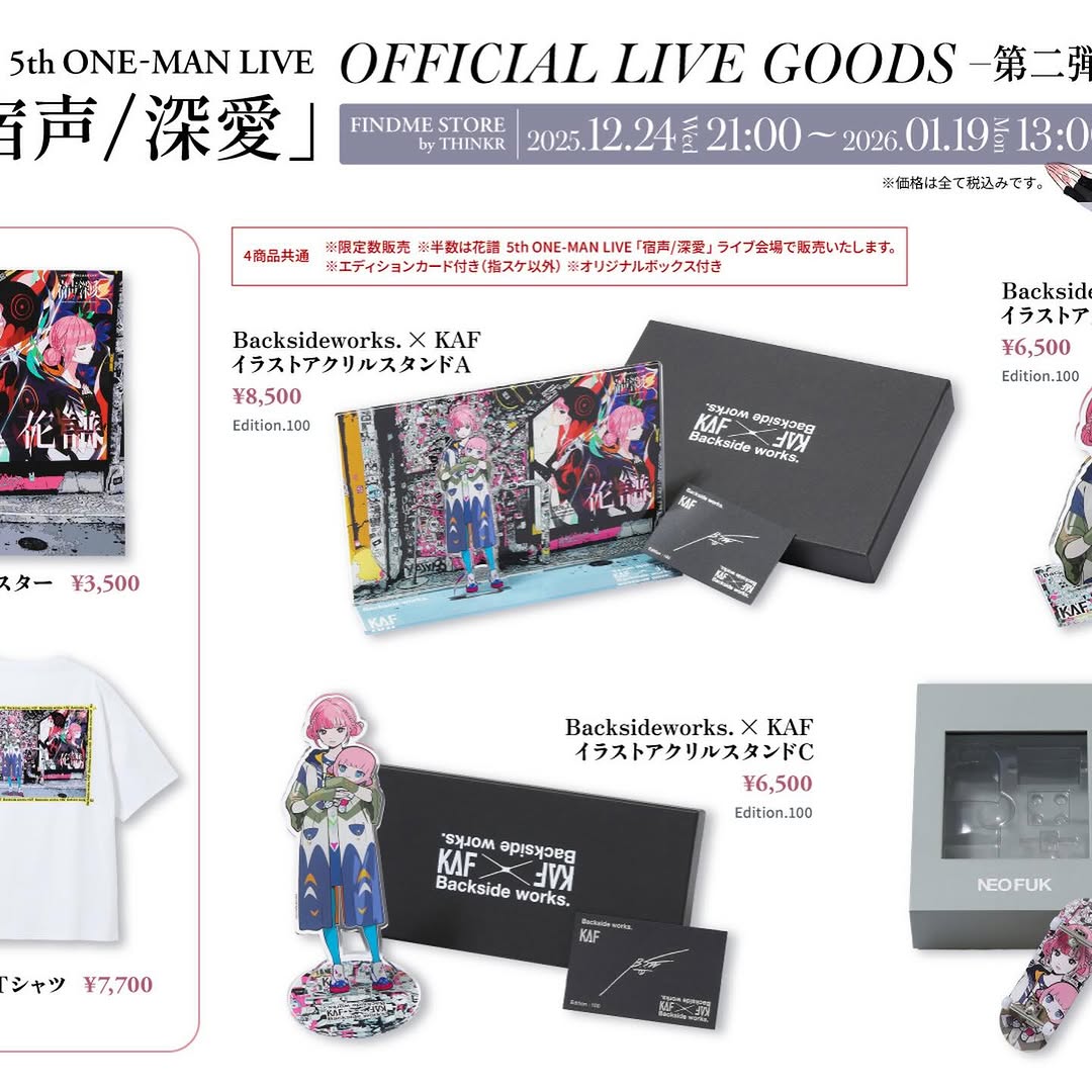
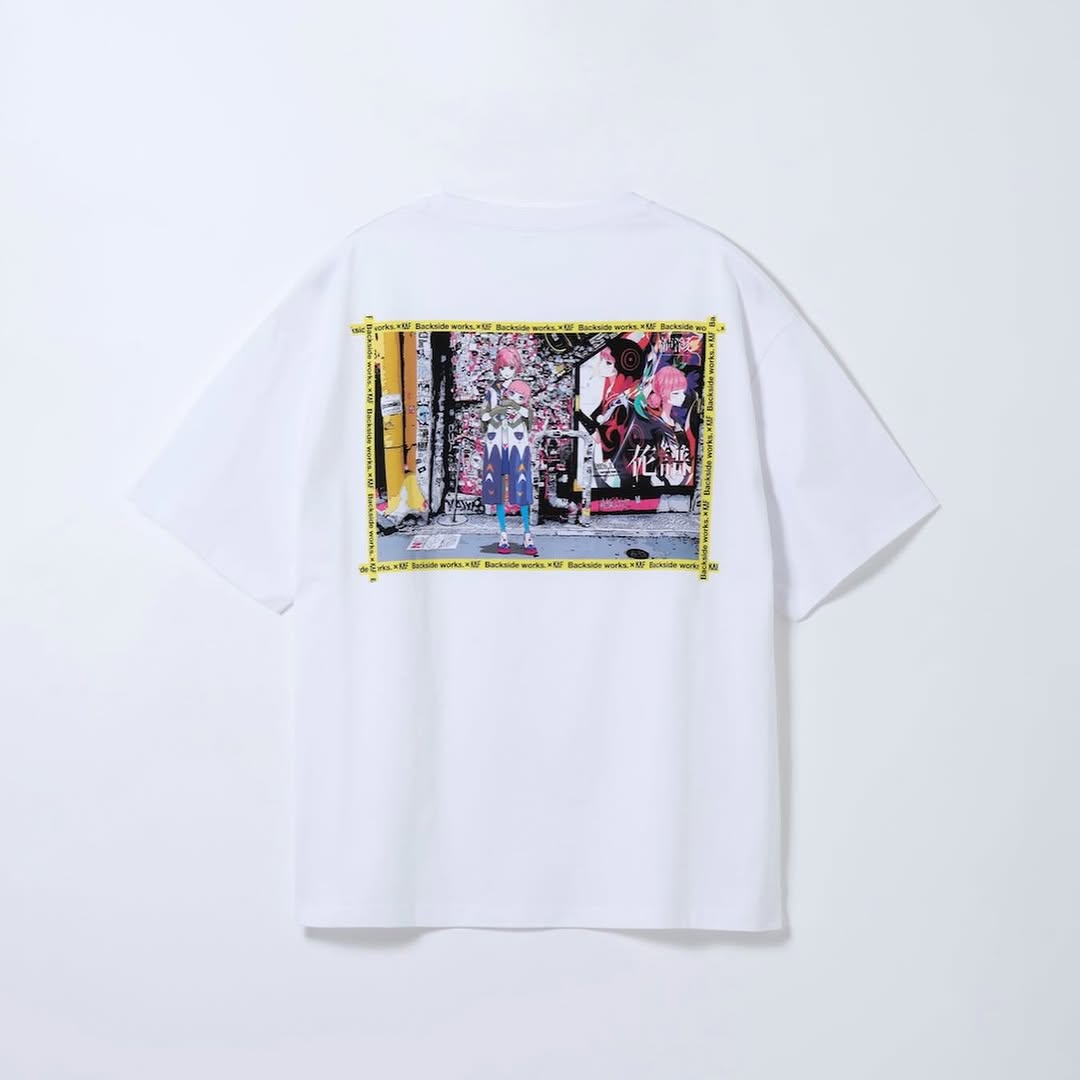
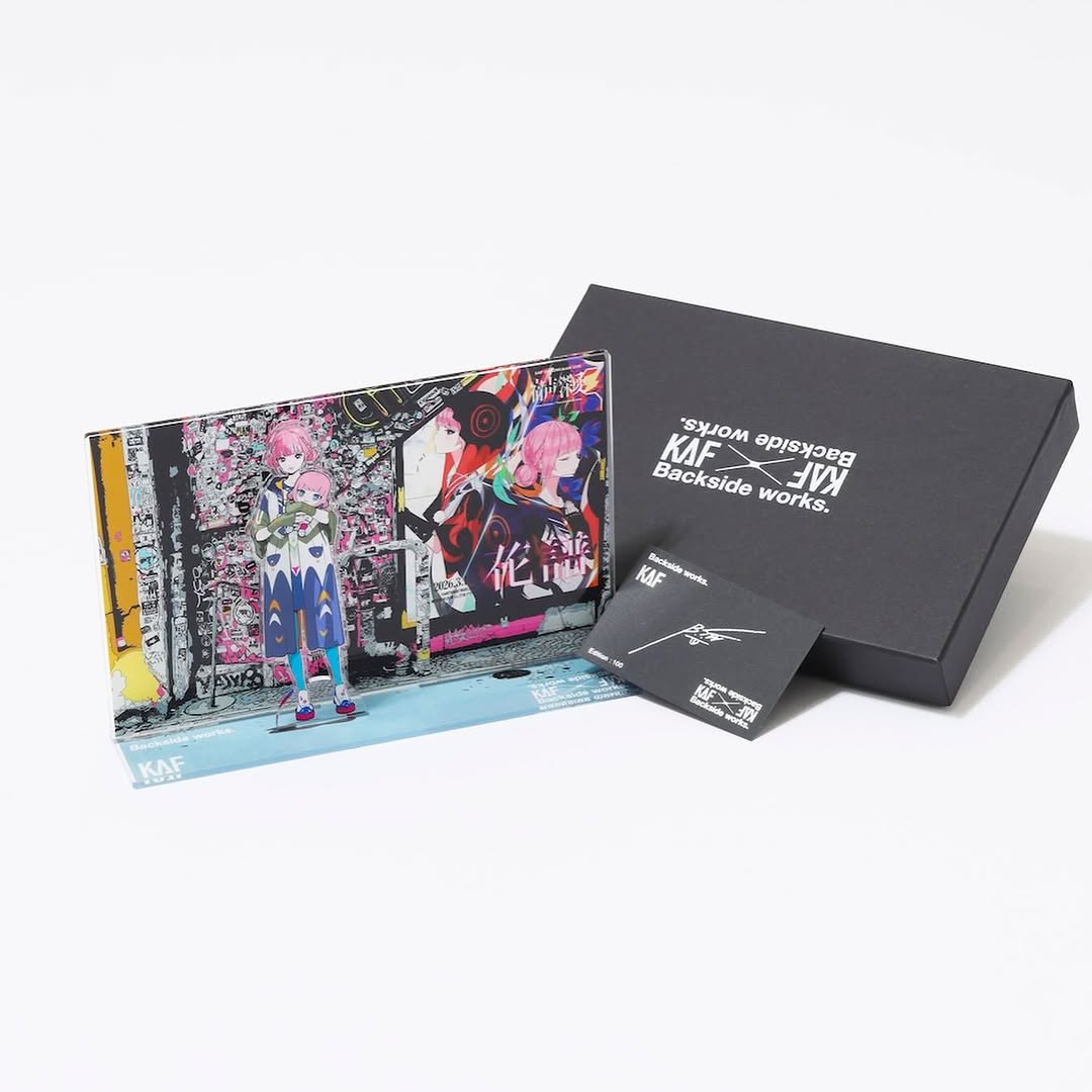
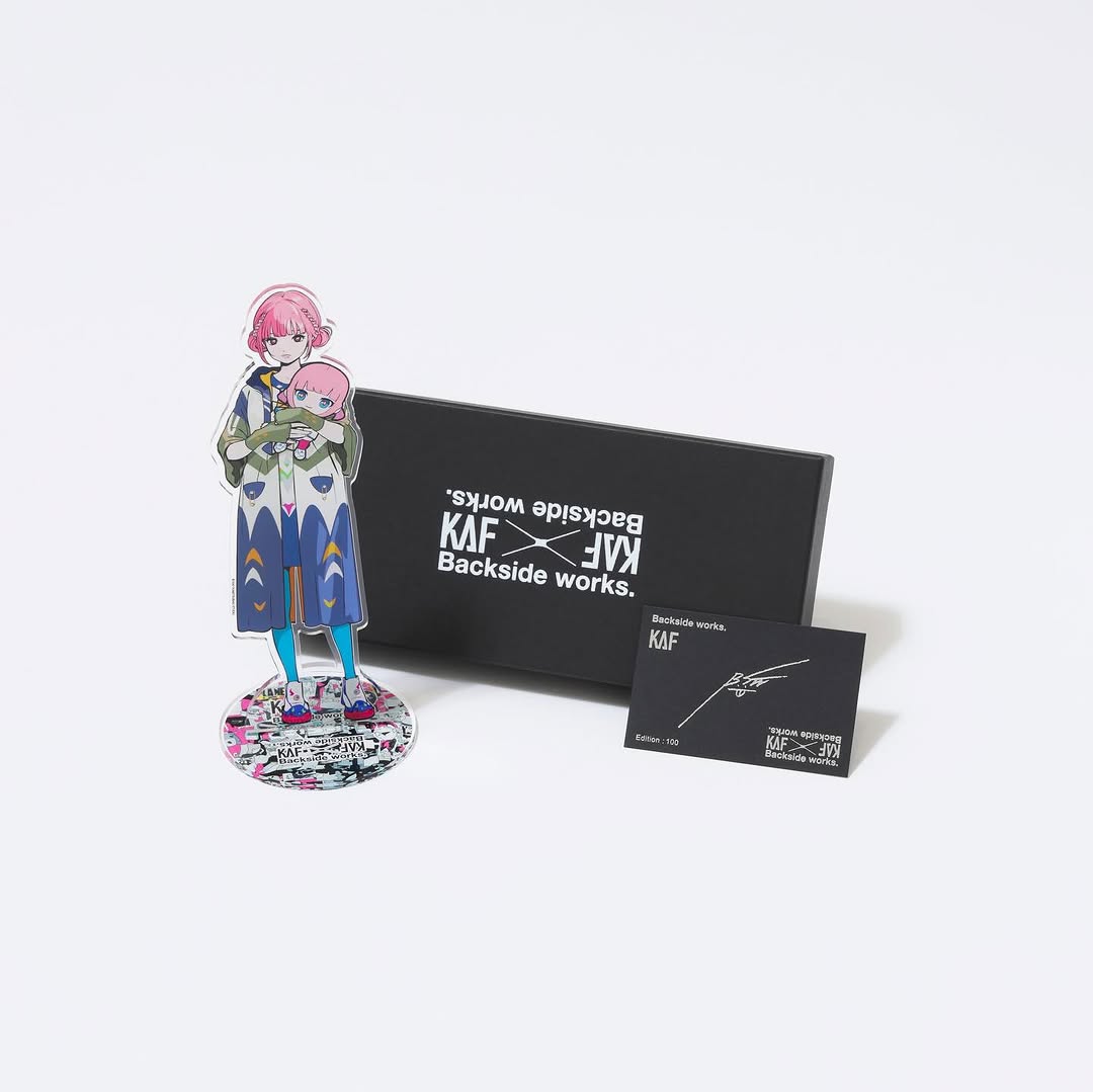
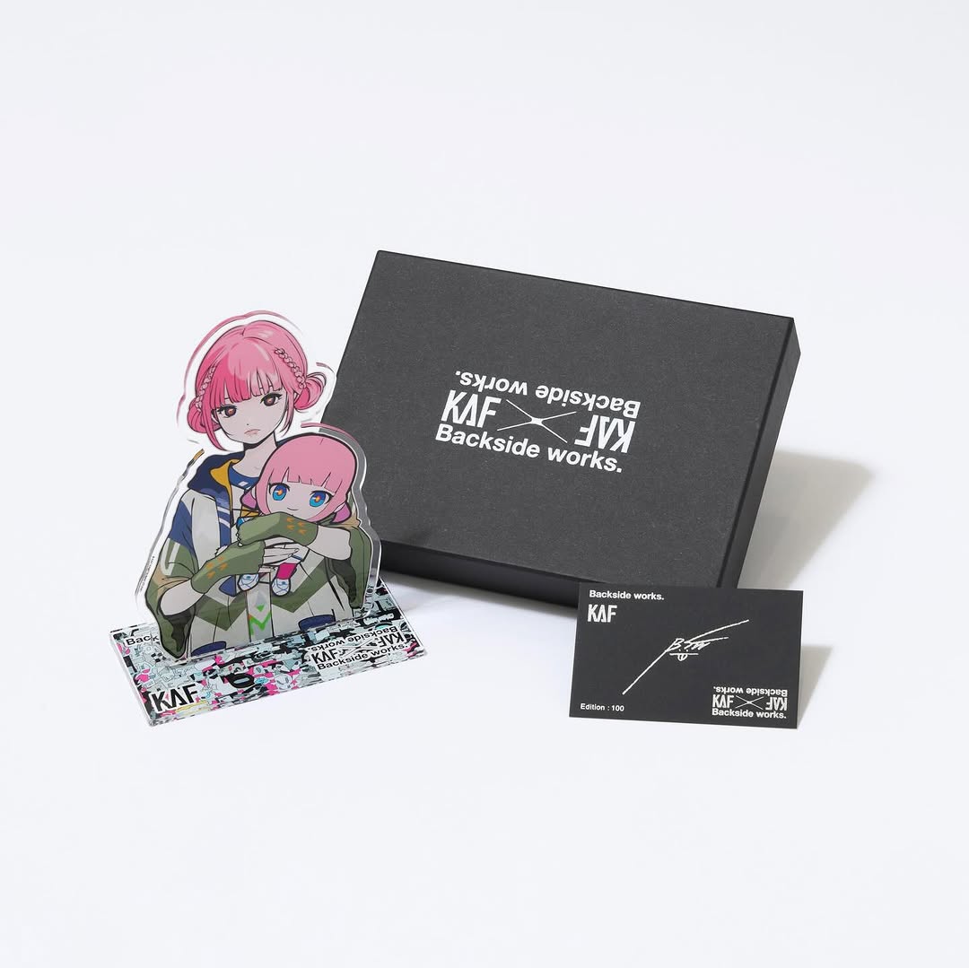
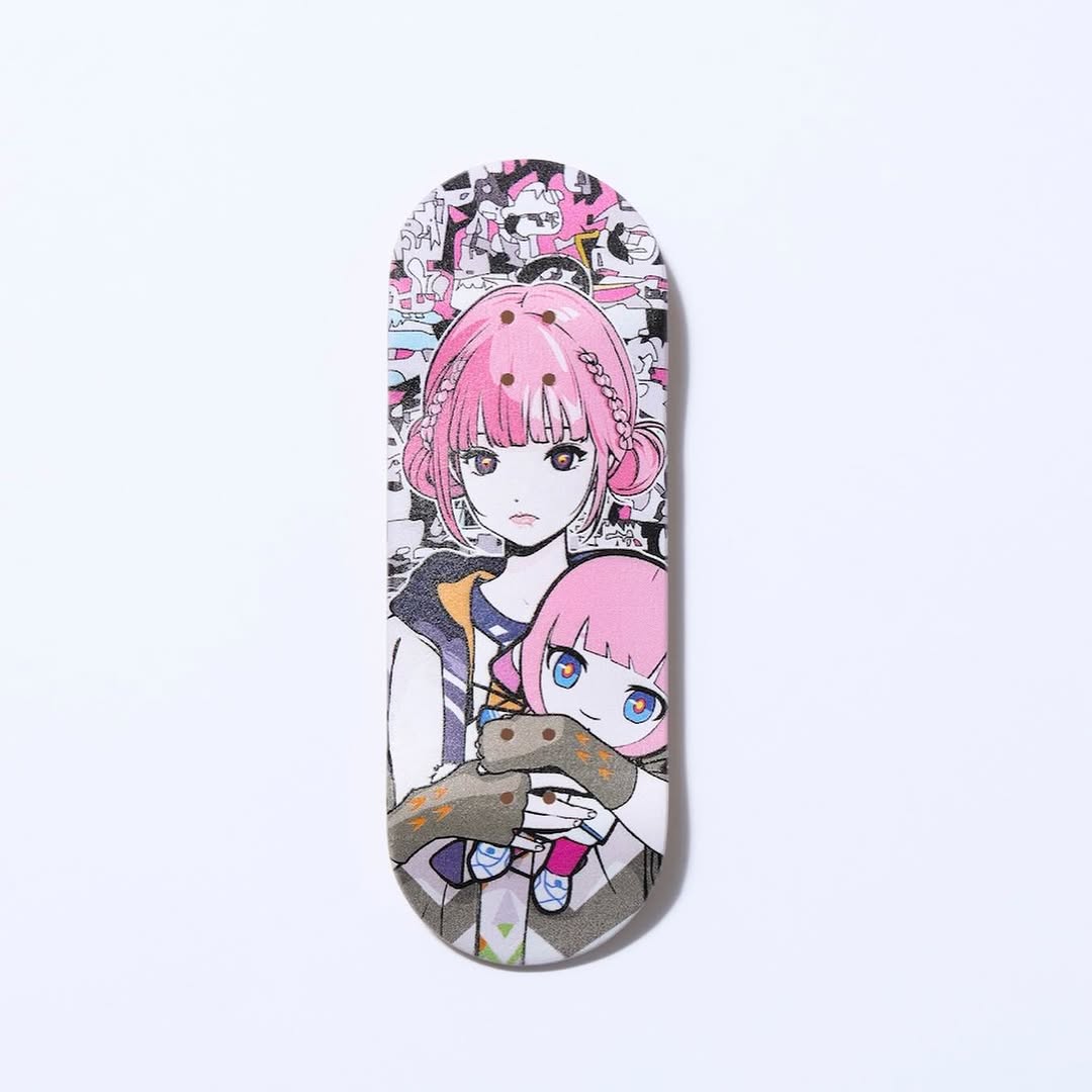
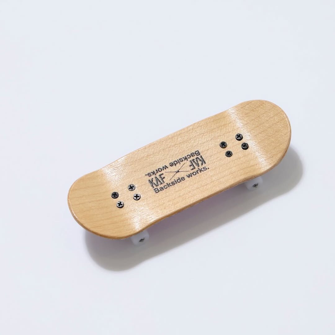
【#花譜5thワンマン グッズ第二弾📢】 花譜 5th ONE-MAN LIVE「宿声 / 深愛」 OFFICIAL LIVE GOODS 第二弾 12月24日(水) 21:00より販売スタート!! 顔や本名、性別、年齢を明かさずに活動する福岡出身の作家Backside works.さんがライブを記念して特別に描き下ろした花譜のイラストを使用したグッズを販売いたします!! 一部商品は数量限定となっております。 予めご了承ください。
【#花譜5thワンマン グッズ第二弾📢】 花譜 5th ONE-MAN LIVE「宿声 / 深愛」 OFFICIAL LIVE GOODS 第二弾 12月24日(水) 21:00より販売スタート!! 顔や本名、性別、年齢を明かさずに活動する福岡出身の作家Backside works.さんがライブを記念して特別に描き下ろした花譜のイラストを使用したグッズを販売いたします!! 一部商品は数量限定となっております。 予めご了承ください。
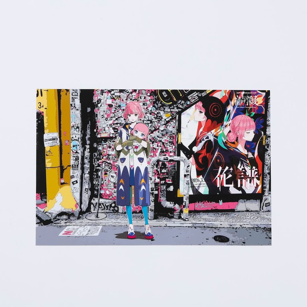
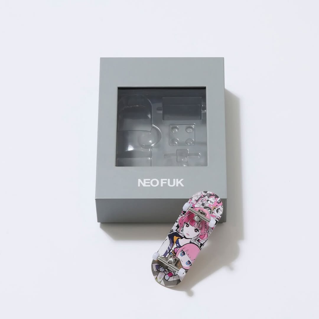
This is one of the simplest layouts that still feels premium: a rectangular artwork centered on a white background with generous margins. It’s the visual equivalent of a clean product page. You immediately understand what’s being sold, and the art gets to breathe.
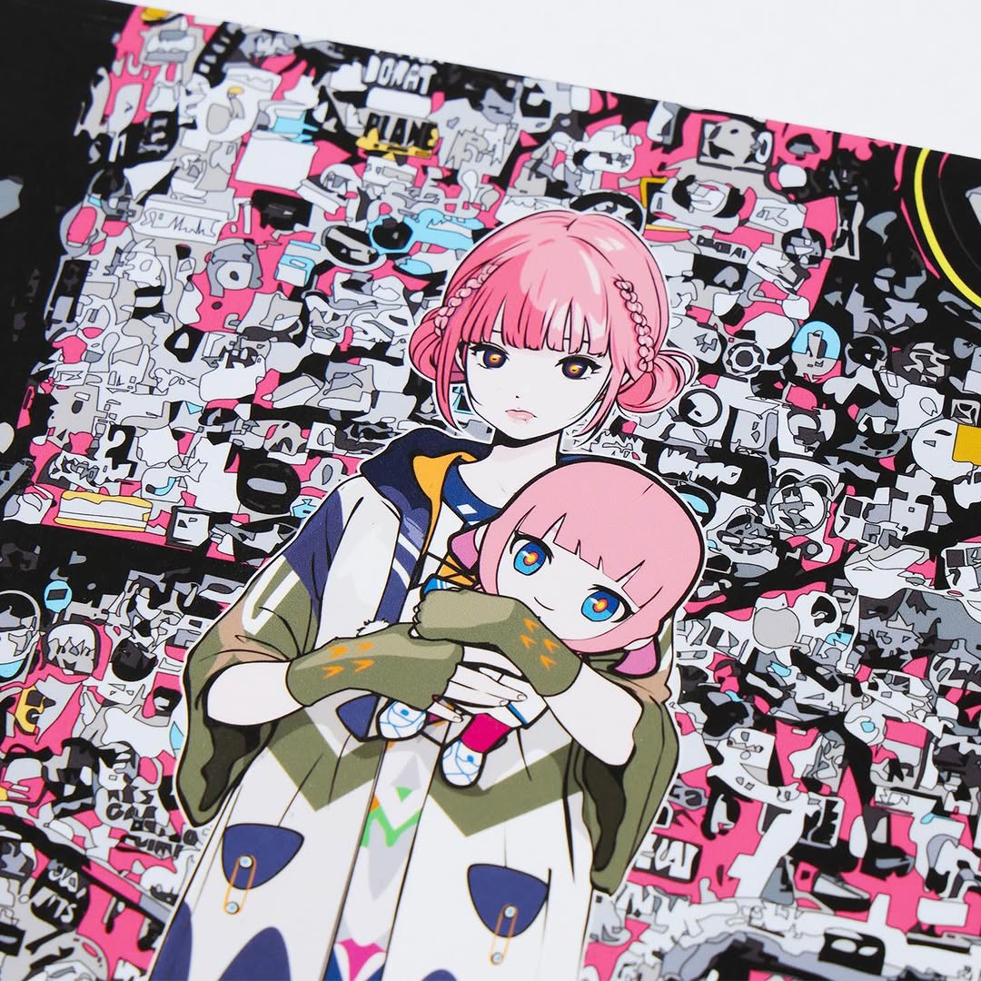
For illustration-heavy designs—especially busy collage scenes—white space is a feature, not a waste. It increases readability, makes screenshots cleaner, and gives your audience a “save this” reason because the image functions like a catalog card.
Centered layouts perform because they’re frictionless. The viewer doesn’t have to decode the scene: it’s simply “here is the artwork.” That clarity increases saves and shares, which is often more valuable for merch posts than raw likes.
This format also scales. Once you lock the template (white background, centered print, consistent margins), you can post an entire collection with a cohesive look—perfect for launches, pop-ups, and limited drops.
| Signal | Evidence (from this image) | Mechanism | Replication Action |
|---|---|---|---|
| Instant product read | Single centered print, no props | Reduces confusion and increases intent | Show one SKU per image and keep it centered |
| Premium whitespace | Large white margins around the artwork | Feels official and “shop-like” | Use generous margins; avoid filling every pixel |
| Collection-ready template | Repeatable framing and lighting | Makes the drop feel curated | Lock the layout and reuse it across all goods |
| Busy art contained | Collage scene isolated on white | Improves readability of dense artwork | Keep backgrounds neutral when the illustration is complex |
Recipe 1: Single-SKU grid
Recipe 2: Background swap
Recipe 3: Detail companion
The key choice here is restraint. A centered print with breathing room makes the design feel intentional. It also makes your post easier to repost—fans can screenshot it without weird cropping, and media accounts can share it without needing to redesign anything.
If you want this to look premium, focus on two things: the background must stay close to pure white, and the print must be sharp. Everything else is optional.
| Prompt chunk | What it controls | Swap ideas (EN) |
|---|---|---|
| “rectangular print centered, large negative space” | Catalog framing and clarity | “smaller object with bigger margins”, “tight crop”, “gallery spacing” |
| “seamless pure white background, high-key” | Premium cleanliness | “off-white paper”, “light grey seamless”, “white cyclorama” |
| “soft diffuse lighting, minimal shadows” | Professional product feel | “two-softbox lighting”, “window light”, “bounce fill” |
| “crisp focus, high resolution, print-like color grading” | Trust and detail | “matte paper texture”, “slight grain”, “sharper edge definition” |
| “busy collage illustration, hot pink accents” | Artwork identity | “monochrome ink”, “pastel palette”, “minimal character portrait” |
Clean studio product photo of a rectangular art print centered on a seamless pure white background with large negative space around it. The print depicts a detailed anime-style street collage scene: a full-body pink-haired girl standing in the center holding a small doll, dense sticker/graffiti wall with hot pink accents, a grungy yellow vertical panel on the left, and a large poster/billboard with two faces and bold Japanese title text on the right. Square 1:1 framing, minimal perspective distortion, crisp focus, soft diffuse lighting, minimal shadows, photoreal catalog look, no props, no hands.