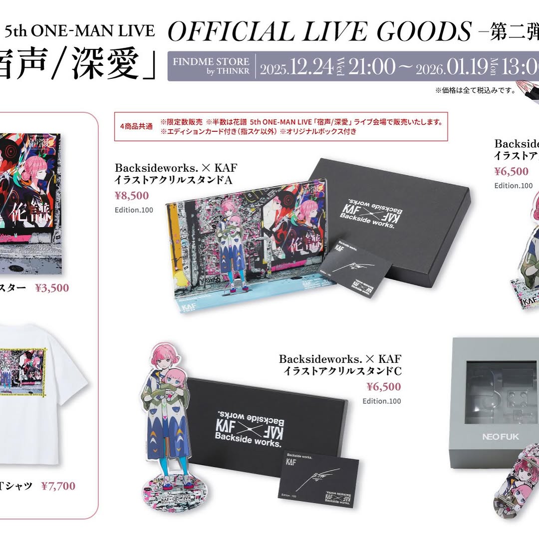
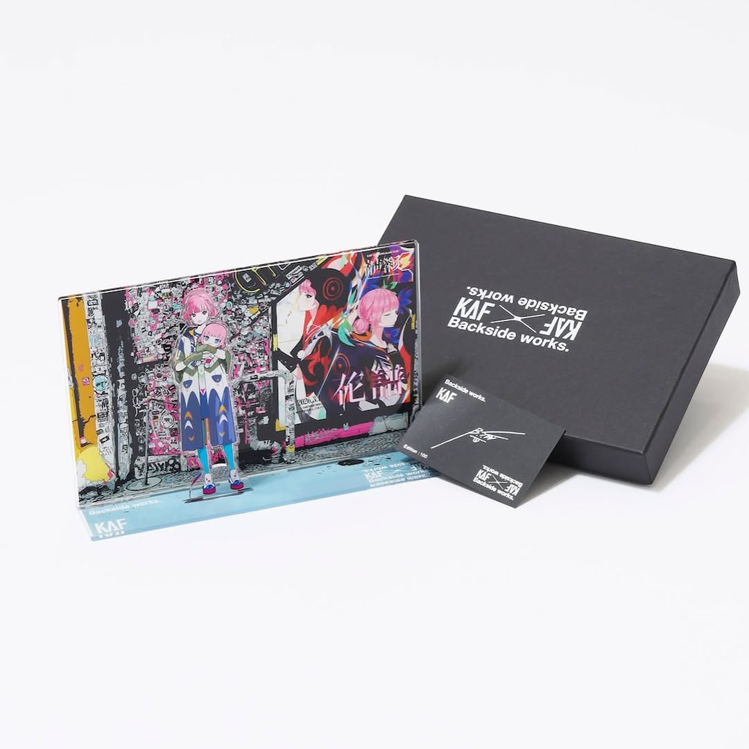
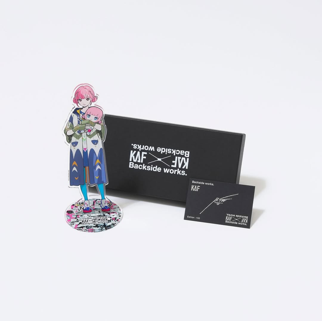
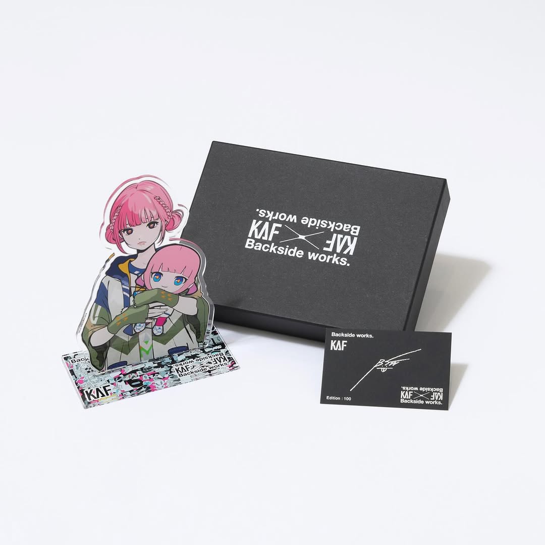
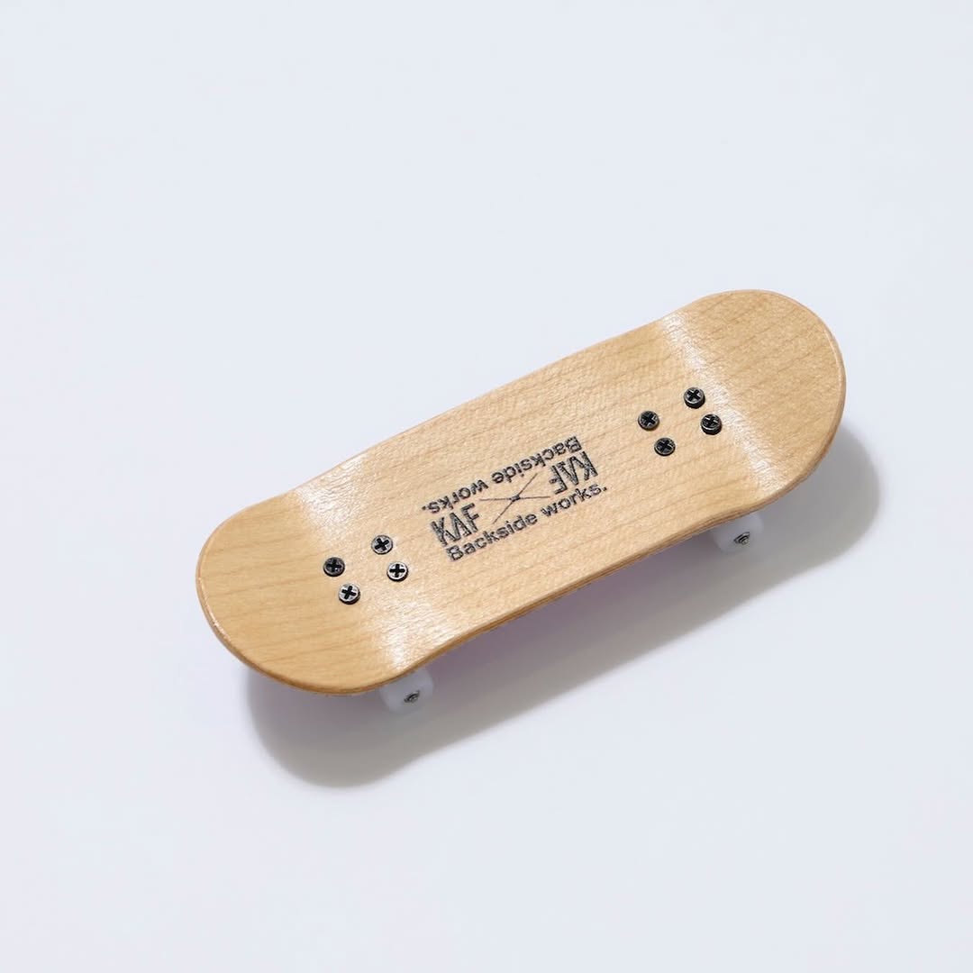
【#花譜5thワンマン グッズ第二弾📢】 花譜 5th ONE-MAN LIVE「宿声 / 深愛」 OFFICIAL LIVE GOODS 第二弾 12月24日(水) 21:00より販売スタート!! 顔や本名、性別、年齢を明かさずに活動する福岡出身の作家Backside works.さんがライブを記念して特別に描き下ろした花譜のイラストを使用したグッズを販売いたします!! 一部商品は数量限定となっております。 予めご了承ください。
【#花譜5thワンマン グッズ第二弾📢】 花譜 5th ONE-MAN LIVE「宿声 / 深愛」 OFFICIAL LIVE GOODS 第二弾 12月24日(水) 21:00より販売スタート!! 顔や本名、性別、年齢を明かさずに活動する福岡出身の作家Backside works.さんがライブを記念して特別に描き下ろした花譜のイラストを使用したグッズを販売いたします!! 一部商品は数量限定となっております。 予めご了承ください。
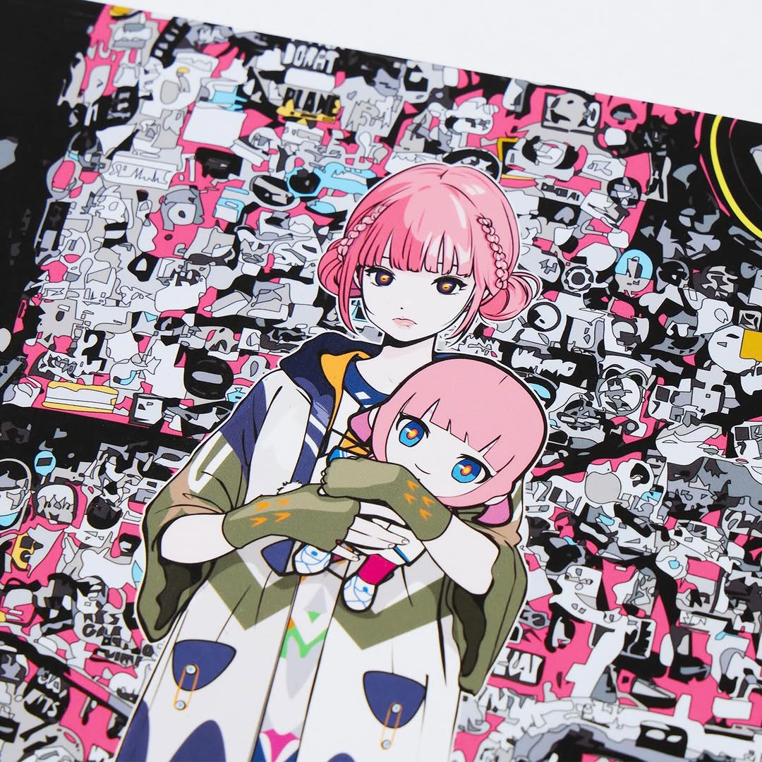
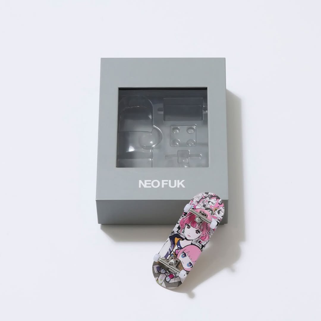
When you’re selling illustration-based merch, you’re really selling two things at once: the art itself, and the feeling that the drop is real. This image nails both by using a clean white background, a diagonal placement that feels designed, and a close crop that lets the print quality do the talking.
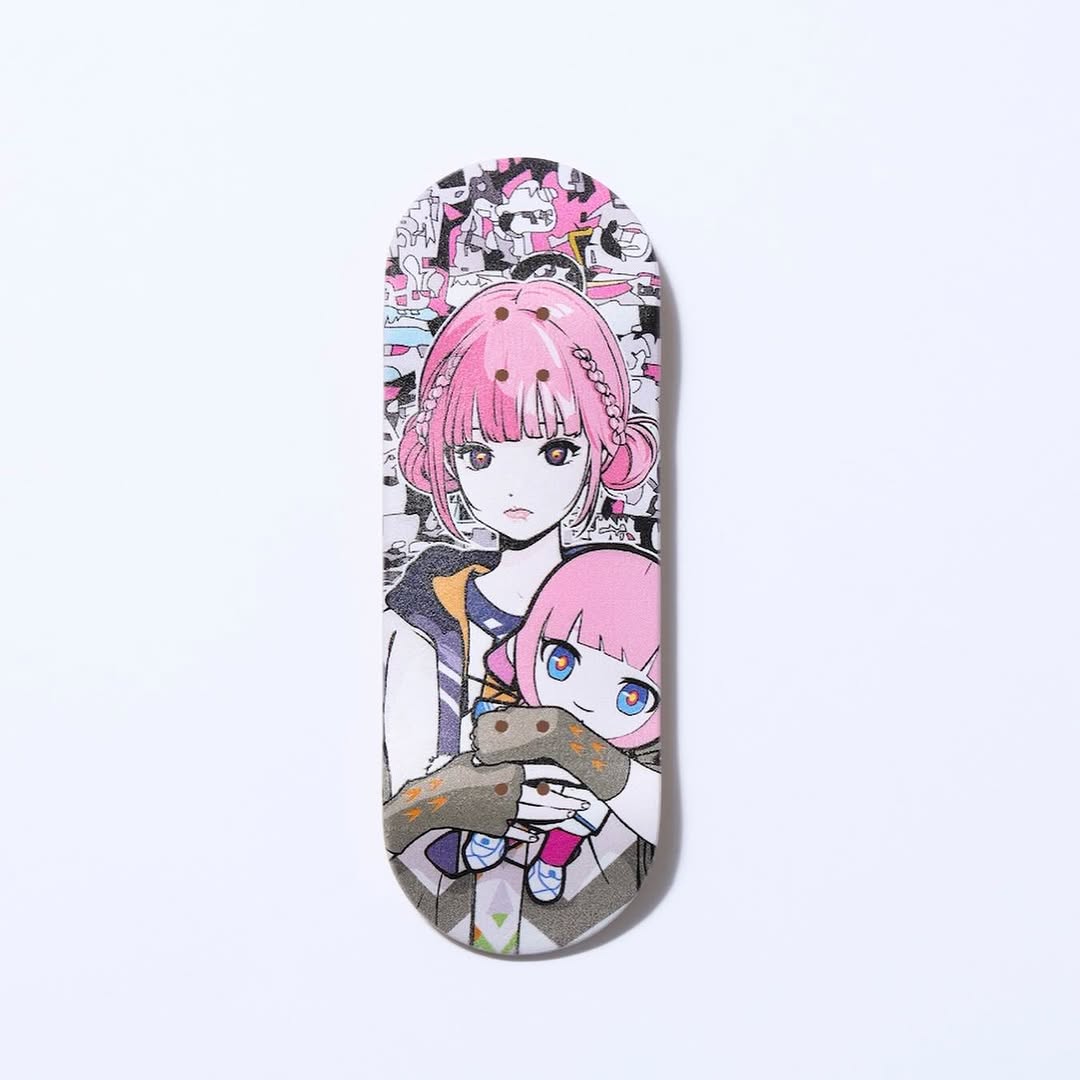
The art style here is loud—dense collage, heavy black/white, hot pink accents—so the photo does the opposite: it stays quiet. That contrast makes the illustration feel even more collectible.
People share merch when they trust it. A close-up photo of the actual illustration (or a realistic print-like render) signals “this exists.” It also rewards zooming: viewers inspect character detail, collage texture, and linework. That inspection time is engagement.
Diagonal placement is another small win. It feels like editorial layout, not a catalog screenshot. Your brain reads it as a designed post, which raises perceived quality.
| Signal | Evidence (from this image) | Mechanism | Replication Action |
|---|---|---|---|
| “It’s real” proof | Print photographed on a white surface, edges visible | Builds trust faster than a pure digital mockup | Shoot (or render) the print with visible edges and soft edge shadow |
| High contrast containment | Busy collage art isolated on a clean white background | Reduces visual noise and improves readability | Use a white seamless and avoid props that compete with the artwork |
| Zoom incentive | Dense linework and sticker collage details | Encourages inspection, saves, and shares | Crop close enough that details are visible at phone scale |
| Designed layout | Diagonal placement, centered composition | Feels like editorial packaging | Rotate the print 10–20° and keep margins consistent |
Recipe 1: Print + margin system
Recipe 2: Texture proof
Recipe 3: Series pacing
The illustration already has motion and chaos built in. A white background gives it room. The only “styling” choice you need is the angle. That small diagonal tilt adds energy without adding clutter. If you add props, you’ll often reduce perceived quality because the viewer stops trusting the product read.
One more detail: keep the print looking matte. Glare makes linework unreadable. Soft, diffused light is the simplest way to protect the art.
| Prompt chunk | What it controls | Swap ideas (EN) |
|---|---|---|
| “clean white studio flatlay, seamless background” | Trust and clarity | “light grey seamless”, “white cyclorama”, “minimal tabletop” |
| “print sheet placed diagonally, edges visible” | Designed composition + real-world cue | “straight alignment”, “stacked prints”, “slight overlap” |
| “soft diffuse lighting, minimal shadows, no glare” | Legibility of linework | “two-softbox setup”, “window light”, “bounce fill” |
| “crisp focus, high resolution, print texture subtle” | Collectible feel | “macro detail crop”, “matte paper grain”, “foil accents” |
| “busy collage artwork, hot pink accents” | Style identity of the illustration | “monochrome ink”, “pastel palette”, “minimal line art” |
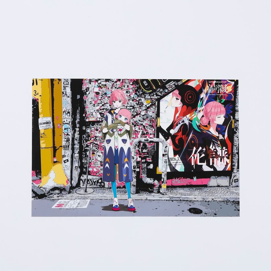
Clean studio product detail photo of a printed anime illustration sheet placed diagonally on a seamless white surface. The artwork shows a pink-haired anime girl holding a small pink-haired doll with big blue eyes, with a dense black-and-white sticker/graffiti collage background and hot pink accents. Top-down flatlay-style angle, square 1:1 crop, crisp focus, visible paper edges with a subtle soft edge shadow. Soft diffuse lighting, minimal shadows, matte print finish, no glare, no props, no hands. Photoreal e-commerce look, high resolution.