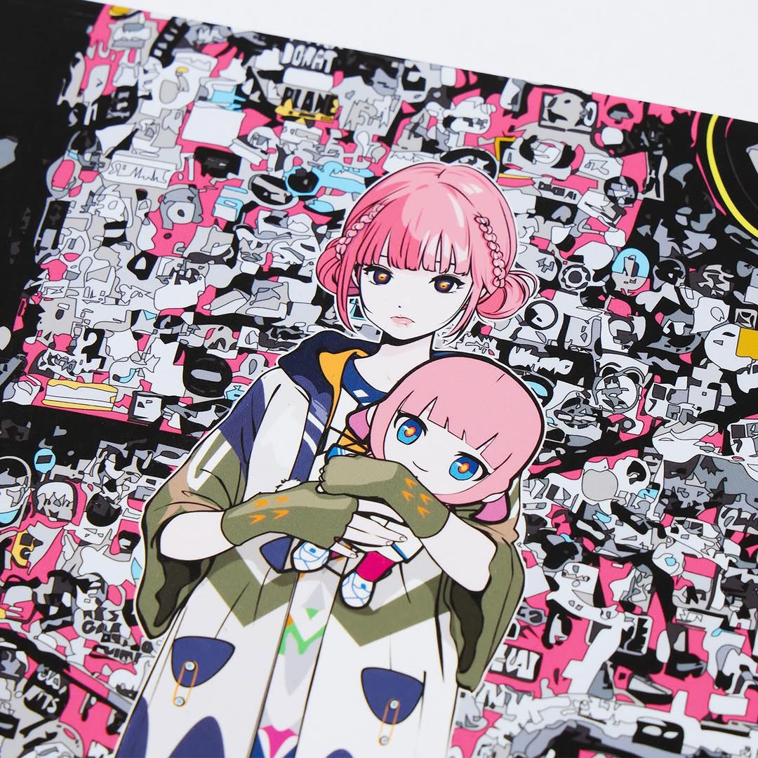
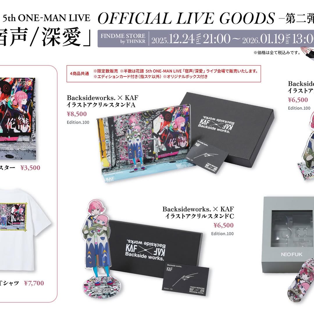
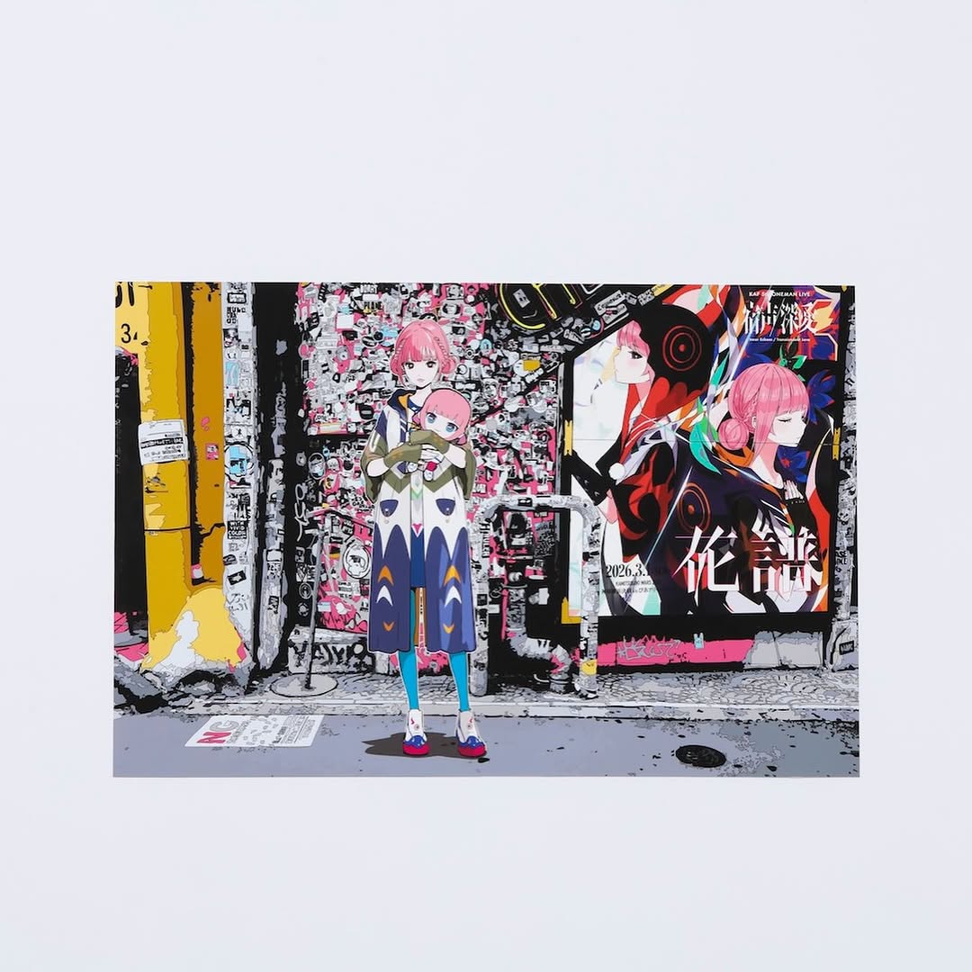
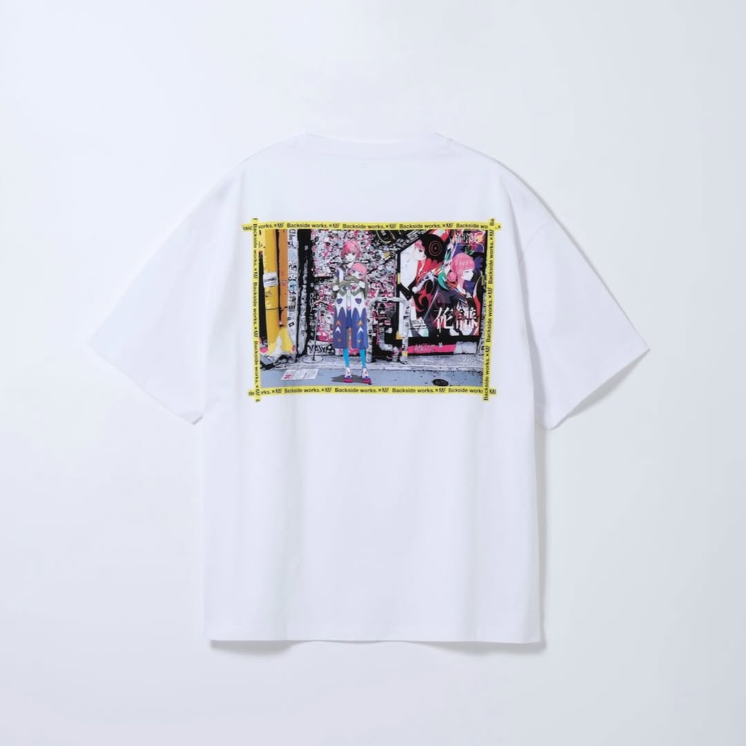
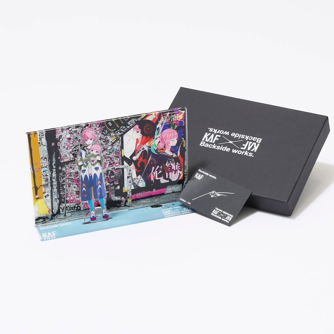
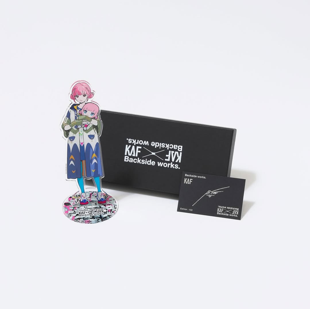
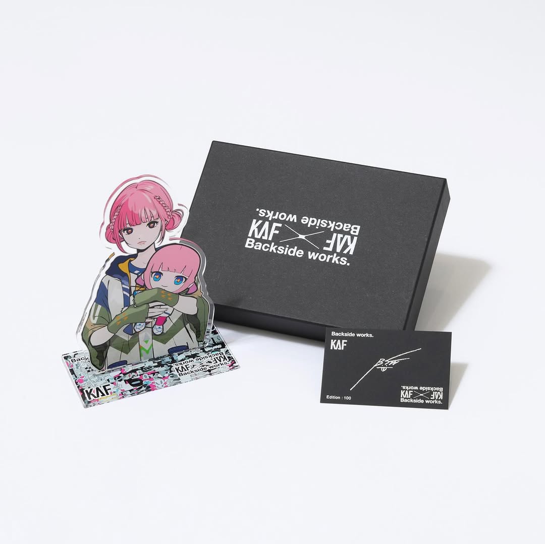
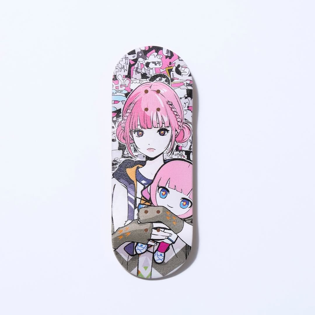
【#花譜5thワンマン グッズ第二弾📢】 花譜 5th ONE-MAN LIVE「宿声 / 深愛」 OFFICIAL LIVE GOODS 第二弾 12月24日(水) 21:00より販売スタート!! 顔や本名、性別、年齢を明かさずに活動する福岡出身の作家Backside works.さんがライブを記念して特別に描き下ろした花譜のイラストを使用したグッズを販売いたします!! 一部商品は数量限定となっております。 予めご了承ください。
【#花譜5thワンマン グッズ第二弾📢】 花譜 5th ONE-MAN LIVE「宿声 / 深愛」 OFFICIAL LIVE GOODS 第二弾 12月24日(水) 21:00より販売スタート!! 顔や本名、性別、年齢を明かさずに活動する福岡出身の作家Backside works.さんがライブを記念して特別に描き下ろした花譜のイラストを使用したグッズを販売いたします!! 一部商品は数量限定となっております。 予めご了承ください。
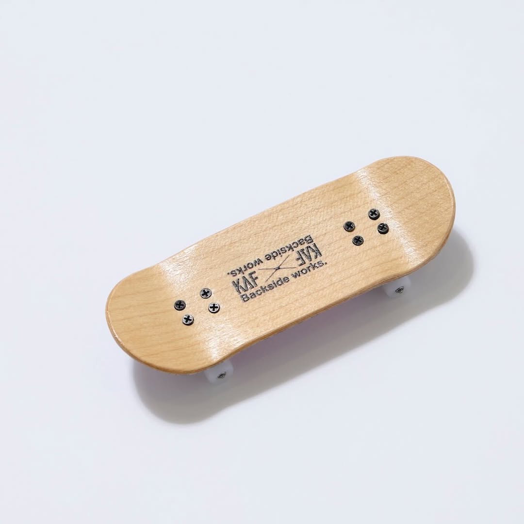
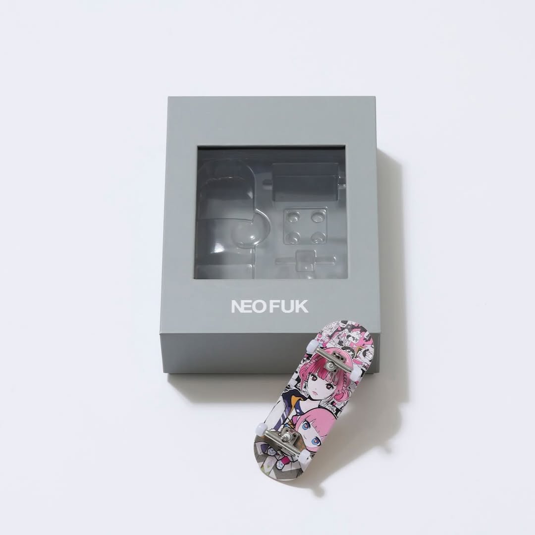
This frame is doing something deceptively powerful: it makes the merch feel official. A miniature fingerboard on a seamless background is not “lifestyle content,” but it is exactly the kind of proof image that gets reposted in fan communities when a drop is announced.
The first mechanism is trust. Clean studio lighting and a blank background signal that the item exists, can be manufactured, and is part of a real release. That matters more than vibes when you are asking people to buy, pre-order, or care about limited quantities.
The second mechanism is readability. The wood tone against white space creates immediate contrast, and the diagonal placement gives the object a little motion without making the image busy. You can screenshot this, repost it, crop it, and it still survives as an announcement slide.
| Signal | Evidence (from this image) | Mechanism | Replication Action |
|---|---|---|---|
| Official catalog feel | White seamless background, soft shadow, clean focus | Raises purchase confidence and repost intent | Shoot (or generate) a “proof” image before any lifestyle creative |
| One-object clarity | Single fingerboard, no props, no hands | Low cognitive load improves scroll-stop | Make the hero slide one item only; save bundles for slide 2 |
| Subtle motion cue | Diagonal placement across negative space | Keeps the frame alive without noise | Angle the product 15–25 degrees; do not add background clutter |
| Material honesty | Visible wood grain and hardware screws | Texture reads as “real object,” not mockup | Prioritize material detail (grain, stitching, edges) over filters |
This image is a reminder that “boring” can be strategic. The blank background is not laziness; it is a distribution feature. It allows fan accounts to repost without losing clarity, and it allows the caption to carry the logistics without the image feeling like an ad banner.
If you want this to perform, treat lighting as your main creative tool. The soft shadow and slight sheen on the wood are what make the item feel physical. Once the proof system is locked, you can safely explore lifestyle shots as a second format.
| Observed | Recreate | Why it matters |
|---|---|---|
| White seamless background | Keep backgrounds empty and bright on hero slides | Maximizes trust and repostability |
| Soft directional shadow | Light from upper-left; shadow to the right | Signals realism without drama |
| Readable branding on object | Ensure logo/text is visible in at least one shot | Improves attribution when reposted |
| One item per frame | Do not stack products on the first announcement image | Prevents confusion and keeps the hook clean |
| Prompt chunk | What it controls | Swap ideas (EN, 2–3 options) |
|---|---|---|
| background system | Trust and cleanliness | white seamless; light gray sweep; clean studio |
| lighting direction | Shadow and physicality | upper-left soft key; top-down soft key; window soft light |
| composition angle | Energy without clutter | diagonal; centered straight; slight off-center |
| material detail | Whether it feels manufactured | wood grain; brushed metal; matte plastic |
| one-object constraint | Clarity and repostability | single item only; no hands; no props |
Baseline Lock: (1) seamless background, (2) soft shadow, (3) single product.
One-change rule: change only 1–2 knobs per run. Example sequence: