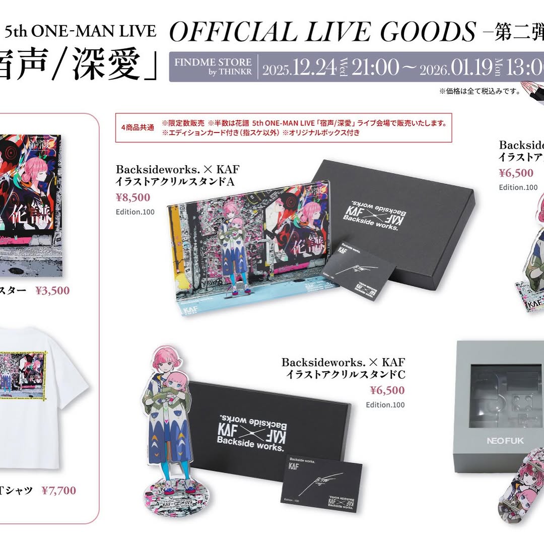
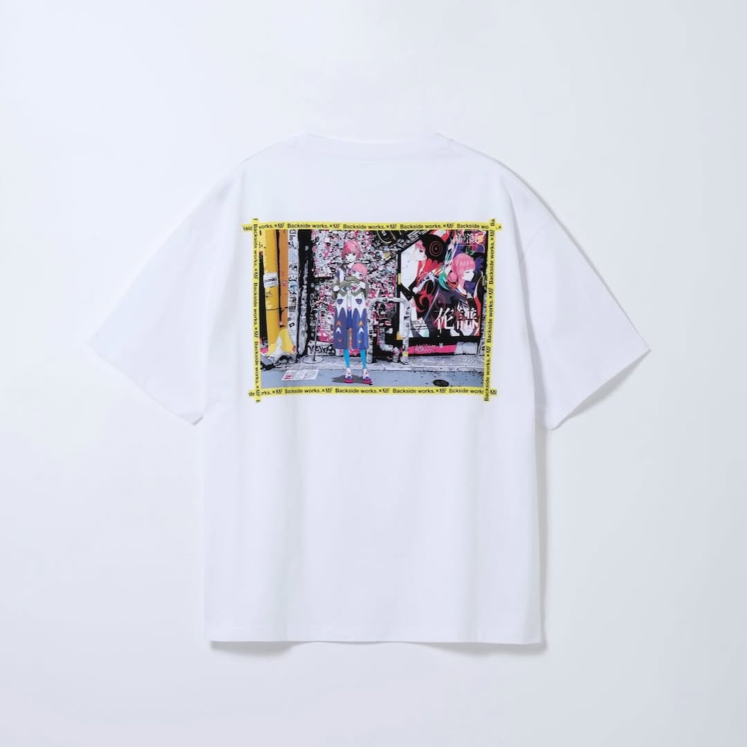
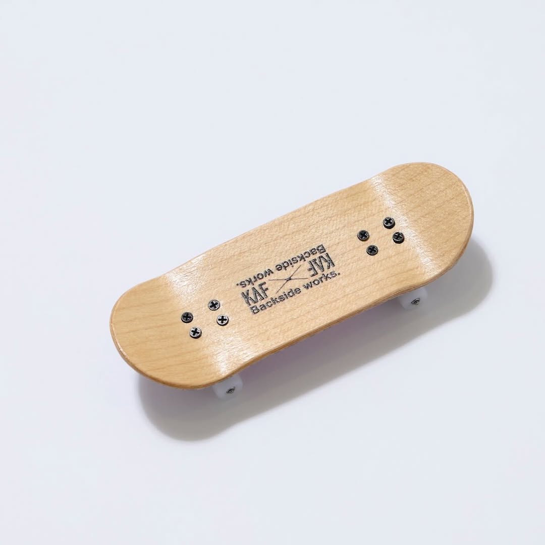
【#花譜5thワンマン グッズ第二弾📢】 花譜 5th ONE-MAN LIVE「宿声 / 深愛」 OFFICIAL LIVE GOODS 第二弾 12月24日(水) 21:00より販売スタート!! 顔や本名、性別、年齢を明かさずに活動する福岡出身の作家Backside works.さんがライブを記念して特別に描き下ろした花譜のイラストを使用したグッズを販売いたします!! 一部商品は数量限定となっております。 予めご了承ください。
【#花譜5thワンマン グッズ第二弾📢】 花譜 5th ONE-MAN LIVE「宿声 / 深愛」 OFFICIAL LIVE GOODS 第二弾 12月24日(水) 21:00より販売スタート!! 顔や本名、性別、年齢を明かさずに活動する福岡出身の作家Backside works.さんがライブを記念して特別に描き下ろした花譜のイラストを使用したグッズを販売いたします!! 一部商品は数量限定となっております。 予めご了承ください。
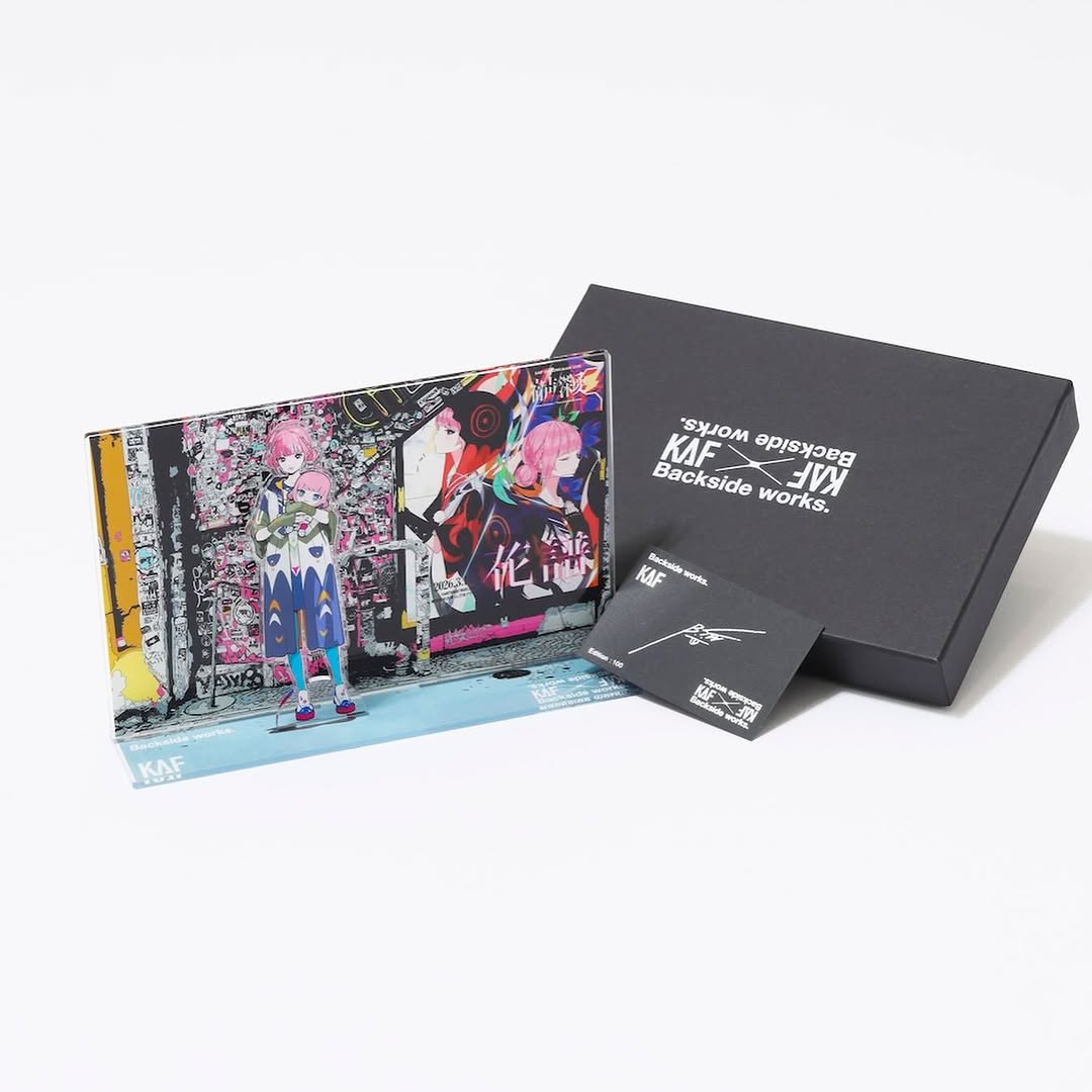
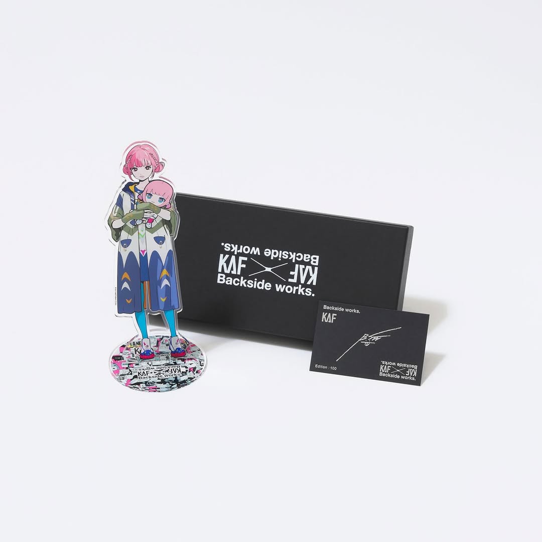
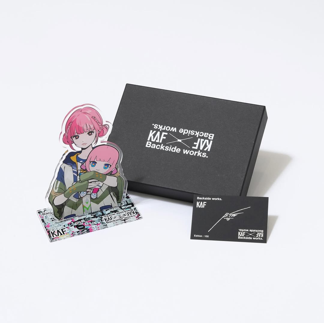
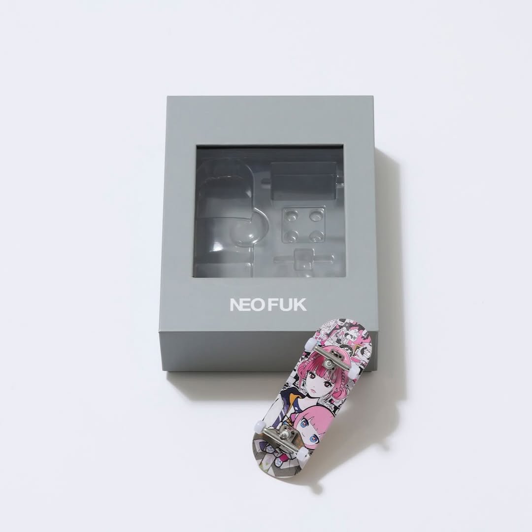
This image is a great reminder that “good” product photography is mostly structure. Three items. Clear hierarchy. A white background that doesn’t fight the design. The colorful acrylic artwork is the hero, and the black box acts like a frame that makes the colors feel even louder.
If you’re a creator selling merch (prints, acrylic stands, box sets), you don’t need a complex scene. You need a setup that communicates: what it is, what you get, and what it feels like. This layout does that in one glance.
Fans share merch posts when the photo feels official. The clean white set reads like e-commerce, while the illustrated acrylic piece reads like art. That blend makes the post feel both collectible and legitimate—perfect for launches, limited drops, and live-event tie-ins.
Also: the black box is doing quiet work. It signals “premium packaging,” which raises perceived value before anyone reads the caption. You can replicate that effect even with simple materials—if you control the lighting and keep the background pure.
| Signal | Evidence (from this image) | Mechanism | Replication Action |
|---|---|---|---|
| Clear “what you get” read | Three items arranged with no overlap chaos | Reduces purchase friction; viewers understand the bundle instantly | Lay out 2–4 items with one hero in front, packaging behind, insert card visible |
| Premium packaging cue | Matte black rigid box with crisp white branding | Black packaging signals “collector” and raises perceived value | Use matte black packaging (or a black backing board) to frame your hero item |
| High-key cleanliness | Seamless white background with soft shadows | Feels official and shop-ready; easy to repost | Light with a large soft source; keep shadows soft and background close to pure white |
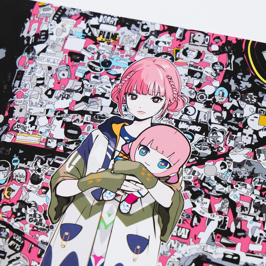
| Color pop by contrast | Vivid artwork against white + black | Contrast makes the art feel more saturated without over-editing | Keep the set monochrome so your illustration is the only color story |
Recipe 1: “Hero + box + insert”
Recipe 2: Color control
Recipe 3: Angle swap
The hero item sits in front-left, which is where many viewers’ eyes land first. The box sits behind-right, which reads like “packaging” and signals value. The small card is the proof of completeness—an easy way to communicate that the bundle is thoughtfully designed, not thrown together.
Soft shadows are important. Hard shadows make the shot feel like a quick snapshot. Soft, light grey shadows make it feel like a catalog image. That’s the difference between “fan photo” and “official drop.”
| Prompt chunk | What it controls | Swap ideas (EN) |
|---|---|---|
| “seamless white background, high-key product photo” | Clean e-commerce feel | “light grey seamless”, “white cyclorama”, “minimal studio” |
| “matte black rigid box, crisp white branding” | Premium packaging cue | “kraft box”, “metal tin”, “sleeve packaging” |
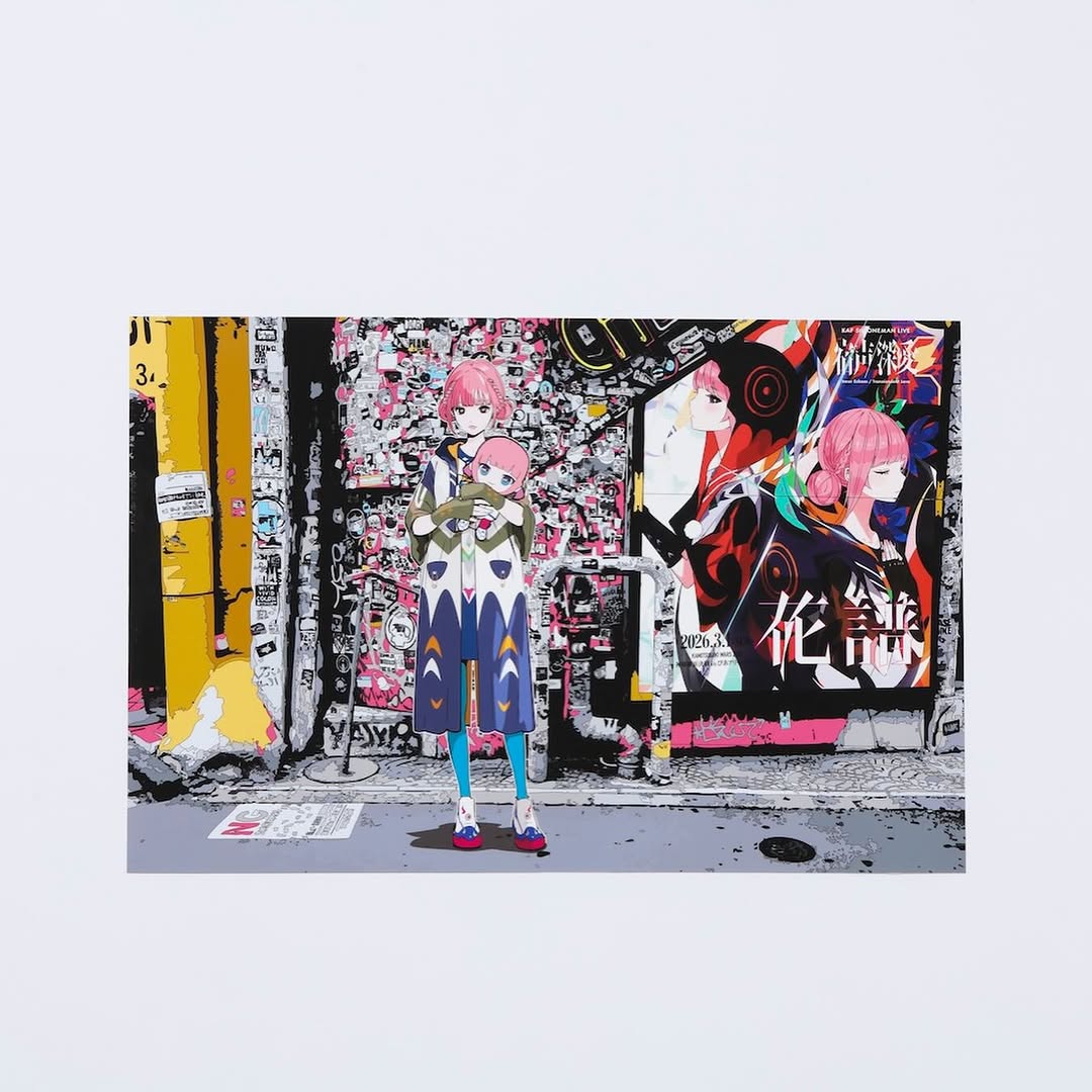
| “clear acrylic plaque, transparent edges, subtle reflections” | Material correctness for acrylic | “acrylic standee”, “glass frame”, “clear resin” |
| “softbox lighting, soft shadows, no glare hotspots” | Professional lighting | “diffused daylight”, “two-softbox setup”, “bounce fill” |
| “balanced layout: hero left, box right, insert card visible” | Instant bundle readability | “flatlay grid”, “stacked arrangement”, “diagonal layout” |
Clean studio product photo on a seamless pure white background: a clear acrylic display plaque with vibrant anime-style artwork placed foreground-left, a matte black rigid box with crisp white branding placed background-right, and a small black brand card with white logos leaning in the foreground-right. Three-quarter product angle from slightly above tabletop height, square 1:1 framing, generous white negative space above. Soft diffuse softbox lighting from upper-left, gentle soft grey shadows, subtle controlled reflections on acrylic, matte box finish. Photoreal e-commerce look, ultra-clean, sharp edges, no clutter, no hands.