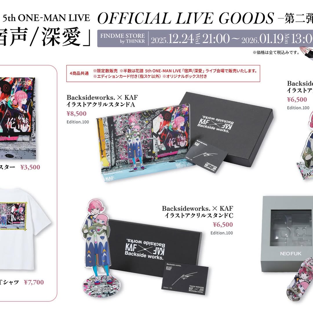
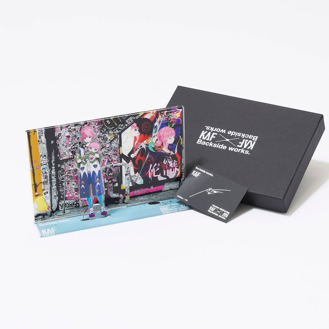
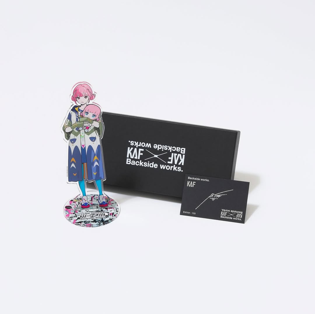
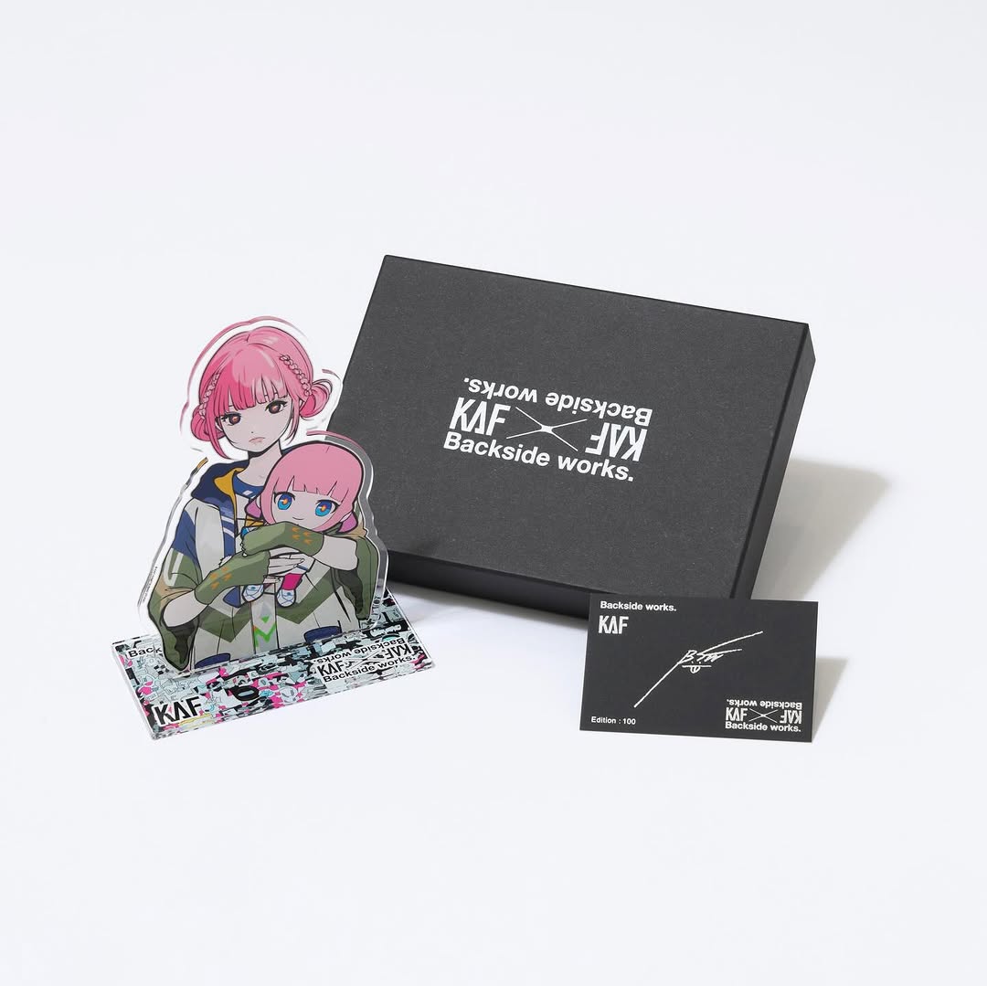
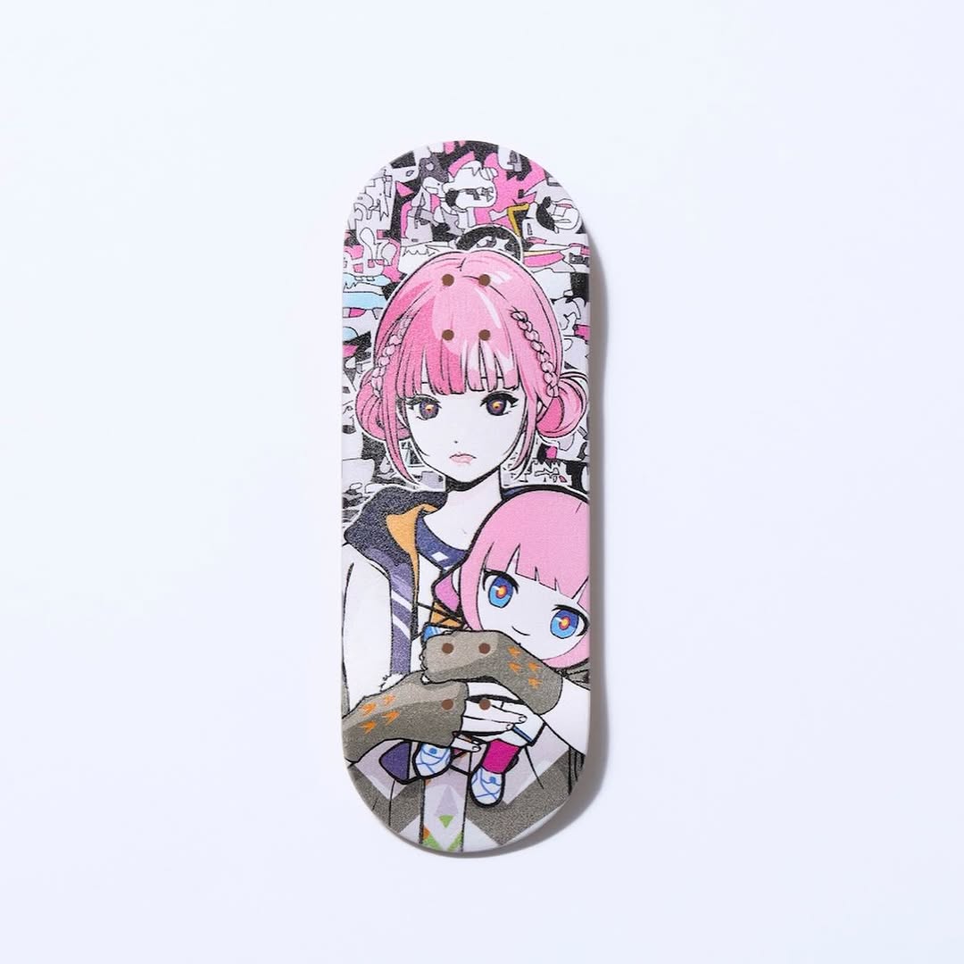
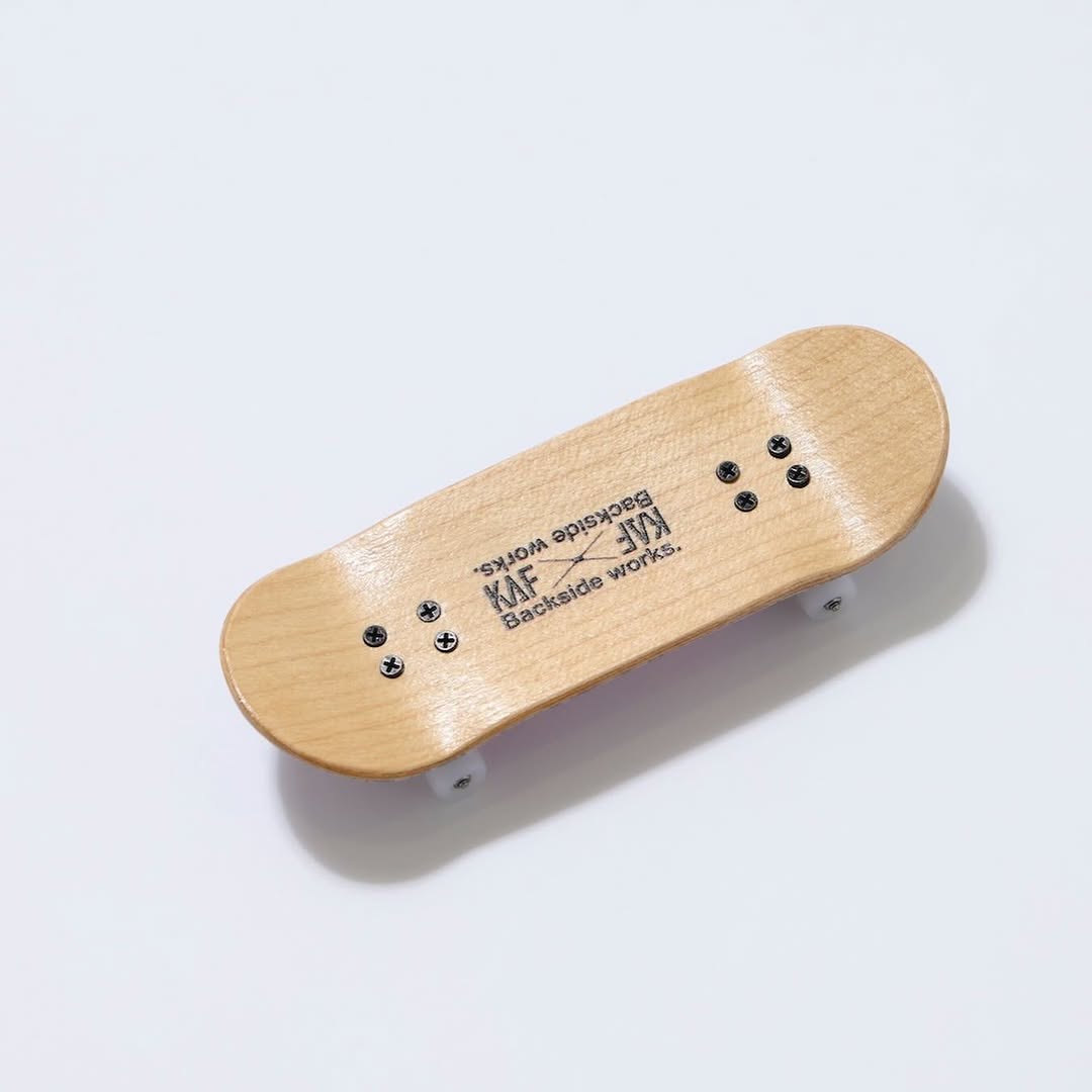
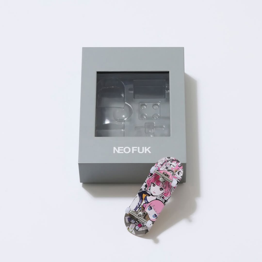
【#花譜5thワンマン グッズ第二弾📢】 花譜 5th ONE-MAN LIVE「宿声 / 深愛」 OFFICIAL LIVE GOODS 第二弾 12月24日(水) 21:00より販売スタート!! 顔や本名、性別、年齢を明かさずに活動する福岡出身の作家Backside works.さんがライブを記念して特別に描き下ろした花譜のイラストを使用したグッズを販売いたします!! 一部商品は数量限定となっております。 予めご了承ください。
【#花譜5thワンマン グッズ第二弾📢】 花譜 5th ONE-MAN LIVE「宿声 / 深愛」 OFFICIAL LIVE GOODS 第二弾 12月24日(水) 21:00より販売スタート!! 顔や本名、性別、年齢を明かさずに活動する福岡出身の作家Backside works.さんがライブを記念して特別に描き下ろした花譜のイラストを使用したグッズを販売いたします!! 一部商品は数量限定となっております。 予めご了承ください。
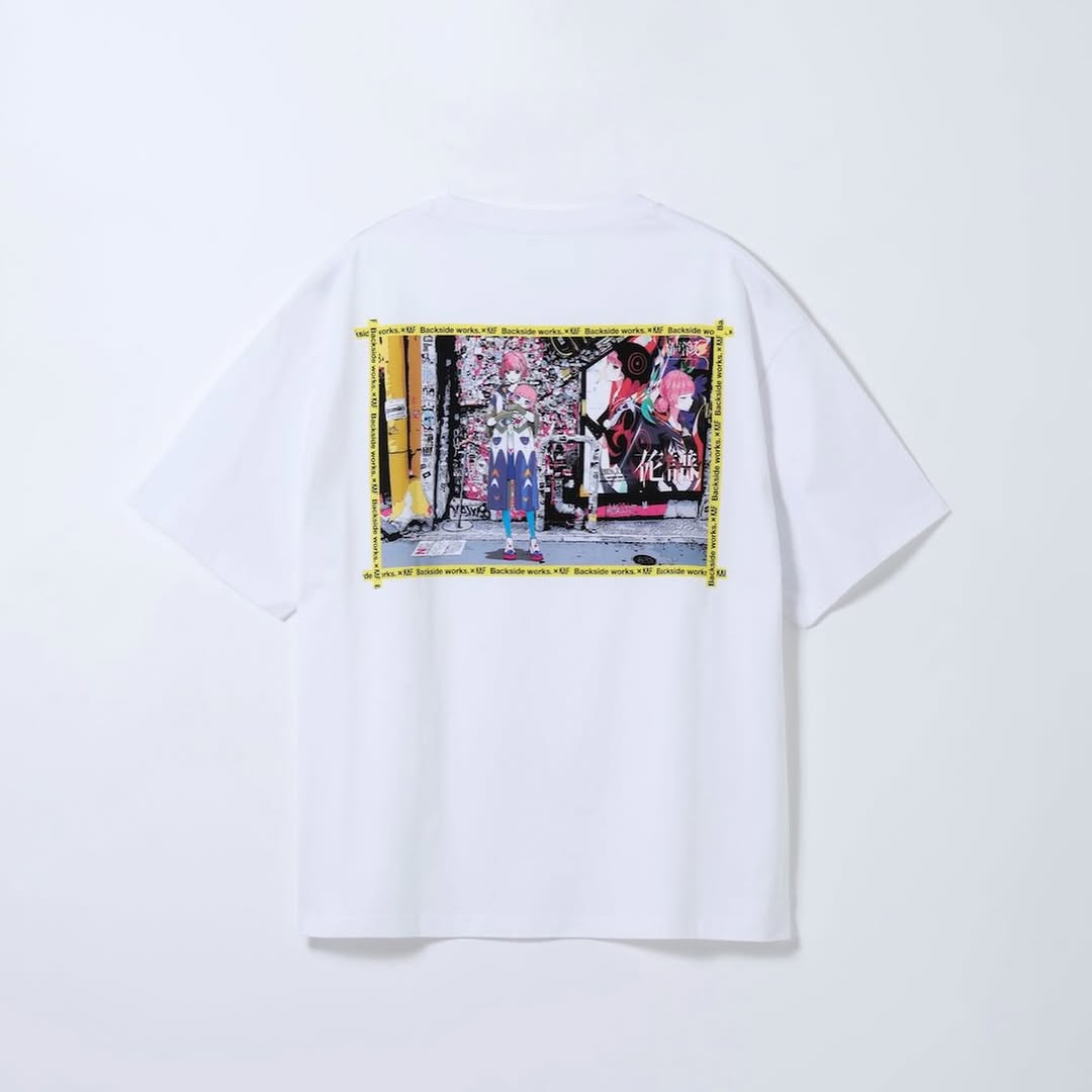
This image is a classic example of clean product communication: one item, one background, one focal graphic. There is no styling noise, so the viewer immediately understands the product and print placement. For commerce-focused creators, that clarity is essential for conversion-friendly content.
The graphic panel and yellow border details add enough personality to prevent the shot from feeling generic. It still reads like catalog photography, but with a distinct streetwear identity. That balance supports both discovery and purchase intent.
| Signal | Evidence (from this image) | Mechanism | Replication Action |
|---|---|---|---|
| Instant product clarity | Single centered shirt on plain background | Reduces cognitive load and improves quick decision-making | Shoot one SKU per frame for primary listing images |
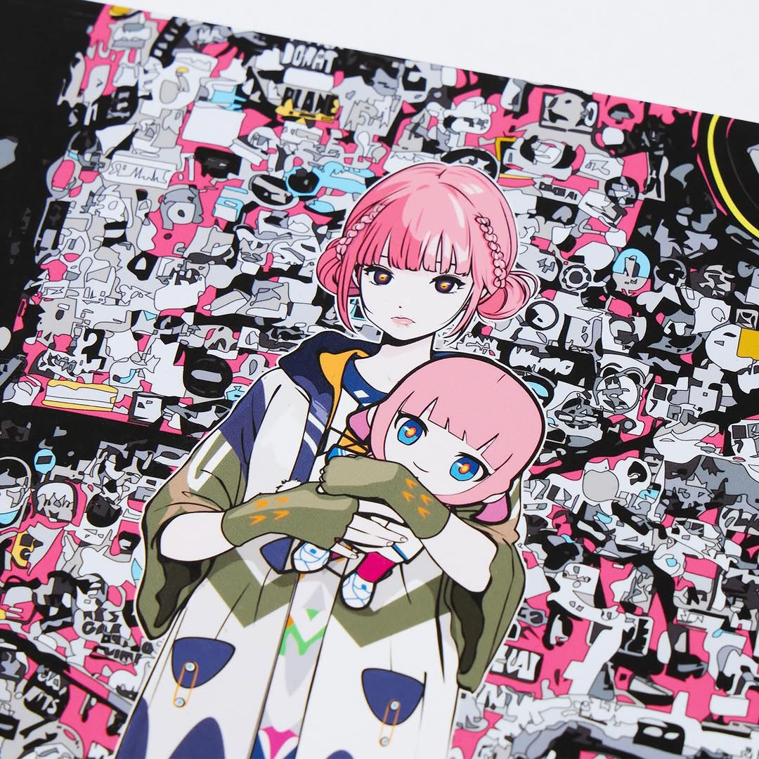
| Brand personality | Anime-collage graphic with yellow frame text | Differentiates item from basic blank tees | Highlight one signature print zone in every hero shot |
| E-commerce trust | Even lighting and accurate white fabric tone | Signals honest representation of product | Use neutral white balance and avoid heavy color grading |
| Scroll retention | Minimal composition with one vivid print block | Eye lands on graphic quickly and stays | Keep background quiet, push contrast into the print area |
| Recipe | Keep | Change | Slot template (EN) |
|---|---|---|---|
| Colorway variant | Centered product-only framing | Swap base tee color while keeping print template | {tee color} + {same print block} + {clean background} + {catalog lighting} |
| Detail-first variant | Neutral background and true color lighting | Crop tighter to print and stitching details | {macro product crop} + {signature graphic zone} + {even light} + {texture clarity} |
| Styled mannequin variant | Graphic hierarchy and color accuracy | Add mannequin torso for fit context | {neutral mannequin} + {hero tee} + {minimal backdrop} + {fit demonstration} |
The shot uses negative space as a quality signal. By giving the garment room, the design feels intentional and premium. The white shirt silhouette remains crisp, while the print becomes the visual anchor. The yellow border acts like a built-in attention frame, guiding the eye directly to the artwork.
For creator-led brands, this format is highly scalable. You can keep the same lighting and framing template across multiple SKUs, then differentiate products through print and color only. That consistency improves both operational speed and brand recognition.
| Prompt chunk | What it controls | Swap ideas (EN, 2-3 options) |
|---|---|---|
| "single centered white tee product shot" | Catalog clarity | "hoodie centered shot" / "long-sleeve tee" / "tank top flat lay" |
| "anime-collage rectangular back print" | Design focal identity | "typography print" / "photo print" / "abstract graphic patch" |
| "yellow tape-like border text around print" | Secondary attention framing | "white border" / "black caution frame" / "no border clean print" |
| "soft neutral studio light" | Color accuracy and trust | "hard shadow editorial" / "top-down flatlay light" / "warm campaign tone" |
Baseline Lock: lock centered product scale, lock neutral background, lock true white balance.