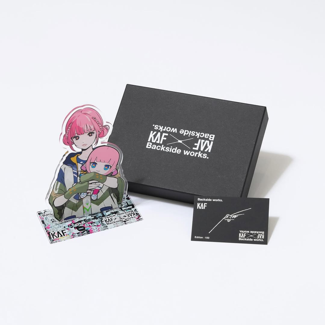
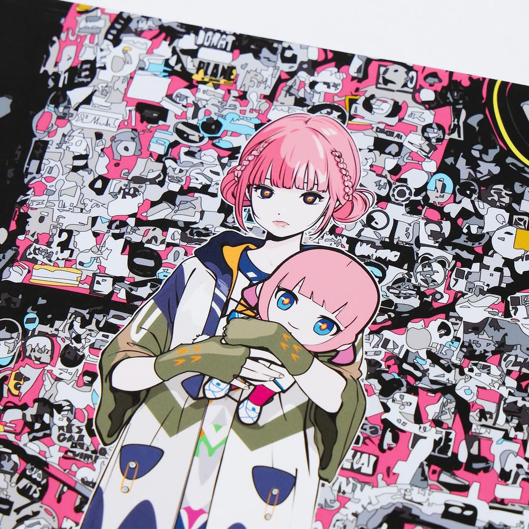
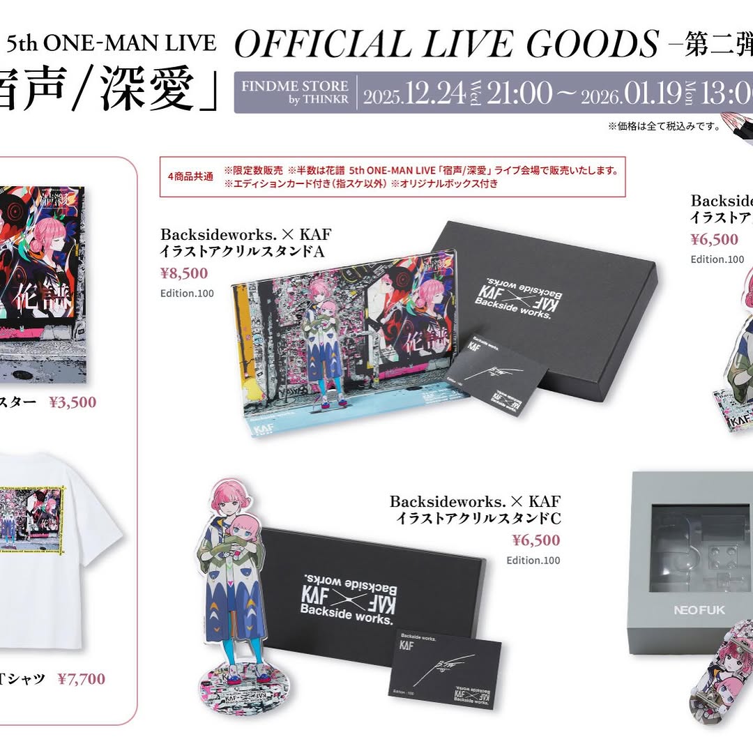
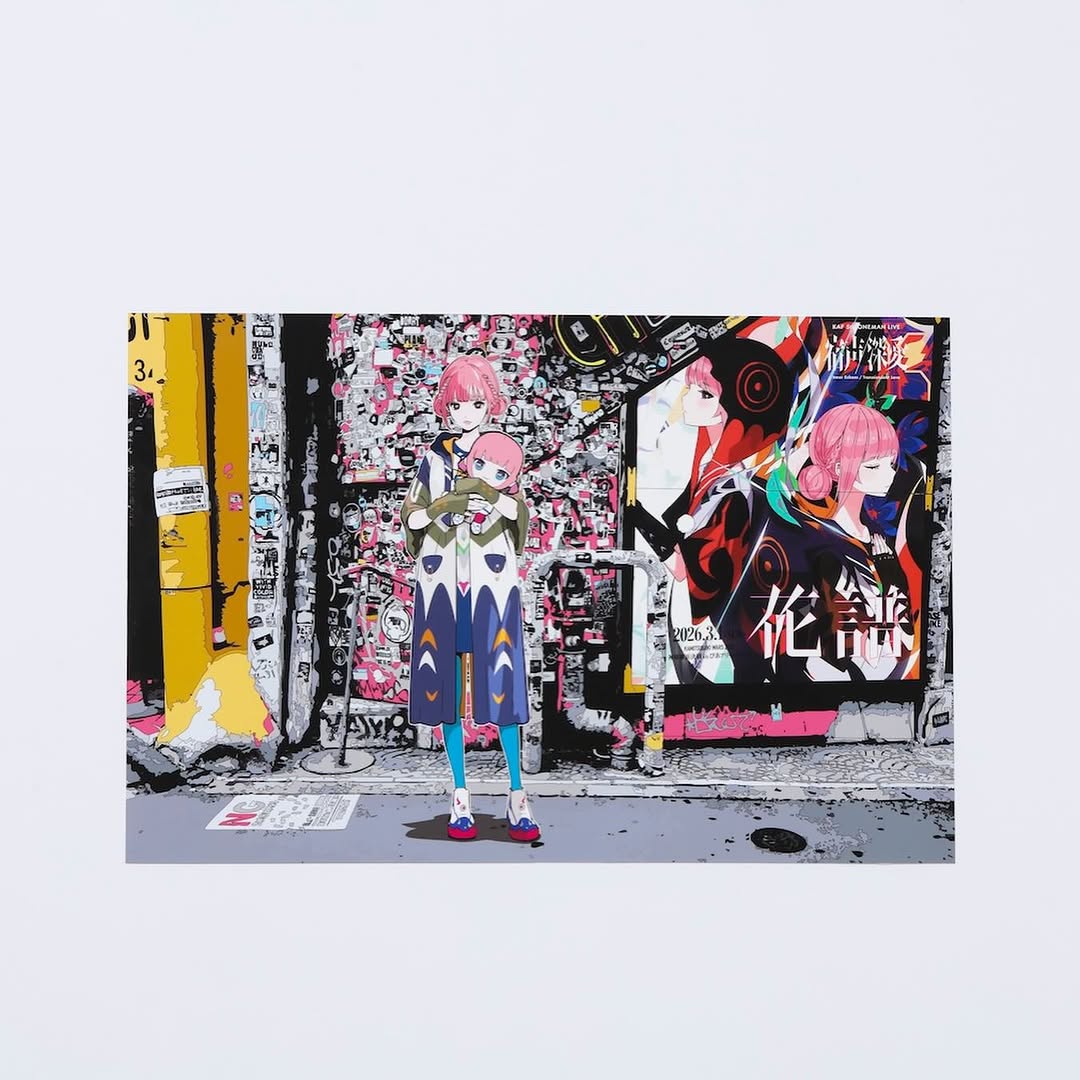
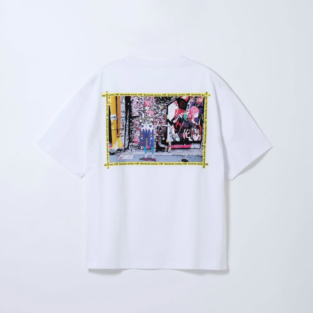
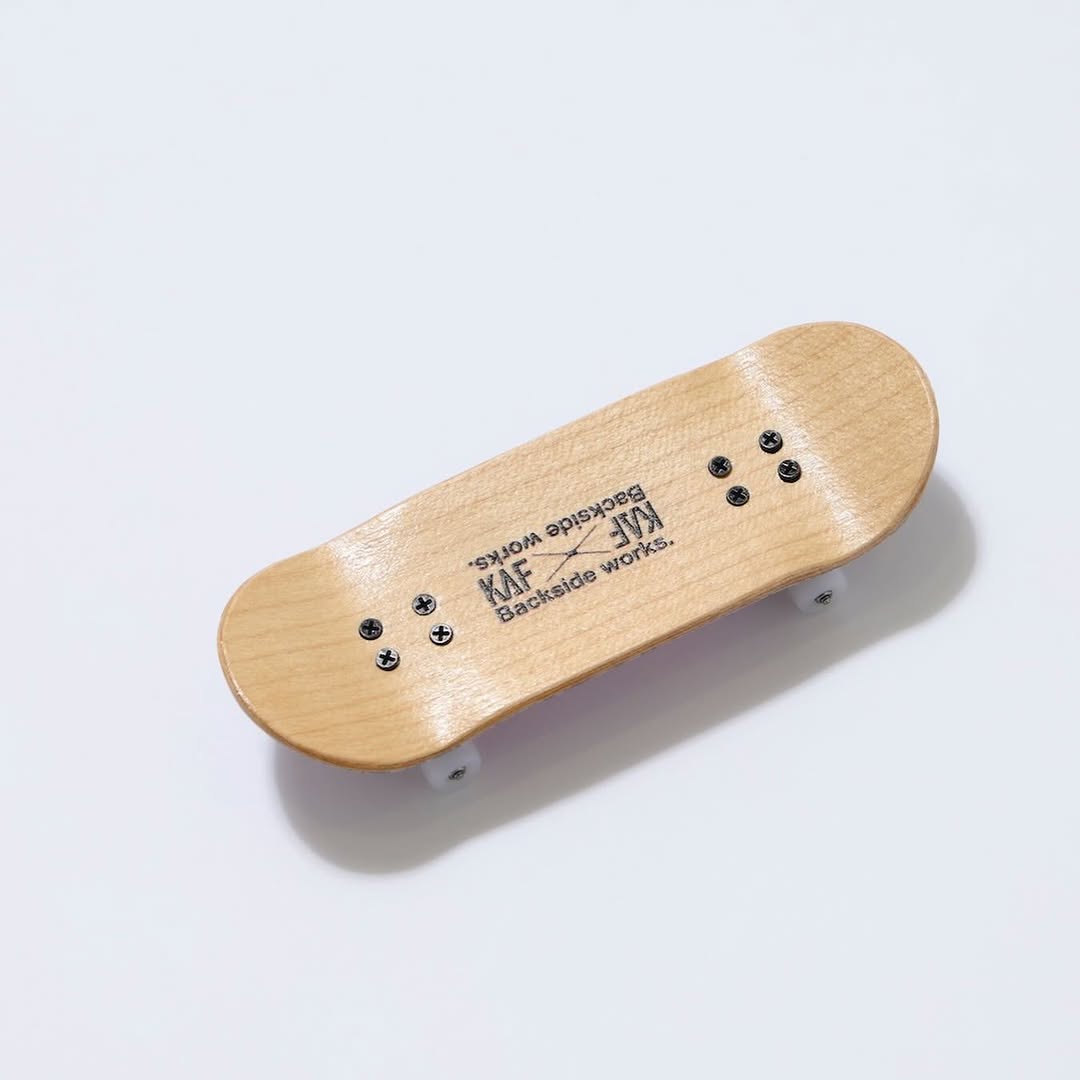
【#花譜5thワンマン グッズ第二弾📢】 花譜 5th ONE-MAN LIVE「宿声 / 深愛」 OFFICIAL LIVE GOODS 第二弾 12月24日(水) 21:00より販売スタート!! 顔や本名、性別、年齢を明かさずに活動する福岡出身の作家Backside works.さんがライブを記念して特別に描き下ろした花譜のイラストを使用したグッズを販売いたします!! 一部商品は数量限定となっております。 予めご了承ください。
【#花譜5thワンマン グッズ第二弾📢】 花譜 5th ONE-MAN LIVE「宿声 / 深愛」 OFFICIAL LIVE GOODS 第二弾 12月24日(水) 21:00より販売スタート!! 顔や本名、性別、年齢を明かさずに活動する福岡出身の作家Backside works.さんがライブを記念して特別に描き下ろした花譜のイラストを使用したグッズを販売いたします!! 一部商品は数量限定となっております。 予めご了承ください。
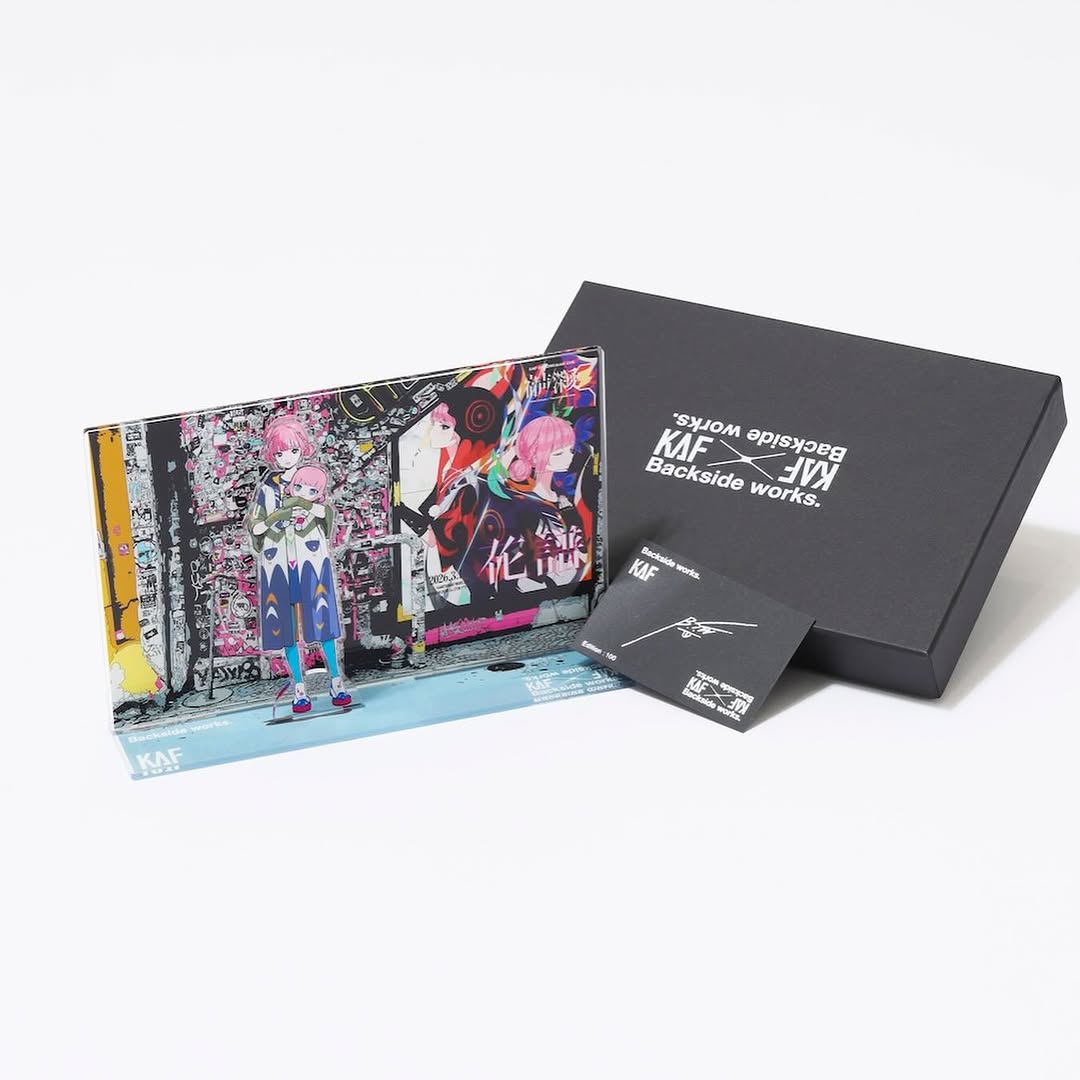
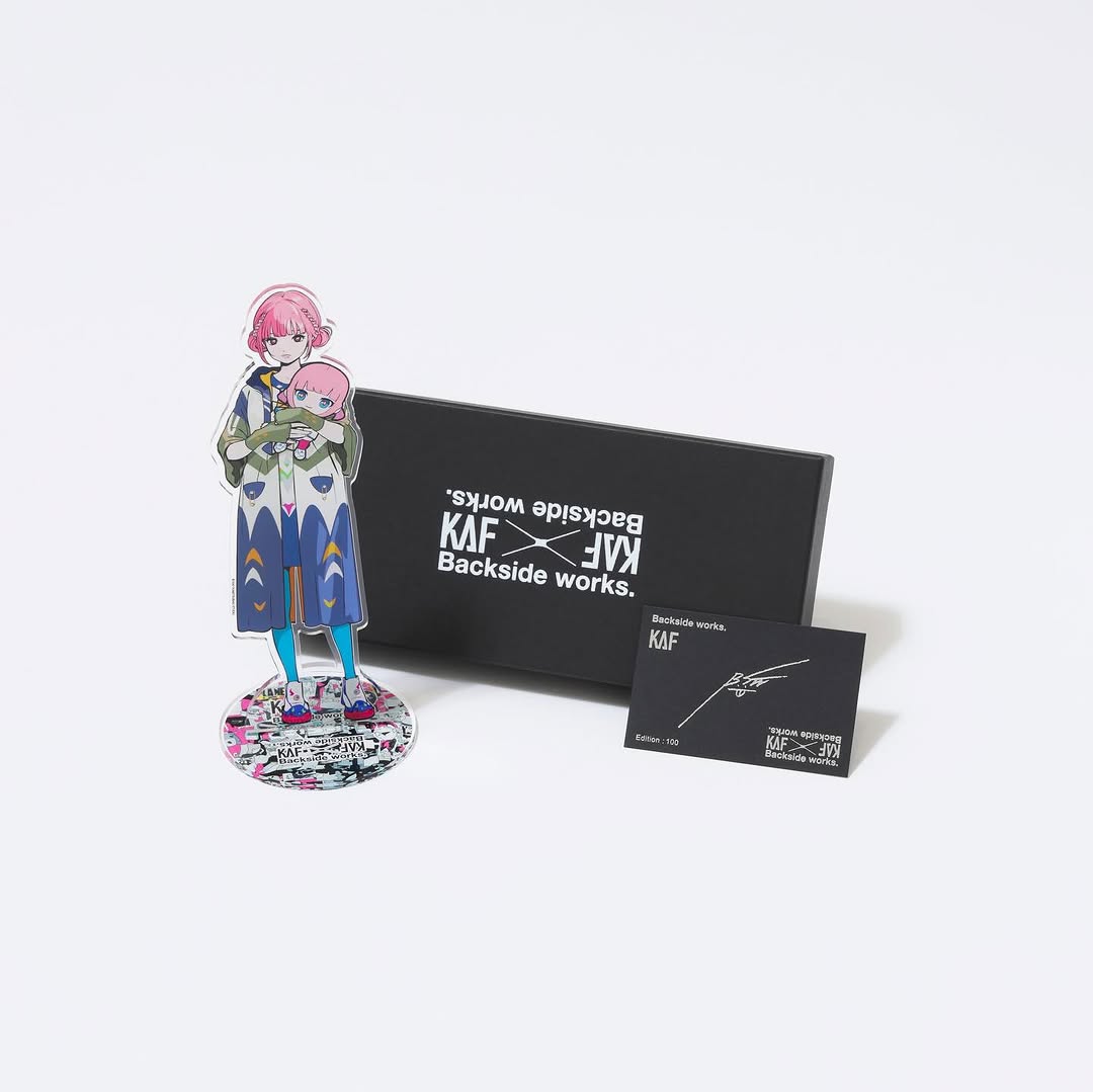
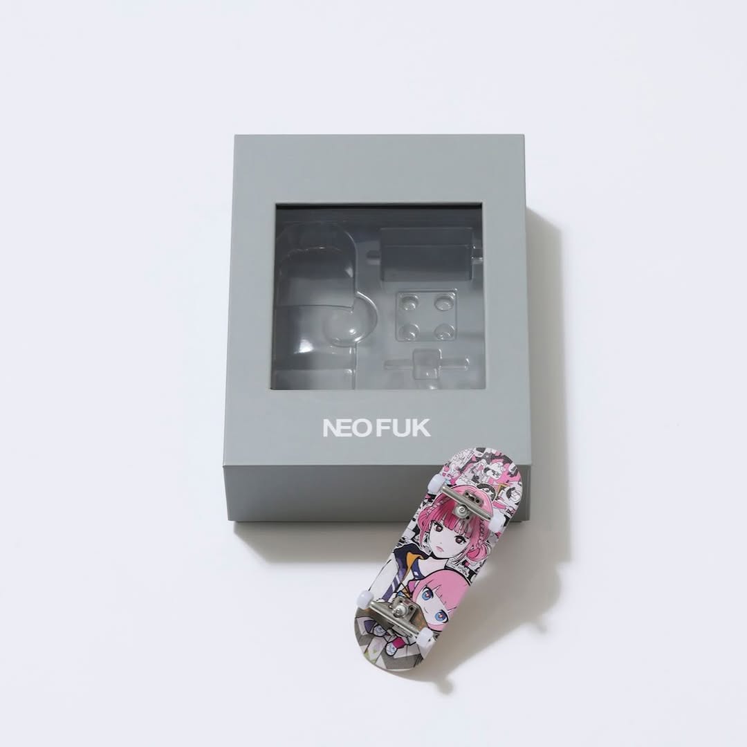
This image works because it sells a system, not just a single object. Viewers see the box, the acrylic character stand, and the edition card together, which instantly communicates collectibility and perceived value. That bundle framing is a strong conversion trigger for creator merch drops.
The composition is also optimized for trust. Clean background, clear object separation, and readable branding reduce uncertainty. Buyers can quickly understand what they get, which lowers friction at the decision stage.
Another growth advantage is content modularity. From this one master shot, creators can generate zoom crops, unboxing narratives, and authenticity storytelling posts. That makes it an ideal core asset for SEO-rich product pages.
| Signal | Evidence (from this image) | Mechanism | Replication Action |
|---|---|---|---|
| Bundle clarity | Box + standee + edition card all visible | Increases perceived completeness and value | Always include the full set in one hero frame |
| Brand legibility | KAF / Backside works text readable on black surfaces | Builds product authenticity and trust | Prioritize lighting that preserves white text contrast |
| Material contrast | Matte box, glossy acrylic, matte card | Signals quality through tactile differentiation | Use soft key light to reveal each material behavior distinctly |
| Negative space control | Large clean area around objects | Makes layout premium and ad-ready | Leave intentional empty space for future headline overlays |
{main box} + {hero collectible} + {auth card} on {clean seamless}{minimal backdrop} {triangular object layout} {soft product light}{matte + glossy + matte materials} {single scene} {catalog sharpness}The aesthetic language is restrained and collector-oriented. Black packaging provides authority, the anime stand adds personality, and the card adds legitimacy. Instead of visual excess, the image relies on spacing and object hierarchy. This is exactly what premium merch content needs: enough detail to feel rich, enough simplicity to feel trustworthy.
| Observed | Recreate | Evidence cue |
|---|---|---|
| Triangular object arrangement | Place hero object left, box rear-right, card front-right | Balanced visual flow across frame |
| Soft studio shadows | Use broad diffused key from top-left | Objects remain dimensional without harsh contrast |
| Readable branding on dark surfaces | Expose for white typography while protecting black texture | Trust signal for authenticity |
| Acrylic edge highlights | Allow subtle specular reflections on transparent parts | Material quality becomes visible |
| Prompt chunk | What it controls | Swap ideas (EN, 2-3 options) |
|---|---|---|
| “one black presentation box with white logo text” | Primary packaging anchor | “matte navy box”, “foil-stamped sleeve box”, “drawer-style box” |
| “anime acrylic standee in foreground-left” | Character identity cue | “mini figurine”, “lenticular card stand”, “die-cut art plaque” |
| “edition/auth card in foreground-right” | Collectibility proof | “numbered certificate”, “QR auth ticket”, “holographic serial card” |
| “minimal seamless background” | Commercial cleanliness | “off-white matte surface”, “stone-texture light gray”, “warm paper backdrop” |
| “soft diffused product lighting” | Material readability and trust | “two-softbox flat light”, “single soft key + bounce”, “top diffusion tent light” |
Use product-click rate and save rate as top KPIs. For collectible merch, these are stronger intent signals than likes.